
In this article, we will learn how to create Power BI Reports. This article is created for newbies to start the Power BI world with a simple example. We will connect to SQL Server, show how to transform data from SQL Server in Power BI, and then we will create some reports, and play with the options available in Power BI.
Requirements
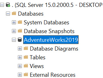
As this is mainly a SQL Server website, we will use the Adventureworks database. Adventure Works is a fictitious company that sells bikes and bike parts. It is the most famous sample database in SQL Server. Using this database will simplify our job because the data is already generated. You can install your adventure databases by following these steps:
Also, you will need to install the Power BI Desktop. You can download Power BI here:
Connect to SQL Server from Power BI Reports
The first step is to connect to SQL Server using Power BI. Power BI has several options to connect to different sources like Excel, JSON, CSV files, Oracle, Web pages, the Dataverse, OData, Analysis Services, and several other options.
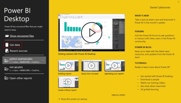
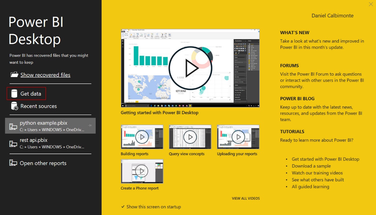
First, open Power BI and select the Get Data option to connect to SQL Server.
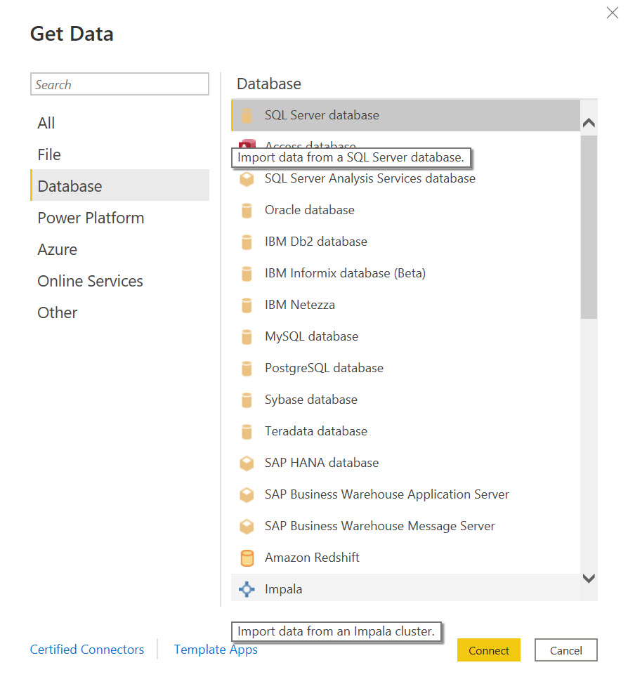
Secondly, select Database and SQL Server database and press Connect.
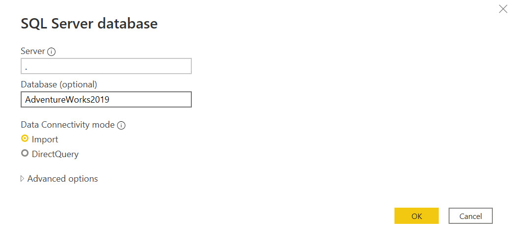
Specify the SQL Server name. In this example, I am using a dot (.) which means that the local SQL Server will be used. Optionally, the database name. You can import selected tables or views or write a query with the data required. If you want to write a query, specifying the database name is necessary. In this example, we will not write a query.
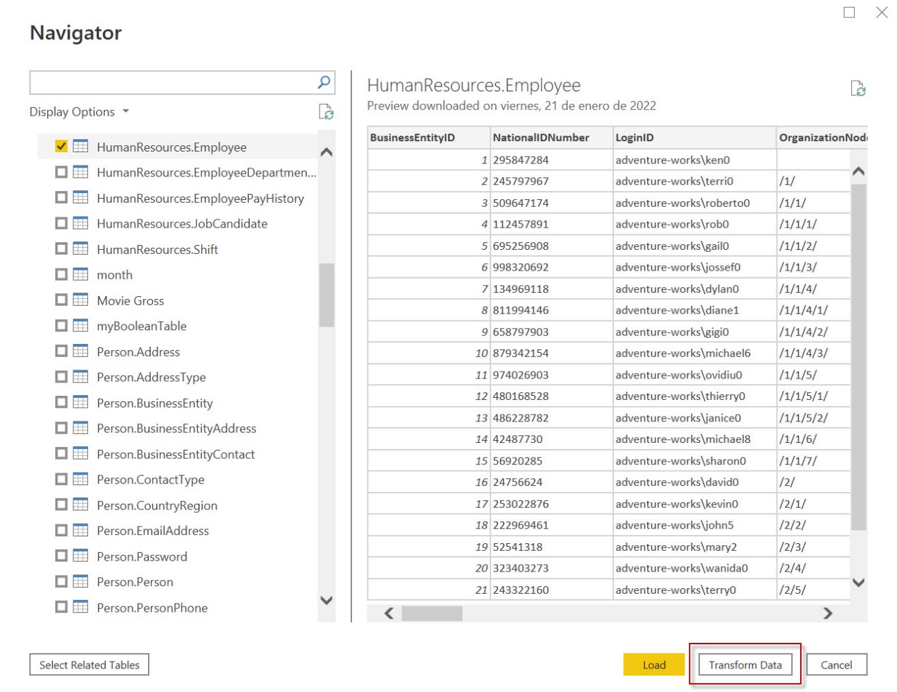
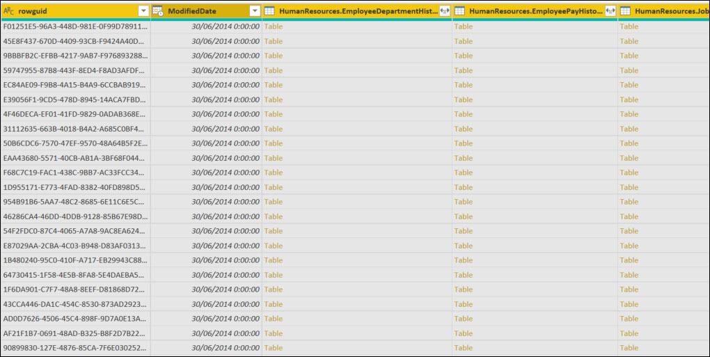
In this example, we will select the HumanResources.Employee table to generate reports and select Transform data. The transform data will be used to remove some columns that are not required.
Transform data to generate Power BI Reports
In Power BI, you can transform the data before the reports are generated. You can remove columns, and add calculated columns, and values. Also, it is possible to remove rows, split columns, and group data.
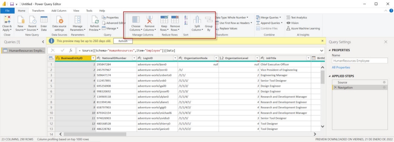
Also, you can change the data type, Transform the data, remove duplicated data, remove errors, unpivot columns, rename column headers, and more.
In this example, select multiple column headers by clicking and keeping pressed the Ctrl button to select the columns rowguid, ModifiedDate, and the last columns. Right-click and select Remove to remove the columns selected.
Finally, to save the changes, select Close & Apply to apply the changes. Now you will have your data without the columns removed.
Creating your Power BI Reports
We connected to SQL Server, get the data, and remove some columns, now we are ready to create Power BI reports.
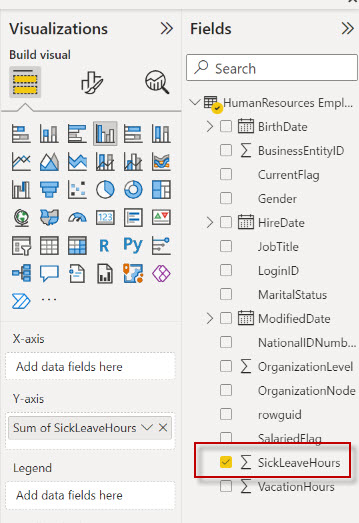
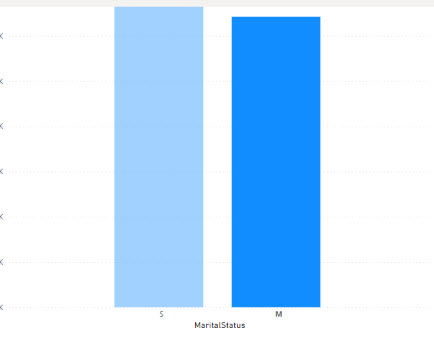
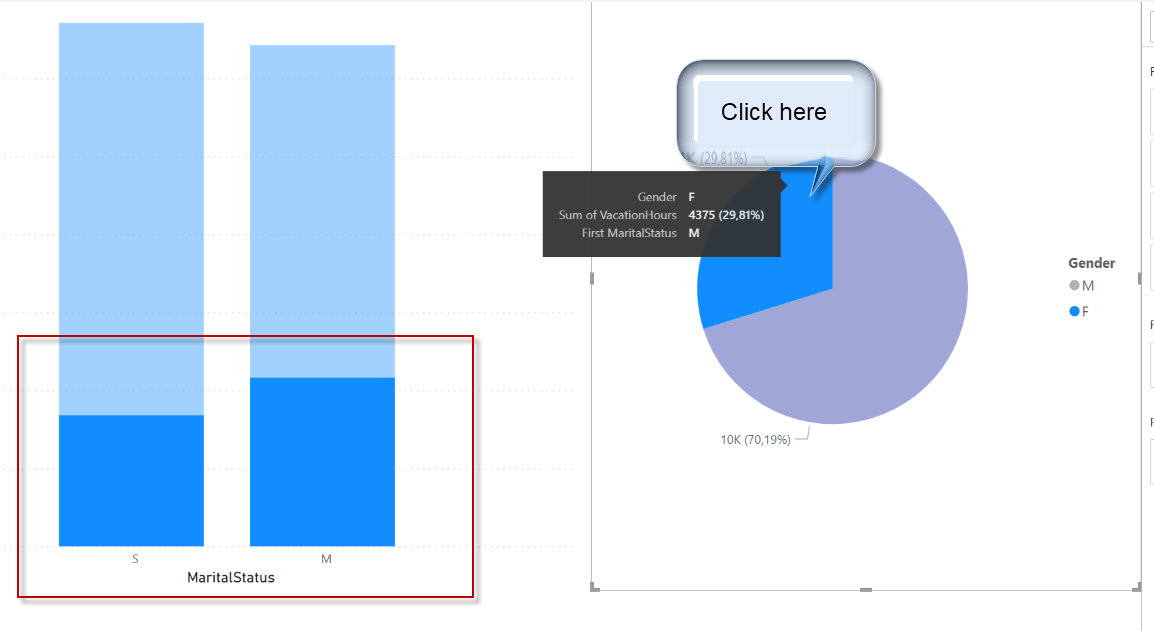
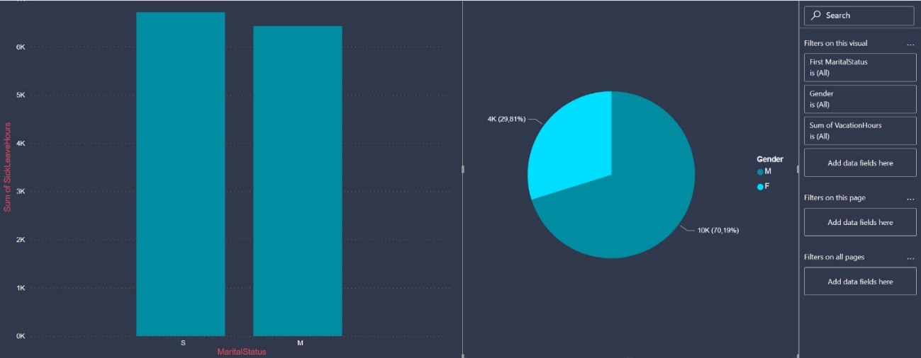
First, in the Reports, go to Fields and check the SickLeavingHours field. This column shows the total sick leaving hours.
Secondly, drag and drop the MaritalStatus column from the Field pane to the X-axis in the Visualizations. The bar chart will show the married and single employees and the total Sick Leaver Hours.
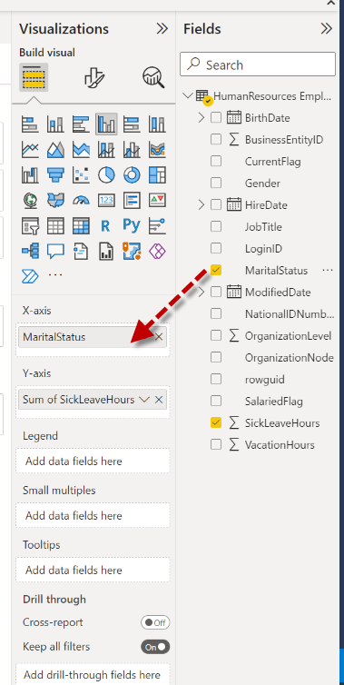
Finally, we have the first chart. There are more sick leaving hours from single employees (S) than the married (M) ones.
The bar chart is fine, but I do not like the blue color. How can I change the bar colors?
Changing the colors of the Power BI Reports
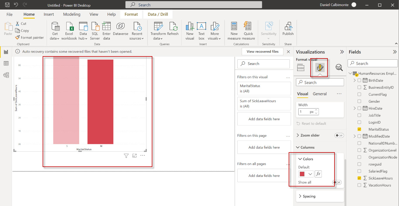
The Visualizations pane is used to modify the format and the colors. You need to select the bar chart and Go to Visualizations to change the bar chart colors.
The format your visual option allows changing the format for X-axis, Y-axis, Gridlines, Zoom Sliders, Columns, Data labels, and the Plot area background. You can, for example, modify the fonts of the X-axis values, the title, and more. Note that the format of your visual options changes according to the visual selected. Each visual has different format options.
In this example, we are going to change the default blue color with a new color.
By default, the value of the bar charts is blue. To change this value, go to Visualizations, Format Your visual, and then select Columns>Colors and select a new color for the bar chart.
Creating a pie chart in Power BI Reports
Previously, we worked with a bar chart. Now, we will learn to create a pie chart. First, in Reports, right-click in an area outside the bar chart to create a new chart.
Secondly, drag and drop the Pie Chart to the report area and also drag and drop the vacation hours and gender to the pie chart.
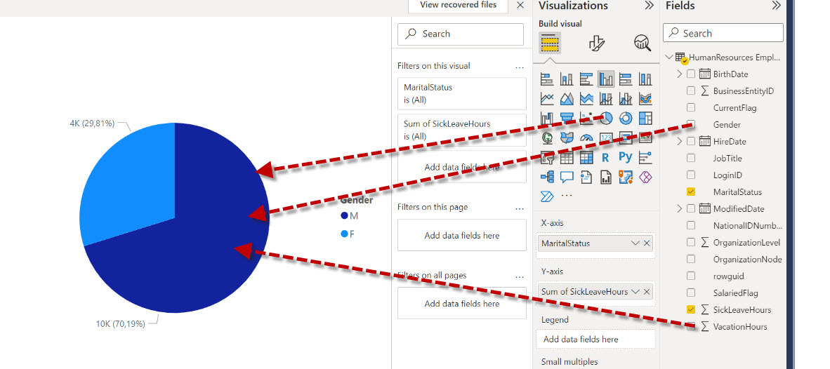
We noticed that there are more vacation hours in total for Male employees (70 % approx.) and around 30 % of the vacation hours belong to female employees.
Dynamic filters in Power BI Reports
Something that people love about Power BI (and this is one of the reasons to call it Power) is that you can click on your reports in a section of one chart and the other charts on the same page will use the filter selected in the chart.
For example, if I click the Male (M) bar chart, the pie chart will show the information related to males.
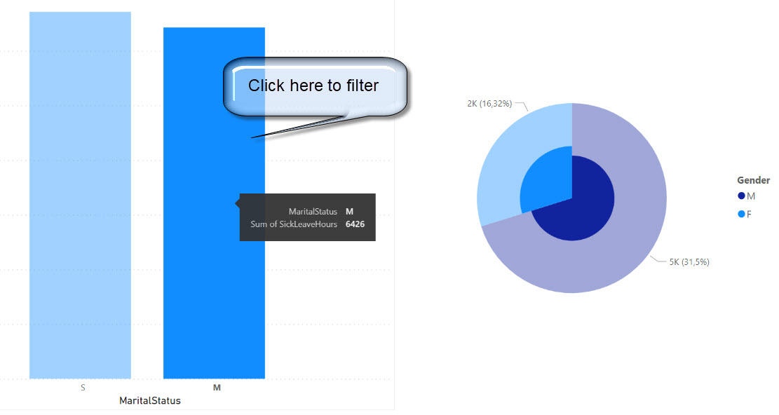
In addition, if I click the Female (F) area in the pie chart, I will be able to see the selected region in the bar chart.
So, without extra code, we can generate very powerful and intuitive reports for your users. This feature saves a lot of time because this is created dynamically and automatically. Other technologies would require extra effort to add some filters to have similar behavior.
I have another problem. I do not like the colors by default. Is there an easy way to change the format of the report?
And the answer is yes. Let’s take a look at the next section.
Changing the theme
In Power BI, you have a great community and you can also download a theme for your report. I am pretty bad at selecting and combining colors, so I always download a theme that is a JSON file. Let’s take a look at this option.
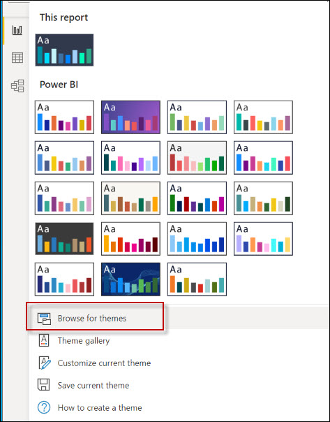
In the Ribbon, go to View and select Theme Gallery.
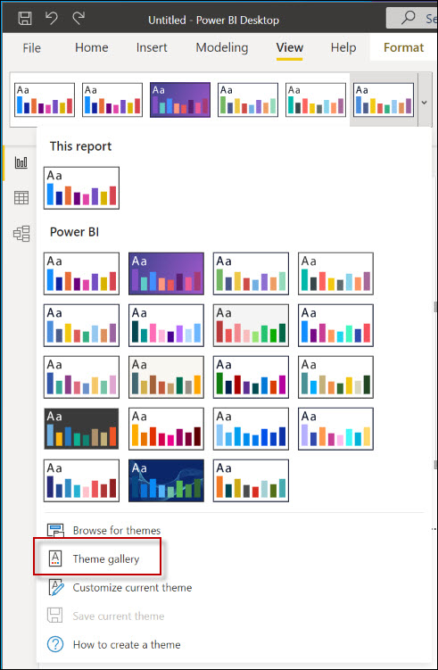
You can choose any theme from the gallery. In this example, I will click on Seppirus Theme
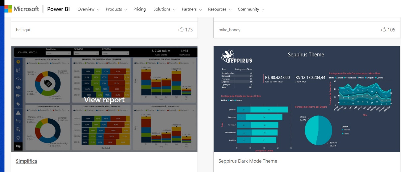 Also, download the Seppirus Dark Mode.json file on your computer.
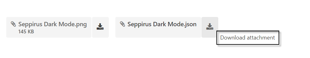
Once downloaded select the Browse for themes in Power BI and select the Seppirus Dark Mode.json file
My report will apply the theme in the report.
As you can see, changing the theme is a straightforward process.
Other visuals
There are other visuals and report options that may be useful to you:
- Analyzing spatial data with Azure Maps in Power BI
- Analyzing key influencers in data with Power BI
- Generating smart narratives in Power BI
- Filtering data using Slicers in Power BI Reports
- Power BI: Waterfall Charts and Combined Visuals
- Power BI: Conditional formatting and data colors in action
With these articles plus this one, you will be ready to face the real world in Power BI.
Conclusion
Power BI is a very simple and intuitive tool. It is very simple to start and learn. However, it includes several options that can be complex like adding Python and R scripts. It also includes some visuals that include artificial intelligence. However, as you can see, creating a bar chart, a pie chart, and transforming data are very simple tasks in Power BI. In this article, we learned to create a bar chart, change the colors, and create a pie chart, we also learned to create dynamic filters by clicking on chart areas, and finally, we learned how to change the default colors using themes downloaded from the forum. If you have questions, feel free to write your comments.

He has worked for the government, oil companies, web sites, magazines and universities around the world. Daniel also regularly speaks at SQL Servers conferences and blogs. He writes SQL Server training materials for certification exams.
He also helps with translating SQLShack articles to Spanish
View all posts by Daniel Calbimonte
- PostgreSQL tutorial to create a user - November 12, 2023
- PostgreSQL Tutorial for beginners - April 6, 2023
- PSQL stored procedures overview and examples - February 14, 2023