

In this article, we will learn how to use smart narratives in Power BI to generate textual narratives that summarize the key highlights of the data presented in the report.
Introduction
Data can be of different varieties like textual data, financial data that deals with numbers, spatial data that is related to geographical information, and other such tens to hundreds of varieties of data exists. Data of specific types are hosted in purpose specific databases as well as data objects so it can be managed depending upon the nature of data. Unlike the approach of specific types of data repositories or objects for specific types of data, the data consumption practice works almost in the inverse fashion. Transactional reports typically have less variety in any given report as the data has a limited scope and context that is reported. Analytical reports and dashboards typically present a large variety of data like key influences, Key Performance Indicators (KPIs), spatial data presented on maps, scorecards, trend lines, charts, graphs, grids and many more forms of data representation. While a large volume and variety of data are reported on dashboards, it becomes tedious to interpret key highlights in the report for an end-user just by visually glancing at the dashboard.
To make it easier for the end-user, this job may be done by report or business analysts who may pre-analyze the reports, manually form textual narratives that summarize the key highlights in the report. While it solves the challenge in question, it opens a possibility of analysts’ bias getting introduced in the report, and the end-user may or may not agree with the narrative. Some systems solve this issue by employing complex machine learning / natural language processing / other artificial intelligence-based mechanisms to auto-generate smart textual narratives that summarizes the key highlights of the data. Though this approach works, it requires a significant number of resources and hard-to-find skills which is outside the bounds of a normal end-user who may want to use a reporting tool in a self-service manner and build a dashboard.
Modern reporting solutions like Tableau, AWS QuickSight, Microsoft Power BI, and others in similar league have been offering a feature to generate key insights using built-in AI/ML in the reporting tool which enables an end-user to extract insights as well as enables a report developer to have a smart visual that auto-updates the insights based on the change in the data.
Generating narratives from data in Power BI
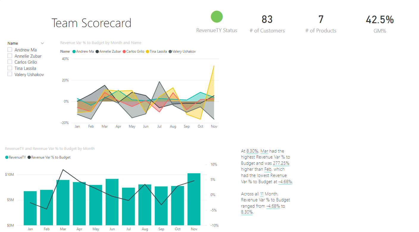
We need to have a report with a variety of data and visuals presented in the report, so that it simulates the complexity of the report that is usually found in real-world scenarios. One can use any existing Power BI reports or use some of the sample reports available from Power BI. It is assumed that Power BI Desktop is installed on your machine and a reasonable complex Power BI report that is populated with sufficient data and visualizations is already available and open in Power BI Desktop. Shown below is an example of one such report.
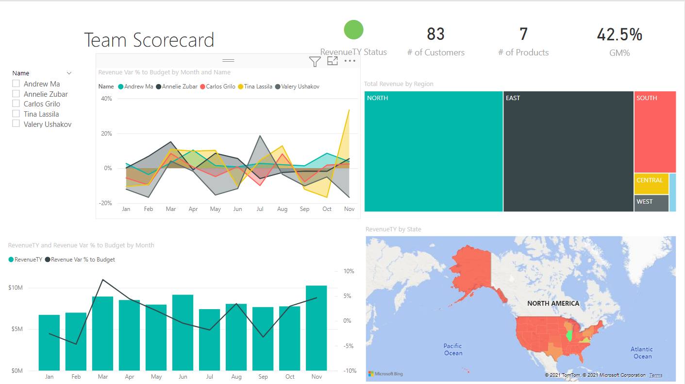
Let’s analyze the dashboard manually to derive some insights that we can derive visually from this dashboard. There are four charts in this dashboard – column chart, line chart, a heat map and spatial map. Of all these charts, the easiest to interpret is the bar or column chart. If we hover the mouse pointer on the higher bar, we can see that the last bar is the tallest. When we hover the mouse, we can see the month and the field as well as its value. From the chart, it seems that November month is having the maximum revenue which is shown in the RevenueTY field. It is not easy to make out how much higher this percentage is compared to any other month shown in the chart.
Another chart that shows a lot of details categorically is the line chart. If we hover the mouse over this chart, it will show the details along with values. In this chart, as seen below, the last month shows a lot of variances between the revenue generated by different personnel. This is represented by the field Revenue Var and Budget. It is again hard to visually make a comparative analysis between different months and personnel.
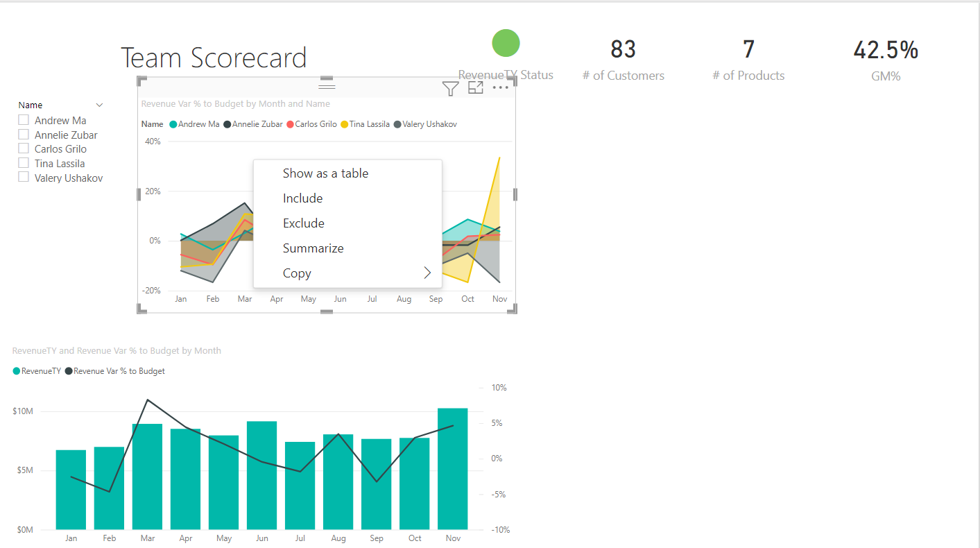
The rest of the two charts do not represent or encapsulate that much amount of detail as the rest of the two charts. Let’s say we intend to add some textual narrative to it without doing any details analysis manually. This is the time to add the smart narrative visual to this report. For now, we just intend to explore the narrative that gets generated based on the data in the report to catch some quick derivations that this visual can make using its built-in intelligence. An easy way to create a narrative using any visual is by right-clicking and selecting summarize option from the context menu as shown below.
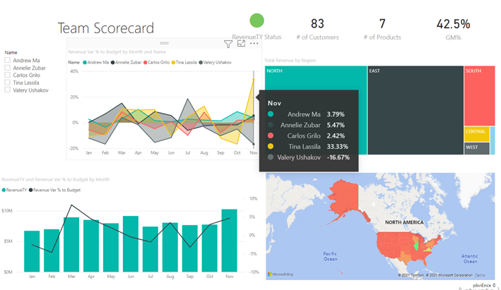
Once we click on this option, it will create a new box with a narrative summarized in it as shown below. The narrative here has two statements mentioned in it. The first statement is “At 8.30% Mar had the highest Revenue Var % to Budget and was 277.25% higher than Feb, which had the lowest Revenue Var % to Budget at -4.68%”. Where we were analyzing this chart, we were not able to make this comparative analysis and instead it seems that November month had the highest variance.
The second narrative statement is “Across all 11 Months, Revenue Var % to Budget ranged from -4.68% to 8.30%”. Again, this is another example of comparative analysis that was not easy to make visually just by glancing at the chart.
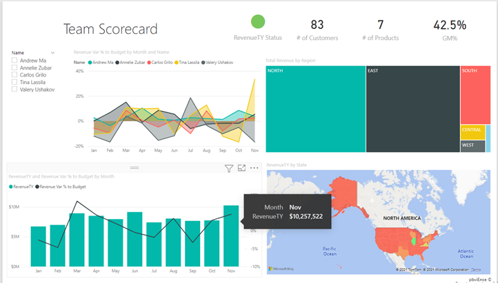
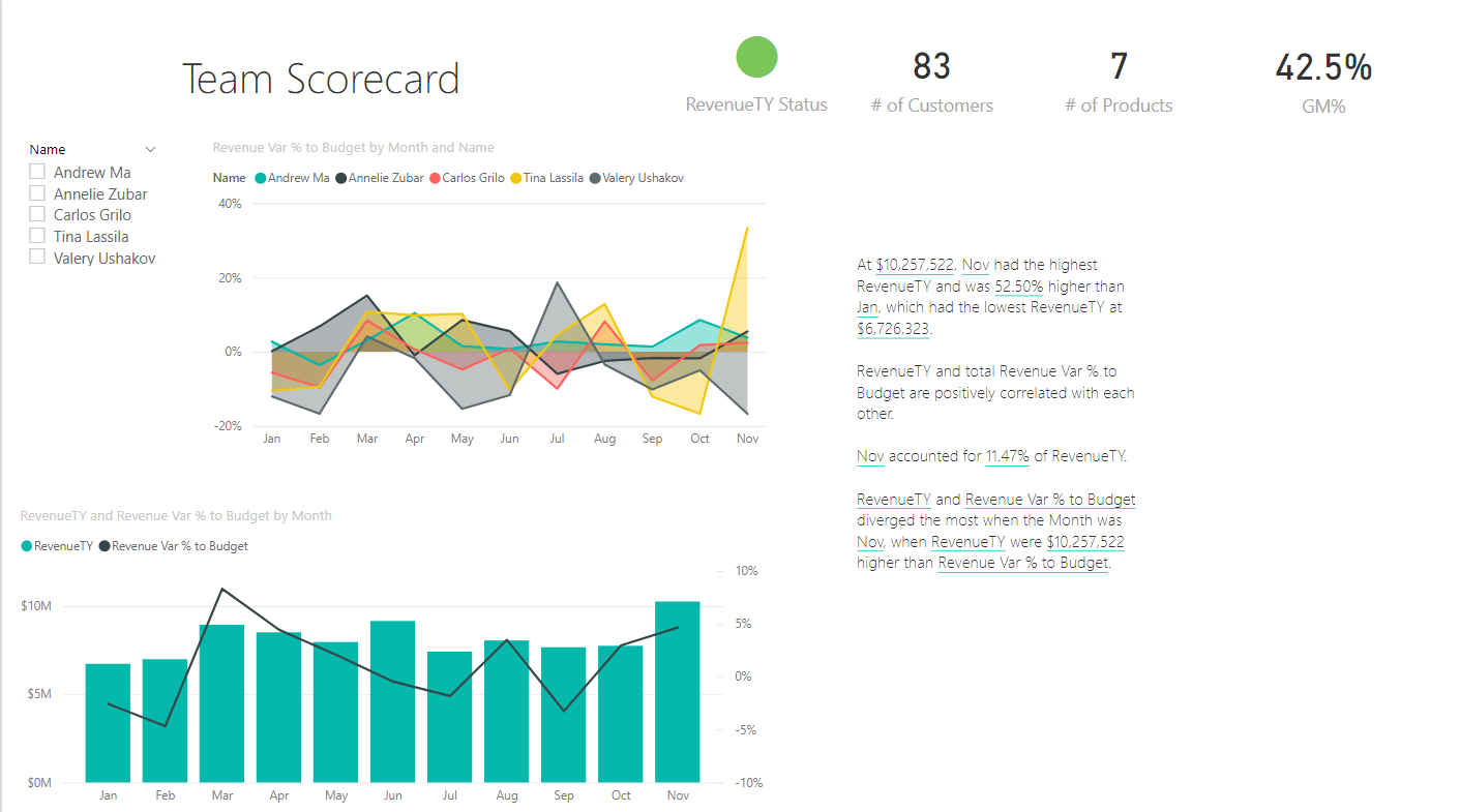
Let’s say that now we intend to generate a narrative for another chart. We can right-click on the chart again and select the summarize option. It will generate a narrative as shown below.
The first narrative is “At $10,257,522, Nov had the highest RevenueTY and was 52.50% higher than Jan, which had the lowest RevenueTY at $6,726,323”. We were able to figure out that November had the highest value, but we were not able to determine the comparative analysis which this narrative generated automatically for us.
The next narrative that got generated is “RevenueTY and total Revenue Var % to Budget are positively correlated with each other”. This is a very interesting and valuable insight that tells us that the two attributes are positively correlated with each other which means that the value of the other attribute increase as the value of the other attribute increases. A negative or inverse correlation means that the value of one attribute will decrease and the value of the other correlated attribute increases.
The next narrative is “Nov accounted for 11.47% of RevenueTY”. To figure out this insight visually, we would have needed a pie-chart. But interestingly this narrative saved the screen real-estate for us and provided this insight automatically without any visual effort to determine this.
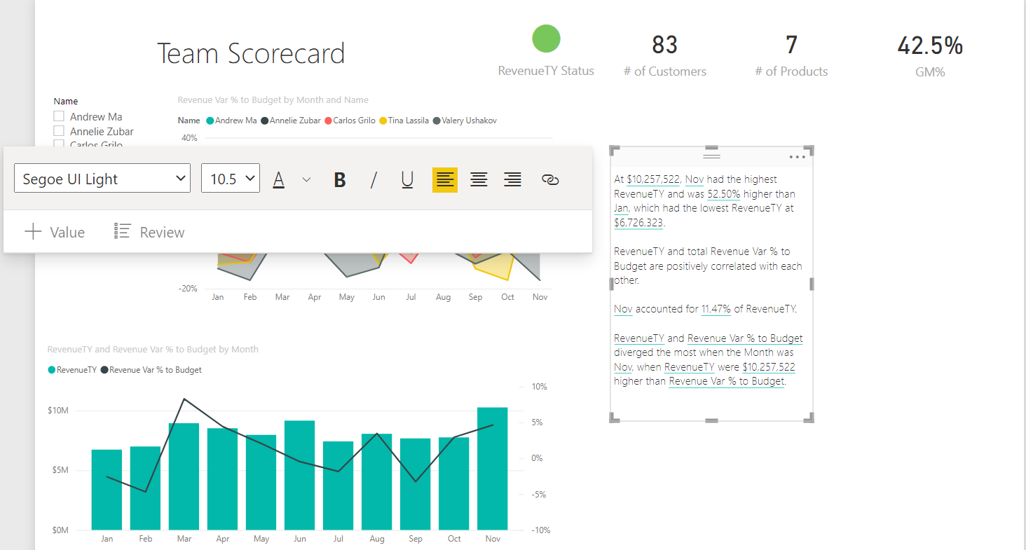
One important aspect of any report of the dashboard is the aesthetic representation of the information presented on the report. The narrative generated is not formatted by default to match the visual theme of the report. But it provides options to format the narrative container as shown below.
In this way, we can use the Smart Narrative feature to generate insights that are hard to derive visually and are updated dynamically as the end-user interacts with the visuals.
Conclusion
In this article, we first understood the need and process of generating insights from data in an automated fashion. We used an existing Power BI report with reasonable complexity and then used the Smart Narrative feature or visual to generate a narrative in plain text that provides key insights into the data represented in any given chart as well as the entire report.

She has a deep experience in designing data and analytics solutions and ensuring its stability, reliability, and performance. She is also certified in SQL Server and have passed certifications like 70-463: Implementing Data Warehouses with Microsoft SQL Server.
View all posts by Gauri Mahajan
- Oracle Substring function overview with examples - June 19, 2024
- Introduction to the SQL Standard Deviation function - April 21, 2023
- A quick overview of MySQL foreign key with examples - February 7, 2023