
In this article, we will use Power BI Desktop to analyze key influencers in a dataset and learn how to use the corresponding visualization as well.
Introduction
Data volumes can grow in terms of breadth and depth. When data grows in depth, it can mean that the dataset contains a very huge number of records but the attributes in the dataset may be limited or in the normal range. When the data grows in breadth, it may mean that the dataset would have a very large number of attributes, but the number of records in the dataset may be in normal ranges. A dataset that is voluminous in terms of breadth poses a unique challenge. Certain types of analysis like root cause analysis, exploratory data analysis for machine learning and similar forms of analysis become challenging as it becomes hard to determine which attributes influence the target attribute in question. For example, to find out what factors or attributes affect customer ratings from a large variety of attributes, one may need to consider many permutations and combinations, as well as scope the data to the required extent. Doing this manually can be an extremely tedious process and an end-user generally is not equipped with the skills or resources required for programming approaches like exploratory data analysis. Reporting tools like Power BI and others provide self-service options and visualizations to analyze influencers in the data.
Generating narratives from data in Power BI
It is assumed that the latest version of Power BI Desktop is already installed on the development machine and accessible by the user. To simulate a voluminous dataset, we need at least a small data model with a different number of attributes in it. We can use any available dataset for this exercise, so one can use the data that is already available with them. Alternatively, one can import the data in the Power BI report that we are going to create by using the Get Data menu option. In our case, I will be using a sample customer rating and feedback data model available from Microsoft. The data model along with data is already imported in the Power BI report. When we click on the data model view, it would look as shown below.
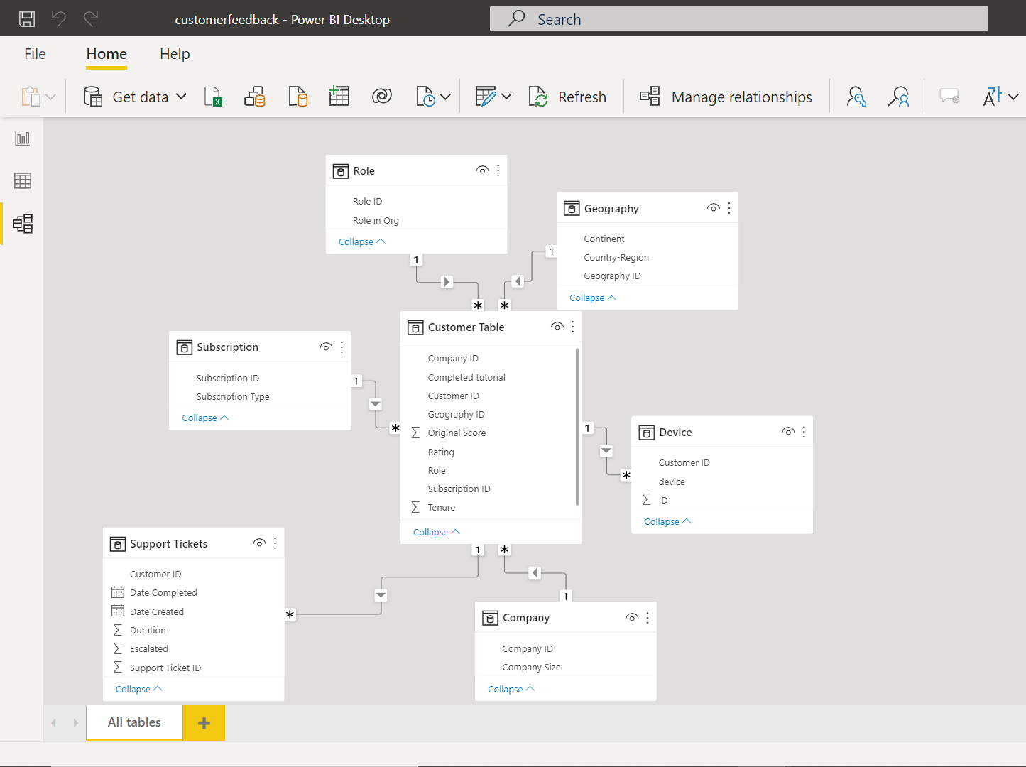
As seen below, here we have a set of related tables, namely Customer, Geography, Role, Subscription, Company, Device and Support Tickets. The data is about customers and its related details like geography, subscription, devices used by them, and the ratings provided by them for different services they may be using. The intention here is to analyze the factors that influence the ratings provided by customers. This analysis is different from the typical reporting where we report transactional or aggregated data on the report with is then analyzed from various angles for aspects like distribution, trend, comparative values etc. In this analysis, we will attempt to find the key influencers that affect customer ratings.
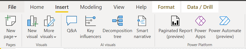
Power BI Desktop recently introduced a smart visual named Key Influencers. This item is available in the Insert menu option as shown below. Once we have the data as well as the model in the report, we can click this menu item to add Key Influencers smart visual to the report.
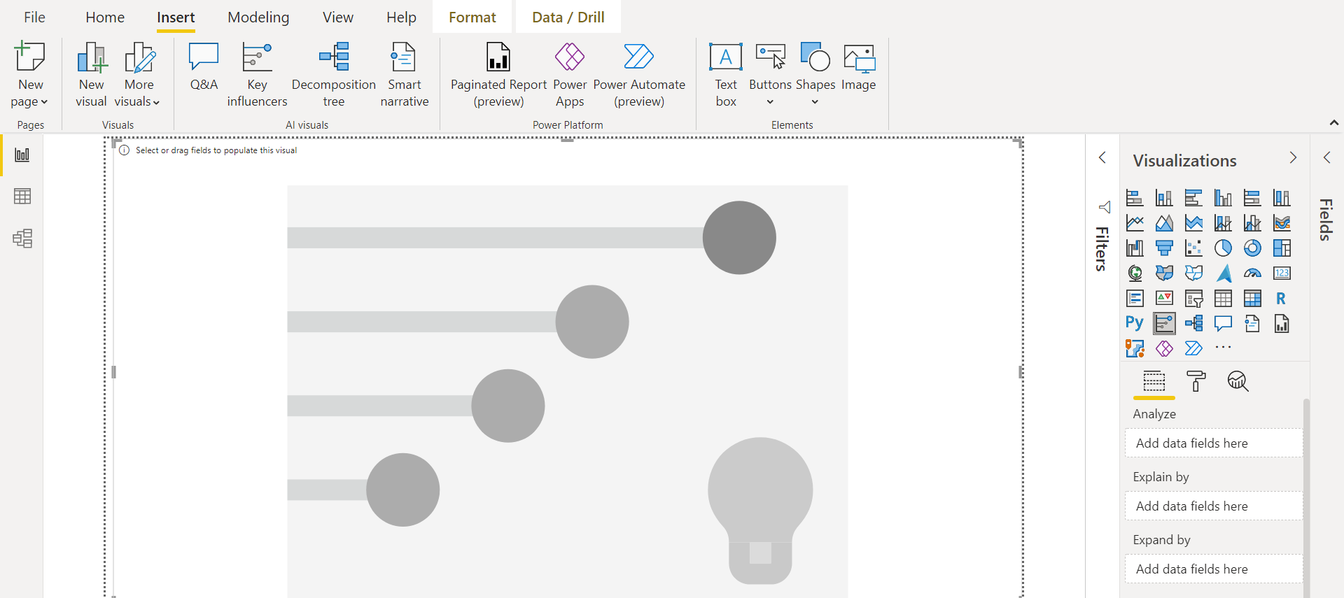
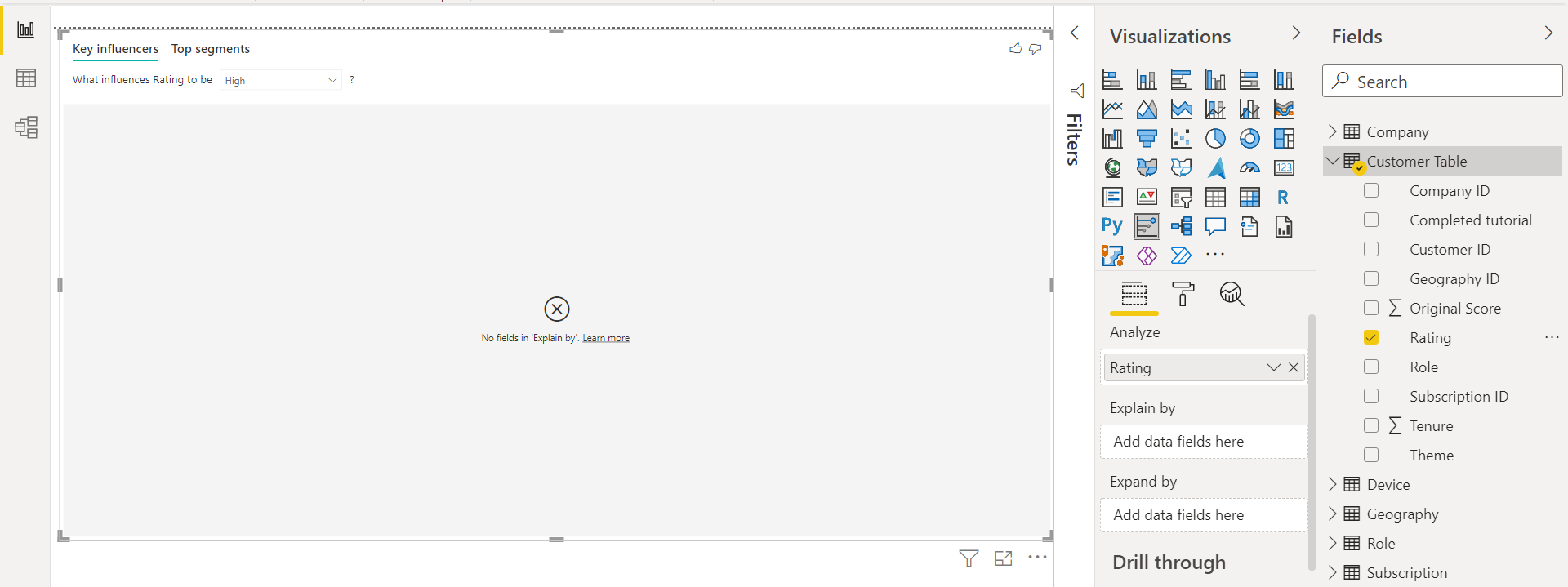
Once the Key Influencers are added to the Power BI report, it would look as shown below. The visual would be empty by default. The key areas that are required to make this visual works are Explain section and Analyze By section. The Analyze section is used to point to the variables or attributes that we intend to analyze. The Explain By section is used to point to the variables or attributes that may be influencing the attributes specified in the Analyze section.
To start populating this visual, we can expand the fields section and start assigning the right attributes to the right section. As this is custom tickets and rating data, we intend to analyze the factors that are contributing to high or low customer ratings. The most natural attribute to analyze in this kind of dataset is the rating attribute. Drag and drop the rating attribute in the Analyze section as shown below.
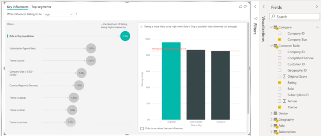
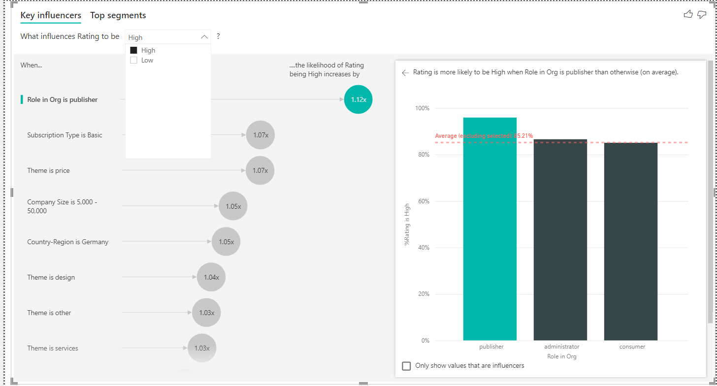
The visualization won’t render yet, as we have not specified the attributes to be used to determine whether they impact the ratings attribute. Let’s drag and drop the attributes that look relevant enough to be impacting the ratings attribute like Region, Role, Subscription, Company Size, Theme etc. Once we drag and drop these attributes, the visual would be populated with data as well as corresponding analysis as shown below. There are two sections that get created in the visual – Key Influencers and Top segments. The Key Influencers section would be in focus by default. This section would be vertically divided into two parts – one section would show the influencing attribute with the specific value of the influencing attribute as well as the degree of influence. The other section would show the split or distribution of values in the selected attributes. In the below section, the Role in Org attribute is selected which seems to be contributing to the High customer ratings by 1.2x. The major values in the Role field are shown on the right side which are publisher, administrator, and consumer. The red dotted horizontal line on the chart shows the values that are above the average.

By default, the analysis is shown for one of the values in the targeted attribute. In our case, the analysis shown above is for the rating attribute when the value is High. The rating would have at least two values i.e., High, and Low. If we click the drop-down near the text that says, “What influences rating to be”, it will show the different values as shown below.
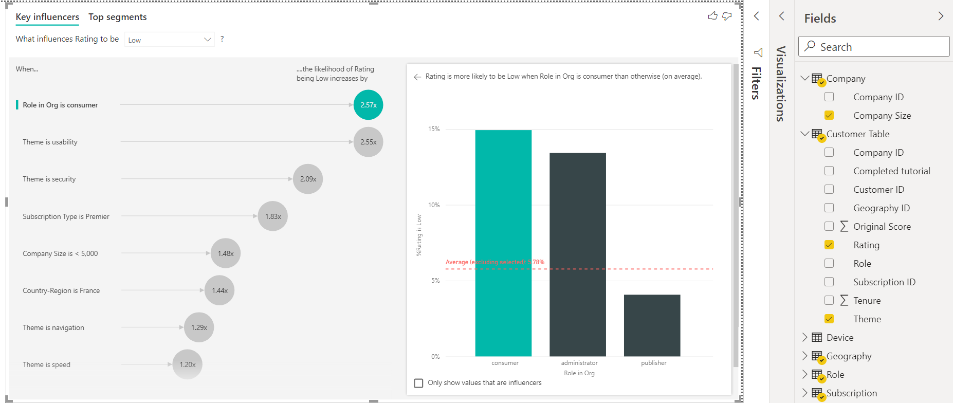
Let’s select the value Low to analyze what factors contribute to low ratings. Once selected, the analysis would change as shown below. If we just take a glance at the data shown above and below, it would be clear that role is a very important attribute that influences ratings, and customers seem to be providing more low ratings and publisher seems to be providing more high ratings. Also, the degree to which the role attribute influences ratings is higher in the case of low ratings than in the case of high ratings.
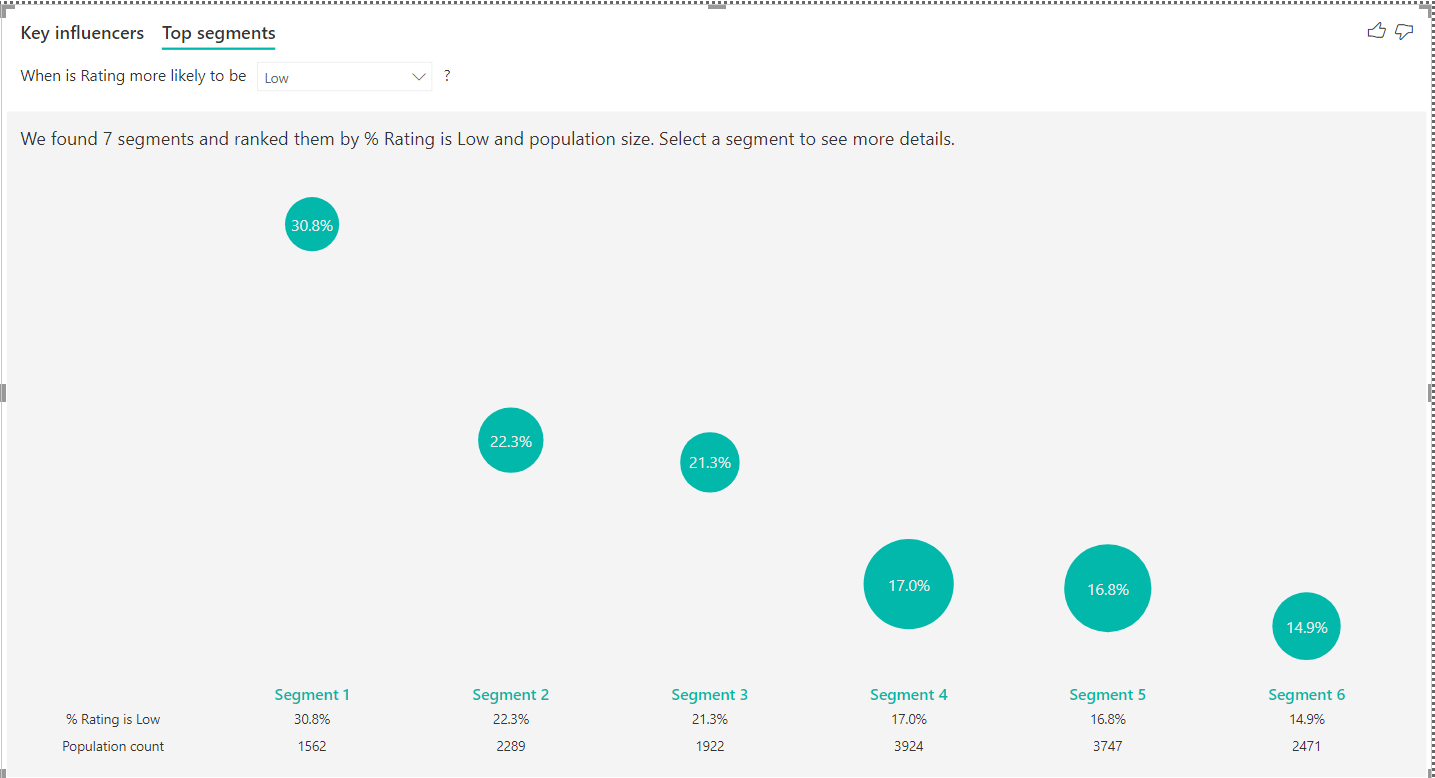
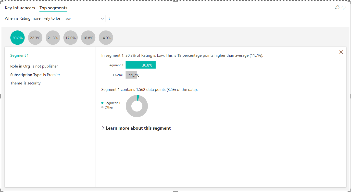
If we click on the Top segments tab, it will show the segments i.e., categories that it has determined which leads or contribute to a specific value of the ratings. Here it shows that it detected seven segments and rated them. The visual here just shows the segment rank, percentage when rating is low and the population i.e., the relative dataset size that falls in this segment.
The detail of the segment is not very clear from this visual. We can click on any of the bubbles to explore the criteria that have been used to define this segment. Once we click on any segment, the details would appear as shown below. The left pane of the details section shows that the criteria used to define segment 1 is when the role in org is non-publisher, subscription type is premier, and the theme is security.
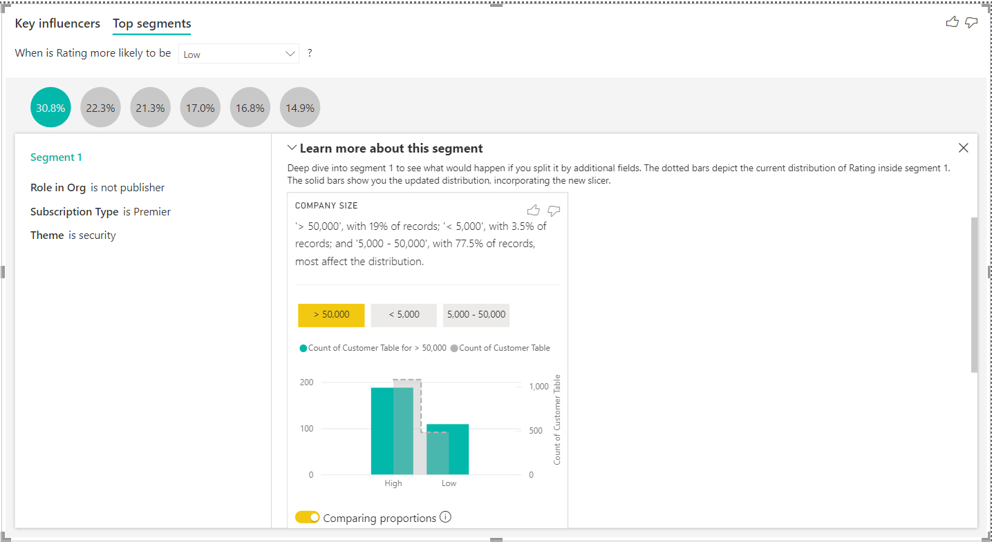
A lot of details about this segment can be explored by expanding the Learn more about this segment section as shown below.
In this way, using the Key Influencers smart visual, one can expedite the analysis of key factors that influence the targeted attribute.
Conclusion
In this article, we learned about the Key Influencers analysis and how to use this smart visual in the Power BI Desktop tool. We started with a sample dataset, identified an attribute for analysis and then analyzed the attributes which may be the key influencers of the targeted attribute.

She has a deep experience in designing data and analytics solutions and ensuring its stability, reliability, and performance. She is also certified in SQL Server and have passed certifications like 70-463: Implementing Data Warehouses with Microsoft SQL Server.
View all posts by Gauri Mahajan
- Oracle Substring function overview with examples - June 19, 2024
- Introduction to the SQL Standard Deviation function - April 21, 2023
- A quick overview of MySQL foreign key with examples - February 7, 2023