
In this article, we will learn how to represent spatial data on Azure Maps visualization and explore the features to effectively format the data to make it intuitive for the end-user.
Introduction
Typically, datasets have a variety of attributes. With the increase in volumes of data being generated, there is a continuous increase in the variety of data as well. This means that there are increasingly more and more attributes being captured to make the data context rich. Despite the increased variety in data, date, and time as well as location are two of the most common attributes that relate to almost all forms of data. It is highly possible that only a very specialized or rare category of data would have no time or location information attached to it. While date and time are still considered as a standard or primitive data type, capturing location information needs special treatment in terms of data types. Location can be captured in many forms like mailing addresses, geographical names in the hierarchy from continents to towns. But to represent this information on a geographical map which is the most usual form of representing spatial information, any spatial data that is not in the forms of latitude and longitude, requires implicit or explicit geo-coding which is the process of extracting latitudes and longitudes from location information in plain text. Once latitudes and longitudes are available this information can be represented easily on maps. Power BI recently introduced Azure Maps visualization, which can report spatial data with a variety of rich map-related features.
Azure Maps Visualization
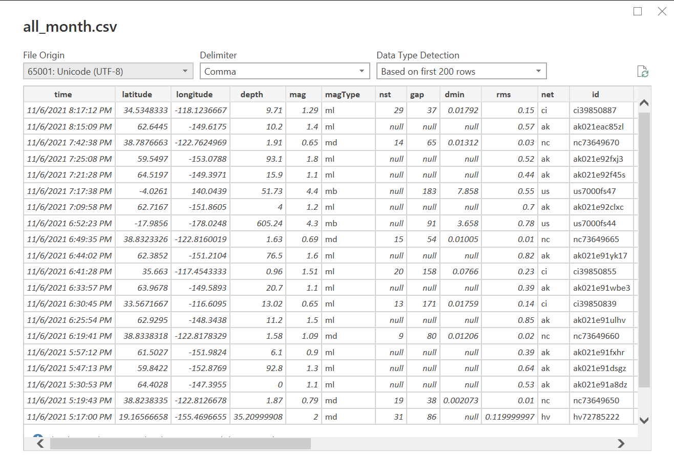
It is assumed that the latest version of Power BI Desktop is already on your machine with the required privileges to administer this tool. To create any report, usually, the first step is to source data from the data source. As we intend to use a map as the visualization, we need data that is rich in location-related information. The first thing to learn about the Azure Maps visualization in Power BI is that it needs latitude and longitude as two of the attributes in your dataset to render the data on a map. It won’t implicitly geocode addresses to latitude and longitudes for you. So, we need to get a dataset that has these attributes available. US Geological Survey provides earthquakes related data in a CSV file format, which is well suited for the Azure Maps visualization. One can download the CSV file that contains data of all the earthquakes from here. After downloading this file, navigate to the Power BI Desktop, open the Get Data menu, select the CSV connector, and provide the address of the file that we just downloaded. Once the data is read, it would look as shown during the preview. As seen below, the latitudes and longitudes can be clearly seen in the dataset. Click on the Load button to import this dataset in our Power BI report.
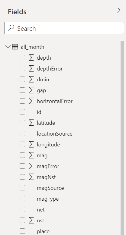
Once the dataset is loaded, consider exploring the fields in the dataset. Expand the fields pane and the list of fields would be as seen below. The fields starting with the word “mag” mean magnitude. We will be using some magnitude-related fields while configuring the Azure Maps visualization in Power BI.
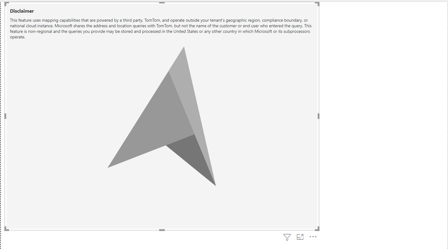
Click on the Azure Maps visualization from the visualization pane and it would get added to the design area of the Power BI report layout. Read the disclaimer carefully to ensure that the details mentioned in the disclaimer are okay with the security policy of your organization. As the name of this visualization is Azure Maps, it is self-explanatory that visualization has something to do with Azure. This visualization connects to Azure to get map images that would be rendered to create a map. To render the map accurately, it would send location information like latitudes, longitudes, coordinates, etc. to request relevant map images. A report transmitting data to a third-party / provider’s cloud-based service may be a sensitive item or security concern for some organizations. Consider reviewing the Microsoft Azure Legal Information for privacy and other information related to Azure Maps, before using this visualization in the production environment with sensitive data.
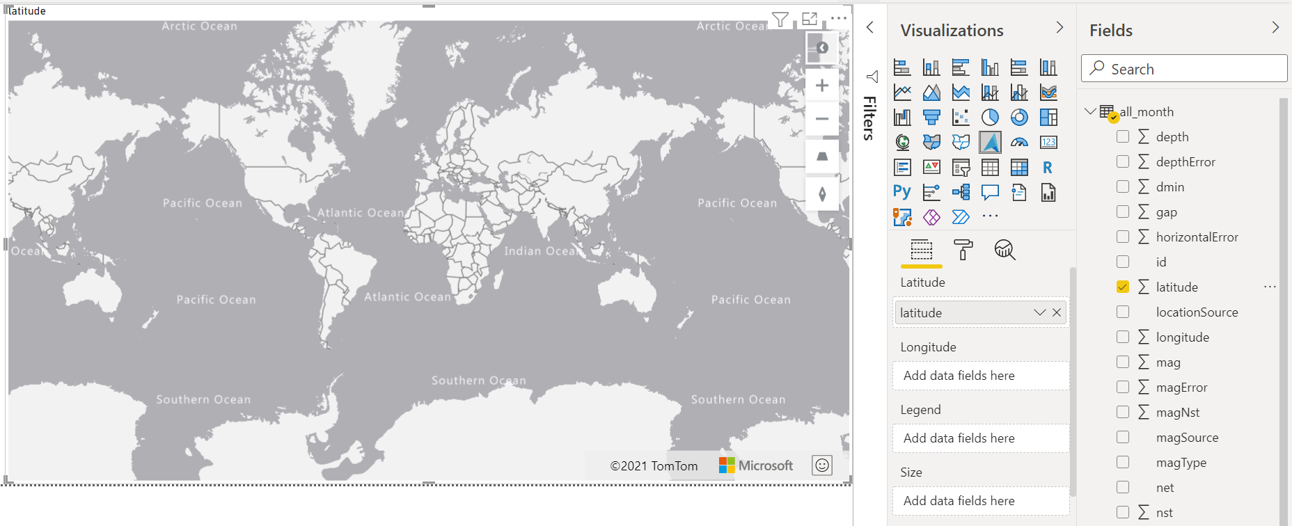
Now that we have the data and basic understanding of how the Azure Maps visualization in Power BI is going to work, let’s start configuring this visualization with data. The first step we need to do is drag-and-drop the latitude attribute and assign it to the latitude section as shown below. This would result in the world map being displayed, but it won’t display the actual data as latitude is not enough to accurately pinpoint the location on a map. We need longitudes as well to plot a location on the map.
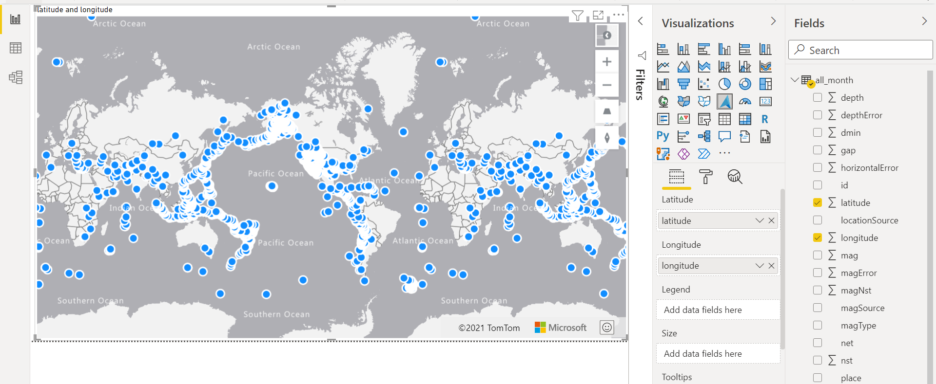
Drag and drop the longitude attribute in the relevant section on the map, and the map would be populated with all the locations in the dataset as shown below. As we have not specified any other factors for plotting the locations, all the locations are of the same size and color.
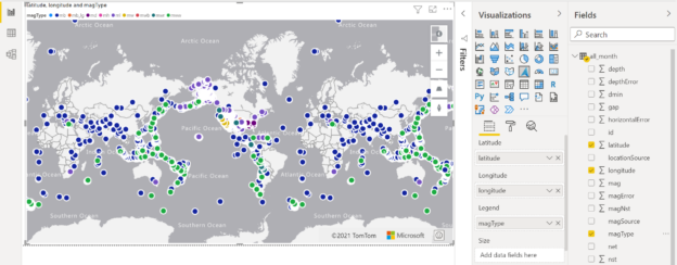
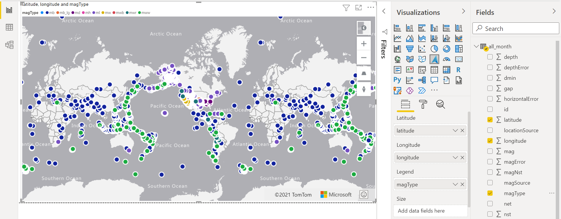
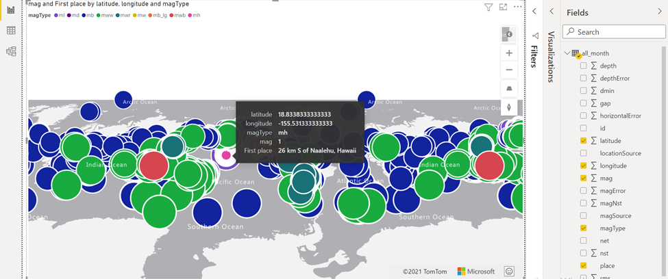
Now that we have all the locations plotted where earthquakes were recorded, it’s time to start using the magnitude-related attributes to classify this data and understand the data better. Let’s add the magType attribute which stands for the magnitude type of the earthquake. There are less than ten types of magnitudes, so this would be an ideal field for categorizing earthquakes. Once we add this attribute to the legend section, the map would look as shown below.
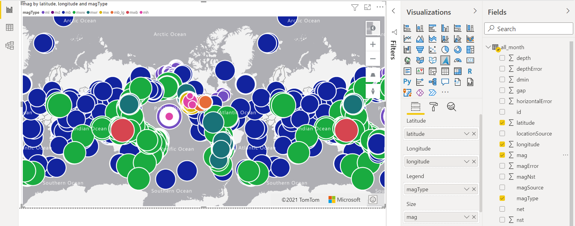
We can see the earthquakes across the globe in a categorized manner, but it’s not possible to make out the comparative size of the earthquake as all of them have equal plotting sizes. To make the size of the bubble proportional to the size of the earthquake, we can add the mag field to the Size section which would make the size of the bubble relevant and proportional to the value of the magnitude field. Once done, the map would look as shown below. As the dataset has close to ten thousand records and most of the earthquakes would have close values in terms of magnitudes, the maps look flooded with bubbles.
Before we start filtering this data, we can add fields in the tooltip section. Consider adding the place field in the tooltip, and then hover the mouse and you would be able to see all the fields as shown below.
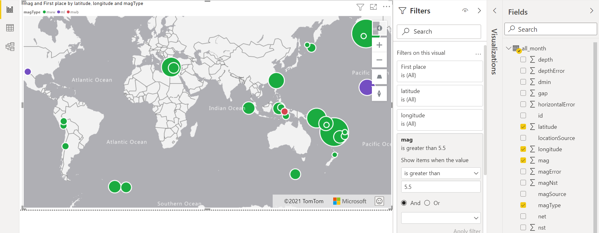
Let’s say that we intend to view the earthquakes that are above the magnitude value of 5.5 only. Click on the Filters pane, select the mag field and configure it with the filter criteria of greater than or equal to 5.5 and click on the apply filter button. This visual would look now as shown below. One can easily make out from this visualization that most of the earthquakes having a magnitude of 5.5 or more are of the same magnitude type as most earthquakes around Japan.
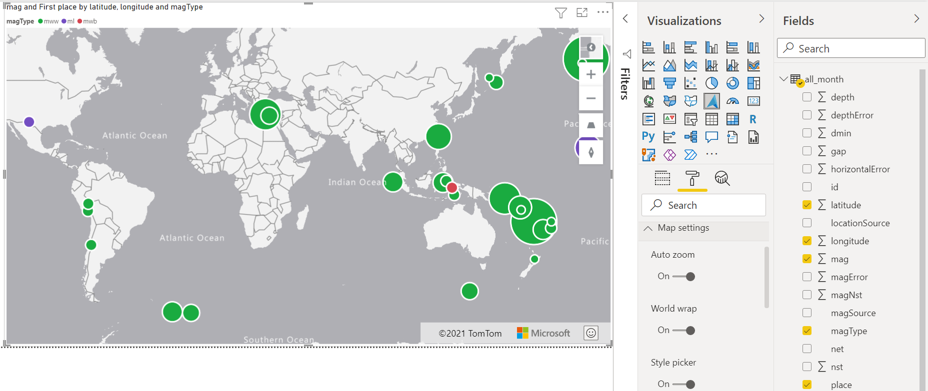
While most of the maps offer this functionality, one may wonder what is so unique about the Azure Maps visualization in Power BI. There is an array of map-related settings like Auto Zoom, Style Picker, Navigation Style, and many other formatting options are available with this visualization which makes it very feature-rich.
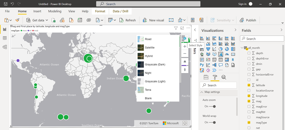
We can select from a variety of rendering options like Road, Satellite, Hybrid, Night, Terra i.e., terrestrial, and other such options to explore the map depending upon the use-case being reported on the map.
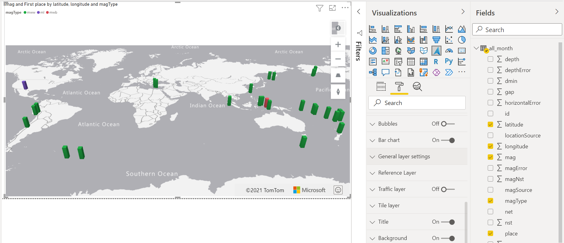
Azure Maps visualization in Power BI supports multiple layers of layering on the map to overlay reference layers that can help to use the map with data as well as with spatial reference scales. The default mode of plotting data on the map is bubbles, but one can optionally choose the plot the data as bars and even customize the looks and feel as well as the rendering behavior of these bars as shown below.
In this way, one can use the Azure Maps visualization in Power BI to create feature-rich spatial reports in Power BI.
Conclusion
In this article, we learned about the process of plotting spatial information on a map and how Azure Maps visualization can be used for spatial data. We used a sample spatial dataset, imported it into the Power BI report and then plotted this data using Azure maps visualization. Then we explored various options and features of the visualization.

She has a deep experience in designing data and analytics solutions and ensuring its stability, reliability, and performance. She is also certified in SQL Server and have passed certifications like 70-463: Implementing Data Warehouses with Microsoft SQL Server.
View all posts by Gauri Mahajan
- Oracle Substring function overview with examples - June 19, 2024
- Introduction to the SQL Standard Deviation function - April 21, 2023
- A quick overview of MySQL foreign key with examples - February 7, 2023