

This article shows you how to use Power BI conditional formatting and apply different color schemes to reports in the Reports View of Power BI desktop. The same process can be applied for Power BI conditional formatting in the cloud.
Importing the dataset
The dataset that you will be using in this section can be downloaded in CSV format from the following Kaggle link: https://www.kaggle.com/washingtonpost/police-shootings
The dataset contains records of the people killed in shootings by a US police officer in the line of duty. The dataset contains information such as the name of the person killed, whether or not a person had signs of mental issues, what type of weapon the person was carrying, the city in which the person is killed, etc.
There are a number of different ways to import datasets into Power BI. The simplest one is to click “Get data” located on the left of the landing screen when you open the Power BI desktop.

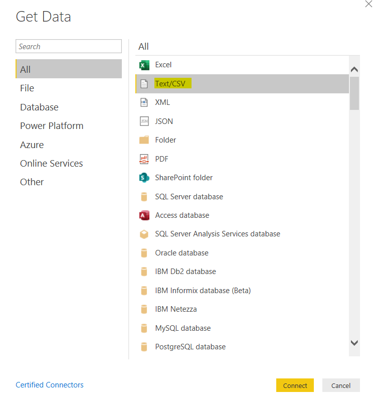
When you click the ‘Get data’ button in the above window, the dialogue box below will appear.
Here you can see a menu showing the different types of the dataset that Power BI will accept. Since the dataset that you want to import is in CSV format, click the “Text/CSV” option from the drop-down list and click the ‘Connect’ button.
When you do this a new dialogue box will appear asking you to navigate to the location of the CSV file containing the dataset and to select it.
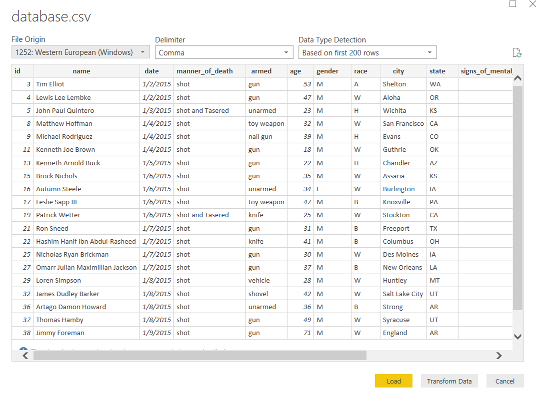
Once the dataset has been imported, you should see the window shown below.
You can see the attributes or column names of your dataset. At this point, the data is not loaded into Reports view. To import your data into the Reports View, click the yellow ‘Load’ button. Remember, clicking the ‘Transform Data’ button will import the data into the Power BI Query Editor.
Larger datasets can take some time to load into the Reports View. If it is taking some time you will see the following while it uploads.
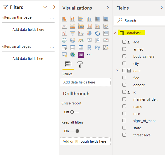
Once the dataset has been imported, you should see the dataset attributes show in the Fields pane in the right column of the Reports View, as shown below. Now you are ready to create your reports.
Creating Reports
In this section, you will see how to create reports in Power BI reports view and change reports colors. Once we have done that we will look at Power BI conditional formatting.
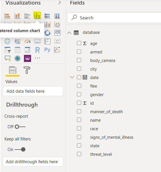
Let’s start with a clustered column chart in Reports View.
To do this, click on the ‘clustered column chart’ icon in the list of items under the Visualizations field. This is the column chart highlighted in yellow below.
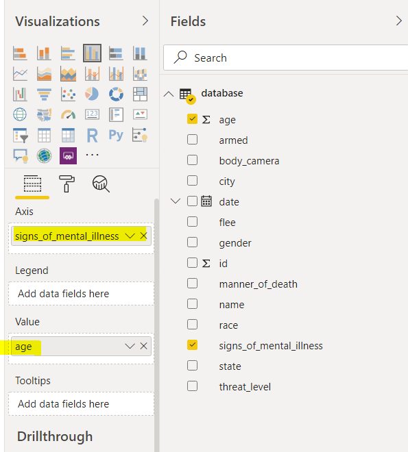
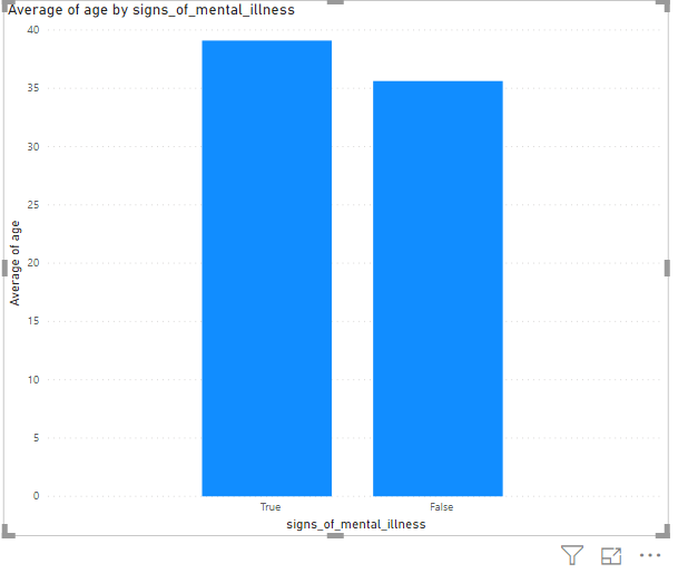
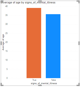
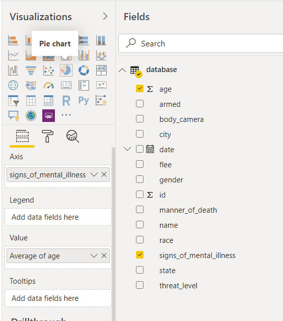
In the clustered column chart, you will see the distribution of the average ages of the people shot who showed signs of mental illness, and those shot who didn’t show signs of mental illness.
To create this chart, drag the “signs_of_mental_illness” field from the Fields pane to the “Axis” field of the clustered column chart. Similarly, drag the “age” column to the “Value” field as shown below.
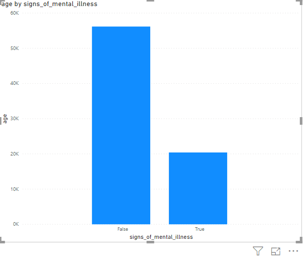
In the Reports view, you should now see the image below.
The columns or bars in this graph shows the sum of the ages of the people in each category. However, a much more useful graph would show the average age of the people in each category as obviously, the sum depends on how many people there are in each category.
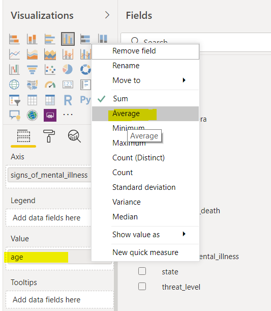
To view the average ages of the people with and without signs of mental illness, simply click the downward triangle next to the age field in the visualizations pane and click the “Average” option from the dropdown list that will appear.
The graph now shows that among the people who have shot the average age of the people with signs of mental illness is slightly greater than the average age of the people who have not shown signs of mental illness.
Changing colors
Now that we have a basic graph let’s look at some formatting. Let’s see, how we can change the colors of the clustered column chart.
To do this, click on the “Format” icon under the different plot icons in the Visualization pane. Look at the following screenshot for reference.
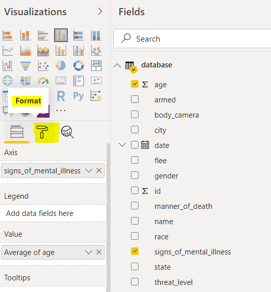
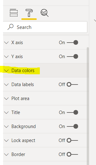
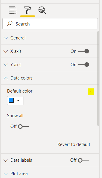
You should now see a list of options – as you can see below. To alter your column colors, click on the “Data colors” option:
This will open a small window which gives you the option to change the colors of all of your columns.
To change the colors of each column separately, switch on the “Show all” slider and then select a new color for each of the columns in your chart. For example, in the following screenshot, red has been selected for the True column.
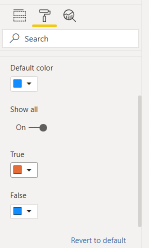
In the output, you can see that the True column is now red.
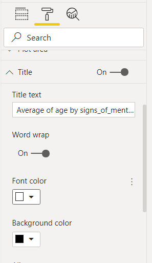
In addition to changing colors for columns, you can also change the color of the plot title.
To see how this works, again go to Format and then select “Title”. You now have the option to change the foreground and background colors for the title.
Below we have chosen to have the foreground color white and the background color black.
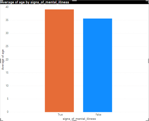
In the output below, you can actually see that the title color has changed so that the text shows as white against a black background.
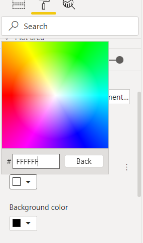
In addition to choosing from a set of pre-selected default colors, it is possible for you to choose custom colors as well using RGB values for your column colors.
To do so, click on the “Custom color” option when choosing a color (data or title) as shown below.
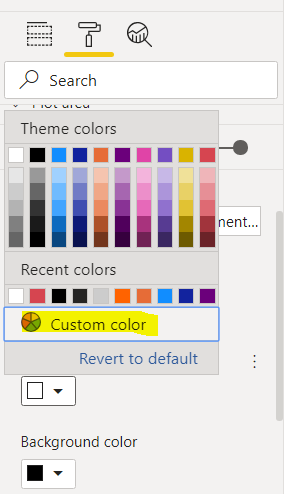
You will be presented with the color pane below. Here you can select the color of your choice with the help of a mouse click or can also enter a precise RGB value for the color that you want.
Before we move onto Power BI conditional formatting let’s look at one other example of using colors in a chart.
Let’s draw a pie chart. To do this, select the Pie chart icon from the list of plot icons in the Visualizations pane as shown in the below screenshot.
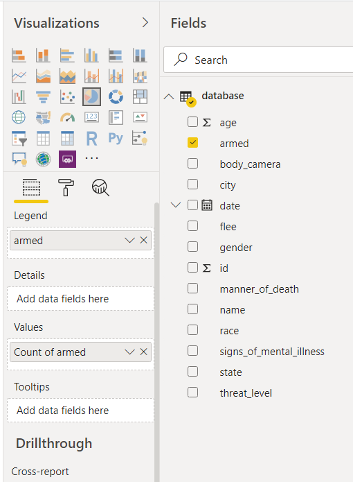
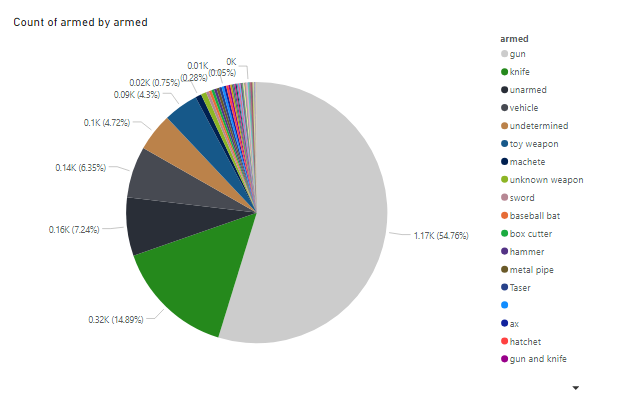
The Pie chart that we want to produce, will show the weapons that were being carried by the people who were shot.
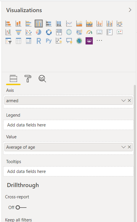
To do this, click in the Legends field in the Visualization pane and select (tick the checkbox) the armed column. Next, click the Values field in the visualization pane and drag the armed column from the Fields pane to the Values field as shown below.
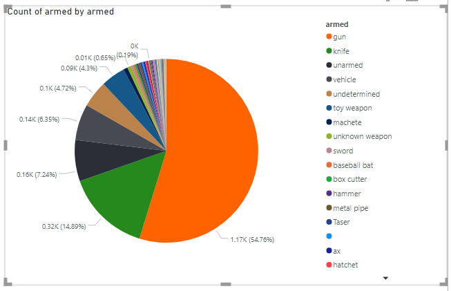
The pie chart below will be produced.
It shows that 54.76% of the people shot were carrying a gun when they were shot, 14.89% were carrying a knife while 7.24% were unarmed.
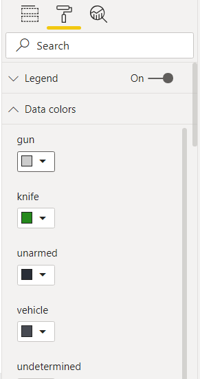
Again, to change colors, go to Format and Data Colors.
In the screenshot below, the color that represents the people who were carrying guns has been changed to grey. This is a manual adjustment to the formatting of the chart and your data colors. In the next section, we will look at Power BI conditional formatting which is when the Power BI automatically changes the color depending on the values being shown in the graph.
In the output below, you can see that the color change has taken effect.
Power BI Conditional Formatting
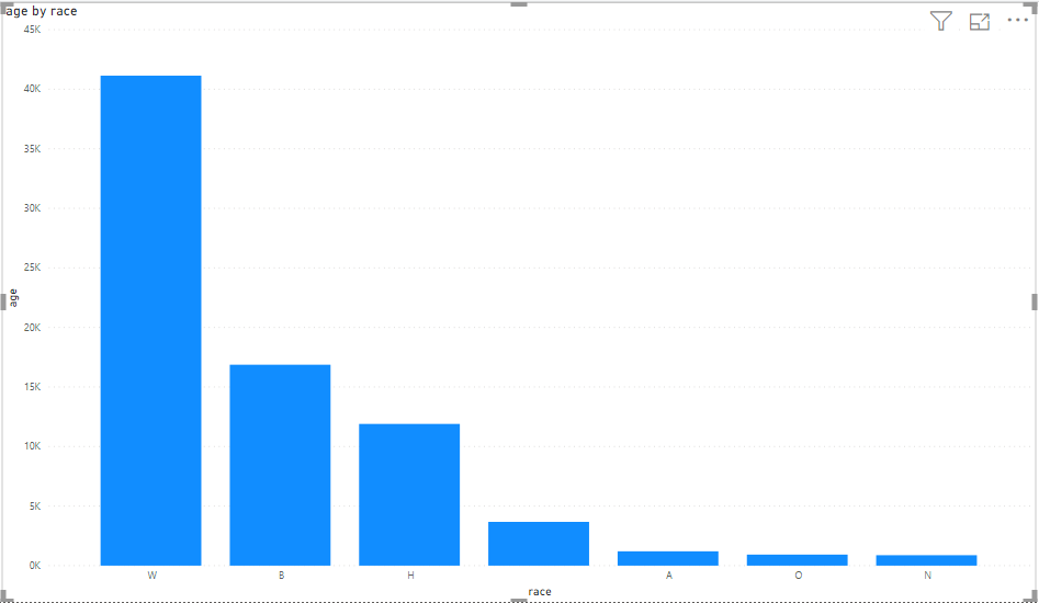
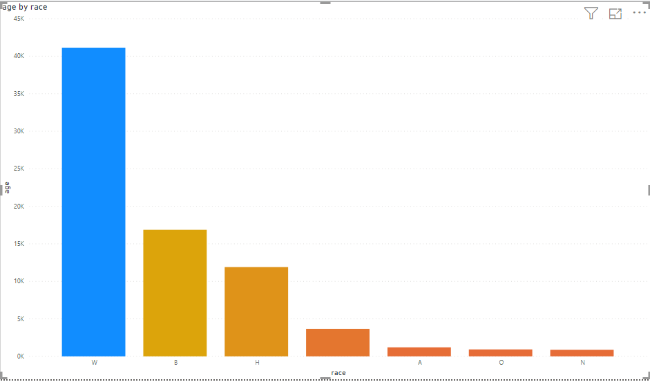
With Power BI conditional formatting, you can change the colors of your charts based on conditions. Let’s plot a clustered column chart that shows the sum of the ages of people split into their various races. The following screenshot shows how you can create such a visualization
The output shows that the majority of people killed are white.
Now let’s look at formatting the plot above based on a condition.
For our example, let’s add a gradient to the change in the color of the different columns depending on the values of columns in a chart.
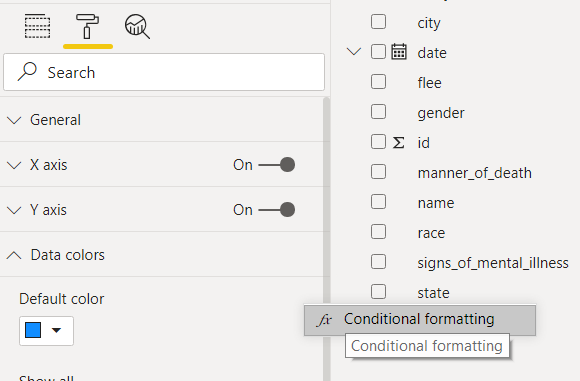
To do this, click on three dots that are next to the “Default color” option under the Data “colors” field in the Formats field. See the yellow highlight in the screenshot below.
If you click three dots, you will see the “conditional formatting” option as shown below. Click on that.
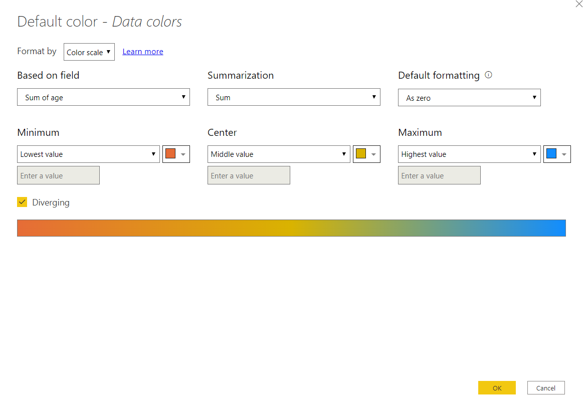
In the Power BI conditional formatting window, you will have a number of options as shown below. We will format the chart using the color scale based on the sum of the age field. The gradient will change from minimum to maximum value for the sum of age.
Let’s set it so that the gradient for the column with the lowest value will be orange and they will gradually change to blue as the sum of people’s ages increases.
The plot generated as a result of the above Power BI conditional formatting settings shows that the color of stacked columns changes in the form of the gradient with the smallest column having a color of orange while the longest column being blue.
You will see that the three rightmost columns are all the same color (almost) as their values are almost the same. The color change is driven by the change in value.
Conclusion
In this article, we’ve seen how you can create a chart, how you can adjust the default colors that Power BI uses for your charts and then how you can use the values of the figures shown in that chart to adjust the way that the chart appears.
There is a huge amount that you can do with Power BI conditional formatting to make your graphs and reports clearer and hopefully, this article has shown you how to get started with it.

View all posts by Ben Richardson
- Working with the SQL MIN function in SQL Server - May 12, 2022
- SQL percentage calculation examples in SQL Server - January 19, 2022
- Working with Power BI report themes - February 25, 2021