
In this article, you will look at Power BI Waterfall charts and see how they can be used to plot distributions of numeric data against categorical data. You will also see how you can combine multiple charts in reports view to create Power BI combined visuals.
Importing an example dataset
To create an example combined visual or Power BI waterfall chart, we are going to need an example dataset.
Feel free to use your own dataset but if you want to follow this article you should use the same dataset. It contains data on a number of different factors such as birth and death rates, life expectancy, net migration, the sex ratio at birth etc., for different countries and regions in the world, divided into periods of 5 years, starting from 1950-1955 up to projected values for the years 2095-2100.
You can download the dataset for free from this link. The dataset will be download as a CSV file.
Start by importing the CSV file. Click the “Get Data” button and choose the “Text/CSV” option from the list of datatypes that are shown.
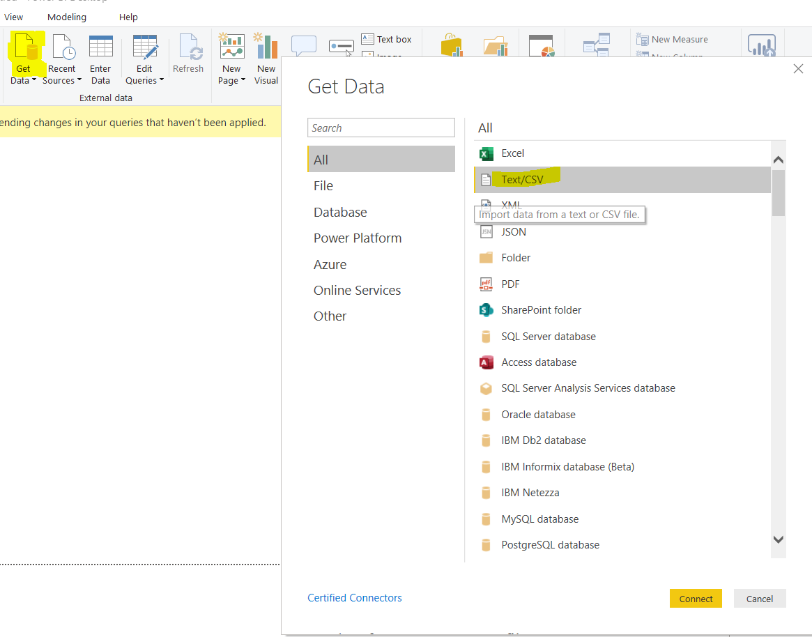
After you click the “Connect” button, a dialogue box will pop up. Select the option for CSV files. The actual uploading of the file will take some time.
Once it’s finished you will see the data in a dialogue box as per the screen shown below. This tells you that the data has been uploaded successfully.
You can now see some of your data, for example, the “Time” column contains the time period information for the record and the “LEx” column contains the average life expectancy for that time period and country.
For more details on the dataset, please see this link. It is worth mentioning that the dataset contains predicted information for future time periods as well. Data for 2035 – 2040 is not a mistake!
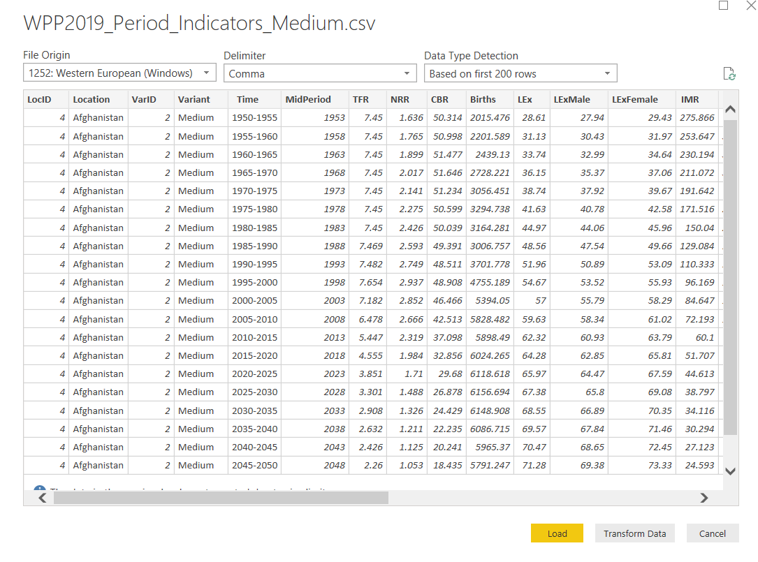
Since, the options to create a combined visual or Power BI waterfall chart are available in the reports view, click the “Load” button to load your dataset into the reports view.
Now we are ready to plot combined visuals and Power BI waterfall charts. First, you will see how you can create Power BI combined visuals and in a later section, you will see how to create Power BI waterfall charts.
Creating Power BI Combined Visuals
Creating combined visuals in Power BI is pretty straight forward. You can combine as many visuals as you want on a single page in reports view. You are only limited by the availability of space in the reports view. Furthermore, the reports view contains charts that allow you to combine information from multiple columns in a dataset.
Let’s first add multiple charts in a reports view. The first chart that we are going to add is a Card. A card is a simple visualization that contains a single piece of information. To create a card, select the “Card” chart from the “Visualizations” pane as shown below:
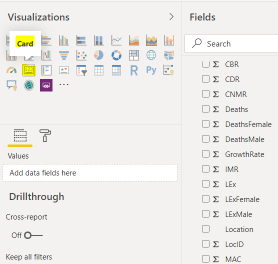
Since a “Card” visualization can display a single value, you should see only one field in the “Fields” pane. Drag the “Deaths” column from the data fields on the left. To show the average number of deaths for all the regions over all the years, click the inverted arrowhead to the right of the “Deaths” field and then select “Average” as shown below:
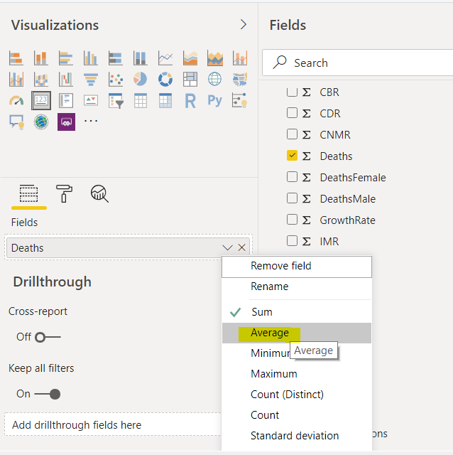
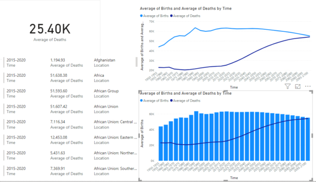
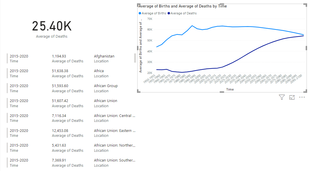
A card will now appear in the reports view, which looks like the below. Currently, this card is showing the average death rate for all the regions and for all the time periods in our dataset.

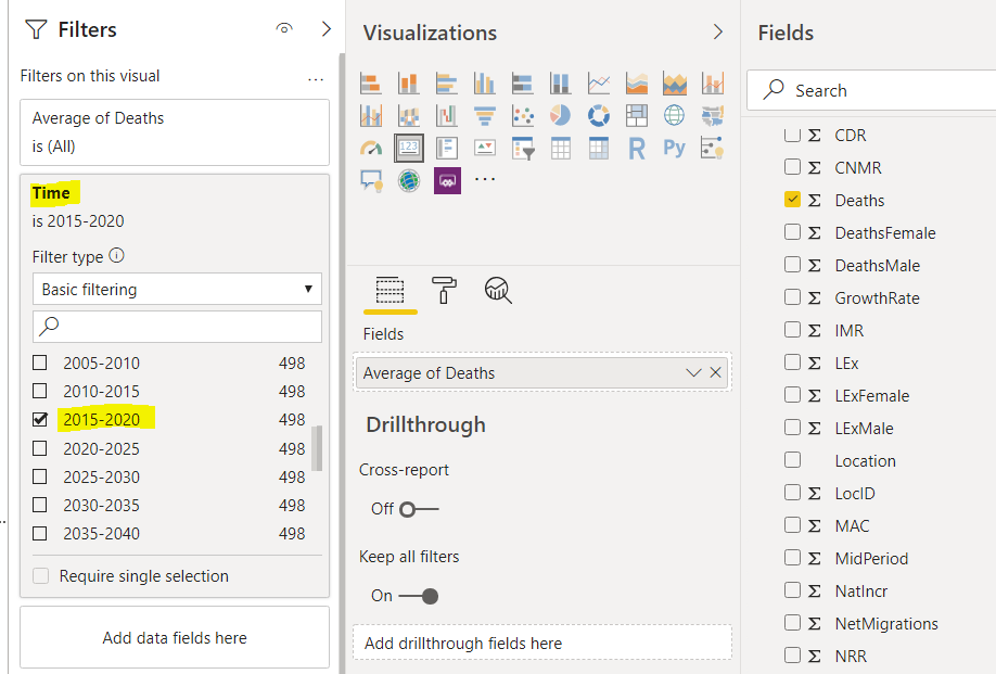
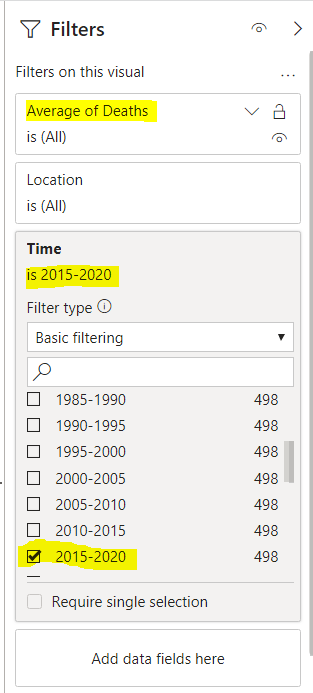
Perhaps we also want to see the average death rate for the time period between 2015 and 2020.
To do so, drag the “Time” column from the fields to the “Filters” pane and then from the list of time periods, check the checkbox for the period 2015-2020 as depicted in the following screenshot.
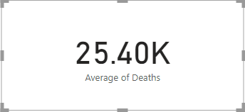
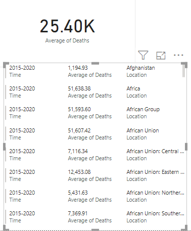
Now the Card will show the following:
Next, we will add a “Multi-row card” which is capable of displaying multiple values in a row. Select “Multi-row card” from the list of visualizations as shown in the following screenshot.
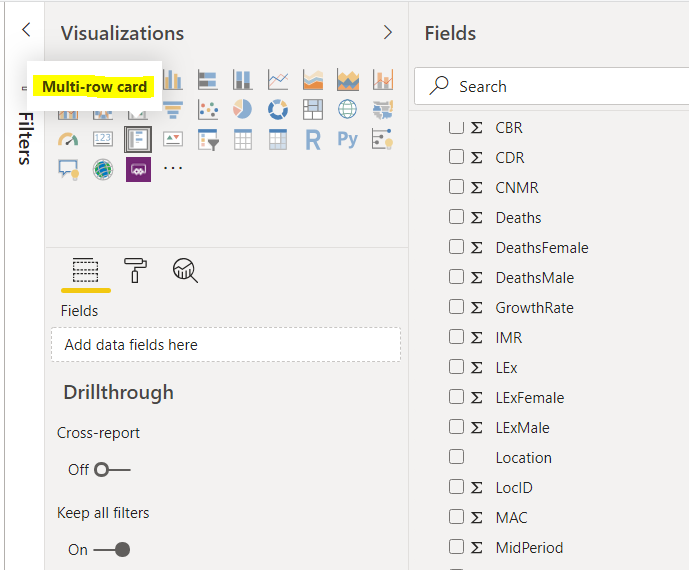
Next, in the fields add “Time”, “Average of Deaths” and “Location”.
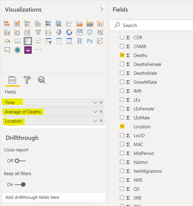
Having done that select the time period between 2015 and 2020 from the filter fields.
Now you should see your single card and multi-row card in the reports view. You can see that the multi-row card shows the average number of deaths by country and region for the time period between 2015 and 2020. The following screenshot shows the two charts together.
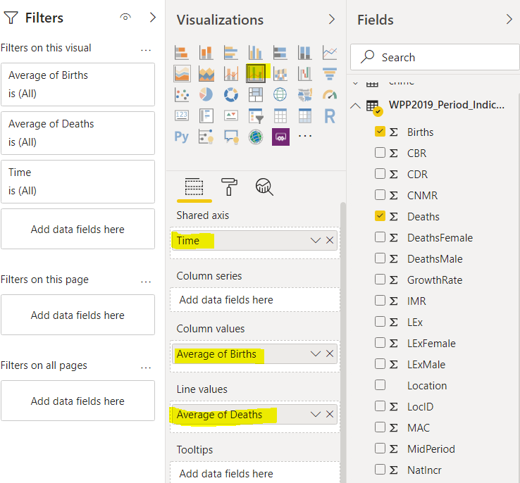
Let’s now add a line plot that shows both the average death rates and average birth rates for all the countries and regions for 5-year time periods from 1950 to 2100.
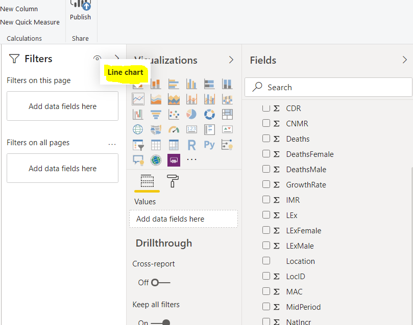
Select a “Line chart” option from the list of visualizations.
Add the “Time” column to the axis field and “Average of Birth” to the values field.
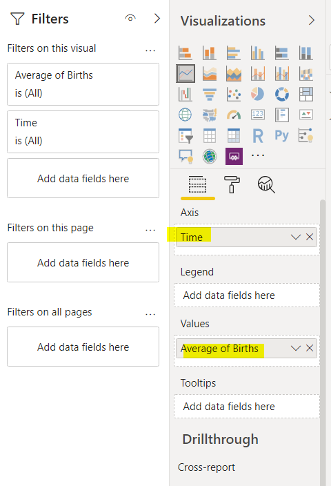
The default line plot does not have the time periods in ascending order.
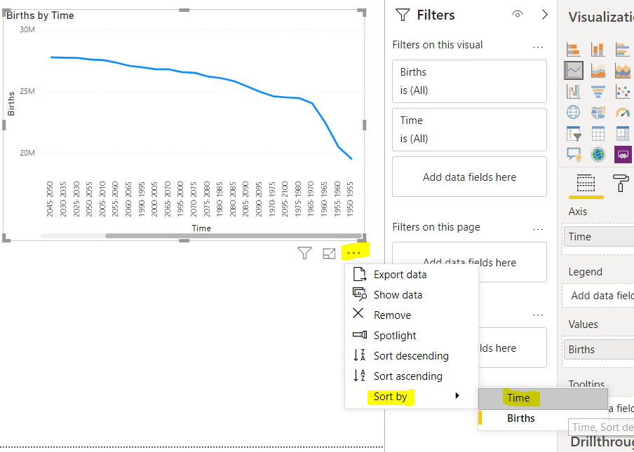
To sort the line plot by ascending order of the Time, click the three dots below the chart and then from the dropdown list select “Sort by – Time”. Look at the following screenshot for reference.
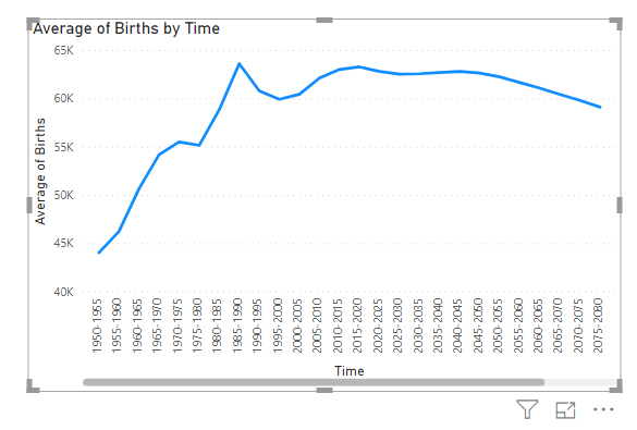
The line plot should now look like this:
To combine the line plot for average birth and average death rates add the “Average of Deaths” column to the “Values” field as depicted in the following screenshot.
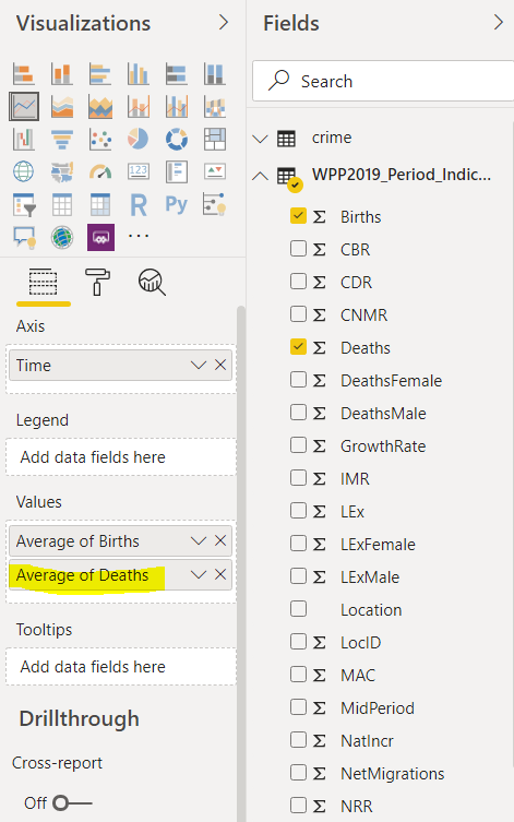
Now you should see three plots in your reports view. You can see that the projected average death rate and the birth rate will approximately be equal in the world by the year 2100.
Next, we will add a line and clustered column chart that shows the average birth rates in the form of columns while the average death rate in the form of a line as shown in the image below:
You should now see the following four charts in your reports view.

This is how you can combine multiple images in a single page of reports view and data from multiple columns in a single chart.
Creating a Power BI Waterfall Chart
A Power BI waterfall chart displays the distribution of the data in a numeric column with respect to a categorical column.
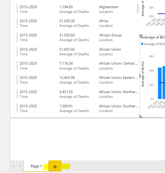
You will create our Power BI waterfall chart on a new page. You create a new page by creating a new reports view. Click on the “+” icon at the bottom of the existing reports view to create a new page as shown below:
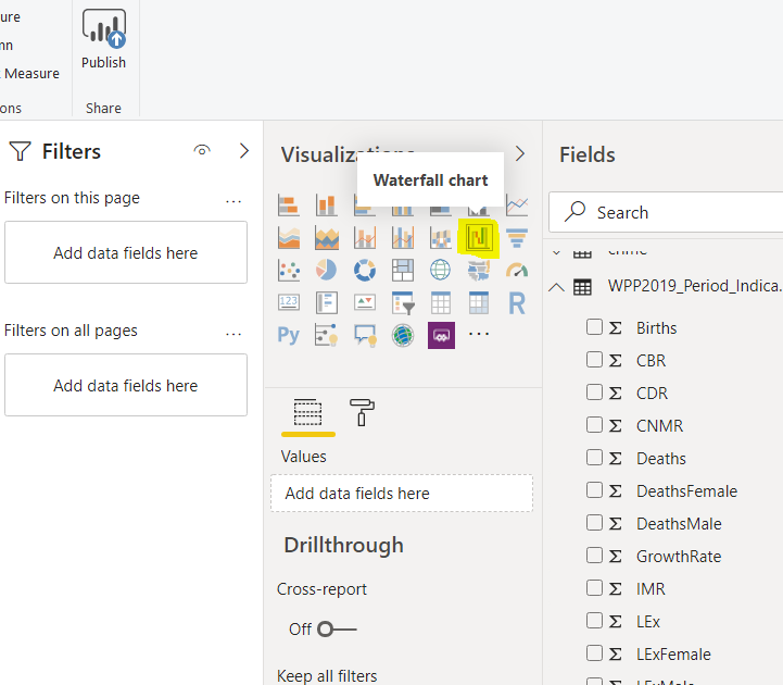
To create a waterfall chart, you need to click on the “Waterfall chart” icon from the visualization pane as depicted in the following screenshot.
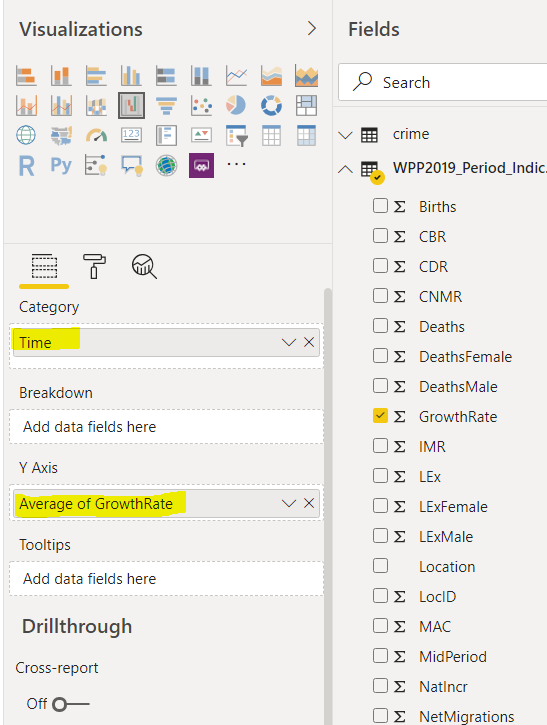
We will be plotting the average percentage population growth rate of all the countries and regions with respect to time. To do this, first, add the “Time” column to the “Category” field and then the“Average of GrowthRate” column to the “Y-Axis” field as shown below:
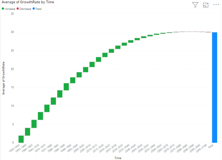
As a result, you should see the Power BI waterfall chart shown below.
The chart is arranged in the ascending order of Time. The following waterfall chart shows that the average population growth rate percentage was much higher in the early 50s and is decreasing consistently with time.
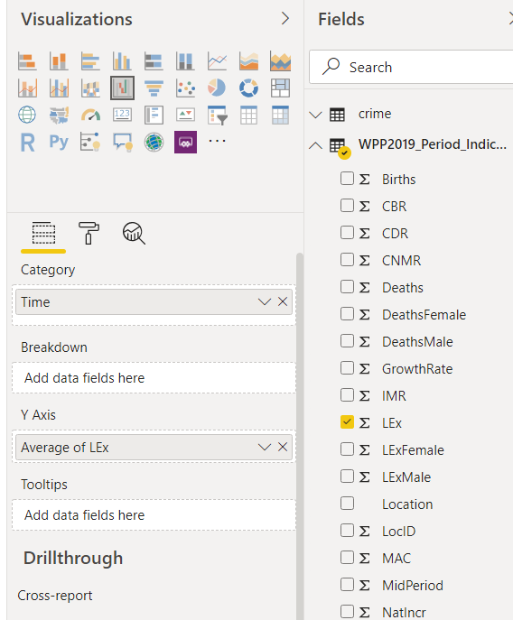
Let’s plot another Power BI waterfall chart. Let’s show average life expectancy against time. To do so, add “Time” to the “Category” field and Lex to the ‘Y-Axis’ before selecting the Average function as we did above.
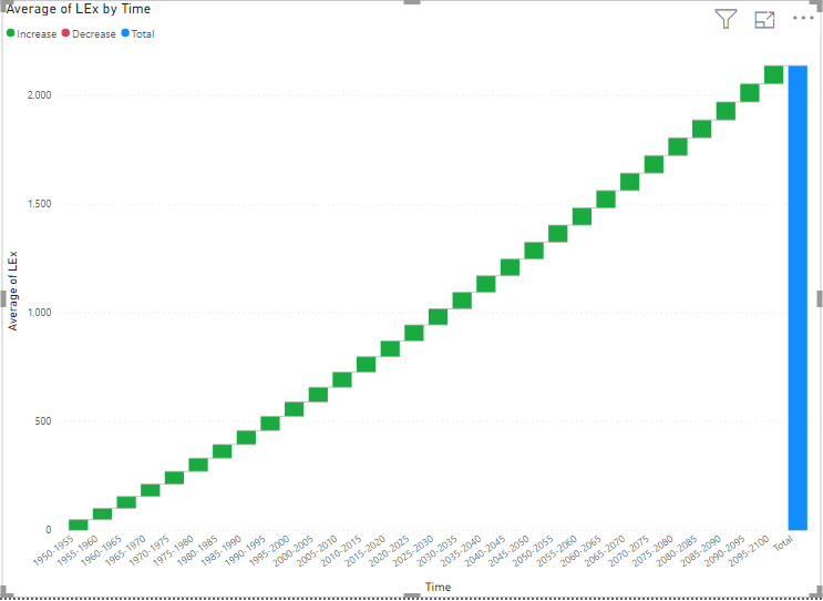
The Power BI waterfall chart generated as a result is shown below. The output shows that average life expectancy has increased over time which makes sense given the improvements in medical science over time. Thankfully people now tend to live longer compared to the past.

View all posts by Ben Richardson
- Working with the SQL MIN function in SQL Server - May 12, 2022
- SQL percentage calculation examples in SQL Server - January 19, 2022
- Working with Power BI report themes - February 25, 2021