
In this article, we will learn how to user slicers to filter data in a Power BI report.
Introduction
Power BI Desktop is one of the most popular report authoring tools that offers a variety of features for rich report authoring. Reports can vary in terms of the data volume that it reports. The report can have minimal data, as well as certain reports, can have overwhelming volumes of data in them. To control the volume of raw data in a report which an end-user may find challenging to analyze visually, typically rich visualizations are used to bring out the insights contained in the data in a visual and analytical way. While these techniques are efficient to abstract the volume of data, an end-user may want to scope the data based on few parameters to assess the data based on various scopes. While filtering the data prior to presenting it on the report given the report designer an option to scope the data, the next level of data filtering capability needs to be given to an end-user. One of the most common ways of filtering data while using the Power BI report is by using slicers in the report.
Using Slicers in Power BI Reports
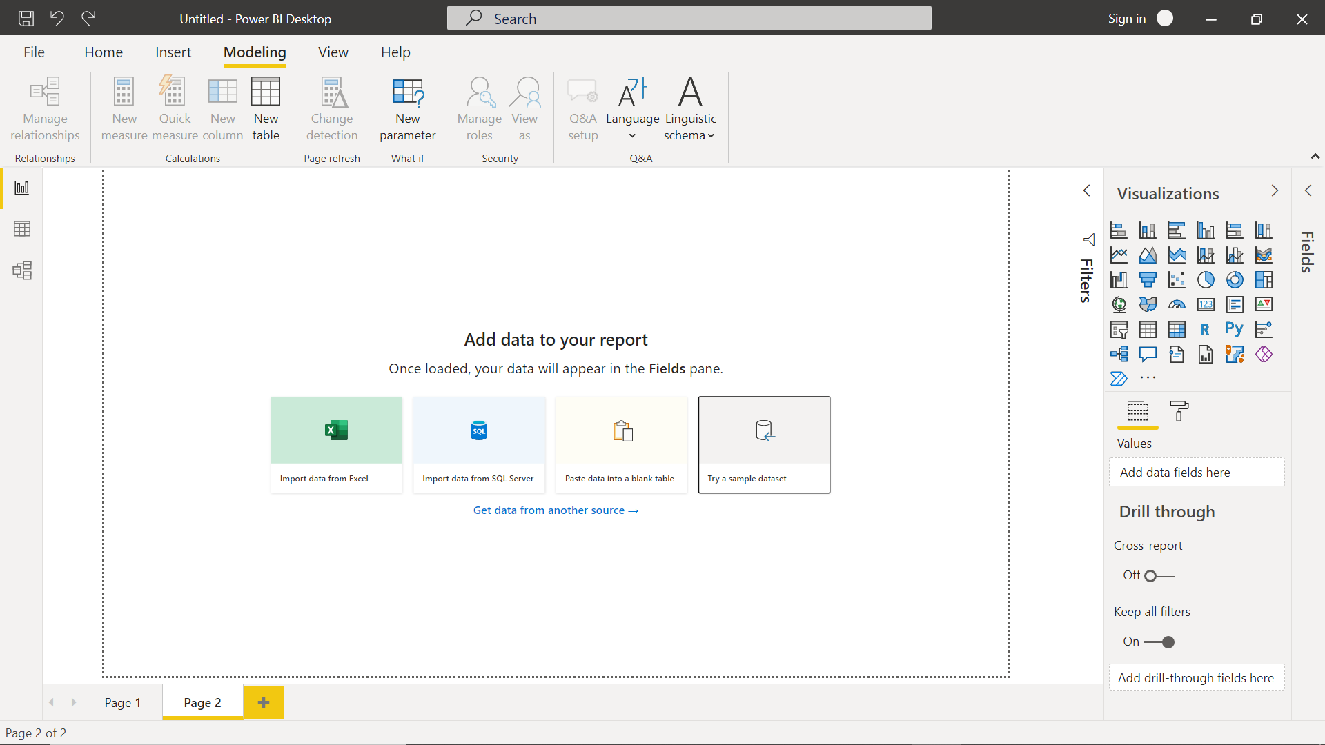
As we would be using Power BI Desktop to author a Power BI report, it is assumed the Power BI Desktop is already installed on the development machine and ready to use. Launch Power BI Desktop and the landing screen would look as shown below. The first step in any report authoring exercise is to source data which can then be represented using the visual elements available for reporting. In our case, we can just use the sample data that comes built-in with Power BI Desktop. To source this sample data, click on the try a sample dataset option as shown below.
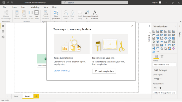
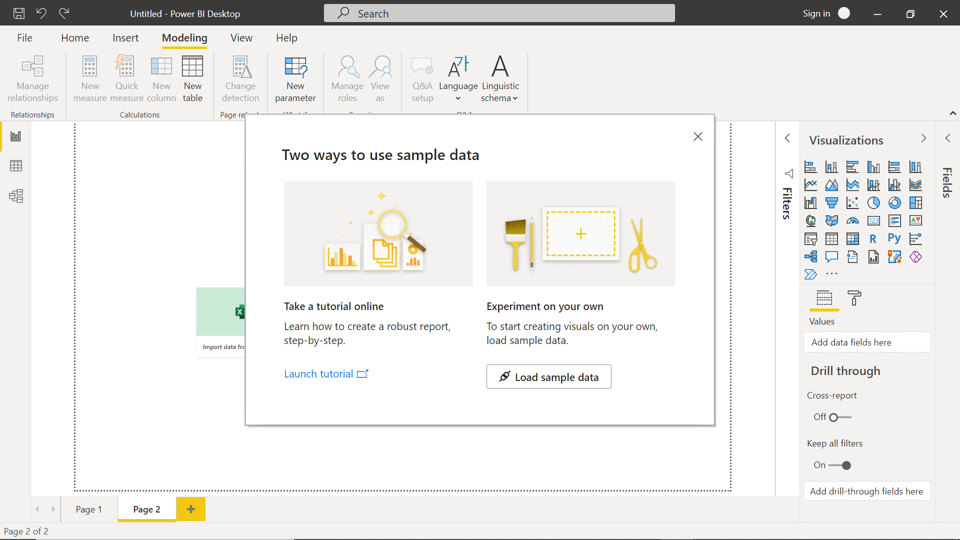
This will bring up a wizard with two options as shown below. To load the sample data quickly, we can click on the load sample data button as shown below.
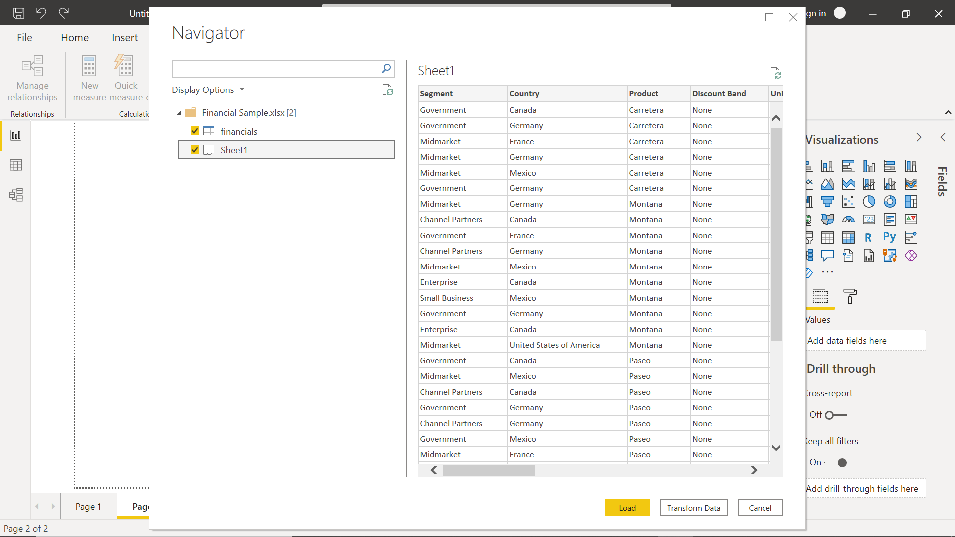
In the next step, we would be presented with a preview of the dataset as shown below. One of the datasets is financials and another one is called Sheet1. We can click on the desired dataset to preview the data in it on the right-hand side of the wizard as shown below. We can optionally choose to transform the data or load it straight away. For now, we will select both the datasets and click on the Load button to load this data in our report model.
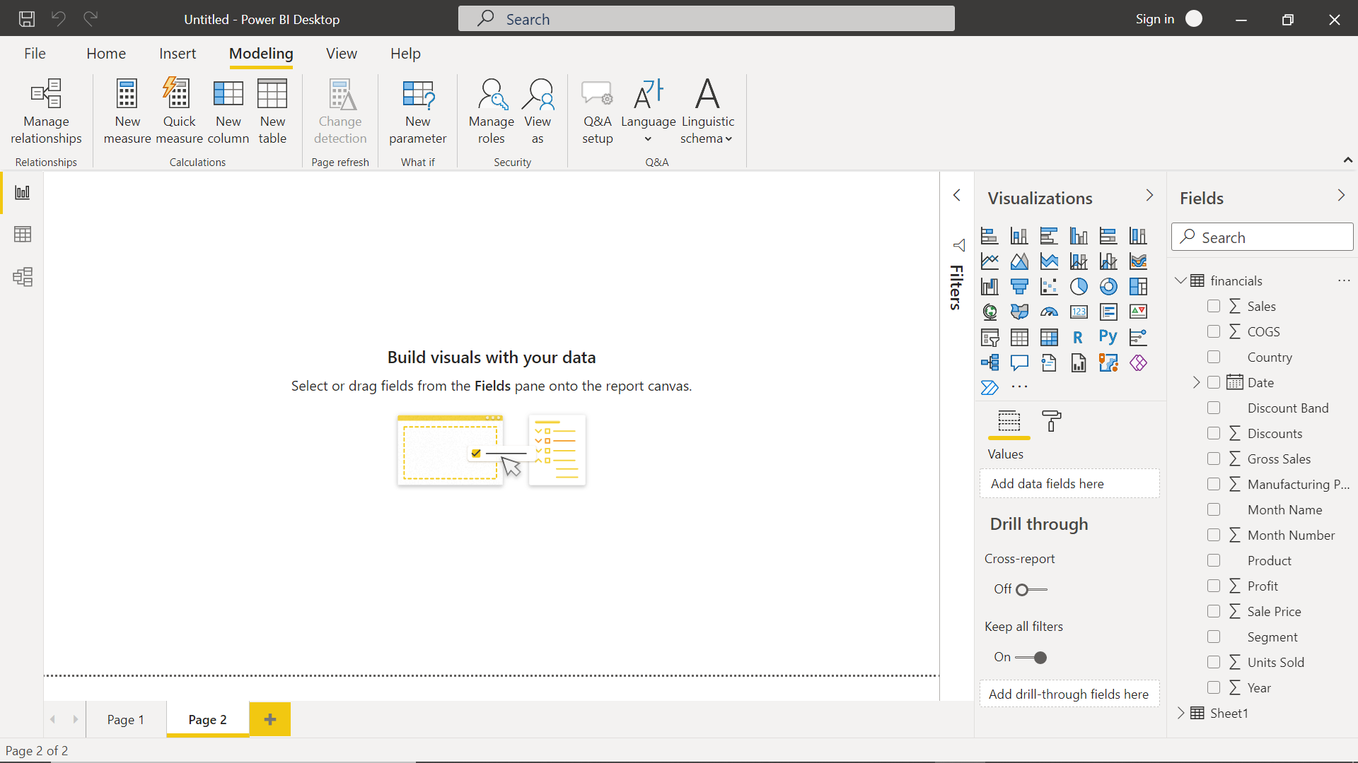
Once the data is loaded, the would be get listed on the right-hand side in the fields pane. These fields are now ready to be used with different visual controls available in the visualizations pane.
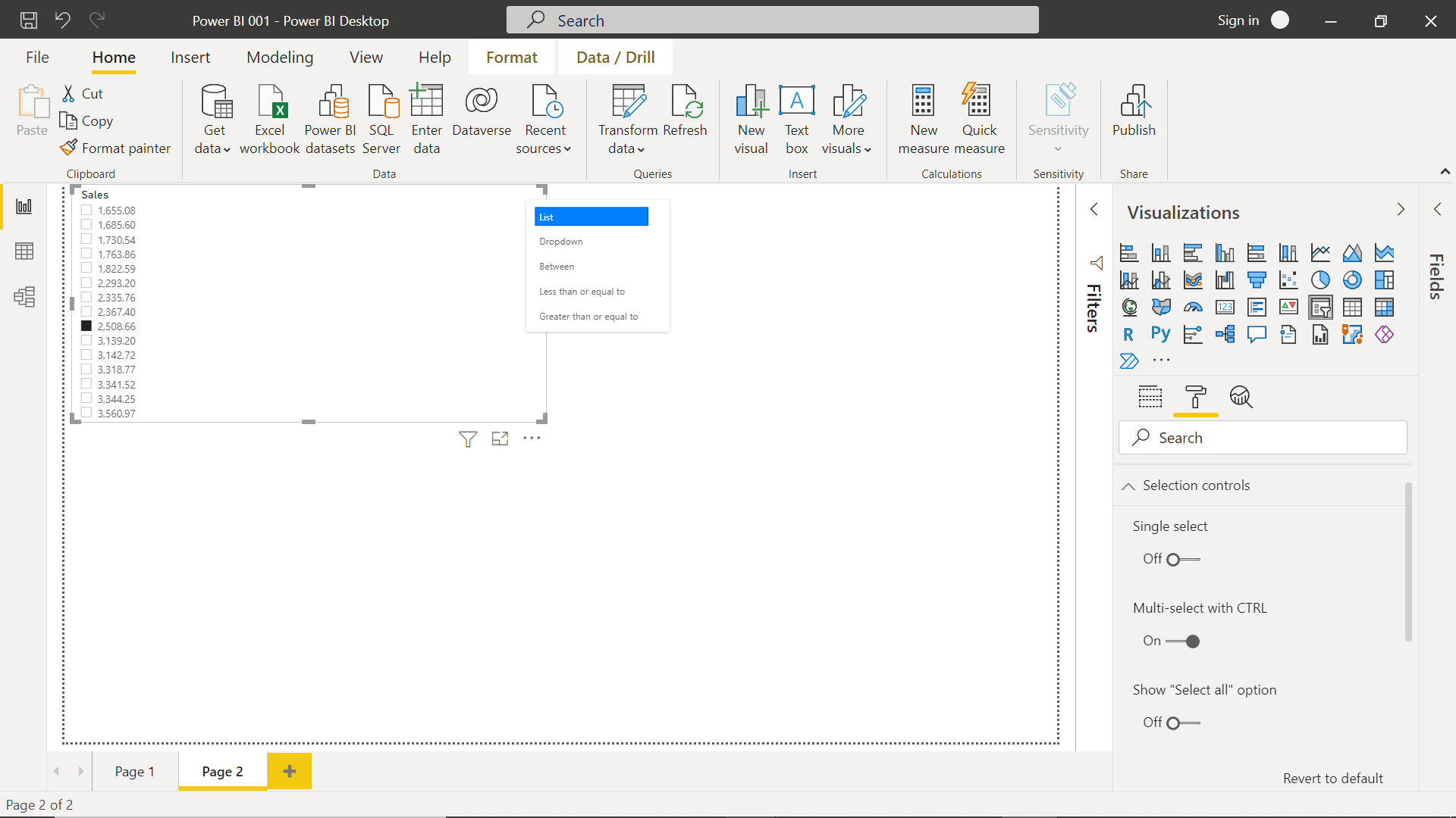
We intend to explore slicers first, so we can start by clicking on the slicer control in the visualization pane. Once we click on it, a slicer control would get added to the report layout. We need to populate it with at least one field so that we can start exploring the layout. For example, if we select a numeric field like Sales after selecting the slicer, it will get added to the slicer and the slicer would get populated with data as shown below. As numeric fields can have continuous values i.e., many discrete values, we may want to modify the appearance of the slicer to show the data in a different format than a lengthy list of unique values. By default, the data is shown in a list format. If we click on the icon on the top-right corner of the slicer control, it will give a list of options to modify the appearance of the control as shown below. At times we may want to make the values in the slicer control as single-select or multi-select. Also, at times we may want to show an option like “Select All” which allows the user to select all the values instead of clicking a lengthy list of values to select all the options. All such customizations for the slicer control can be done from the format pane as seen on the right side. The format pane provides options to customize the cosmetic appearance of the slicer control like color, font, etc.
Let’s say that we intend to show the list of values as a range, we can select the Between option from the menu, which will change the appearance of the slicer control from a list to a slicer as shown below. The user can just slide the slicer to determine the value one intends to select. In this way, there are different options to control the appearance of the slicer depending on the nature of the data.

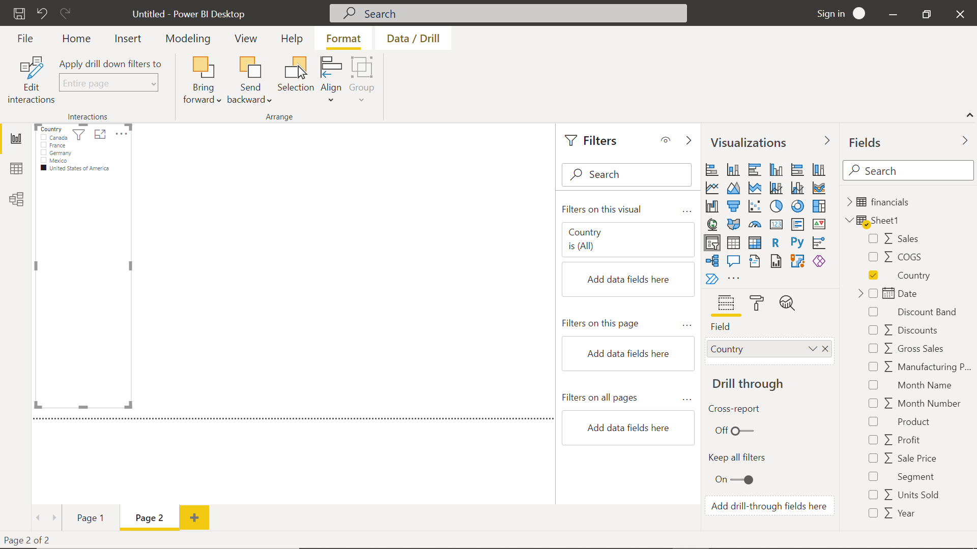
Now let’s say that we have a very simple slicer requirement, where the value of the slicer is a limited set of character values. For example, let’s select Country as the slicer. In our sample dataset, we just have a few countries in the list, so the slicer can be used in its default form and the user can select one or more countries from the list as shown below.
At times, the size of the font may become an issue in focusing on the list of values and the way it appears on the report layout. One can click on the focus mode icon on the top-right corner of the control to zoom into the control and focus on every detail inside the control as shown below.
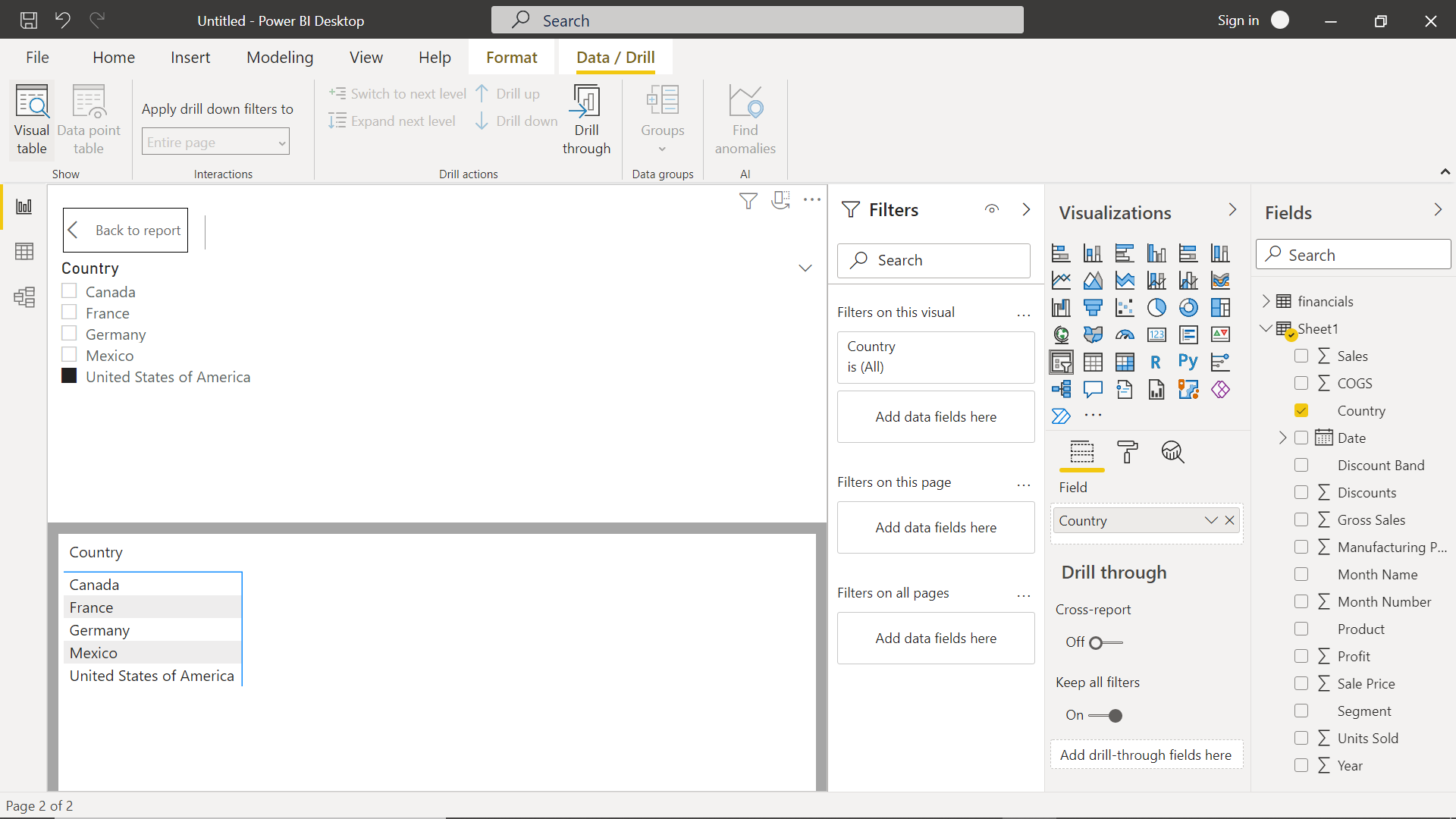
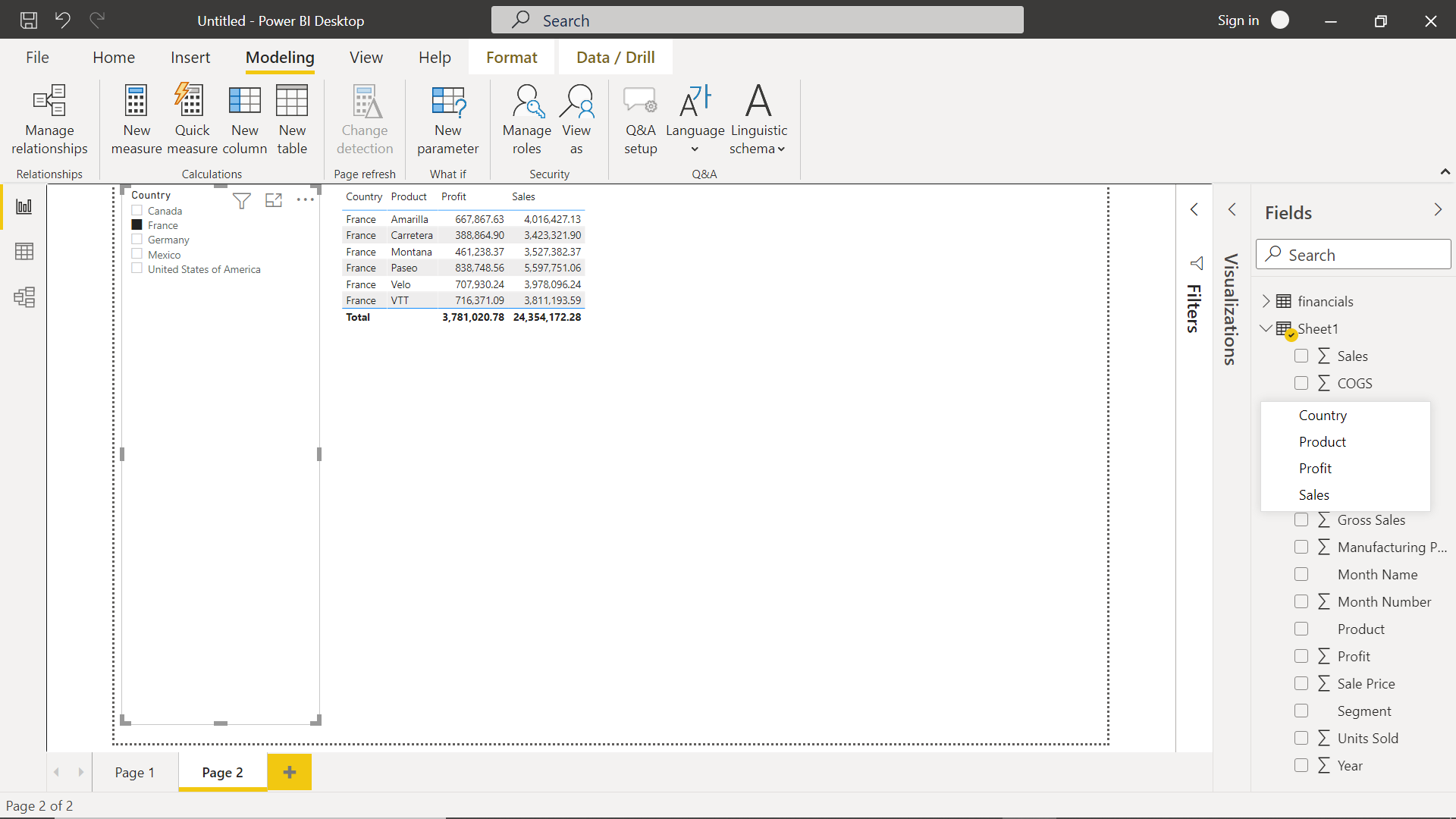
Click on the Back to Report button to navigate back to the design mode. The slicer is the user to filter or scope the data in other elements on the report layout. To realize the effect of the slicer on other data, we can simply add a table control on the report and populate it with a set of fields. This will populate the table with all the records for the selected fields as shown below.
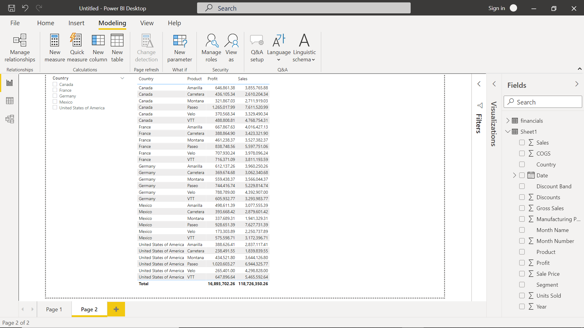
Click on any of the values in the slicer control, and we would be able to see that the data in the table control is getting filtered based on the selection in the slicer control. This makes it convenient for the user to view the data for all the combinations of the values in the Country field.
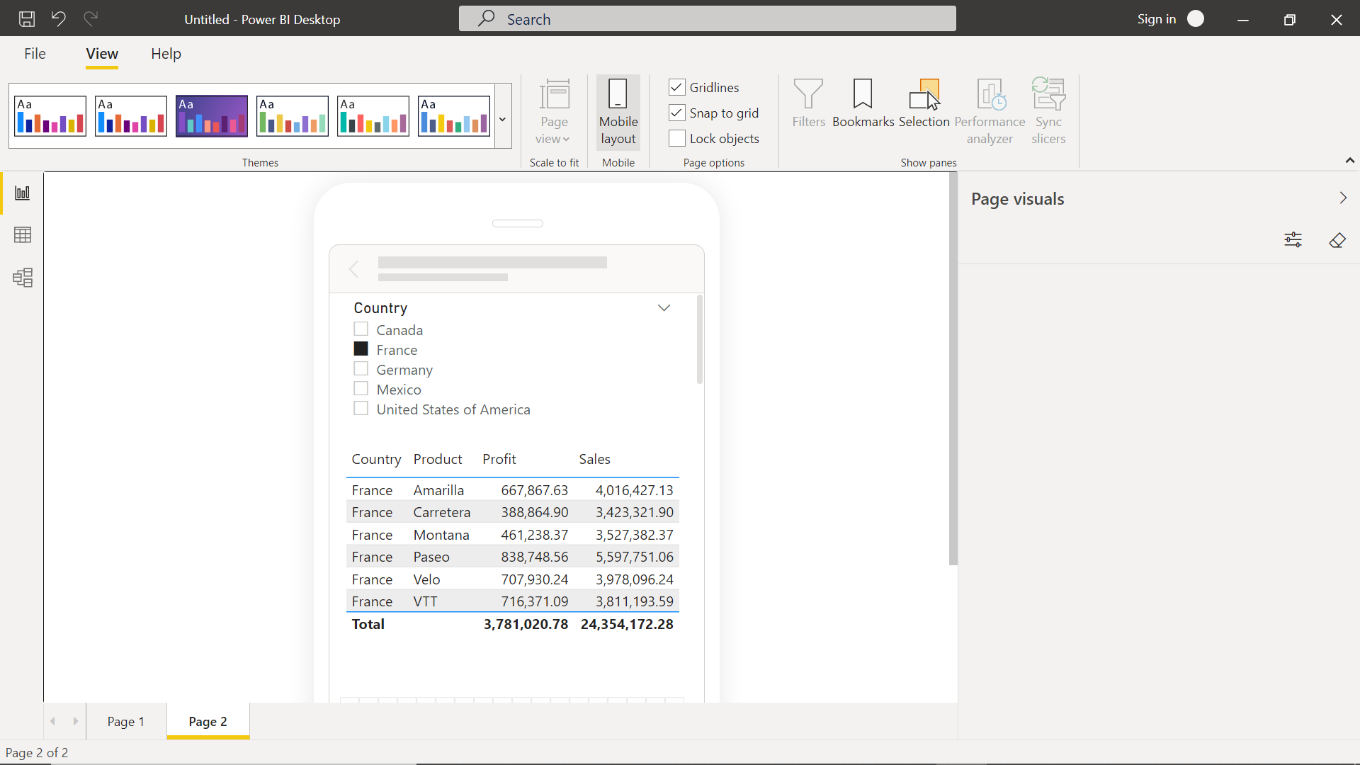
Another option we have for formatting the slicer control is by using themes and layout. Click on the View menu, and we would be able to find the themes in the theme section. If we select any given theme, it will apply to the entire report layout including slicer control as well. While the slicer control works for the regular report layout, we can customize the same for the mobile layout as well. As shown below, we can organize the slicer control to fit in a mobile layout and it would make it even more convenient for a user to analyze the data in the limited screen space of the mobile layout.
In this way, one can use slicer control to enable an end-user to slice the data as per one’s need. While we discussed the slicer control with just one data table, in real-life scenarios, the report may contain several visualizations. Using slicer control in such a variety of visualization provides an easy way for the user to control the scope of data across the entire report.
Conclusion
In this article, we learned how to populate sample data in a Power BI report using Power BI Desktop. We learned the user of slicer control, how to control the method of presentation depending upon the nature of data and finally, we learned how to use it with visualizations on the report layout.

She has a deep experience in designing data and analytics solutions and ensuring its stability, reliability, and performance. She is also certified in SQL Server and have passed certifications like 70-463: Implementing Data Warehouses with Microsoft SQL Server.
View all posts by Gauri Mahajan
- Oracle Substring function overview with examples - June 19, 2024
- Introduction to the SQL Standard Deviation function - April 21, 2023
- A quick overview of MySQL foreign key with examples - February 7, 2023