

Candlestick chart for stock data analysis in Power BI Desktop
Power BI Desktop contains a wide range of custom visualizations which helps to represent and analysis of the data with extensive formatting options. You can effectively showcase your data and save time as well by creating complex data chart with simple configuration options.
In the series of charts in PowerBI, we have explored below so far.
In this article, we will explore a Candlestick chart. Let us take an overview of this first.
Overview of Candlestick chart
Candlestick charts are used to show price movement for the securities in the stock market. These financial charts are commonly used by the technical analyst to analyze the trends of a particular security and do the trend analysis.
In this chart, we represent each day data for a stock with the candlestick. It contains information about open, high, low and closing price about a stock.
There are two kinds of candlestick available:
- Bearish Candlestick: If the closing price is less than the opening price for the period then it shows Bearish Candlestick
- Bullish Candlestick: If the closing price is higher than the opening price for the period then it shows Bullish Candlestick
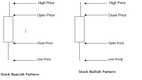
In Candlestick chart, both the bearish and bullish candlesticks are represented by the different color so that easily identify the stock pattern for the period. The candlestick body shows the price range in between the open and close price for the period.
Let us import sample data into Power BI Desktop to create the Candlestick charts.
Import data in Power BI Desktop
In the previous articles, we imported data into Power BI Desktop using the flat file (.CSV or .txt) or from the excel sheet (.xls or .xlsx).
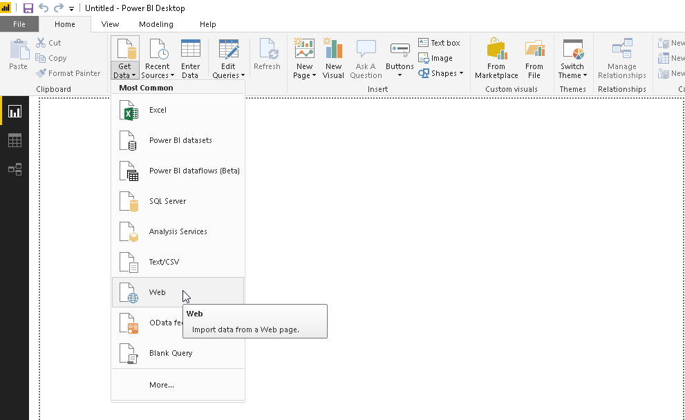
In this article, we will import the data from the ‘Web’ data source. In web data source, we will import data directly from the web page.
Click on the ‘Web’ from the Get data as shown here.
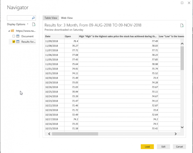
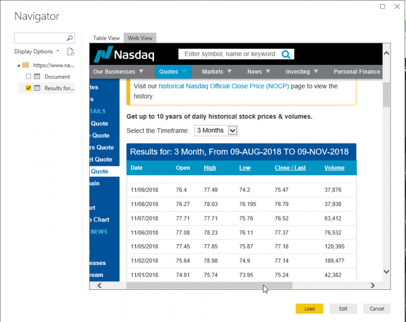
In this example, we will import the data from the NASDAQ website. Paste the URL from which you want to import the data into Power BI dataset.
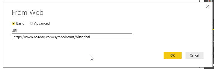
Click OK and it launches Navigator where we can see the table view of the data.
We can get the web view of the URL as well from the ‘web view’ link.
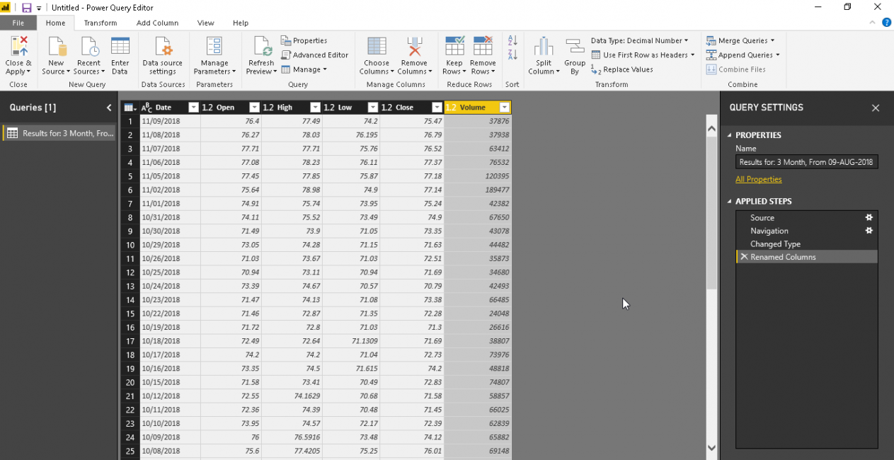
Click on ‘Edit’ and modify the column names. To modify column name, double-click on the particular column name and edit it.
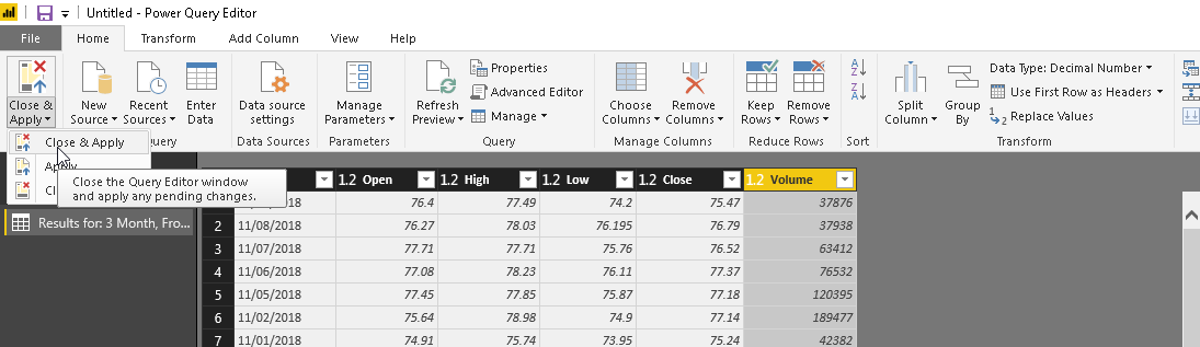
‘Close & Apply’ to save the formatted data.
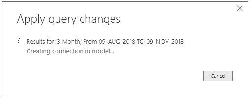
It applies the query changes and shows below pop up message.
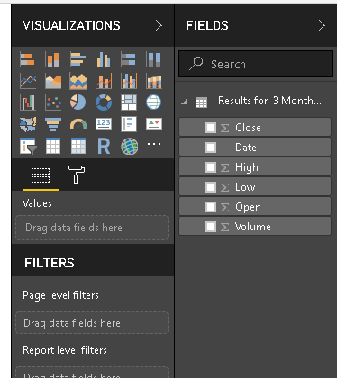
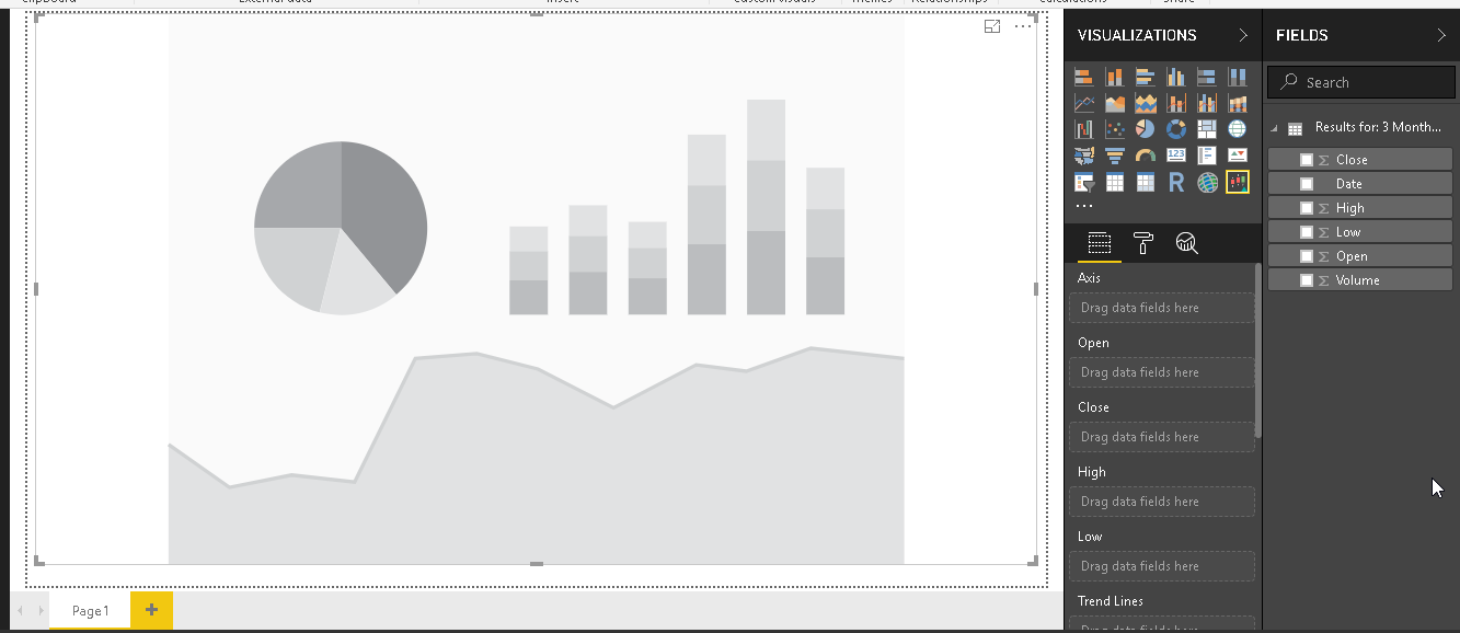
Now, in this step, the data set is now shown in the ‘Fields’ section. Our dataset contains close, data, high, low, close and volume the stock for that particular day.
Candlestick chart is a custom visual so we need to download it from the Marketplace. In the menu bar, click on the ‘From Marketplace’ and search for the keyword ‘Candlestick’.
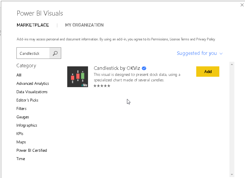
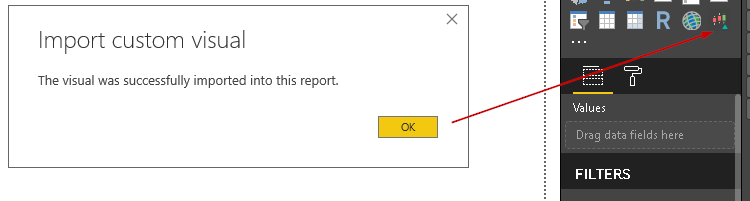
Add the visual by clicking on the ‘Add’ and below icon is added into visualization along with the success message.
Double click on the Candlestick chart icon and adjust the size of the visual give it a proper visual.
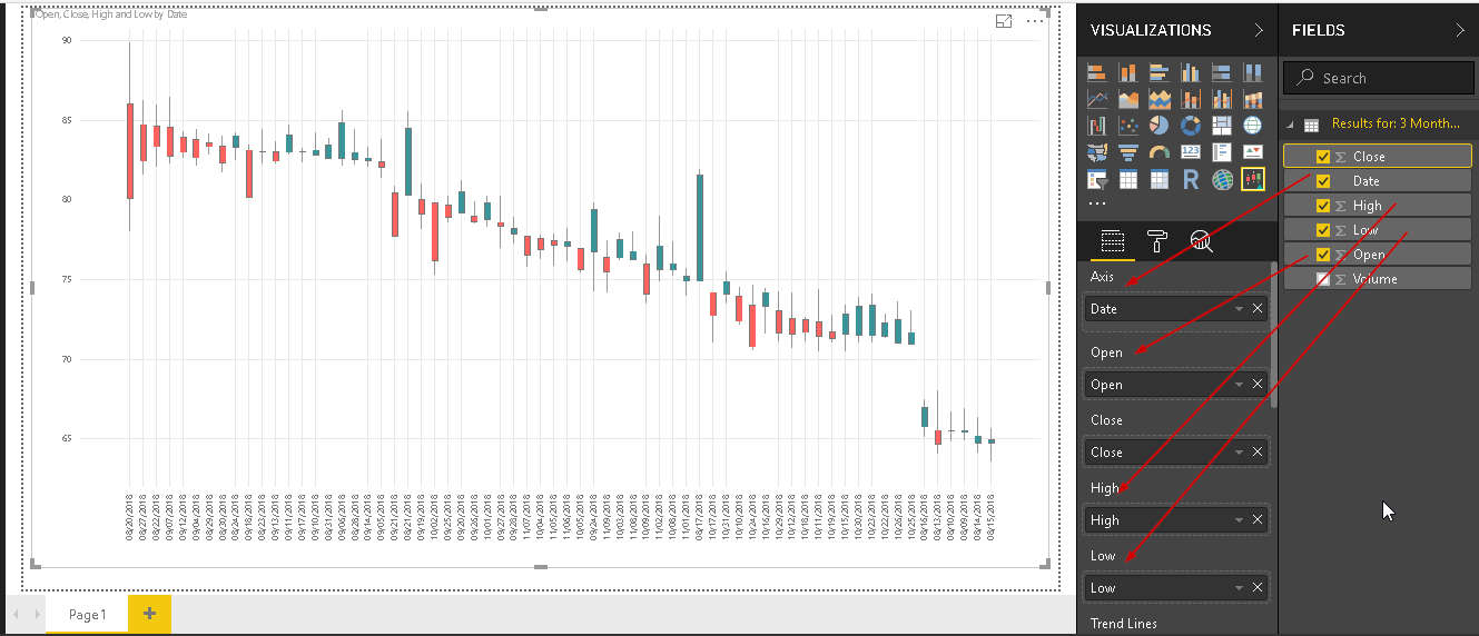
In the detail section, add the respective value as below.
- Axis: – Date
- Open: Open field from the dataset
- Close: Close field from the dataset
- High: High field from the dataset
- Low: Low field from the dataset
This generates the candlestick chart as below.
To understand the candlestick chart better, let us reduce the data size. To do so, click on ‘Edit Queries’ from the menu bar.
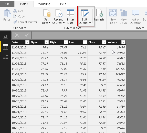
This opens the power query editor where we can make changes in the data set.
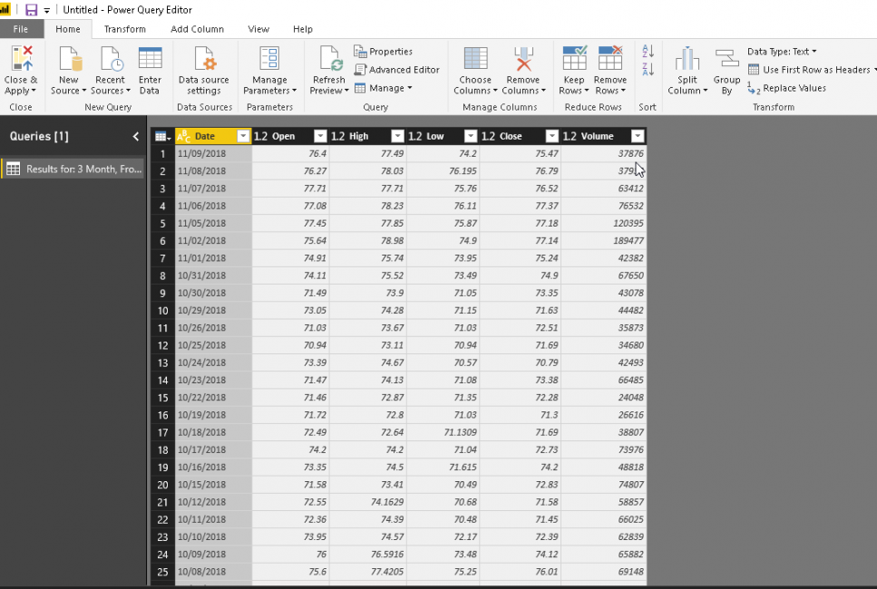
Now, we want to narrow the data set so click on the ‘Remove Rows’ and ‘Remove Bottom Rows’.
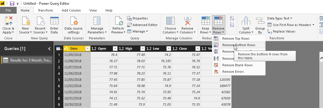
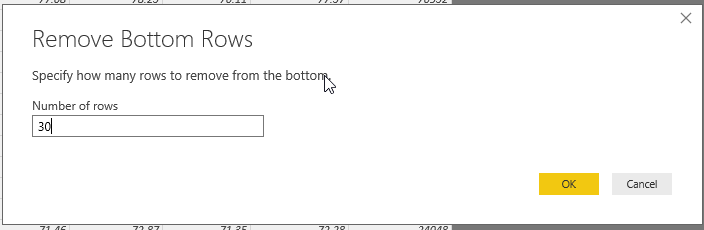
Enter the number of rows we want to remove from the bottom of the dataset. In this example, we want to remove 30 rows from the bottom. Click on OK to apply the changes.
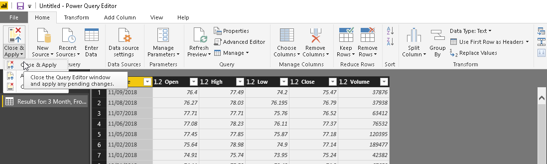
Click on ‘Close & Apply’ to save the changes in the data set.
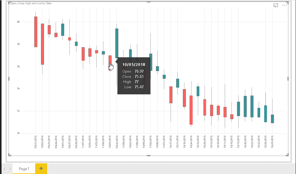
Now, Candlestick chart is generated with the updated data set. This chart is visible now to understand it properly.
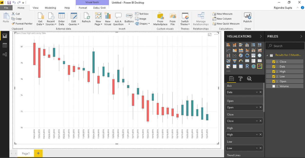
In the chart, candlesticks are in two colors. This is because of the bearish and bullish pattern for the timeframe. We can control the colors of these candlesticks, which we will see in a later section of the article.
If we hover the mouse over a candlestick, it shows the complete detail of the stock open, close, high and low values.
Now let us do some formatting to customize the chart and get details in the much better way.
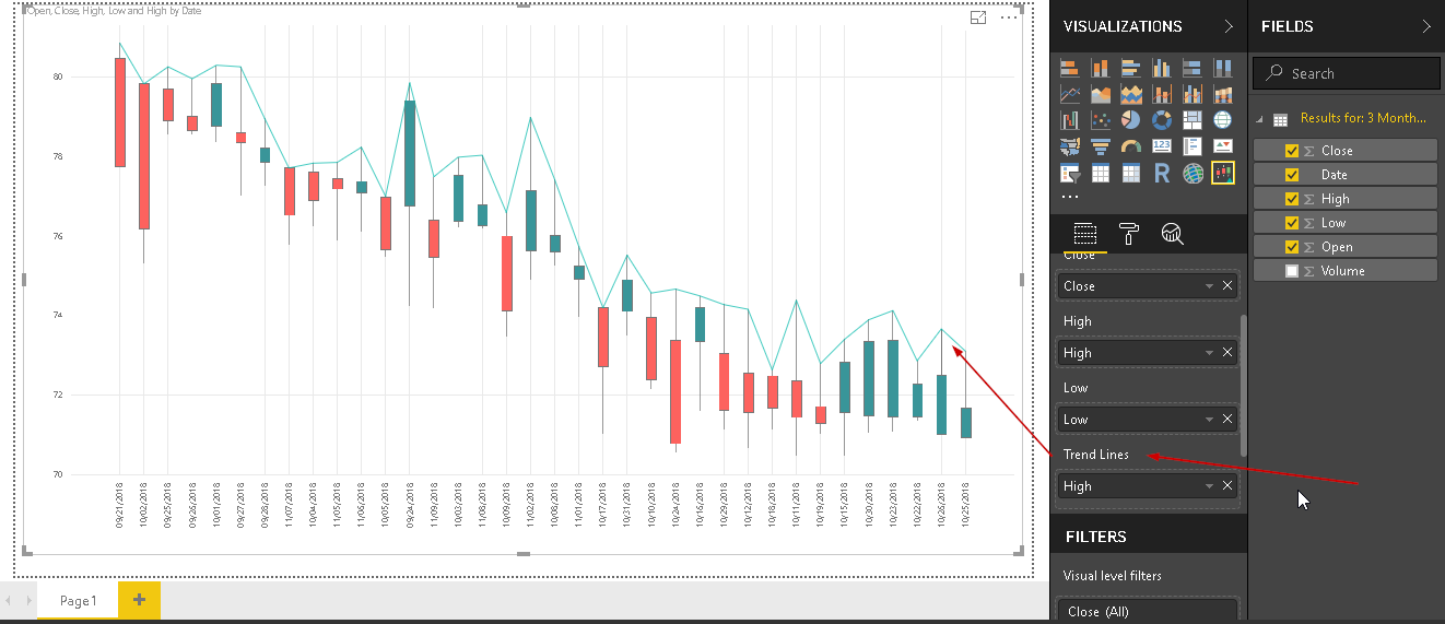
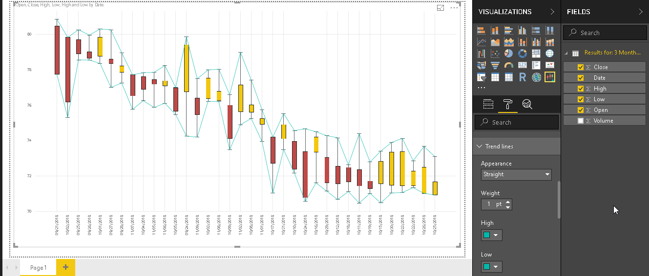
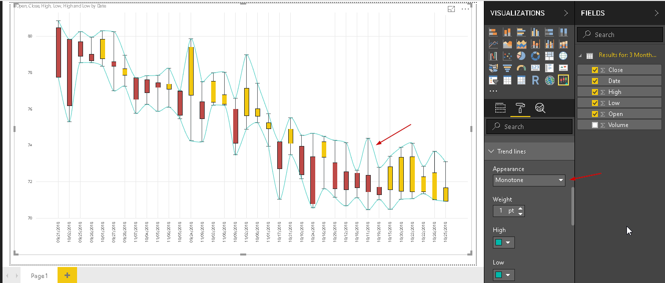
Trend lines: we can add trend lines to under the stock trend for a particular value. For example, in below we specified trend lines for the ‘High’ value in the dataset.
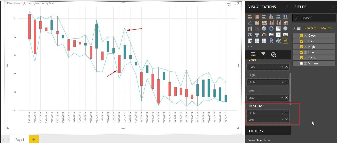
We can add multiple trend lines in a candlestick chart. In below screenshot, you can see trend lines for both the high and low values.
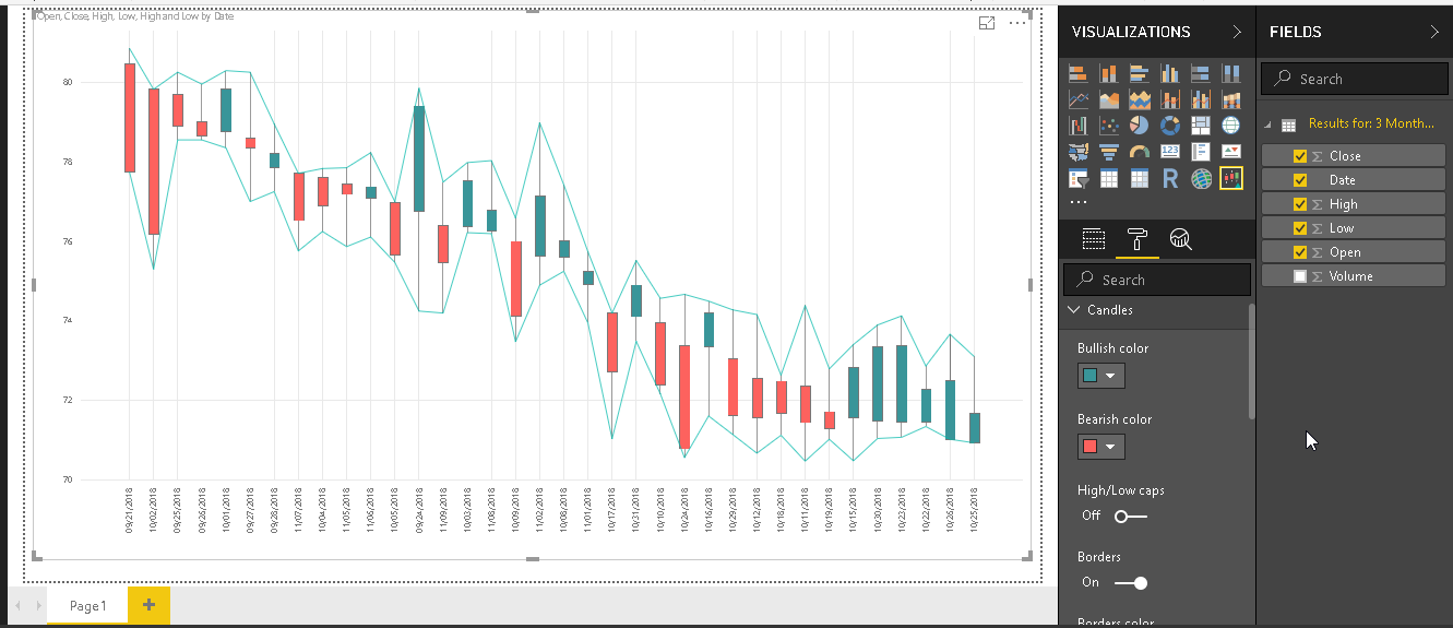
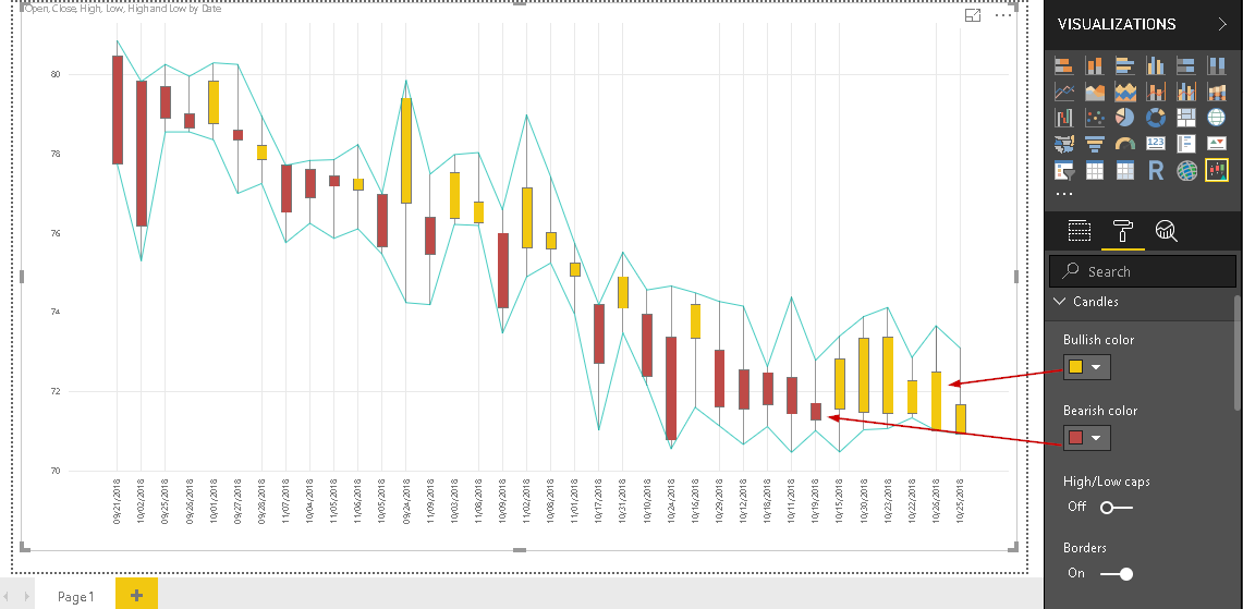
Candles colors: By default, it shows the below colors for the bullish and bearish candlestick chart pattern.
Let us change the color for both the bearish and bullish candles. You can view the changes quickly in the chart.
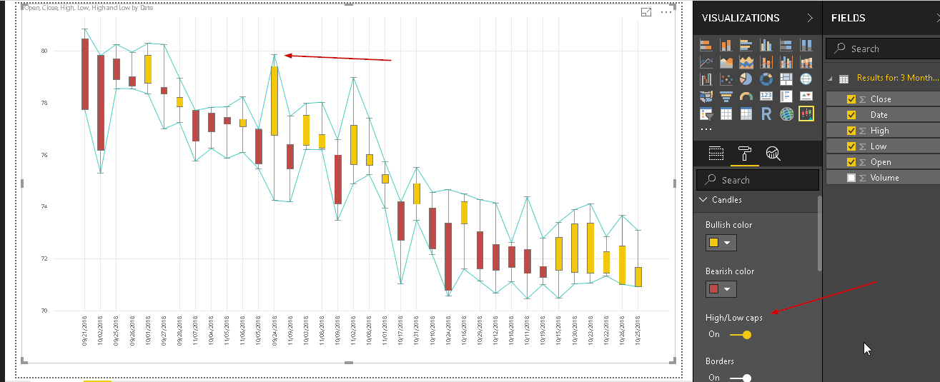
High/Low Caps: we can place the high and low-value caps. To do so, turn on the ‘High/Low caps’ and you can find the caps as pointed in the chart.
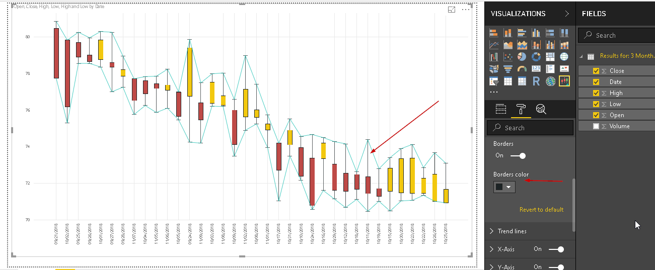
Borders color: we can change the borders colors for the candlesticks with the option ‘Borders color’. Choose an appropriate color and it is applied to the candlestick chart.
Trend lines: By default, trend lines appearance is straight and we have common colors for both the high and low-value trend lines.
If we change the appearance to ‘Monotone’, you can notice the difference in the trend lines shape.
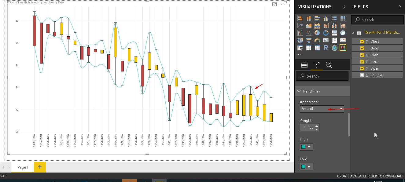
Similarly, for ‘Smooth’ appearance the trend line appears as below.
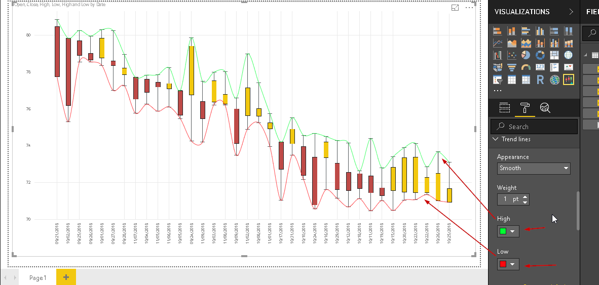
As mentioned earlier, by default trend line color is common for both high and low values. Let us change different color for both the trend lines as shown here.
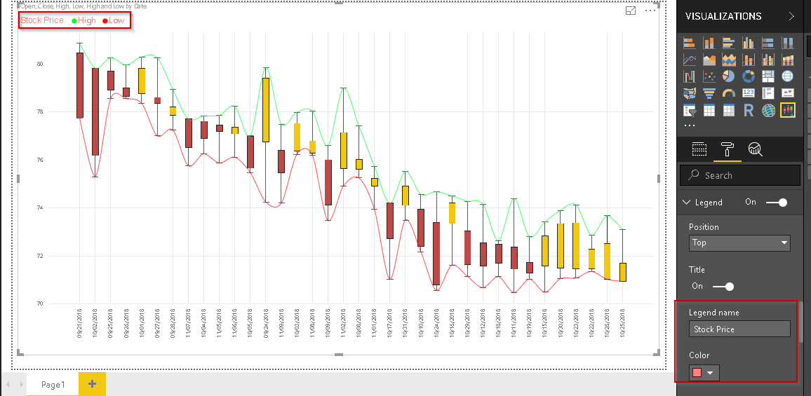
Legend: By default, the legend is set to off. If we set it ‘On’, we can see a legend as highlighted below.
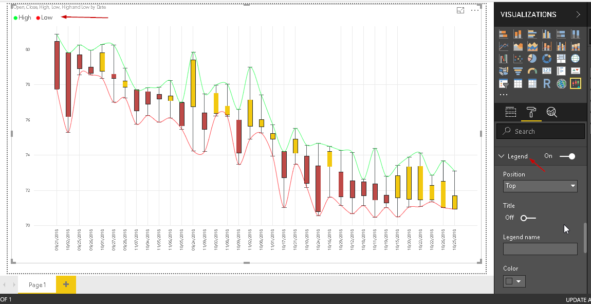
We can give a name to legend as well. In below example, I gave legend name as ‘Stock Price’ and you can see legend name highlighted here.
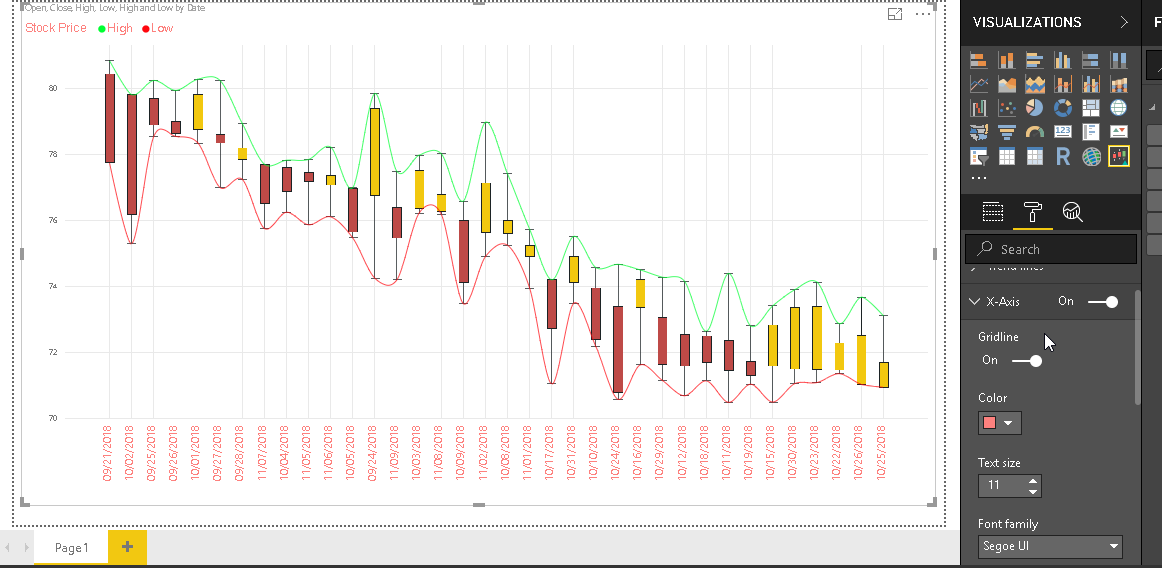
The x-axis and Y-Axis Formatting: We can do the formatting for the x-axis and y-axis such as color, text size, text font etc.
In below example, I change the formatting for x-axis and you can notice the change.
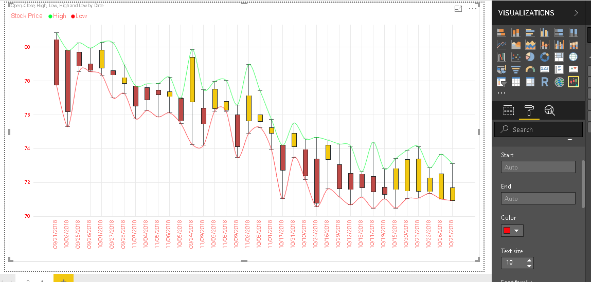
Similarly, for y-axis formatting, the chart looks as below.
Color Blindness: we have different option to set color formatting by vision. By default, vision is set to Normal in candlestick chart.
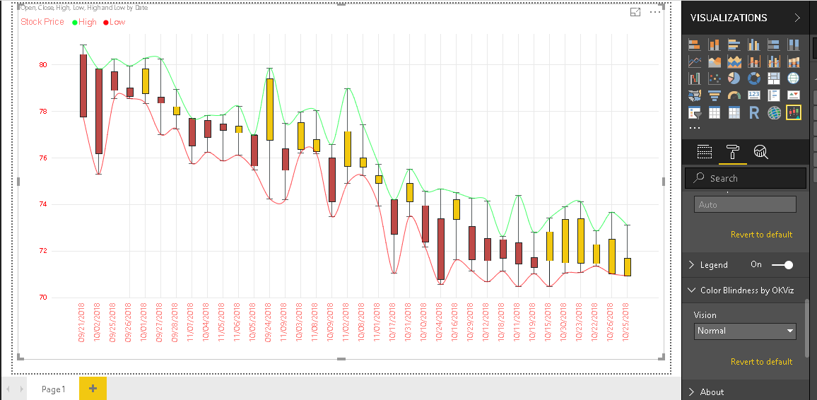
Below are the options to choose for the vision:
- Normal
- Protanopia
- Deuteranopia
- Deuteranomaly
- Tritanopia
- Tritanomaly
- Achromatopsia
- Achromatomaly
- Low Contrast
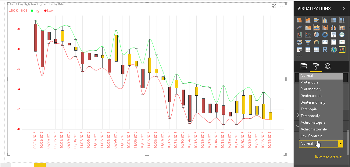
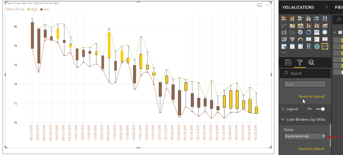
Let us change the vision to ‘Deuteranomaly’ in Candelstick chart and we can notice the change the color combination of candlestick chart.
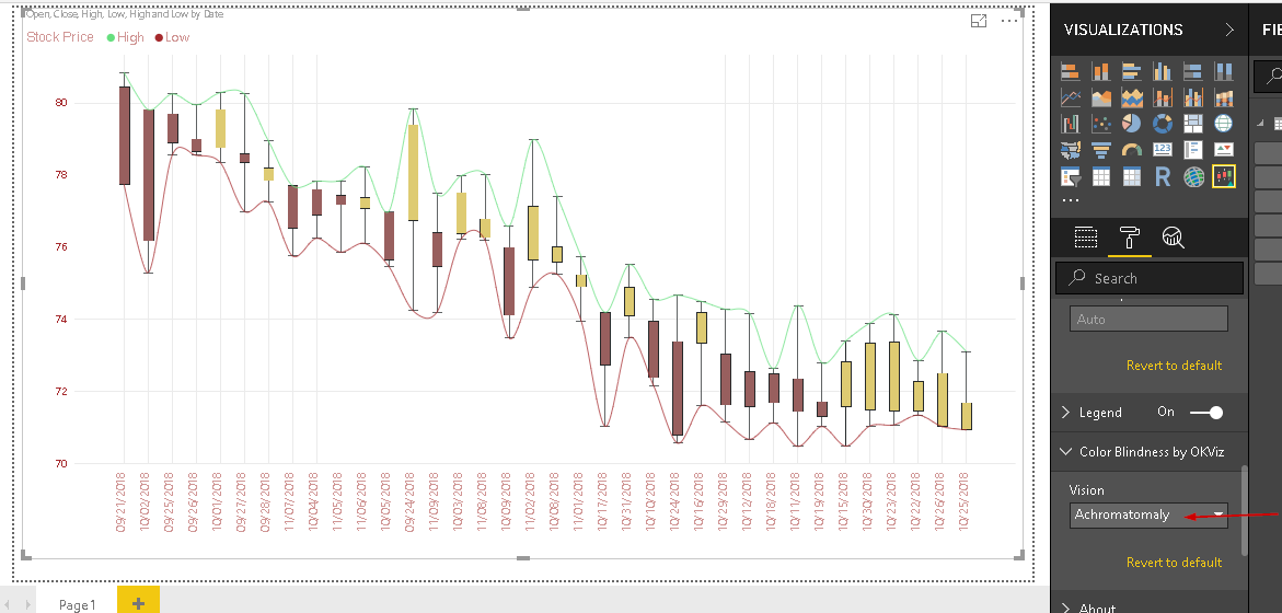
Similarly for ‘Achomatomaly’ chart looks as below
Conclusion
Candlesticks chart in Power BI Desktop helps to analyze the security (stock) data for the data analyst or the traders so that they can read the stock price movement and technical charts effectively. You can explore this chart with your data set. We will cover more useful charts in upcoming articles.
Table of contents

I am the author of the book "DP-300 Administering Relational Database on Microsoft Azure". I published more than 650 technical articles on MSSQLTips, SQLShack, Quest, CodingSight, and SeveralNines.
I am the creator of one of the biggest free online collections of articles on a single topic, with his 50-part series on SQL Server Always On Availability Groups.
Based on my contribution to the SQL Server community, I have been recognized as the prestigious Best Author of the Year continuously in 2019, 2020, and 2021 (2nd Rank) at SQLShack and the MSSQLTIPS champions award in 2020.
Personal Blog: https://www.dbblogger.com
I am always interested in new challenges so if you need consulting help, reach me at rajendra.gupta16@gmail.com
View all posts by Rajendra Gupta
- How to install PostgreSQL on Ubuntu - July 13, 2023
- How to use the CROSSTAB function in PostgreSQL - February 17, 2023
- Learn the PostgreSQL COALESCE command - January 19, 2023