
In my last article, Power BI Desktop Interactive chord diagrams, we underscored that Microsoft Power BI desktop has a rich set of customized visualization features. These visualizations can help to produce convert data to information in an efficient manner to an easy to understand format. We can freely download them from Microsoft AppSource
In this part of the series, we will explore below points
- Pulse Chart in Power BI overview
- Creating Pulse Chart in Power BI
- Importing data into Power BI dataset using SQL Server
- Customizeing the Pulse Chart in Power BI
- Examples of to create and learn Chord diagram
Pulse Charts
Normally in the hospital emergency department, we can see that the cardiac monitoring device shows the patient’s heart rate continuously. In those devices, heart rates are being shown in the form of pulse chart. It automatically captures the data, creates a pulse chart and continuously moves forward.
Power BI also provides the option to create a Pulse chart. A pulse chart draws the events based on the time series. It allows customizing the chart as well. We can play, pause, move forward, backward in the chart. We can also observe the playback of the complete chart so that we can observe the trend directly.
We can open the link Pulse Chart as shown below and download the Pulse chart to import in Microsoft Power BI Desktop.

Creating a Pulse Chart with Power BI Desktop
Example 1: Pulse Chart for Heart rate data
To create the pulse chart, I have the below data into my database that shows the body temperature and heart rate data of a patient with the timelines.

We need to import the data into the Microsoft Power BI desktop. In my last article, I explained that we could import the data into Power BI Desktop through various methods. We imported the data from CSV in my last example. In this example, we are going to import data from SQL Server Database.
Click on Get data and select SQL Server Database.


Now provide the below details to connect to the database.
- Server\Instance name
- Database Name (Optional)
- Data Connectivity Mode
- Import: If we directly want to import the data from a single table
- DirectQuery: we can use this to import data through the query
Click on Ok that asks for additional connection information.

Select the authentication method. If we want to use windows authentication, select ‘Use my current credentials’.
Else click on Use alternate credentials and provide a username, password. Click on Connect to make the connection.

By default, it tries to connect to the data source with encrypted connections. However, it cannot connect, we can access the data using an unencrypted connection. Click OK to go forward.

Preview data and click on Load if all looks good.

It creates the connection and loads the data into power BI Desktop.

We can see the data fields once the import is completed.

Now, the next step is to import the Pulse Chart into Microsoft Power BI Desktop. Click on ‘From MarketPlace’

Enter ‘Pulse’ in the search box and we can see the Pulse chart with a small description.

Click on Add to import custom visual and once done, we can see below pop up message.

As shown below, we can see the Pulse Chart icon into the Visualization section.

Double click on the icon and it shows the below screen. Adjust the size of the chart with the sidebars.

Once we have adjusted the size, it is easy for us to visualize the data into Pulse Chart.

Now drag the fields from the datasets below.
| TimeStamp | Values |
| Obs | HeartRate |

As we can see above, it draws the patient heart rate data over a period.
In the top left corner, we can see the chart controls, if click on play, it shows up the playback of the chart as shown below.

Similar to this, if we want to draw body temperature into Pulse Chart, simply drag the field to Values section.


If we want to add a title and description in the Pulse Chart, we can drag the columns to the Event Title and Event Description tab.
For example, if in my example, we want to show ‘HeartRate’ in the event title and description. Therefore, we can see the pop-up window on top of a selected item.

If we want to highlight the selected line item, we can click on Focus Mode.

In the focus mode, we can see that it zooms the particular line item and shows up the event description and title.

To exit the focus mode, click on Back to Report.

Customize the Pulse Chart in Power BI Desktop
We can customize the Pulse Chart in Power BI Desktop easily. Click on Format icon as shown.

Format Pop Up window: We can customize the pop- up window size, color, font size, the location from the Popup section.

Change the pop-up the width, height, color, text size, text color as per requirement.


We can see the customized pop-up window.

Customize Chart title: By default, Pulse chart title is difficult to read.

In order to improve its visiblily, go to the format section and Title. In the Title section, we can change the title, font color, title alignment (left, center, right), Text size, font etc. Default values are as shown below.

Change it as per the requirement.


We can the title is now updated with our customized settings.

Customize TimeSeries: By default, we can see the time series in the middle of the chart.

Go to Format section and X-axis. We can select the font color, axis color, background color and position of the time series. If you want to move time series to bottom, select the bottom position.

Example 2: Population and employment data
Let us look at one more example to display the population and employment data. Since we have already covered the steps above, we will directly look at the Pulse chart in this case.
Below is our sample data. You can download sample data from the link.

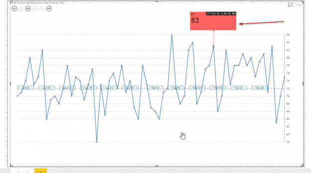
We can see the below Pulse Chart from the data. In the below example, we see the unemployed percentage as per the year. In the event title, we can see population and event description as ‘labor_force’.


Conclusion
The pulse Chart in Microsoft Power BI desktop is really good and useful to represent data as a visual data story. You can create and explore this for your dataset with simple configuration options. I hope you have enjoyed this article and feel free to provide feedback or questions in the comments below.
Table of contents

I am the author of the book "DP-300 Administering Relational Database on Microsoft Azure". I published more than 650 technical articles on MSSQLTips, SQLShack, Quest, CodingSight, and SeveralNines.
I am the creator of one of the biggest free online collections of articles on a single topic, with his 50-part series on SQL Server Always On Availability Groups.
Based on my contribution to the SQL Server community, I have been recognized as the prestigious Best Author of the Year continuously in 2019, 2020, and 2021 (2nd Rank) at SQLShack and the MSSQLTIPS champions award in 2020.
Personal Blog: https://www.dbblogger.com
I am always interested in new challenges so if you need consulting help, reach me at rajendra.gupta16@gmail.com
View all posts by Rajendra Gupta
- How to install PostgreSQL on Ubuntu - July 13, 2023
- How to use the CROSSTAB function in PostgreSQL - February 17, 2023
- Learn the PostgreSQL COALESCE command - January 19, 2023