
We have explored useful visualizations in Power BI Desktop with my previous articles that covered:
In this article, we will learn how to create ‘Hexbin Scatterplot’ charts with Power BI Desktop. We create scatter charts in Excel to represent two-dimensional data with the help of dots. This two-dimensional data is represented across both the X and Y-axis. Scatter charts display both data points in a single chart based on the data distribution.
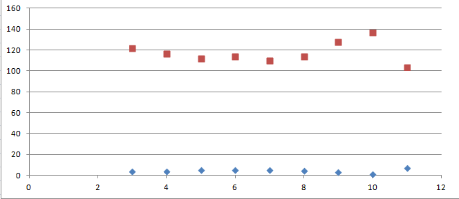
Below is the sample scatter chart in the excel sheet.
In Power BI, the bubbles replace these points, therefore we can call a scatter chart a bubble chart as well. Let us first understand the basics of a Scatter chart and then we will see how a hexbin scatterplot in different from that chart.
Load sample Data into Power BI Desktop
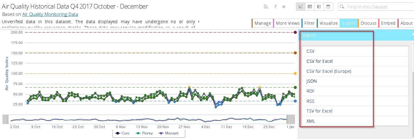
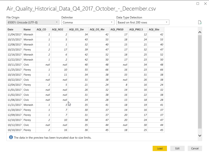
We have imported data from a flat file (.CSV) in the previous article, therefore in this article, we will not cover importing in detail. In this article, we will use sample data Air Quality Historical Data Q4 2017 October – December. This data contains air quality historical data of various components for the period of October to December 2017.
Please note this is unverified data and used for demonstration purpose only.
Open the link and click on ‘Export’ and download the CSV format to import purpose.
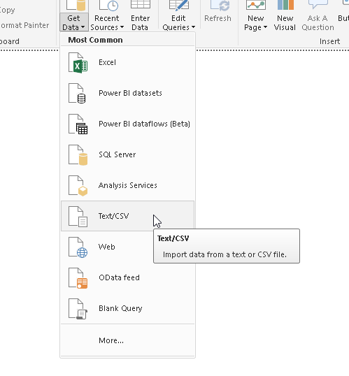
Import CSV data from the ‘Get Data->Text\CSV’ and provide the path of the.CSV file.
Get a preview and load the data into Power BI Dataset.
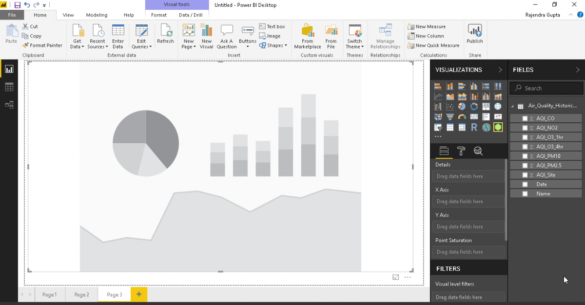
We can view the data and columns now in Power BI Desktop once data import is successful.
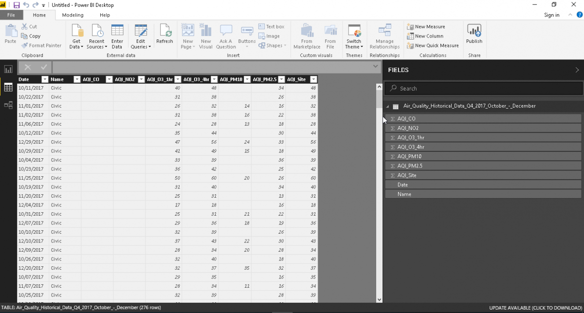
Now, just select the data columns from the data set and it generates below the bar graph. It is difficult to analyze the data due to the complexity of the data and due to multiple columns.
The Scatter Plot visualization is available by default as shown.
![]()
Click on the Scatter Plot icon and observe below that format shows scatter plot with various bubble sizes.
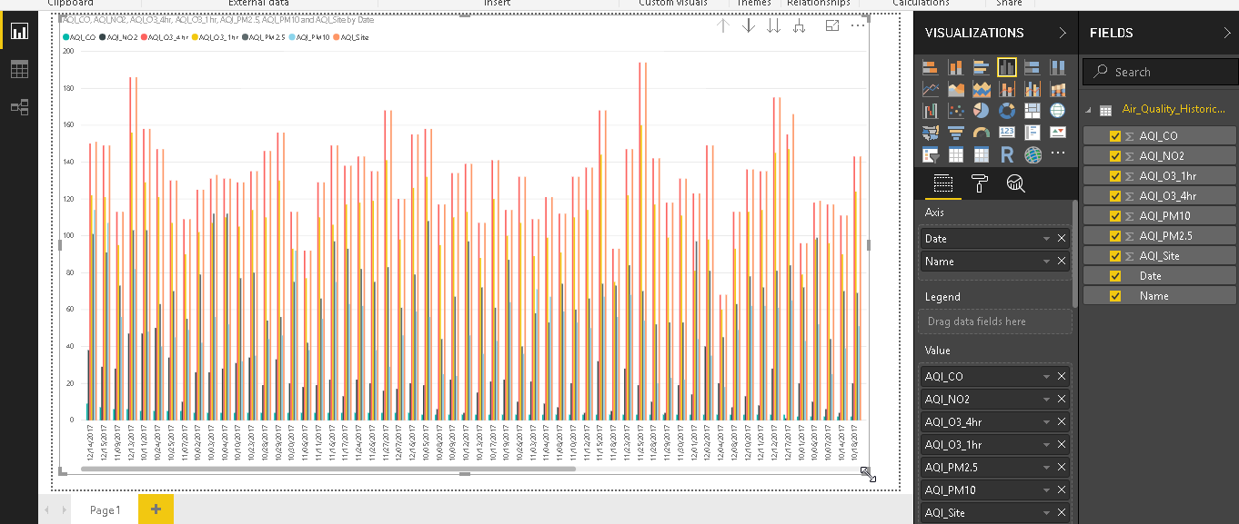
Provide the input for the chart in details, legend, x-axis, and y-axis to generate the Scatter chart as below. Here it shows various data points of different colors.
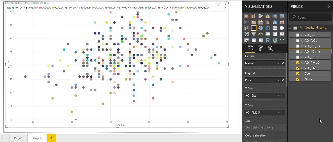
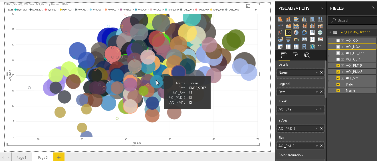
In the above image, bubbles sizes are similar for all bubbles. It does not vary the size of the bubble in according to our data. In the field area, define Size as per our dataset column. For example, in the below chart, we have set Size as AQI_PM10. It changes the scatter chart now with various bubble sizes. These bubbles are overlapping with each other, so it is difficult to get analysis based on the bubble size.

We can get information about any particular bubble by just moving the cursor over it.
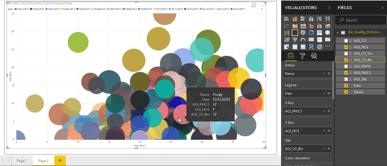
Change the data set columns as per requirement and Scatter chart changes accordingly.
Until now, we have how we can represent data with Scatter Chart. Power BI Desktop contains enhancements to scatter chart using the ‘Hexbin Scatterplot’.
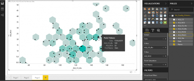
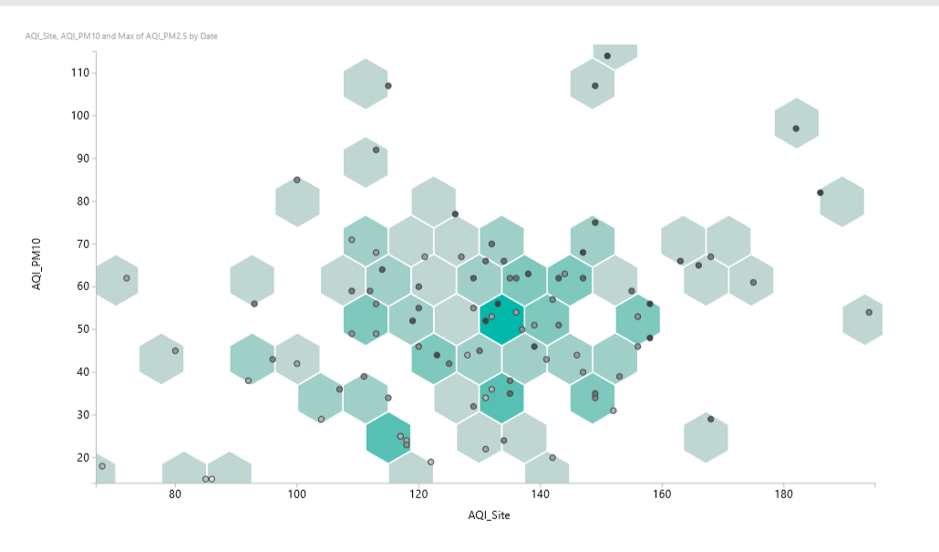
In Hexbin Scatterplot, we represent data on top of the hexagonal bins. Each bin shows the density of the points. Color saturation is different for the bins based on the density. Data points are represented by dots in the hexagonal bins. Bins are attached to each other with a white border by default. We can use this chart to identify the data patterns easily as compare to the Hexbin Scatterplot.
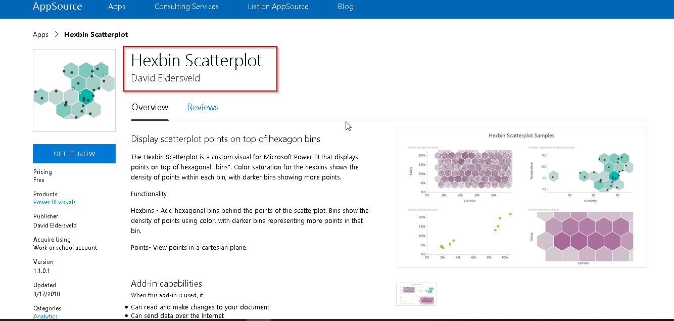
Go to the link ‘Hexbin Scatterplot’ and get details of it from Power BI visuals.
This is a custom visual that we need to download and install from the app source. In the previous article, we saw to import visual using the menu bar. There is one alternative to this. Click on three dots icon (…) and select Import from the marketplace.
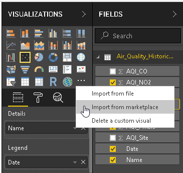
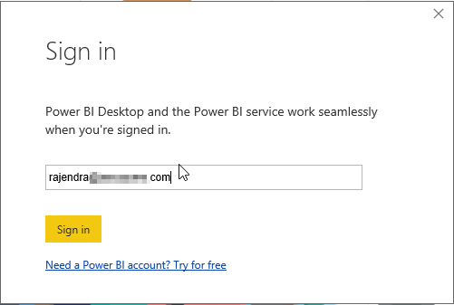
Sign in with the work or school account
Search for the ‘Hexbin’ to get more details about this chart.
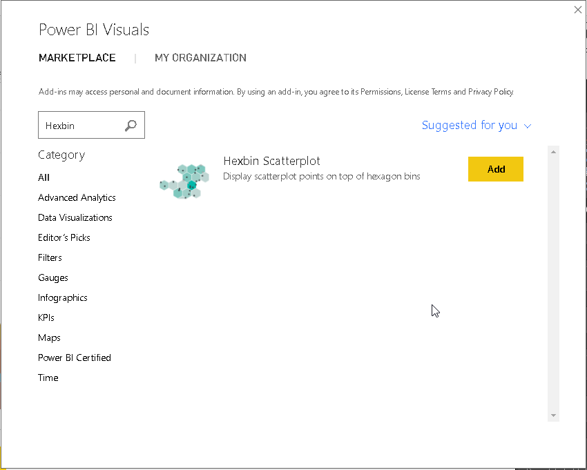
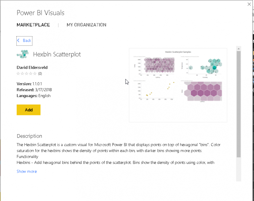
We can view the description here as well. Click on ‘Add’ to download and install automatically.
Below you can ‘Hexbin Scatterplot’ icon in hexagonal bins shape.
![]()
Click on the icon and adjust chart size by moving sliders.
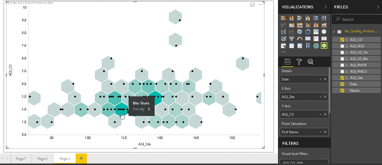
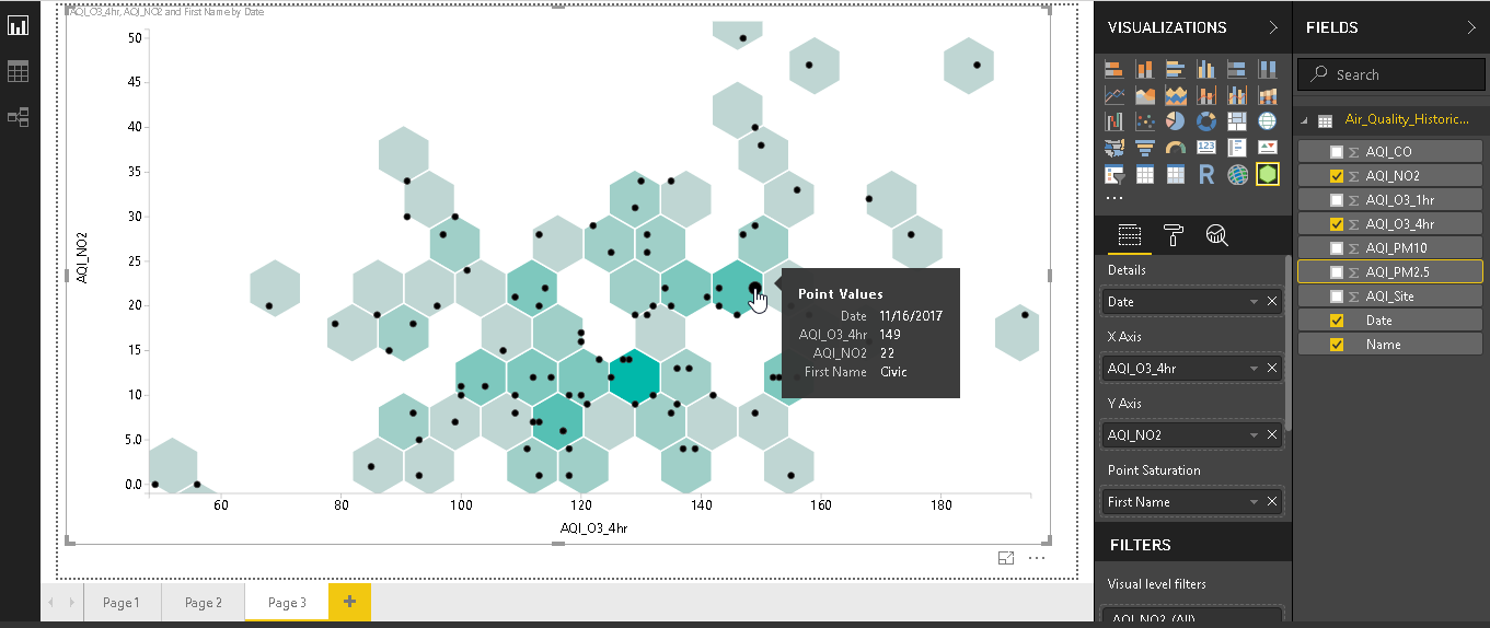
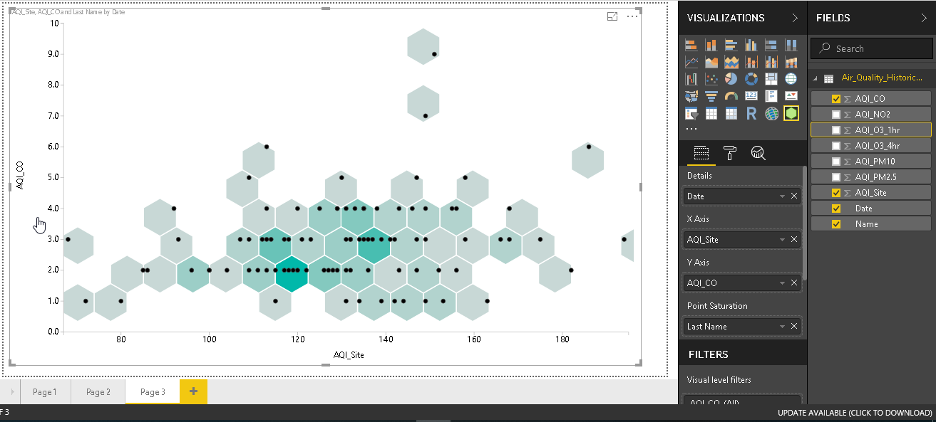
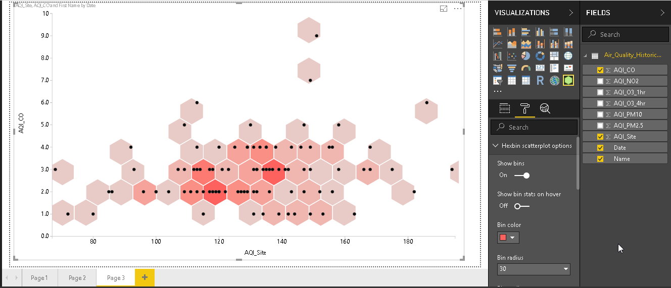
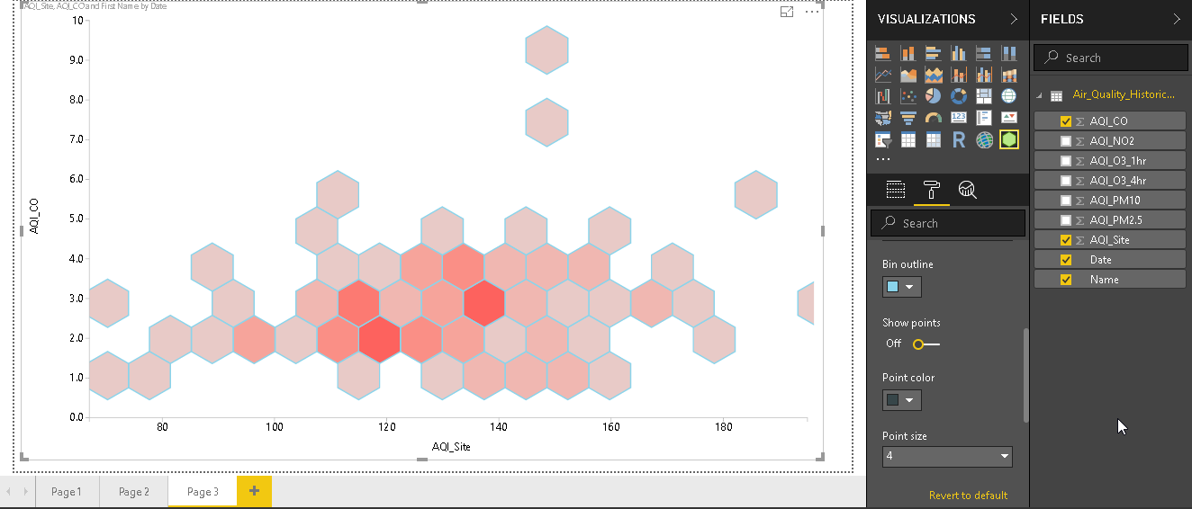
Now create the Hexbin Scatterplot by selecting the desired fields in the chart area similar to scatter plot. Below is the chart with various bins having dots and in different color shades.
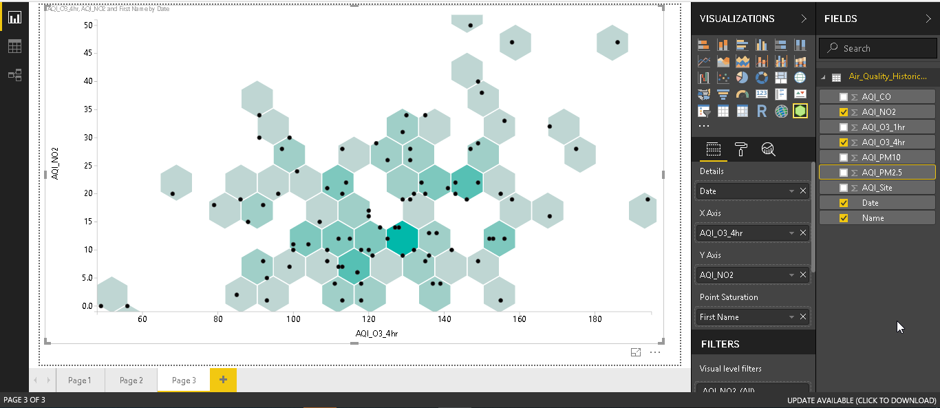
We can view each bin density by placing cursor over the bin.
As you can see, each bin contains multiple points which represent data points. If we point the cursor to any point, it shows the detailed value in a pop up box.
Change the data fields and the Hexbin Scatterplot is changed accordingly.
Hexbin Scatterplot formatting options
We might not need to these hexagonal bins in our analysis of the data. We can customize the hexbin scatterplot from the format section.
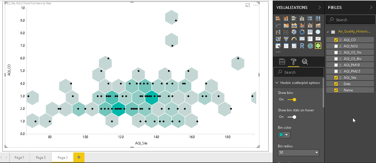
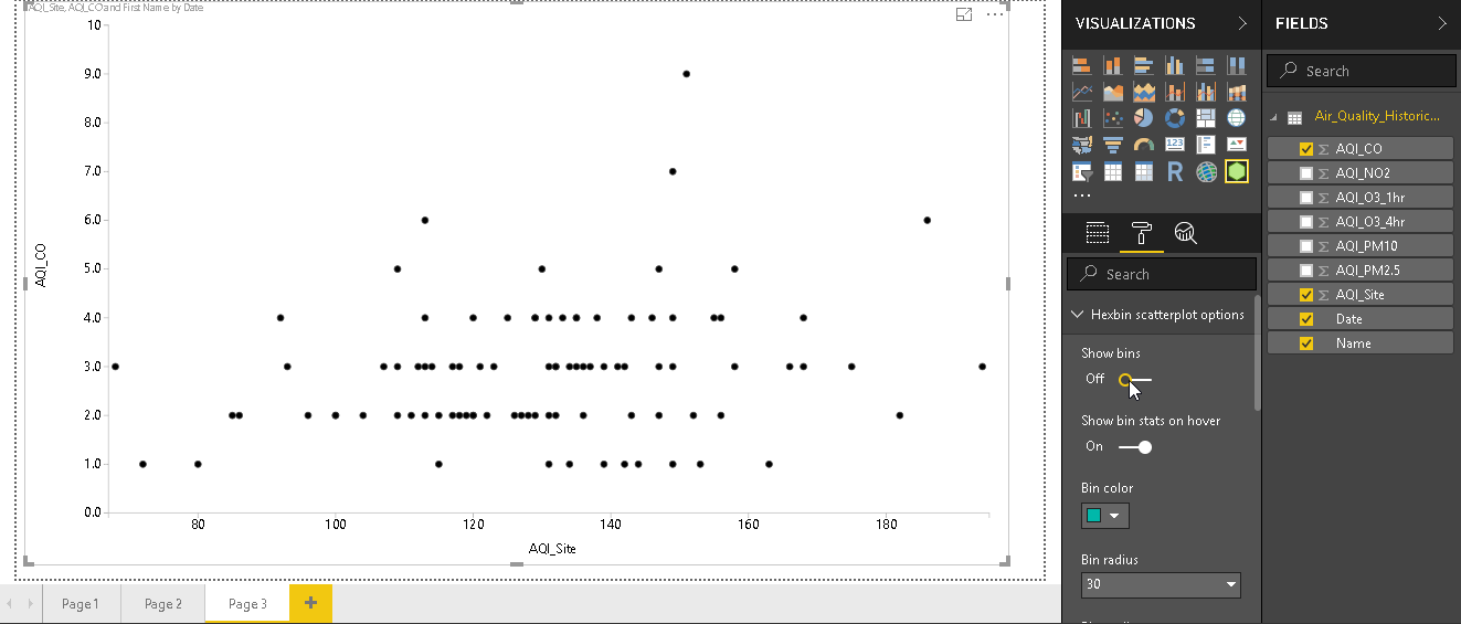
- Show bins: By default, show bins are ‘On’. Move this slider and turn it off. In below image, we can see just the data points without the hexagonal bins.

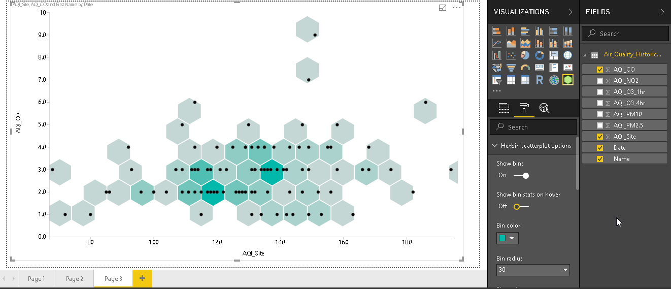
- Show bin stats on hover: Previously, we saw that if we hover the mouse over the data point, it shows the details in a tooltip pop up box. We can disable this property with ‘Show bin stats on hover’
- Bin Color: To do more customize chart, change the bin color as shown below.
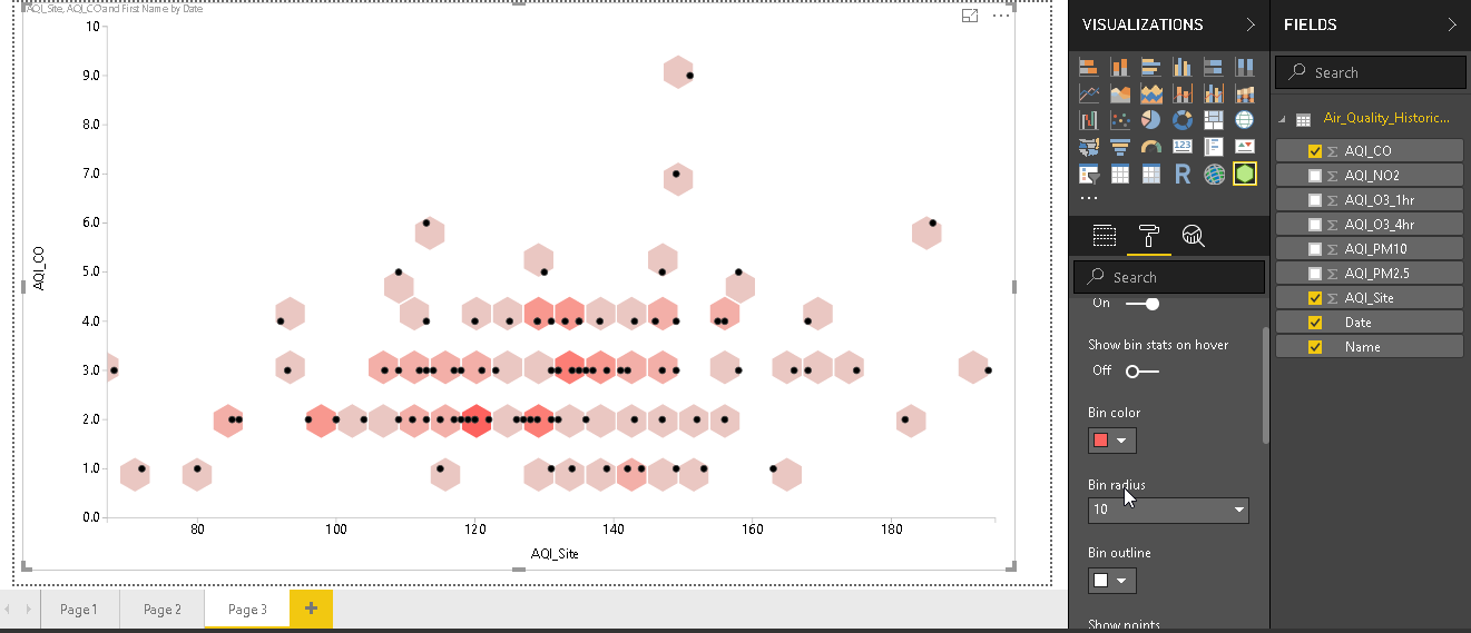
- Bin Radius: We can do more analysis that is granular by controlling the bin radius. The default bin radius value is 30. If we change it to 10, the hexagonal bin size gets smaller by 3 times.
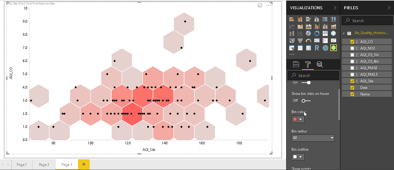
Similarly, if we change the bin radius to 40, bin size increases as accordingly.
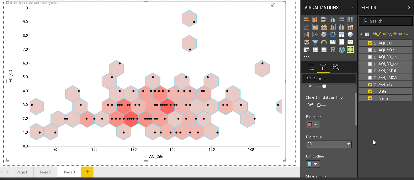
- Bin Outline: Each bin is connected with the other bin with a white bin outline. We can also change the bin outline color from the option ‘Bin outline’. In the below example, I changed the outline color and you can see the difference in the chart.
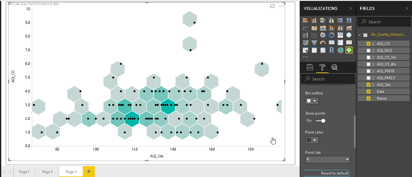
- Show Points: As stated above, the Hexbin Scatterplot contains dots in the hexagonal bins. If we do not want those dots, we can turn it off from the ‘Show Points’. Turning off show points can help us to examine the hexin scatterplot based on the bin density.
- Revert to Default: While doing the customization for the hexbin scatterplot, we can revert to the default format without any customized setting. We need to click on ‘Revert to default’ to do so.
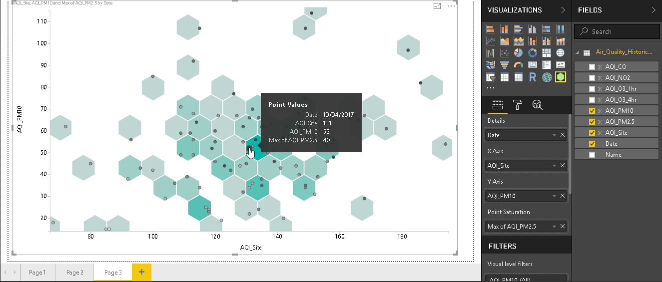
Using the point saturation, we can set the aggregation as well like average, min, max etc. for example, in below chart, we set the Point Saturation as ‘Max of AQI_PM2.5’. In the tooltip, also you can see the all columns value and point saturation value as ‘Max of AQI_PM2.5’
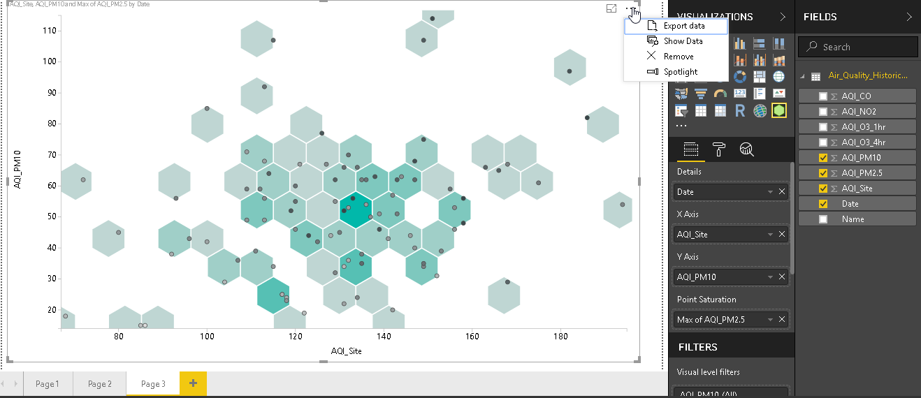
- Export and Show data: In the top right corner of the chart, we have the option to export the data and show data. We can export from the dataset using the ‘Export Data’ option.
Sometimes, we want to view the data as well in tabular form with the chart. We can do this with ‘Show Data’ option.
Once we click on ‘Show Data’ it divides the chart into two area
- Hexbin Scatterplot chart
- Data table

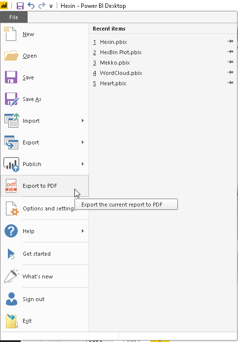
- Export: Let us export this chart into PDF format. Go to File -> Export to PDF. Provide the location and it exports the chart there.
You can open the file and view the chart.
Conclusion
The Hexbin scatterplot, in Power BI Desktop, provides a way to visualize data using various bins and data points based on the density. We can also use this chart with lots of customization options which helps us to do the analysis of complex data in a single chart.
Table of contents

I am the author of the book "DP-300 Administering Relational Database on Microsoft Azure". I published more than 650 technical articles on MSSQLTips, SQLShack, Quest, CodingSight, and SeveralNines.
I am the creator of one of the biggest free online collections of articles on a single topic, with his 50-part series on SQL Server Always On Availability Groups.
Based on my contribution to the SQL Server community, I have been recognized as the prestigious Best Author of the Year continuously in 2019, 2020, and 2021 (2nd Rank) at SQLShack and the MSSQLTIPS champions award in 2020.
Personal Blog: https://www.dbblogger.com
I am always interested in new challenges so if you need consulting help, reach me at rajendra.gupta16@gmail.com
View all posts by Rajendra Gupta
- Understanding PostgreSQL SUBSTRING function - September 21, 2024
- How to install PostgreSQL on Ubuntu - July 13, 2023
- How to use the CROSSTAB function in PostgreSQL - February 17, 2023