
Power BI Desktop amplifies the value of data. We can connect to multiple data sources and visualize the data interactively. One of the best parts of Power BI Desktop is the custom visual feature. It allows developers to create custom visuals and users can then download these visuals from the marketplace and use it as per the data set requirements. We can prepare reports using Power BI Desktop and share the reports using the Power BI service.
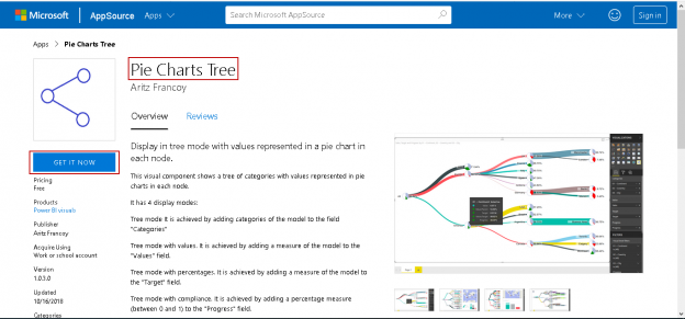
In this article, we will explore the Power BI Desktop custom visual ‘Pie Tree Chart’. We can represent hierarchical data in tree mode with the values in a pie chart for each node. It provides a different way to represent the data in the chart.
Importing Data into Power BI Desktop using Excel data source
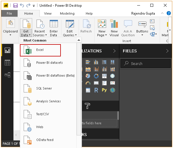
We will first import the data using Excel sheet into Power BI Desktop.
In Power BI Desktop, Click on the ‘Get Data -> Excel.’
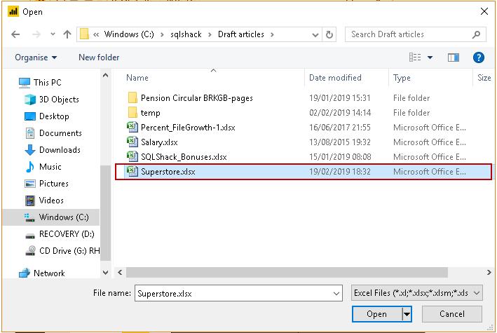
Provide the source Excel file path and click ‘Open.’
If you want to make any change in the data, you can click on ‘Edit’. We do not want to make any change in the data therefore, click ‘Load’.
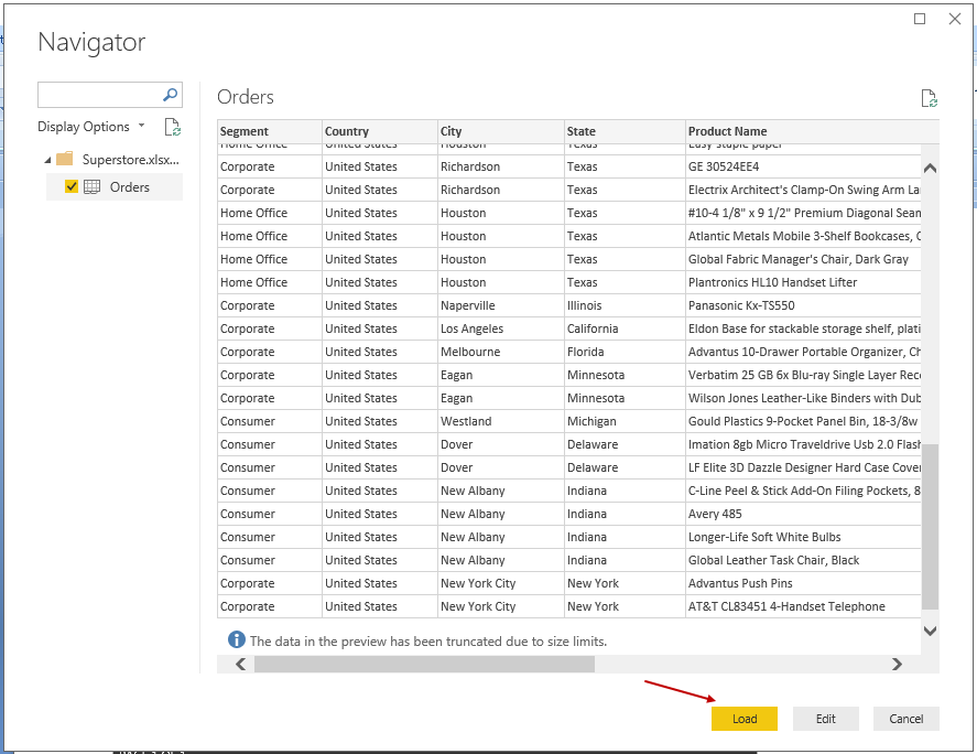
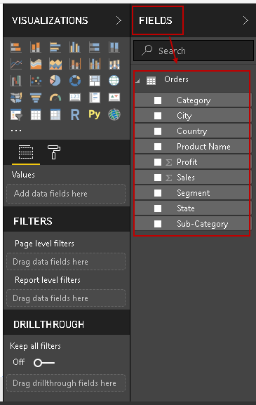
You can view the imported data set in the FIELDS area.
Importing Pie Chart Tree visuals from Marketplace into Power BI Desktop
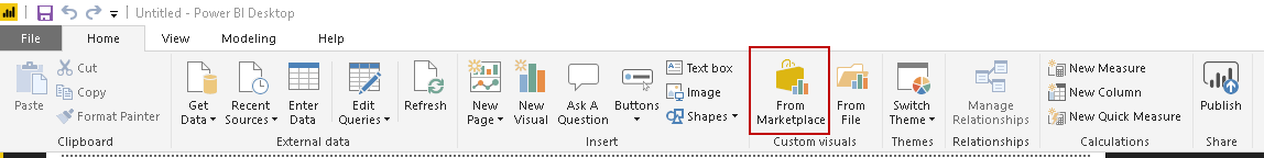
In the Menu bar, we can go to the Custom Visual Section. In this section, click on the ‘From Marketplace’
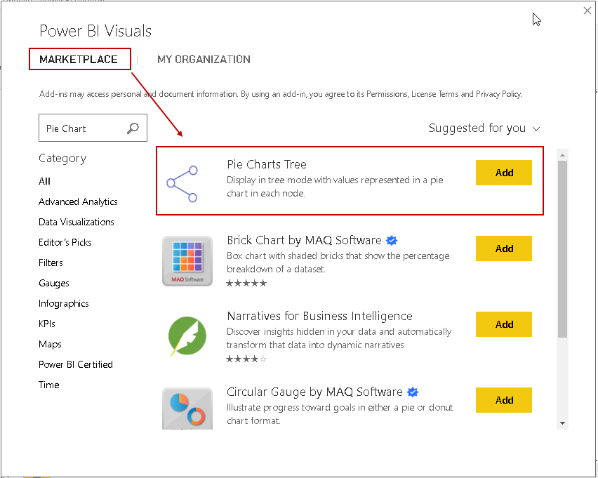
In the Power BI Visuals Marketplace, search for the Pie Chart Tree and add it.
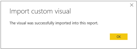
It downloads and installs the custom visual Pie Tree Chart.
You can also download the Pie Tree Chart from the Microsoft AppSource.

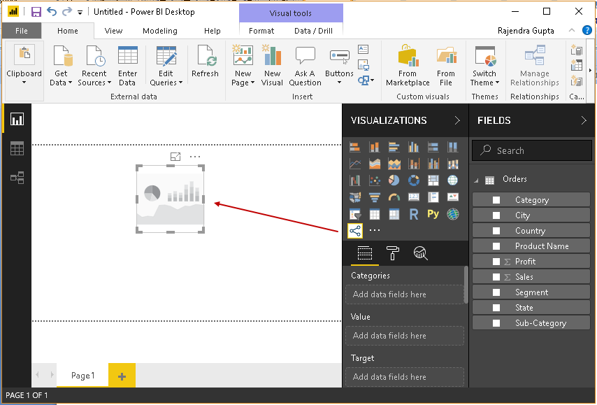
Preparing the Pie Tree Chart
We have sample data in Power BI Desktop along with the Pie Tree Chart. Click on the Pie Tree chart icon in the visualization section. It populates a chart image in the chart area of Power BI Desktop.
Drag the ‘Category’ field from the FIELDS section to the ‘Categories’ area. We get the first level of hierarchy using this.
In the following screenshot, you can see the product category in different lines. We have three categories in our sample data, i.e. Furniture, office Suppliers and Technologies. We can see the different colors for each category in the Pie chart Tree.
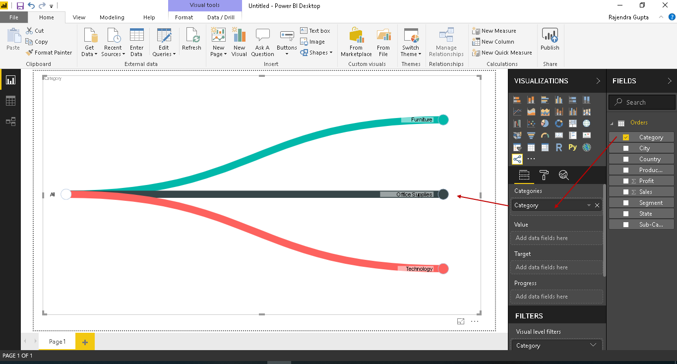
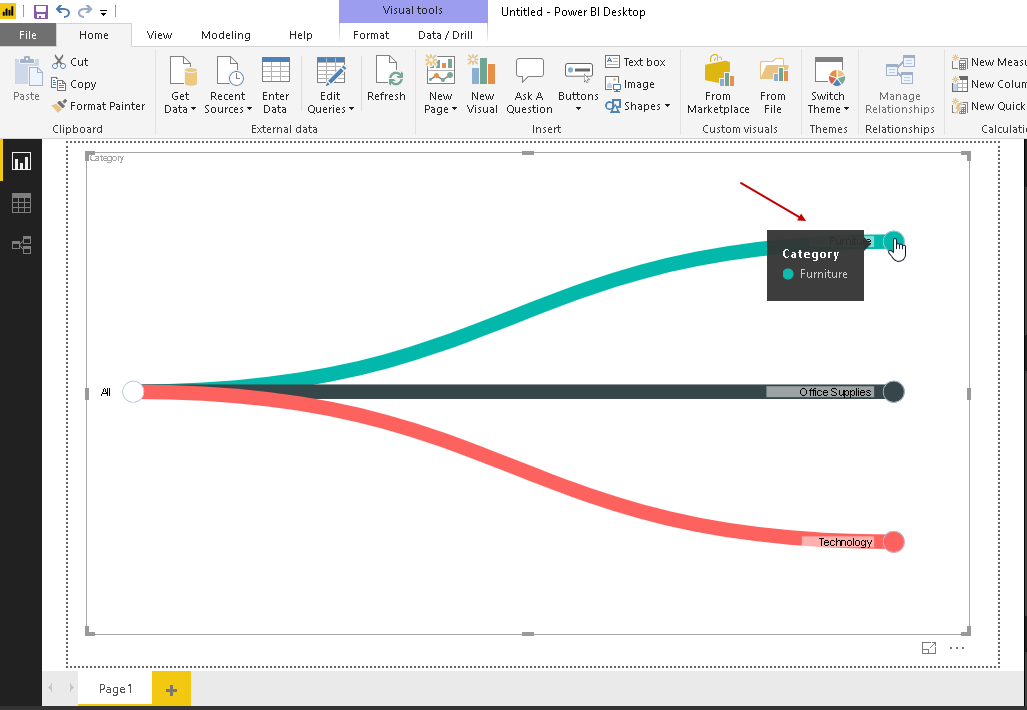
We can hover the mouse over the category, and you can see the particular category name in the pop-up box.
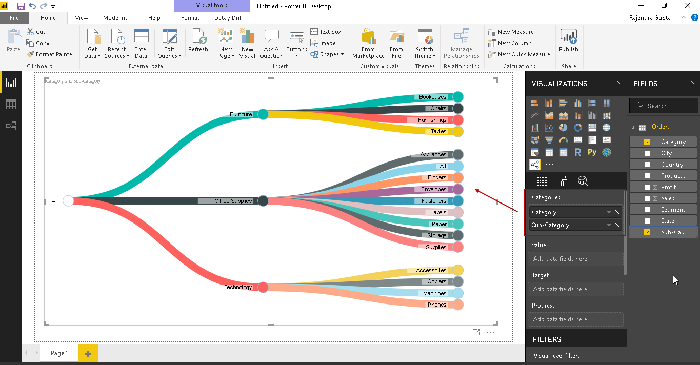
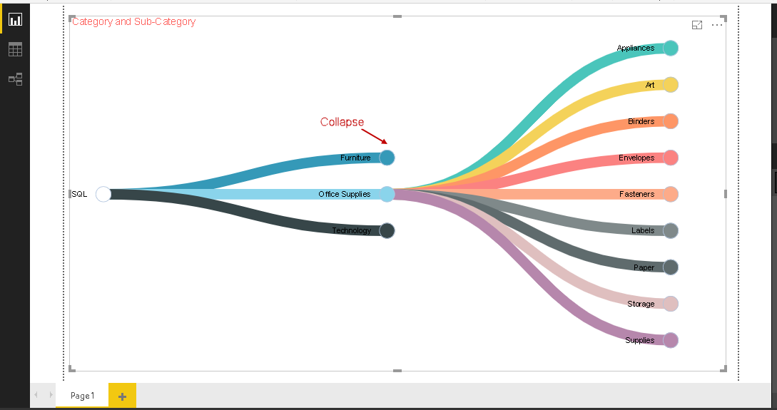
Now let us drag the sub-category field into the categories area. It quickly creates a new level of hierarchy for the sub-category of the products. You can see the sub-categories aligned with each category.
If we have many product categories and their subcategories, the chart becomes complex. Suppose we want to view any particular category, we can quickly view that particular category by collapsing others. In the example, we want to view the ‘Office Suppliers’ category, and then click on rest of two categories. It collapses those particular categories as shown below. In the below screenshot, we can easily view any particular category.
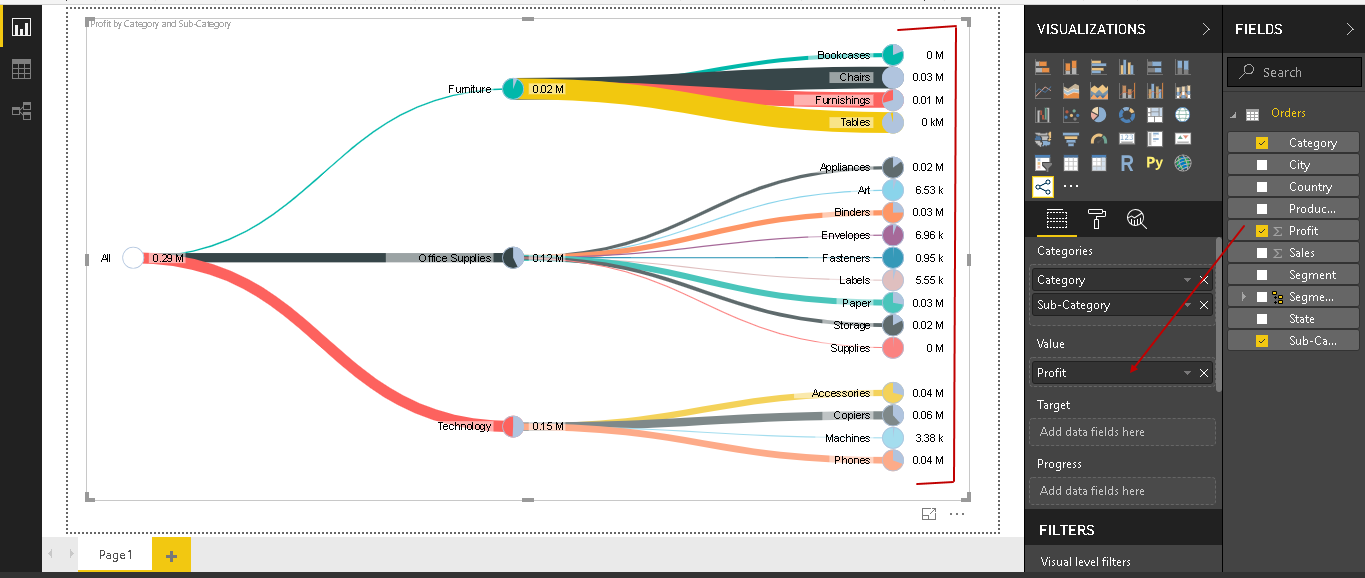
In the next step, we are going to add the values filed ‘profit’ into the ‘Value’ section, and we can see the value for each subcategory.
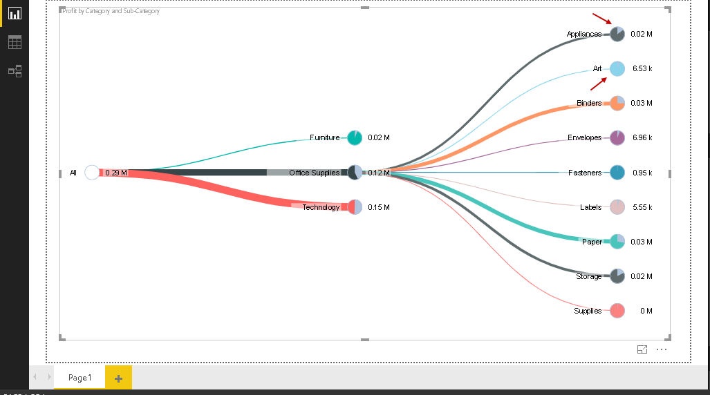
Let me focus on one particular category. We can collapse other categories by clicking on that.
In the Pie Chart Tree, you can notice the pie chart with each category and subcategory. In the Pie chart, it shows the percentage value of that particular category or subcategory however, chart shows the category and subcategory into tree form, this is the reason it is called as Pie Chart Tree.
We can have only one value corresponding to each subcategory. In the below screenshot, we can see the values for the ‘Sales’ field.
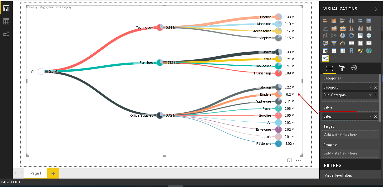
We can easily modify the chart conditions by dragging the required fields. Suppose we want to view the Pie Chart Tree for the sub-category followed by the category and their sales values. In the below screenshot, we will drag the sub-category and Category field to ‘Categories’ and Sales into values section.
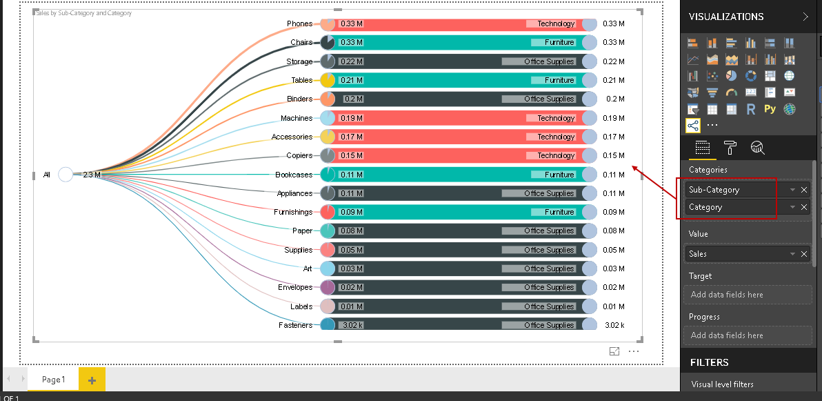
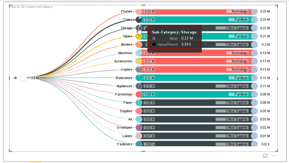
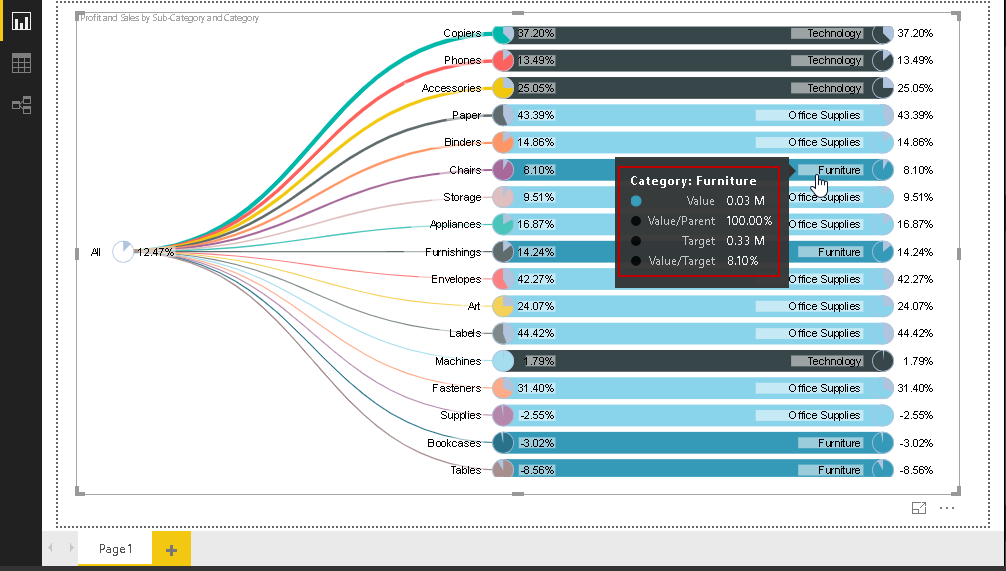
If we hover the mouse over any particular category, we can see the corresponding value and percentage value.
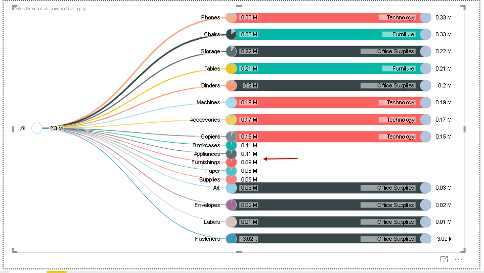
As highlighted earlier, we can have collapsed the particular category. In the below example, we can collapse the desired category while displaying the required category.
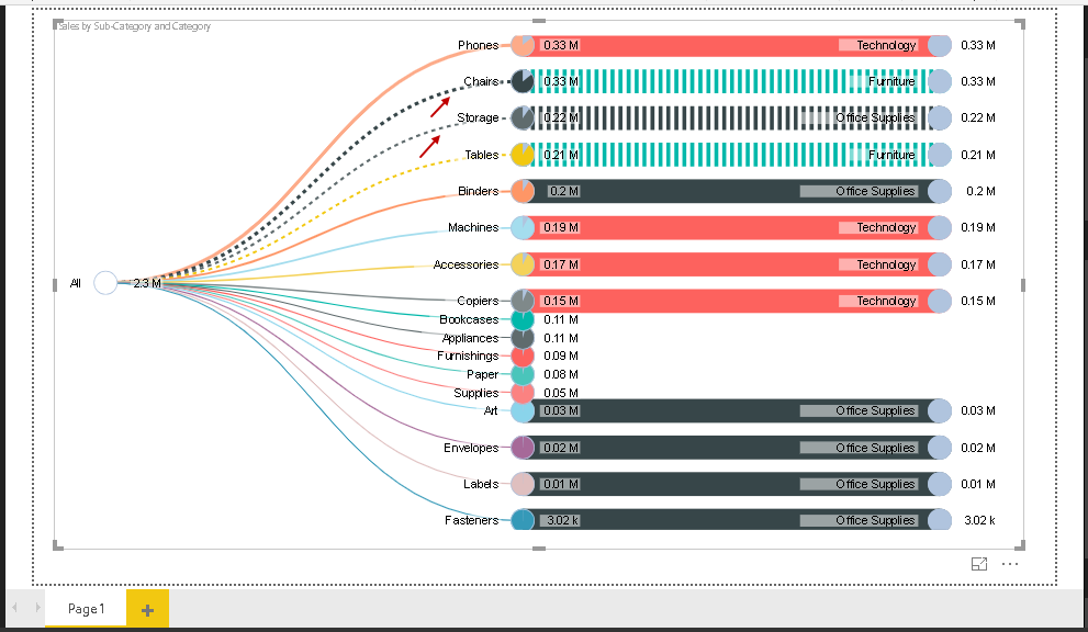
If there are multiple visuals in the page, you can click on the particular link to filter the result set. Once you click on the link, it shows that in the form of multiple dots.
In the next step, we will set the following fields. It prepares the Pie Chart Tree instantaneously with these fields.
- Categories: Sub-category and category
- Value: Profit
- Target: Sales
We can set the target to put the measure in the Pie Chart Tree in Power BI Desktop. It can help to put the target measure and do the analysis of the status as a comparison of the target.
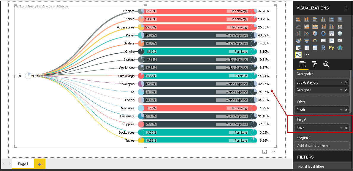
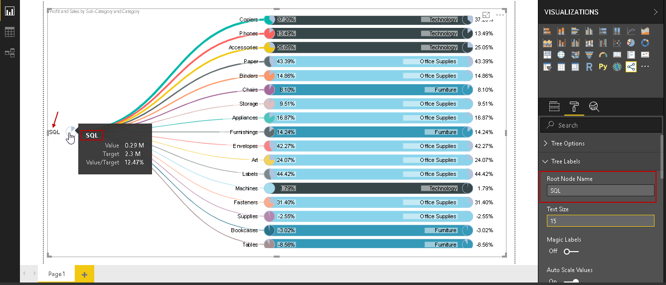
It adds a measured value to the tooltip as well. You can see the target value and target percentage in the tooltip for the particular category.
Formatting for the Pie Chart Tree
Once we have prepared the chart with the dataset, we can customize the Pie Chart Tree as per our requirements. In Power BI Desktop, we can click on the ‘Format’ to get all these formatting options.
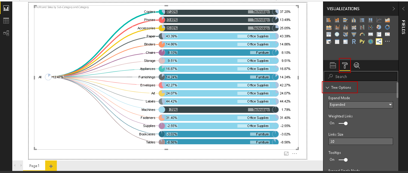
Let us explore these formatting options.
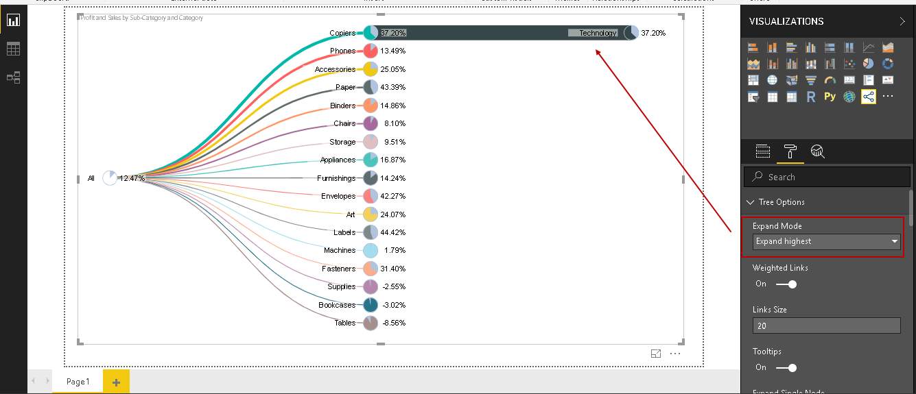
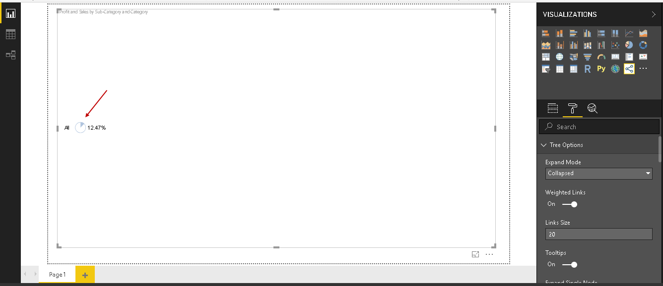
Tree Option – Expand Mode: We can control the tree expand behaviour using this property. By default, it is set to ‘Expanded’. In this mode, we can see all nodes expanded in the Pie Chart Tree.
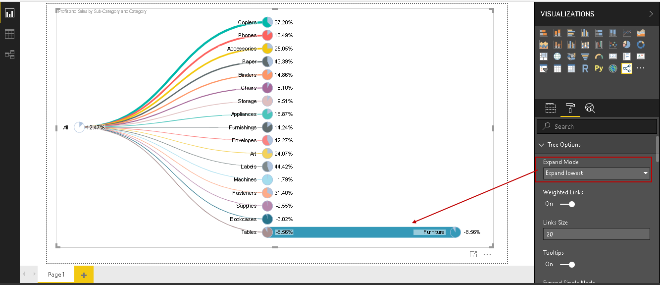
We have the following, other modes.
- Expand Lowest: it only expands the lowest category in the Pie Chart Tree as shown below

- Expand Highest: It expands the top category in the Pie Chart Tree
- Collapsed: In this mode, all the nodes are collapsed
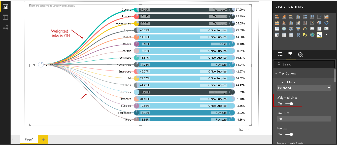
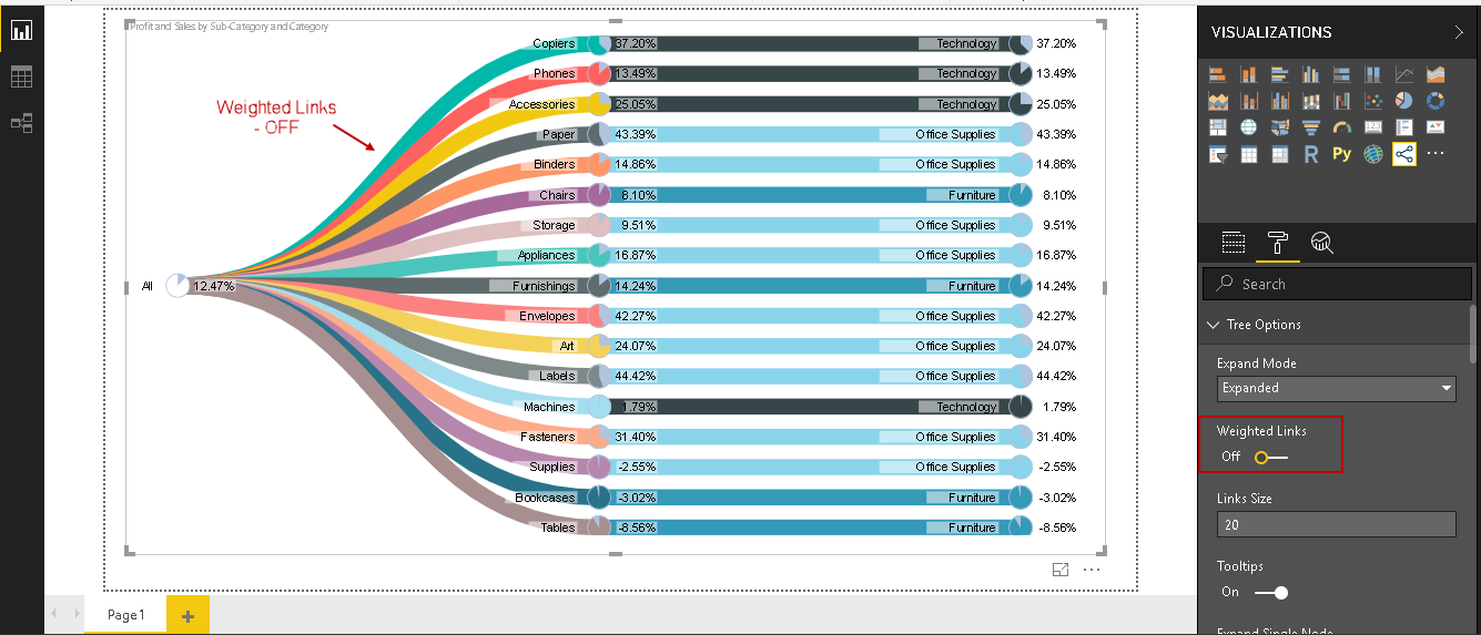
Weighted Links: By default, all the links width is displayed as per their category weight. If we turn it OFF, we get the same width for the links as shown below.
Weighted Links – ON
Weighted Links – OFF
Tooltips: It controls the tooltip behaviour in the Pie Chart Tree. If we hover the mouse over any category, it shows the information in the tooltip. We can disable this behaviour by turning ‘Tooltips – OFF.’
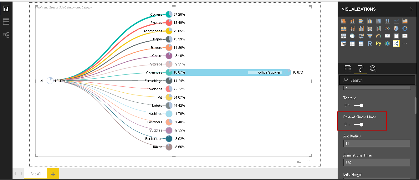
Expand Single Node: We can expand only a single node using this property. We can see below only one node is expanded. This property is disabled, by default.
Tree Labels- Root Node Name: In the Pie Chart Tree, we can see the root node as ‘All’. We can control the root node name using this Root Name property.
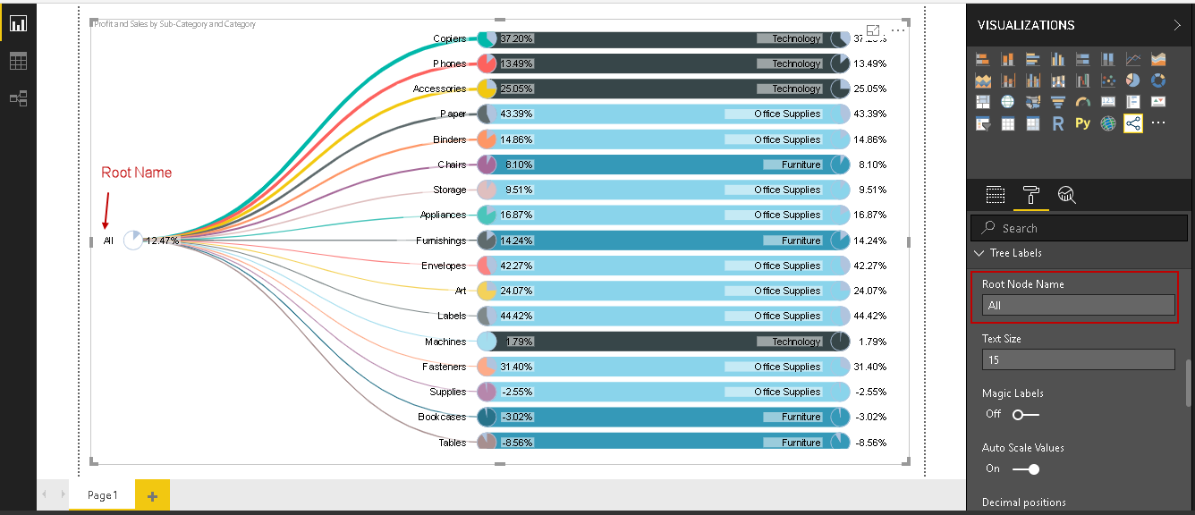
Let us change this to ‘SQL’.
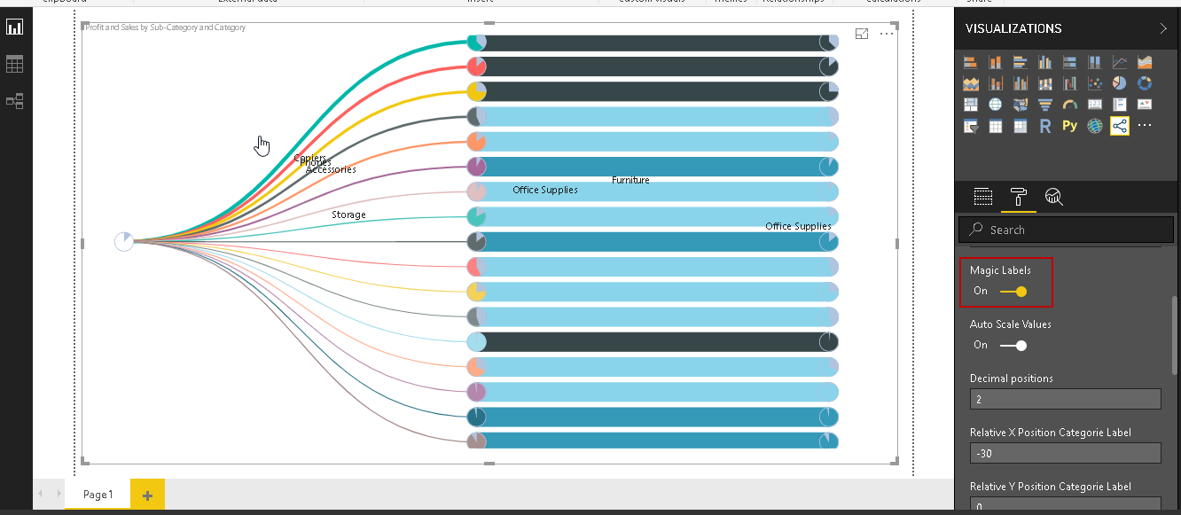
Magic labels: By default, we see the labels with each node. If we turn on the Magic Labels, we will not see the label against each node. It shows the label as we move the mouse around it.
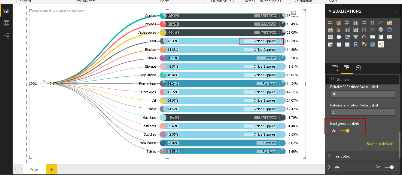
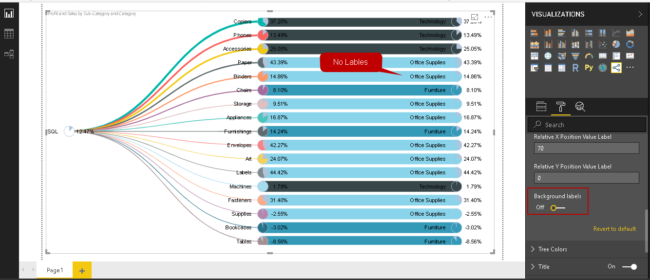
Background labels: We see a background for each label in the Pie Chart Tree. It helps to visualize and read the labels in a better way.
If we do not want to label background, turn if ‘OFF’ and you can see the difference in the label.
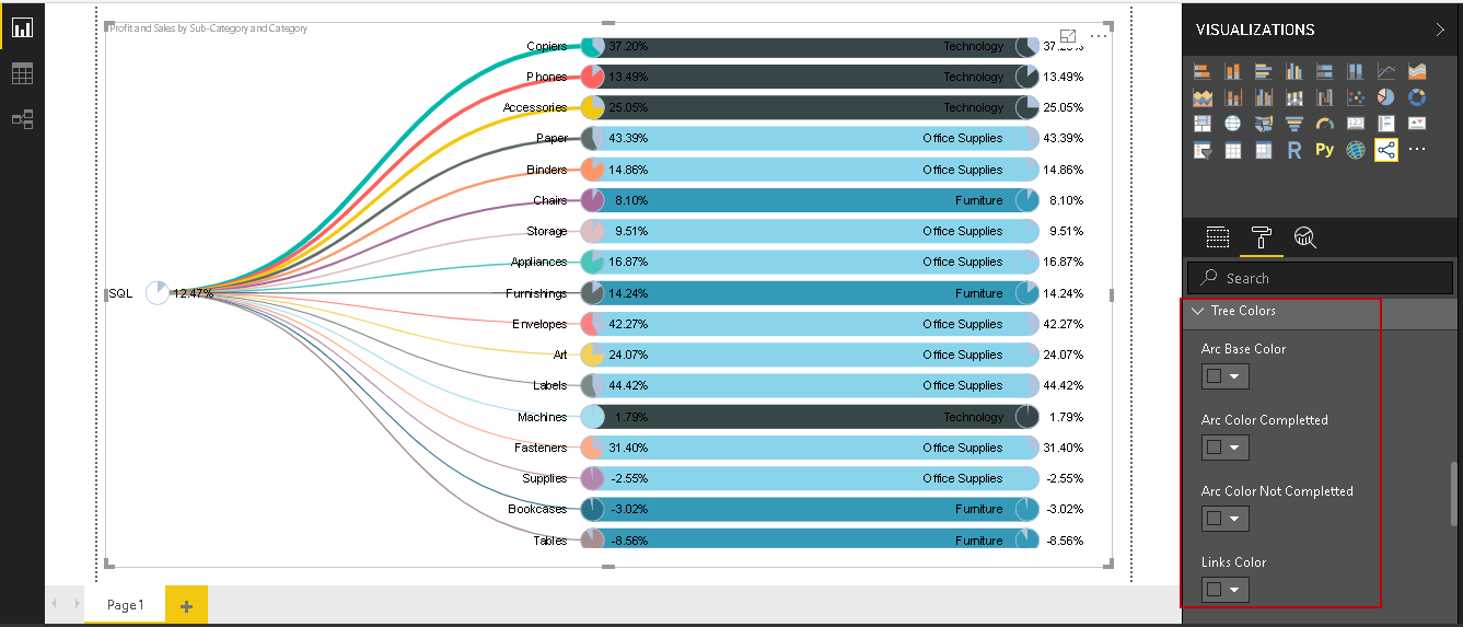
Tree Colours: We can control the tree colours using this property. It allows controlling the Arc Base, Arc colour, Link colour etc. We should make the change if there is any particular requirement only.
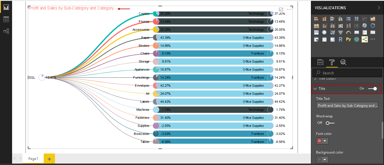
Title: We can customize the Pie Chart Tree title, colour, font, alignment, background colour using this property. In the below screenshot, you can see the modified title.
Conclusion
In this article, we explored the PowerBI Desktop Pie Chart Tree that provides a useful combination of both the Pie chart and the Tree Chart to represent hierarchical data with their values and proportion.
Table of contents

I am the author of the book "DP-300 Administering Relational Database on Microsoft Azure". I published more than 650 technical articles on MSSQLTips, SQLShack, Quest, CodingSight, and SeveralNines.
I am the creator of one of the biggest free online collections of articles on a single topic, with his 50-part series on SQL Server Always On Availability Groups.
Based on my contribution to the SQL Server community, I have been recognized as the prestigious Best Author of the Year continuously in 2019, 2020, and 2021 (2nd Rank) at SQLShack and the MSSQLTIPS champions award in 2020.
Personal Blog: https://www.dbblogger.com
I am always interested in new challenges so if you need consulting help, reach me at rajendra.gupta16@gmail.com
View all posts by Rajendra Gupta
- Understanding PostgreSQL SUBSTRING function - September 21, 2024
- How to install PostgreSQL on Ubuntu - July 13, 2023
- How to use the CROSSTAB function in PostgreSQL - February 17, 2023