
Power BI desktop helps to create interactive reports and dashboards from a high and complex volume of the data. The Power BI desktop is an integrated tool where we can get the data from different sources.
In this article, we are going to explore the below points
- Power BI Data Sources
- Importing data into Power BI
- Adding Chord diagram for Power BI Visualizations
- Examples of to create and learn Chord diagram
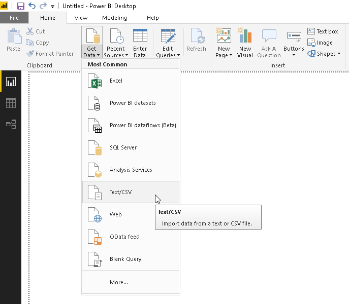
Importing Data into Power BI Desktop
We can get the data from the different sources as mentioned above and transform them into business intelligence reports, charts, different kinds of visualization etc.
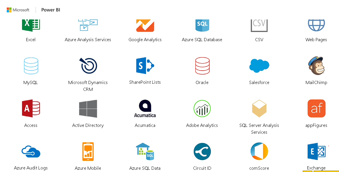
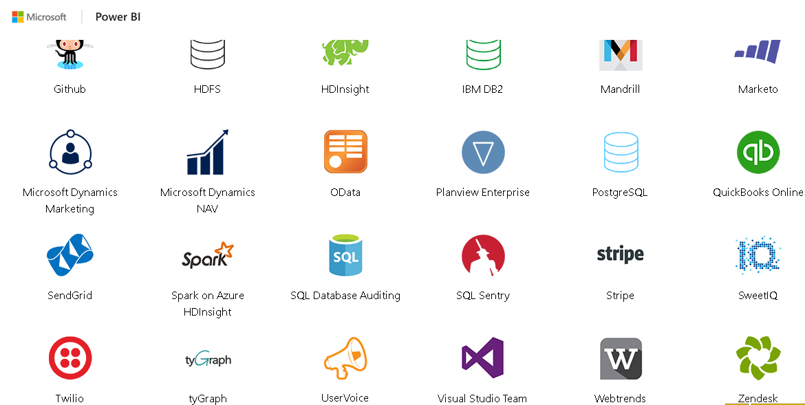
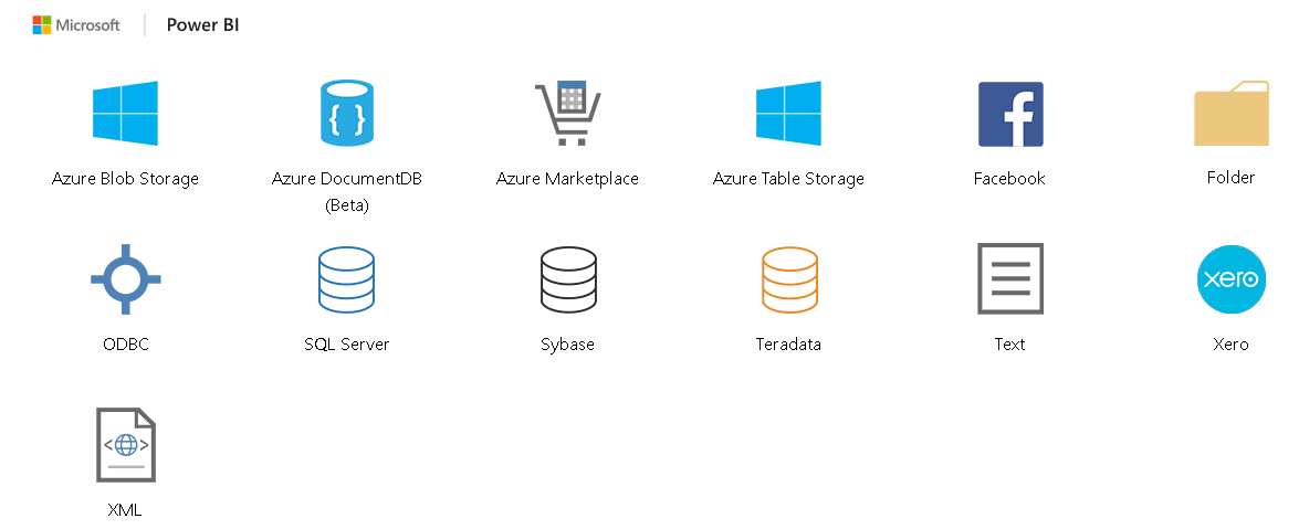
As per the PowerBI Microsoft, the sources we can pull data are:
File | Excel Text, CSV, XML, JSON, Folder, Sharepoint folder. |
Database |
|
PowerBI |
|
Azure |
|
Online Services |
|
Other |
|
Power BI provides many open source visuals to extend the features and functionality of presenting data using Power BI. We can download the different charts, visual from the the Power BI marketplace. We need to login to the Power BI Marketplace using the corporate, work account.
Adding Chord diagram in Power BI Visualizations
Chord diagrams provide an easy way to define the interrelationship data visualization in a matrix. A circular diagram represents the relationship among a group of entities. We connect data points in the form of an arc in chord diagram.
.
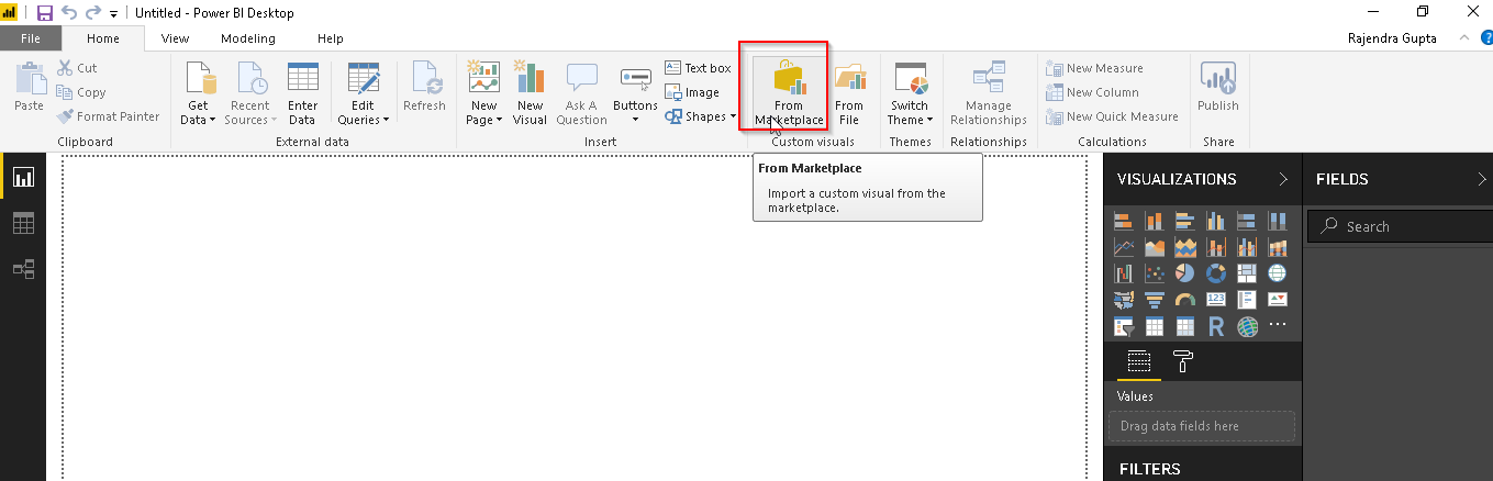
As stated above, we can add the visualizations from the marketplace. Launch Power BI Desktop to add and create more visualization.
Click on ‘From MarketPlace’. We should have an active internet connection available to connect to the marketplace.
In the marketplace, we can see different Power BI Visuals. Power BI provides some suggestions based on our usage. We can also search for any visuals available in the Power BI Desktop.
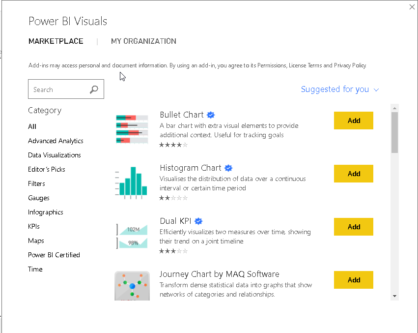
In this article, we are going to use Chord visual. Type ‘Chord’ in the search box and enter. It gives the result of the specific visual based on the search condition. We can also get small descriptions for particular visual as well. A chord diagram is freely available visual to add into the Power BI desktop.
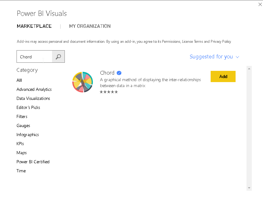
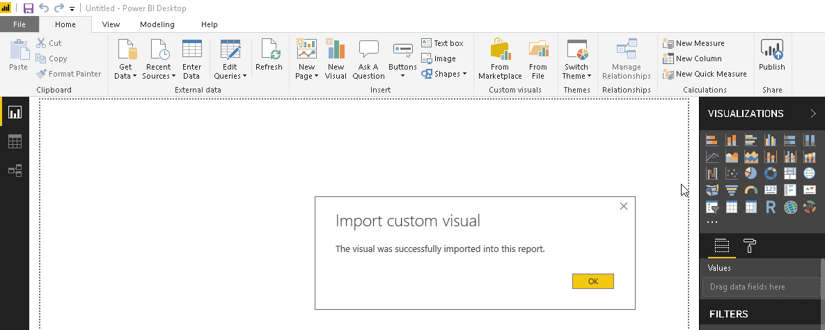
Click on Add to import the Chord visual in the Power BI Desktop. We get the message once the import operation is completed.
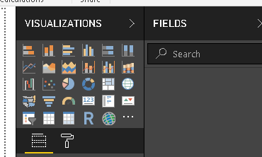
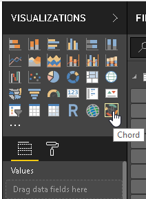
Once the import is completed, we can see that chord visual in the Visualization section as shown below.
If we do not have internet connectivity on the server, we can install the chord diagram from Appsource separately and import the file into Power BI Desktop.
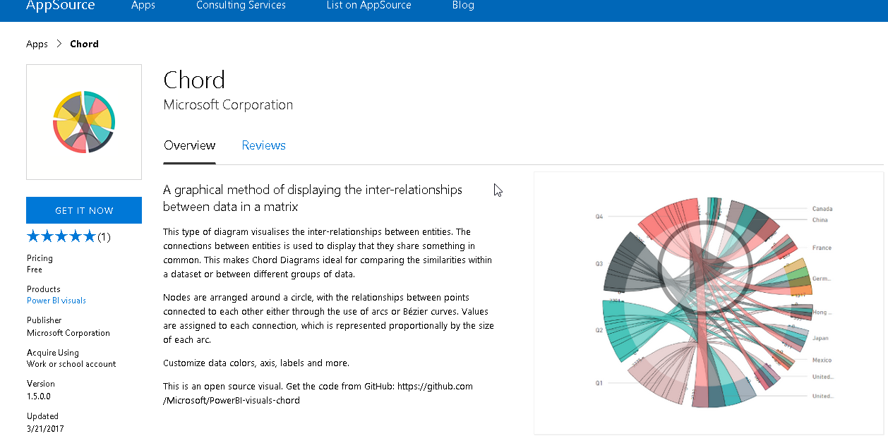
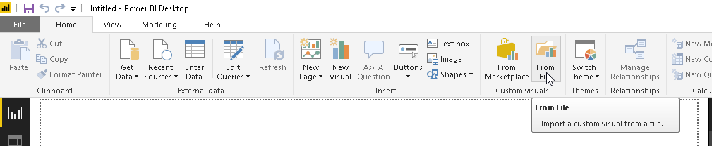
Click on ‘Get It Now’. Download the file and import file by using option ‘From File’
Example 1: Hair preference data analysis using Chord diagram
To demonstrate the Chord diagram or visual, we will use the data from the GitHub.
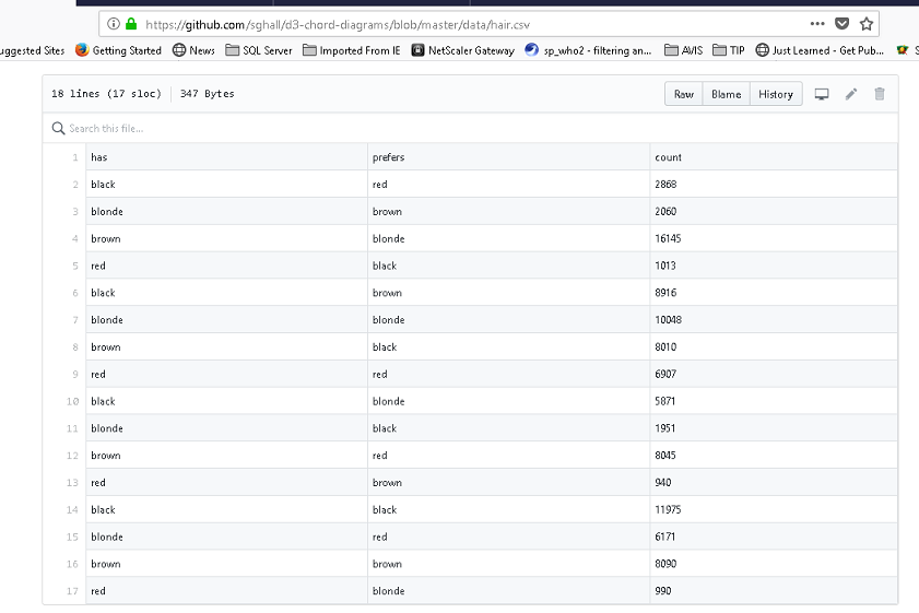
Click on Raw and it gives the data in below format.
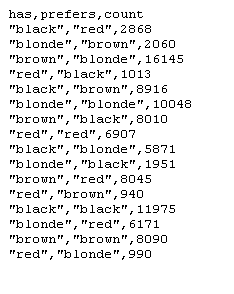
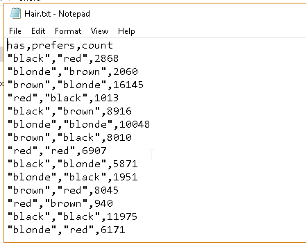
Copy the data and paste into the .txt file and save it.
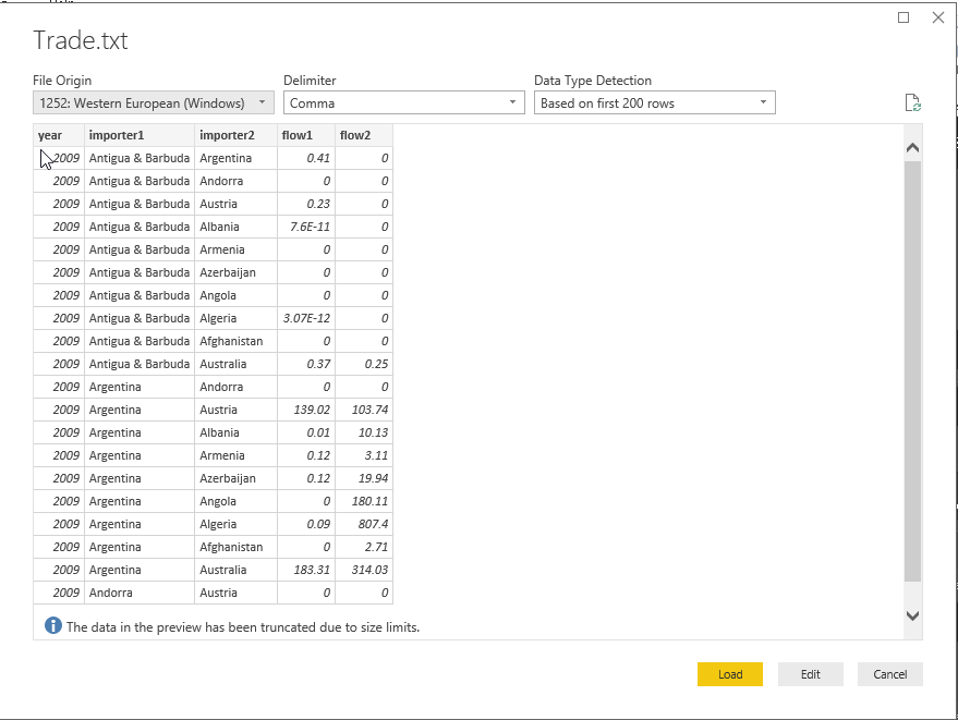
In the next step, we will import this data into Power BI. Therefore, go to Power BI Desktop and get data->Text\CSV
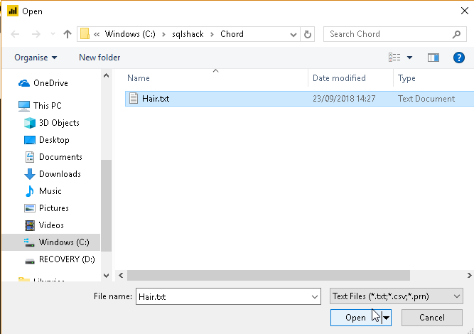
Now go to the path where we saved our sample data hair.txt file and click on open.
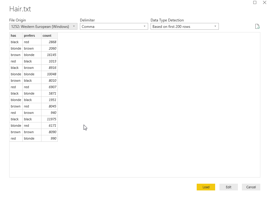
It shows the preview of the data. Click on ‘Load’ at the bottom.
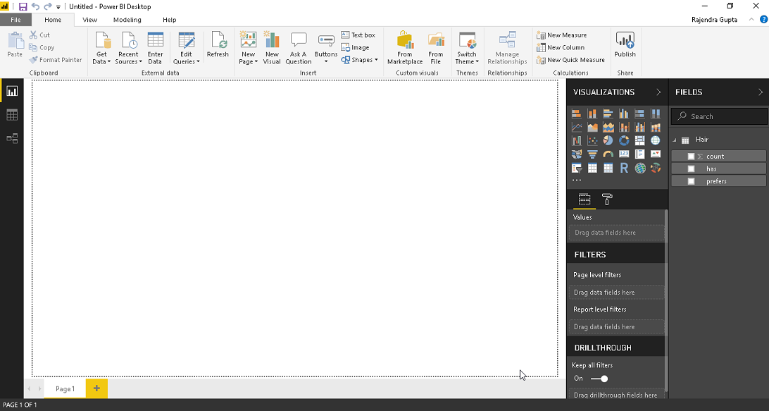
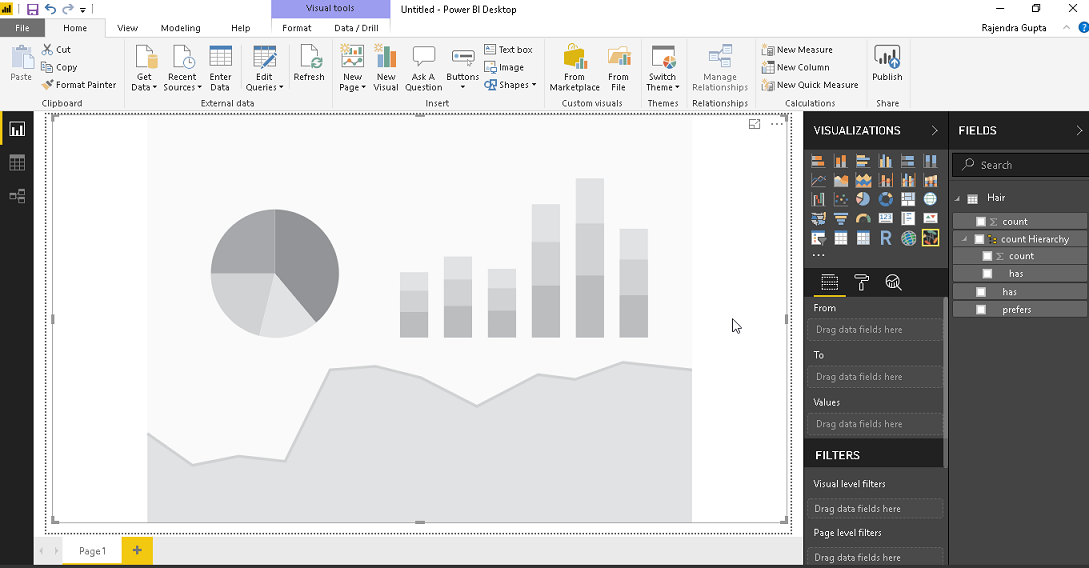
Now we can see the data fields on the right side.
Once we have the data into the Power BI Desktop, we need to plot that data using the chord diagram. Click on the chord icon from the visualization tab. Expand the chord diagram to the screen size and it looks as you can see here.
Now to show the data on Chord diagram, move the fields from the dataset to chart options as below
From | To | Values |
Count hierarchy | Prefers | Count |
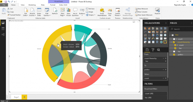
We can see the chord diagram with data visualization as per our example. We can see that each category represents different color and are interconnected to each other in the form of arcs.
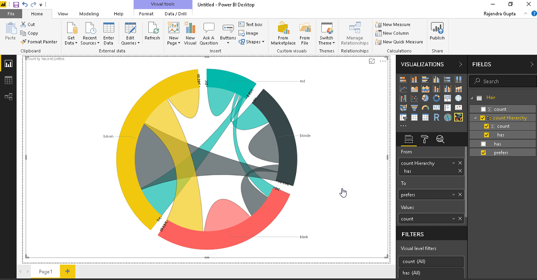
A chord diagram is an interactive visual to read through. If we hover mouse to a particular arc, we can see the data distribution as per the data matrix.
For example, in below we can see
Black -> brown 8,916
Brown -> black 8,010
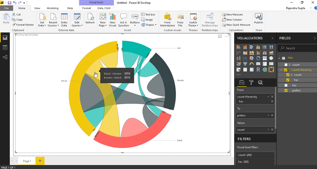
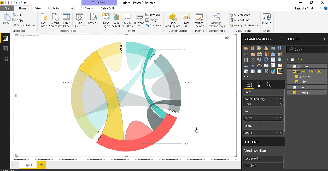
We can click on any particular category to highlight that category.
Example 2: Trade data analysis using Chord diagram
Now let us look at data that are more complex again from GitHub. Follow the same process to put the data into the Power BI dataset. Below is the sample data we are going to use in this example.
In order to display, this trade data into a chord diagram, again add the fields into corresponding sections.
From | To | Values |
Importers1 | Importers2 | Flow2 |
This produces the complex chord diagram with the conditions specified.
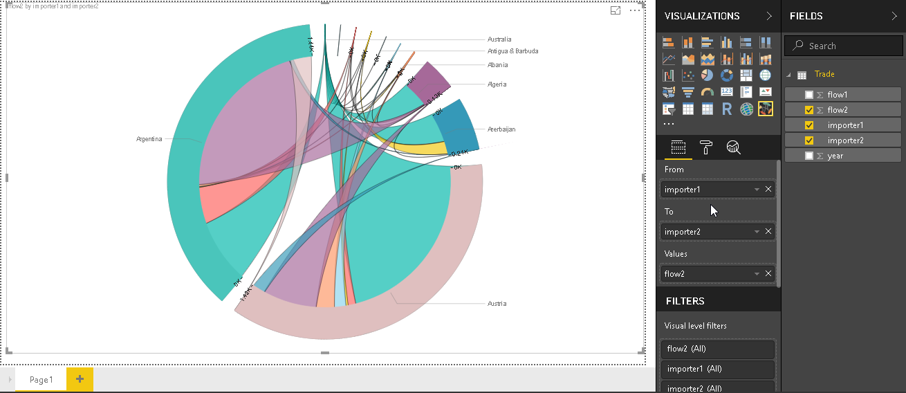
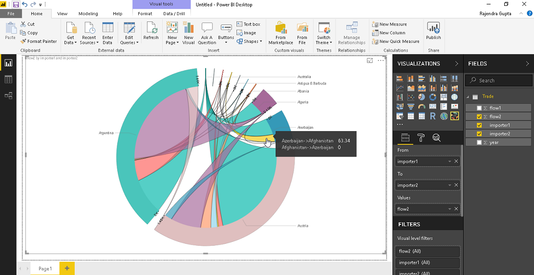
We can get the values about the trade from one country to another by simply move the mouse over the category. This shows up the values in a pop up box.
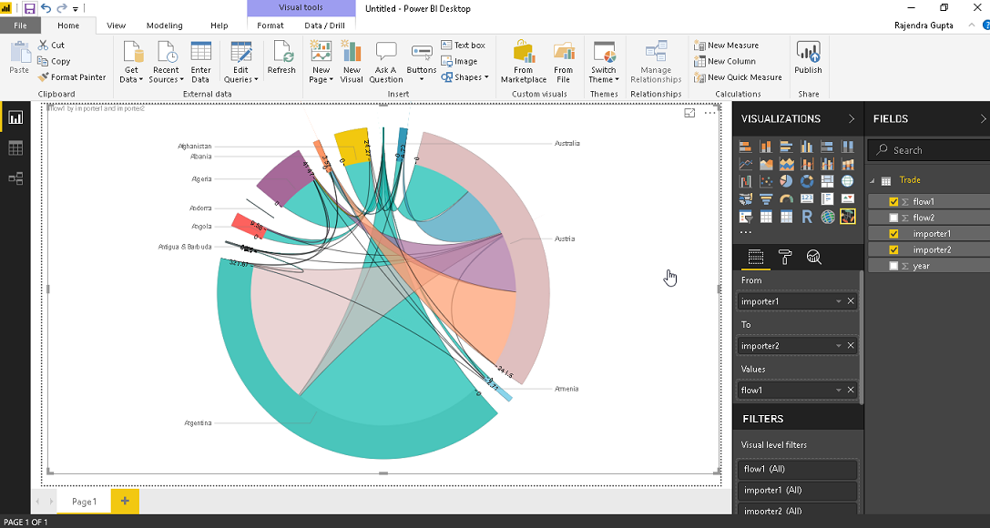
It is a very quick way to create the chord diagram. For example, we want to create the chord diagram as per flow1 column in our data sample. Simply move the field to values column and chart is updated quickly.
Filter out the data in Chord diagram
We can plot a chord diagram with very complex datasets. In this case, it becomes difficult to understand the data. In this case, we might want to filter out the diagram based on particular condition.
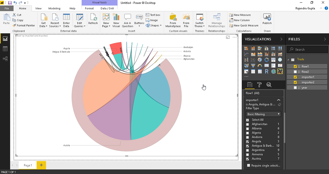
For example, if we want to filter the data from any particular country in our example, click on basic filtering and select the required country for which we want to see the data into a chord diagram. In below example, I have filtered out for ‘Antigua & Barbud’ and it shows the trade data for this county.
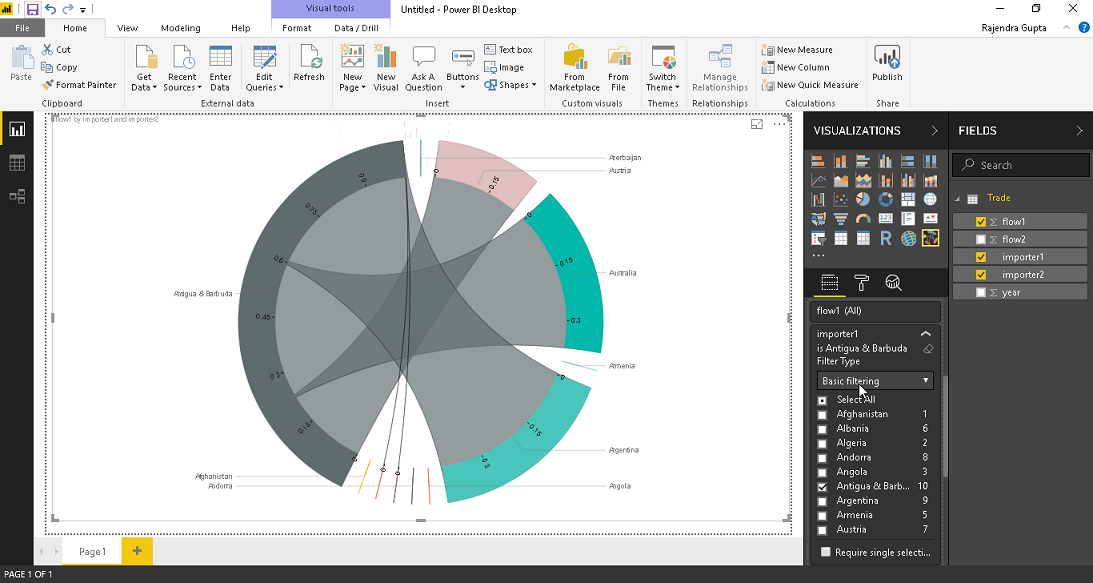
We can do multiple selections in the filter condition as shown below.
Conclusion
We can use Chord visualizations in Power BI desktop to study complex data relationships effectively. Explore this feature in Power BI for your environment.
Table of contents

I am the author of the book "DP-300 Administering Relational Database on Microsoft Azure". I published more than 650 technical articles on MSSQLTips, SQLShack, Quest, CodingSight, and SeveralNines.
I am the creator of one of the biggest free online collections of articles on a single topic, with his 50-part series on SQL Server Always On Availability Groups.
Based on my contribution to the SQL Server community, I have been recognized as the prestigious Best Author of the Year continuously in 2019, 2020, and 2021 (2nd Rank) at SQLShack and the MSSQLTIPS champions award in 2020.
Personal Blog: https://www.dbblogger.com
I am always interested in new challenges so if you need consulting help, reach me at rajendra.gupta16@gmail.com
View all posts by Rajendra Gupta
- Understanding PostgreSQL SUBSTRING function - September 21, 2024
- How to install PostgreSQL on Ubuntu - July 13, 2023
- How to use the CROSSTAB function in PostgreSQL - February 17, 2023