
Power BI Desktop helps to visualize complex data with the help of inbuilt and custom visualizations. It allows integrating data from the various data sources and preparing visualization from it.
Microsoft recently integrated the Python programming language in the Power BI. Python is a powerful object-oriented language and is used by the data analyst and scientist to analyze complex datasets. We can now use the Python as a preview feature in the Power BI August 2018 release onwards. We can now use Python scripts to generate custom visualization. The combination of these technologies is akin to 1 + 1 = 3 or like the famous ad for Reese’s Peanut butter cups, when chocolate was introduced to Peanut Butter 😉
Getting started
We should install the Python in the system before we can use the Python scripts in Power BI. Go to the Python Download page and download the installer based on the OS version.
Once the appropriate Python download is completed, click on the installer file to launch it.
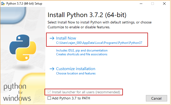
You can choose the highlighted options to install Python for all users. You can enable the option ‘Add Python 3.7 to PATH’ to add this into the environment variable. We will do it manually at a later stage, therefore leave this option unchecked.
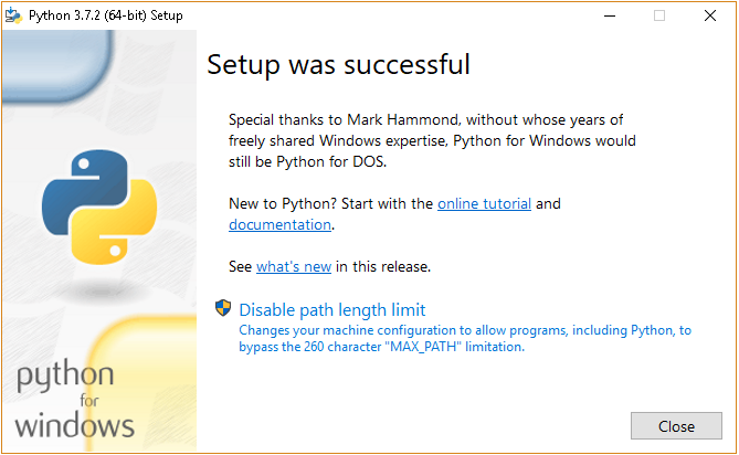
Once the set up is completed, you get the following message ‘Setup was successful’.
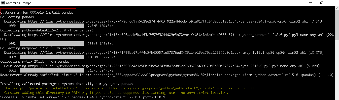
We need to install two Python packages, i.e. Pandas and Matplotlib using the command prompt. Open the command prompt and execute the command. Pandas is an open-source data analysis tool for Python.
Pandas is an open-source, BSD-licensed Python library providing high-performance, and easy-to-use data structures and data analysis tools for the Python programming language
|
1 |
pip install pandas |
It downloads the required packages along with its dependencies.
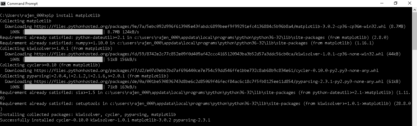
Similarly, we need to install the Matplotlib plotting library for the Python programming language with the below command
|
1 |
pip install matplotlib |
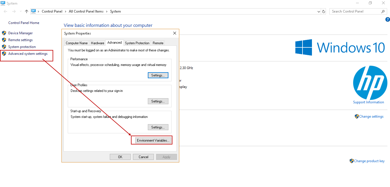
In the next step, we need to add the Python folder path in the environment variable. Right click on the computer and view properties. In Properties, go to the advanced system settings, click on the ‘Environment Variables’
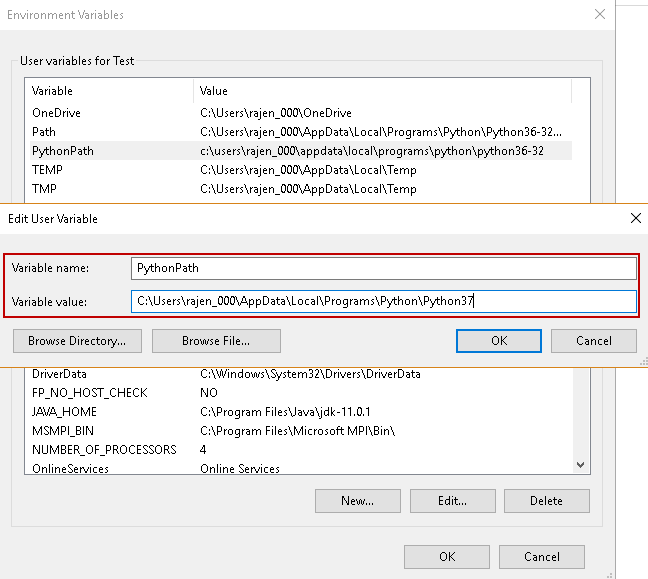
In the Environment Variables, click ‘New’, and it opens a pop-up box.
Enter the below details in the edit user variable page.
- Variable Name: PythonPath
- Variable Value: C:\Users\rajen_000\AppData\Local\Programs\Python\Python37
We have set up the environment until now to use Python. Now we are going to look at using the Python in the Power BI.
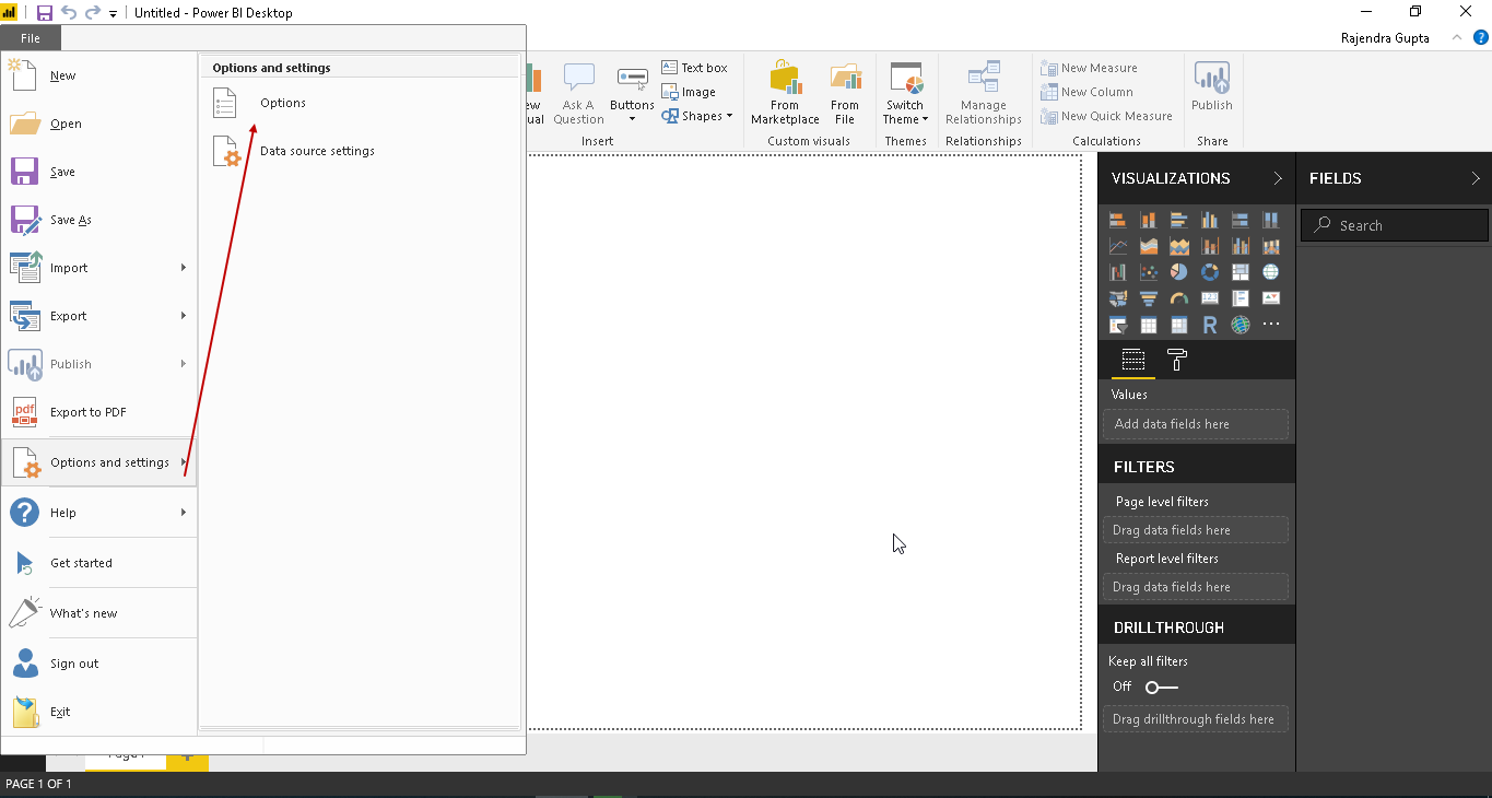
As stated earlier, Python is a preview feature in the Power BI. We need to enable it explicitly to use this feature. Launch the Power BI and go to ‘Options and Settings -> Options’
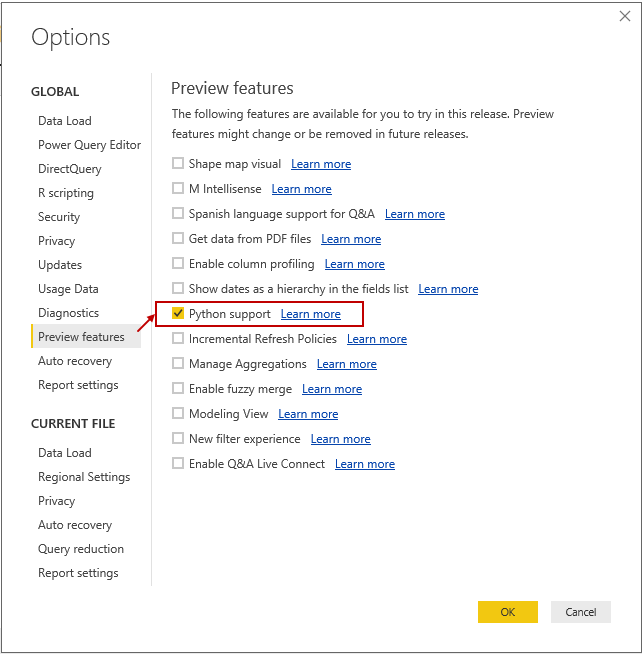
In the ‘Options’ page, go to ‘Preview Features’. Here, we need to enable the option ‘Python Support’. You can click on the hyperlink ‘Learn more’ to get more details about this.
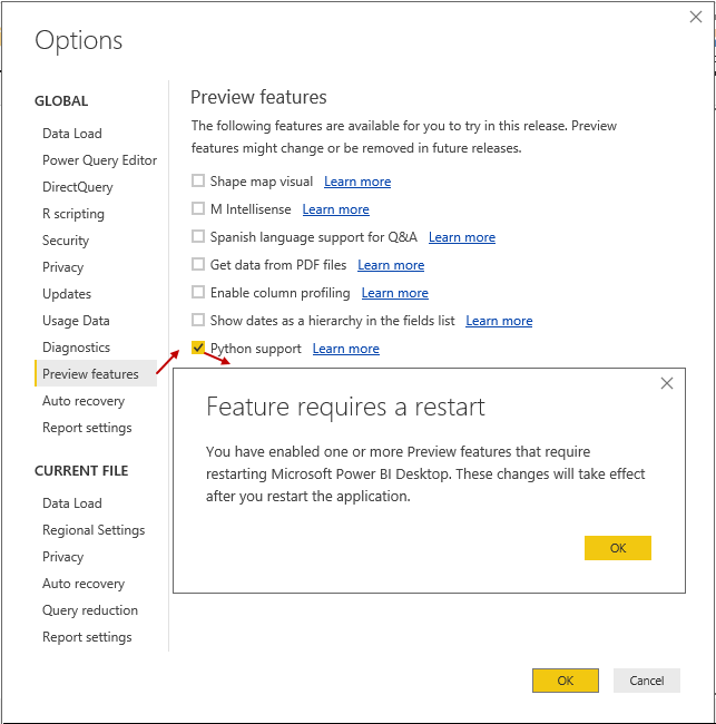
Click ‘OK’, and we get the following message. We need to restart the Power BI to enable the preview feature ‘Python Support’.
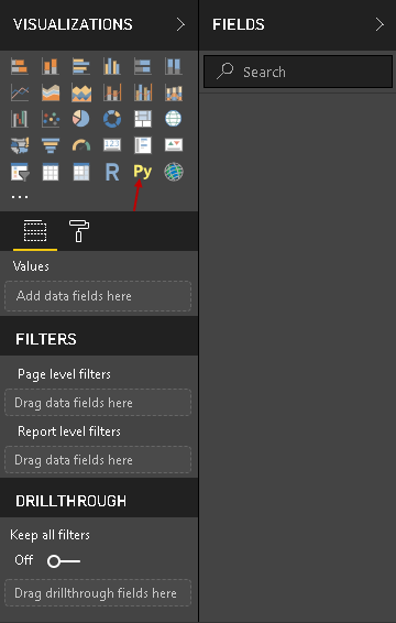
Once we again launch the Power BI, in the following image, you can see the Python visual in the ‘Visualization’ section.
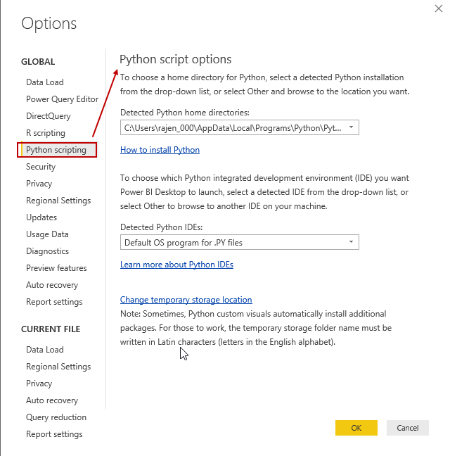
Once we have enabled the Python in power BI and restarted it, we can verify it from the Options page again. Here, you get the new option ‘Python scripting’. In this ‘Python Scripting’, we can change the python home directories, temporary locations and Python IDE locations, however; we are going to leave the default configurations.
Note: If you are having multiple Python versions installed on the system, verify that the Python home directories should match with the environment variable ‘Path’.
In this page, as well you can view the essential hyperlinks. You can go through them to get more knowledge about Python.
Sometimes, we might require an additional Python package to install using the Power BI. It uses the temporary storage location to download the installer files. It should have sufficient free space to hold these files. If we want to change the location, click on the hyperlink ‘Change temporary storage locations’ and browse to the required folder.
Creating Visualization with Python in Power BI Desktop
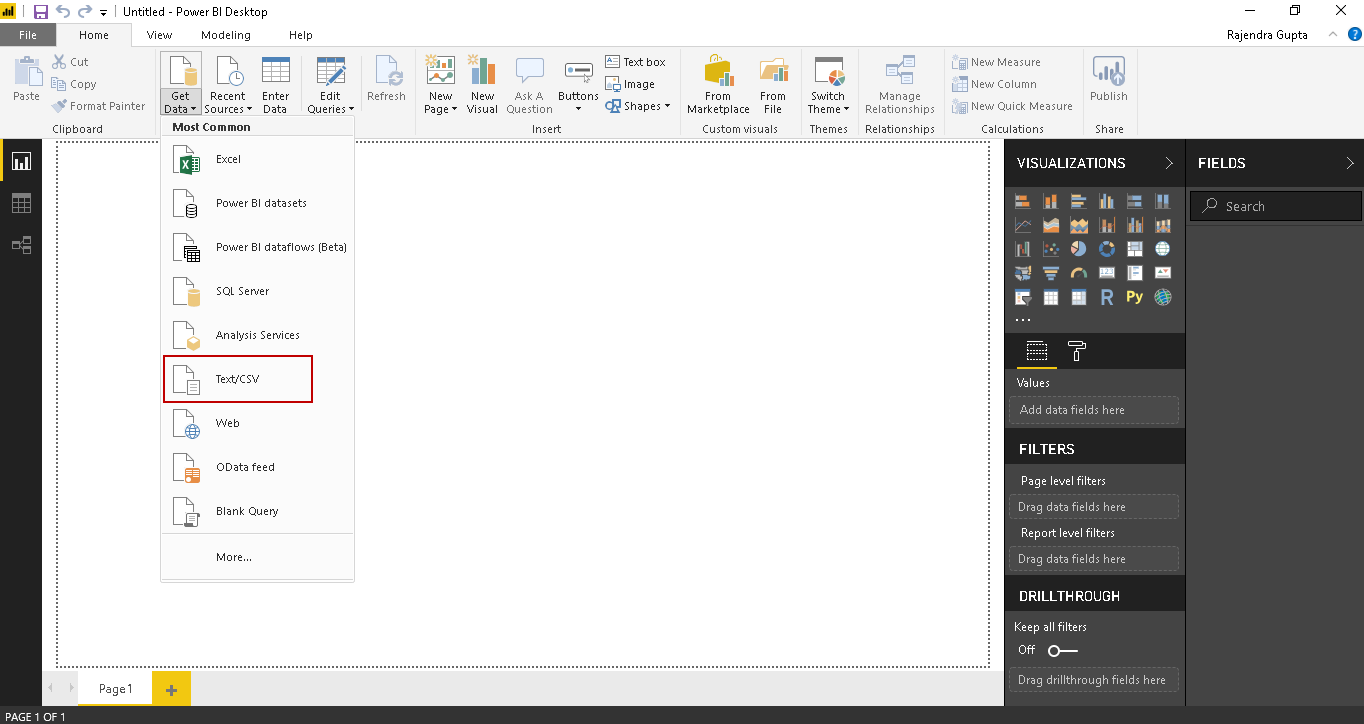
We can prepare the visualization in Power BI now with the Python. We required sample data to prepare the visualization, therefore, let us import the sample data from the CSV files. In the menu bar, click on ‘Get Data -> Text/CSV’
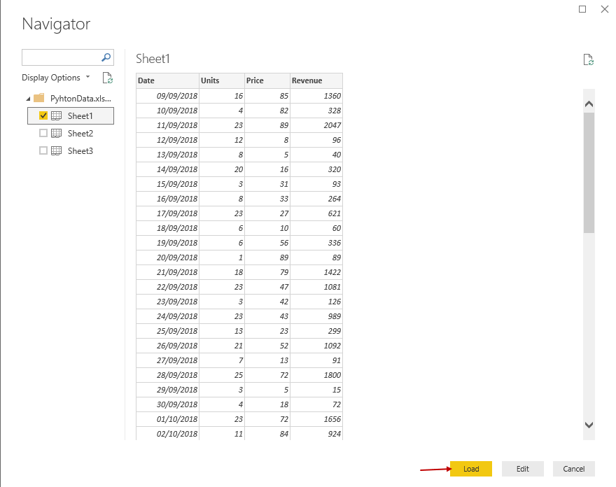
Provide the location of the CSV file and ‘Load’ data.
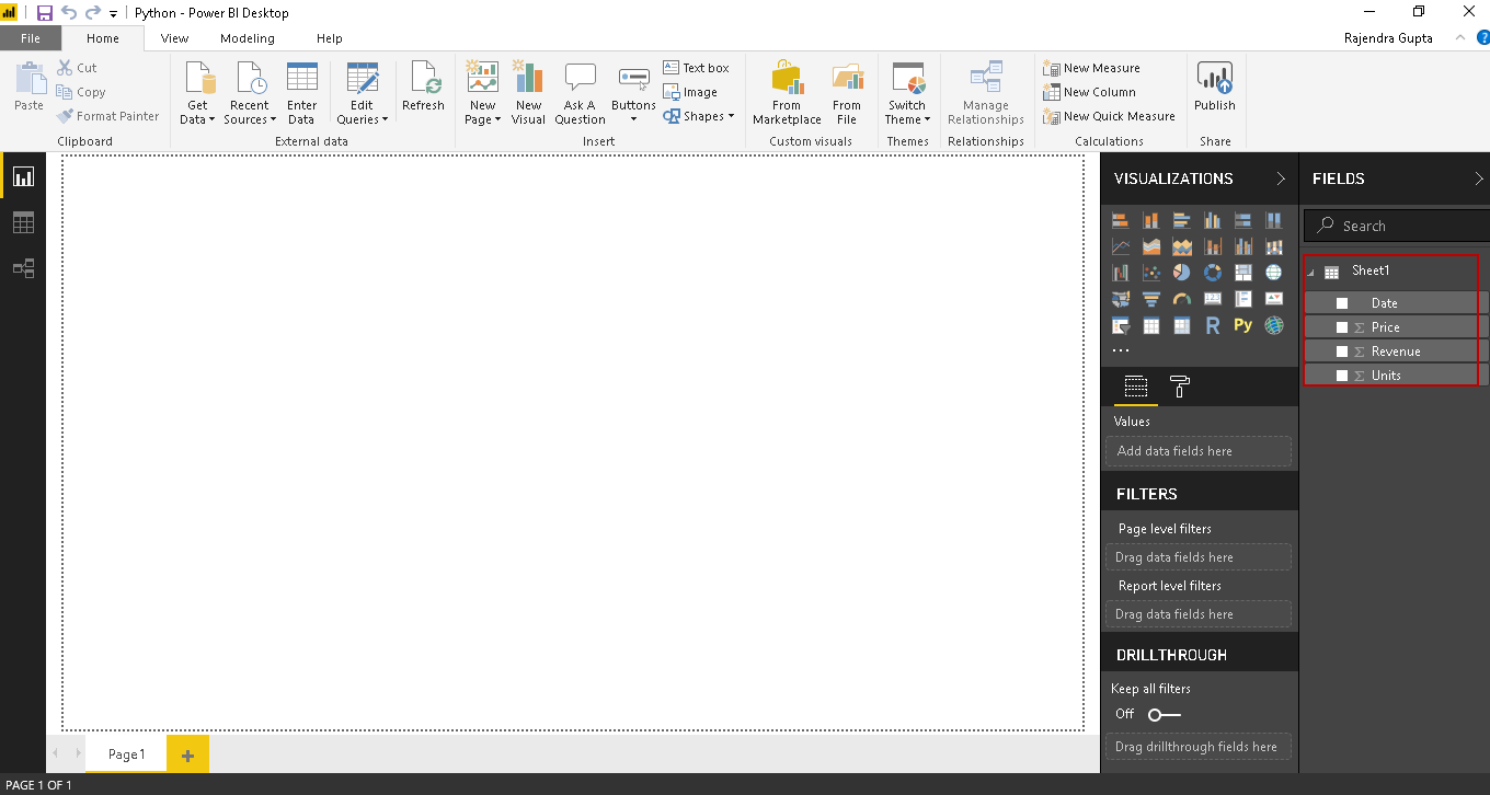
In the following image, you can see the data set is loaded in the Power BI.
At this point initial configuration is completed, we need to add the report layout and query using the Python language. Click on the ‘Python Visuals’, and we get the warning to accept the script visuals to run the Python Scripts.
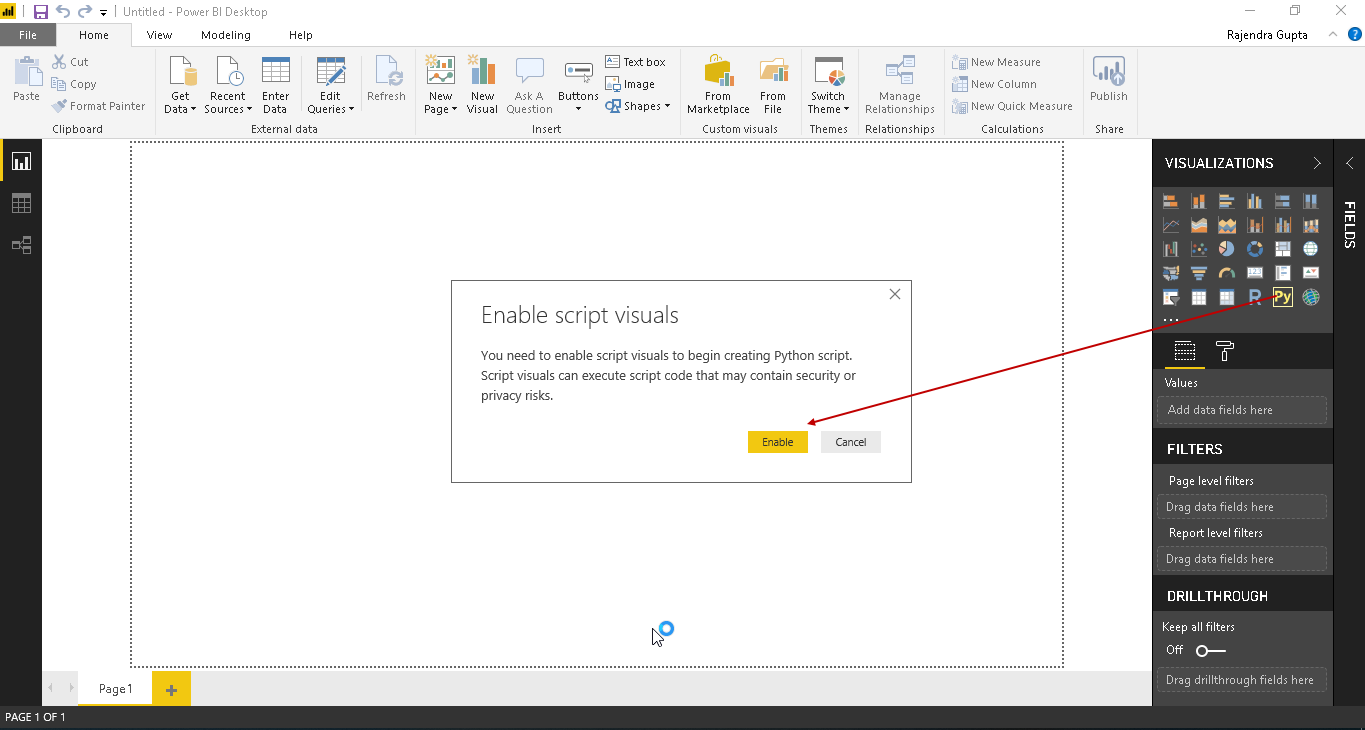
Click on the ‘Enable’, and we get the following report layout in the Power BI Desktop. It shows the Python icon in the top report section and the bottom window, and you get the Python script editor.
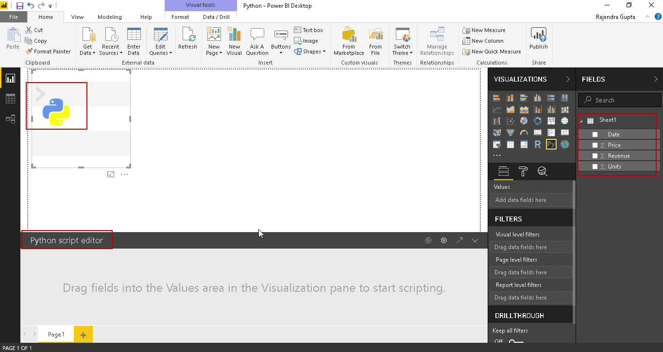
In the Python Script editor, you get a message to drag the fields into the values area in the Visualization pane to start scripting. Once you drag the fields to the Values area, you can see the scripts in the Python script editor. You also get a message that it will remove the duplicate rows from the data.
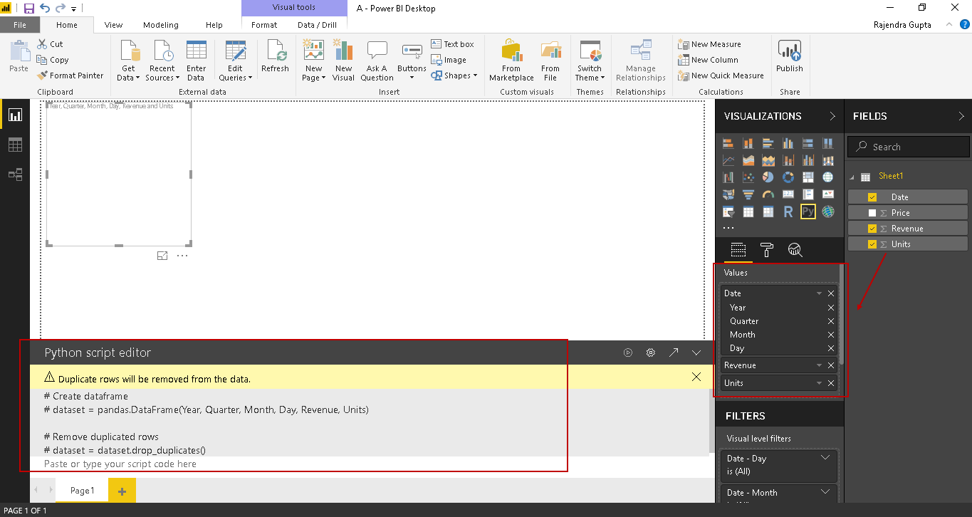
In the ‘Date’, by default, it shows the date hierarchy. We want date field here, therefore, modify this value to ‘Date’ instead of ‘Date hierarchy’.
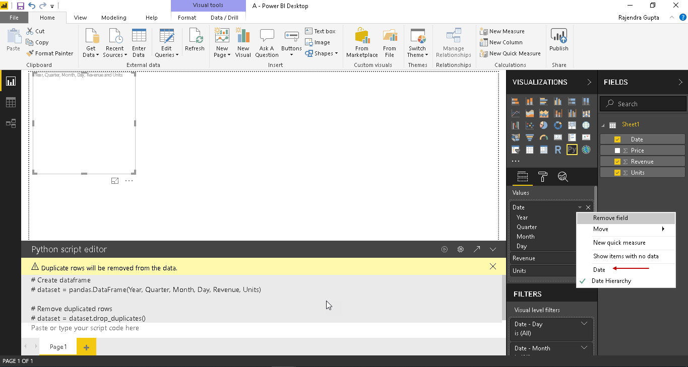
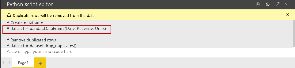
It now shows the Date column instead of the date hierarchy. You can see a change in the data frame query mentioned in the Python Script Editor.
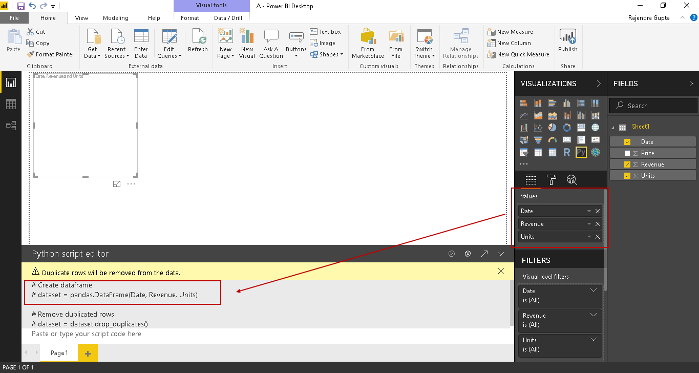
In the Python script editor, it automatically creates the data set using the ‘Pandas’ data frame with the required column from the data fields.
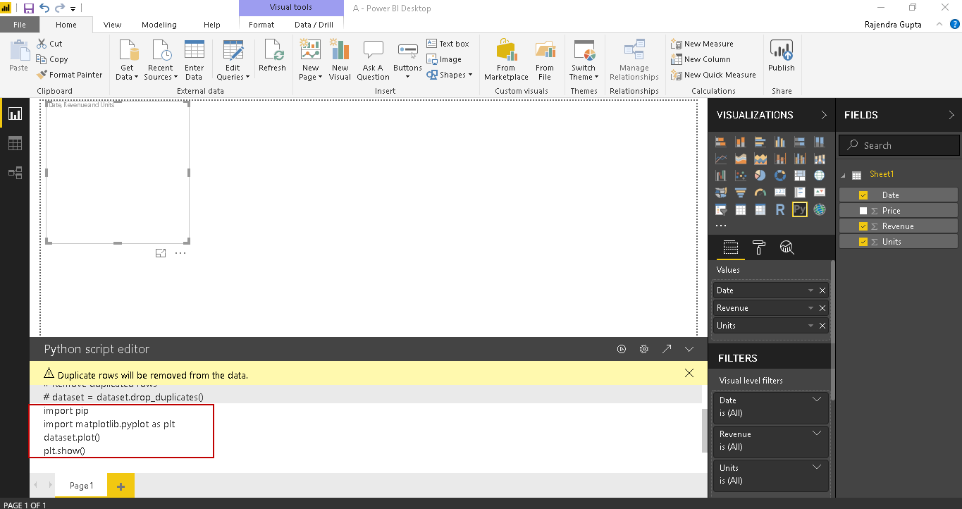
We can write the code in the section ‘Paste or type your script code here’. Copy the Python code below to plot the data set.
|
1 2 3 4 |
import pip import matplotlib.pyplot as plt dataset.plot() plt.show() |
In this query, we imported the matplotlib in the Power BI. It further created the visual using the plot() function.
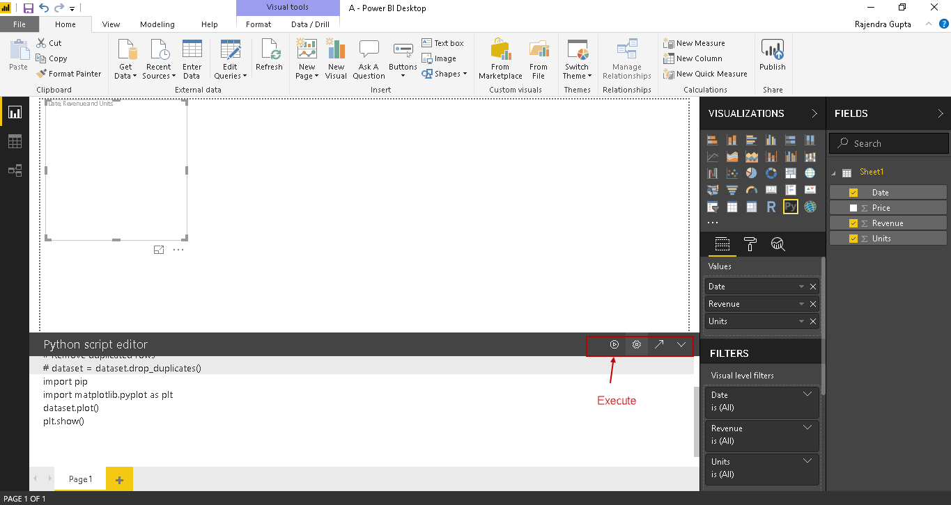
We need to run the Python code to visualize the data set. The script will connect to the Python from the environment variable path. Click on the ‘Play’ icon in the right side o the Python script editor.
In the following image, you can see the visualization using the Python code in the Power BI.
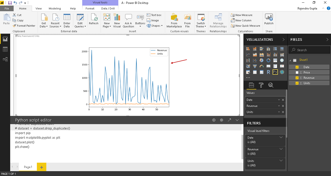
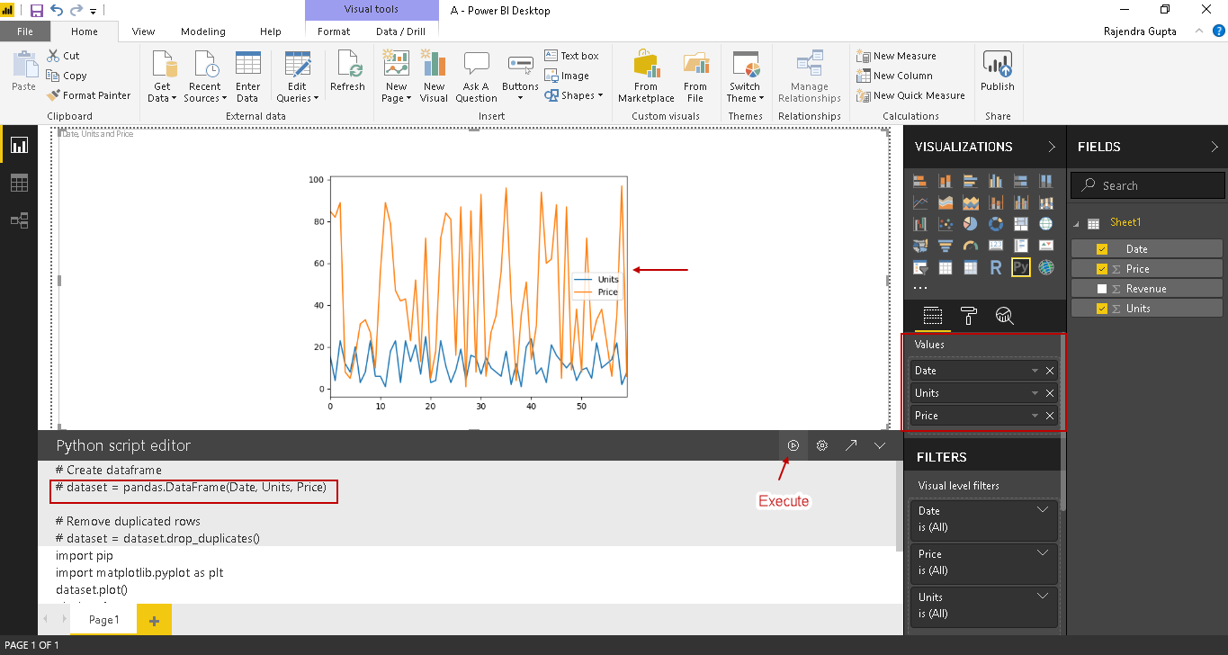
Let us consider to prepare the visual using from the ‘Date’, ‘Price’ and ‘Units’ fields from the Values section. We do not need much programming knowledge to prepare the visualization. Select the required fields. It automatically makes the changes in the Python script editor. You can execute the Python code and view the plot accordingly.
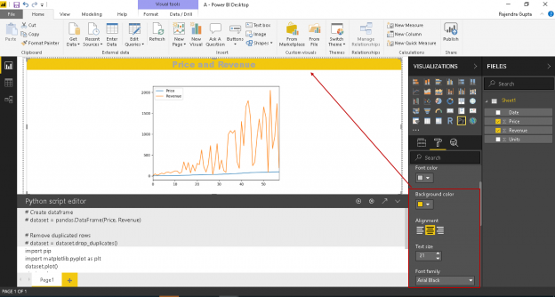
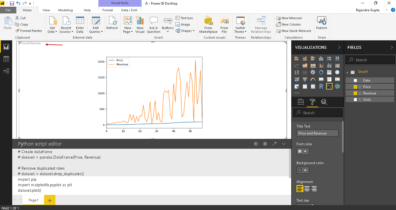
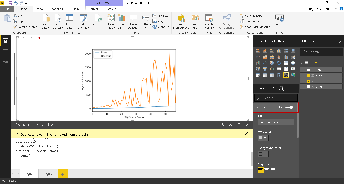
Similarly, in the following image, you can see visual with fields ‘Price’ and ‘Revenue.’
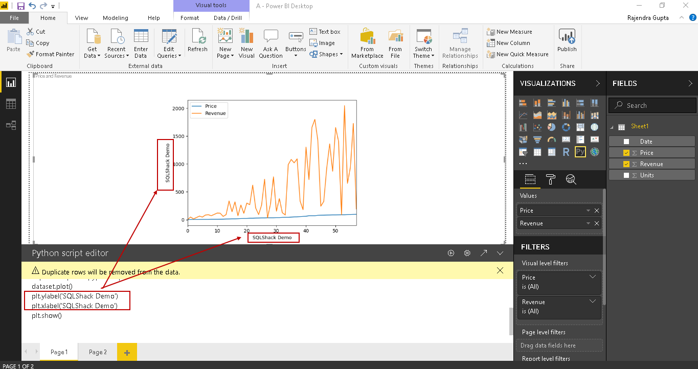
We might need to define the labels on both the axis. We can define the labels using the below command. For the demonstration purpose only, I defined labels on both x and y-axis as ‘SQLShack Demo’.
|
1 |
plt.ylabel('SQLShack Demo') |
|
1 |
plt.xlabel('SQLShack Demo') |
Customizing the chart title
In the following image, you can notice that the chart title is not visible properly. We can make changes to it using the ‘Title’ in the format area.
Expand the ‘Title’ and change the title properties from the below options.
- Title Text
- Title font colour
- Title background
- Title alignment (left, right or centre)
- Title text
- Title size and font
Once we have modified the chart format settings, we can see the updated chart title looks.

Limitation of running Python scripts in Power BI
- We can use the Python plot for maximum 150,000 rows in the data set
- We cannot prepare an interactive image with it
- Python script will give a time out error after 5 minutes of execution
- Python plot cannot be used for cross filtering
Conclusion
In this article, we explored the integration of the Power BI Desktop and programming language Python. We can use Python to create visualization for the complex data sets with Power BI. I encourage you to explore this powerful combinations of technologies in your environment.
Table of contents

I am the author of the book "DP-300 Administering Relational Database on Microsoft Azure". I published more than 650 technical articles on MSSQLTips, SQLShack, Quest, CodingSight, and SeveralNines.
I am the creator of one of the biggest free online collections of articles on a single topic, with his 50-part series on SQL Server Always On Availability Groups.
Based on my contribution to the SQL Server community, I have been recognized as the prestigious Best Author of the Year continuously in 2019, 2020, and 2021 (2nd Rank) at SQLShack and the MSSQLTIPS champions award in 2020.
Personal Blog: https://www.dbblogger.com
I am always interested in new challenges so if you need consulting help, reach me at rajendra.gupta16@gmail.com
View all posts by Rajendra Gupta
- How to install PostgreSQL on Ubuntu - July 13, 2023
- How to use the CROSSTAB function in PostgreSQL - February 17, 2023
- Learn the PostgreSQL COALESCE command - January 19, 2023