
In my last articles on Power BI Desktop (see the index at the bottom of the article), we have explored that Power BI has a rich set of visualizations. We can present data using various custom visuals available from Microsoft AppSource. These visuals are available free to download and use it as per our requirements.
Some of the articles for references are:
Note: You should have Power BI Desktop installed in order to use the custom Visuals along with a work account to download them from Microsoft AppSource.
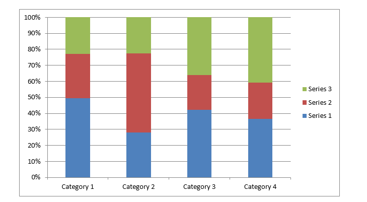
Normally we use stacked bar charts in Excel to analyze the data in excel with the help of 100% Stacked Column Charts as shown below.
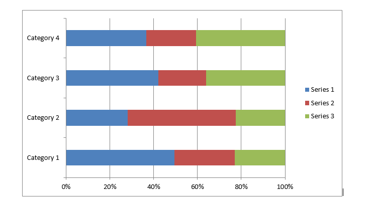
There is another way to represent data in terms of the stacked bar chart as shown below.
In the stacked chart, as shown here, the length or width of the bar shows the particular category data. It helps to analyze the data from a single category perspective but if we want to add more categories into the chart, it would be difficult to get these from the stacked charts.
Power BI presents a unique way to represent data into a two-dimensional stacked chart called Mekko charts aka Marimekko Charts. In Mekko Charts both x and y-axis represent a percentage scale. This percentage scale represents both height and width of the segment. The column width of each segment is scaled so that total width matches the chart width. Therefore, Mekko charts are two way 100% stacked charts.
Import Data into Power BI Desktop
Let us first prepare the sample data for creating the Mekko Chart. We will prepare both the 100% stacked charts and Mekko Charts to see the difference in both the charts.
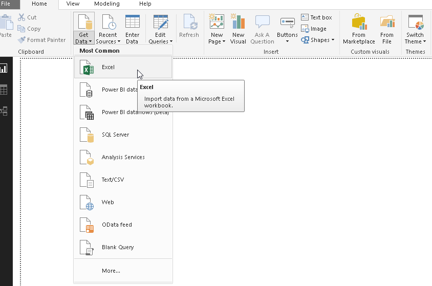
In this example, let us import data from the source as an Excel file. Therefore, to import the data follow the steps below
Click on Get Data -> Excel Data Source
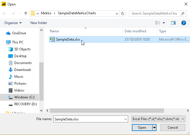
Go the Excel file to import data into Power BI Desktop
We can view sample data as shown below
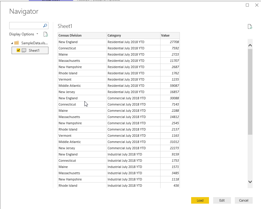
We need to load the data into Power BI Desktop, therefore ‘click on Load’. We can view the sample data and make changes if required. In order to make changes, click on Edit and save the data.
Now we have the data set into Power BI Desktop.
100% Stacked Column chart
Let us create a 100% stacked column chart from the sample data set. 100% Stacked Column charts are available in the Power BI Desktop itself, we can use them without download it separately.
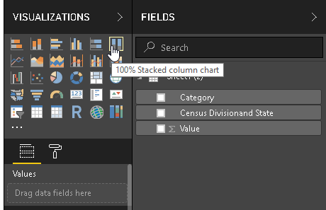
Launch the Stacked Bar chart and adjust the width and height of the chart as shown below.
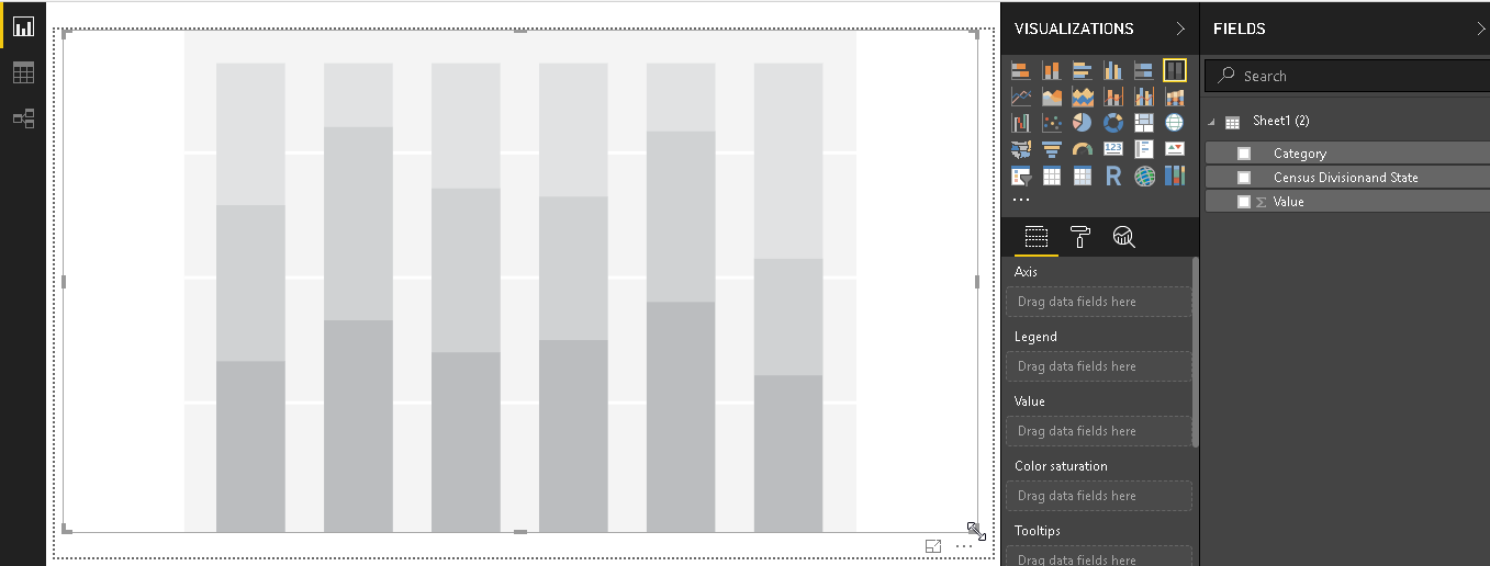
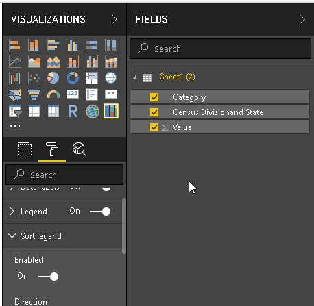
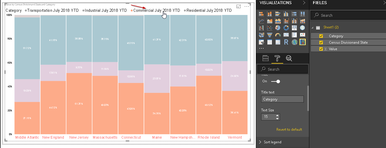
Create the 100% Stacked Column Chart by selecting the data columns from the dataset as shown below. We can see here that it shows category for each Census division and as per the category. Each Census has its own data bars, which are further divided into the category.
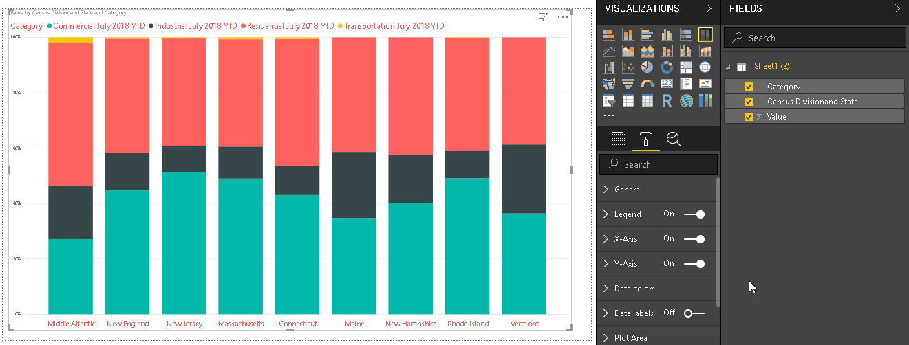
Now in order to show more details in the chart, go to ‘Data labels’ section and switch it on. Just move the slider to turn it ‘On’. The Mekko Chart now chart shows data labels as well in terms of percentage. Each vertical bar category sum of percentage is 100%

100% Stacked Bar chart
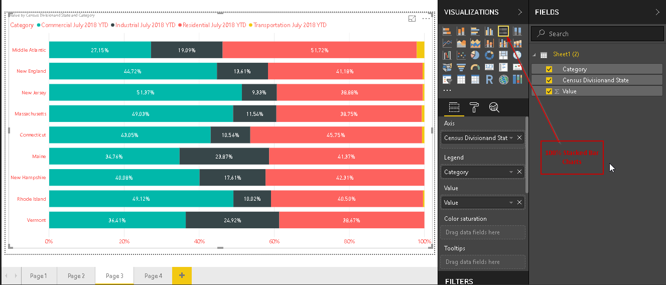
Now let us create the 100% Stacked Bar chart from the Visualization section. This chart is also available by default in Power BI Desktop. Therefore, click on the 100% Stacked Bar chart icon and create a chart from the same data set.
We can see here that as compared with the 100% stacked Column chart, this chart shows data into bar format.
Mekko chart
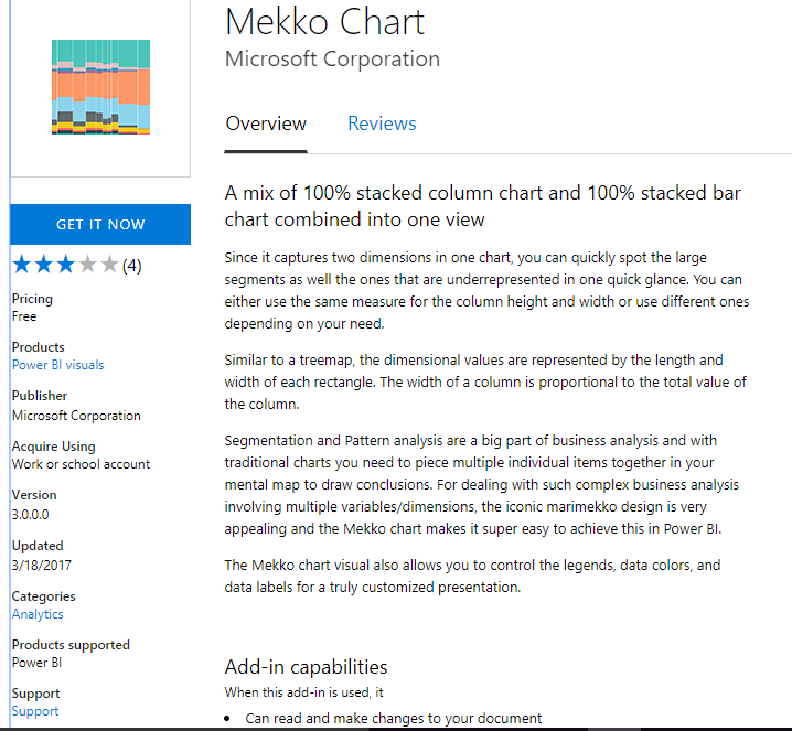
Mekko Charts are a mix of 100% Stacked Column Chart and 100% Stacked Bar chart combined into one view. In today’s data analytics, we need to analyze the complex data, which we require multiple data fields, dimensions. We can do the segmentation and pattern analysis with the help of Mekko Charts. By default, this chart is not available in Power BI Desktop, go to the AppSource and install it.
We can download the file from here and then import later in Power BI Desktop or we can directly import the Mekko Chart. We need to have an active internet connection to connect and download the package.
We will import the Mekko Chart directly using Power BI Desktop Import function. To import the Mekko Chart, Go to Marketplace and search Mekko Chart
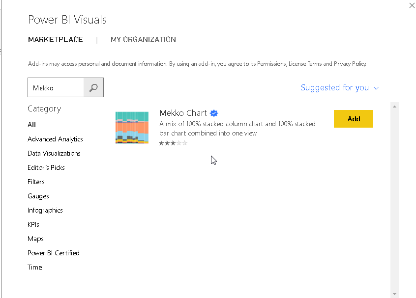
We can see in the description “A mix of 100% stacked column chart and 100% stacked bar chart combined into a single view”.
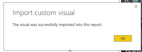
Click on Add to import this customized visualization. It shows below message once the import is successful.
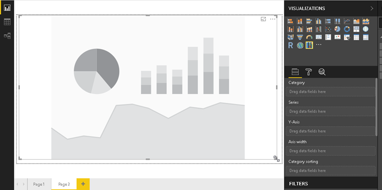
In the below image, we can see the Mekko Chart icon (
![]() ) once the visual import is successful.
) once the visual import is successful.
![]()
Click on Mekko Chart icon and adjust the height, the width of the Mekko Chart to have a better visual.
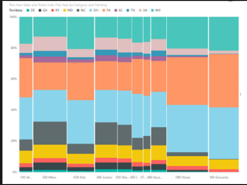
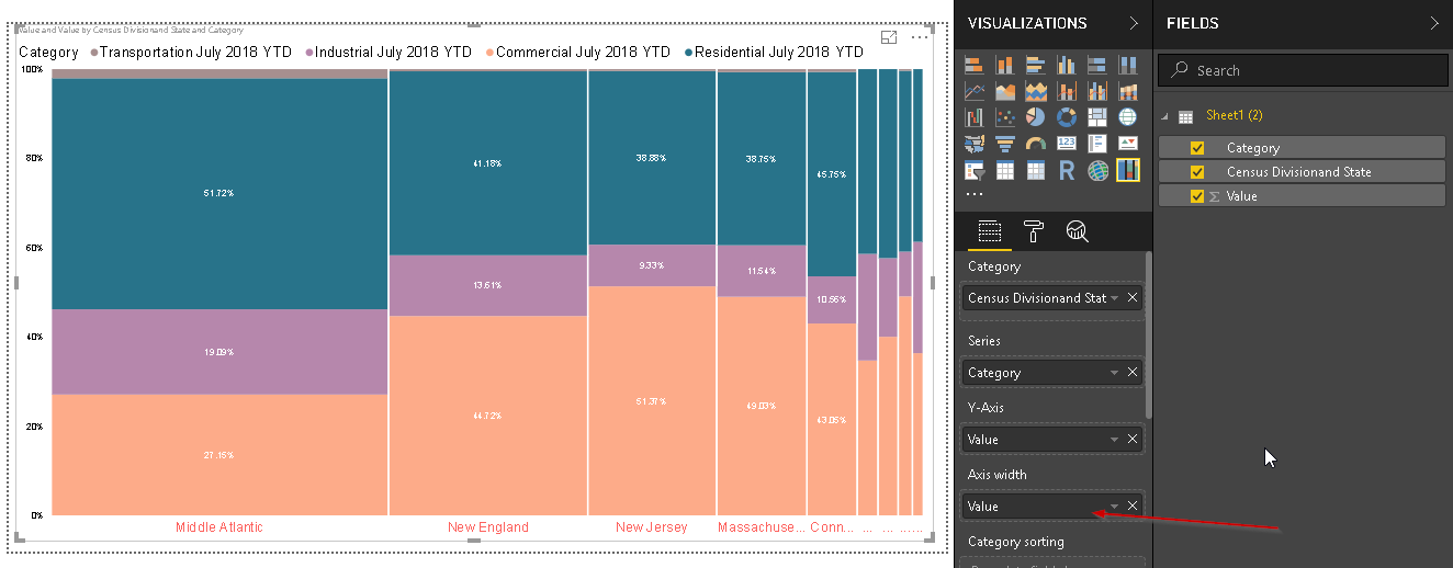
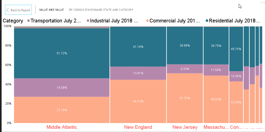
Now we need to define the fields to create the Mekko Chart. We will use the existing data that we used in the 100% stacked Column chart and 100% Stacked Bar chart. Define the columns to the Category, Series, Y-Axis fields. In the below image, Mekko Chart is generated with defined columns.
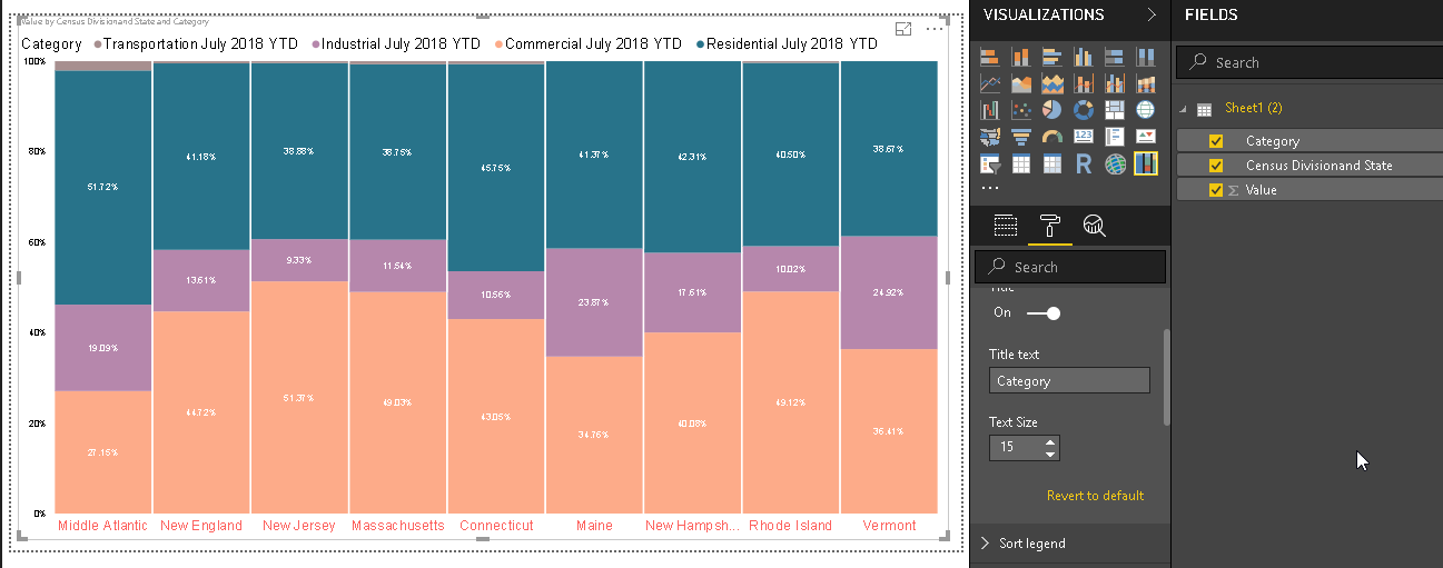
We can see here the Mekko chart is showing data in terms of both columns and Bars as per the data values and categories. We can highlight any particular category by clicking on that section. For example, below if we click on Commercial July 2018 YTD, we can highlight the section below.
Note: In the above Image of Mekko chart, we have customized the x-axis, a category to give a better look. You can customize them as per your requirement from the format section.
Currently, the width of the bars is the same for all categories. It does not reflect any change in the width of bars due to our data. If we want to show this width as per our data then we need to set that particular column into the Axis Width section. For example, below we can see that Mekko chart after we set the Axis width as Value.
Therefore, the width of the bars in the Mekko chart is now changed as per the data values.
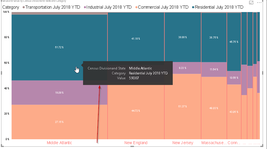
If we hover mouse to any particular segment, we can see the detailed description for that particular field. For example, we can see the highlighted value in a pop box as shown.
Focus Mode formatting
We can view the chart in the focus mode in which we can view the visual with the highlighted mode and with all filters. Click on the small icon on the top right corner to enable focus mode.
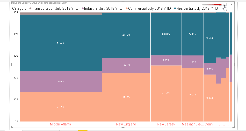
We can see the below Mekko Chart in the focus mode.
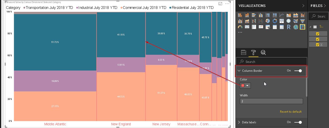
Column Border formatting
By default, Mekko charts categories or segments are separated by a while column border. You can view the column border in the above image.
We can control the properties of the column border using ‘Column Border’ section in the format area. We can change the column border color, width. We can turn it off as column border also.
In the below example, I changed the column border color and we can see the change in the Mekko Chart.
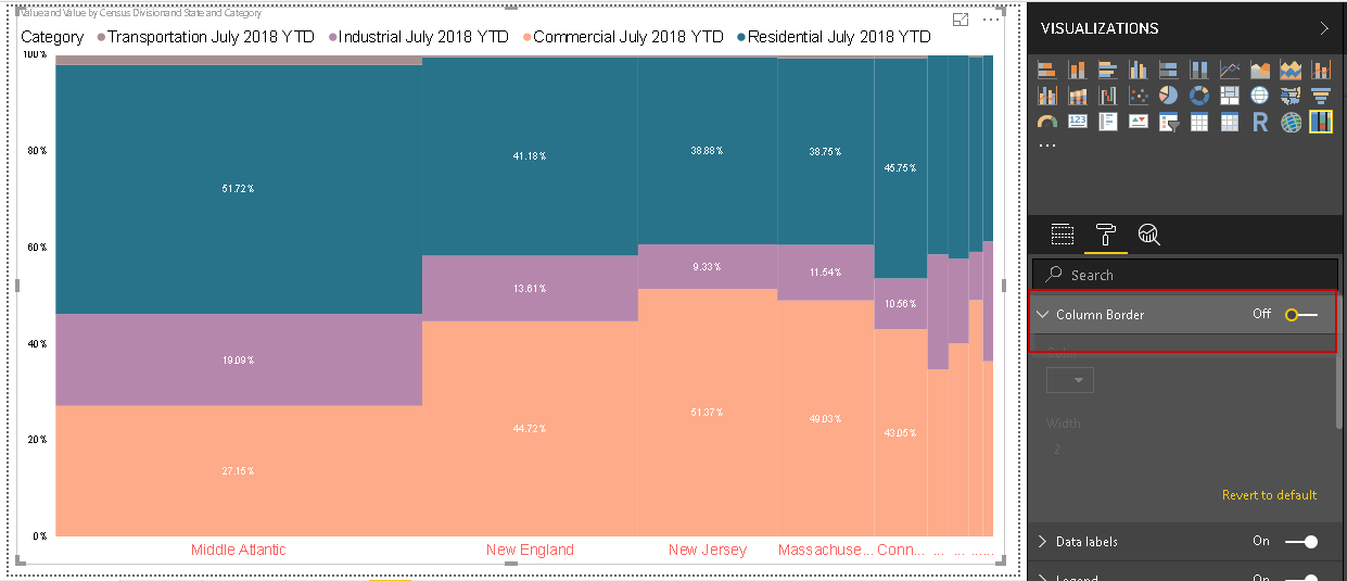
In below example, we turned off ‘Column Border’ setting. You can notice the difference in Mekko Chart without any border.
Conclusion
Mekko Charts in Power BI desktop allows data to be displayed along with two dimensions simultaneously. These charts are useful for the analysis or representing complex data and provide a better view as compared to 100% Stacked Column and bar charts.
Table of contents

I am the author of the book "DP-300 Administering Relational Database on Microsoft Azure". I published more than 650 technical articles on MSSQLTips, SQLShack, Quest, CodingSight, and SeveralNines.
I am the creator of one of the biggest free online collections of articles on a single topic, with his 50-part series on SQL Server Always On Availability Groups.
Based on my contribution to the SQL Server community, I have been recognized as the prestigious Best Author of the Year continuously in 2019, 2020, and 2021 (2nd Rank) at SQLShack and the MSSQLTIPS champions award in 2020.
Personal Blog: https://www.dbblogger.com
I am always interested in new challenges so if you need consulting help, reach me at rajendra.gupta16@gmail.com
View all posts by Rajendra Gupta
- Understanding PostgreSQL SUBSTRING function - September 21, 2024
- How to install PostgreSQL on Ubuntu - July 13, 2023
- How to use the CROSSTAB function in PostgreSQL - February 17, 2023