
In this article, we will explore the Flow Map chart in Power BI Desktop. Power BI is helpful to visualize the data through various form of the inbuilt and the custom charts. We have explored few such important charts in previous articles. Below is the list of articles for reference
- Enlighten World Flag Slicer in Power BI Desktop
- Power BI desktop Mekko Charts
- Hexbin Scatterplot in Power BI Desktop
- Power BI Desktop Pulse Charts
- Word Cloud generator in Power BI Desktop
- Candlestick chart for stock data analysis
Let us understand the flow map chart using an example of airlines. An airline connects multiple cities together. In this scenario, you can consider one origin and the multiple destinations. For example, flights operate from origin airport and connect to multiple destinations across the world. Therefore, if we want to represent this kind of data or object movement, we need to use the flow control chart in Power BI Desktop.
Import data for Flow Map Chart in Power BI Desktop
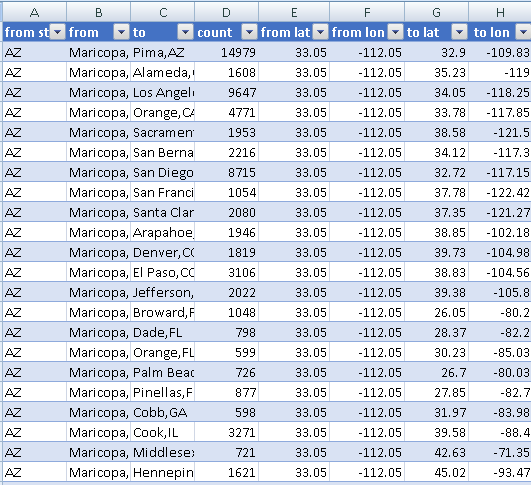
In this article, we will use the sample data from GitHub. You can click on this link and download the excel sheet containing the sample data. Below is the screenshot of the excel file. You can see in the screenshot that our data contains below fields.
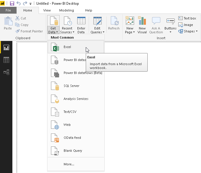
Import this excel sheet using Excel data source.
- Get Data -> Excel
Provide the location of the excel file and view the sample data.
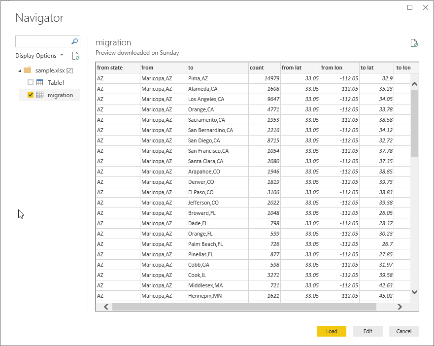
Once you click on ‘Load’, it creates the data model and creates data set accordingly.
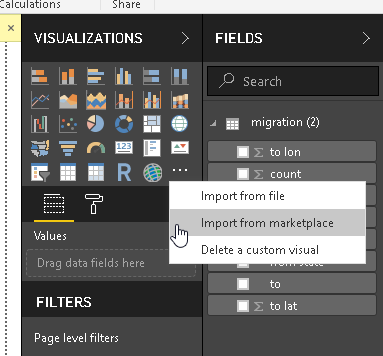
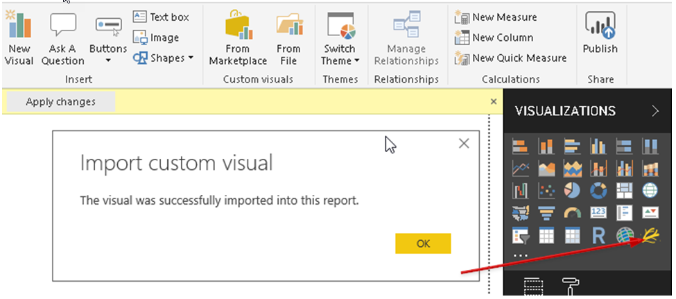
We have the data set in place for our visual. Now, we will import the ‘Flow Map’ from the marketplace. You can click on the eclipse icon and then on Import from the marketplace.
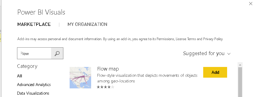
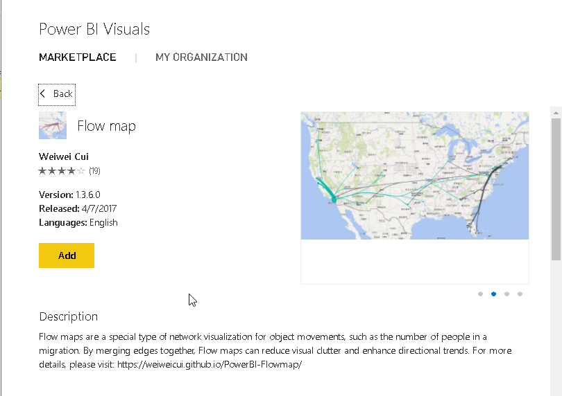
Search flow maps chart in the marketplace. You can go over the description ‘Flow-style visualization that depicts the movement of objects among geo-locations.’
Add the visual to the visualizations area. The icon of the flow map also depicts the flow process.
Click on the flow map visual icon. Adjust the height and width to have a better visual.
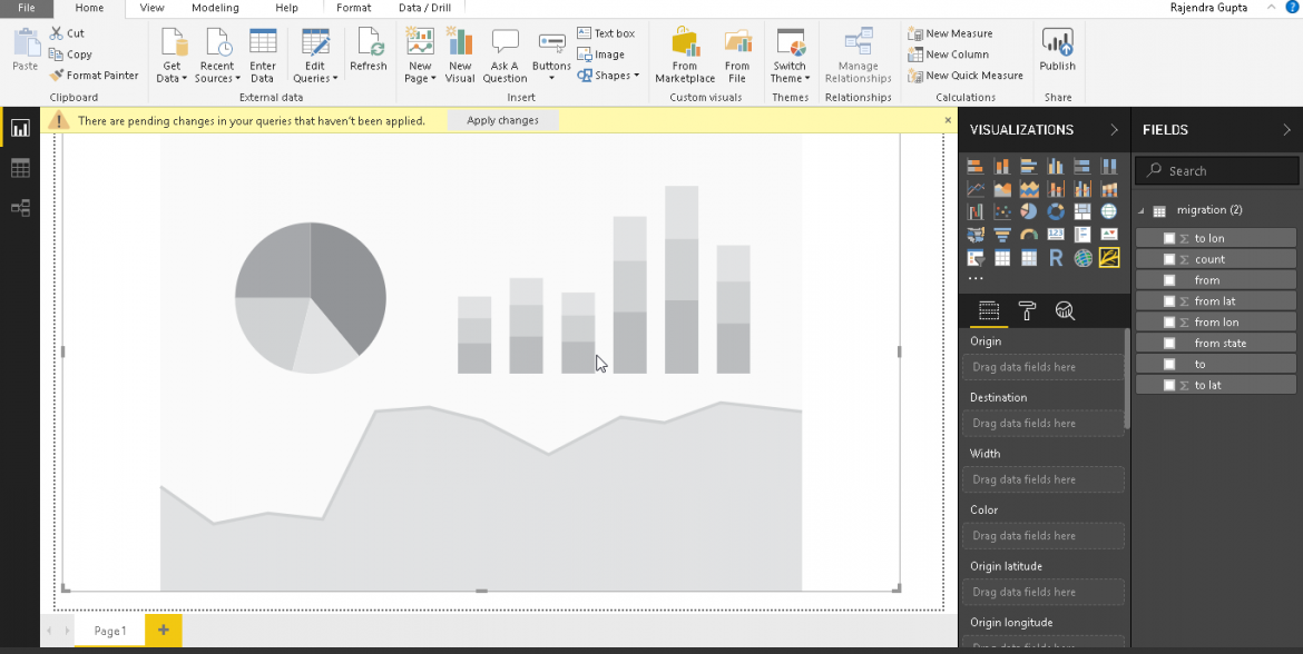
We need to draw a flow map now. We need to map the fields as below.
- Origin: from
- Destination: to
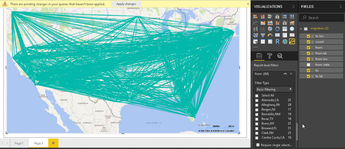
This draws the flow map chart as shown below. It looks very complex to understand. We will make it simple later section.
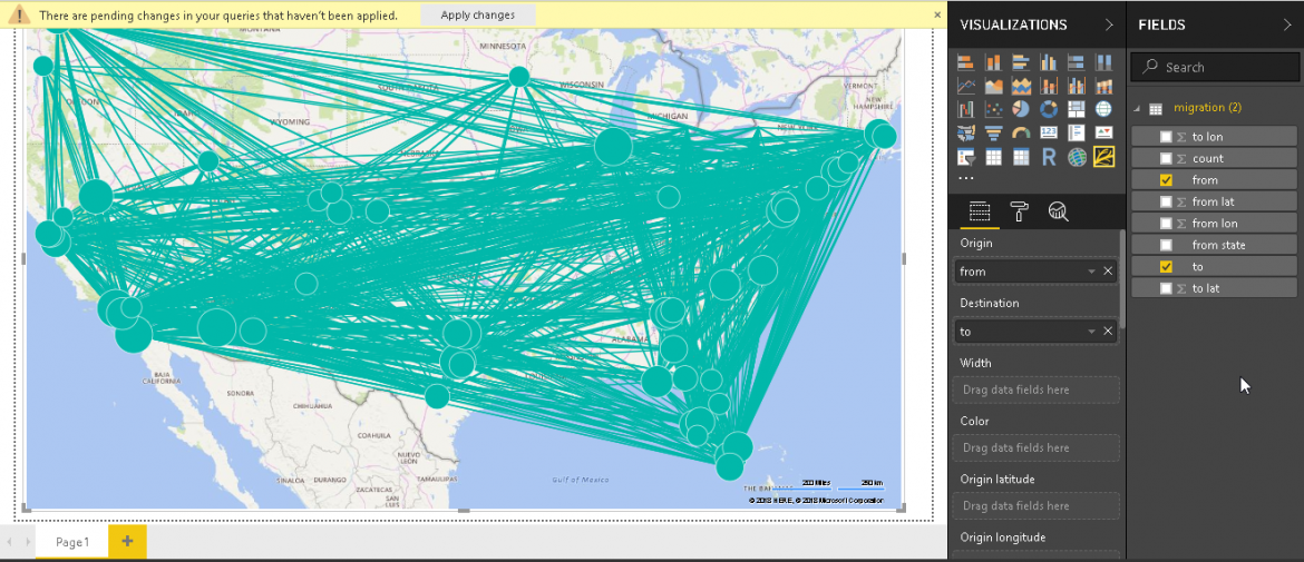
Now Map following fields as well to add the details into the chart.
- Origin name -> from
- Width -> count
- Color -> from
- Origin latitude -> from lat
- Origin longitude -> from long
- Destination latitude -> from lat
- Destination longitude -> from long
- Destination name -> to
- Toll tip -> count, to and from
Below is the flow map chart from the dataset field we set it up.
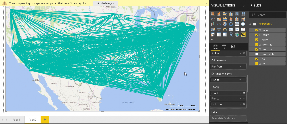
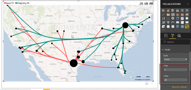
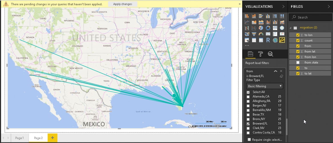
We need to make the flow map chart simply to understand. We will filter the flow map for a particular country. Scroll down and look for the ‘Report level filters’.
In the Report level filter, select just one country. For example, in below image, we filtered out the chart for from county: Broward, FL. Look at the chart now, we can see the flow of the lines from the origin to destinations.
When we take the cursor to any line, it shows the tooltip information in a pop-up message.
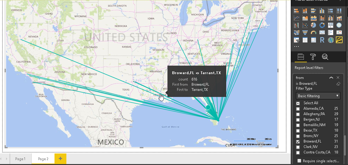
Below is another example of the tooltip below.
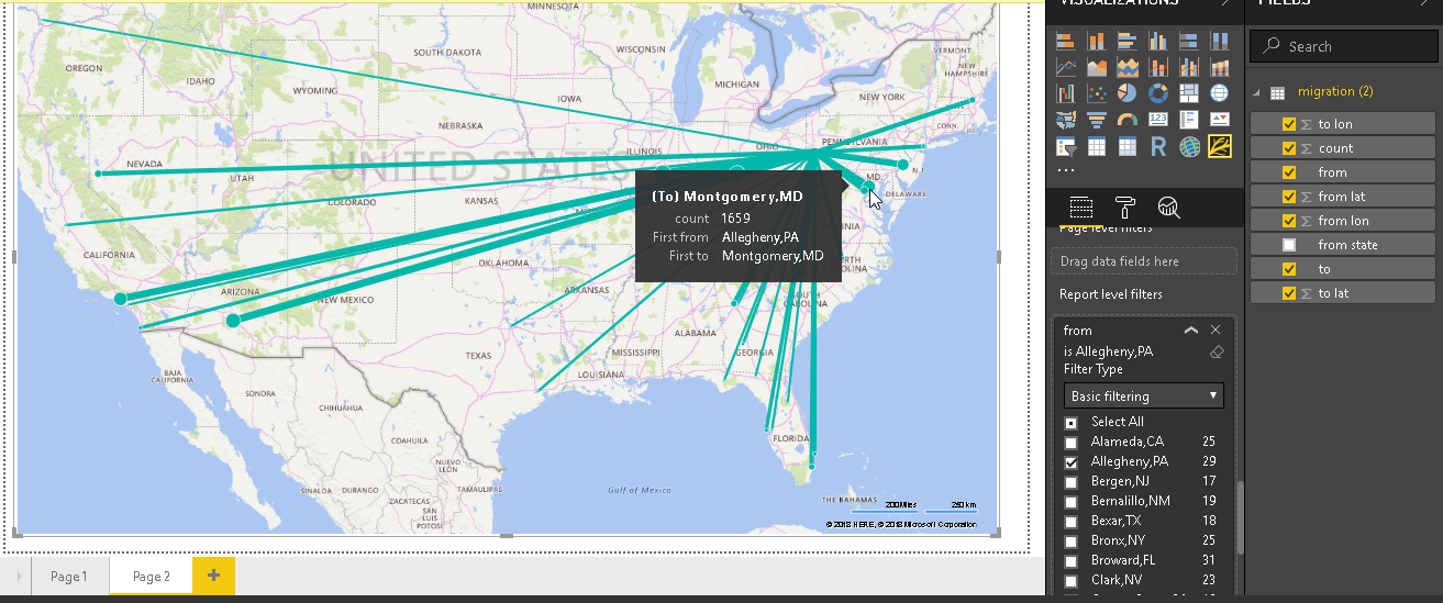
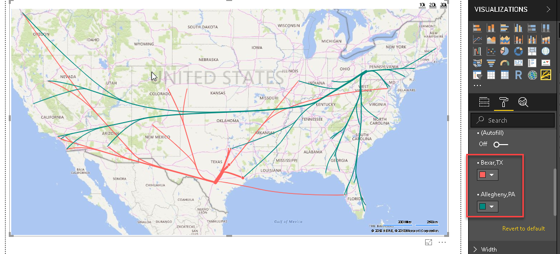
Let us change the country from the filter. In the below example, it shows country ‘Allegheny, PA’. You can see the change in the chart according to the origin.
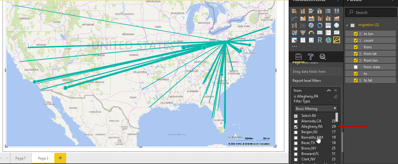
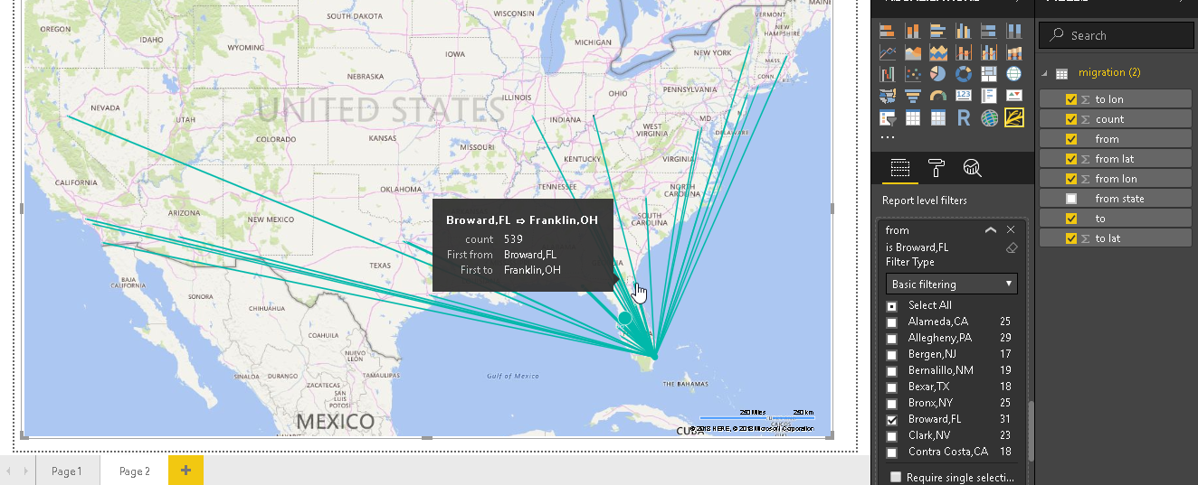
Look at the tooltip again. This shows the tooltip information as per the origin and the destination lie.
Customize the flow map chart
We can customize the flow map chart as per our requirement. Let us do some formatting.
-
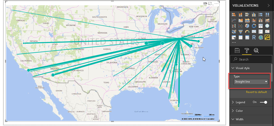
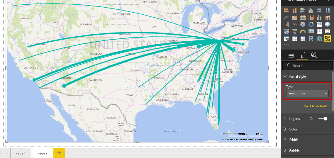
Visual style: we have various options to connect the origin and the destination. Below image shows the visual style as a straight line

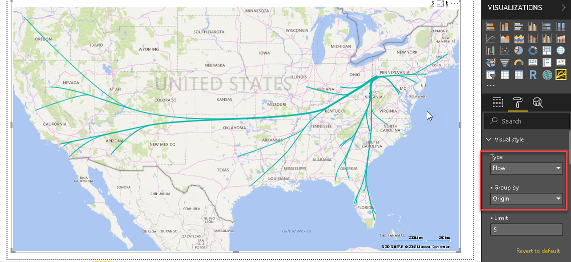
Let us change the visual style to ‘flow’. You can notice the change in the connection line between source and destination.
Another option is to set visual style as ‘Great Circle’. It changes the flow as shown here.
-
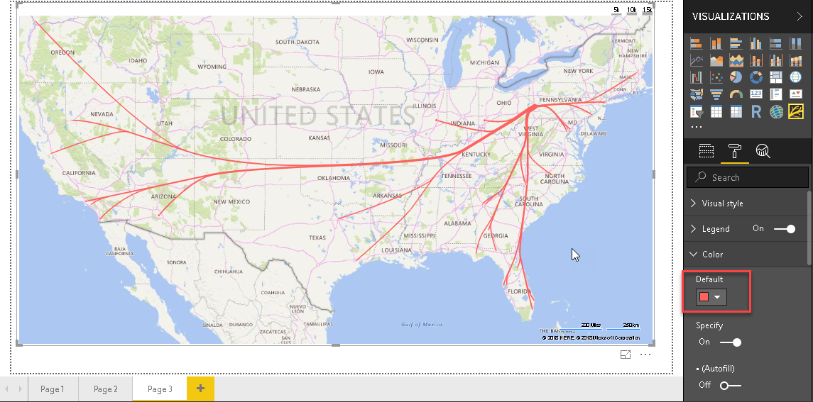
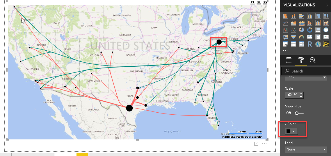
Color: We can control the flow line color using this section. By default, you can see below colors in flow map
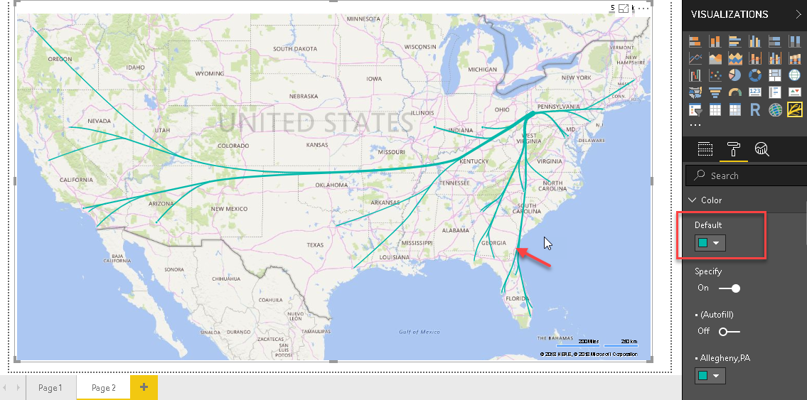
Let us change this color and see the difference in the flow map.
We can control the flow map color for each origin. Let us add two countries to the filter section.
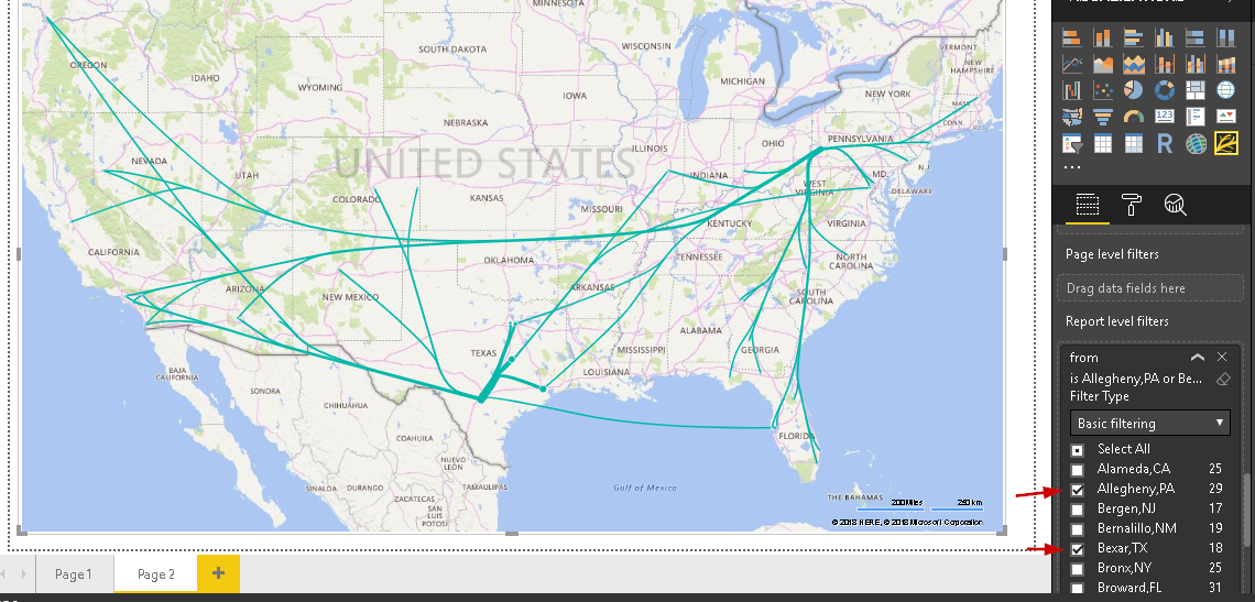
Now change the different color for each origin. You can see different colors for flow lines of originating from each origin.
-
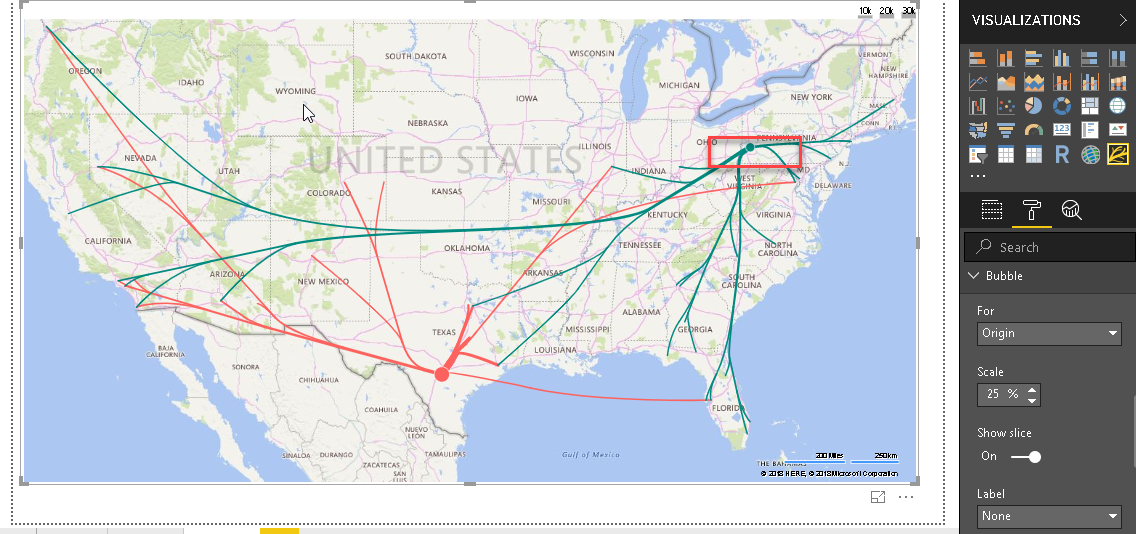
Bubble: we can set the bubble for both the origin and the destination or individually. Below image shows the bubble for the only origin
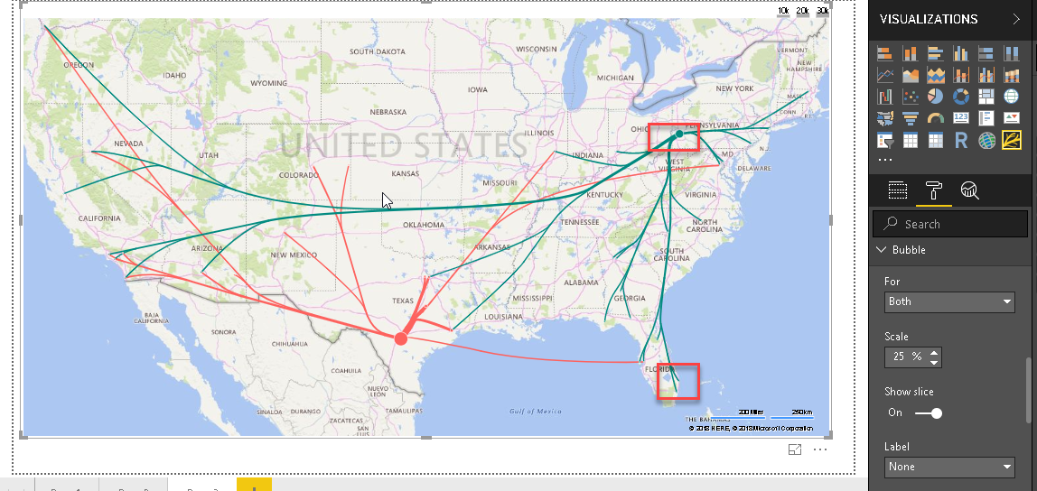
Change option to show bubble for a destination. In below image, you will find bubbles for each destination.
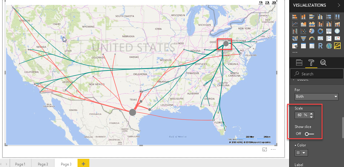
We will change the scale for the bubble and turn off the bubble. You will notice in the flow map that bubble color changes to grey and size as per the scale percentage.
Now we will Change the bubble color as shown below.
-
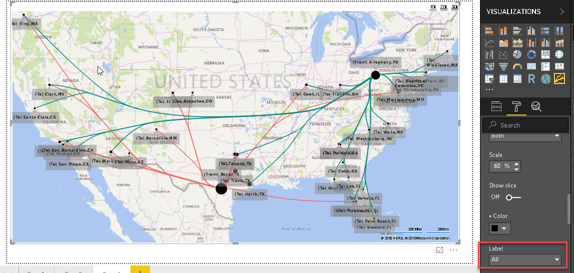
Label: By default, the label is ‘None’. We can change this to ‘All’ and we can origin and the destination name for all bubbles
We have also option to set label as ‘By click’. It means if we click on any bubble, only that country name appears in the flow map. Once we click on that again, name disappears.

-
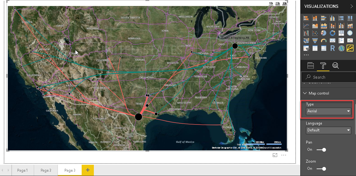
Map Control: We can change the map look using this section. We have seen so far default map type ‘color’. If we change it to ‘Aerial’, flow map changes as shown here
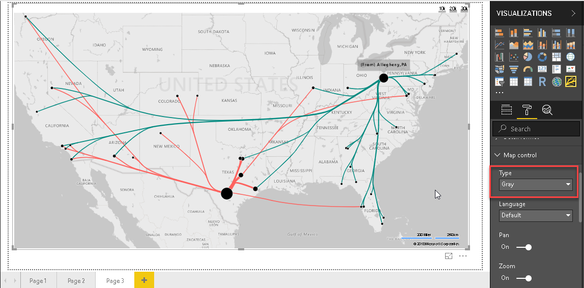
Below image shows map type as ‘Gray’.
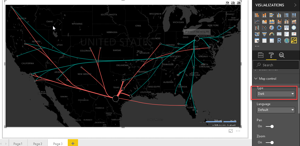
Below image shows map type as ‘Dark’.
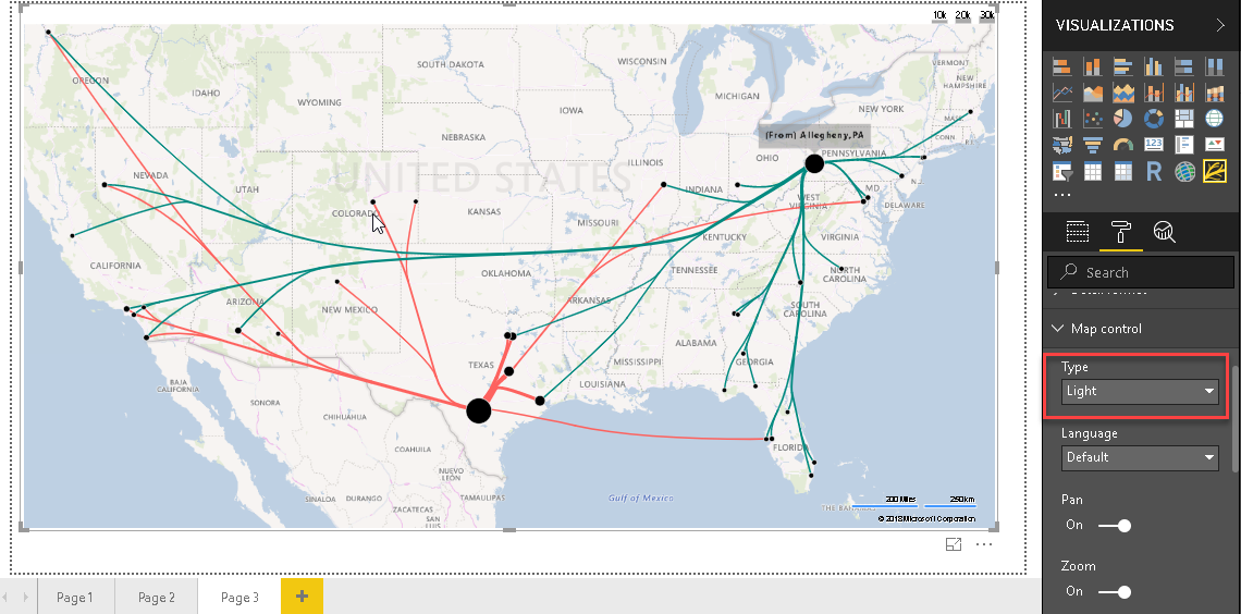
Below image shows map type as ‘Light’.
-
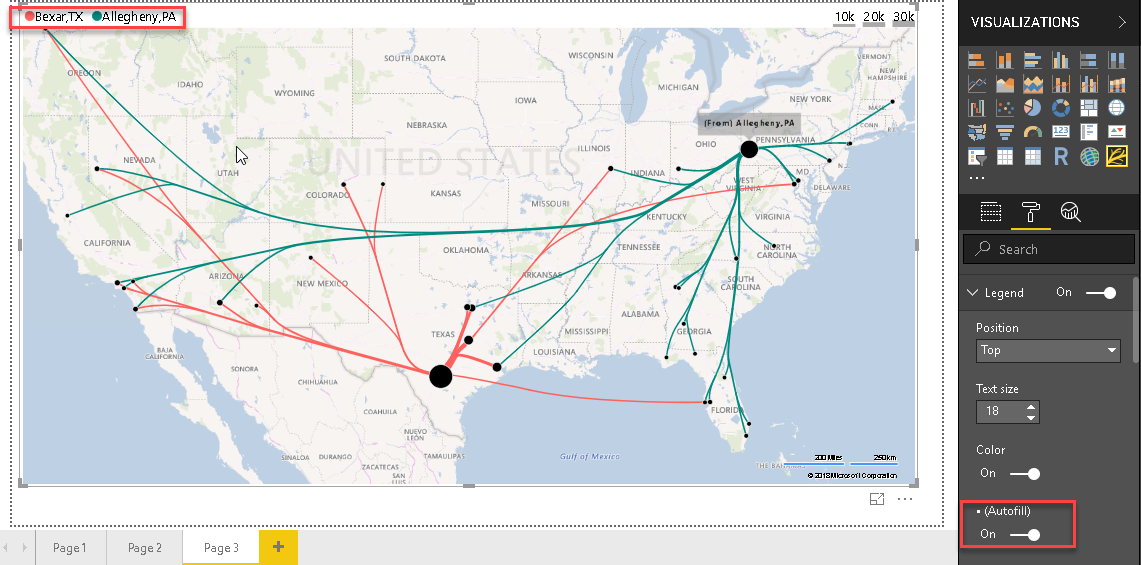
Legend: We can set the legend properties and make ‘Autofill’ turn on. This creates the legend automatically
-
Width: We can set the width of the connecting lines using the width property. Below image shows the width with the modified min and max values

-
Advanced: In the Advanced section, we have two options:
-
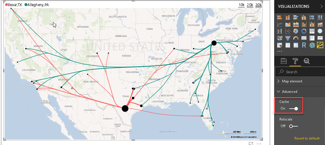
Cache stores the locations coordinate so that we can easily look out for the flow map chart with modified data
-
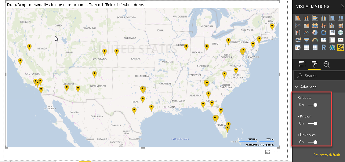
Relocate allows filtering out the location from the known and unknown. If we do not know longitude and latitude of any location, it maps that as unknown. Once we turn on the ‘Relocate’, flow map chart looks as below. We can manually change geo locations and turn off relocate once we are done
-
Conclusion
Flow Map chart is a great way to highlight the data flow between origins and the destination. We can customize the visuals as per our requirements. You can explore this with your data set. Stay tuned for more custom visuals in Power BI Desktop on SQLShack.
Table of contents

I am the author of the book "DP-300 Administering Relational Database on Microsoft Azure". I published more than 650 technical articles on MSSQLTips, SQLShack, Quest, CodingSight, and SeveralNines.
I am the creator of one of the biggest free online collections of articles on a single topic, with his 50-part series on SQL Server Always On Availability Groups.
Based on my contribution to the SQL Server community, I have been recognized as the prestigious Best Author of the Year continuously in 2019, 2020, and 2021 (2nd Rank) at SQLShack and the MSSQLTIPS champions award in 2020.
Personal Blog: https://www.dbblogger.com
I am always interested in new challenges so if you need consulting help, reach me at rajendra.gupta16@gmail.com
View all posts by Rajendra Gupta
- Understanding PostgreSQL SUBSTRING function - September 21, 2024
- How to install PostgreSQL on Ubuntu - July 13, 2023
- How to use the CROSSTAB function in PostgreSQL - February 17, 2023