

In this article, I’ll share some of the tricks and tips that I had to employ in order to successfully replicate Excel’ XY Scatter Report Chart.
In the article, Available options for generating heatmaps in an SSRS report, I covered some of the limitations of SQL Server Reporting Services (SSRS) specifically when it comes to native support for heatmaps compared to other Microsoft reporting tools and thus how such a limitation can make it difficult for BI developers to perform like-for-like migration of Excel reports (with heatmaps) into SSRS reports. In the same article, I went on to suggest 3 main workarounds for replicating Excel’s heatmap feature into an SSRS report. In this article, I continue to look at Excel-to-SSRS report migration but instead of heatmaps, I focus on demonstrating some of the tricks and tips that I’ve recently had to employ in order to successfully replicate Excel’s XY Scatter Report Chart (with Quadrants) into an SSRS platform.
Background
XY Scatter graphs with quadrants can easily improve readability of your report and be very effective in indicating where scattered data points fall within a given quadrant. Depending on the labels that you have assigned to your quadrants, an XY Scatter graph can give you a breakdown of your company’s Strengths, Weaknesses, Opportunities, and Threats (SWOT) against predefined measure.
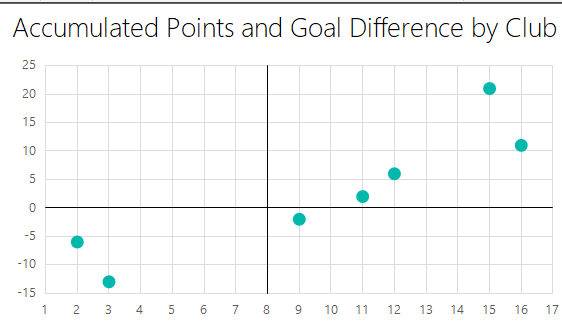
As the name implies, XY Scatter graphs require two sets of measures (X and Y) to successfully plot a single data point. For the purposes of this demo, my XY Scatter graph is based on data collected during the 2017/2018 UEFA Champions’ League season. I use this data to determine a football club’s performance (i.e. poor, average, good, excellent) with respect to points accumulated vs goal difference.
| Club | Points | Goal Difference |
| Celtic | 3 | -13 |
| CSKA Moscow | 9 | -2 |
| Dortmund | 2 | -6 |
| FC Basel | 12 | 6 |
| Juventus | 11 | 2 |
| PSG | 15 | 21 |
| Tottenham | 16 | 11 |
Table 1
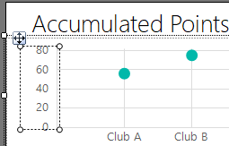
Using Microsoft SQL Server 2016 Report Builder, I have created a report dataset based on Table 1. I have also added an XY Scatter chart wherein X and Y values are mapped against Points and Goal Difference fields, respectively. A preview of this Report Builder SSRS report is shown in Figure 1.
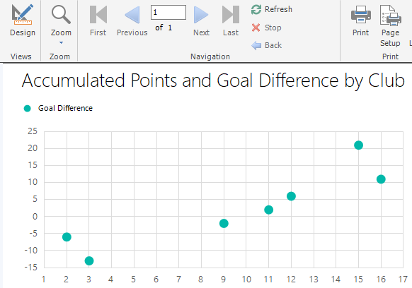
Figure 1
Having successfully created an SSRS version of the XY Scatter graph, I will spend the rest of the article demonstrating how we can get the SSRS report shown in Figure 1 to include quadrants and related labels as per the Excel version of the report shown in Figure 2.
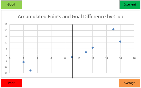
Figure 2
Create a Quadrant over an SSRS XY Scatter Report Chart
- Manually Create Quadrants by Drawing Lines
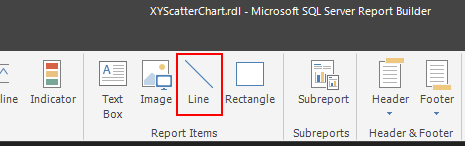
Perhaps the simplest way to splitting an SSRS XY Scatter report chart into 4 quadrants, is by manually drawing lines on the chart area using the Line report item type, as shown in Figure 3.

Figure 3
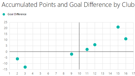
Using the Line report item type, I drew vertical and horizontal lines that interlace to form 4 quadrants on the SSRS XY Scatter report chart as shown in Figure 4.
Figure 4
One obvious disadvantage of creating a quadrant using the Line report item type is that the positioning of the lines, especially the vertical line is static. Imagine, for instance, that in subsequent seasons of the UEFA Champions League – the maximum points accumulated becomes 50, that will mean we will have to manually move the position of our vertical line from 10th to the 25th interval along the chart’s x-axis. Therefore, manually drawing quadrant lines is not an optimal option when dealing with a dynamic dataset.
- Dynamically Create Quadrants using StripLines
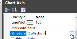
One useful tip for dynamically creating quadrants over an SSRS XY Scatter report chart is by making use of StripLines. In order for StripLines to produce both horizontal and vertical lines, we need to configure the StripLines property in both vertical and horizontal Chart Axis. To access the StripLines property, you need to click on either the vertical or horizontal Chart Axis as shown in Figure 5.
Figure 5
Then, navigate to the property window – usually located on the right-hand side in Report Builder – and click on the ellipsis button next to StripLines property, as shown in Figure 6.
Figure 6
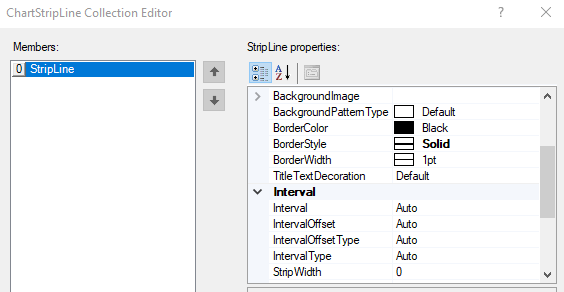
In the ChartStripLine Collection Editor, add a StripLine entry and ensure that Border-related properties are configured as shown in Figure 7.
Figure 7
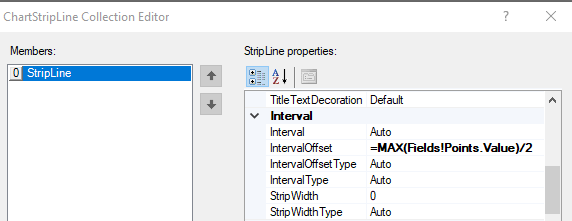
When configuring the horizontal chart axis, ensure that the value for the IntervalOffset key is set to a calculated expression as shown in Figure 8. This will ensure that whenever values from the Points field change, the positioning of the strip line will be adjusted accordingly.
Figure 8
Once StripLines have been added in both vertical and horizontal Chart Axis, a quadrant should be formed over your XY Scatter chart during the next time you run your report, as shown in Figure 9.
Figure 9
Assign labels to Quadrants
Similarly, to drawing lines over charts, we begin with a simpler approach to adding labels to quadrants by making use of the Textbox report item.
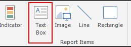
Figure 10
Using the Textbox report item, I have added Good, Excellent, Poor, and Average labels to my quadrants and adjusted the background color to mimic that of the labels shown in Figure 2.
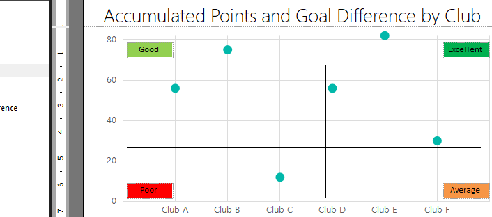
Figure 11
Unfortunately, simpler approaches often do not yield optimal results as the preview of Figure 11 shows that all labels (textboxes) get positioned outside of the chart area during a preview of the report, as shown in Figure 12. This means that we cannot reliably use textboxes as labels for quadrants over our SSRS XY Scatter charts.
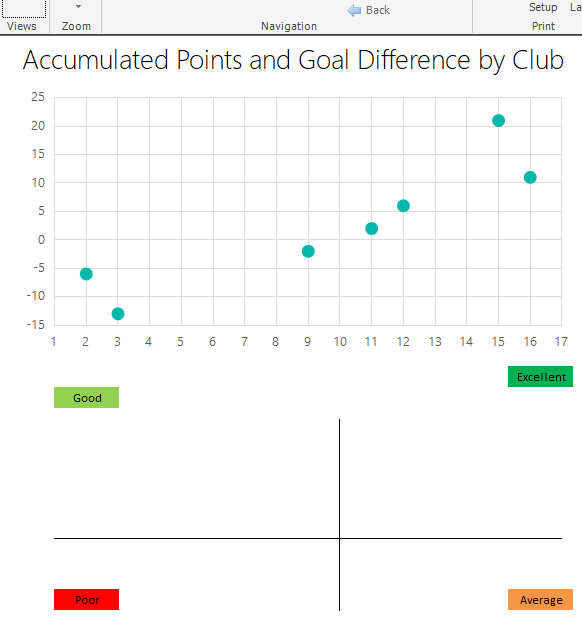
Figure 12
However, one trick that we can rely on involves making use of multiple chart titles as labels for our quadrants. To configure chart titles as labels, we first need to add them into our XY Scatter chart as illustrated in Figure 13.
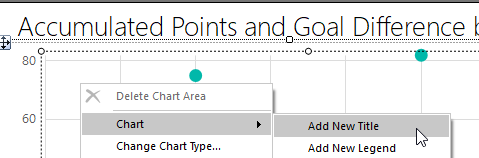
Figure 13
Once all the chart titles have been added, we next move them around the chart area by enabling the CustomPosition property which is located at the bottom of each Chart Title property menu as shown in Figure 14.
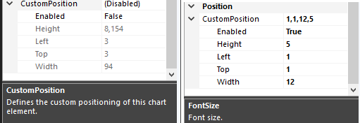
Figure 14
Having adjusted CustomPosition properties, you will notice that next time you preview the report, all 4 chart titles get correctly positioned as labels for quadrants in our SSRS XY Scatter report chart, as shown in Figure 15.
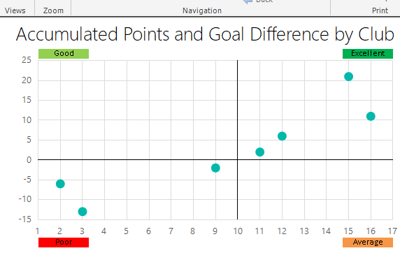
Figure 15
Summary
In this article, we have looked at how an Excel’s XY Scatter Chart with Quadrants can be replicated into a SQL Server Reporting Services. It was demonstrated that the difficulty of this Excel-to-SSRS report replication often occurs when a quadrant with labels has to be created over the SSRS XY Scatter report chart. Yet by using a combination of StripLines and Chart Titles, we managed to successfully create a dynamically responsive quadrant with labels over the SSRS XY Scatter report chart.
Downloads

Sifiso's LinkedIn profile
View all posts by Sifiso W. Ndlovu