
In the previous article, in this series, How to create and configure a Sunburst chart in SQL Server 2016 Reporting Services, we have explored new chart types in SQL Server 2016; the Sunburst chart and the Tree Map chart, that are used to display hierarchical data. The Sunburst chart is a way of presenting relational datasets together in a compact form. The Tree Map Chart is also a way of showing hierarchical data.
In this article, we are going to show how to create a Tree Map chart and its comparison with the Sunburst chart.
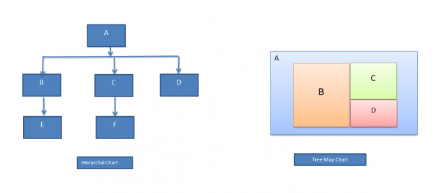
The Tree Map chart
The Tree Map chart is a good way for displaying large amounts of hierarchically structured data. It shows hierarchical data into a number of rectangles. The tree Map Chart consists of different groups, and each group contains further rectangles These rectangles are of different size depending upon the data. These boxes are placed from left to right in order of large to small values.
Below is the architecture diagram of a Tree Map chart.

Sample Data
In this article, we are going to use Olympic Games medal tally as the sample data. It includes top six countries medals data. The data is further divided into sports category.
We have prepared the data using Excel sheet to create the SSRS report we need to import that data first into the sample database.
You can find the Excel sheet in the attachment section.
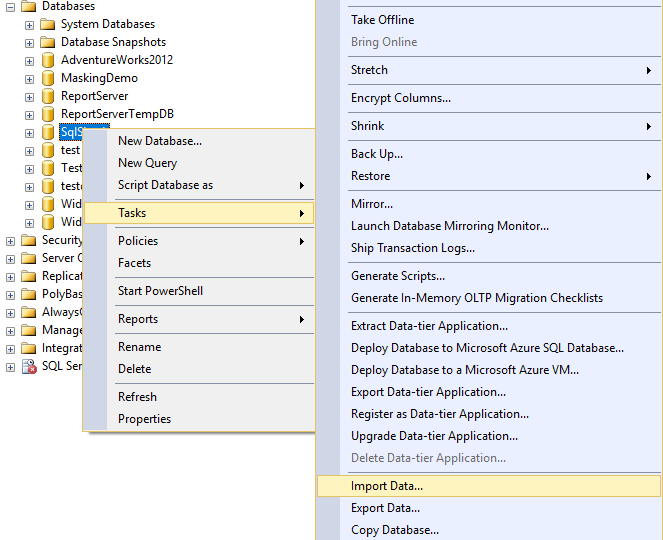
To import data into a database, we need to Right click on the database and click import data
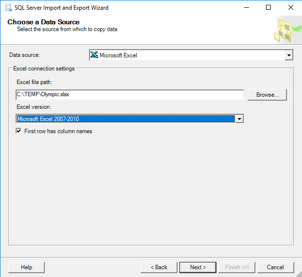
We’ll select the data source as Microsoft Excel and give the Excel file path. In our Excel sheet, the first row has column names so we will choose the checkbox, ‘First row has column names.’
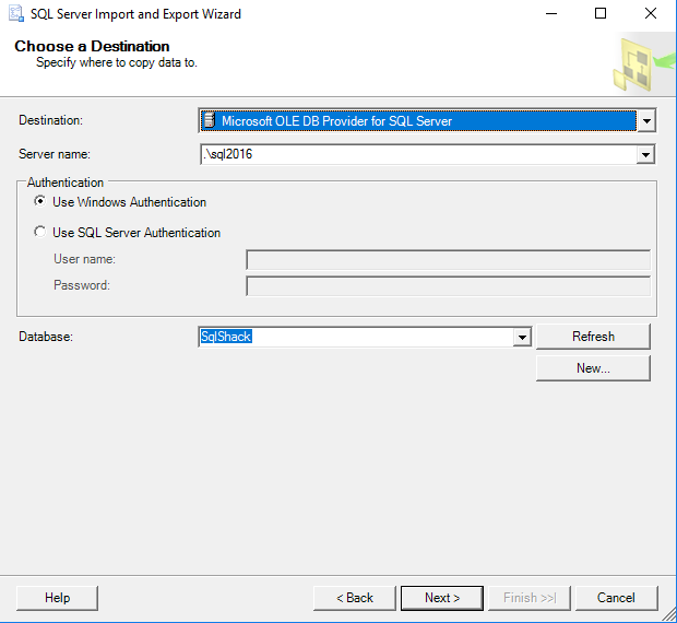
We will enter the destination as Microsoft OLE DB Provider for SQL Server and choose the Server name and Database name
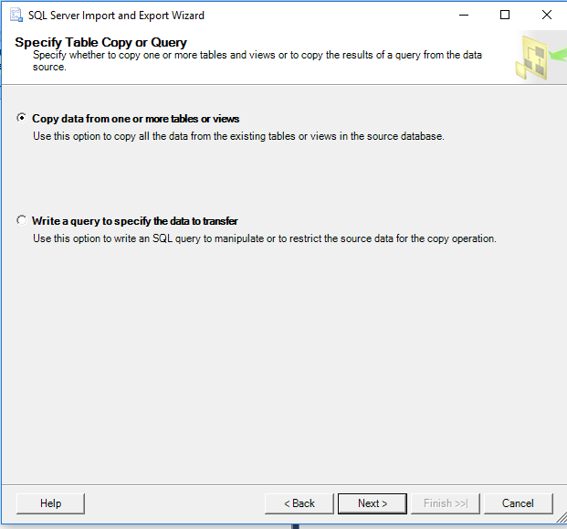
We’ll select option ‘Copy data from one or more tables or views.’
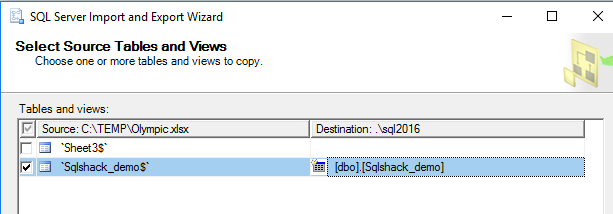
We’ll click the Excel sheet name that contains the data and the destination table name.
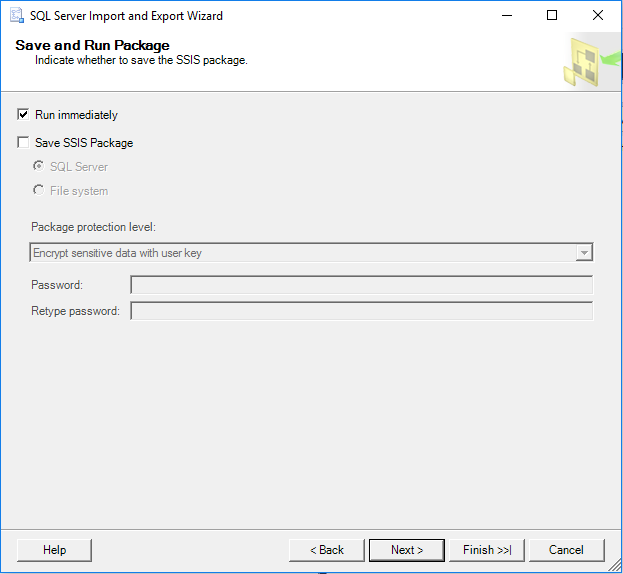
We’ll run the package. If we want to save the package, we will click on the ‘Save SSIS Package’ checkbox.
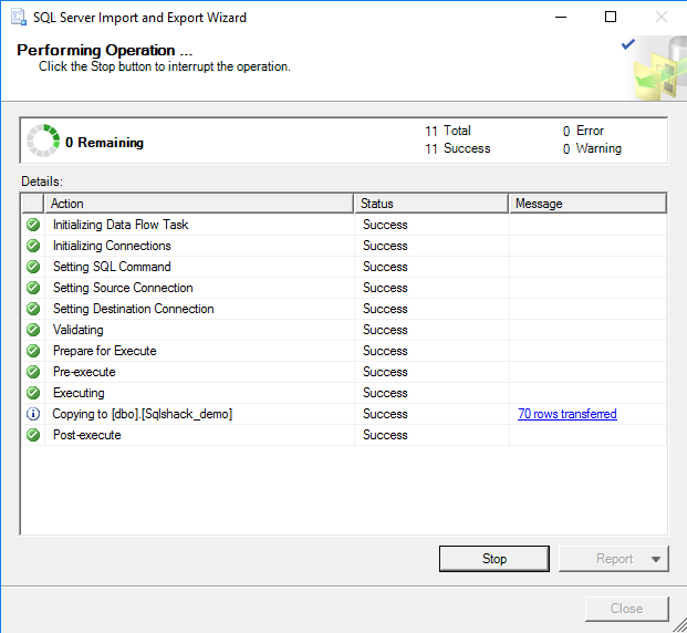
Once Data import is successful, it will show progress and status as success with number of rows transferred message.
Creating a Tree Map Chart in SQL Server 2016 Reporting Services
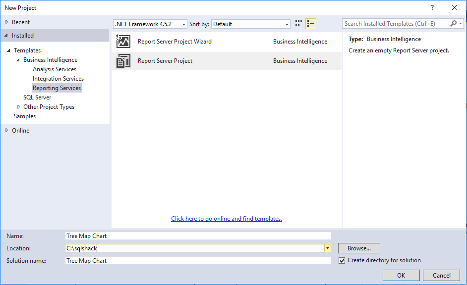
We will open Visual Studio 2015 and click on new project-> Report Server project
We’ll assign the name to the report server project along with the location as shown below
In the project, we will go to solution explorer and click on Add-> New item
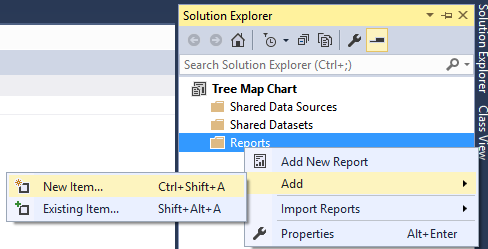
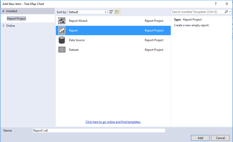
We’ll select the report from the report project
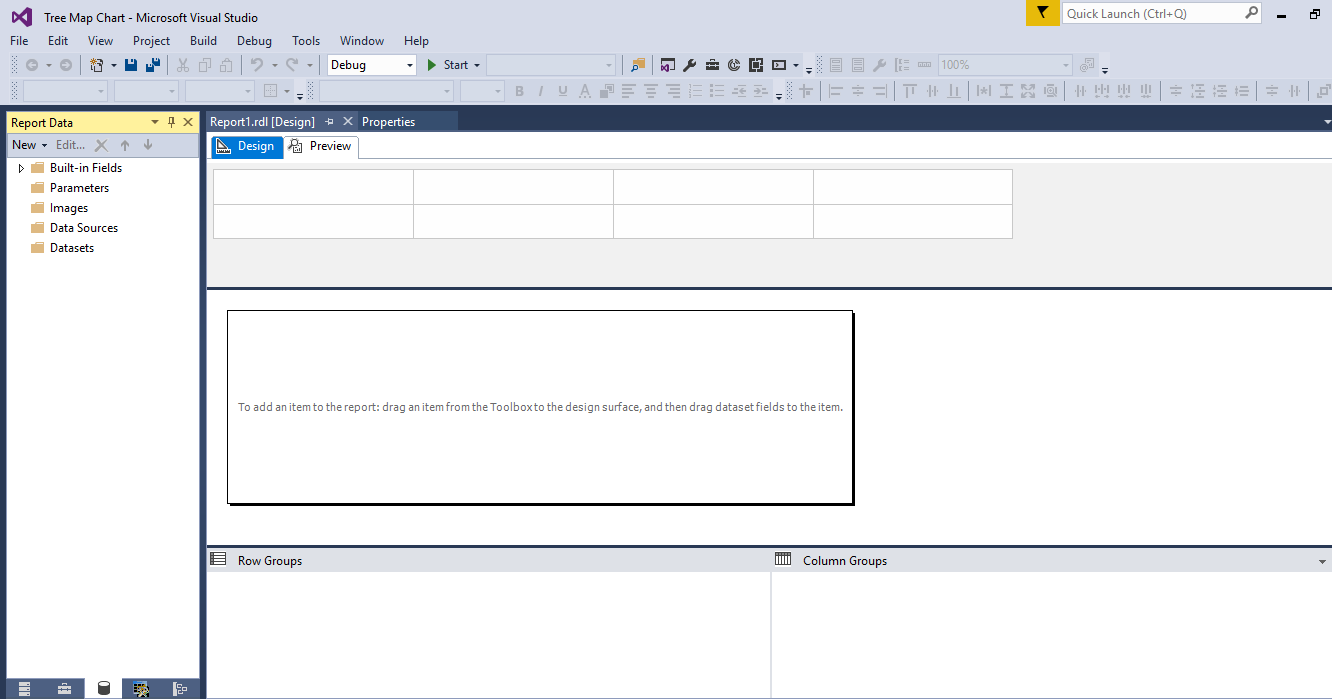
We will open the report project; we can see the design window as below:
We will create the data source by providing connection string (server name, database name and authentication method)
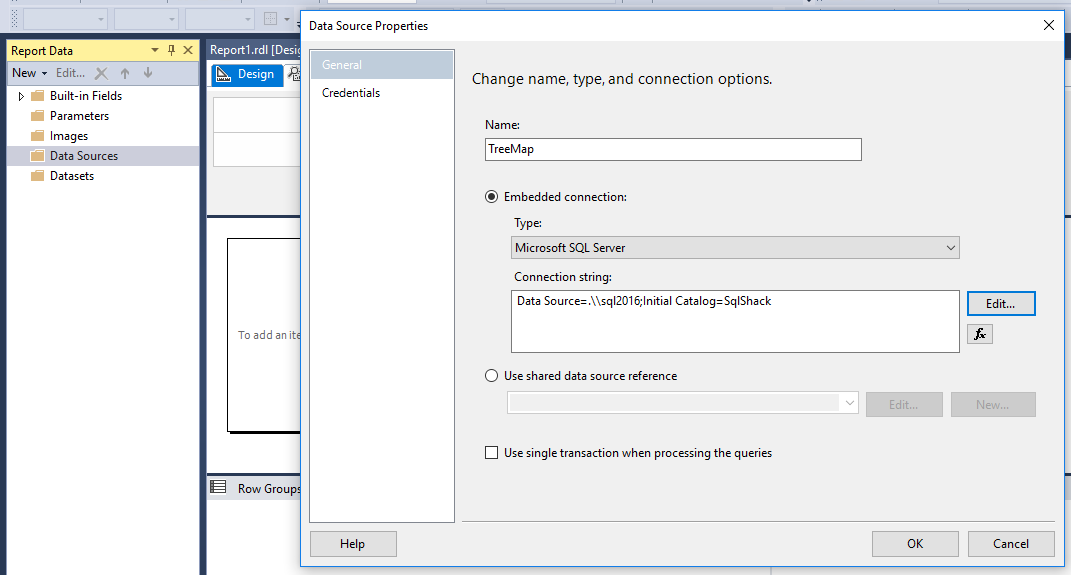
We will create the data set that contains the query to return report data.
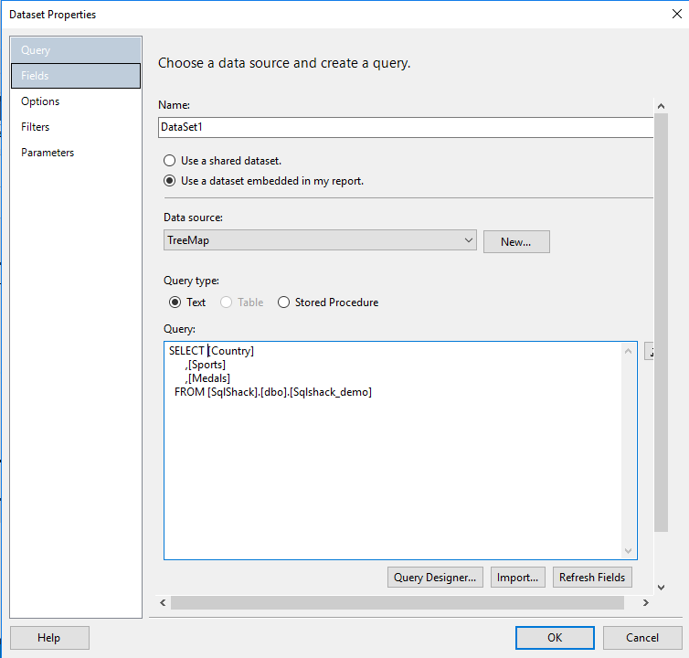
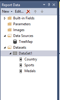
We can see the report data source and data set below in the report data window.
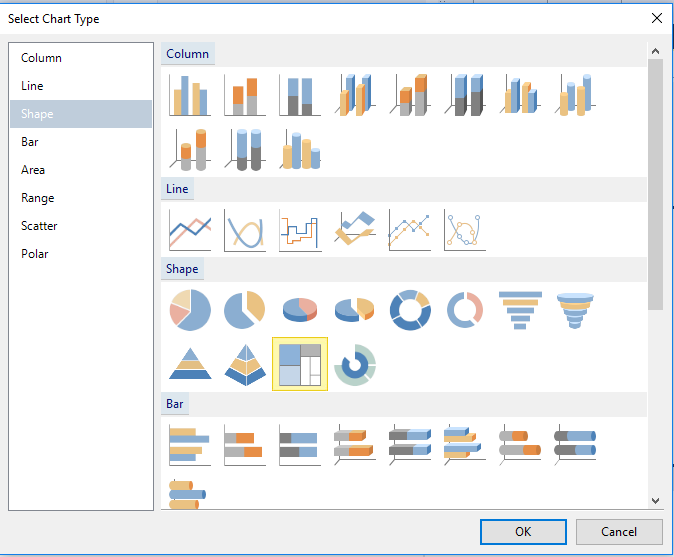
Now, we will right click on a blank area of the report and insert the chart. We’ll select the Tree Map chart from the graph window.
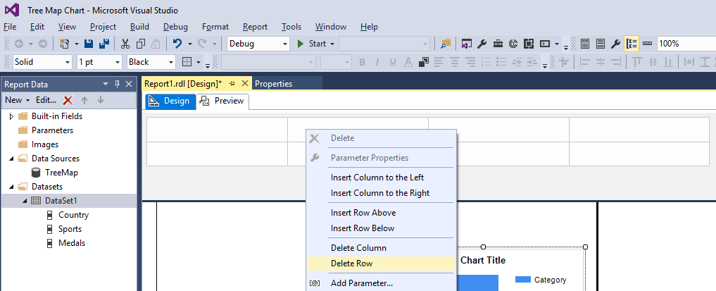
Since we are not using any parameters in the report data, we can delete the parameter window by right click on it and delete row
It will be difficult to display the chart data in a smaller window, so we’ll adjust the window by dragging it towards right and downside.
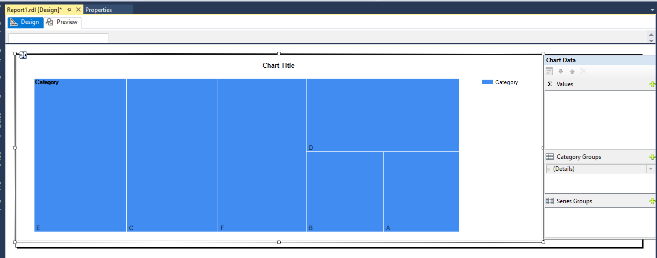
We’ll click on the Tree Map chart, which will open the data window. We will select the Medals field from the drop-down.
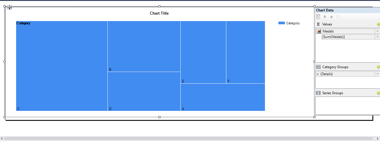
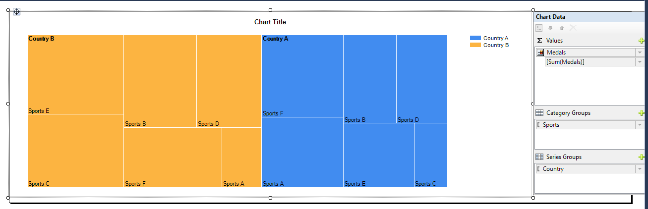
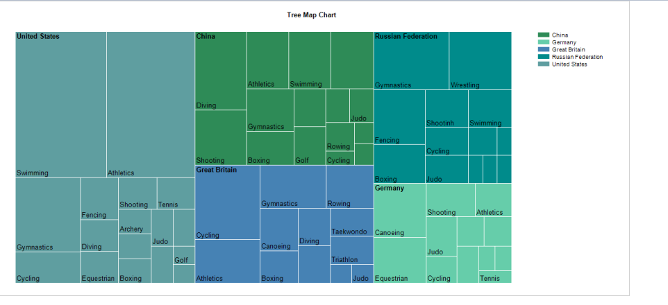
In the category group, we’ll choose sports. We can see that the chart is divided into sports A, Sports B, etc.
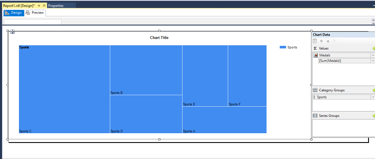
In the series group, we’ll select the country. We can see below that chart divides into sports. Each color represents a different country.
Our Tree Map chart configuration is now finished, so we’ll click on preview. We can see that
-
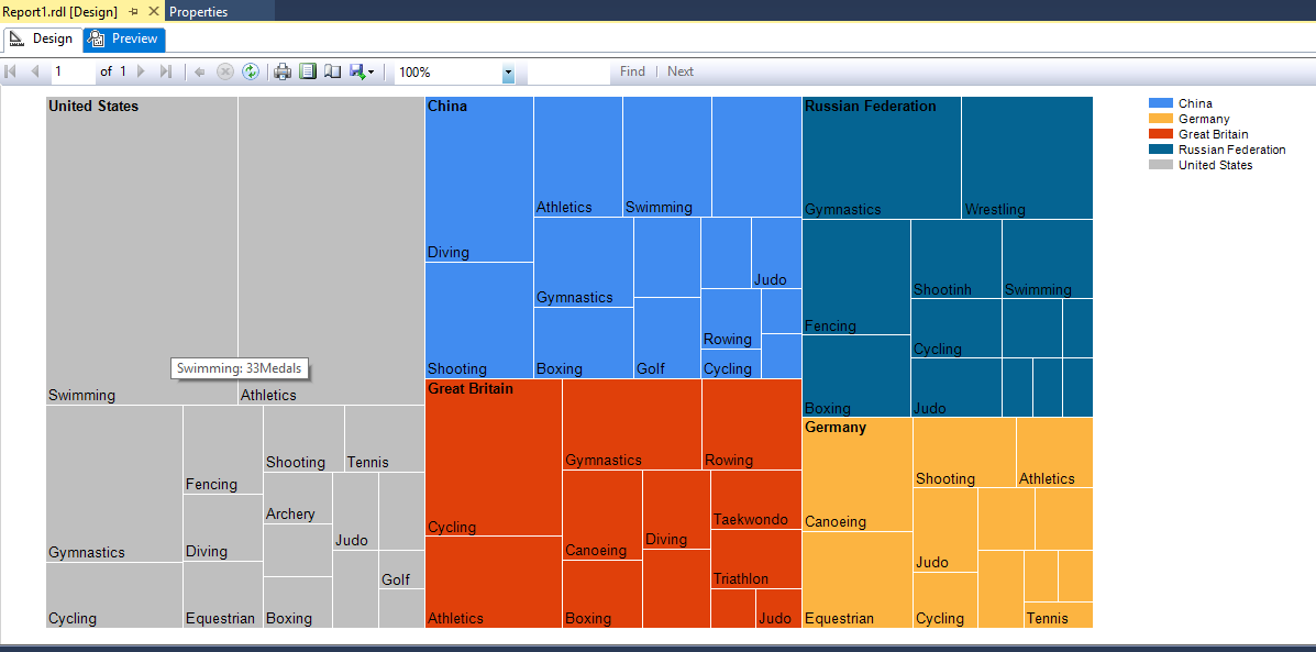
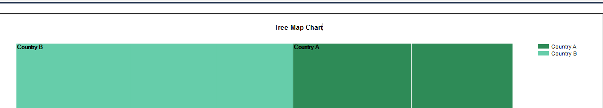
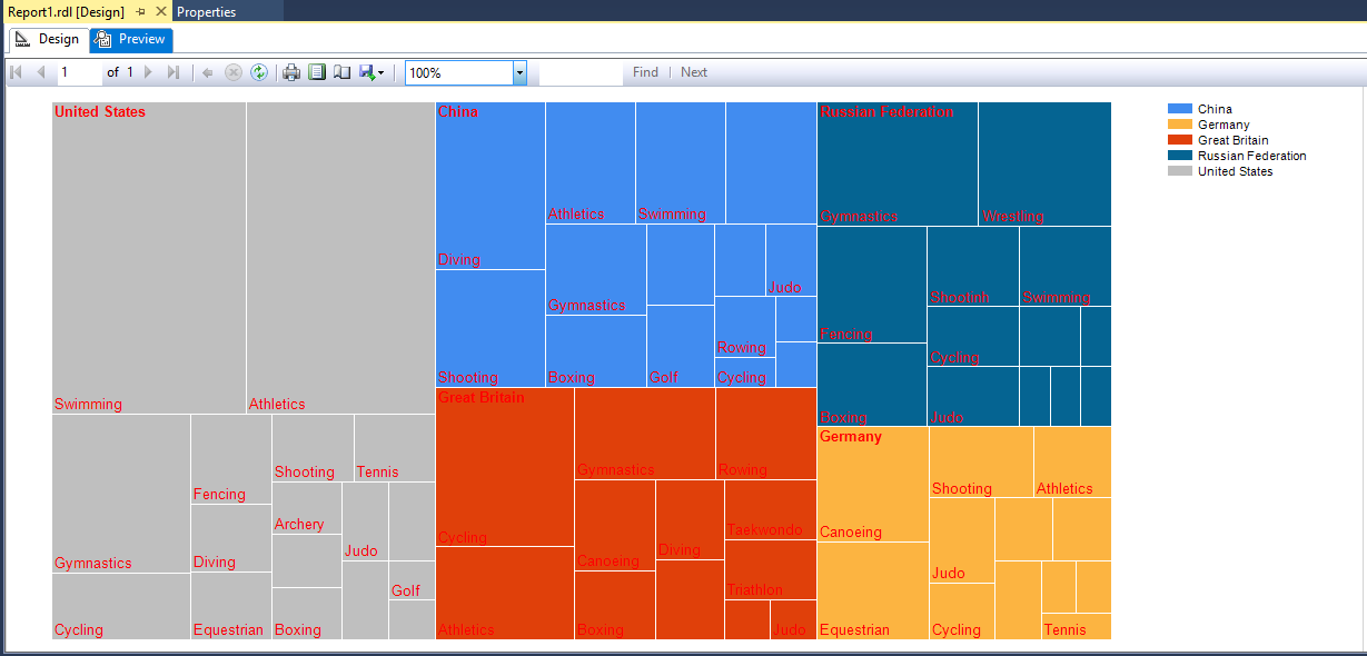
The Tree Map chart consists of various blocks as per country. For example
- United States group – Grey
- China – Blue
- Great Britain – Brick
The order of different country groups is as per the total number of medals.
- Each country group has different blocks as per sports.
- The group’s arrangement is from left to right based on the data.
In the sample data below, is the order of countries based on a total number of medals.
- United States
- China
- Great Britain
- Russian Federation
- Germany
So, the United States is on the left side in the chart while Germany is on the right side.
We can see above, that some of the blocks are not showing anything. We can adjust the chart
- Go to design page and change the overall area.
- Modify the font size.
Also, each box has different size. This size of rectangles is in proportion to the data. For example, in the United States, Large box shows swimming (33 medals), Small box shows golf (1 medal)
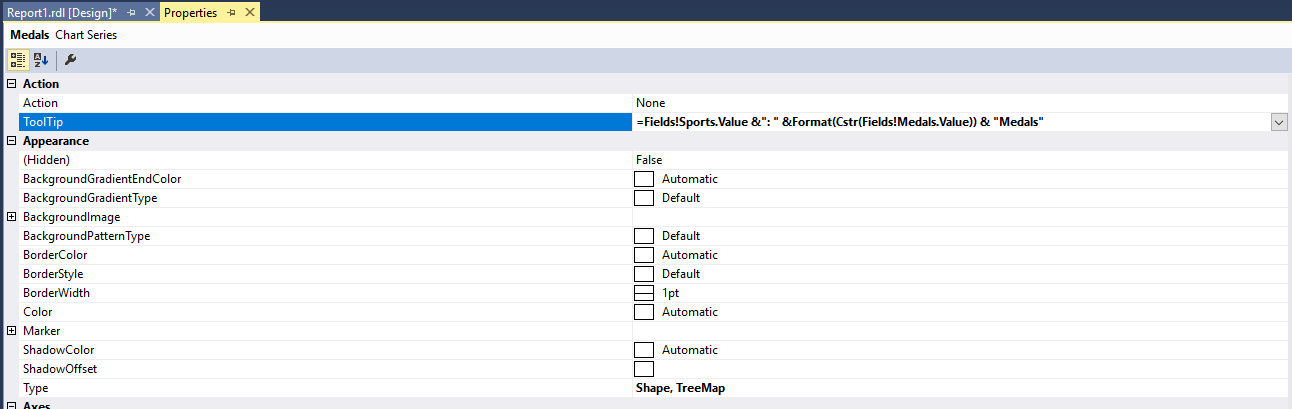
Now, if we want to know the number of medals for each sport by hovering the mouse over it, we’ll need to enable the tooltip property.
To enable values in a tooltip, we will click on the values in chart data, go to properties -> Tooltip, and enter the expression as:
|
1 2 3 |
==Fields!sports.Value & ": " &Format(Cstr(Field!Medals.Value)) && "Medals" |
This expression will display the number of medals based on each sports category. We will click OK and go to preview.
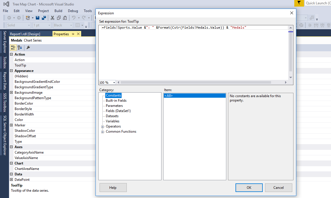
We can see now – if we go to sports swimming, it displays the data as Swimming: 33 Medals. Similarly, we can go to each box (game) to check the number of medals earned.
Be default, the chart uses BrightPastel Palette. There are many palette options available:
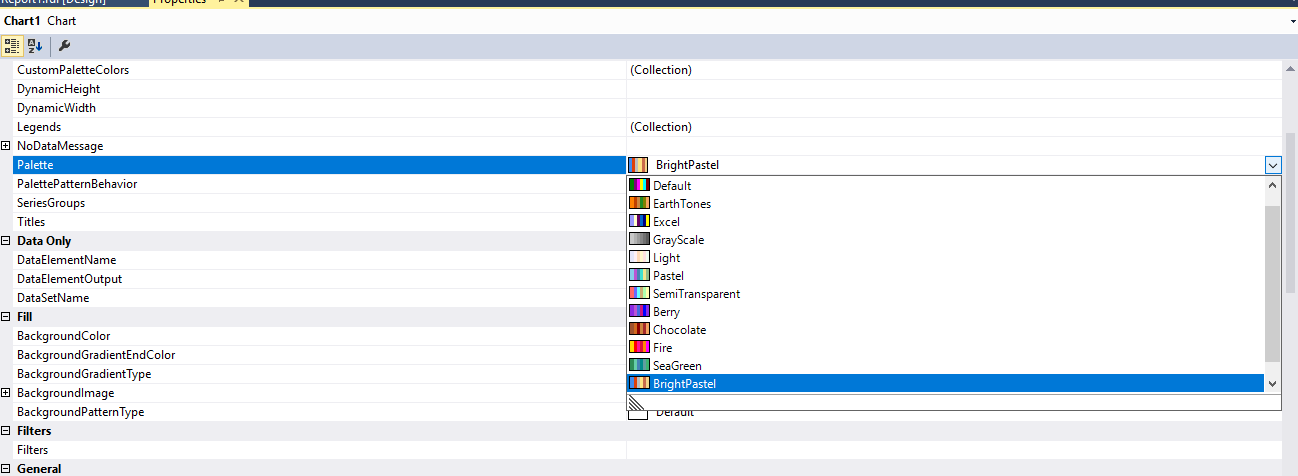
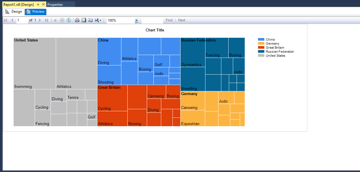
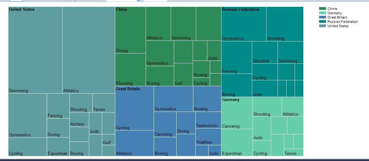
If we choose palette as sea green, the chart preview looks like below:
We will set the chart title as the Tree Map Chart:
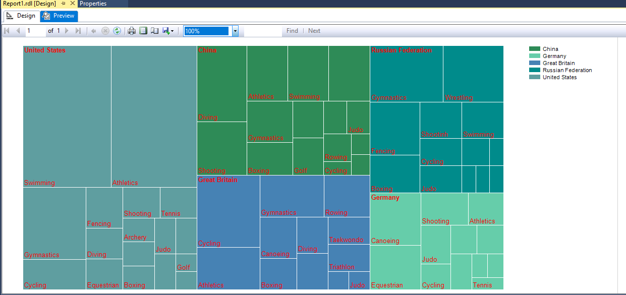
Now, the Tree Map looks as below:
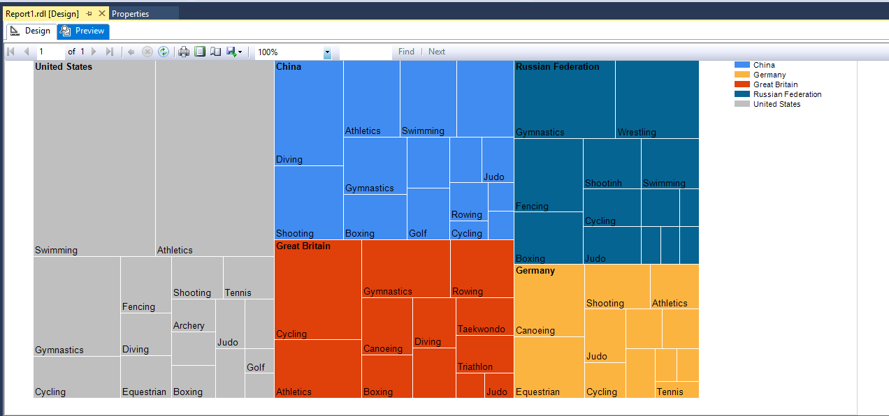
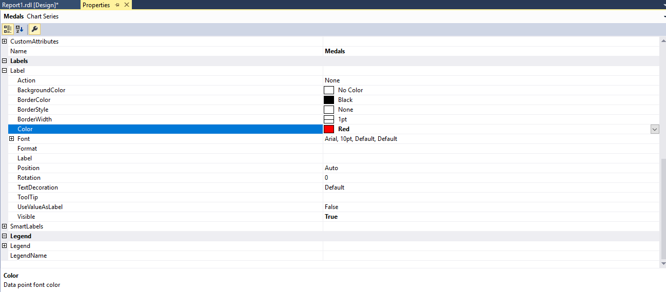
There are many options available to customize the chart. To change the font (color, size, accent) click on the series property -> Labels.
If we change the color to red, chart data looks like below:
Comparison between sunburst and Tree Map Chart
Below are Tree Map and sunburst charts, created with the dataset in the example.
The Tree Map Chart
The Sunburst chart
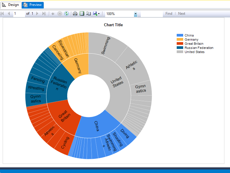
We can see that, in the sunburst chart above, it is difficult to identify categories. Using Tree Map charts – we can easily visualize them.
Below is the comparison between these charts
- The Sunburst chart shows the corresponding values with rings, representing the levels from inside to out. The Sunburst charts can have more than two levels
- Sunburst charts become complicated and hard to read with the increasing level of the hierarchy while a Tree Map chart is easy to display and read.
- Tree Map charts aren’t great at showing hierarchical levels between the largest categories and each data point. The Sunburst chart is useful in explaining that.
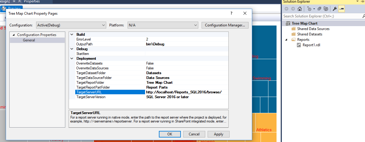
Deploying the package
Once we have the report ready with the SSRS report, we can use it to report server URL. In the Solution Explorer, we’ll right-click on the project name and choose the target server URL and the destination server version.
Conclusion
The SQL Server 2016 reporting services enhancements, Tree Map and Sunburst charts, represent hierarchical data in an easy to understand manner, and convey graphical information elegantly and informatively.
References
- SQL Server Data Tools GA updates for June 2016
- SQL Server 2016 RC1: What’s new in Reporting Services?
- What’s New in Reporting Services in SQL Server 2016 CTP 2.3
- Tree Map and Sunburst Charts in Reporting Services
Attachment


I am the author of the book "DP-300 Administering Relational Database on Microsoft Azure". I published more than 650 technical articles on MSSQLTips, SQLShack, Quest, CodingSight, and SeveralNines.
I am the creator of one of the biggest free online collections of articles on a single topic, with his 50-part series on SQL Server Always On Availability Groups.
Based on my contribution to the SQL Server community, I have been recognized as the prestigious Best Author of the Year continuously in 2019, 2020, and 2021 (2nd Rank) at SQLShack and the MSSQLTIPS champions award in 2020.
Personal Blog: https://www.dbblogger.com
I am always interested in new challenges so if you need consulting help, reach me at rajendra.gupta16@gmail.com
View all posts by Rajendra Gupta
- Understanding PostgreSQL SUBSTRING function - September 21, 2024
- How to install PostgreSQL on Ubuntu - July 13, 2023
- How to use the CROSSTAB function in PostgreSQL - February 17, 2023