
Power BI has a rich set of visuals to represent data according to our requirements. These custom visuals make it easy for us to highlight data effectively to understand and share the data in reports. We have learned many customized visuals so far in ongoing series of Power BI Desktop.
In this article, we will explore Enlighten World Flag Slicer visual for Power BI Desktop.
Import Data for Enlighten World Flag Slicer in the Power BI Desktop
Suppose we want to prepare a report to examine the 2018 Asian Games medal table using Power BI Desktop. In the report, Enlighten World Flag Slicer is helpful to visualize the data from the dataset and represent country names with their flags. This represents the country with flags symbol and we can filter out the report for the country just by click on the respective country flag.
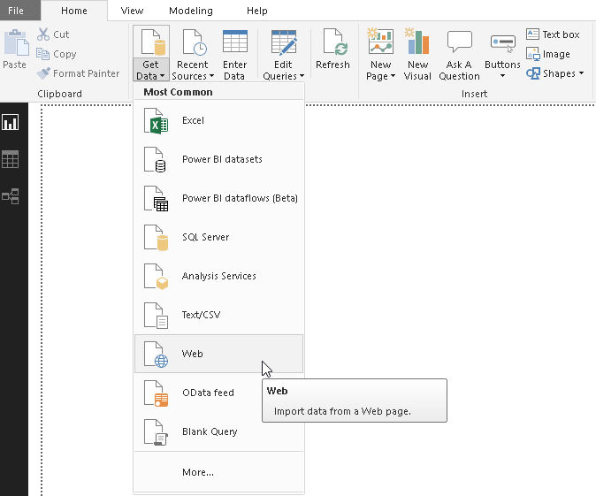
In this article, we will take data from the Wikipedia 2018 Asian Games medal table. In Power BI Desktop, we can directly fetch data from the web data source and prepare chart from it without exporting data into excel or flat file format. Launch the web data source from Get Data -> Web
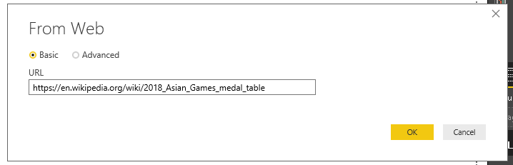
In the basic option, enter the URL of the web page containing data table and click OK.
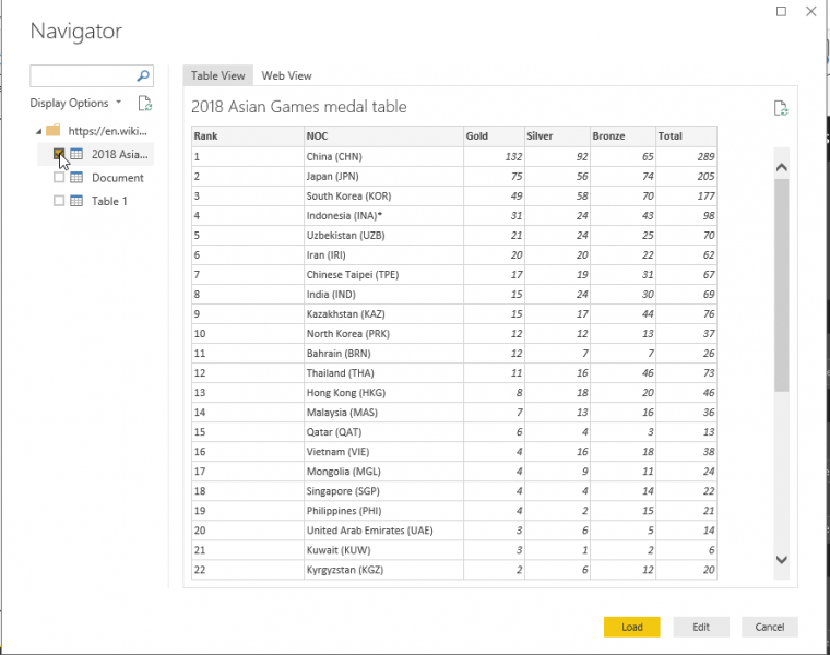
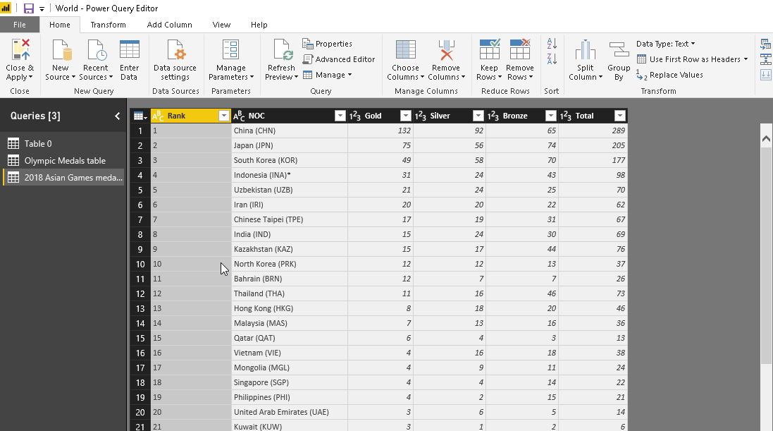
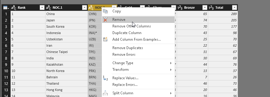
Preview the data. We can see in the column ‘NOC’ country name are shows along with abbreviations, for example, China (CHN). We need to remove the abbreviation so that we can generate the enlighten world flag slicer. To edit the data, click on ‘Edit’
It opens Power BI editor to make changes in the data.
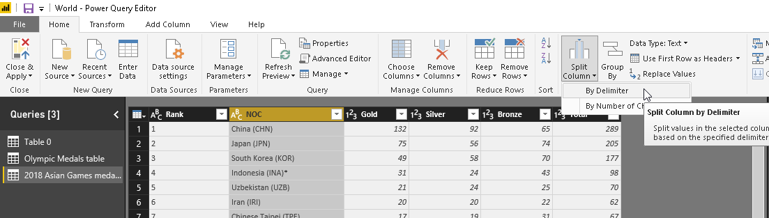
We can split the column to get rid of abbreviations. Click on the ‘Split Column -> By Delimiter’
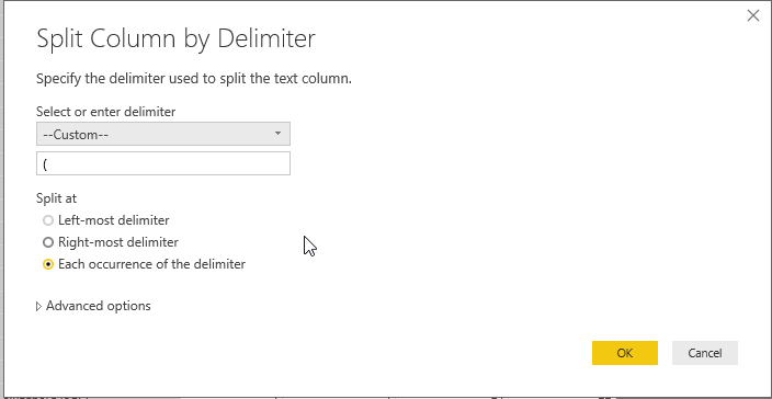
It automatically selects the delimiter. However, we can select or enter delimiter. We can also choose to split at leftmost/rightmost or split at each occurrence of the delimiter. Proceed next by clicking on ‘OK’.
It splits the column based on the delimiter condition specified.
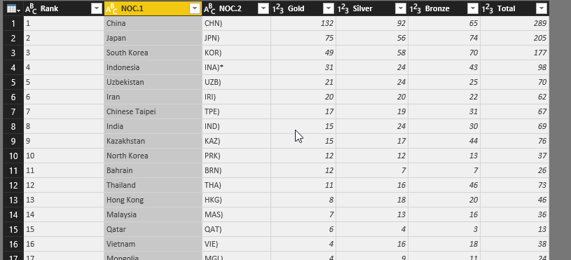
We do not need this column, so right click on the column and remove it.
Also, rename the column name from ‘NOC’ to ‘Country’. Close and apply to save changes.
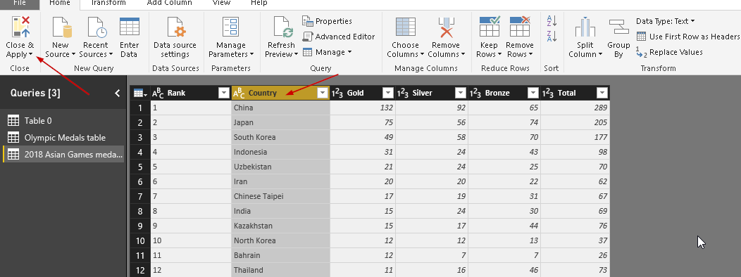
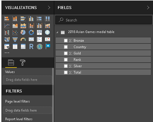
We can see dataset now to prepare visuals as required. Our sample dataset contains a list of countries, and their medals tally (Gold, bronze or silver).
Before we create the enlighten world flag slicer visual, let us create ‘Map’ chart from our data set. Double click on ‘Map’ chart icon as shown and adjust the chart height width in the bottom part of the screen.
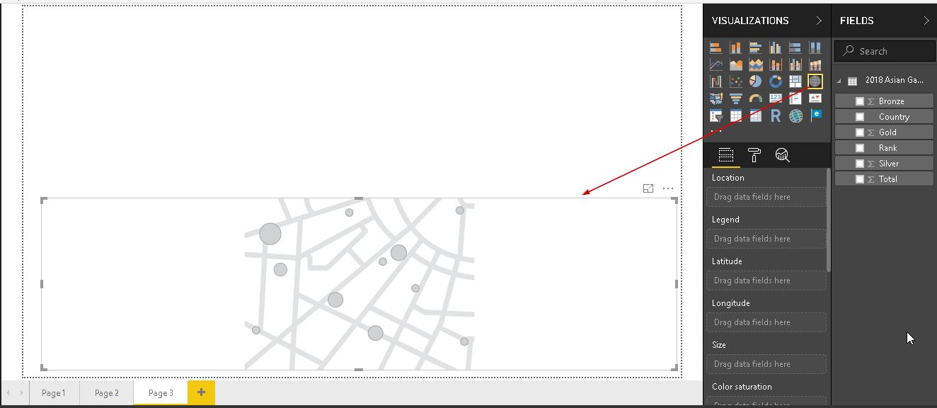
Now, drag the column fields as below
- Location -> Country
- Size -> Total
It generates the map chart as shown here. For the countries listed in our data set, it puts a dot to represent the country.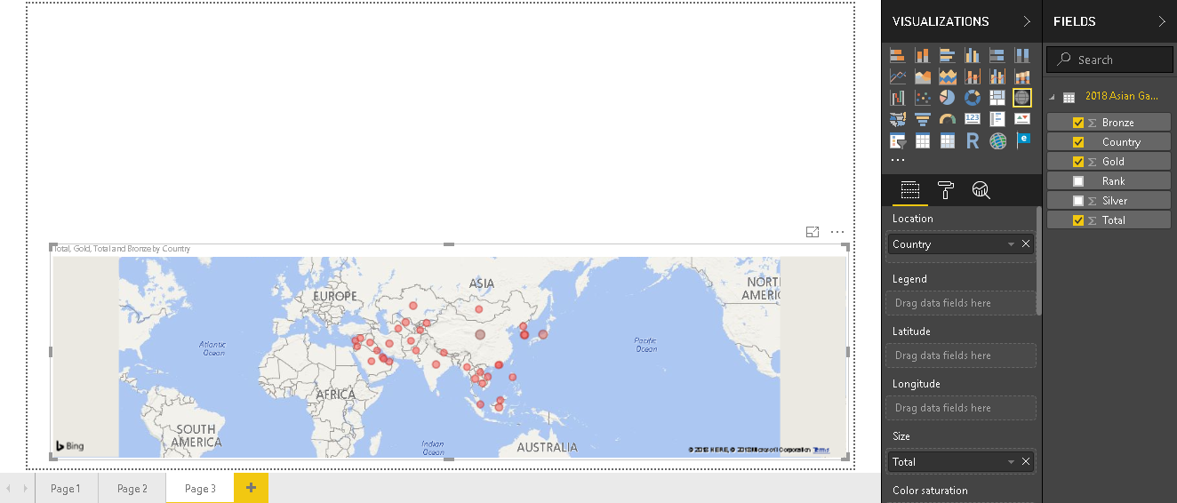
In this chart, data is shown for all countries together. We can get the data for Individual County if we hover the mouse over the dots.
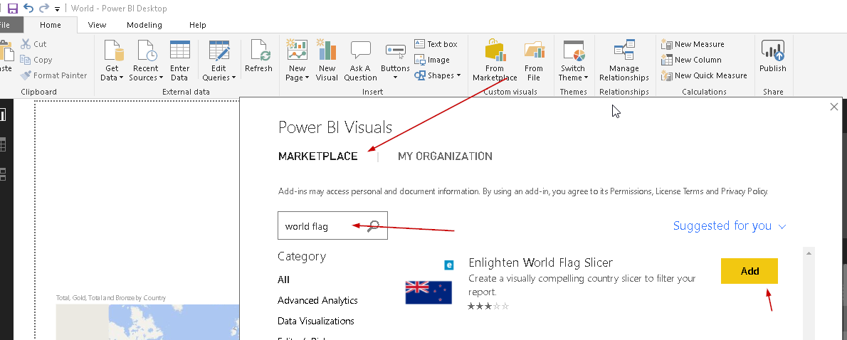
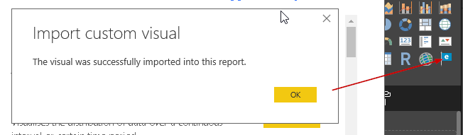
Now, we will import the ‘Enlighten World Flag Slicer’ visual from the Marketplace. Search it and add as shown below.
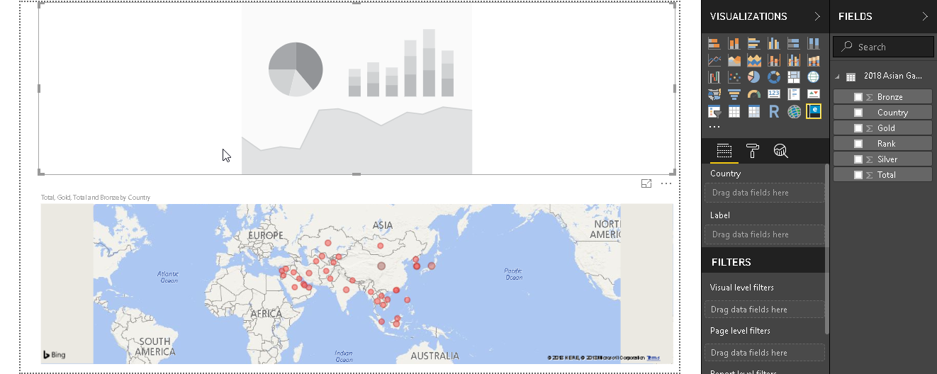
You can see the icon as a flag shape in the visualization area.
Double click on it and adjust the size on the upper side of the blank screen.
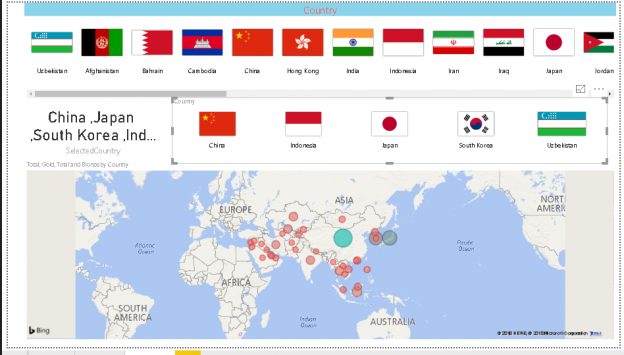
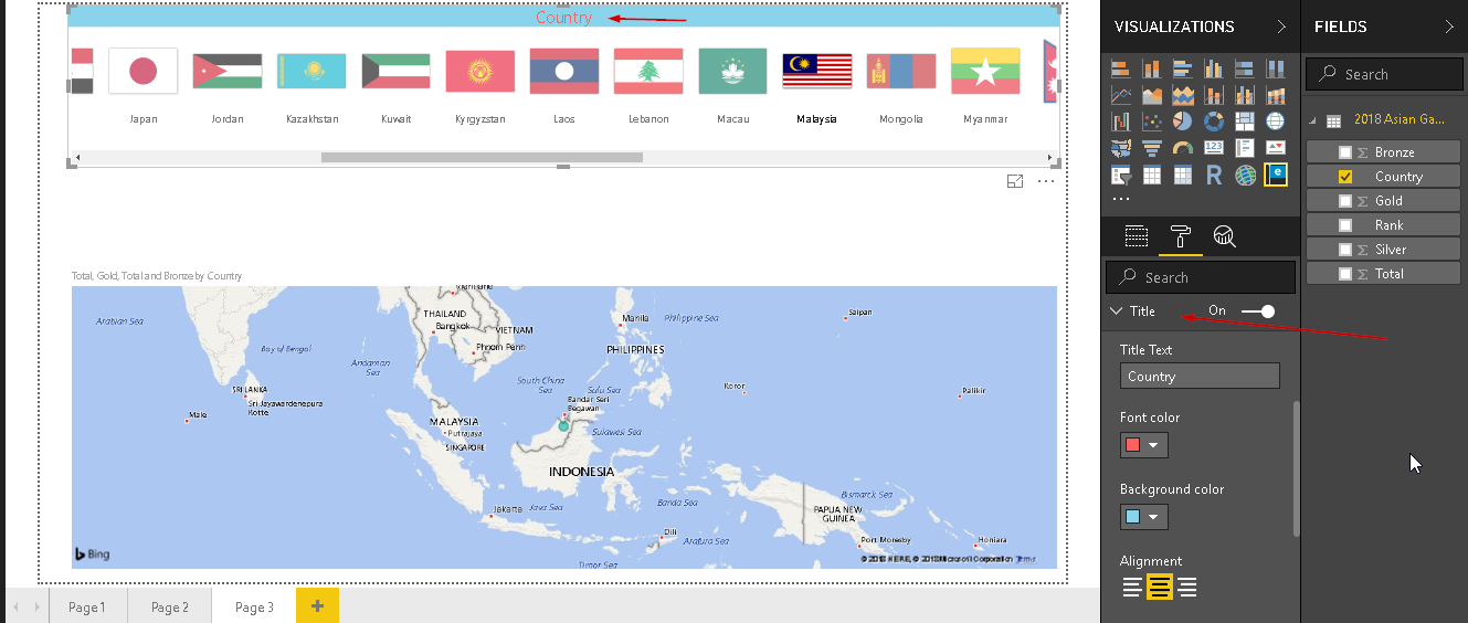
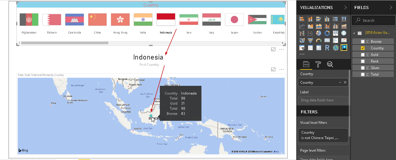
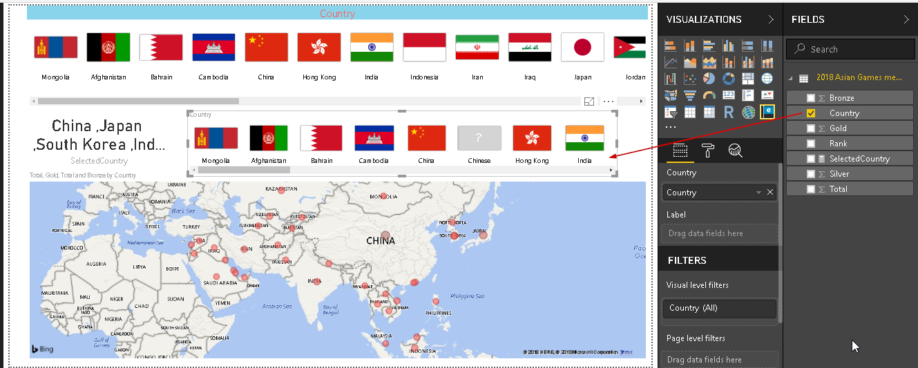
Click on the ‘Enlighten World Flag Slicer’ and select the ‘Country’ from our dataset. It shows the flag of each country listed in our data set.
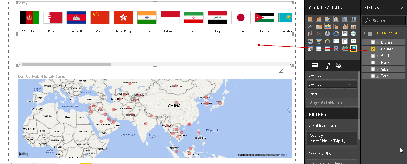
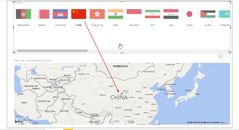
Now, if we click on any particular country, the map auto zooms to that particular country. For example, here I clicked on ‘China’ and you can see in the chart ‘China’ is zoomed in.
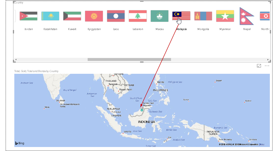
Similarly, let us click on another country say ‘Malaysia’ and map chart is again zoomed on that country.
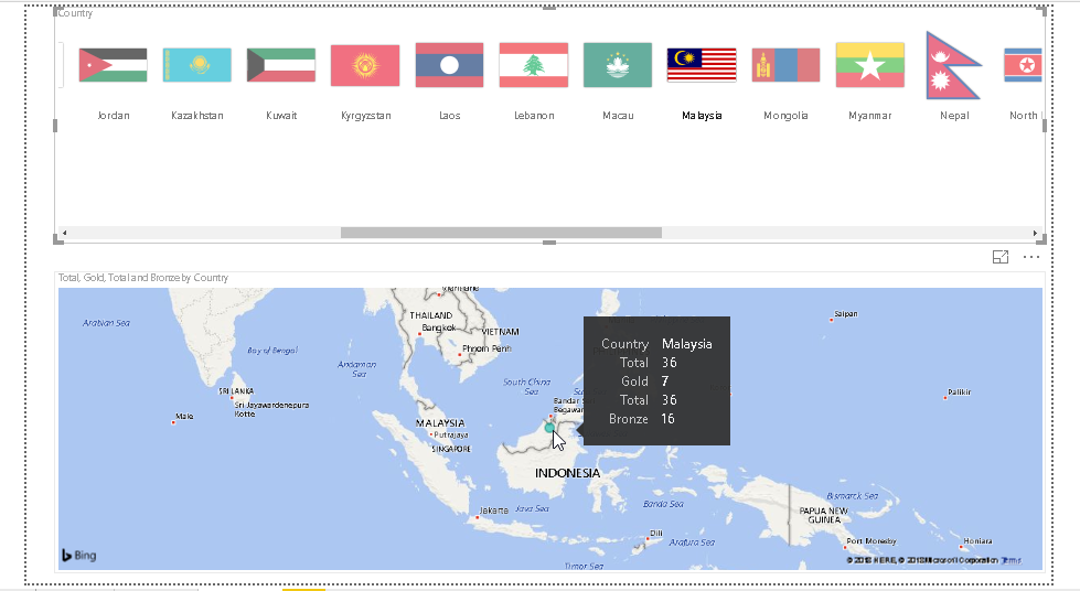
If we hover the mouse over the dot representing country, you can see details of medals won by that particular country. For example, below you can find details of ‘Malaysia’ country medals.
Now, we will do a little bit of formatting for our enlighten world flag slicer visual. In the format area, click on ‘Title’ and modify the title properties such as font color, background, alignment etc. This will provide a better look for our chart title.
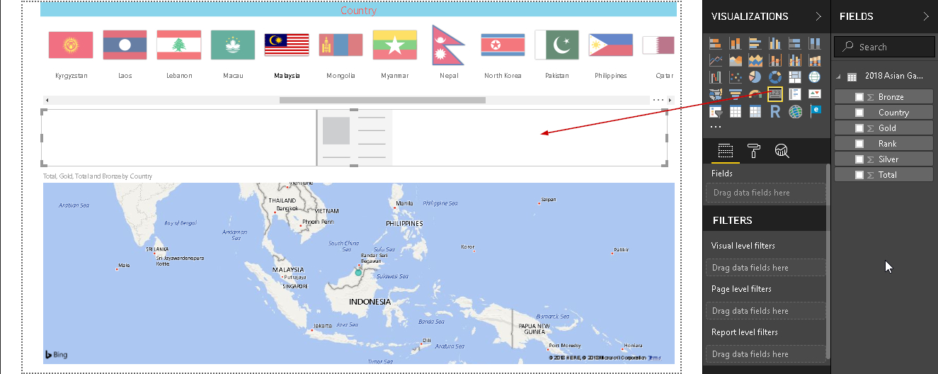
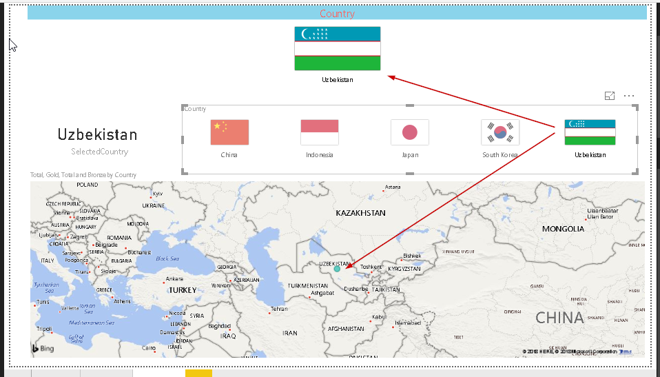
As shown above, when we click on any particular country, map redirects to that country. We cannot find the selected country from the flags since it is not highlighted. Therefore, let us add another chart ‘Card’ into the area.
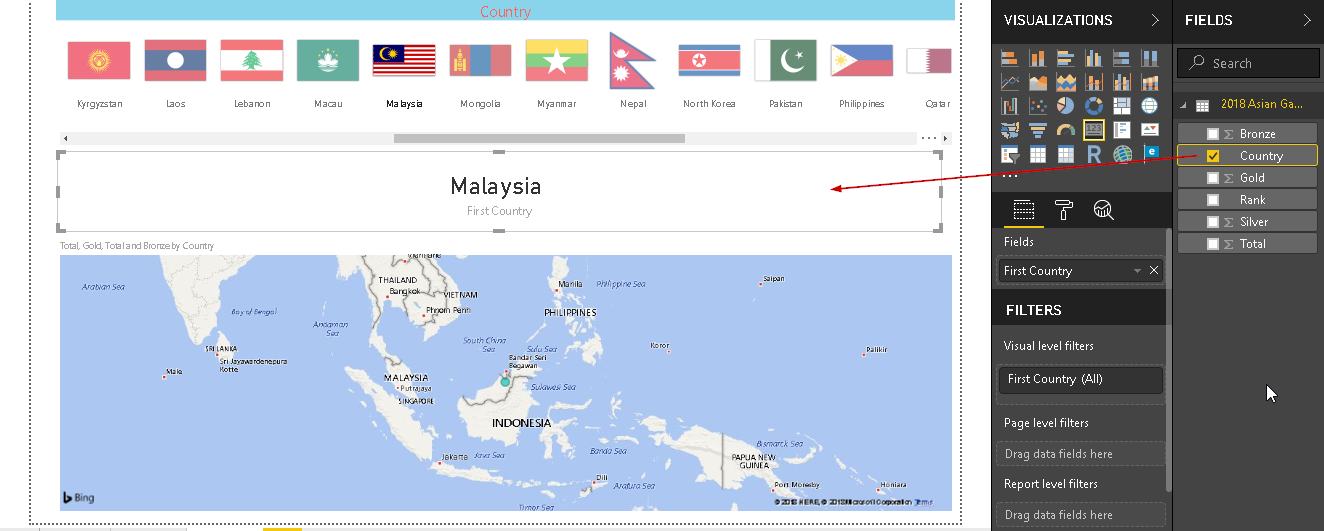
Select the chart and click on a country from the dataset. Now, it will show the name of the country we selected from the flags. For example, below it shows Malaysia.
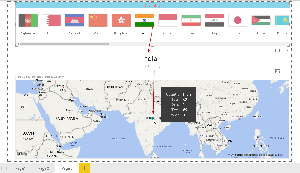
Similarly, below it shows county ‘India’
Below we can see Indonesia along with the medals tally for it.
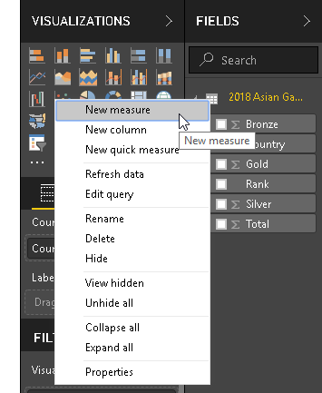
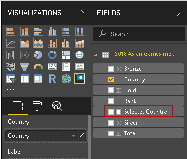
We still have one issue with our report. In the above example, you can notice that whichever country we select, it shows ‘First Country’ below the country name. In order to address this, let us create another ‘Measure’ column in the dataset. Right, click on the dataset and select ‘New Measure’.
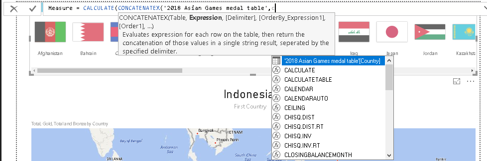
Here, we will use DAX codes to prepare a measured column:
- CALCULATE: It evaluates an expression in a context that is modified by the specified filters
- CONCATENATEX: it concatenates the result of an expression evaluated for each row in a table
This is interactive to write DAX queries, as soon we write, it guides us with syntax, options.
Therefore, the formula for the measured column is as below
Measure = CALCULATE(CONCATENATEX(‘2018 Asian Games medal table’,’2018 Asian Games medal table'[Country],”,”))
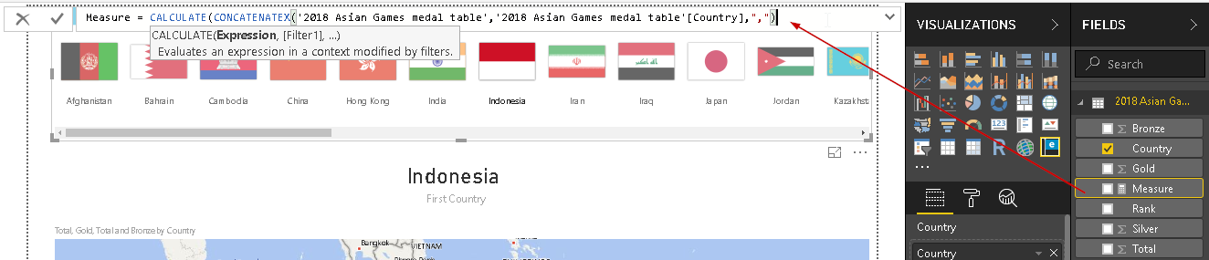
Rename the column from Measure to ‘SelectedCountry’.
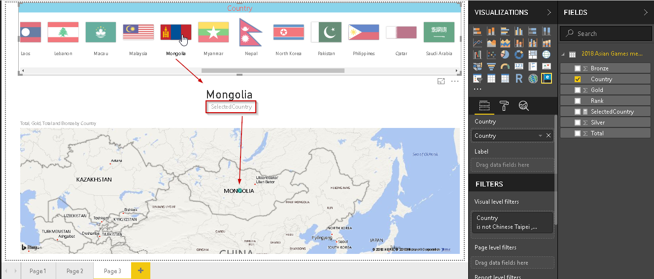
Now, map the ‘Selectedcountry’ column in the chart. It shows all countries name if we do not select the country, else only that particular country name is shown.
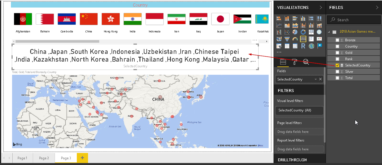
Select any country and we can see that it shows our new column name instead of the first country below the selected country name.
Suppose, we want to filter the records based on top 5 countries. We need to make a separate section and display these top 5 countries flags. Adjust the chart size and insert another enlighten world flag slicer as shown here.
In the new enlighten chart, map the column ‘Country’.
Currently, it is showing all flags in the new enlighten world flag slicer chart. We want to display only the top five countries chart here, so in the ‘Visual level filter’ section, select Top ‘N’.
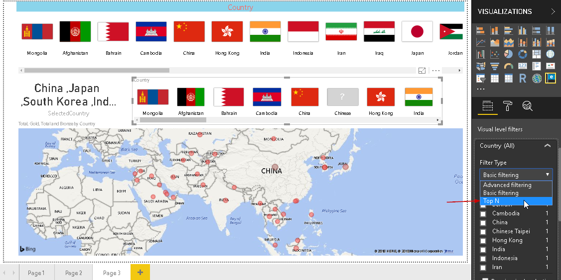
Enter the number of items we want to show. Below this, we can select how to want this filter to apply. For example, in my example, I want to select top countries based on the total number of gold medals. You can see now only top 5 countries flags are displayed.
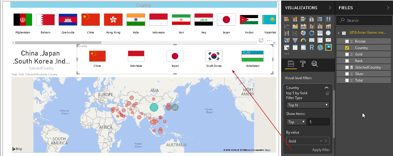
Now, this chart works in two ways. If we click on the country flag, in the top section, the new area also shows that country flag and map redirects to that particular country.
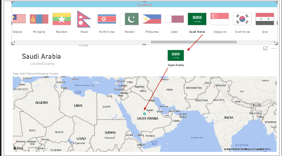
Click on the blank area and it removes the filter on the county flag.

In another way, click on the flag from the top five country flag, and the top chart shows only that country flag instead of all countries.
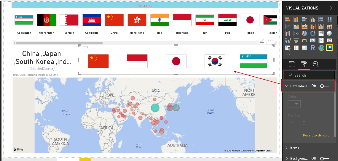
Format Enlighten World Flag slicer
- Data labels: By default, ‘Data labels’ setting is ‘On’. It shows the country name below the flag. If we change this to ‘Off’, we cannot see the country name:
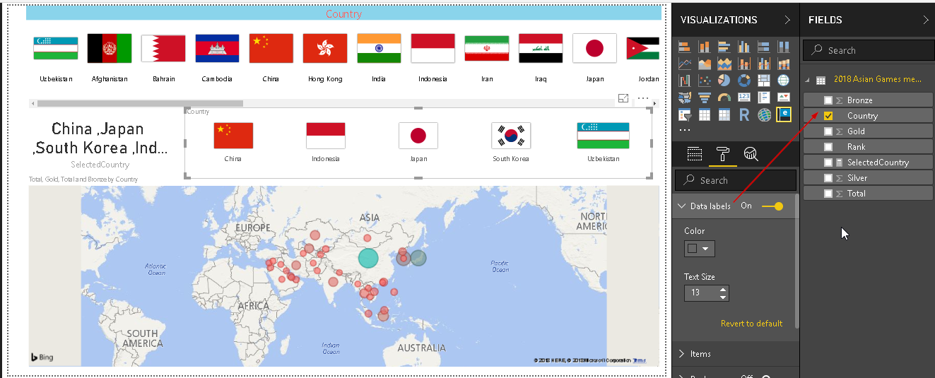
If we change data labels back to ‘On’, we can control the color and the font size for the countries name. By default, data labels show the country name.
We can change it to show the value of another field also. For example, in below example, we can see the ‘Gold’ medals count below the flag names.
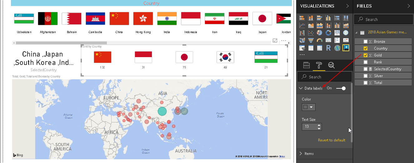
Let us change it back to the country name and look out for the other formatting option.
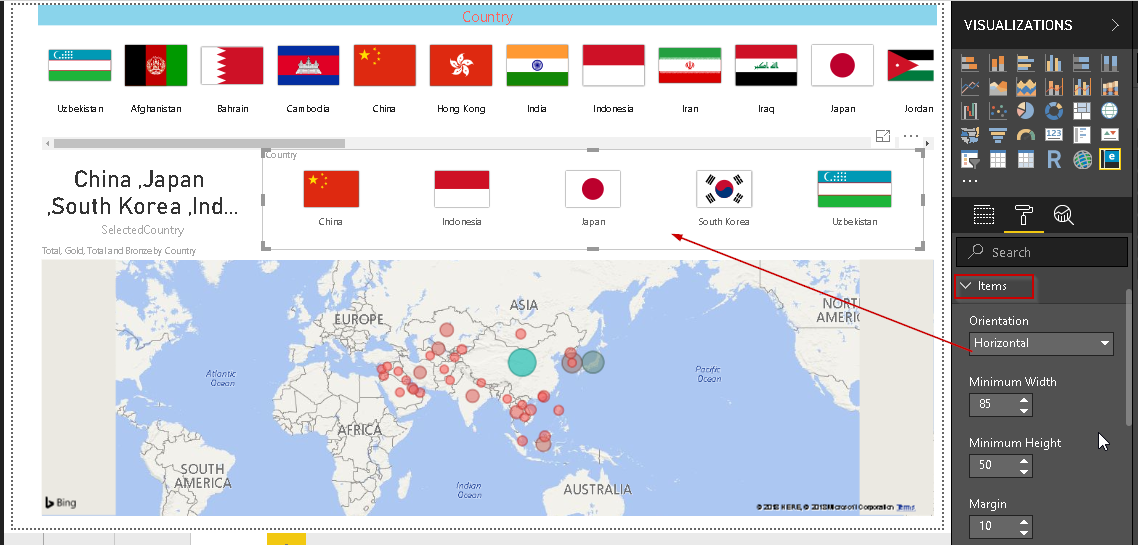
- Orientation: By default, orientation is set to horizontal.
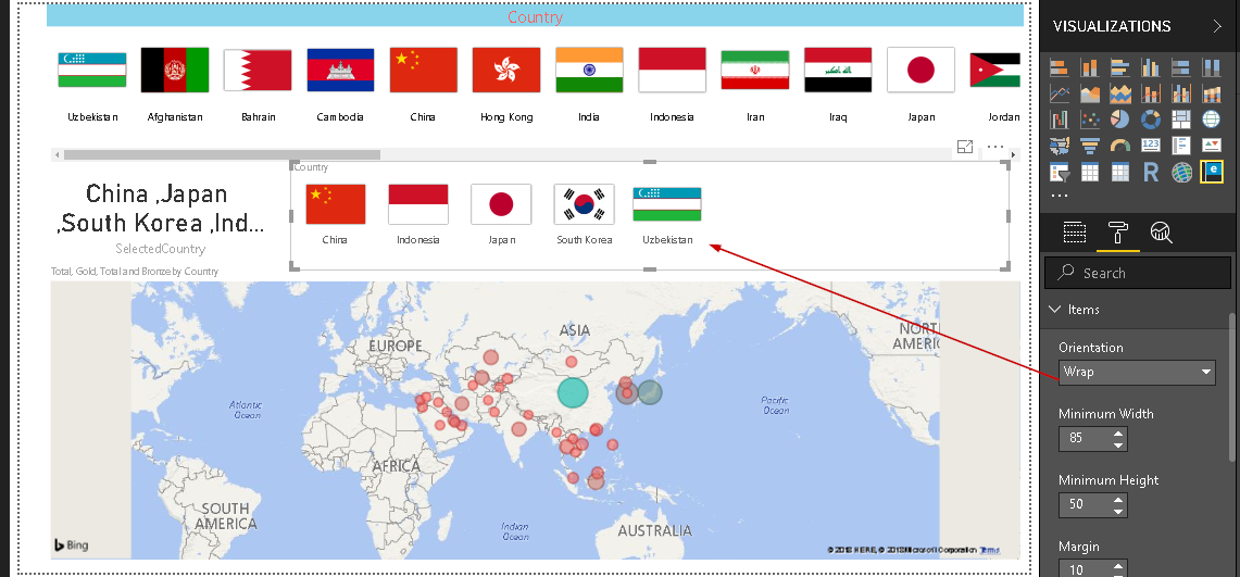
If we change it to ‘Wrap’ mode, the flag comes closer to each other as shown here.
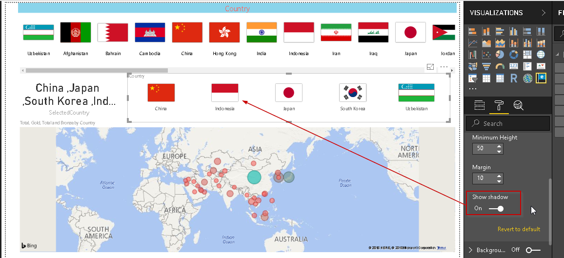
- Show Shadow: By default, the shadow section is ‘On’. It shows the border around the flag.
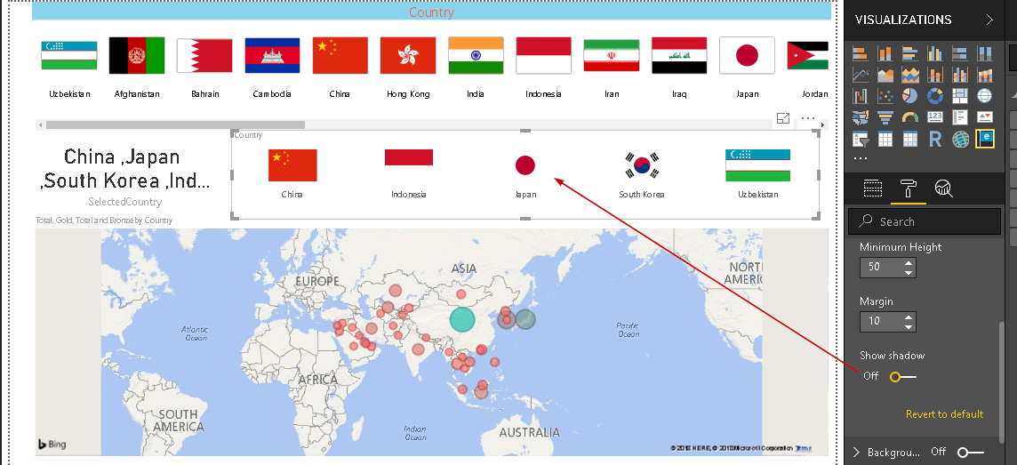
If we disable the show shadow, it does not show the border. We should not make this change. As you can see if we remove the border, the country flag looks inappropriate.
Conclusion
The Enlighten World Flag Slicer represents each county with its flag and provides ability to filter out the results for any particular country. You can explore this visual into Power BI Desktop. We will continue the series of exploring customized visuals in Power BI Desktop in future articles.
Table of contents

I am the author of the book "DP-300 Administering Relational Database on Microsoft Azure". I published more than 650 technical articles on MSSQLTips, SQLShack, Quest, CodingSight, and SeveralNines.
I am the creator of one of the biggest free online collections of articles on a single topic, with his 50-part series on SQL Server Always On Availability Groups.
Based on my contribution to the SQL Server community, I have been recognized as the prestigious Best Author of the Year continuously in 2019, 2020, and 2021 (2nd Rank) at SQLShack and the MSSQLTIPS champions award in 2020.
Personal Blog: https://www.dbblogger.com
I am always interested in new challenges so if you need consulting help, reach me at rajendra.gupta16@gmail.com
View all posts by Rajendra Gupta
- Understanding PostgreSQL SUBSTRING function - September 21, 2024
- How to install PostgreSQL on Ubuntu - July 13, 2023
- How to use the CROSSTAB function in PostgreSQL - February 17, 2023