
In this article, I am going to give an overview of the most widely used chart types in Power BI. Power BI, as everyone might be aware, is one of the SaaS offerings from Microsoft in the field of BI and Analytics. It provides a very intuitive way for non-technical users to do analyses and create reports on their own without having to rely on a technical team. One of the main purposes of Microsoft behind Power BI is to promote self-service BI and it is one of the BI tools in the market with a comparatively lower learning curve as there are many similarities compared to Microsoft Excel.
Although there are many different chart types available in Power BI, it is essential to understand when to use which chart. This is important because when you present some information to the readers, they should be able to gain insights at a glance and interpret the results rather than trying to understand what the chart or the graph is trying to depict.
Let’s look at some of the most frequently used chart types in Power BI. For the purpose of this tutorial, I’ve imported a few tables from the WideWorldImportersDW database into Power BI and will be creating the charts based on these tables.
Figure 1 – Imported Data Model
Bar Chart
One of the most important chart types in Power BI is the bar chart. A bar chart is used to represent categorical data in rectangular bars by the length of the rectangle denoted by a specific measure value. The category with the highest measure value has the longest bar whereas the one with the lowest value has the shortest bar. This type of chart is helpful in representing categories mostly as it visualizes only one dimension with a measure.
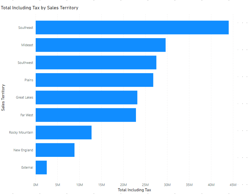
Figure 2 – Horizontal Bar Chart
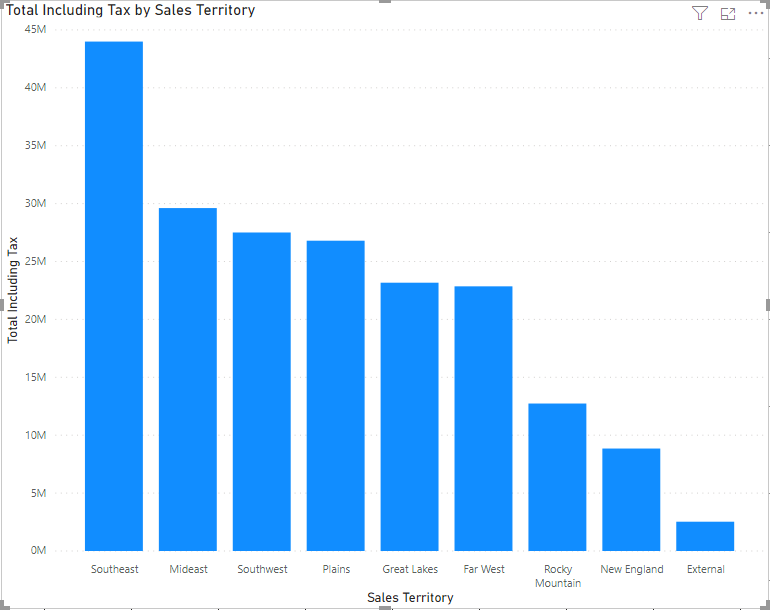
Figure 3 – Vertical Bar Chart
In the charts above, we can see that the Total Sales is being displayed by Sales Territory. Southeast, with the highest sales has the longest bar whereas External has the lowest sales. Choosing between vertical and horizontal chart types in Power BI is a bit debatable. However, I prefer to use a horizontal bar if there are more than ten categories otherwise a vertical bar chart looks good.
Stacked Bar Chart
This is an extension of the simple bar chart that we saw in the previous sample. In a stacked bar chart, we can introduce two dimensions with a measure as opposed to a single dimension in a simple bar chart. This second dimension can be used to sub-categorize the first dimension along with the measure values. For example, in the figures below we have two dimensions – Sales Territory and Buying Package and a measure Total Including Tax. The second dimension depicts the categorization among how the sales for a particular Sales Territory is divided.
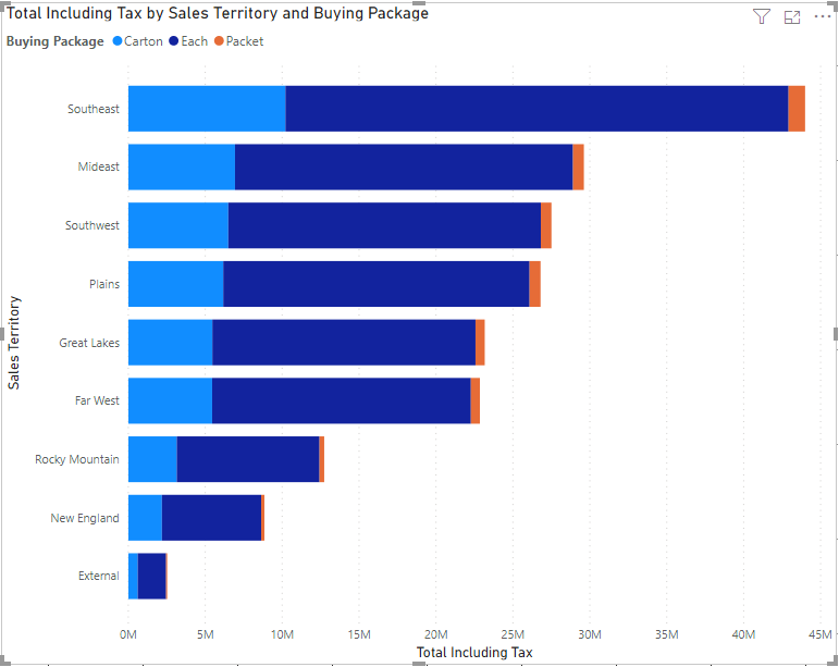
Figure 4 – Horizontal Stacked Bar Chart
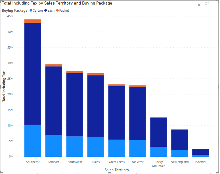
Figure 5 – Vertical Stacked Bar Chart
Clustered Bar Chart
The clustered bar chart is almost similar to the stacked bar chart except for the fact that it groups the second dimension by the first and then displays the chart. It is useful if you want to visualize a sub-group within a group by a measure.
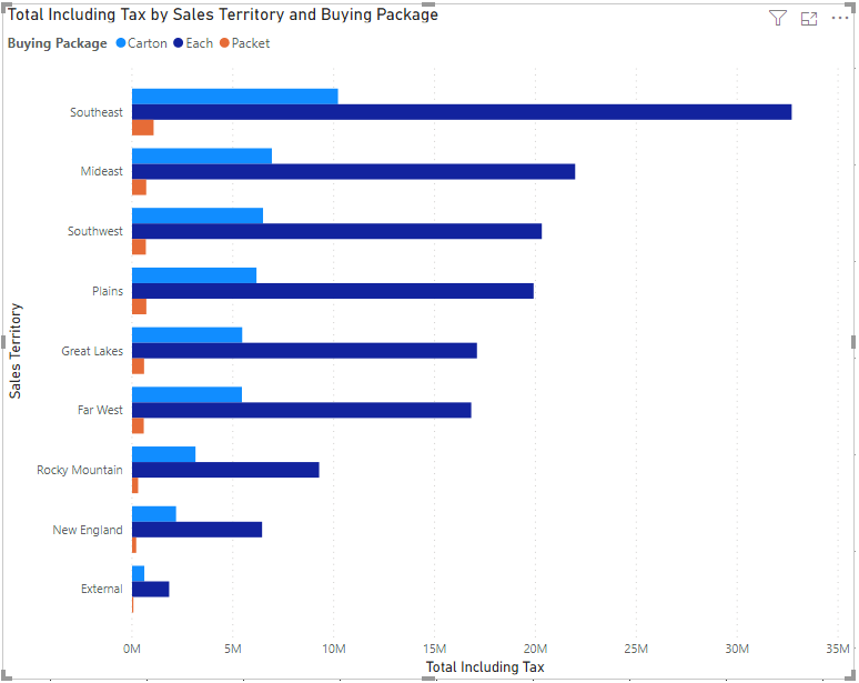
Figure 6 – Clustered Bar Chart
Line Chart
The line chart is another important and frequently used chart types in Power BI. These types of charts are used to define a trend over a period of time. Usually, it is not recommended to use any other dimension other than the dates along the X-axis. This gives the reader an impression of the moving value across the time period. A line chart in Power BI can have one or two dimensions. With a single dimension, a single line will be plotted along the time, whereas if a second dimension is introduced, a line for each of the values of the second dimension will be plotted on the graph.
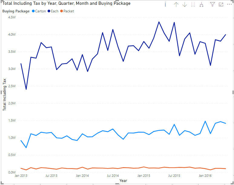
Figure 7 – Line Chart
Area Chart
An Area Chart can be considered as an extension of the line chart that we came across in the previous example. In this chart, the line and the area underneath are color-coded such that it is easier for the reader to make some comparisons among the different dimension members. An area chart can be built using one dimension or two. If it is created using two dimensions, then dimensions are displayed on top of one another. Such an area chart can be called a stacked area chart.
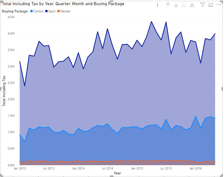
Figure 8 – Stacked Area Chart in Power BI
Combo Chart
Combo chart as the name suggests is a combination of both bar and line chart in a single visual. This is helpful when visualizing categorical data along with two measured values. In a combo chart, usually, we keep a single dimension that can be represented by two measures. One measure will be represented by the length of the bars whereas the second measure will be denoted by the line. We can also make a stacked combo chart by introducing a second dimension which will sub-categorize the first dimension like in a stacked bar chart.
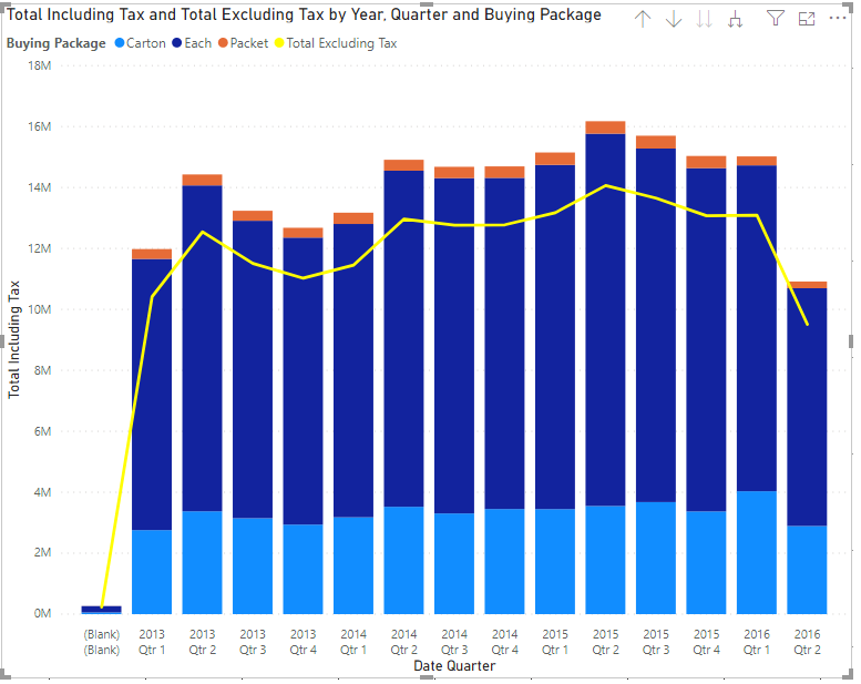
Figure 9 – Stacked Combo Chart
Pie Chart
A pie chart is another most commonly used chart types in Power BI. It is used to understand the proportion of a dimension relative to the other members of the same dimension. The proportion is calculated by a measured value which calculates the area in percentage and allocates to each of the members. Pie charts are useful if the dimension has 5-6 members only to visualize. If there are more members in the dimension, then the pie chart becomes much cluttered and loses readability.
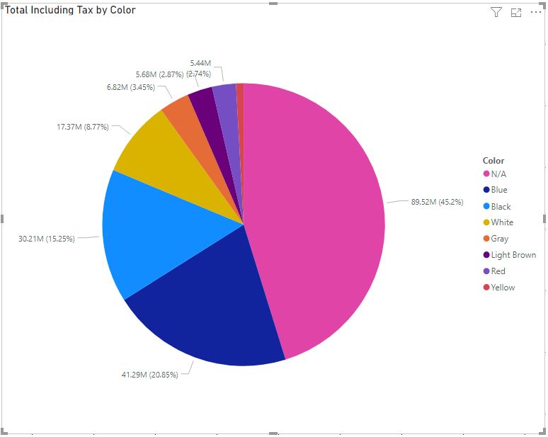
Figure 10 – Pie Chart
Gauge
A gauge in Power BI is used to calculate the performance of a specific measurement based on some goals. It is used to represent the health of a specific measure or the current status of a KPI. A needle is used in the chart to represent the goal and the colored gauge represents the current status of the measure, whether the goal has been reached or not. The current measurement value is also displayed in the figures just below the gauge.
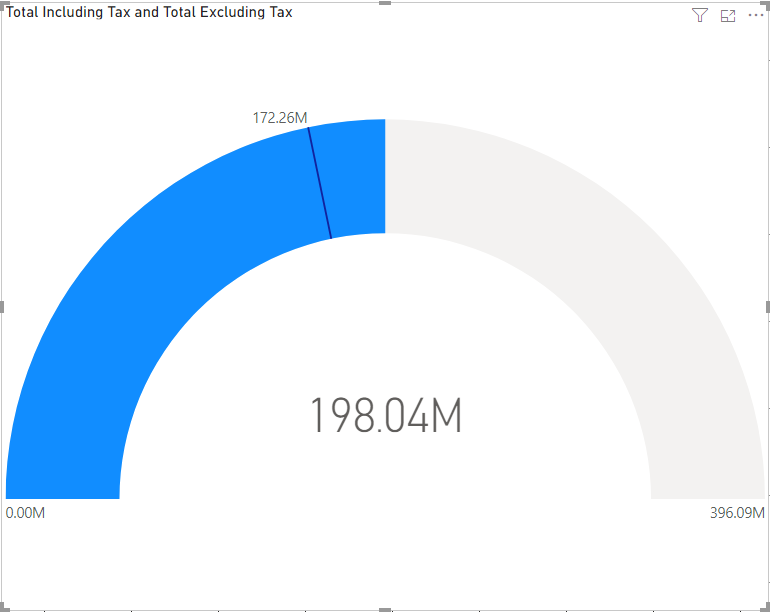
Figure 11 – Gauge Chart in Power BI
Cards
Cards are a simple visual where the value of the measure is displayed. Also known as the big number of tiles in Power BI, these are extremely used to provide a one-time glance at the value of a certain measure. For example, cards can be used to learn about Total Sales or Total Profit in a year, etc.
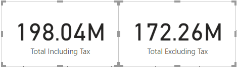
Figure 12 – Cards in Power BI
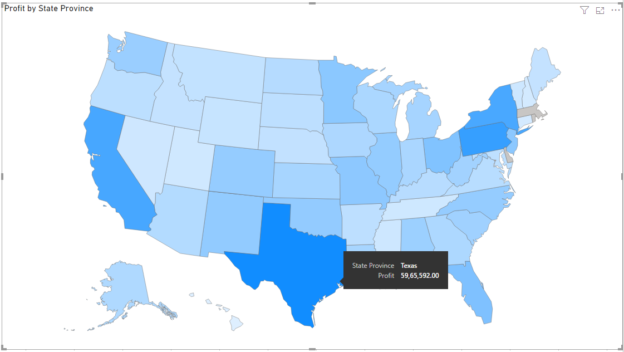
Maps
Maps are another important type of chart used in Power BI. These charts are used to represent geographical data directly on the maps which become very intuitive and easy to understand for the readers. Maps in Power BI can be automatically created from the values in the dimensions. For example, if the dataset contains cities or states, the Power BI engine is capable to extract the information and plot those on the maps. Alternatively, there is also a provision to provide latitude and longitude values to plot the cities on the maps.

Figure 13 – Maps in Power BI
Tables
Last but not least, of course, tables are the best when it comes to visualizing a set of records by rows in a tabular format. To whatever extent, modern a dashboard might look, when it comes to detailed information, tables work the best for any kind of analysis.
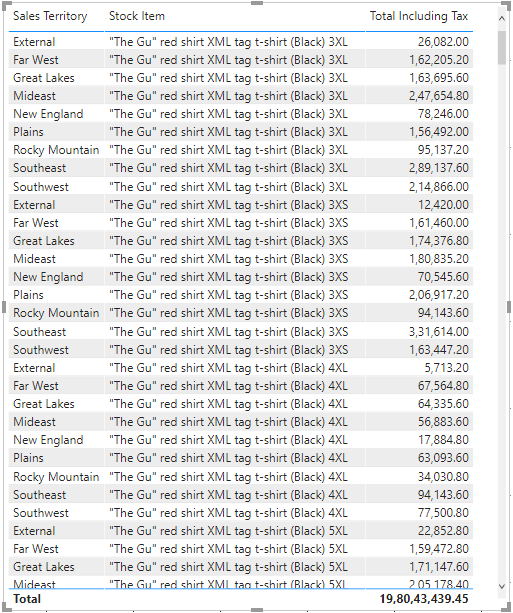
Figure 14 – Tables in Power BI
Conclusion
In this article, I have explained widely used Chart Types in Power BI. It is important to choose a visual wisely based on what is the information that needs to be presented.

He is a prolific author, with over 100 articles published on various technical blogs, including his own blog, and a frequent contributor to different technical forums.
In his leisure time, he enjoys amateur photography mostly street imagery and still life. Some glimpses of his work can be found on Instagram. You can also find him on LinkedIn
View all posts by Aveek Das
- Getting started with PostgreSQL on Docker - August 12, 2022
- Getting started with Spatial Data in PostgreSQL - January 13, 2022
- An overview of Power BI Incremental Refresh - December 6, 2021