

The Report View in Power BI can be used to create beautiful visualizations in Power BI.
Power BI has several interconnected modules such as Query Editor, Data View, Relationship View, Report View, etc. Each module has its own functionality.
In this post, we will look at how to create a simple visualization in Power BI Report View with the help of different plots.
Connecting Power BI to your Data
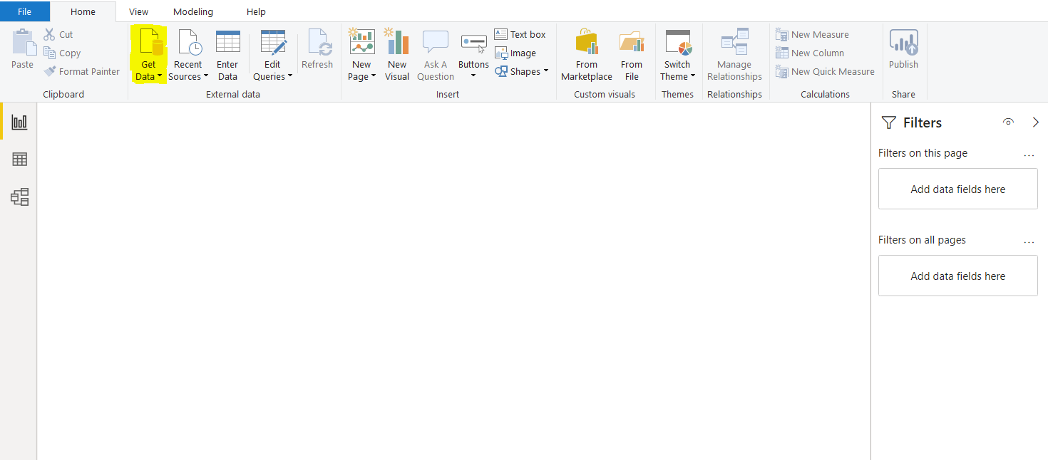
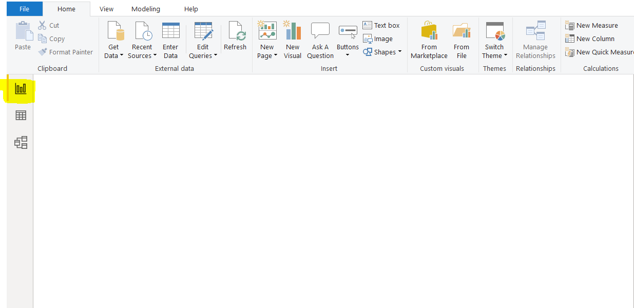
Before you start creating visualizations using Report View, you need to import data to your model. To do this, from the top menu, click on “Get Data” as shown in the following screenshot.
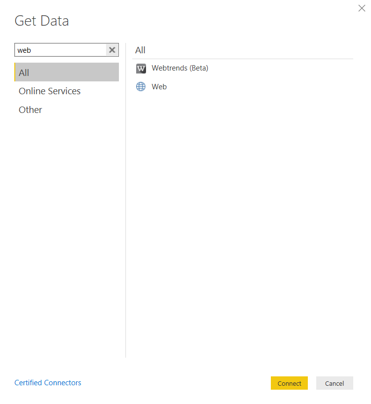
A new window will pop up, showing all the sources of data sources available to Power BI.
Type “Web” into the search area.
Very quickly, “Web” will appear as a data source in your All Data list of sources.
You need to click on “Web” and select the ‘Connect’ button. You will be able to see this in the screenshot below.
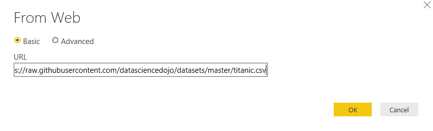
The box showing below will pop up, where it says ‘URL’ you need to insert the below URL:
https://raw.githubusercontent.com/datasciencedojo/datasets/master/titanic.csv
This URL will take you to a file of data held on Github. It is a CSV file.
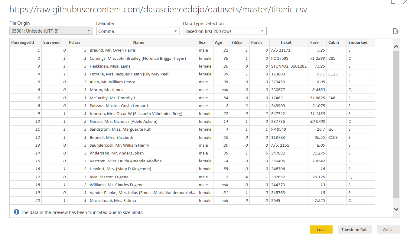
This CSV contains data on the Titanic, including the passengers that traveled on this unlucky cruise as the Titanic was hit by an iceberg on its maiden voyage in 1912. The dataset consists of 12 columns and 887 records.
Sometimes Power BI can be slow to find and create a connection with files that are held online so you may need to be a little patient.
However, as soon as it has created the connection, your Power BI window will be as shown below.
Now, if you select the ‘Load’ button, the data will be imported into Power BI. Once the data is loaded, we can create our visualization in the Report View.
Creating a visualization in Power BI Report View
In this section, you will see how to create a very simple visualization in Power BI Report View. As an example, we will create a clustered column chart and a pie chart.
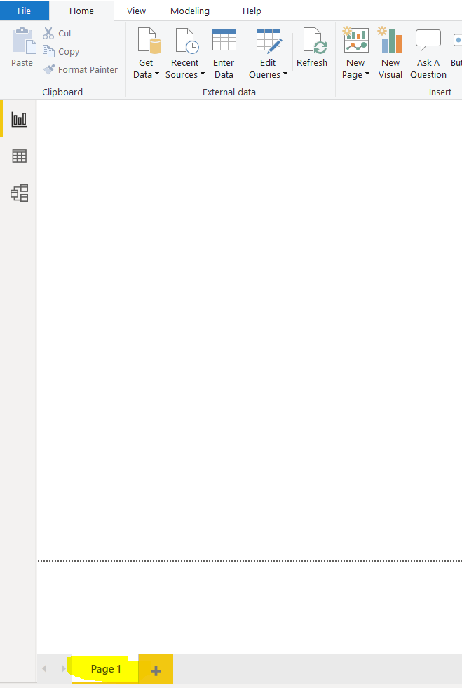
Once you click the “Load Button” after importing the data, as explained in the last section, you should see the following screen. The screen is empty at the moment. On the left side of the screen, you should see three options stacked vertically. The topmost option, highlighted in yellow in the screenshot, is the Report View. Click this icon to open the Report View if you have not done so already.
At the bottom left of the report view, you should see the default page name, i.e., “Page 1”, as shown in the following screenshot. A visualization in Power BI can span multiple pages. Having multiple pages is a way to logically categorize your visualizations.
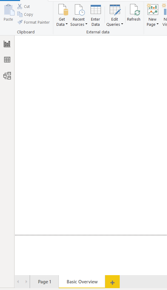
You can create a new page by simply clicking the plus button next to the names of the already existing pages. We will create a new page named “Basic Overview”, as shown in the following screenshot. To create a new page, all you have to do is double click the page name and overwrite the existing page names.
Creating a Clustered Column Chart visualization in Power BI
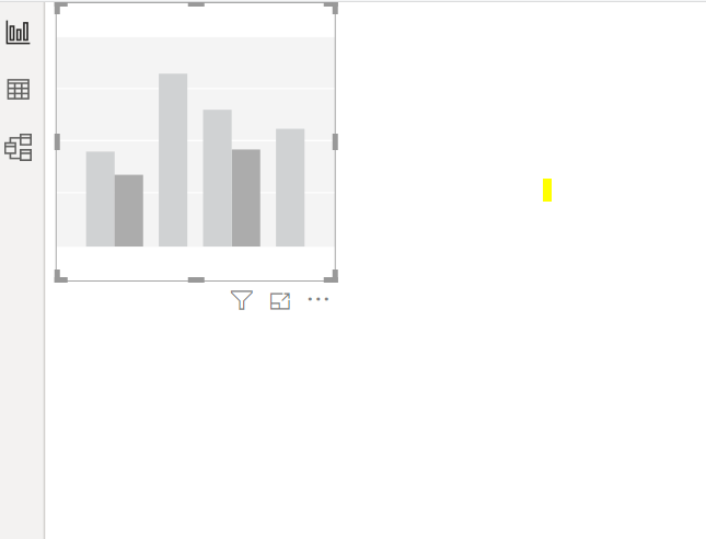
Let’s create a simple clustered column chart. To create a new graph, you have to select the chart type that you want to plot from the “Visualization” panel, as shown in the following screenshot, where we select the “Clustered Column Chart” option, as shown highlighted in the following screenshot.
Once you click the chart type, you should see an empty clustered column chart, as shown below. You can drag and drop the chart as well as resize it according to your preference.
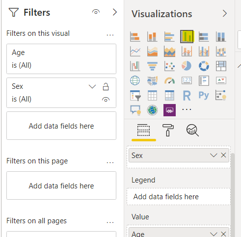
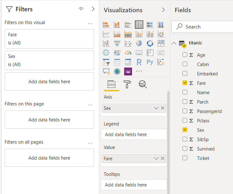
We want to create a clustered column chart that displays the fare paid by the passengers of both the genders who traveled in the Titanic ship. Click the “Fields” button under the “Visualization” panel. Drag the “Fare” column from the Titanic dataset and drop it in the “Value” field. In the “Axis” field, drag the “Sex” column, as shown in the following screenshot.
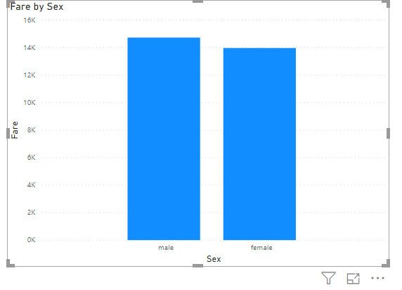
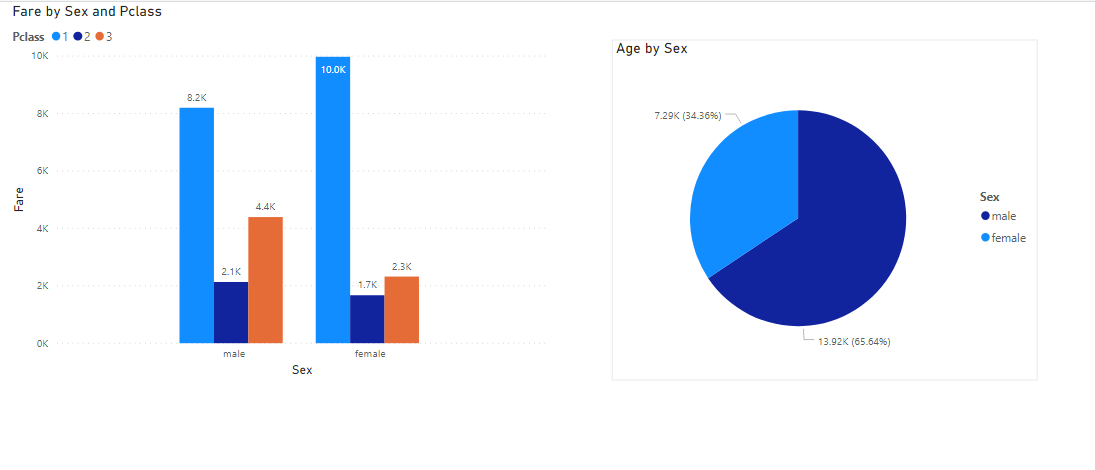
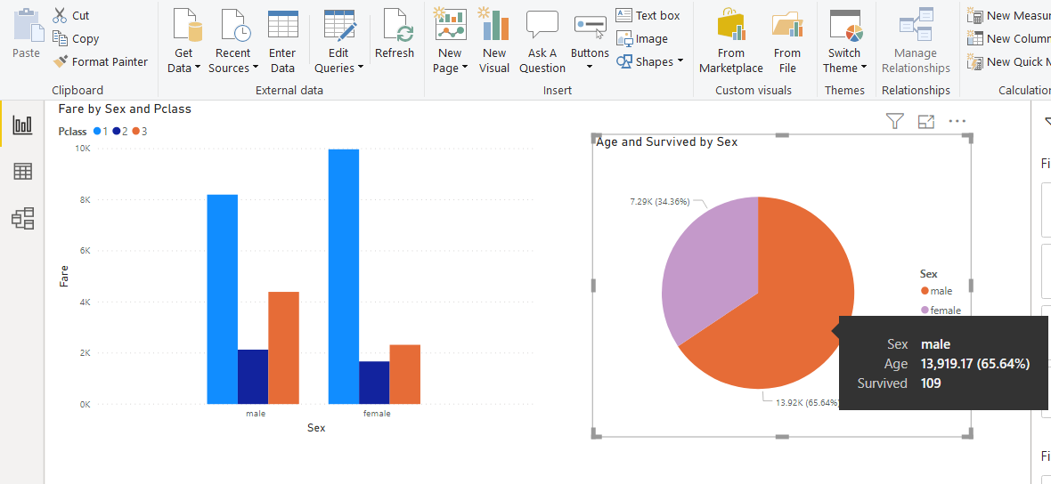
You should see the following clustered column chart in the output. You can see that overall, that the total fare paid by the males is slightly more than females.
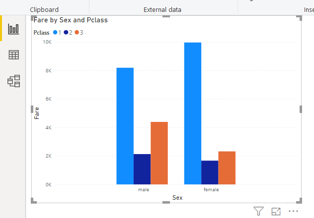
Let’s further categorize the column chart by dividing the columns into the passenger class. To do so, drag the “Pclass” column from the dataset to the “Legend” field, as shown below.
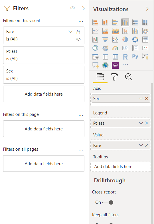
In the output, you should see clustered column chart with fare further divided into passenger class, in addition to the gender of the passengers. It can be clearly seen that the first-class passengers paid the highest fares.
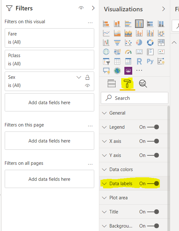
Our clustered column chart is not labeled at the moment. You cannot see the total amount of fare paid by passengers from different genders belonging to different passenger classes. To label the data, click on the “Format” button under visualizations, as highlighted in the following screenshot. Next, drag the radio button to the right of “Data Labels” so that it displays “On”.
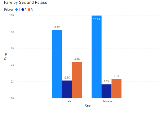
Now if you look at your clustered column chart, you can see that the bars are labeled as shown in the screenshot below:
Creating a Pie Chart visualization in Power BI
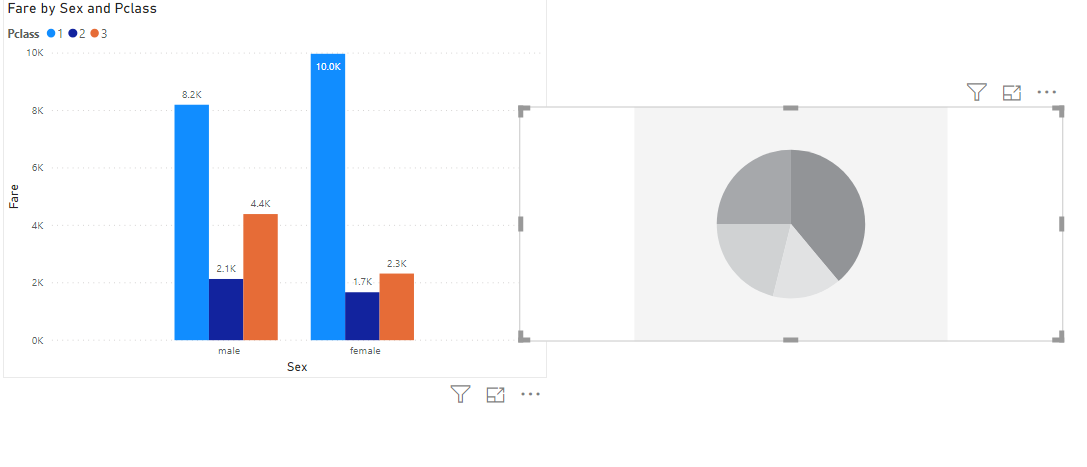
Let’s create one more chart type for our visualization. We will add a pie chart to our existing visualization. To do so, you need to click on the “Pie Chart” visualization from the “Visualization” pane as shown below:
You should see an empty pie chart on your page. You can drag it across the page and resize it if you want.
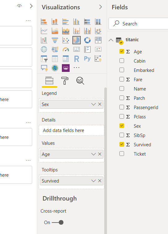
Like clustered column chart, the next step is to add data to your pie chart. We will create a pie chart that displays the ratio of the total ages of males and females. Let’s first drag and drop the “Age” column from the Titanic dataset to the “Values” field, as shown below:
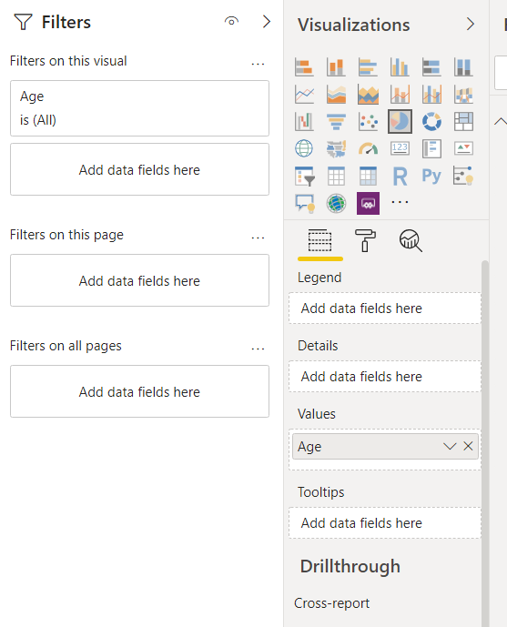
In the output, you see that the pie chart contains only one color and displays the overall age of the passengers.
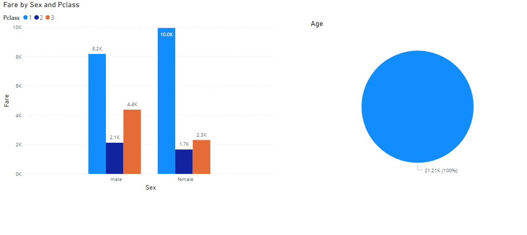
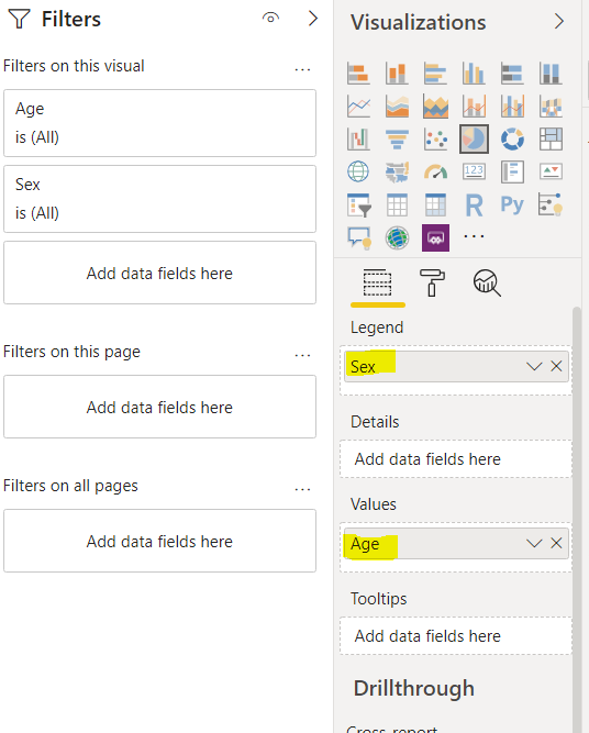
To split the pie chart by gender, drag the “Sex” column from the dataset and drop it to the “legends” field as shown below:
Now in the output, you can see the pie chart showing the distribution of age for male and female passengers.
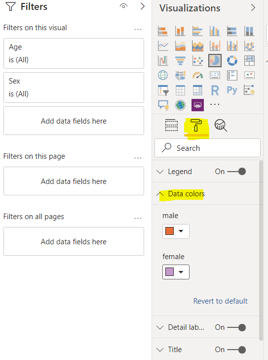
You can change the color of any plot by clicking the “Format” field under the visualizations pane, as shown in the following image. In the following image, the color for male passengers in the pie chart is set to orange, while for female passengers, the data color is set to pink.
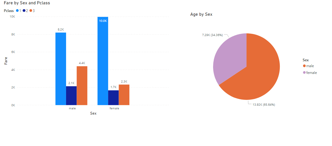
In the output, you should see the updated pie chart with the colors that you supplied.
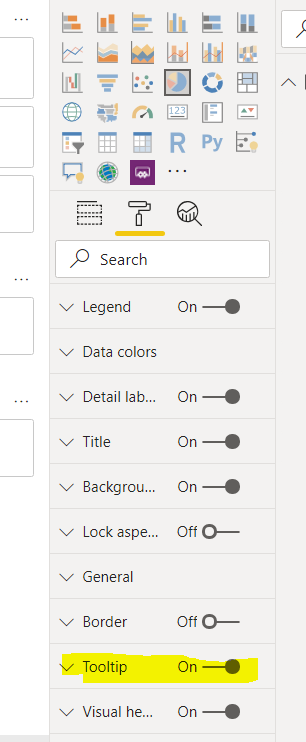
When you hover over the charts, by default, you do not see any tooltip. To enable the tooltips again, go to “Format” and then drag the “Tooltip” radio button to switch it on, as shown in the following screenshot.
Once you enable the tooltip, you can hover over the plot to see additional information about the plot as shown below:
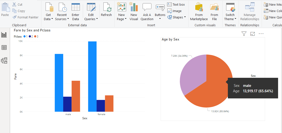
You can see the total male age along with the percentage of the total age on the tooltip. For instance, if you want to display the number of survived passengers on the tooltip, drag the “Survived” column from the Titanic dataset to the “Tooltips” field as shown below:
Now, if you again hover your mouse over the male portion of the pie chart, you can see the number of male passengers who survived.
Conclusion
In this article, you saw how to create a very simple visualization in Power BI using Report View. You saw how to create a clustered column chart and how to create a Pie chart using Power BI. You also saw how to change color and add tooltips to the charts in the report view.

View all posts by Ben Richardson
- Working with the SQL MIN function in SQL Server - May 12, 2022
- SQL percentage calculation examples in SQL Server - January 19, 2022
- Working with Power BI report themes - February 25, 2021