

Introduction
This is the fifth article of a series dedicated to discovering geographic map tools in Power BI.
In the ToC below the article you can find out references to the previous article and the project’s goal
Take a pill for a headache and immerse yourself in a world ruled by command lines with obscure syntax; but if you commit yourself to learn, an unbelievable power will raise from your scripts. In other words: welcome to R.
What is R?
R is the most common open-source language for statistical computing and graphics. R provides a wide variety of statistical and graphical techniques, and it is highly extensible.
R is shipped with a huge number of packages for spatial data, analysis and plotting. Many kinds of maps (geographic, choropleths, projections, topological, animated) and many drawing options are available using R.
R for Power BI
R scripts are fully supported and integrated with Power BI, offering the way for performing statistical analysis and creating compelling visuals. The integration of R in Power BI, grants access to a rich array of data visualizations that are not present in the standard Power BI visuals set.
Using R in Power BI you can:
- Import data and create connectors writing scripts
- Cleanse, transform, model, shape, analyze data
- Create charts, maps, and any kind of compelling visualization
In the current article, we will focus on the way to exploit the power of R for creating maps and performing spatial analysis on data.
Prerequisites
To use R from Power BI some preliminary steps must be accomplished:
- Download and install R. Power BI requires a local R installation into your computer. For download R go to the following web page: CRAN Mirrors choose the mirror and the release that is best fit for you. In my case, I downloaded R for Windows from CRAN Milano, from this link. Install the R release on your local machine
- Configure Power BI for using R. Run Power BI Desktop, go to File > Options and Settings > R scripting. Power BI should recognize the folder for your local R release. If it doesn’t, click on Other and browse to the folder where R is installed

You could also have more than one R version installed on your machine, like me. Then you got to choose which R you want to use in your Power BI report. Simply click on the dropdown list and select the appropriate version.
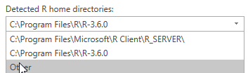
You could also switch between versions according to the Power BI report you’re creating and the features you need.
Once done, close and restart Power BI Desktop.
- Install R Studio. My suggestion is also to install an R IDE. R scripts into Power BI are neither easy to write nor debug. Is it simpler to test scripts outside the environment and then copy and paste into the Power BI Desktop script window? From the link is it possible to download a free version for R Studio. Once installed, check the R version used by the IDE. Open R Studio > Tools > Global Options > General. Under R Sessions it is listed the version of R currently used. As in Power BI, you can switch between different versions, by clicking on Change …
Install R packages
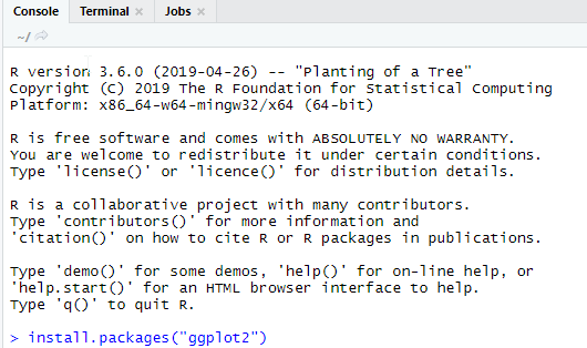
Some packages are required to complete the demo. Open R Studio. In the Console Window enter the following command (once a time):
- install.packages(“ggplot2”)
- install.packages(“ggmap”)
- install.packages(“maps”)
- install.packages(“calibrate”)
- install.packages(“dplyr”)
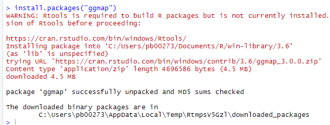
There is a bunch of packages in R for spatial data. The above-mentioned are just the most common. Some additional packages will be required further on.
To close R Studio, either click on File > Quit session … or write q() in the Console window.
Google Maps Key
Unfortunately, before getting started, a preliminary step is required. Some of the most common packages rely on Google Maps API, therefore you need to get an API key from Google Developers Console. Google Maps API is not a free service, but there an allowance of 40,000 calls for months that allows testing without any fee. Register your API key at this address. If you want to know more about Google geo-location APIs, please visit the following link.
Once, you got the API key, continue to the next step.
First R map
Now it is time for building our first map. Let’s do it in R Studio before. Afterwards, we will repeat the same procedure in Power BI.
Open R Studio. Click on the green + icon on the top left and select R Script.
A new window appears where you can write your R script.
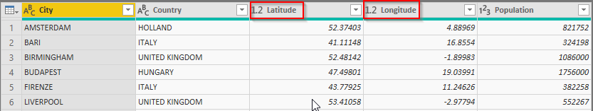
Download the attached file Cities_R.csv and save it in a folder with a “simple” path; no spaces in the name. Mine is saved on C:\RMaps. Please pay attention that R is case-sensitive, when writing your script.
The file contains data for some European cities with population and geographic coordinates (Latitude and Longitude). Import the file in R Studio. In the blank empty window write the following code:
|
1 2 3 4 5 6 7 8 9 10 11 12 13 14 15 16 |
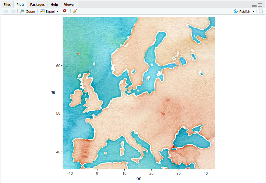
#call libraries library(ggmap) library(ggplot2) #register your google key frr using with google register_google(key = "xxxxxxxxxxxxxxxxxxxxxxxxxxxxxxxx") #import csv file. First change working directory setwd("C:\\Rmaps") #read csv cities <- read.csv("Cities_R.csv") #draw an empty simple map m <- get_map(location = 'europe', maptype = "watercolor", source = "google", zoom = 4) #display map ggmap(m) |
Calling the get_map function, we passed some parameters:
- Location = the area definition. Could also be a set of coordinates
- Source = the mapping service called by the function. Could also be Open Street Map or Stamen
- Maptype = type of rendering for the image
If you’re are interested in knowing more about the get_map function and parameters, please check out the online documentation
So, from the above script in the plot area, you got a new empty map.
Now add the cities to the map. Add two lines to the script and execute only
|
1 2 |
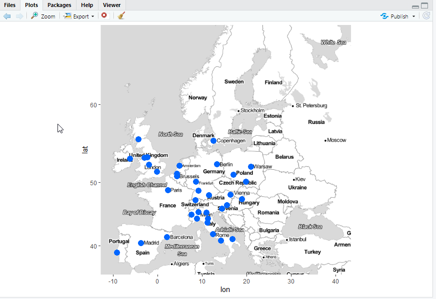
e <- get_map(location = 'europe', maptype = "toner-lite", source = "google", zoom = 4) ggmap(e) + geom_point(aes(x = cities$Longitude, y = cities$Latitude), colour ="#0066FF" ,size = 4, data = cities) |
geom_point adds a new layer to the map, in this case plotting latitude and longitude for the cities in our dataset
But some other features can be plotted to our map, using few other parameters from geom_point
Write and execute the following line:
|
1 |
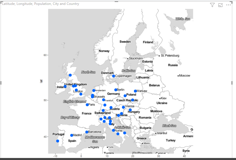
ggmap(e) + geom_point(aes(x = cities$Longitude, y = cities$Latitude, colour = factor(Country), size = Population), data = cities) |
Now the map is displaying a different size for every point, based on the population value, and it’s also using a country-based color coding with the related legend.
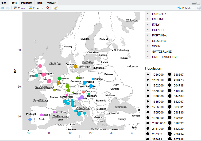
As you can see, R allows full control of every aspect of visualization. It is even possible adding a layer over layer to the map using the geom_xxx set of functions from package ggplot2
So far so good. Now we want to replicate the same map using R in Power BI.
Open Power BI Desktop. Click Get Data > Text/CSV > Import the file Cities_R.csv from your local folder.
In the preview window click Edit and open the Query Editor for your dataset.
Check out the format for Latitude and Longitude is a decimal number and click Home > Close & Apply
Back to report view. Drag and drop an R visual to the canvas. At the bottom of the screen, the R script editor opens. This is the area where to write R scripts to be executed.
But, first of all, we need some data. Keep the R visual selected and drag all the fields from the dataset Cities_R into the Values bucket.
Consequently, the following script is automatically generated into R script editor:
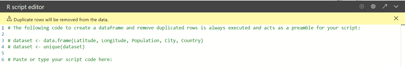
By default, the data passed to R from Power BI is converted into a tabular format and passed to a standard variable called “dataset”. This is what happens on row 3:
|
1 |
Data.frame() |
= converts all the data into tabular format.
Dataset <- the values you dropped into the bucket are passed to a default variable called “dataset”
On row 4 all the duplicate values are removed from the unique(dataset) function
All these rows are commented because of the initial # symbol. You got to write your code from the next one, row 7.
Let’s try to replicate the same maps as we built in R studio. Type in the following code:
|
1 2 3 4 5 6 7 8 9 10 11 |
#call libraries library(ggmap) library(ggplot2) #register your google key register_google(key = "xxxxxxxxxxxxxxxxxxxxxxxxxxxxxxxxx") #draw an empty simple map m <- get_map(location = 'europe', maptype = "watercolor", source = "google", zoom = 4) #display map ggmap(m) |
Then you have to execute the script. Click on the Play button on the first bar for the R editor 
You get the following output:
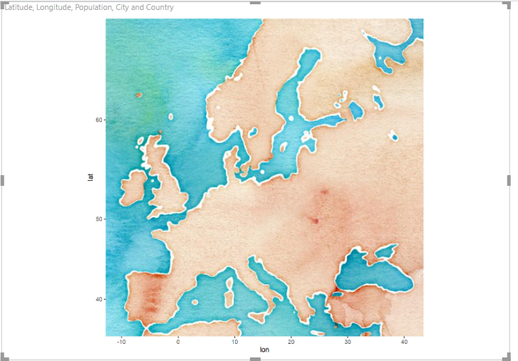
Same empty Europe’s map as in R Studio.
Moving ahead on the example, add cities spots on the map. Delete or comment out the previous lines:
|
1 2 3 4 |
#draw an empty simple map #m <- get_map(location = 'europe', maptype = "watercolor", source = "google", zoom = 4) #display map #ggmap(m) |
And write the following code:
|
1 2 3 4 5 6 7 8 9 10 |
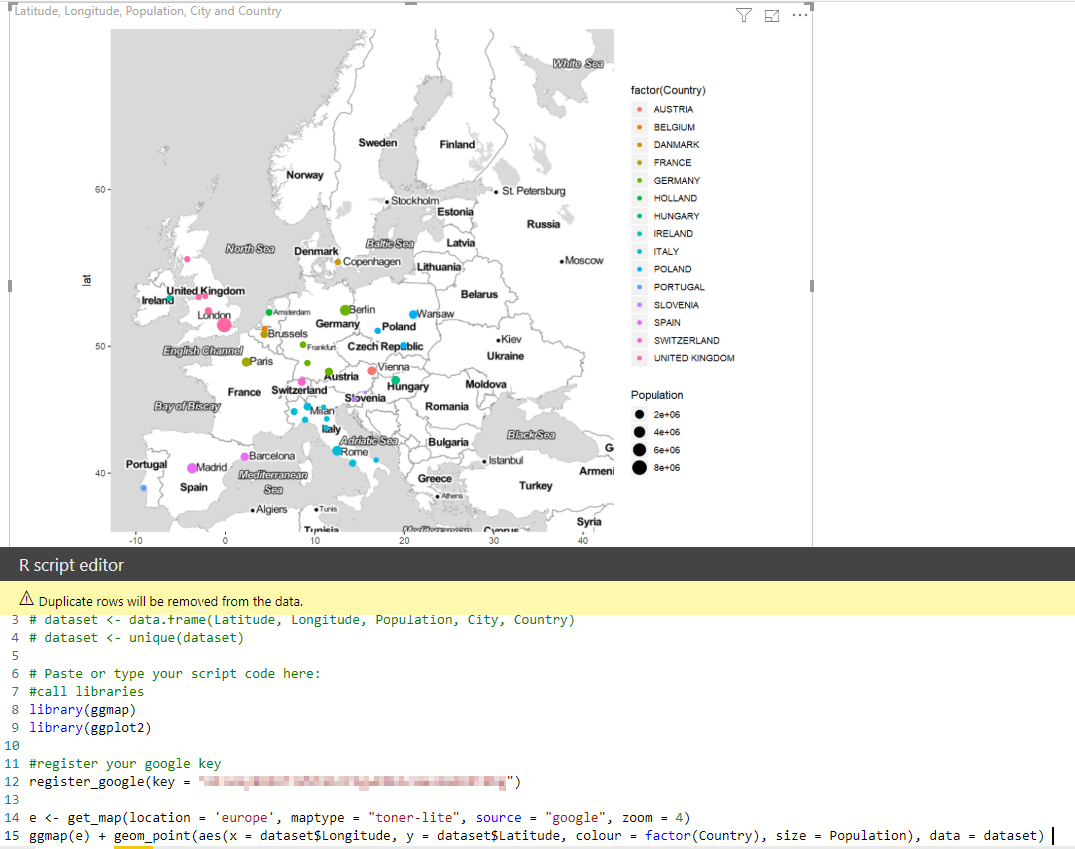
# Paste or type your script code here: #call libraries library(ggmap) library(ggplot2) #register your google key register_google(key = "xxxxxxxxxxxxxxxxxxxxxxxxxxxxxxxxxxxx") e <- get_map(location = 'europe', maptype = "toner-lite", source = "google", zoom = 4) ggmap(e) + geom_point(aes(x = dataset$Longitude, y = dataset$Latitude), colour ="#0066FF" ,size = 4, data = dataset) |
to get the following output:
Note the reference to the keyword dataset into the script:
|
1 |
ggmap(e) + geom_point(aes(x = dataset$Longitude, y = dataset$Latitude), colour ="#0066FF" ,size = 4, data = dataset) |
Data is coming from a dataset called “dataset” and the dollar sign before Latitude and Longitude means we are referencing a column from that dataset.
The last example is the full map with coordinates, different sized bubble points and legend. Again, either comment or delete the previous code and write down the following lines:
|
1 2 3 4 5 6 7 8 9 |
#call libraries library(ggmap) library(ggplot2) #register your google key register_google(key = "xxxxxxxxxxxxxxxxxxxxxxxxxxxxxxxxx") e <- get_map(location = 'europe', maptype = "toner-lite", source = "google", zoom = 4) ggmap(e) + geom_point(aes(x = dataset$Longitude, y = dataset$Latitude, colour = factor(Country), size = Population), data = dataset) |
And a fully-featured map is shown to your report.
Subplot
For the second example, we prepare a visual that you cannot get using any other tool. R allows you to combine different elements in the same plot offering endless possibilities, really. I want to show you some of these features.
Download the sample file Cities_Italy_gender_R.csv. It is a simple list of some Italian cities, with the gender distribution population, males and females. Open R Studio. Some other packages are required to install:
|
1 2 |
install.packages("TeachingDemos") install.packages("dplyr") |
Once the packages are ready, open a new blank window in R Studio and type in the following code:
|
1 2 3 4 5 6 7 8 9 10 11 12 13 14 15 16 17 18 19 20 21 22 23 24 25 |
#call libraries library(maps) library(ggmap) library(ggplot2) library(dplyr) library(TeachingDemos) library(reshape2) library(methods) require(TeachingDemos) #import csv file. First change working directory setwd("C:\\Rmaps") #read csv sp <- read.csv("Cities_Italy_gender_R.csv") tb <- sp map('world', region = 'Italy') points(tb$Longitude, tb$Latitude, col = "#0066FF", pch = 20, cex = 2) for(i in 1:nrow(tb)){ subplot(barplot(height = as.numeric(as.character(unlist(tb[i,6:7], use.names = FALSE ))), cex.names = 0.5, axes = FALSE, col=rainbow(8)), x = tb[i,'Longitude'], y = tb[i, 'Latitude'], size = c(0.3,0.3), vadj = 0 ) } legend("topright", legend=names(tb[, 6:7]), fill=rainbow(8), bty = "n", cex = 0.8) |
The script uses the map function to sketch the border of a geographic area. In no filter is passed, then you get all the world’s outline. In this case, I filtered out only Italy. The next step is to draw points on the map, based on latitude and longitude. The last call is a cycle for drawing a histogram over the points, based on gender distribution. Try to execute step-by-step.
Run the code until the line with map call. This is the output:
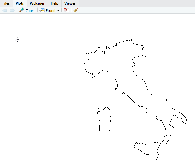
A simple outline of Italy.
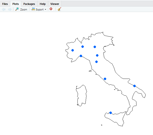
Then add the next row to draw points on the map:
The last step is adding histograms (and a legend):
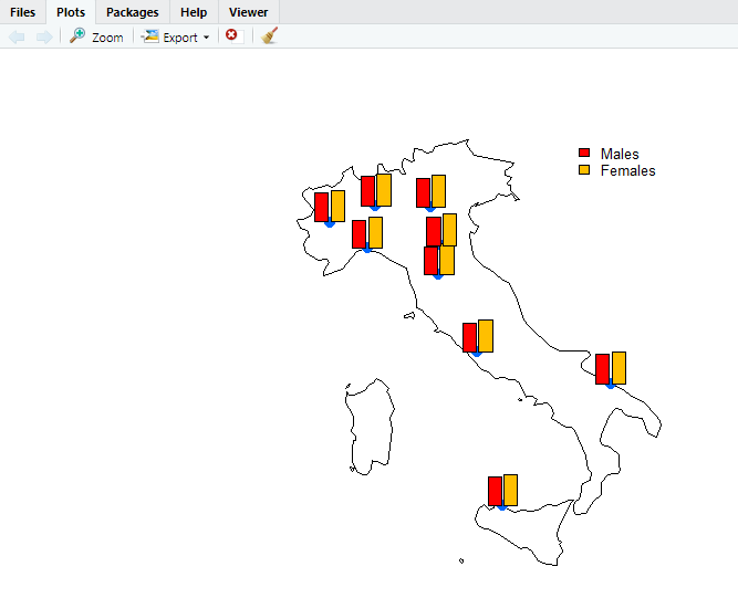
There no other way to get such visualization and R also allows piling up layer over layer making your map richer and detailed.
Let’s replicate it in Power BI. Open a new file or add a new empty page to the existing one. Import the data Get Data > Text/CSV > <your location> > Cities_Italy_gender_R.csv. In the preview window, click Load.
Drag an R visual on the canvas, add the following fields to the bucket: Latitude, Longitude, Males, Females.
Code for the R script editor:
|
1 2 3 4 5 6 7 8 9 10 11 12 13 14 15 16 17 18 19 20 |
#call libraries library(maps) library(ggmap) library(ggplot2) library(dplyr) library(TeachingDemos) library(reshape2) library(methods) require(TeachingDemos) tb <- dataset map('world', region = 'Italy') points(tb$Longitude, tb$Latitude, col = "#0066FF", pch = 20, cex = 2) for(i in 1:nrow(tb)){ subplot(barplot(height = as.numeric(as.character(unlist(tb[i,3:4], use.names = FALSE ))), cex.names = 0.5, axes = FALSE, col=rainbow(8)), x = tb[i,'Longitude'], y = tb[i, 'Latitude'], size = c(0.3,0.3), vadj = 0 ) } legend("topright", legend=names(tb[, 3:4]), fill=rainbow(8), bty = "n", cex = 0.8) |
Run the code and you get the following output:
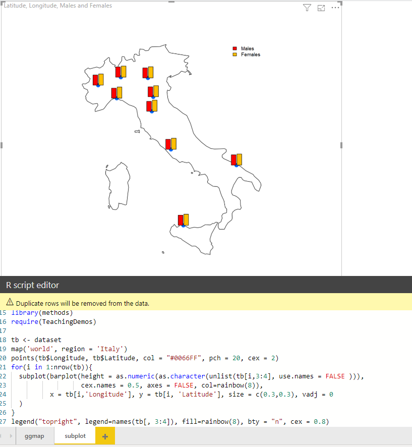
Your second map using R in Power BI is now completed!
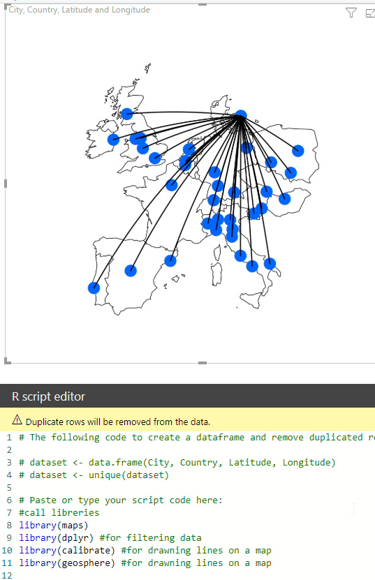
Routes
For my third example, I also want to show you a complex visualization easy to produce in R with few lines of code: displaying routes on a map. The goal is to display air routes from a starting point to various destinations.
Another package called “geosphere” is required; open R Studio and install it.
|
1 |
install.packages("geosphere") |
This time I execute my script directly in Power BI. You already know how to prepare it in R Studio. The dataset to be used is Cities_R. Drag and drop an R visual into the canvas. In the Values bucket, add following fields: City, Country, Latitude, and Longitude.
Below is the code to execute:
|
1 2 3 4 5 6 7 8 9 10 11 12 13 14 15 16 17 18 19 20 21 22 23 |
library(maps) library(dplyr) #for filtering data library(calibrate) #for drawning lines on a map library(geosphere) #for drawning lines on a map #draw european countries map map('world', region = c('Austria', 'Belgium', 'Denmark','France','Germany','Netherlands','Hungary','Ireland','Italy','Poland','Portugal','Slovenia','Spain','Switzerland','UK')) #filter origin orig <- filter(dataset, City == "COPENHAGEN") dest <- filter(dataset, City != "COPENHAGEN") #exclude origin #plot the origin points(orig$Longitude, orig$Latitude, col = "#00cc00", pch = 19, cex = 3) #plot the destinations points(dest$Longitude, dest$Latitude, col = "#0066FF", pch = 19, cex = 3) #plot the directions for (i in 1:nrow(dest)) { a <- c(orig[1,]$Longitude, orig[1,]$Latitude) b <- c(dest[i,]$Longitude, dest[i,]$Latitude) #calls the function gcIntermediate to get intermediate points (way points) between the two locations with longitude/latitude coordinates. intermed <- gcIntermediate(a,b,n=100,addStartEnd=TRUE) lines(intermed, col="black", lwd=2) } |
The output map displays routes from Copenhagen to other European destinations with curves based on the earth’s sphere.
Shape map
Moving on another example of the endless possibilities offered by spatial packages in R. Time to talk about shape maps. A shape map is a visual built to show comparisons of regions on a map by applying different colors to each region. It is based on shapefile, a storage format nowadays universally recognized as the standard for storing geospatial information. A shapefile format spatially describes vector features: points, lines, polygons. It is therefore commonly used to represent geometric locations for data and its attributes.
This is how a shape map usually looks like:
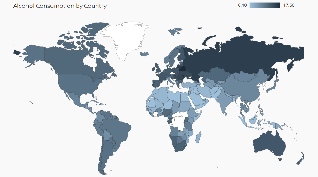
Using a shape map you can easily build a “choropleth”, a thematic map with different shades of color according to the measure you want to show.
If you want to know more about shape maps, please refer to my previous articles for this series How to create geographic maps in Power BI using built-in shape maps and How to create geographic maps in Power BI using custom shape maps
Native shape map visual in Power BI has a big flaw; it is missing a legend. Using shape maps in R you can overcome this issue and furthermore have access to many other features.
For this example, we need a shapefile and some demo data. I prepared a MyEurope.shp and Europe_shape_demo_data.csv, which contains expenses amount for some European countries. Please download and copy to your R working directory.
Some packages are missing. Open R studio and run the following commands:
|
1 2 3 4 5 6 7 |
install.packages("scales") install.packages("maptools") install.packages("plotly") install.packages("sf") install.packages("rgdal") install.packages("rgeos") install.packages("mapproj") |
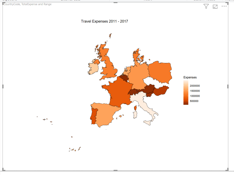
Open Power BI and import the file Europe_shape_demo_csv. As you can see, I includes a “Range” field for creating a legend. Add a new page to the report. Drag and drop an R visual into the canvas. Move all the fields from the dataset into the Values bucket: CountryCode, Range, TotalExpense
Below is the code to be executed into Power BI.
|
1 2 3 4 5 6 7 8 9 10 11 12 13 14 15 16 17 18 19 20 21 22 23 24 25 26 27 28 29 30 31 32 33 34 35 36 37 38 39 40 41 42 43 44 45 46 47 48 49 |
library(ggplot2) library(dplyr) library(scales) library(RColorBrewer) library(maptools) library(plotly) library(sf) library(units) library(rgdal) library(ggplot2) library(rgeos) #import shape file setwd("C:/RMaps/EU_shape") eu.shp <- readOGR(dsn = "C:/RMaps/Eu_shape", layer = "MyEurope") %>% spTransform(CRS("+init=epsg:4326")) #import demo data setwd("C:/RMaps") eu.dt <- read.csv("Europe_shape_demo_data.csv",header = TRUE, sep = ';') colnames(eu.dt)[1] <- "CountryCode" #fortify shape file to get into dataframe eu.shp.f <- fortify(eu.shp, region = "GMI_CNTRY") #rename the id column to match the CountryCode from the other dataset colnames(eu.shp.f)[6] <- "CountryCode" #merge with CountryCodes merge.shp <-merge(eu.shp.f, eu.dt, by="CountryCode", all.x=TRUE) fp <-merge.shp[order(merge.shp$order), ] #delete countries that not match final.plot <- filter(fp, TotalExpense != "NA") #basic plot ggplot() + geom_polygon(data = final.plot, aes(x = long, y = lat, group = group, fill =TotalExpense ), color = "black", size = 0.25) + coord_map() + scale_fill_distiller(name="Expenses", palette = "Oranges", breaks = pretty_breaks(n = 5)) + labs(title = "Travel Expenses 2011 - 2017") + theme(axis.line=element_blank(), axis.text.x=element_blank(), axis.text.y=element_blank(), axis.ticks=element_blank(), axis.title.x=element_blank(), axis.title.y=element_blank(), panel.background=element_blank(), panel.border=element_blank(), panel.grid.major=element_blank(), panel.grid.minor=element_blank(), plot.background=element_blank(), plot.title = element_text(hjust = 0.5) ) |
It worth adding some explanation, as this time the code is quite complex to debug.
This step imports the external shape file in R. The command init = epsg:4326 converts the curvature to standard projection WGS84. Keep in mind that at this stage the eu.shp variable is a spatial object for R
|
1 2 3 4 |
#import shape file setwd("C:/RMaps/EU_shape") eu.shp <- readOGR(dsn = "C:/RMaps/Eu_shape", layer = "MyEurope") %>% spTransform(CRS("+init=epsg:4326")) |
This step imports the demo data from CSV. The command colnames changes name for column 1 of the dataset. This is important for matching data to the shapefile
|
1 2 3 4 |
#import demo data setwd("C:/RMaps") eu.dt <- read.csv("Europe_shape_demo_data.csv",header = TRUE, sep = ';') colnames(eu.dt)[1] <- "CountryCode" |
This step changes the type for the shape object from spatial to a data frame (tabular format). The technical term is “fortify”. Changing a spatial object to tabular format is necessary to make it usable from ggplot package. If you query the objects in R Studio, you can check the difference, before and after the fortifying process.
|
1 2 |
#fortify shape file to get into dataframe eu.shp.f <- fortify(eu.shp, region = "GMI_CNTRY") |
Now, to the fortified object, change the name of column 6 to match the dataset with values. Both the shape map and dataset must have a common key. In our example, the key is the country code: “AUT”, “ITA”, “DEU”, “DNK”, …
Using the same column name, it is possible to merge the two datasets as it’s done in the next step
|
1 2 |
#rename the id column to match the CountryCode from the other dataset colnames(eu.shp.f)[6] <- "CountryCode" |
Merge the two datasets: the shape map now fortified and called eu.shp.f, the list of countries with some data to show called eu.dt. The common key to match both datasets is the CountryCode. Then the rows are sorted and the last step removes countries that are not matching the data.
|
1 2 3 4 5 |
#merge with CountryCodes merge.shp <-merge(eu.shp.f, eu.dt, by="CountryCode", all.x=TRUE) fp <-merge.shp[order(merge.shp$order), ] #delete countries that not match final.plot <- filter(fp, TotalExpense != "NA") |
Finally, the map can be plotted using ggplot. Pay attention to the way the plot is built. Starting from the basic ggplot command further instructions are added through the + sign.
geom_polygon draws the polygons for the shape map from latitude and longitude values stored in the .shp file. Then the polygons are filled with coord_map and scale_fill_distiller functions. All the subsequent steps are “make-up”. Add a title, show/remove axis, show/remove background, grid, etc.
Try executing the script without the last rows to check out how you can easily control layout and settings for your map plot.
|
1 2 3 4 5 6 7 8 9 10 11 12 13 14 15 16 17 18 19 |
#basic plot ggplot() + geom_polygon(data = final.plot, aes(x = long, y = lat, group = group, fill =TotalExpense ), color = "black", size = 0.25) + coord_map() + scale_fill_distiller(name="Expenses", palette = "Oranges", breaks = pretty_breaks(n = 5)) + labs(title = "Travel Expenses 2011 - 2017") + theme(axis.line=element_blank(), axis.text.x=element_blank(), axis.text.y=element_blank(), axis.ticks=element_blank(), axis.title.x=element_blank(), axis.title.y=element_blank(), panel.background=element_blank(), panel.border=element_blank(), panel.grid.major=element_blank(), panel.grid.minor=element_blank(), plot.background=element_blank(), plot.title = element_text(hjust = 0.5) ) |
Geocoding
Geocoding is the process to get coordinates (latitude and longitude) from an address. This is usually performed by calling APIs, for instance, Google Geocoding API or other geocoding services. R allows geocoding through ggmap package; the function geocode calls Google APIs as well. Remember that, in order to use Google APIs you need a key, for free calls tough.
I use two cases for showing you the geocoding function: passing directly a static address and from a dataset. The dataset to be used is called “HotelAddress.txt”. The dataset contains the addresses for some hotels in Paris. We want to geocode these locations, starting from addresses. Please download from the bottom of the article to your R folder.
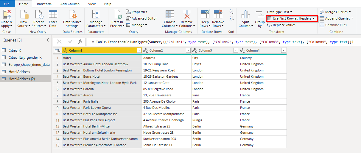
Open Power BI Desktop, add a new page to the report. Get data > Text/CSV > <your folder> > HotelAddress.txt. This time, in the preview window, click Edit.
We need two further steps before working with this dataset:
- Promote the first row as a header. Menu Home > Use First Row as Headers
-
Add a new custom column to the dataset. We need to concatenate three fields Address, City, Country into one and then pass the full address to geocoding function. Select Add Column > Custom Column. Into the dialog window type following data:
New column name = FullAddress
Custom column formula = [Address] & “,” & [City] & “, ” & [Country]
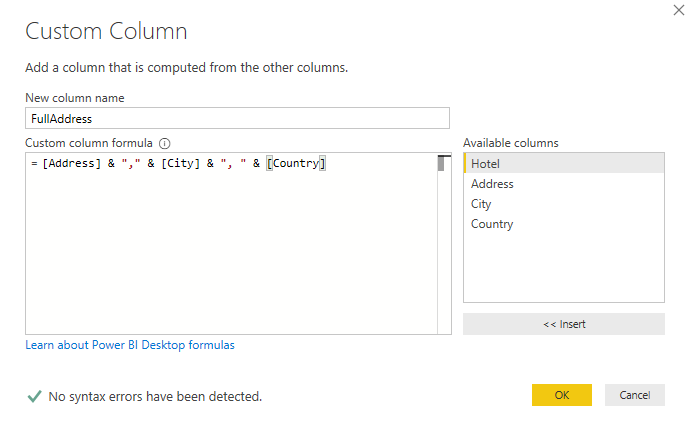
Click Ok. Close Query Editor Home > Close & Apply.
Now we can test the geocoding functions. Drag and drop an R visual into the canvas. Add field FullAddress from the dataset “HotelAddress” and type in the following R code:
|
1 2 3 4 5 |
#register your google key register_google(key = "xxxxxxxxxxxxxxxxxxxxxxx") wh <- geocode("Ghelamco Arena, Ottergemsesteenweg Zuid, Gent, Belgium", output = "latlon", source ="google") qmap(location = c(lon = wh$lon, lat = wh$lat), zoom = 15, maptype = "satellite") |
I choose satellite as a map type. This is the output.
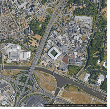
A google static image centered on the location I passed to the script.
Now, let’s try to geocode addresses coming from a dataset. Add another R visual to the canvas. Fields to be passed are: Hotel, FullAddress, City
R code to copy and paste
|
1 2 3 4 5 6 7 8 9 10 11 |
library(ggplot2) library(ggmap) library(dplyr) #register your google key register_google(key = "xxxxxxxxxxxxxxxxxxxxxxxxxxxxxxxxxxxx") addr <- filter(dataset, City == "Paris") gc <- geocode(as.character(addr$FullAddress), output = "latlon", source ="google") m <- get_map(location = 'Paris', maptype = "roadmap", source = "google", zoom = 11) ggmap(m) + geom_point(aes(x = lon, y = lat), colour ="#ff3300", size = 5 ,data = gc) + geom_text(x = gc$lon, y = gc$lat, label = paste(addr$Hotel, gc$lat, gc$lon, sep = "-"), size = 5, hjust = 0, vjust = 0.5, angle = 10) |
Output:

The map of Paris, with the geocoded hotels.
Please pay attention to the following line:
|
1 |
+ geom_text(x = gc$lon, y = gc$lat, label = paste(addr$Hotel, gc$lat, gc$lon, sep = "-"), size = 5, hjust = 0, vjust = 0.5, angle = 10) |
I’m using paste function to retrieve geocoded latitude and longitude along with the hotel name
|
1 |
paste(addr$Hotel, gc$lat, gc$lon, sep = "-") |
Mapdist and routing
A couple of other nice features available from Google APIs. a) Distance between two points; b) routing.
Add a new page to your Power BI report. Drag and drop the R visual into the canvas. Actually, for the next two demos, we are not using data from datasets, but they are necessary in order to enable the R script editor. Therefore, drop a field into the Values bucket, for instance, City from, Cities_R.
Copy and paste code into R script editor
|
1 2 3 4 5 6 7 8 9 10 11 12 13 14 15 |
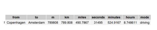
library(ggmap) library(ggplot2) library(dplyr) library(grid) library(gridExtra) #register your google key register_google(key = "AIzaSyB6b6TiVNTm1nPigwKDE5cHavmHAXIt0Vg") from <- "Copenhagen" to <- "Amsterdam" dca <- mapdist(from, to, mode = "driving") dca.df <- data.frame(dca) grid.table(dca.df) |
Please note, I declared origin and destination directly into the script. Of course, you can pass the data as usual from Power BI datasets. It’s up to you to test it. I invoked the simplest function to get distance value between two points. There are more complex API to be used: distance matrix for instance, or from a single origin to many destinations.
The Google API returns a table in this case with a list of values: distance in km, in miles, time, mode …
So, it makes no sense to render a map. I used the grid.table() function to show data in tabular format
The next topic is routing. It gives you the suggested route between two points. It works exactly like Google Maps on a web browser. We want to know the distance and routing from Copenhagen to Amsterdam and show it on a map. This is the R code:
|
1 2 3 4 5 6 7 8 9 10 11 12 13 14 15 16 17 |
library(ggmap) library(ggplot2) library(dplyr) library(grid) library(gridExtra) #register your google key register_google(key = "xxxxxxxxxxxxxxxxxxxxxxxxxxxxxxxx") from <- "Copenhagen" to <- "Amsterdam" #routing route_df <- route(from, to, structure = 'route', mode = 'driving') m <- get_map(location = 'Europe', maptype = "roadmap", source = "google", zoom = 5) ggmap(m) + geom_path(aes(x = lon, y = lat), colour = 'blue', size = 1.5,data = route_df, lineend = 'round') |
for this output:
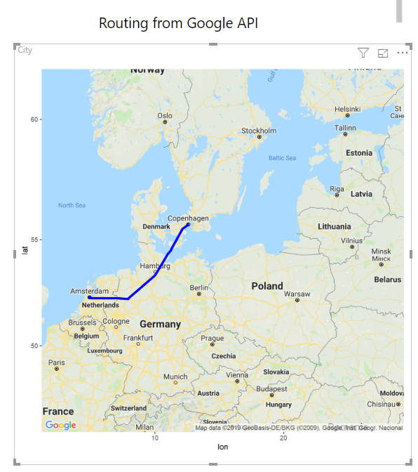
Function route() from ggmap() is invoked, and the returned list of points is plotted over the maps using geom_path() function.
Interactivity. The missing ring
So far, I showed you the brightness of R, a language that allows building custom maps with full control on every detail; from data to the visual’s layout. Now it’s time to face the dark side of the relationship between Power BI and R: what is not supported or not allowed. You’ve probably concluded by yourself trying to zoom in or out the maps, panning or browsing. You simply cannot. Interactivity is not supported in standard R visual for Power BI. Therefore maps are rendered as static images on the canvas.
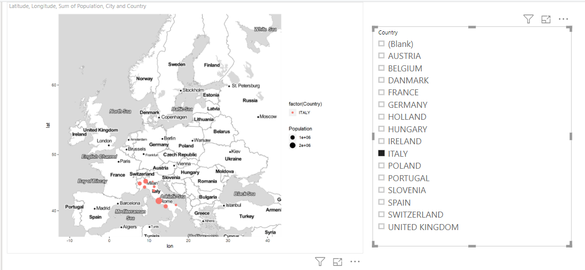
Nevertheless, a common Power BI pattern is guaranteed. Any R visual interacts with other visuals in the way we are used to. For a simple demonstration, open your Power BI report on the first example: the map built with ggmap. Add a slicer to the canvas and put the Country field in the bucket. The R map reacts to the country selected in the slicer, by filtering out only cities for that country. In the example below, for instance, I selected only Italy in the slicer.
These a workaround, but it is quite complex and requires programming skills. If you paid attention, I mentioned “standard R visual” i.e. the one you find out the box in the visuals pane 
But, interactivity is supported for custom visuals built on R packages. Please refer to this article for details. For custom visual the rendering format is HTML, meaning that you can add interactivity, tooltips, selections, etc. Here it is reported the list for supported R packages in Power BI. Scrolling down the list, you can find out a leaflet, the most common package dynamic mapping in R.
If you try to create a map with leaflet using Power BI R visual this is the message you get:
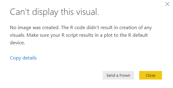
Whereas the same code is R Studio is working fine. Unfortunately, the output from the package is not suitable for Power BI.
Of course, this is not a solution within everyone’s reach. Maybe it could be the topic for the next article …
If you want to dig into details on how to build a custom map visual for Power BI, using leaflet, please refer to Microsoft’s GitHub repository.
Conclusion
In this article, I showed you the integration between Power BI and R for mapping. I introduced you to some of the most common packages in R for geographic representations. But there are still more than this you can do with R spatial features. I hope that I intrigued you. All the R scripts are available in one single file at the end of the article, both for R Studio and Power BI. Feel free to download and reuse.
Take your time, read the official documentation, test the packages and get the most out of your data.
Downloads
| EU_shape |
| demo_datasets |
| R_scripts |
Table of contents
| How to create geographic maps using Power BI – Filled and bubble maps |
| How to create geographic maps in Power BI using built-in shape maps |
| How to create geographic maps in Power BI using custom shape maps |
| How to create geographic maps in Power BI using ArcGIS |
| How to create geographic maps in Power BI using R |
| Customized images with Synoptic Panel |
| MapBox |
| Geocoding |

Common tasks: Database development and monitoring, data warehousing, creating BI solutions and reporting, data analysis.
MCTS certificated: SQL Server Developer.
Speaker at SQL Saturdays, and other conferences in Europe.
Author for SQLShack and UGISS (User Group Italiano SQL Server).
- How to create geographic maps in Power BI using R - August 1, 2019
- How to create geographic maps in Power BI using ArcGIS - August 11, 2017
- How to create geographic maps in Power BI using custom shape maps - June 22, 2017