

Power BI is a data analytics tool that can be used to analyze data with the help of Power BI visuals.
Power BI is a Microsoft application and is available as a desktop application as well as a cloud service. It comes with a variety of visual and filtering options that can be used to create Power BI visuals.
In this article, you will see how to use filters in Power BI visuals in order to filter out any information not required to be displayed.
- Note: Power BI Desktop can be downloaded from this link. For information on the various types of power bi licenses available, see this article
Setting up an initial dataset
In order to demonstrate how to work with filters in Power BI visuals, we’re going to need some example data to work with. For this article, I have chosen the dataset held at this kaggle link. Step one is simply to download the CSV file which contains the data onto your PC.
Now that you have downloaded the data we need to upload it into Power BI.
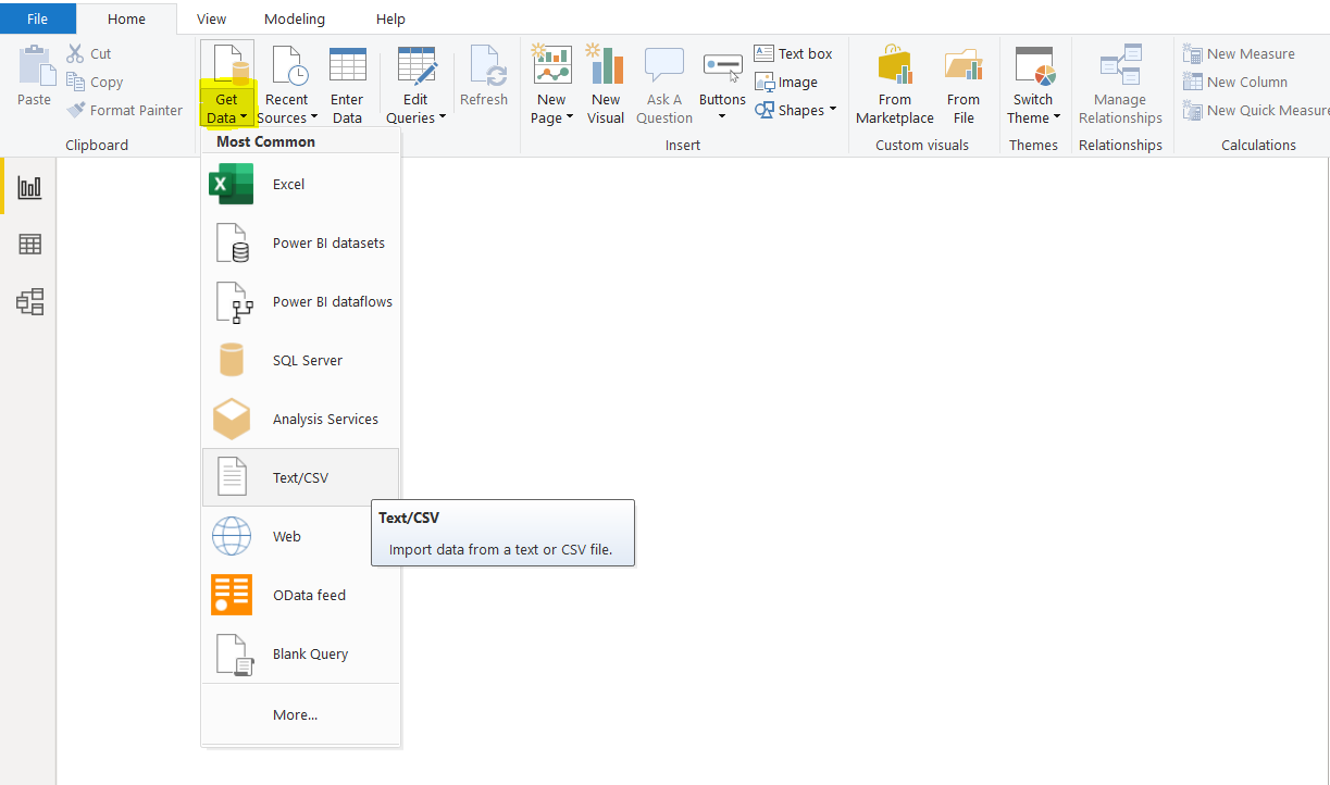
To do this, from the menu at the top of the power bi window click the “Get Data” button, and then choose “Text/CSV” as the file type. You will find this second from the top in the dropdown list. This is shown in the screenshot below.
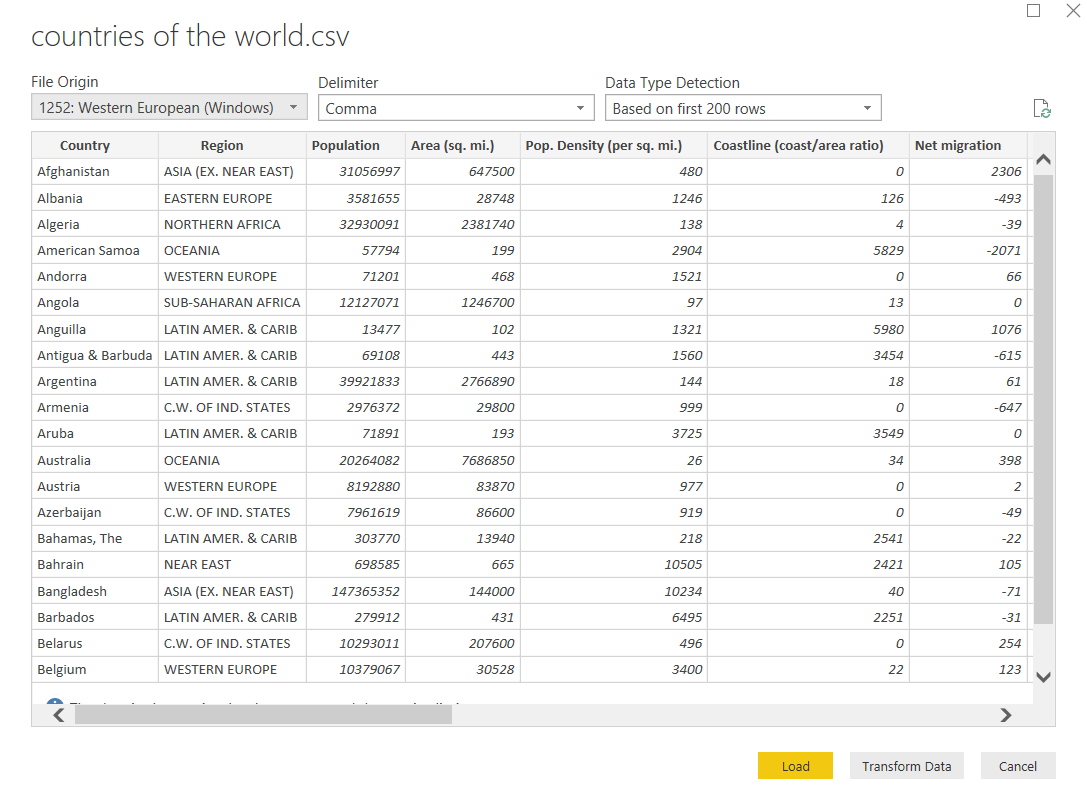
Now that you have uploaded the file, your Power BI window should look the same as the image below. You will see that the dataset contains a list of countries and a variety of data on each one including the region of the world they are in, their populations, their geographical areas, their GDP etc.
Now that the data is in power BI the last task is to load the data into Power BI Reports View. Doing this is very simple, all you do is click the “Load” button at the bottom of the screen.
If you would like to modify the data before you upload it into Power BI Reports View you would click the ‘Transform Data’ button at this stage.
Using Filters in Power BI
To use filters, you first have to create some Power BI Visuals that you can apply the filters to. In this section, we will create different types of Power BI visuals and will see how we can apply filters to them to show the desired data.
The first visual that we are going to create is a Treemap. Treemaps show numerical values in the form of squares and rectangles, grouped by categories. The size of the numerical value being visualized is proportional to the area of the quadrilateral created.
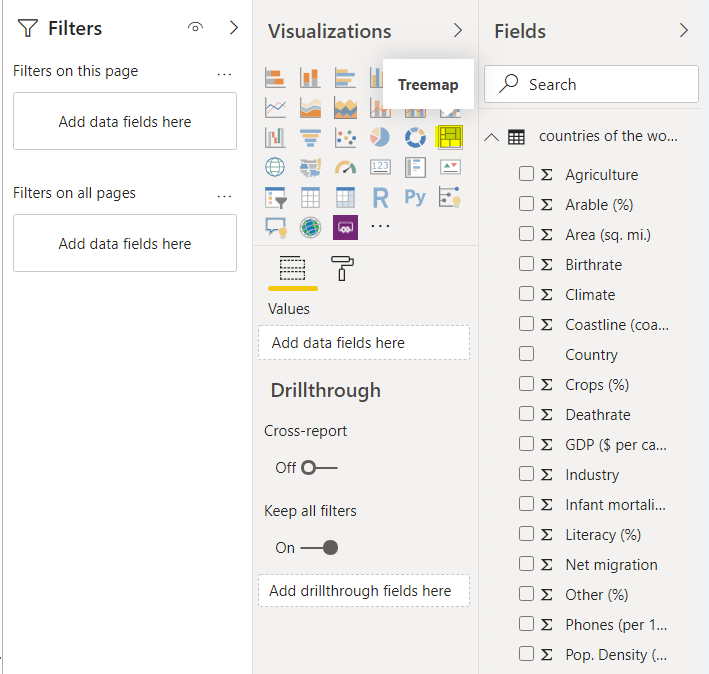
This is best explained with the help of an example. To create a Treemap, select the “Treemap” option from the Visualizations section as shown below.
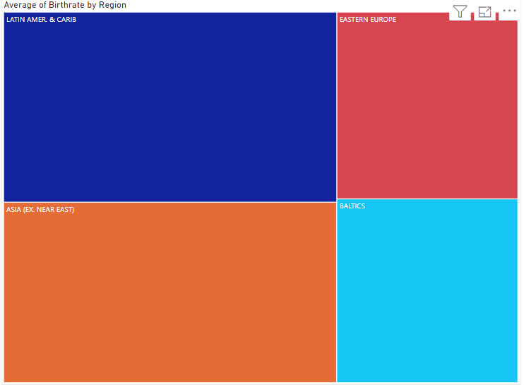
We will create a Treemap that shows the average birth rates in different regions of the world.
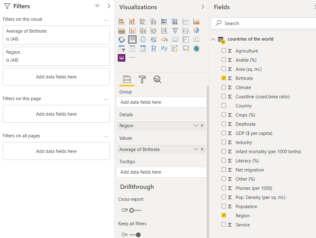
To do this, add “Region” in the Details field for the Treemap and “Average of Birthrate” in the Values field. Remember, to add the “Average of Birthrate” field, you first have to drag and drop the “Birthrate” column into the values field and from the dropdown list that appears, select “Average of Birthrate”.
Once you fill the Details and Values field, you should see the following Treemap.
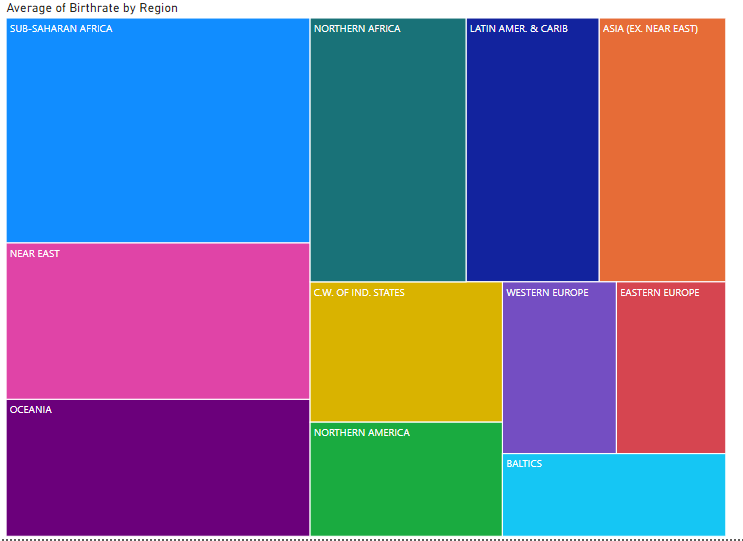
The Treemap above shows that the average birth rate per country is the highest in the “SUB-SAHARAN AFRICA” region, followed by the NEAR EAST and OCEANIA. That is why the “SUB-SAHARAN AFRICA” rectangle is larger than any of the others shown.
What if you want to only see the average birth rate for some of the regions and not all of them?
This is where filters come into play. With filters, you can specify the conditions on which the data will be filtered.
In the reports view, go to the Filters section. You will find this to the left of the Visualizations section as you can see in the following screenshot. By default, you should see two options on the filters field: “Filters on this page” and “Filters on all pages”. Again you can see this in the screenshot below.
It is important to mention that you can create as many Power BI Visuals as you want within a Power BI reports view. To create another visualization, you simply have to add a new page and then add your new Power BI Visual to that page. We will see that later in this section.
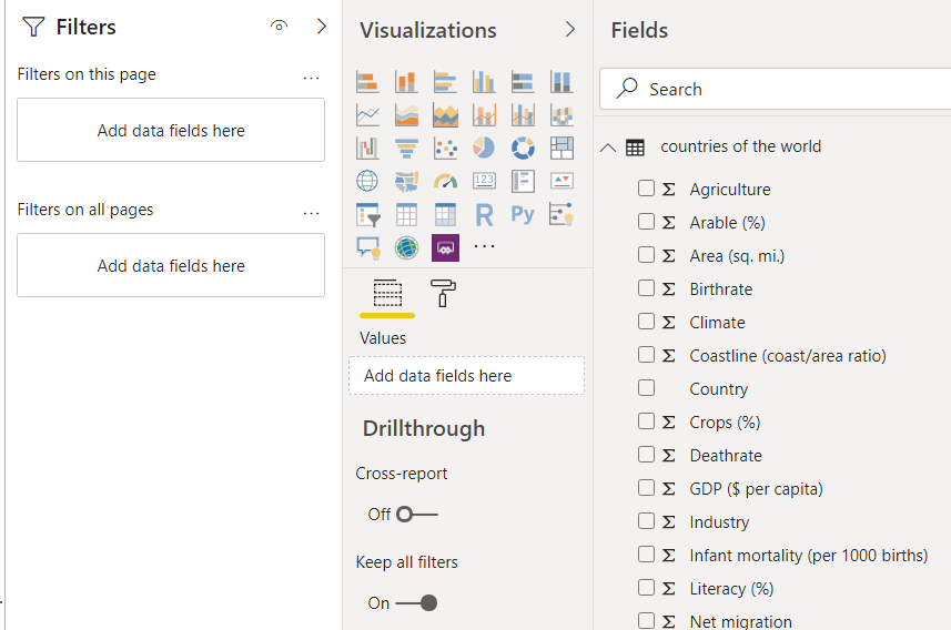
For now, simply drag the “Region” field from the Fields section to the “Add data fields here” field under the “Filters on this page” option in the Filters section as shown below:
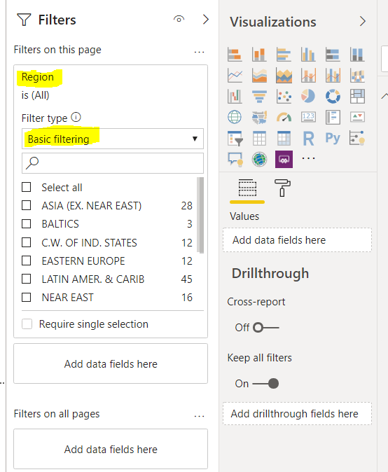
You have two filter types “Basic filtering” and “Advanced filter”. We will look at basic filtering first.
Basic Filtering
With basic filtering, you can select the regions that you want to display in your Treemap. You can see that by default, all the regions are selected.
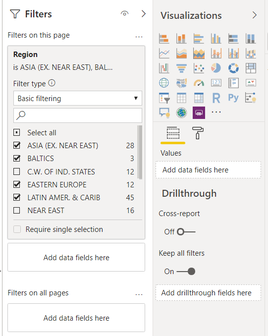
Let’s display the birth rate for “ASIA (EX. NEAR EAST), BALTICS, EASTERN EUROPE, and LATIN AMER & CARIB”. Simply check the checkboxes in front of the names of these regions, as shown in the following screenshot.
Here is the output, you can now see that the average birth rate for only the four selected regions is displayed.
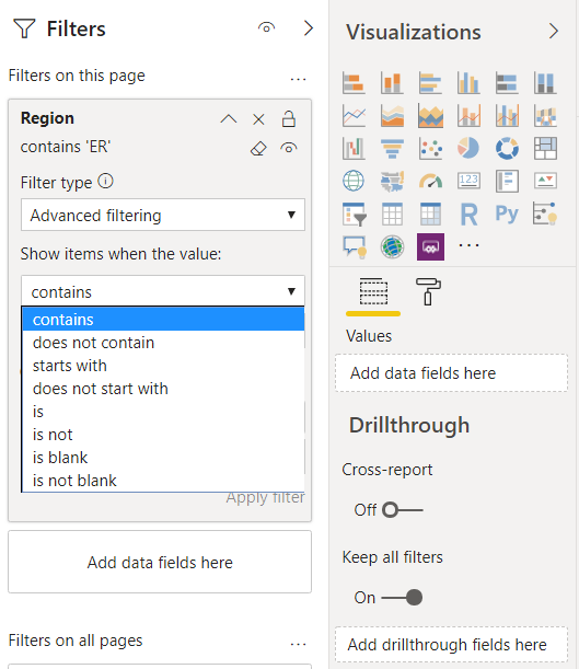
Advanced Filtering
With Advanced filtering, you have more fine-grained control over what you want to filter out. Advanced filtering options vary depending upon the type of column.
For instance, the Region column is a text or string type column, and so there are a number of different filtering options available that you can choose from
You can see them just below the box showing “Advanced filtering” in the screenshot below.
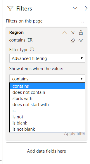
Now if you want to display the average birth rate for only those regions that contain “er” in their names, you can use “contain” filter as shown in the following screenshot:
To remove a filter, simply click on the cross (X) located at the top right corner of a filter.
Adding Filters to multiple pages
As discussed, filters can be added to multiple pages as well. So far we have only looked at applying them to a single page.
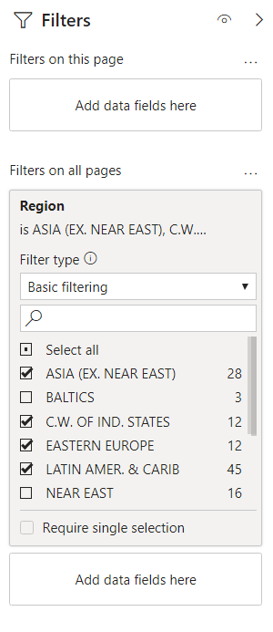
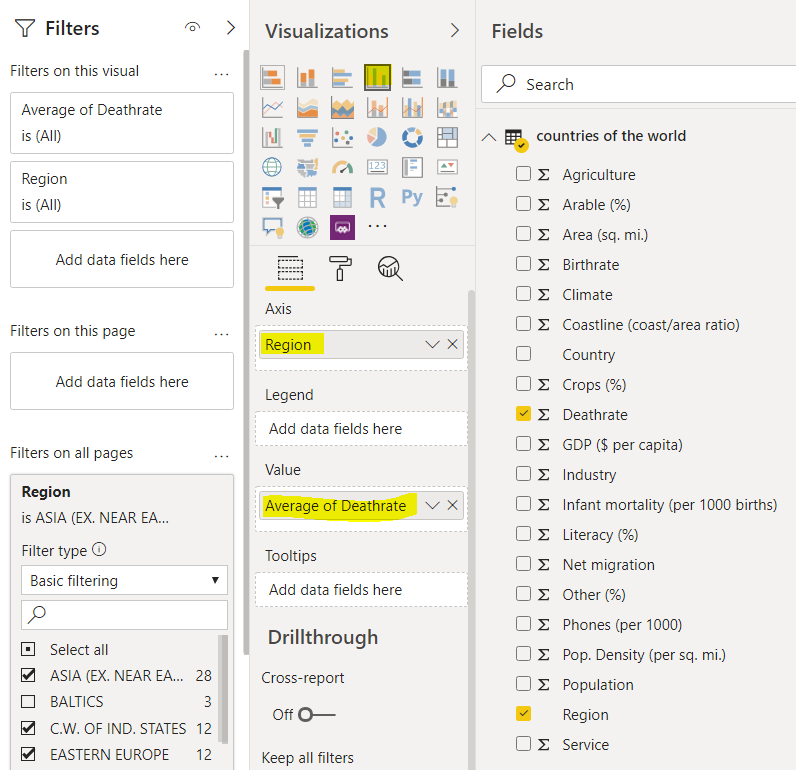
To do this, add the “Region” field from the Fields section to the “Add data fields here” field under the “Filters on all pages” option in the Filters section. Select the four regions that you selected earlier as shown below:
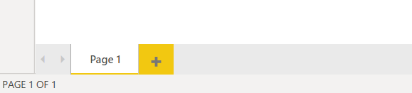
To create new Power BI Visuals on a new page, click the “+” button located at the bottom of the reports view as shown below:
On the new page, add we will add a clustered “Clustered column chart”. In the “Axis” field, add “Region”. Similarly, In the “Value” field add “Average of Deathrate”. Look at the following screenshot for reference.
You should now see the data displayed in a clustered column chart as per the below:
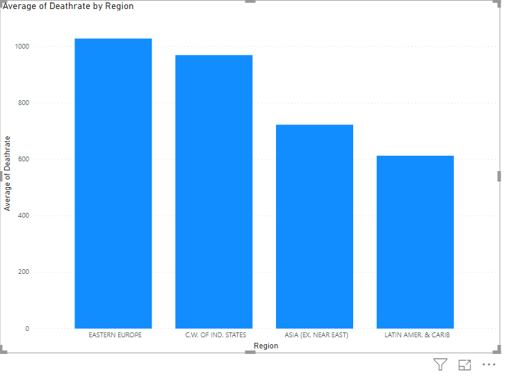
From the graph that has been output, you can see that instead of showing the death rate for all of the Regions, it is showing the data for only the four regions that we specified by the filter in the previous section.
Conclusion
Filters in Power BI are used to display data in Power BI visuals based on the conditions that you set. You can specify filters on Power BI Visuals on multiple pages as well as on a single page. Depending upon the type of data column that you are working with basic and advanced filters will provide you with different types of data filtering options.

View all posts by Ben Richardson
- Working with the SQL MIN function in SQL Server - May 12, 2022
- SQL percentage calculation examples in SQL Server - January 19, 2022
- Working with Power BI report themes - February 25, 2021