
In this article, you will learn how to work with Treemaps and Tables, which are two of the most commonly used Power BI visuals. You will also see how slicers can be used in Power BI to dynamically update the data in Treemaps and Tables. Power BI Visuals are extremely easy to create and don’t require you to write any code.
So, let’s begin without further ado.
Importing the dataset
Before we get started with creating our Power BI visuals we’ll need a data set to work with. For this article, we will be looking at a file of data that all relate to the ship the Titanic (the famous cruise liner). You can access this at this Kaggle link.
To get started please click to download the CSV dataset called ‘train’ to your PC.
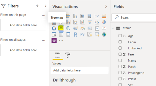
Open Power BI Desktop, and click the Get Data button. You can find this on the left of the ribbon at the top of the page. This is shown in the image below.
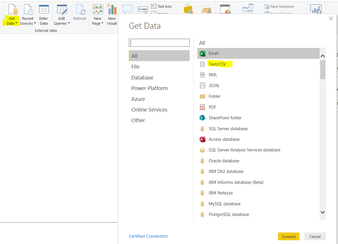
From the GET DATA dropdown menu select the Text/CSV option which is second in the list below Excel.
Select the CSV file containing the data on the passengers of the Titanic that you downloaded above and then upload the data into Power BI by clicking on the Connect button.
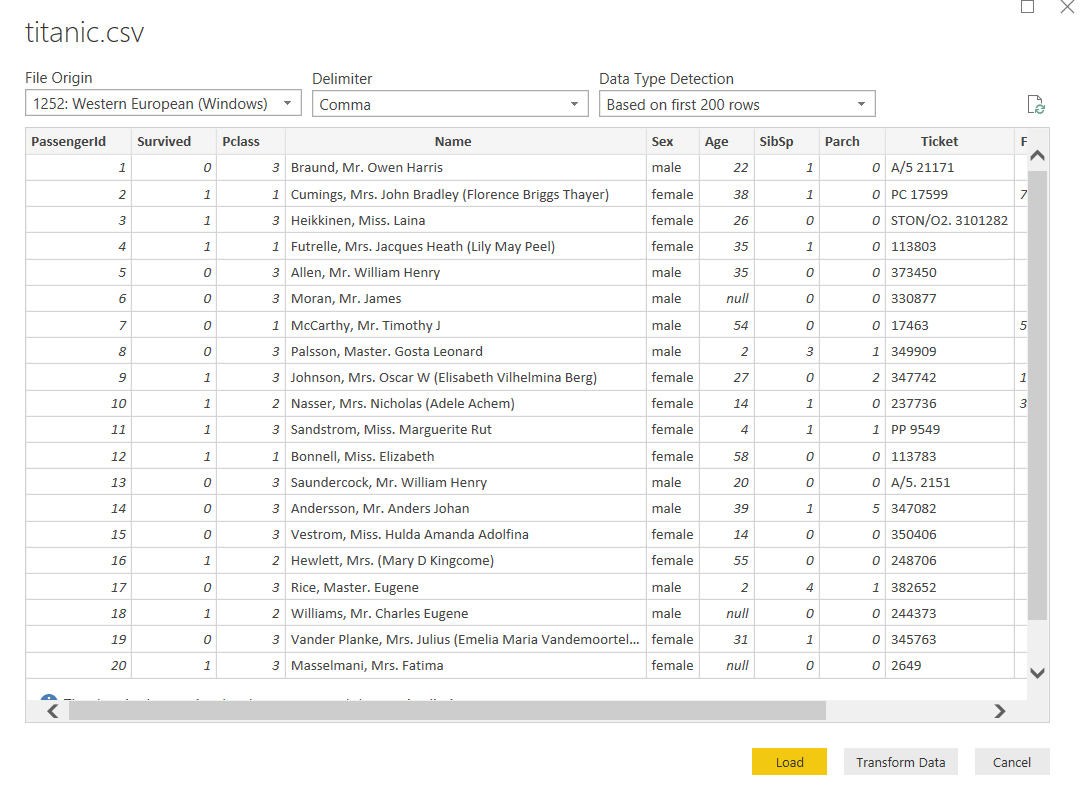
Now that we have the dataset uploaded, your Power BI window should look as it appears in the image below.
This data that we have downloaded contains lots of information about the people who were travelling on the Titanic when it sank in 1912.
If you’d like to add to or modify the data before uploading it into Power BI, you simply click on the “Transform” button and make the changes that you’re looking for. That isn’t something we’re looking at in this article but if you would like to find out more, look at this article on working with Query Editor in Power BI.
For the purposes of this tutorial, click the “Load” button to upload the file to the Power BI reports view. Once you have done that we are ready to get started with creating our Power BI visuals.
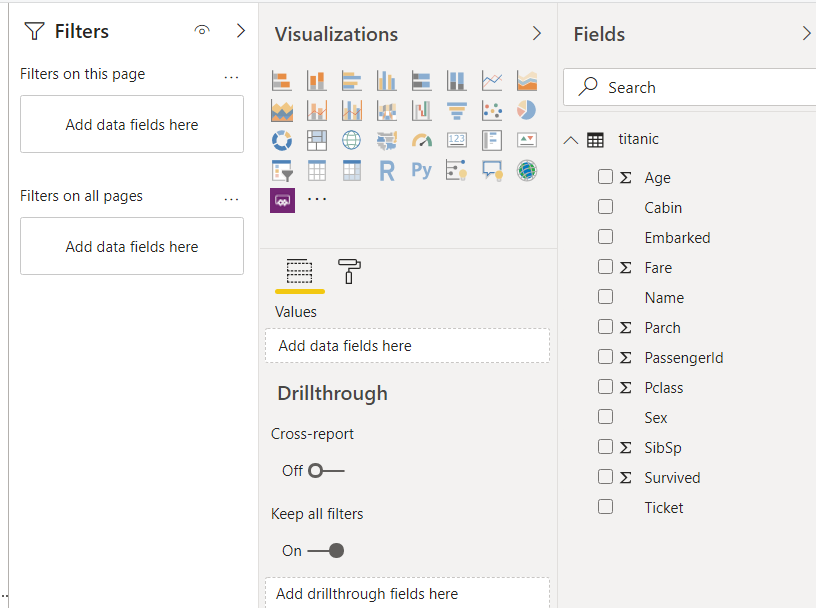
Now that the data is all loaded into the reports view in Power BI, you should see all the columns in the Fields section as per the above image.
Adding Slicers
Before we add Treemaps and Tables to your Power BI visuals, it is important that we add slicers. Slicers will allow us to dynamically update our Power BI Visuals. A great advantage of slicers is that they appear on the face of your dashboard and so they allow you to filter your data in real-time without leaving your dashboard.
To add a slicer, click on the Slicer button from the list of visualizations as shown in the following image.
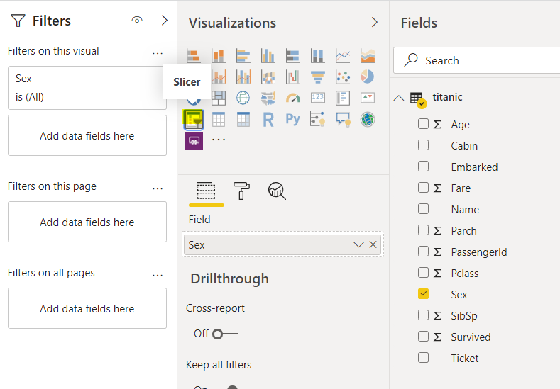
You have to specify the field for the slicer. The field is used to basically filter the data.
Select the Age field from the fields section and add it to the Field column in the visualization as shown in the following image.

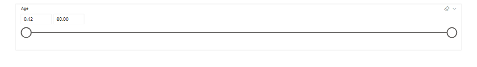
A slicer will be added to the reports’ view. A slicer is shown in the image below. With this slicer, you can update the data based on age by simply clicking on one or both of the circles and dragging it until they are at the values that you would like.
For example, if you want to show the average fare paid by the passengers between the ages of 50 and 60, you can drag the upper and lower limits of the slider to those values and the corresponding graph showing the average will be updated.
You can add multiple sliders to your Power BI reports. Let’s add a slicer that will update our Treemaps and Tables based on gender. To do so again click the slicer option and then add Sex to the Field in the Visualizations as shown below.
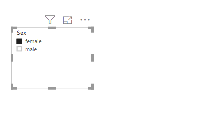
Your Slicer will look like this.
Adding Treemaps
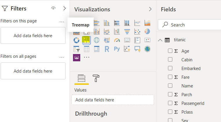
Let’s now add a Treemap to our report that already contains two slicers. To add a Treemap, click the Treemap button from the Visualizations as shown in the following screenshot.
We want our Treemap will display the average fare paid by the passengers grouped by passenger class.
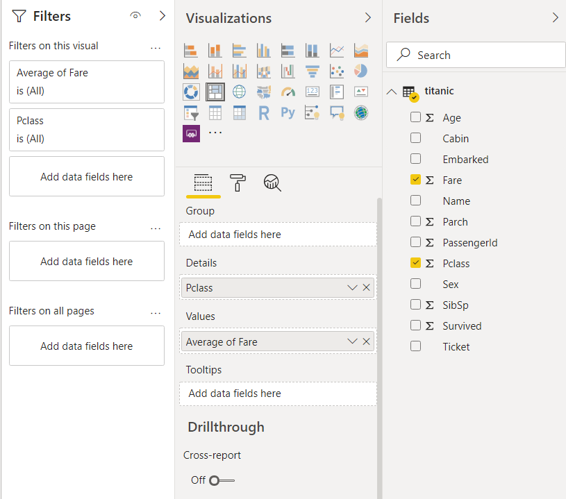
To do so, add “Average of Fare” to the Values field and “Pclass” column to the Details field.
By default, the “Average of Fare” column is not available. To create this a column, first, drag the “Fare” to the Values field and then from the dropdown list, select “Average of Fare”.
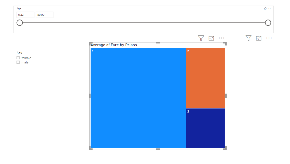
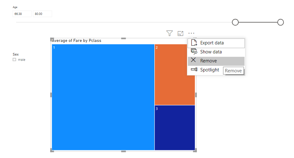
Once you have created your Treemap, the reports view will look like the image below.
You can see that the average fare paid by the first-class passengers (represented by blue area) is far higher than the average fare paid by second, and third-class passengers, as you would expect.
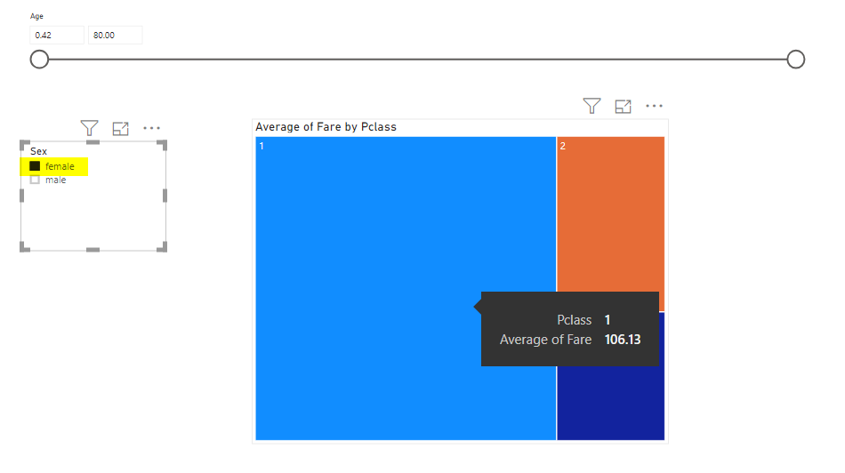
Let’s now update the data based on slicers. If you click on the “male” checkbox from the “sex” slicer on the left, and hover over the blue area in the Treemap, you will see that the average fare paid by males in the first class is 67.23.

Now, if you select female only from the slicer column, and hover over the blue area in the Treemap, you will see that the average fare paid by female passengers is 106.13, which is far more than the male first-class passengers paid.
Finally, let’s look at how you dynamically update the data with respect to age.
If you select both the male and female passengers from the sex slicer and then set the age range between 74 and 80, you will see that within this range the only passengers that traveled were in first class. This also shows that no women between the ages of 74 to 80 traveled on the Titanic.

If you want to remove a Treemap, you simply have to click on the three dots at the top-right corner of the Treemap and select “Remove” from the dropdown list as shown in the following screenshot.
This is how you can create Power BI Visuals with Treemaps and slicers to dynamically drill down into your data and display just the specific information that you want.
Adding Tables
Tables are another form of data presentation. As the name suggests, they are used to create Power BI visuals that simply display the records from the selected fields, in the form of a table.
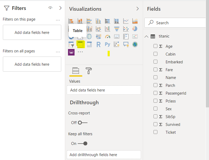
To add a table, select the “Table” visualization from the Visualizations section as shown below.
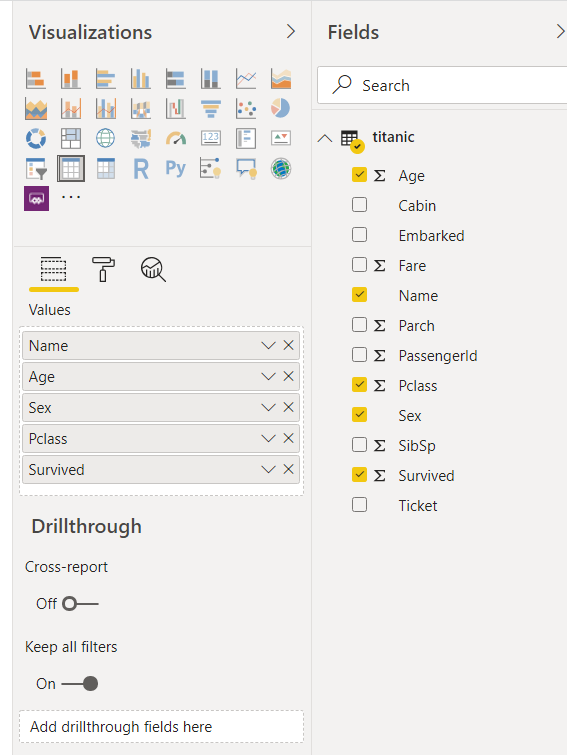
The columns that you want to show in your table are added in the Values field as shown below. In the following screenshot, five columns: Name, Age, Sex, PClass and Survived columns are added in the table.
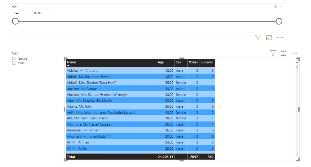
The newly added table looks like this.
As with Treemaps, you can use slicers to dynamically filter data contained in Tables as well.
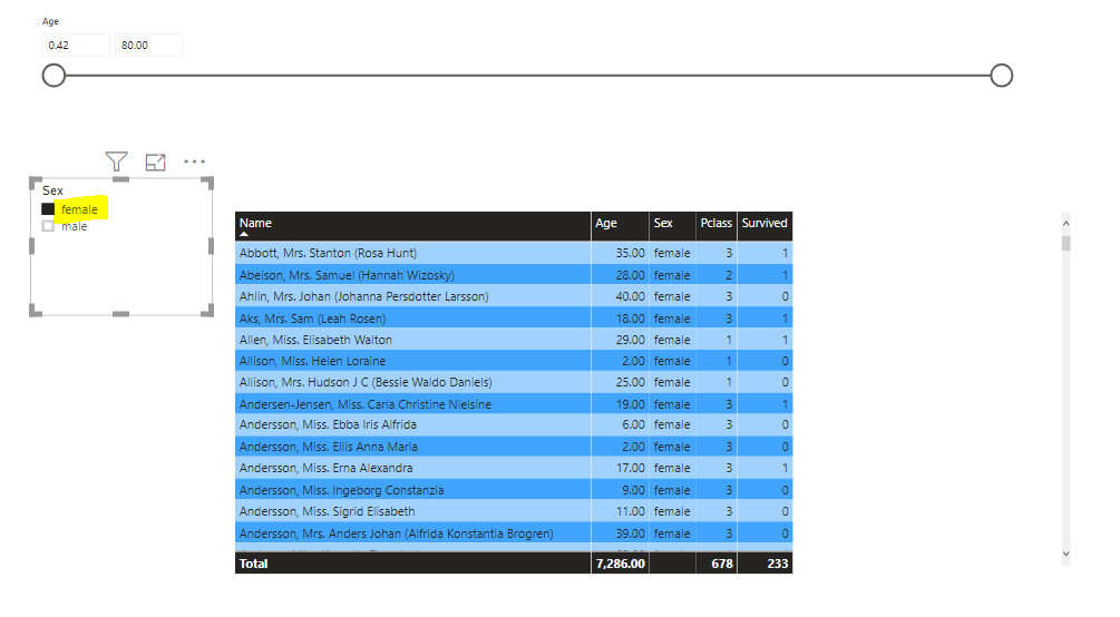
For instance, if you select the “female” checkbox from the slicer, you will only see records of female passengers in the table. This is shown in the following screenshot.
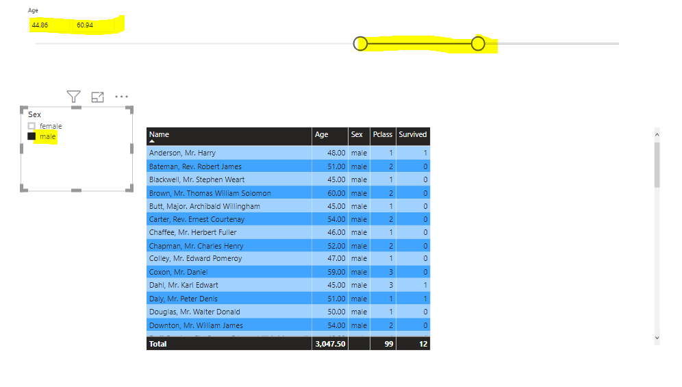
Similarly, the following screenshot shows records of male passengers with ages between 44.86 and 60.94. In the table, you should see the corresponding records.
Conclusion
This article has walked you through how to create Treemaps and Tables as Power BI visuals. These visuals are two of the most commonly used Power BI visuals.
With Treemaps, you can show a data distribution in the form of areas in a square. With tables, you can show records in tabular form. In addition, you can add interactions to your Power BI visuals and drill down into your data dynamically with the help of slicers.

View all posts by Ben Richardson
- Working with the SQL MIN function in SQL Server - May 12, 2022
- SQL percentage calculation examples in SQL Server - January 19, 2022
- Working with Power BI report themes - February 25, 2021