
In this article, I’m going to explain what conditional formatting in Power BI is. Conditional formatting, as the name suggests, is a way of visualizing data that applies special format rules based on some pre-defined conditions on the values of a selected metric. It is mostly used when the data is presented in a tabular format; however, it can also be used in any charts such as bar charts, line charts, etc.
What is conditional formatting in Power BI?
When there is a lot of data expressed in tabular format, it becomes difficult to understand which of the values are higher or lower at first glance. Often, you need to eyeball deeply into the cell values to understand or compare various metrics that are being displayed.
For instance, if you consider the figure on the left below, there is just too much data and you need to compare each of the cell values individually in order to understand more about it. However, if you see figure on the right, you can understand just by looking at a single glance, what are the higher values, the middle values and which values are lower. This is known as conditional formatting in Power BI.

Figure 1 – Conditional Formatting Comparison
Setting up data
Let us first try to import some data into the Power BI data model. Once the data is imported, we will investigate how to implement conditional formatting. For the sake of this article, I’m going to import the data from the famous WideWorldImportersDW database that is provided by Microsoft. You can download and install this database on your local easily. Since I have already installed the database, I won’t be covering those steps here. In order to import the data into Power, you can walk along with me in the steps below:
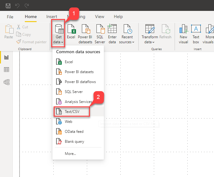
- Open Power BI Desktop and click on Get Data
-
Select SQL Server from the dropdown that appears

Figure 2 – Get Data in Power BI
-
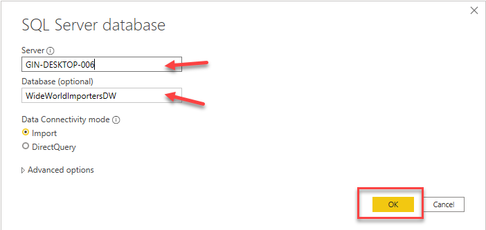
In the Connect Server dialog box that appears, provide the server name and the name of the database and click OK
Figure 3 – Server Details
-
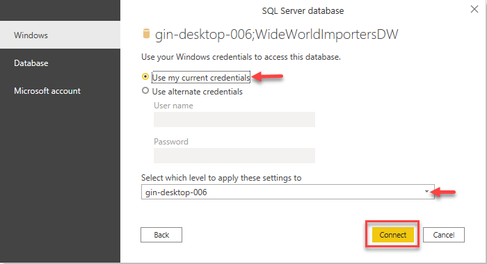
Connect using your credentials as required and click on Connect. In my case, I’m using Windows Authentication mode to connect to the database in SQL Server
Figure 4 – Authentication
-
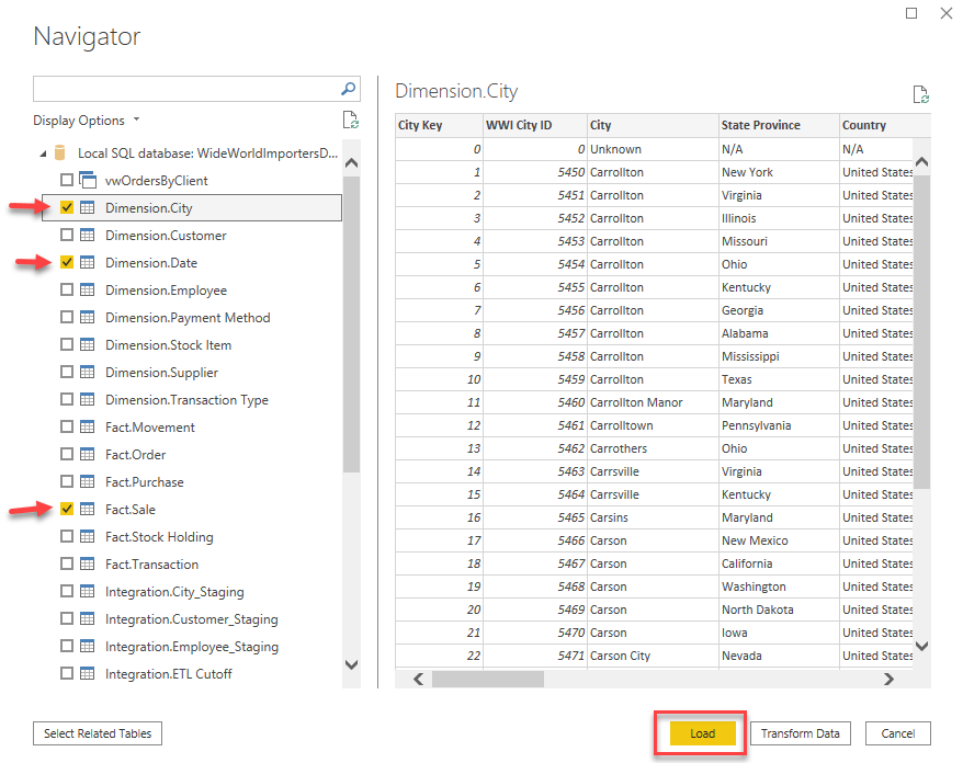
Once you click on Connect, you’ll see that all the tables from the database are listed in the dialog box. For this article, we will just select three of the tables – Dimensions.City, Dimensions.Date and Fact.Sale. Click Load once done:
Figure 5 – Selecting Tables
-
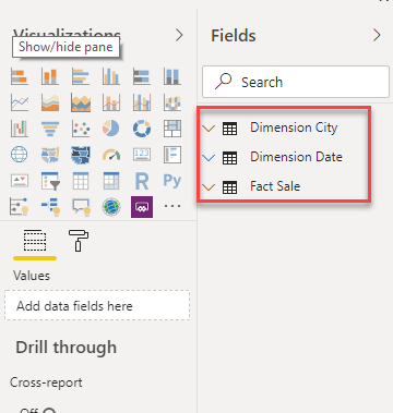
All three tables will now be loaded into the Power BI data model and available on the data pane:
Figure 6 – Data Imported
Building a report in Power BI
Now, let us quickly build a Power BI report using the Matrix visualization. It will use the data from the tables that we just imported. Click on Matrix on the Visualizations pane and drag and drop the respective fields into the Rows, Columns and Values, as shown in the figures below:
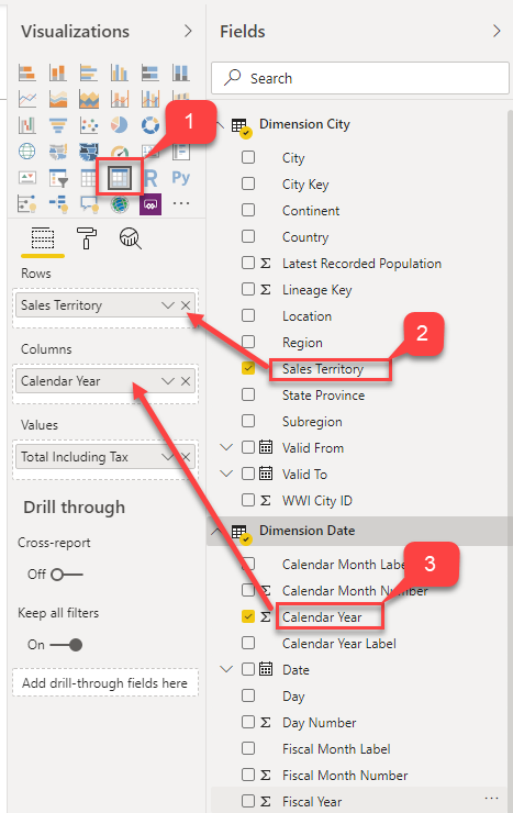
Figure 7 – Building the Matrix
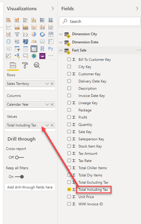
Figure 8 – Building the Matrix
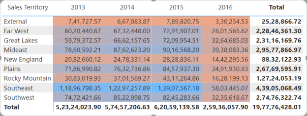
Once the fields are in place, you’ll see a similar kind of matrix being created in the Power BI report. This is a simple matrix that displays the sum of Total Including Tax for each of the Sales Territory and by Year. As you can see, it’s not easy to understand the highest and lowest values in the matrix; we need to dive deep into the visual and understand those values.
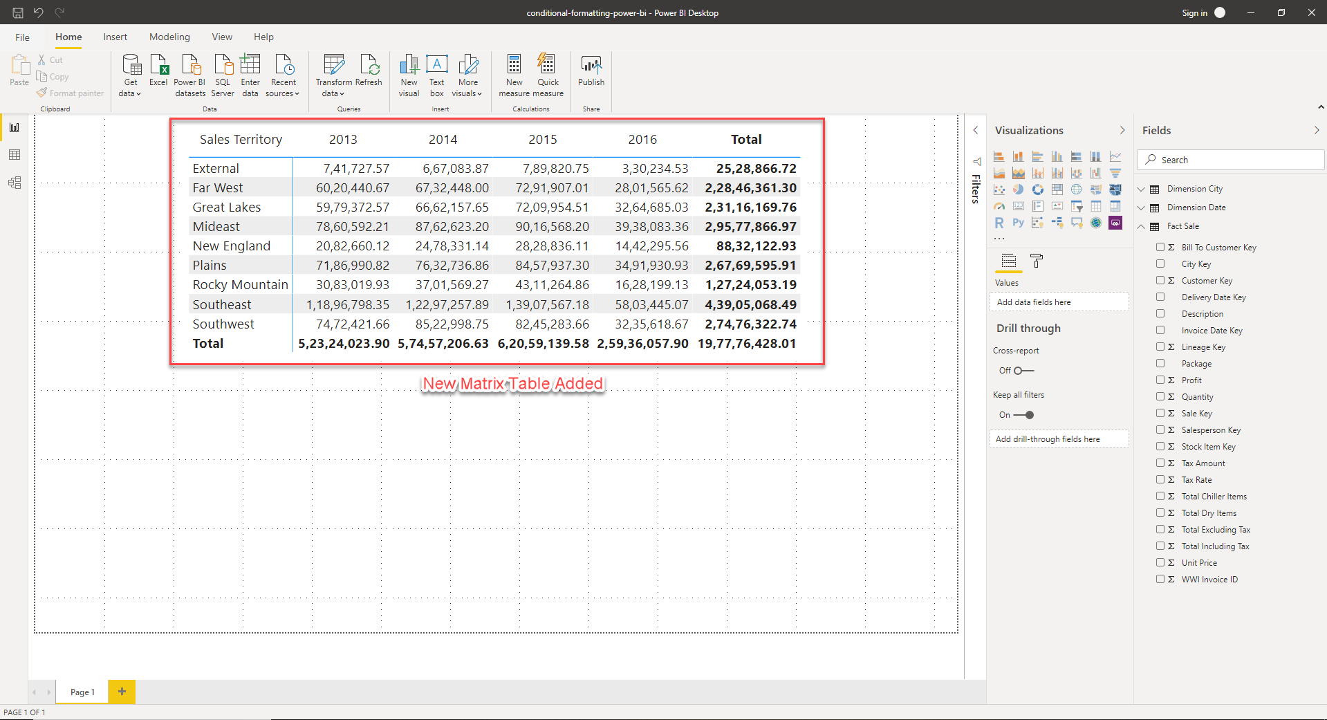
Figure 9 – New Matrix
Implementing conditional formatting in Power BI
In order to implement conditional formatting in Power BI, let us go ahead and define the rules for which we would like to visualize. Let us consider that we will change the background color of the cells based on the values each cell holds. For instance, the cell with the lowest value will have a background color of red while the highest will be highlighted in blue. You can follow the steps below to implement the same.
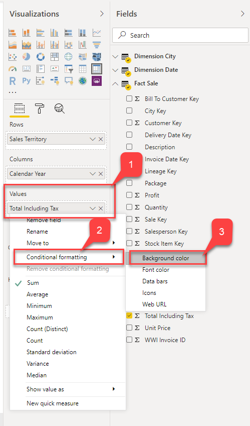
- Right-click on the “Total Including Tax” field in the Values section
Select Conditional Formatting and then click on the Background color
Figure 10 – Conditional Formatting
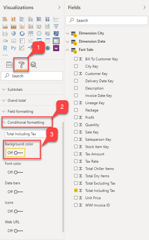
Alternatively, you can also click on the Format button and turn on the Background Color under Conditional Formatting
Figure 11 – Conditional Formatting
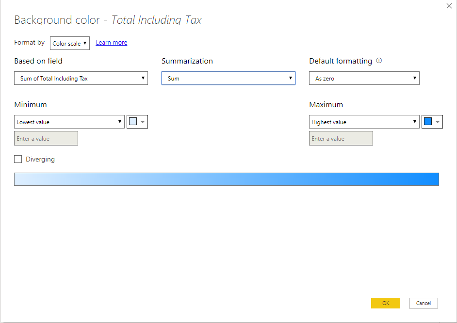
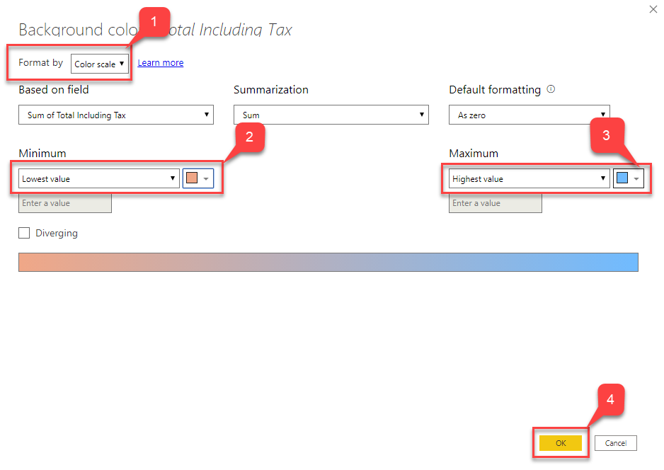
The Background Color – Formatting dialog box opens
Figure 12 – Background Color
Let us now select Color Scale as the Format By option and select the colors as discussed earlier. For the Lowest value, we will assign red while the color for the Highest value will be blue. Click OK once done
Figure 13 – Defining Color Scale
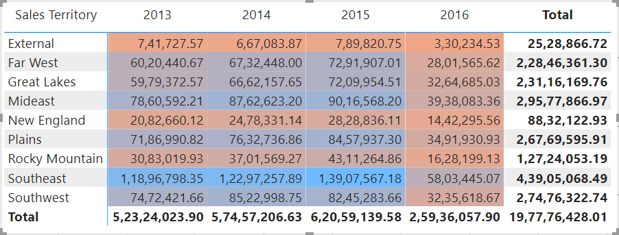
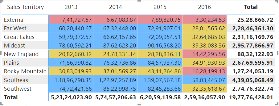
You’ll now see that the matrix has been highlighted with the colors as selected in the step above:
Figure 14 – Conditional Formatting Applied
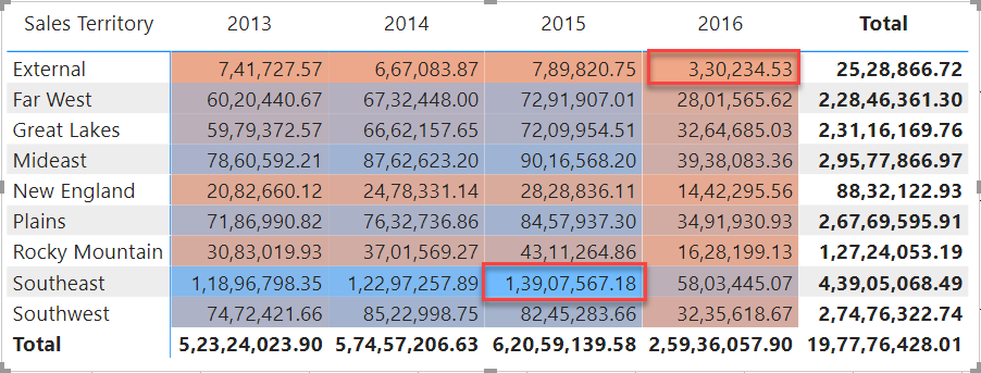
It is now easy to identify which are the lowest and highest values in the entire matrix just by looking at the saturation of the background colors. The highest being “1,39,07,567.18” and the lowest is “3,30,234.52”:
Figure 15 – Highest and Lowest Values
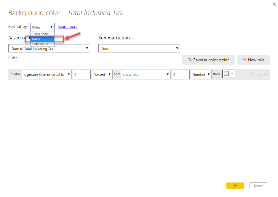
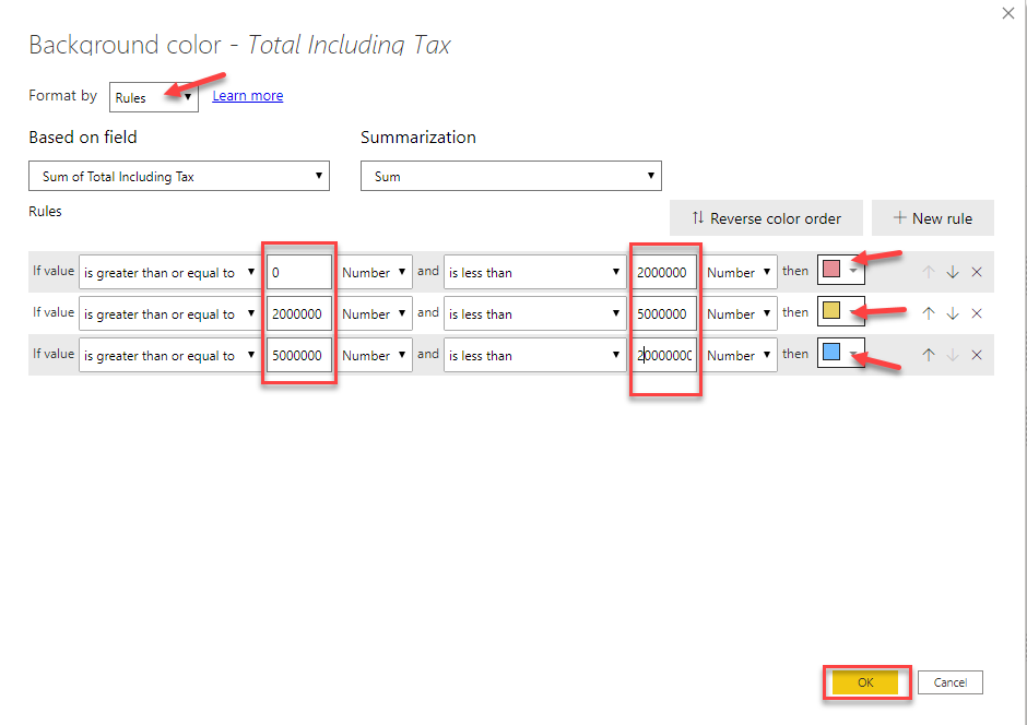
Now that we have seen what conditional formatting in Power BI is all about, let us explore some more different ways of implementing the same. In the steps above, the formatting rule is based on the range of cell values. That means, depending on the value a cell holds, the saturation of the background color changes. However, there might be scenarios where you’d like to visualize the formatting based on a fixed number value and don’t want to change the saturation of the colors. Or you might also want to segregate the measures into categories like High, Average and Low values.
In the steps below, we will try to modify the rules of the conditional formatting from range to fixed values.
- Right-click on the “Total Including Tax” field in the Values section
- Select Conditional Formatting and then click on the Background color
- Alternatively, you can also click on the Format button and turn on the Background Color under Conditional Formatting
- The Background Color – Formatting dialog box opens
In the Format By dropdown, select Rules
Figure 16 – Selecting Rules
- Now, we will create some rules based on which the formatting will be applied. You can create as many rules by clicking the New Rule button
Click OK once done
Figure 17 – Defining Colors
You can see that the formatting for the matrix has been updated. Now we have three different colors that tell us under which category each of the cell values lies
Figure 18 – Rule-Based Conditional Formatting
Thus, in the above exercise, we have seen how we can implement conditional formatting in Power BI based on two different ways. The first one was by using the Color Scale and the second was by defining specific Rules for the formatting.
Conditional formatting with icons in Power BI
Let us now go one step further and implement some icons just as a visual indicator in the cells. These specific icons are helpful when defining any KPIs, or while comparing metrics based on a criterion. You can follow the steps mentioned below to implement the icons in the cells.
- Right-click on the “Total Including Tax” field in the Values section
Select Conditional Formatting and then click on Icons
Figure 19 – Selecting Icons
- The Icons – Formatting dialog box opens
- Let the Format By option be as Rules
- Select Icon Layout as Right of Data and Icon Alignment as Middle
Select any option from the dropdown menu for Style and click OK
Figure 20 – Defining Rules for Icons
Now you can see that the matrix displays additional icons based on the conditions that are defined in the previous step
Figure 21 – Conditional Formatting with Icons
- This is an important feature that helps users to visually understand if the metric has performed well or not
- Again, you can add as many rules as required based on the requirements
Conclusion
In this article, I have explained what conditional formatting in Power BI is all about and how to implement the same. I have also explained the different ways in how conditional formatting can be applied and in what scenarios. Finally, we have seen how to include some infographic visuals (icons) in the visuals that help increase the readability of the reports to a great extent.

He is a prolific author, with over 100 articles published on various technical blogs, including his own blog, and a frequent contributor to different technical forums.
In his leisure time, he enjoys amateur photography mostly street imagery and still life. Some glimpses of his work can be found on Instagram. You can also find him on LinkedIn
View all posts by Aveek Das
- Getting started with PostgreSQL on Docker - August 12, 2022
- Getting started with Spatial Data in PostgreSQL - January 13, 2022
- An overview of Power BI Incremental Refresh - December 6, 2021