
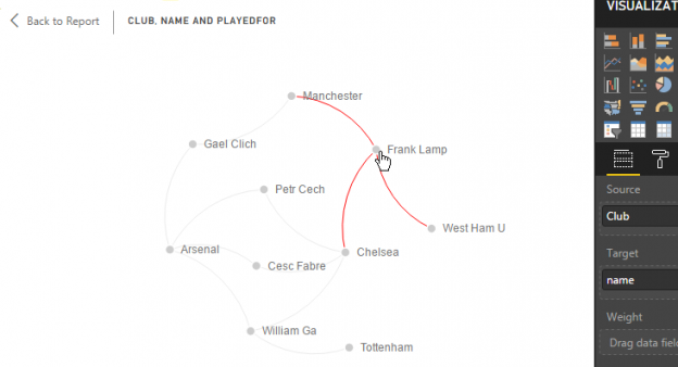
In the article How to plot a SQL Server 2017 graph database using SQL Server R, I highlighted the lack of built-in graph data visualisation as one major limitation of the SQL Server 2017 graph database feature. In the same article, I went on to suggest making use of SQL Server R as one workaround that could be utilised in order to successfully plot and visualise diagrams out of SQL Server 2017 graph database objects. However, whilst 3rd party graph database vendors such as Neo4j provide an interactive and hyperlinked graph diagrams that allows you to – amongst other things – easily drilldown and identify node-relationships as indicated in Figure 1, the graph plotted using SQL Server R is not very interactive in fact it is simply a static image file as shown in Figure 2.

Although the perceived lack of animation in graphs plotted using SQL Server R might not be a deal breaker for data scientists and R developers alike, you may find it hard to convince business end-users to abandon an interactive data visualisation for a static image file. Fortunately, the Microsoft Power BI tool is designed to provide interactive data visualisations for business end-users and it just so happens that it also supports visualisations based off SQL Server 2017 graph database. Therefore, in this article, we take a look at the integration of Power BI and SQL Server 2017 graph database.
Get Data: SQL Server 2017 Graph Database
Continuing to use our sample SocialGraph graph database created in this article, we begin by importing our sample nodes and edges tables into Power BI Desktop client. The first thing that you will notice is that as you attempt to load these tables, you will run into an error message similar to the one shown in Figure 3.
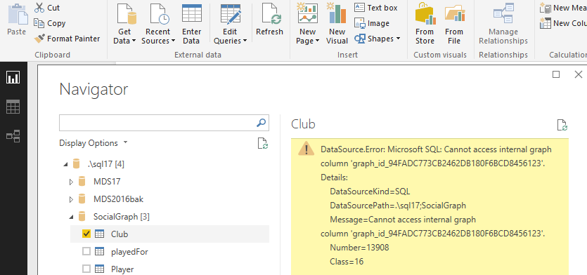
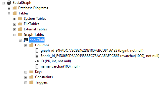
At first glance, one might assume that there is a software bug in the Power BI Desktop tool which causes internal graph columns to be inaccessible. However, regardless of the client tool you may be using, internal graph columns in SQL Server 2017 are not meant to be accessible by applications external to the SQL Server engine. For instance, Figure 4 shows the properties of node table dbo.Club.
Using SQL Server Management Studio (SSMS) as my T-SQL client, I attempted to read the value of the graph_id_* column by executing the code shown in Script 1.
|
1 2 3 |
SELECT graph_id_94FADC773CB2462DB180F6BCD8456123 FROM [SocialGraph].[dbo].[Club]; |
However, the execution of Script 1 led to the error message shown below – which is actually similar to the error message returned in Figure 3 by Power BI Desktop.
Msg 13908, Level 16, State 1, Line 9
Cannot access internal graph column ‘graph_id_94FADC773CB2462DB180F6BCD8456123’.
So how do we get around an error like this one?
Well, it looks like the following steps do the trick:
- Write a SELECT statement against graph database table specifying a list of column names that you are looking for (excluding internal graph columns)
- Wrap the above SELECT statement in a SQL Server view object
- Point Power BI to the newly created SQL Server view object
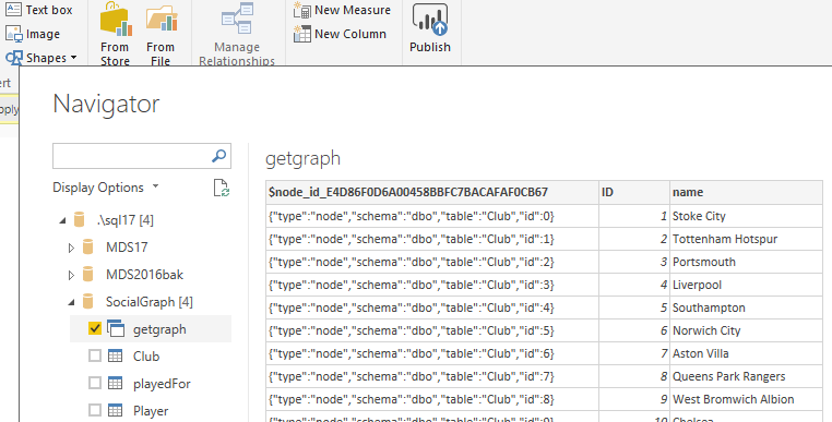
Figure 5 shows a SQL Server view (i.e. getgraph) created using the aforementioned steps being successfully imported into Power BI Desktop.
Now that we have found a mechanism to extract a graph database table into Power BI without any errors, we next modify the definition of our sample getgraph view to include joins to dbo.Player, dbo.Club and dbo.playedFor graph database tables as shown in Script 2.
|
1 2 3 4 5 6 7 8 9 |
ALTER VIEW getgraph AS SELECT a.name, 'playedFor' playedFor, b.name AS Club FROM player a, playedFor, Club b WHERE MATCH(a-(playedFor)->b); |
Import Custom Power BI Visual
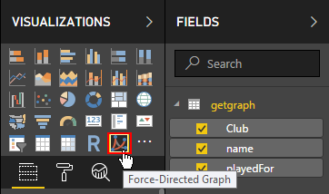
Whilst writing this article, I was using the December 2017 release of Microsoft Power BI Desktop and the release did not readily provide visualisations that supported effective plotting of graph databases. Thus, I had to download and import a Power BI custom visual to successfully plot an interactive graph database. One such custom visual, is the Force-Directed Graph which is an open source custom visual developed by Microsoft and designed for visualising connections between two or more entities. Although my demo is based off the desktop version of Power BI, the Force-Directed Graph visual also works with the web version of Power BI.
Regardless of the version of Power BI you may be using, the installation of the Force-Directed Graph is straightforward; simply click the ellipsis button under the Visualisation pane and choose the import type – in my case, I chose to Import from file. Once the import has been completed, the Force-Directed Graph visual will appear in the list of your visualisations as shown in Figure 6.
Generate Graph Database Using Power BI
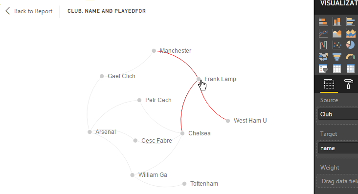
Having imported data off a SQL Server 2017 graph database and successfully installed a custom Force-Directed Graph visual, we are only left with the easiest yet interesting part and that is to plot and generate an interactive Power BI graph. Just like in most Power BI visuals, the Force-Directed Graph visual has several properties that can be configured according to user preference. In terms of configuring data fields, the custom visual is likely to auto-detect what dataset fields goes where but just to be certain, Figure 7 indicates the allocation of fields from the getgraph view according to Source, Target and Link Type properties.
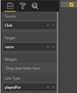
Figure 8 shows that the Force-Directed Graph visual further providers a Format option that can be used to configure properties such as the background appearance of the graph to be plotted, specify data labels and turn on/off graph animations. You can further represent your nodes in the graph using custom images.
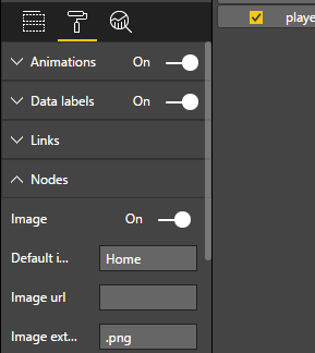
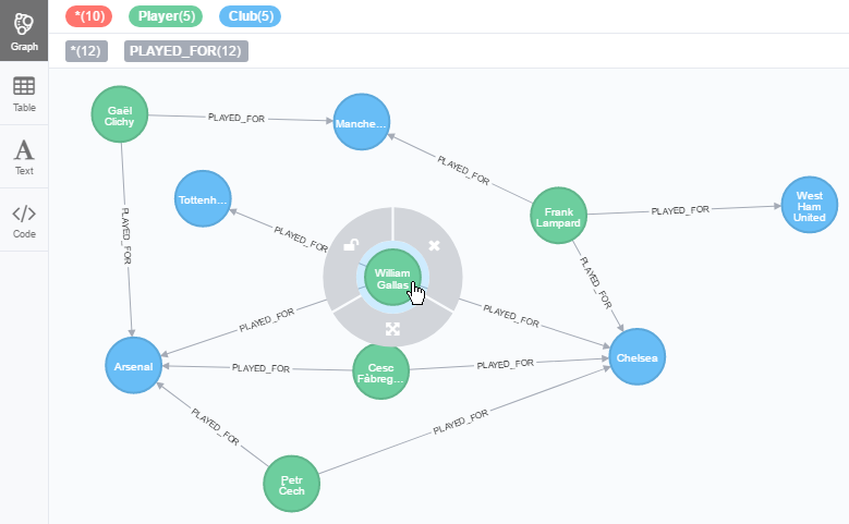
Figure 9 shows a basic graph database that we have managed to plot using Power BI. However, the graph can further be improved by spending some time playing around with the “look and feel” properties displayed in Figure 8.
Summary
In addition to using SQL Server R for plotting SQL Server 2017 graph database as discussed in this article, I have used this article to demonstrate a Power BI mechanism for plotting and visualising graph databases. Although, it relies on custom visual, Power BI provides an interactive option for business end-users to utilise in order to visually make sense of their SQL Server 2017 graph database.
References

Sifiso's LinkedIn profile
View all posts by Sifiso W. Ndlovu