
In this article, we will take a walk-through of the Power BI Desktop user interface and features provided to author reports.
Introduction
In a typical data life cycle, the data journey starts from data capture using various data accumulation and data ingestion methods and ends with different data consumers. One of the most fundamental ways of data consumption is data reporting. Reports have been one of the oldest methods of data consumption, so reporting tools have been existent in the data marketplace since a very long time. Some of the popular reporting tools in the era of cloud are Tableau, Qlik, Looker, Quicksight, etc. In Microsoft parlance, Power BI is the most popular and one of the most important tools for data reporting. Power BI Desktop has been in the industry for several years, and it has continued to add more capabilities in iterations over time. Power BI Desktop is the free authoring tool that is used to develop Power BI reports. Users who are new to Power BI may find it hard to explore and identify the array of capabilities offered by Power BI.
Power BI Desktop Features
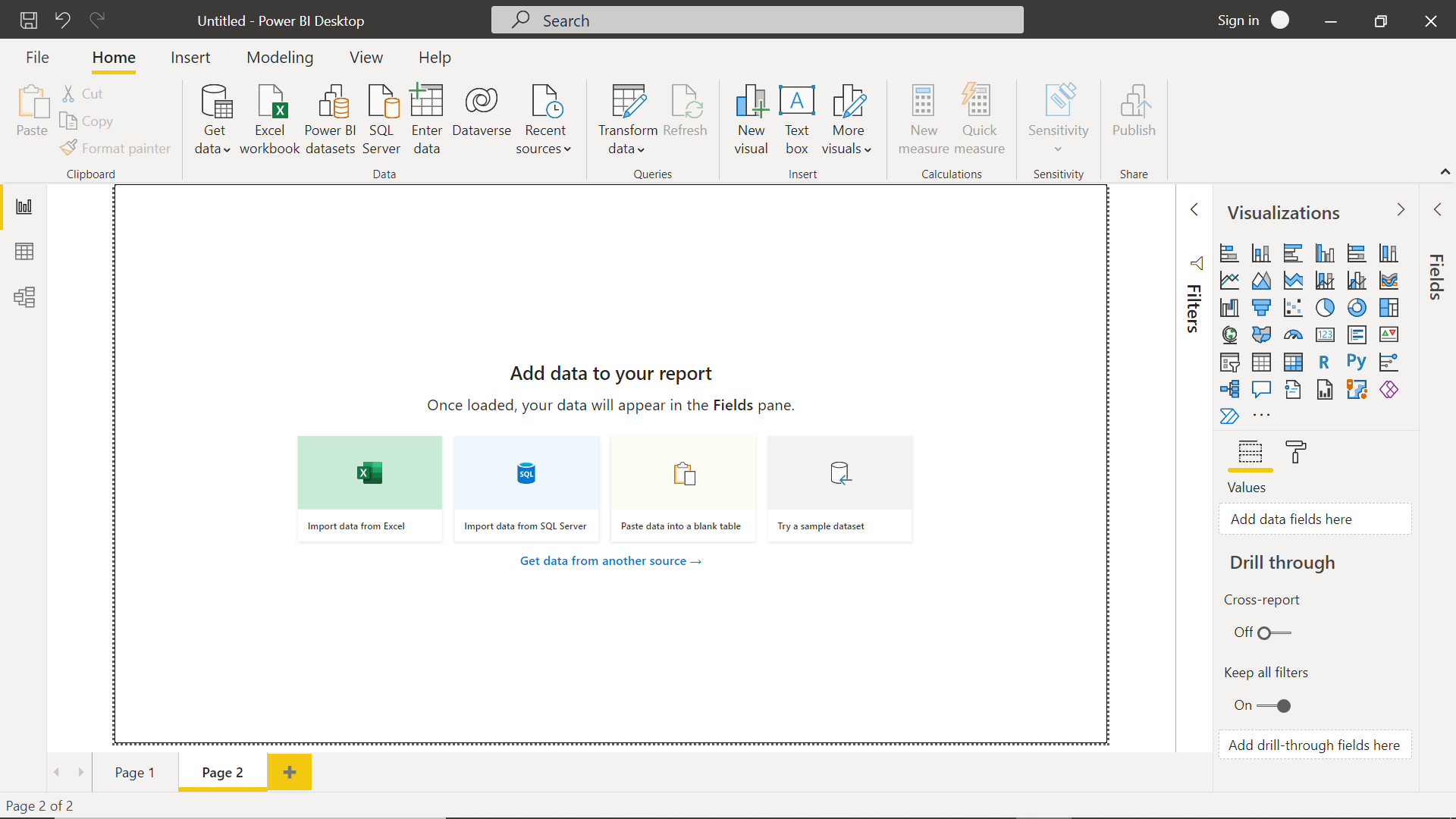
We will be using the September 2021 release of Power BI Desktop for the rest of this article. It is assumed that one has installed and configured the same. Launch the Power BI Desktop and it would prompt you to login using your Microsoft account credentials. Though it is not mandatory, and one can skip it, and land on the home page of the report as shown below. By default, the report authoring interface has only one page. We can click on the plus button to add more pages to the report. The report layout used to be blank in the prior versions of the report. In the latest release, now we get the option to add data to the report from various sources like Excel files, SQL Server, add data manually, or even from a built-in sample dataset. The left-hand pane of the layout shows the report, data, and model views and on the right-hand side of the layout, there are three collapsible panes – Fields, Visualizations, and Filters. A typical way to start authoring reports is to source data first, and then add visualization to the report layout and bind data to the visualization.
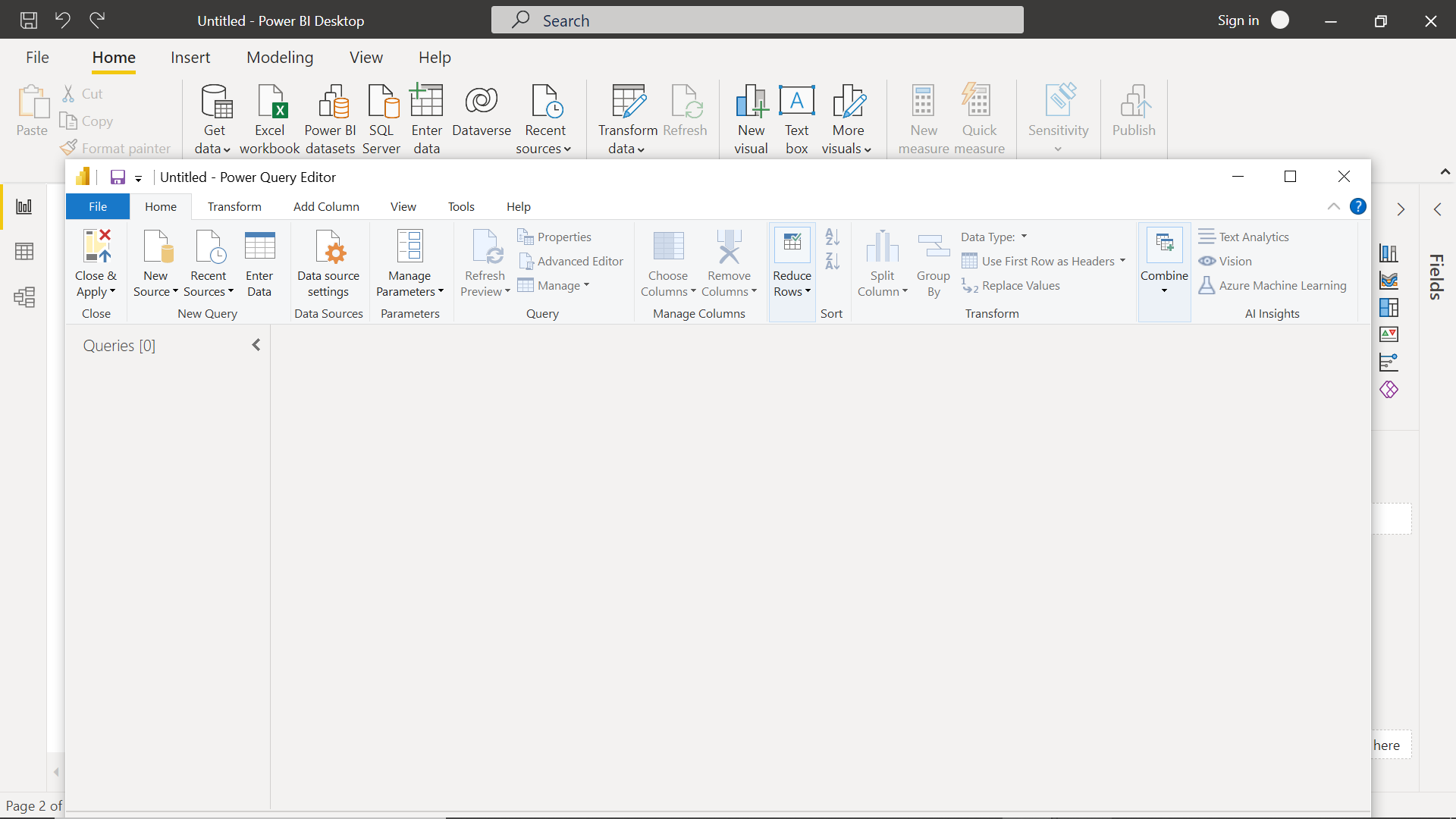
The first major part of the functionality for authoring reports can be accessed from the home menu/toolbar section. The very first active icon that one would find is sourcing data. Some of the most frequent data sources like excel workbook and SQL Server can be seen upfront. The option to enter data manually or reuse existing Power BI datasets is another option to source data. Power BI Desktop supports more than 100+ data sources which can be explored using the GetData menu. Microsoft’s power platform offers a variety of tools or services like Power Automate, Power Apps, Power BI, etc. The data management for the Power platform is generally managed by a service known as Dataverse. One can directly connect to dataverse as well by clicking on the Dataverse icon. Once the data source is connected, while sourcing the data, one has an option to transform the data as well. By clicking on the Transform Data button, one can invoke the Power Query Editor button as shown below. It provides very elaborate options for data mash-up like Excel. These transformations will be executed before the data is loaded in the Power BI Data model and consumed using the visualizations on the report layout.
<
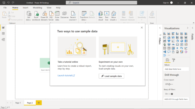
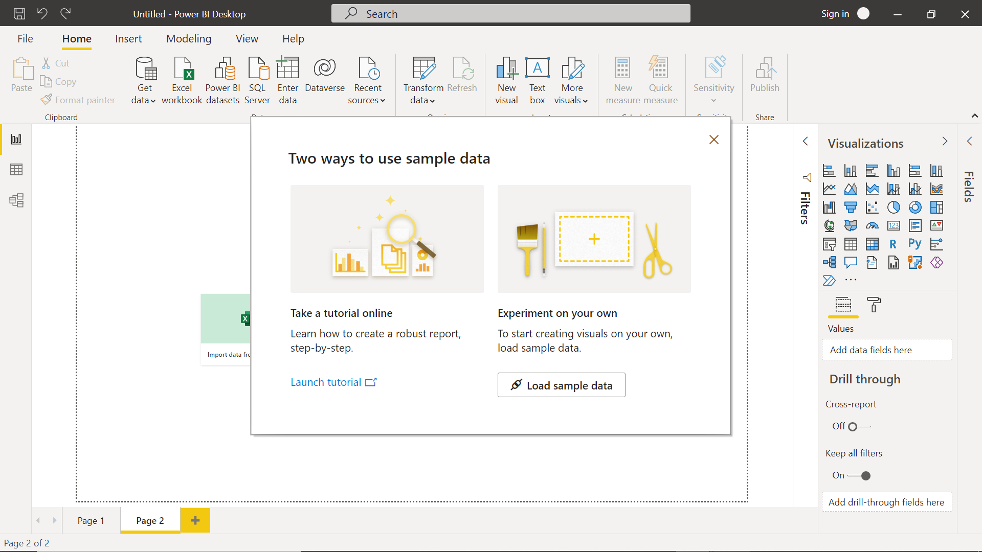
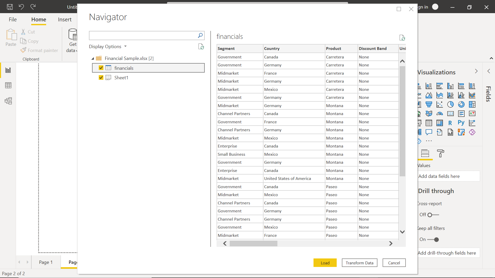
To understand this process of data transformation quickly, we can click on the add sample data button on the page layout. It would invoke a wizard as shown below. It provides two options to add sample data. We can click on the Load sample data button to populate sample data in the Power BI data model.
In the next step, we would be presented with the datasets which we can select and populate in the Power BI data model. Before this data gets loaded in the data model, we can click on the Transform Data button, to design the transformation process and then populate data in the data model.
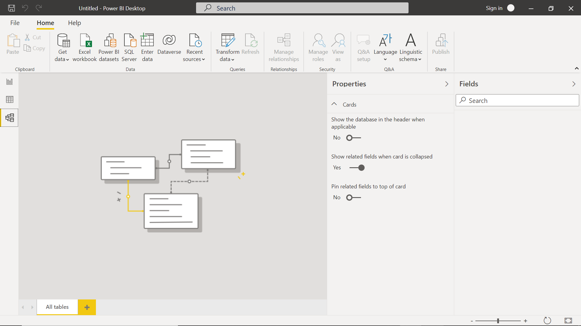
Once the data is loaded, we can explore the model as well as data by using the options in the left-hand pane. Click on the model button to open the model view and it would look as shown below.
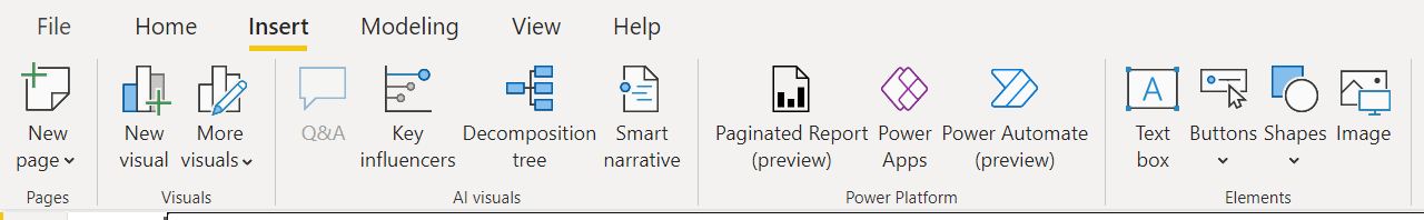
To make a report informative, aesthetic, and creative, a variety of visual elements including shapes and visualizations are required. Once we have added data any binding with the visuals is done, the next step is to all more elements. Click on the Insert menu icon to view the options available for adding elements to the report. We can add new pages to the report by using the new page menu item from the pages section as shown below. We can add out-of-box visuals using the new visual and custom or external visuals using the more visuals menu item. Power BI Desktop comes with a special category of visuals called AI visuals which include visuals like Question and Answers, Key Influencers, Decomposition Tree, and Smart Narrative. These visuals can analyze the data and generate insights using the built-in AI. The next category of features is related to power platforms where we can add power apps, power automate scripts as well as paginated reports. Power platform is a very effective and growing area especially in the self-service segment and integrating this in Power BI reports can be very effective in certain types of reports. Apart from these advanced categories of visual elements, the category of visual elements that are used heavily is the regular visual elements like Textbox, Buttons, Shapes, Images, etc. These are also readily available on the toolbar as shown below.
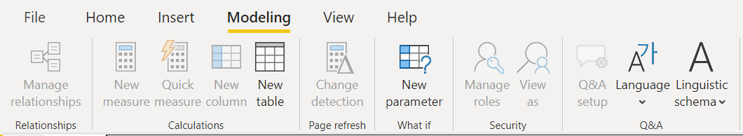
The next menu item of the Power BI toolbar is Modeling. We saw earlier how we can access the modeling view in Power BI Desktop. One can start building the model from scratch or manage an existing data model using the options in this menu item. A data model is composed of data constructs like Tables, Measures, and Relationships. As seen below, we have the option of adding all these elements to the data model as well as relationships. The Data model may change over time, and we have the change detection feature to help with that. For the What If kind of analysis, one may want to parameterize the report which can be done by adding parameters. With a data model as well as data populated in the model, one needs data security. The options for the same can also be accessed from this menu bar. Finally, the language-related options for localization can be accessed from here using the Language and Linguistic schema menu items.
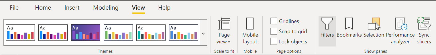
Once the report is populated with the desired elements, supported by the right data model, and decorated with the right visual elements, the final step is to focus on the final polishing of the report. We are typically used to apply them to our slides in office apps like Microsoft Powerpoint. A similar style of styling and themes can be applied to the report as well using the options available in the Themes section as shown below. Power BI Desktop supports page layout as well as mobile layout as well, as the reports can be viewed from a mobile or smart device. These menu options can be used to control the layout of the report based on the device from which the report would be consumed. To use visual aids that can help in aligning all the visual elements at a precise position on the report layout, we can use the features like Gridlines, Locking objects, etc. To free up the screen space, we can toggle panes like filters, selection, etc. and bring up different panes like performance analyzer as and when required.
At a high level, these are the different options presented to a report author in Power BI Desktop, using which one can control different aspects of report authoring.
Conclusion
In this article, we went through a guided tour of features available in Power BI Desktop for report authoring. We also learned how to source data as well as use the built-in Power Query editor to develop transformations that will transform the data before it is populated in the Power BI data model.

She has a deep experience in designing data and analytics solutions and ensuring its stability, reliability, and performance. She is also certified in SQL Server and have passed certifications like 70-463: Implementing Data Warehouses with Microsoft SQL Server.
View all posts by Gauri Mahajan
- Oracle Substring function overview with examples - June 19, 2024
- Introduction to the SQL Standard Deviation function - April 21, 2023
- A quick overview of MySQL foreign key with examples - February 7, 2023