

Azure Data Studio is an open-source, cross-platform and lightweight data management tool. We can use it for on-premise SQL Server, Azure SQL database and Azure SQL data warehouse. Previously we knew this tool as SQL Operations Studio.
- General Availability release date: 24th September 2018 (v1.0)
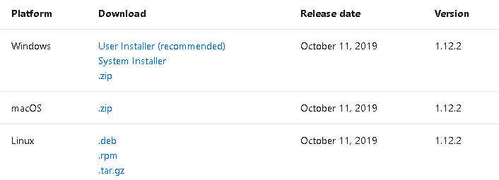
- Current release : October Release (v 1.12.2)
Download and install Azure Data studio using the link on a suitable platform.
Azure Data Studio introduces new features using extensions in the marketplace. You can follow SQLShack for useful extensions for developers and DBA. This article explores the well known and influential visualization tool SandDance using extensions in this tool.
Introduction to SandDance Visualization
SandDance is a useful data visualization extension from a Microsoft research project. We can use it to identify data patterns, trends and insights. An interactive chart can be customized easily. It also provides decision-making capability. We can display individual and aggregate data as well in this chart:
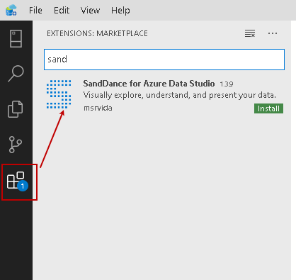
Let’s install SandDance visualization in Azure Data Studio. Navigate to Extension on the left vertical menu bar and search it using keyword Sand:
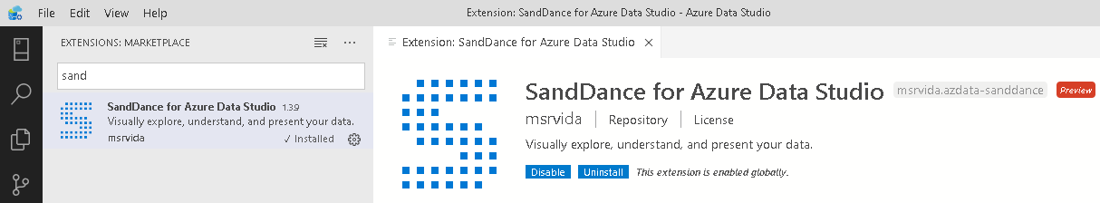
Click on Install. It quickly installs SandDance visualization as shown below:
Prepare data for SandDance visualization
In this example, we use Big Mart Sales Data for visualization. You can download it from this link.
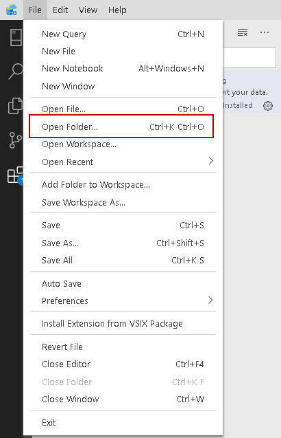
Download the CSV file and save it into a folder. In Azure Data Studio, navigate to File | Open Folder:
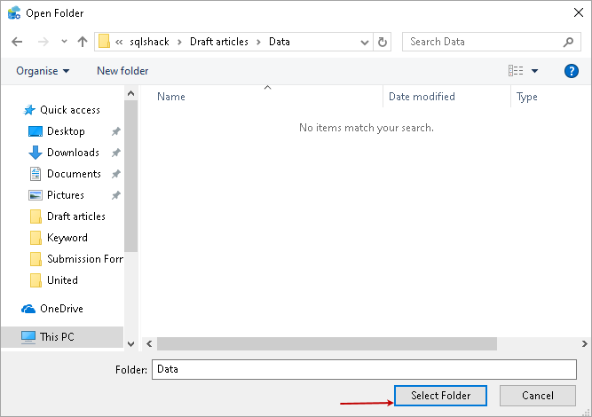
Browse to the folder that contains the CSV file and click on Select Folder:
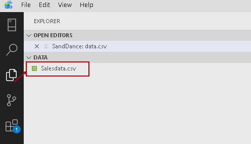
It loads all files present in this folder, and you can see them in the EXPLORER section as shown below:
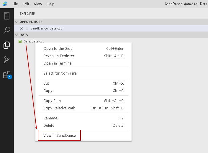
Right-click on this CSV and select the View in SandDance option:
Once you click on View in SandDance, it launches the default visualization as shown below:
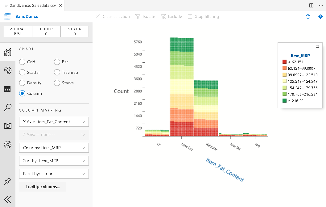
By default, it shows the column chart type. We can drag this chart and place it as the desired location. For example, I moved the chart in the bottom part of the page:
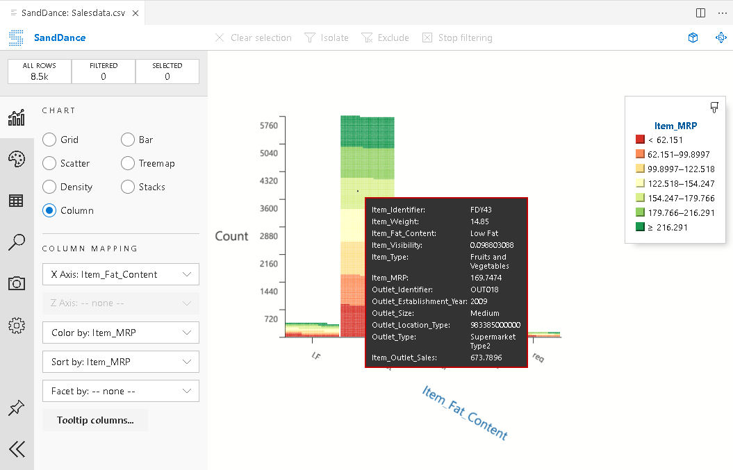
It is an interactive chart, and once we hover the mouse over any column bar, it shows detailed information in the tooltip:
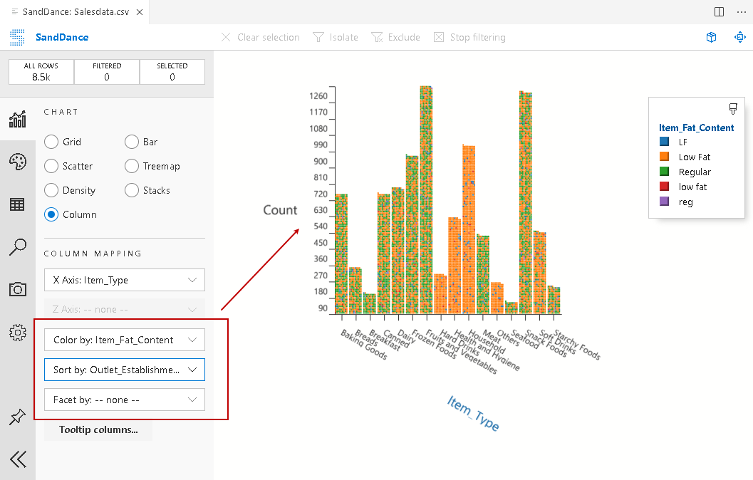
Once we click on View in SandDance, it automatically selects the column mapping as per predefined algorithms. In the above screenshot, we can see X-Axis column mapping for Item_Fat_Content.
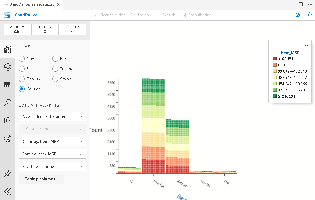
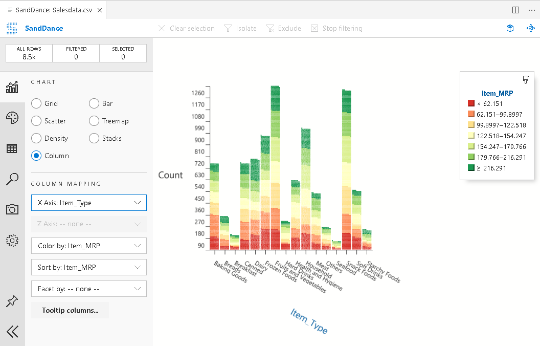
In the drop-down of column mapping, it shows all columns. Choose the required column, and it changes the chart immediately as per the selection. For example, the following screenshot, it shows X-axis for Item_type column:
Similarly, change the columns for color by and sort by for representing data in a better way:
We will cover more chart options in another part of the article. Let’s first explore other chart types available in SandDance.
Density chart
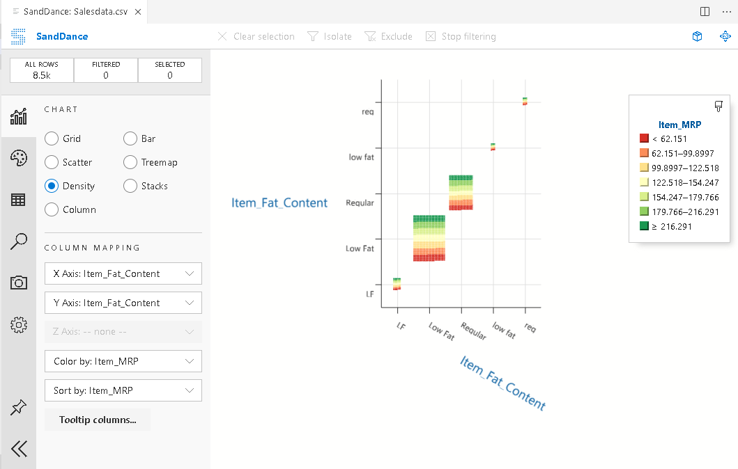
Let’s change the chart type as Density and choose the required columns in the X and Y-axis. We get different chart options for each chart type:
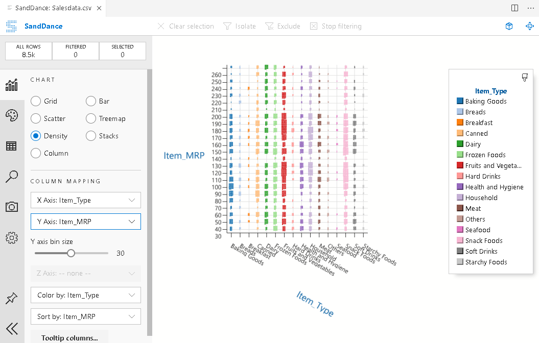
Change the required columns for the x and y-axis for the density chart for reflecting the change:
Scatter chart in Azure Data Studio
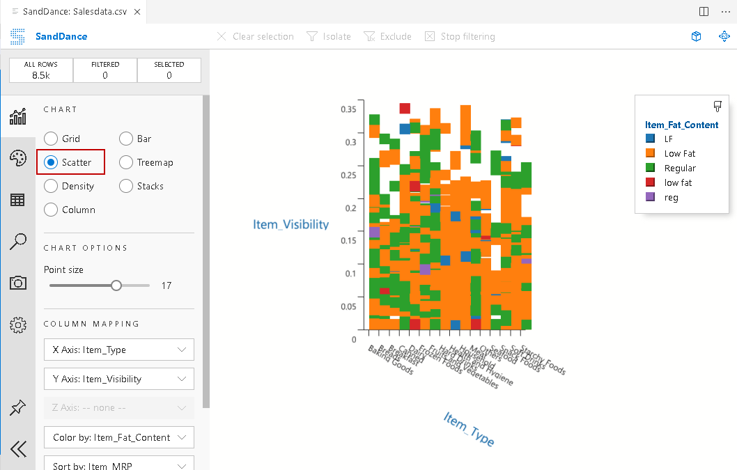
Scatter graph is the most commonly used Sandance visualization. Click on Scatter and choose the required mappings.
In this scatter chart, we use the following mappings:
- X-axis: Item-type
- Y-Axis: Item_visibility
- Color by: Item_Fat_Content
- Sort by: Item_MRP
It also shows different data point colors for the Item_Fat_Content column for values LF, Low fat, regular, low fat, and reg:
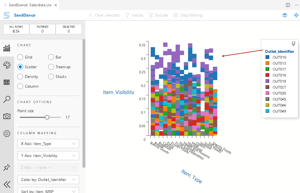
Click on the data point column (right side corner box), and it gives you a list of available columns. Let’s change the column to outlet_identifier:
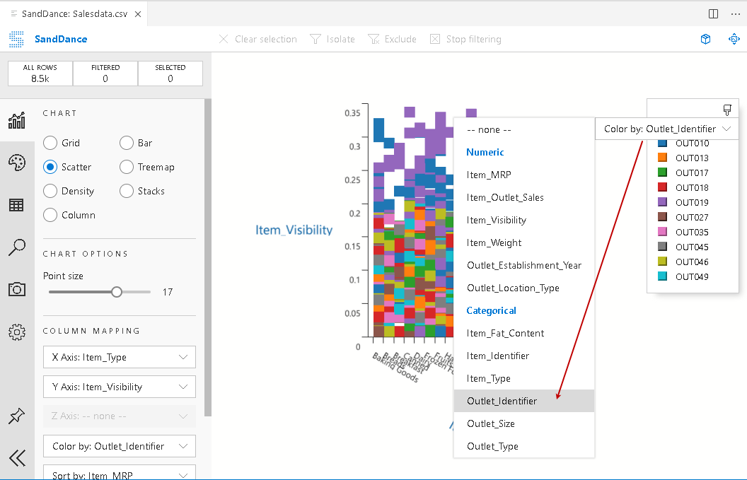
We can see changes in the scatter chart, as shown below:
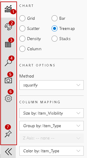
Treemap chart in SandDance for Azure Data Studio
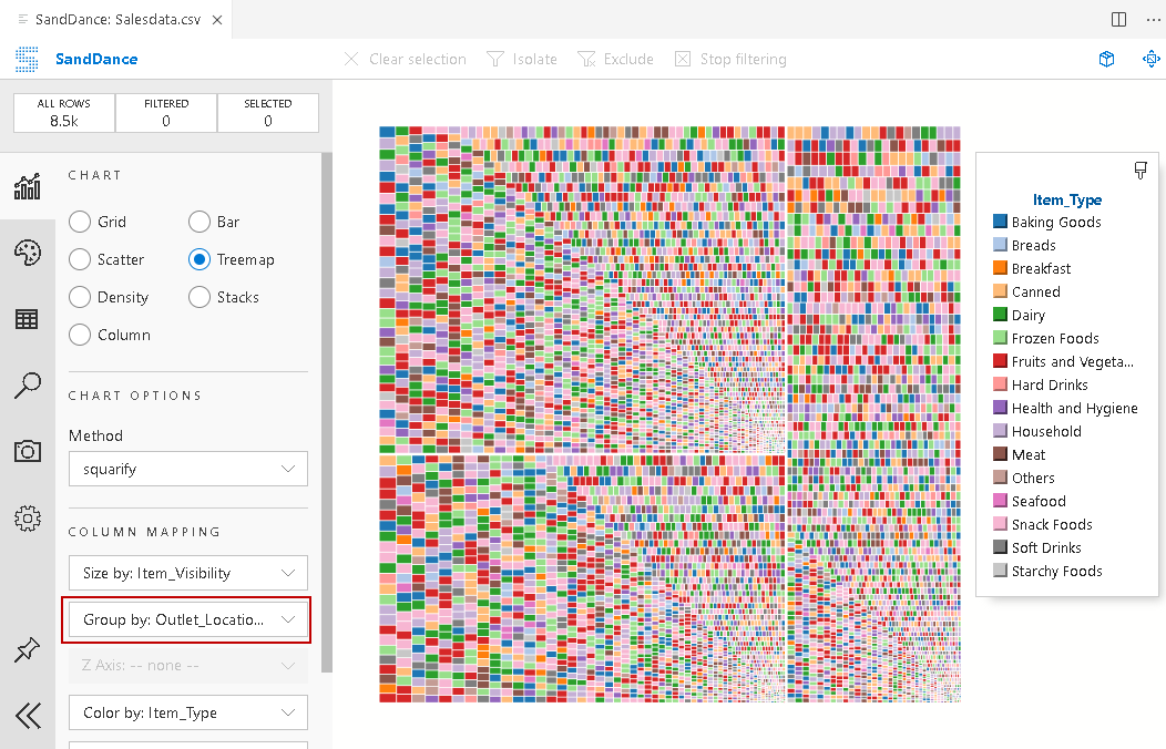
Treemap data visualization is useful for displaying hierarchical data using the nested rectangles. Choose the chart type as a treemap. In the following screenshot, we can see different rectangles group by the outlet_location column. These rectangle sizes vary according to the column Item_visibility:
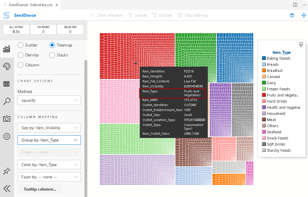
Let’s group by rectangles as per the Item_type column. You can see different rectangles groups in the screenshot:
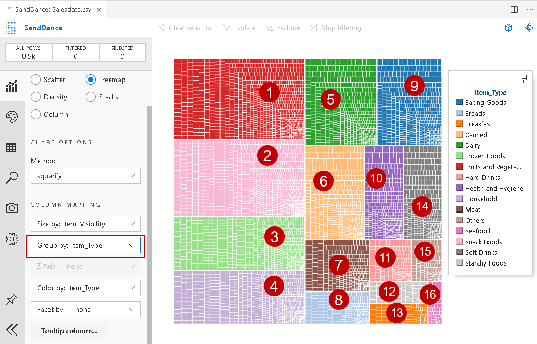
In the tooltip, you can see group 1 belongs to Fruits and vegetables:
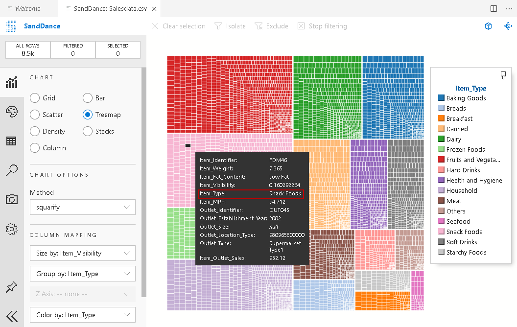
Group2 belongs to Snacks food:
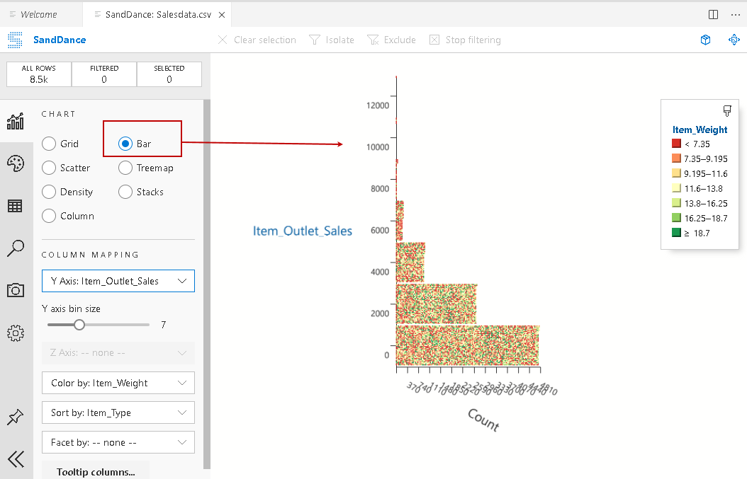
Bar type chart for Azure Data Studio
The following screenshot refers to a bar-type chart with configured column mapping and color-coding:
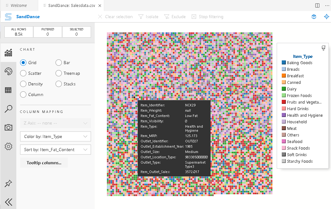
Grid type chart for Azure Data Studio
The following screenshot refers to a grid type chart with configured column mapping and color-coding:
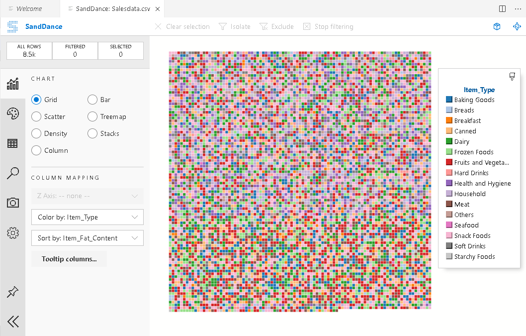
Each grid refers to an item as per the column mapping. You can get the details using the tooltip on a particular grid:
Exploring SandDance menu bar
We explored various types of Sanddance charts. In this option, we explore a few options available in the configuration menu bar, as shown below:
- Chart: We explored various charts type available under this option in previous sections
-
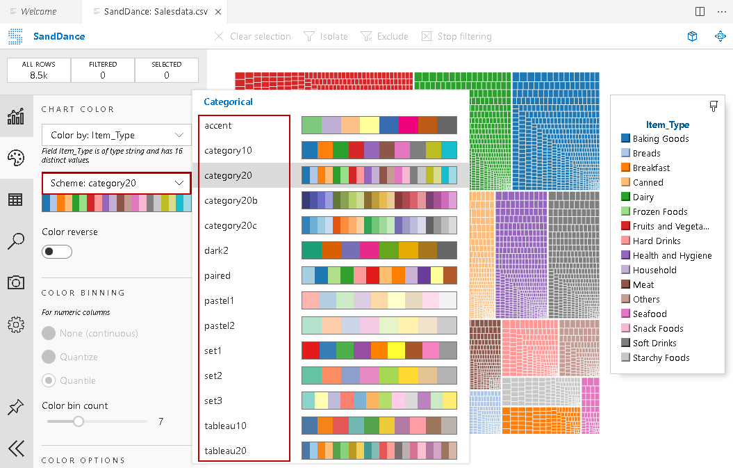
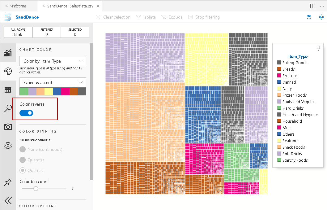
Chart color: We can choose a color scheme from a variety of available color schemes for all SandDance charts. By default, it uses a color scheme: category 20, as shown below:

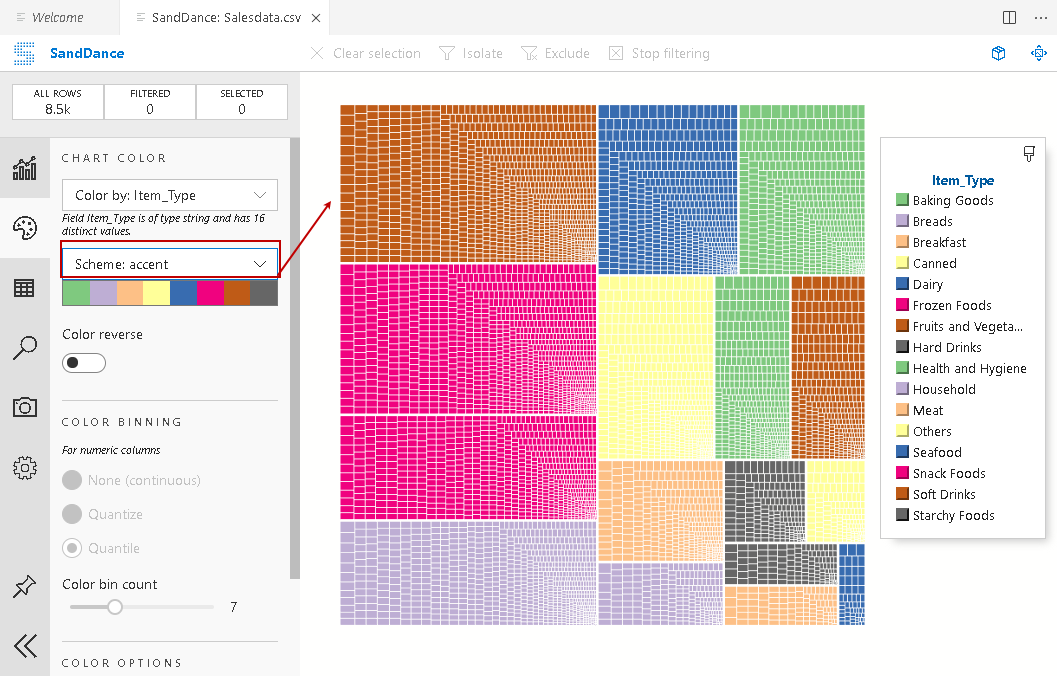
In the following example, we can see color scheme ascent for SandDance charts:
We also have an option – Color reverse. If you turn it on, it reverses the colors in the charts as shown below:
-
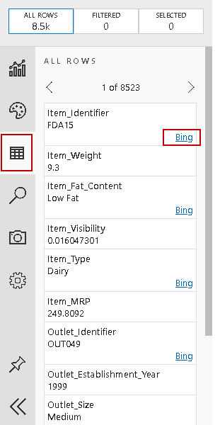
Data browser: In the data browser, we can check the data row by row. You can also notice a hyperlink for searching the item in the Bing search console:
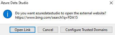
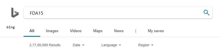
Click on Bing, and it gives the following pop up message:
Click on Open Link, and it opens a web browser and searches the item:
-
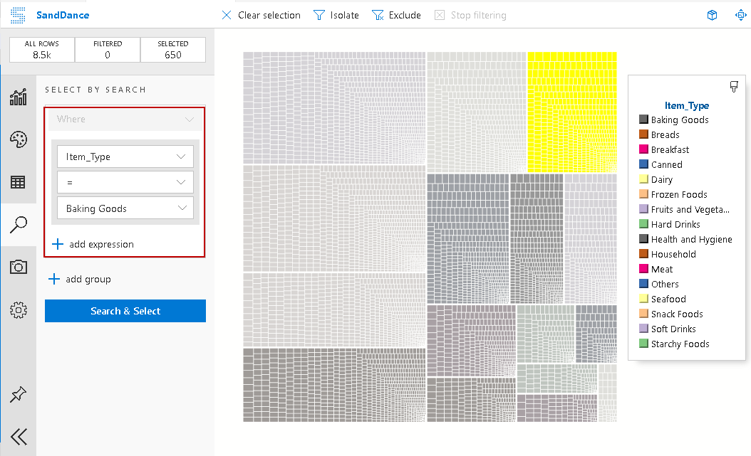
Select by Search: We can use Select by Search feature in SandDance for Azure Data Studio for filter data set by specifying various conditions. We can also use expressions in the search. For example, in the below screenshot, it searches for item type baking goods. It highlights the required portion in the chart:
-
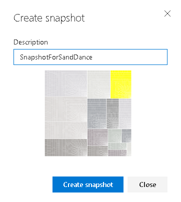
SnapShots: It also allows you to create chart snapshot so that we can view it later. Click on Create Snapshot:
Provide a snapshot description and again click on Create Snapshot:
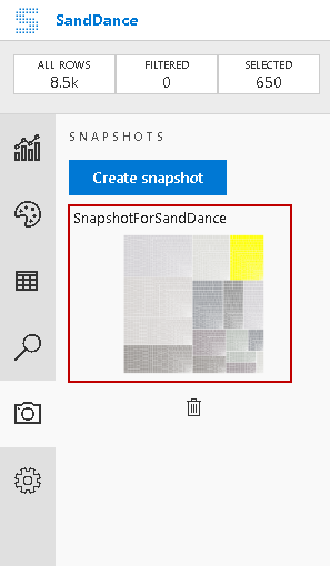
It shows the snapshots with a thumbnail. You also get an option for deleting it:
-
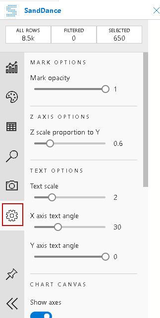
Mark Options: We can use mark options for customizing SandDance in Azure Data Studio. The available configurations are as follows:
- Mark Opacity
- Text options such as increasing, decreasing font size
- Adjusting text angles
- Show axes or legend
- Z scale proportion to Y

Filter data in SandDance for Azure Data Studio
You might have noticed a section in the SandDance that shows the following fields:
- All Rows
- Filtered
- Selected
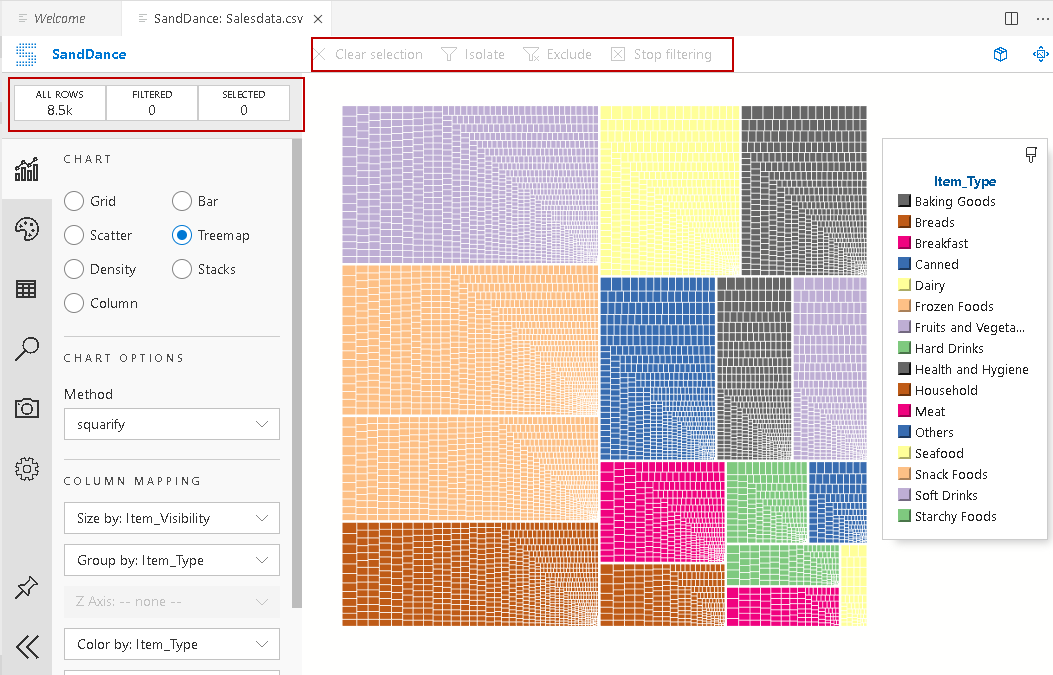
By default, it shows all data in the chart and does not use any filter. You can see the value of All rows (8.5k) that depicts our data row. We are not using any filters; therefore, it shows the zero for the filtered.
Let’s specify a filter to search only item type equals to hard drinks. You can see now that the chart highlights the section satisfying the condition. You can also see a value 210 for the selected column:
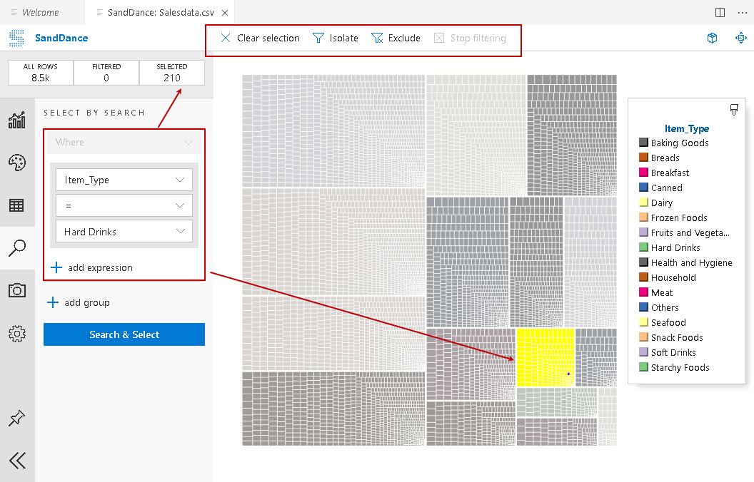
In the above screenshot, it also enables the option – Isolate and Exclude.
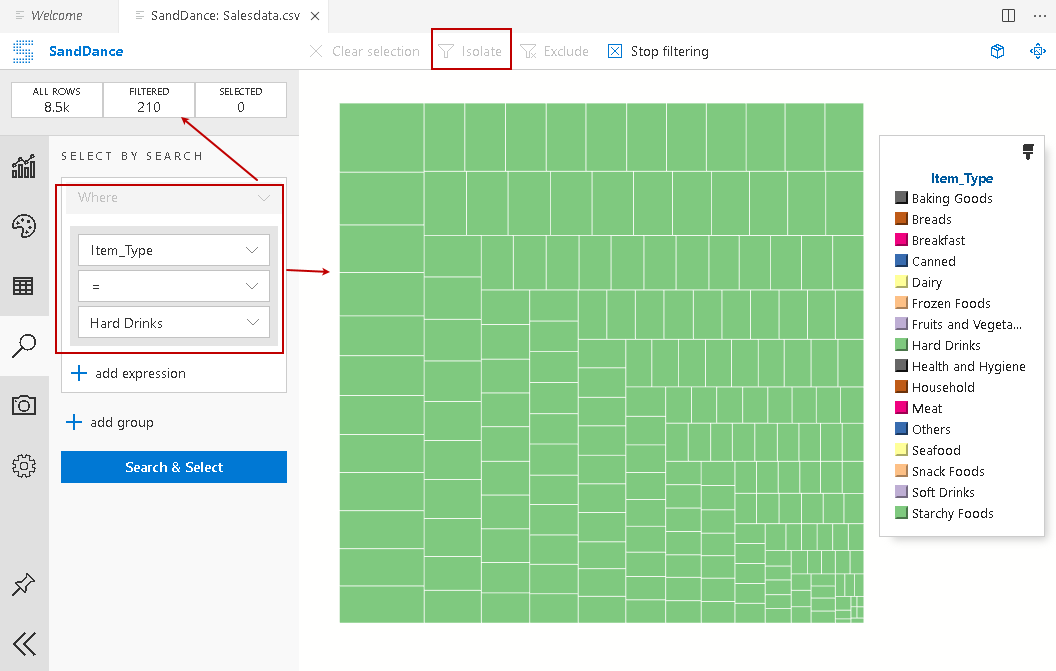
Click on Isolate and notice the change in the chart. It isolates the filtered data and shows the chart only for the filtered data. In the filtered column, you can see value 210:
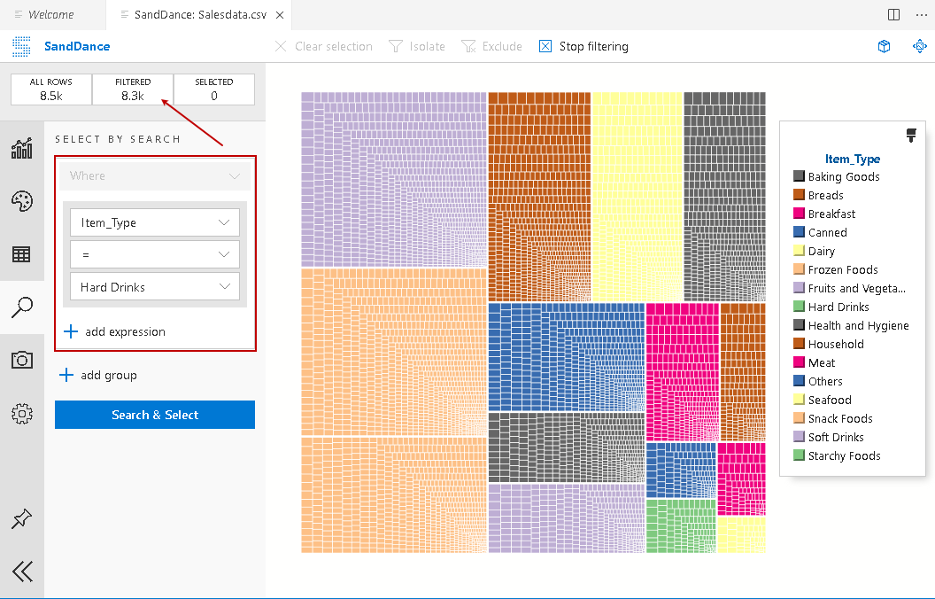
Click on Stop filtering to revert to the original chart. Now, filter the chart again and click on Exclude. It excludes filtered data from the chart and shows a chart for the remaining data. In the filtered column, you can see value 8.3k after excluding data:
View 3D SandChart in Azure Data Studio
By default, you can see 2D SandChart. It provides you to view the 3D chart as well. Click on the highlighted 3D chart option:
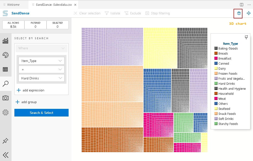
It changes the SandDance from 2D to 3D format, as shown below. It enhances data visualizations for SandDance charts:
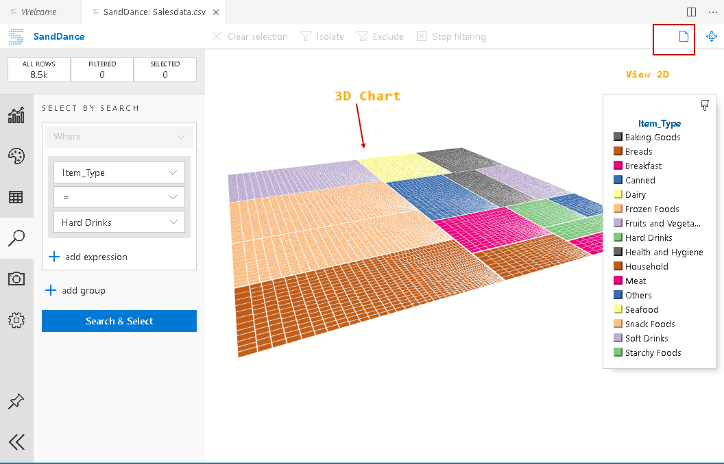
In the 3D format, you can click on the same spot to convert chart back to 2D visualization:
Conclusion
In this article, we explored SandDance charts in Azure Data Studio. This extension enables you to visualize data quickly and easily with various chart options. You should explore these charts for representing your data in an efficient way.

I am the author of the book "DP-300 Administering Relational Database on Microsoft Azure". I published more than 650 technical articles on MSSQLTips, SQLShack, Quest, CodingSight, and SeveralNines.
I am the creator of one of the biggest free online collections of articles on a single topic, with his 50-part series on SQL Server Always On Availability Groups.
Based on my contribution to the SQL Server community, I have been recognized as the prestigious Best Author of the Year continuously in 2019, 2020, and 2021 (2nd Rank) at SQLShack and the MSSQLTIPS champions award in 2020.
Personal Blog: https://www.dbblogger.com
I am always interested in new challenges so if you need consulting help, reach me at rajendra.gupta16@gmail.com
View all posts by Rajendra Gupta
- Understanding PostgreSQL SUBSTRING function - September 21, 2024
- How to install PostgreSQL on Ubuntu - July 13, 2023
- How to use the CROSSTAB function in PostgreSQL - February 17, 2023