
Microsoft SQL Server 2016 introduces several significant new features, and enhances some existing ones in reporting services. We have summarised these new features in the previous article. We’ve also explored how to configure the SQL Server Mobile reports in my earlier article.
SQL Server 2016 reporting services adds new chart types to show hierarchical data. Below are two new chart types:
- Sunburst chart
- Tree Map chart
In this article, we are going to explore how to create and configure the Sunburst chart in SQL Server 2016 reporting services.
The Sunburst Chart
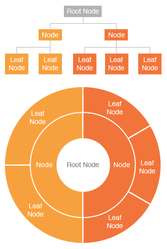
The Sunburst chart is a way of presenting relational datasets together in a compact form. Displaying both balanced and unbalanced hierarchical data can be done using this chart. It is a multi-level pie chart or a ring chart. The Sunburst chart consists of rays or beams radiating out from a central disk in the manner of a sunbeam; that is why it is called a Sunburst chart. This chart shows hierarchy through series of rings. Each level of ring displays the category. The inner ring represents the root node while each ring corresponds to a level defined in the hierarchy. There can be multiple hierarchies, rings in a Sunburst chart.
The rings are sliced and divided based on their hierarchical relationship to the parent slice. The width of each portion is dependent on the value specified. The Sunburst chart has different color ranges to show the relative weight of a category group. These colors can be red, yellow, orange, and green.
As the below image shows, the hierarchical data having a root node, node, and leaf nodes and corresponding sunburst chart.
We can see a Sunburst chart below, having multiple hierarchies.
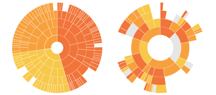
As we can see here, the chart looks like the sun with its rays coming out. Therefore, it is referred to as a Sunburst chart. It can also have an unbalanced hierarchy where some leaf nodes may have a child node as well.
Creating a Sunburst Chart in SQL Server 2016 Reporting Services
For demonstration purpose, I have created a sample table and inserted some data into it:
|
1 2 3 4 5 6 7 8 9 10 11 12 13 14 15 16 17 18 19 20 21 22 23 24 25 26 27 28 29 30 31 32 33 34 35 36 37 38 39 40 41 42 43 44 45 46 47 48 49 50 51 52 53 54 55 56 57 58 59 60 61 62 |
USE [Test] GO /****** Object: Table [dbo].[Car_Sales] Script Date: 9/27/2016 4:30:48 PM ******/ SET ANSI_NULLS ON GO SET QUOTED_IDENTIFIER ON GO CREATE TABLE [dbo].[Car_Sales]( [Organization] [nvarchar](50) NULL, [Make] [nvarchar](50) NULL, [Model] [nvarchar](50) NULL, [Selling Price] [int] NULL, [colour] [nvarchar](50) NULL ) ON [PRIMARY] GO INSERT [dbo].[Car_Sales]([Organization], [Make], [Model], [Selling Price], [colour]) VALUES (N'APD Automobile', N'Buick', N'Century', 112155, N'RED') GO INSERT [dbo].[Car_Sales]([Organization], [Make], [Model], [Selling Price], [colour]) VALUES (N'APD Automobile', N'Buick', N'LeSabre', 332989, N'BLUE') GO INSERT [dbo].[Car_Sales]([Organization], [Make], [Model], [Selling Price], [colour]) VALUES (N'APD Automobile', N'Buick', N'ParkAvenue', 268983, N'BLACK') GO INSERT [dbo].[Car_Sales]([Organization], [Make], [Model], [Selling Price], [colour]) VALUES (N'APD Automobile', N'Buick', N'Regal', 219058, N'WHITE') GO INSERT [dbo].[Car_Sales]([Organization], [Make], [Model], [Selling Price], [colour]) VALUES (N'APD Automobile', N'Buick', N'Rivera', 227554, N'GREY') GO INSERT [dbo].[Car_Sales]([Organization], [Make], [Model], [Selling Price], [colour]) VALUES (N'CDB Automobile', N'Cadillac', N'Catera', 447301, N'BLUE') GO INSERT [dbo].[Car_Sales]([Organization], [Make], [Model], [Selling Price], [colour]) VALUES (N'CDB Automobile', N'Cadillac', N'DeVile', 929204, N'RED') GO INSERT [dbo].[Car_Sales]([Organization], [Make], [Model], [Selling Price], [colour]) VALUES (N'CDB Automobile', N'Cadillac', N'Eldorado', 746974, N'YELLOW') GO INSERT [dbo].[Car_Sales]([Organization], [Make], [Model], [Selling Price], [colour]) VALUES (N'CDB Automobile', N'Cadillac', N'Escalade', 211260, N'SKYBLUE') GO INSERT [dbo].[Car_Sales]([Organization], [Make], [Model], [Selling Price], [colour]) VALUES (N'CDB Automobile', N'Cadillac', N'Saville', 809847, N'BLACK') GO INSERT [dbo].[Car_Sales]([Organization], [Make], [Model], [Selling Price], [colour]) VALUES (N'DRH Automobile', N'Chevrolet', N'1500 Pickup', 86134, NULL) GO INSERT [dbo].[Car_Sales]([Organization], [Make], [Model], [Selling Price], [colour]) VALUES (N'DRH Automobile', N'Chevrolet', N'2500 Pickup', 32495, NULL) INSERT [dbo].[Car_Sales]([Organization], [Make], [Model], [Selling Price], [colour]) VALUES (N'DRH Automobile', N'Chevrolet', N'3500 Pickup', 25877, NULL) GO INSERT [dbo].[Car_Sales]([Organization], [Make], [Model], [Selling Price], [colour]) VALUES (N'DRH Automobile', N'Chevrolet', N'Astro', 75861, NULL) GO INSERT [dbo].[Car_Sales]([Organization], [Make], [Model], [Selling Price], [colour]) VALUES (N'DRH Automobile', N'Chevrolet', N'Blazer', 173738, NULL) GO INSERT [dbo].[Car_Sales]([Organization], [Make], [Model], [Selling Price], [colour]) VALUES (N'DRH Automobile', N'Chevrolet', N'Camaro', 52691, NULL) GO INSERT [dbo].[Car_Sales]([Organization], [Make], [Model], [Selling Price], [colour]) VALUES (N'DRH Automobile', N'Chevrolet', N'Cavalier', 132694, NULL) GO INSERT [dbo].[Car_Sales]([Organization], [Make], [Model], [Selling Price], [colour]) VALUES (N'DRH Automobile', N'Chevrolet', N'Corvette', 198928, NULL) GO INSERT [dbo].[Car_Sales]([Organization], [Make], [Model], [Selling Price], [colour]) VALUES (N'DRH Automobile', N'Chevrolet', N'Express 1500', 114035, NULL) GO INSERT [dbo].[Car_Sales]([Organization], [Make], [Model], [Selling Price], [colour]) VALUES (N'DRH Automobile', N'Chevrolet', N'Express 2500', 171146, NULL) GO INSERT [dbo].[Car_Sales]([Organization], [Make], [Model], [Selling Price], [colour]) VALUES (N'DRH Automobile', N'Chevrolet', N'Express 3500', 610843, NULL) GO ALTER TABLE [dbo].[Car_Sales]ADD DEFAULT ('APD Automobile') FOR [Organization] GO |
So, my sample table data looks like below:
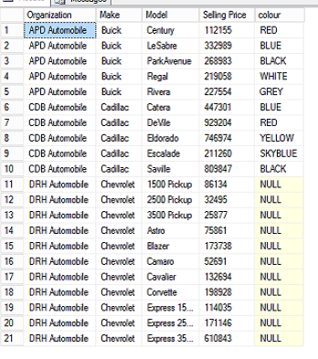
In this sample data, we show different organizations having different make, model, and price of cars. Some of the car colors have been specified as well.
To create the Sunburst chart, we can use SQL Server data tools 2015 or Microsoft SQL Server 2016 Report Builder.
SQL Server data tools allow managing reporting, integration and analysis service development in a single place while if we want only reports development we can go for report builder as well. In this article, I have used SQL Server data tools 2015.
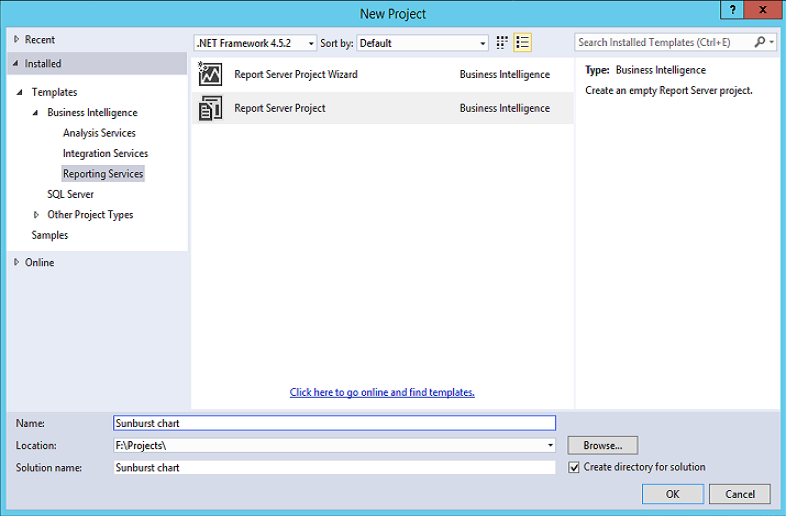
We will open Visual Studio 2015 and Click on Blank Report. Select Report Server Project
In the Solution Explorer, we right-click on reports and then add a new item:
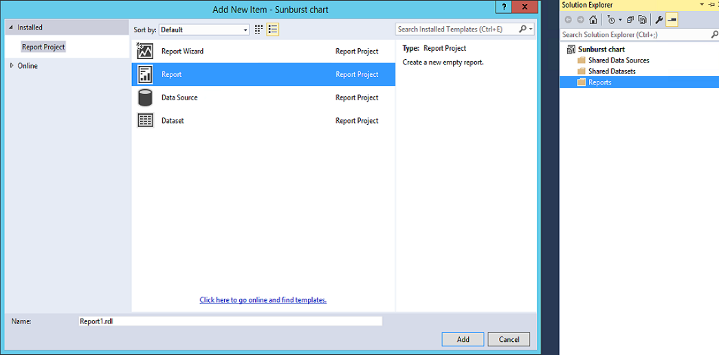
The new report window looks like below:
Create a New Data Source
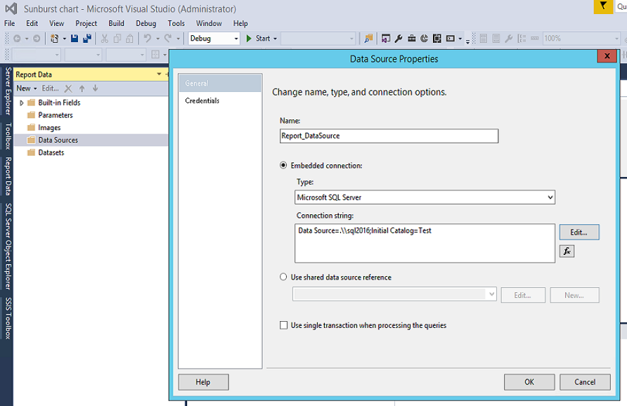
To create a Sunburst chart report, we’ll need to create the data source first. In the report data, we will right-click on data source -> new data source. It opens the data source properties.
Now, we’ll enter the below details in data source properties:
Name: We will enter the name of the data source.
Embedded connection: we’ll select the type as Microsoft SQL Server and enter the connection string.
Create New Datasets
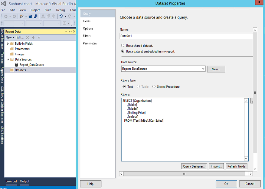
A dataset specifies a query that returns the data for the report. To create a dataset, we can Right click on the dataset -> New dataset. It will open the dataset properties.
We will select the name of the data source created above, and enter the query to select from the table which is also created above.
|
1 2 3 4 5 6 7 8 |
SELECT [Organization] ,[Make] ,[Model] ,[Selling Price] ,[colour] FROM [Test].[dbo].[Car_Sales] |
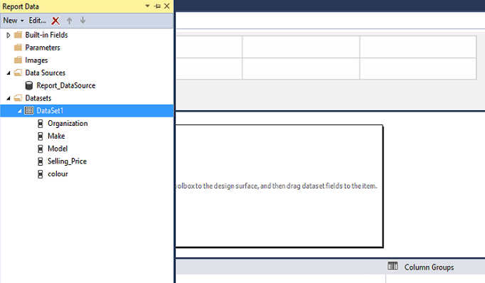
We can see the data source and the dataset below in the report data panel:
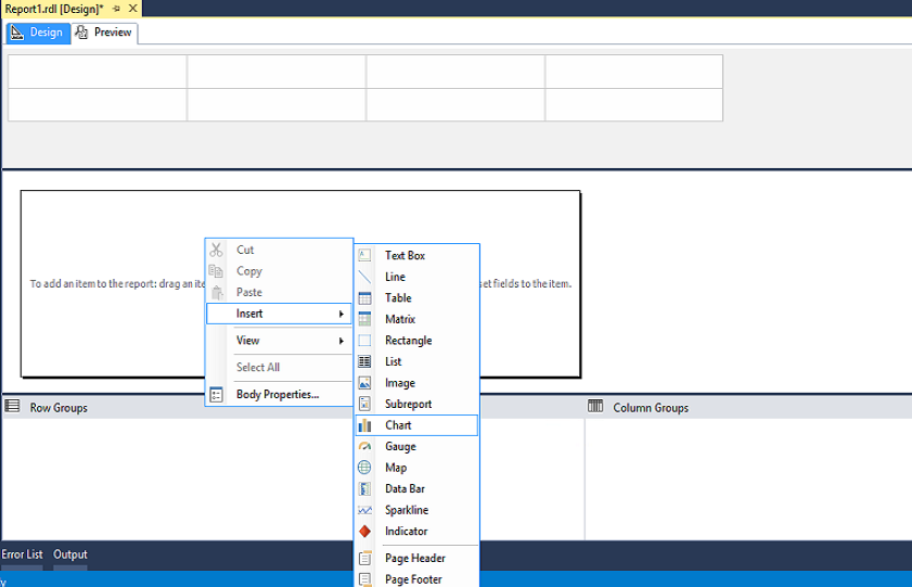
Once the dataset is created, we will right-click on the blank report area and click on the chart:
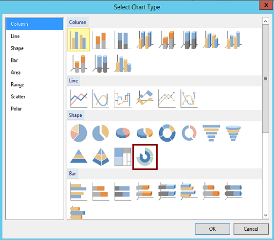
It opens the chart window from where we can select the sunburst chart:
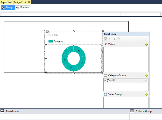
By clicking on the Sunburst chart, we’ve inserted the sunburst chart in the report window. Now, we can click on it and open the chart data window:
We’ll need to adjust the height of the sunburst chart to display it correctly. To do this, we’ll drag the chart window towards the legend:
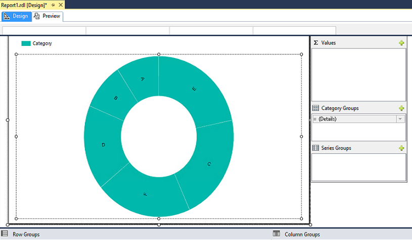
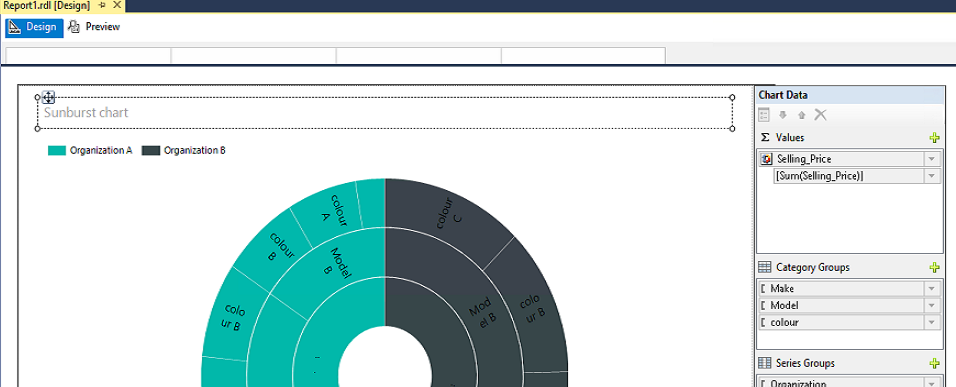
Chart data window has three sections: values, category groups, and series groups. We’ll use this to add the hierarchical data in the sunburst chart.
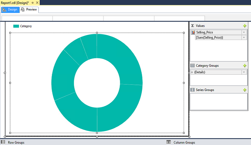
In our example, we want to show car sales values in the sunburst chart, so we’ll click on ‘+’ icon in Values and add the selling price column. The report looks like below:
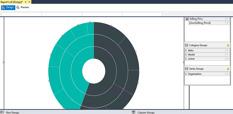
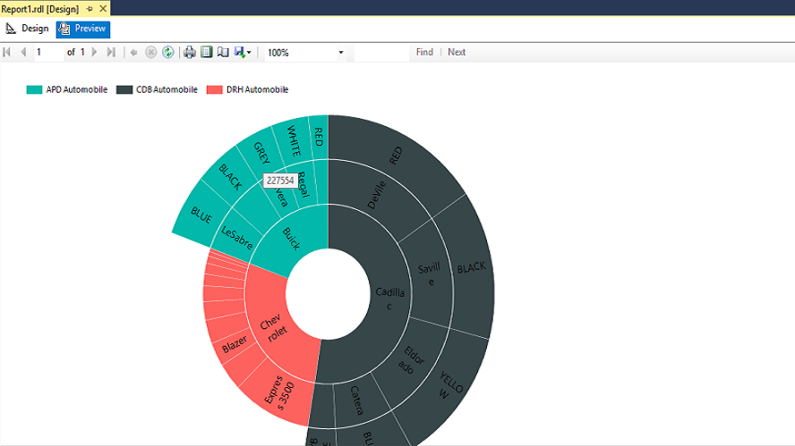
In the category group, we will add make, model and color columns from the dataset, and select the Series group as an organization.
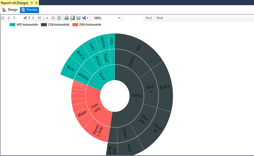
Now we can see the following Sunburst chart hierarchy:
Car Make – First Ring
Model – Second Ring
Colour – Third Ring
If we click on the Preview, the Sunburst chart looks like below:
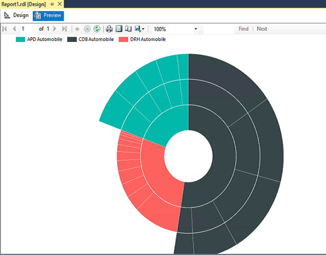
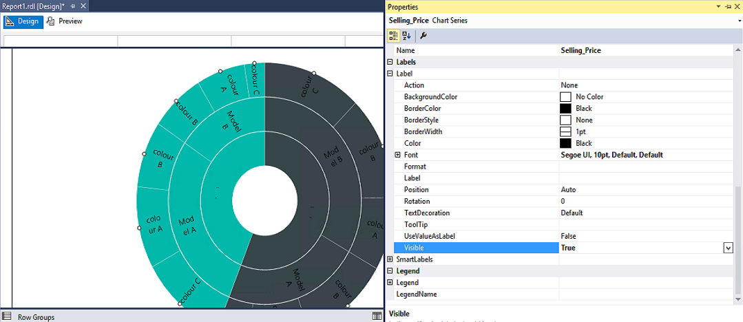
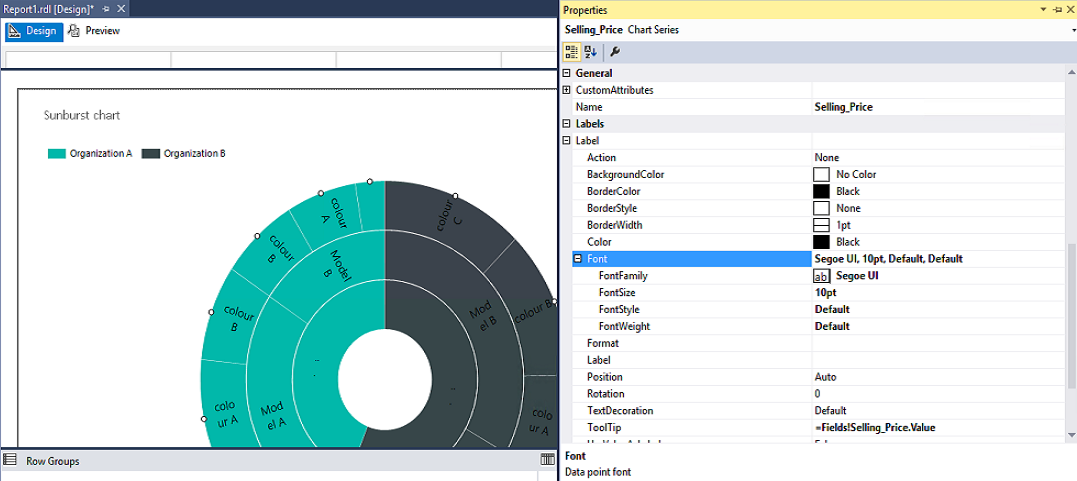
As we can see, there are no any details in the Sunburst chart at this point. So, to show the category values in the chart, we’ll click on the selling price values and open Properties.
In the Property section, we’ll expand labels and set the value to True for the visible column:
Now, if we preview the chart, it shows the group value in the chart:
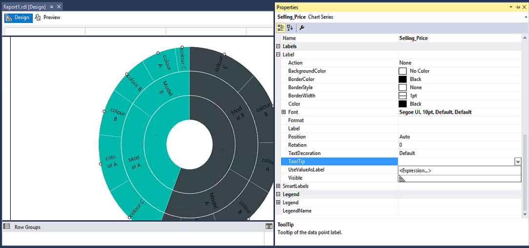
If we want the tooltip to show the value of the sales, we’ll go to the Tooltip, in the property section and click on the Expression:
In the Tooltip, we’ll click on the dataset, from the category, and double click on the selling price. It sets the expression for the tooltip:
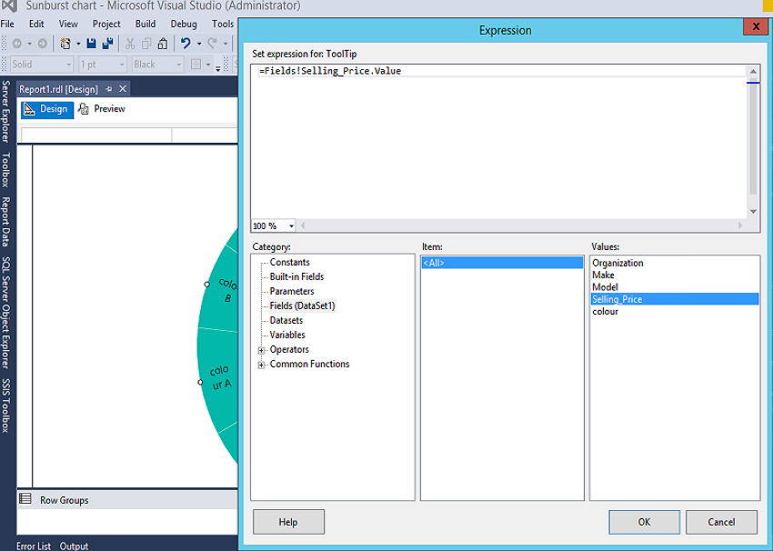
Now, if we hover to the outer ring of the chart, we can see the selling price as shown below.
The label values are displayed according to the font size, chart area and the size of the rectangle. To change the font size, we can go to the chart series properties. We can set the font colour, style, size, font family, etc. inside labels group of the properties.
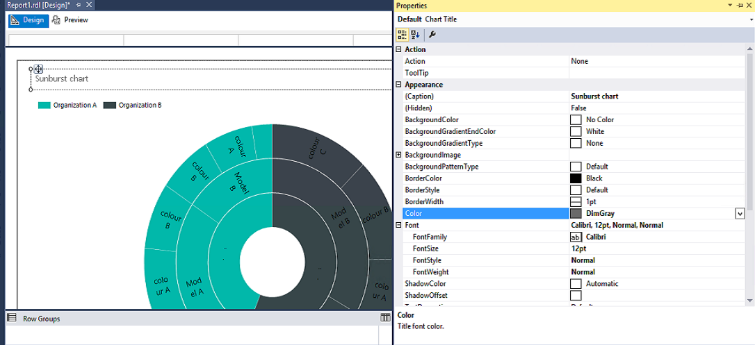
Now, we’ll add the chart title as ‘Sunburst chart’:
We will select the property of the chart title and set the color, font size, decoration, etc.:
Disadvantage of the Sunburst chart
One significant problem with a Sunburst chart is that it is tough to view the hierarchy or data when the data becomes more granular or we have a large number of a child \ leaf levels.
Next Steps: In the next article, we will explore the Tree Map chart along with its comparison to the Sunburst chart.
References:
- SQL Server Data Tools GA update for June 2016
- SQL Server 2016 RC1: What’s new in Reporting Services?
- What’s New in Reporting Services in SQL Server 2016 CTP 2.3
- Tree Map and Sunburst Charts in Reporting Services

I am the author of the book "DP-300 Administering Relational Database on Microsoft Azure". I published more than 650 technical articles on MSSQLTips, SQLShack, Quest, CodingSight, and SeveralNines.
I am the creator of one of the biggest free online collections of articles on a single topic, with his 50-part series on SQL Server Always On Availability Groups.
Based on my contribution to the SQL Server community, I have been recognized as the prestigious Best Author of the Year continuously in 2019, 2020, and 2021 (2nd Rank) at SQLShack and the MSSQLTIPS champions award in 2020.
Personal Blog: https://www.dbblogger.com
I am always interested in new challenges so if you need consulting help, reach me at rajendra.gupta16@gmail.com
View all posts by Rajendra Gupta
- Understanding PostgreSQL SUBSTRING function - September 21, 2024
- How to install PostgreSQL on Ubuntu - July 13, 2023
- How to use the CROSSTAB function in PostgreSQL - February 17, 2023