

This article will help you understand the process of author dashboards using Azure Data Explorer to visualize data hosted in the clusters.
Introduction
Often business transactions are carried out in the format of records stored in a database or data warehouses. But that is not the only repository or form of data. Data exists in different forms of text, images, videos, and in a variety of data formats like JSON, parquet, text, csv, avro, etc. One of the sources of data is logs or telemetry-related data which may exist in the form of a number of files and the volume can be of a scale that can be classified as big data. To process such data, the need is for an engine that can process that data in-place, using a convenient SQL-like query language, and can deal with large volumes of data. Azure provides Azure Data Explorer service that meets these requirements. It offers a scalable engine that can scale to meet the processing needs of log and telemetry data. It also provides endpoints for batch and streaming-based ingestion, which enables loading large volumes of data at a very high velocity, which can be processed in the Azure Data Explorer clusters.
When a cluster of this scale hosts a large volume of data that can be queried with the required performance levels, there is often a need to visualize this data. When the query output is large, it’s hard to analyze or comprehend the data without visualizing it. Azure Data Explorer recently launched a capability to visualize data using dashboards. This service is in preview mode as of the draft of this article. We will visualize data hosted in the clusters in author dashboards using Azure Data Explorer in this article.
Pre-Requisite
In my previous article, Azure Data Explorer for beginners, we learned how to get started with creating a new cluster, pricing information, configuring the cluster, ingesting data as well as querying the data. It is assumed that one has a basic understanding of this service and an instance or cluster of this service is created. Once created, it would look as shown below:
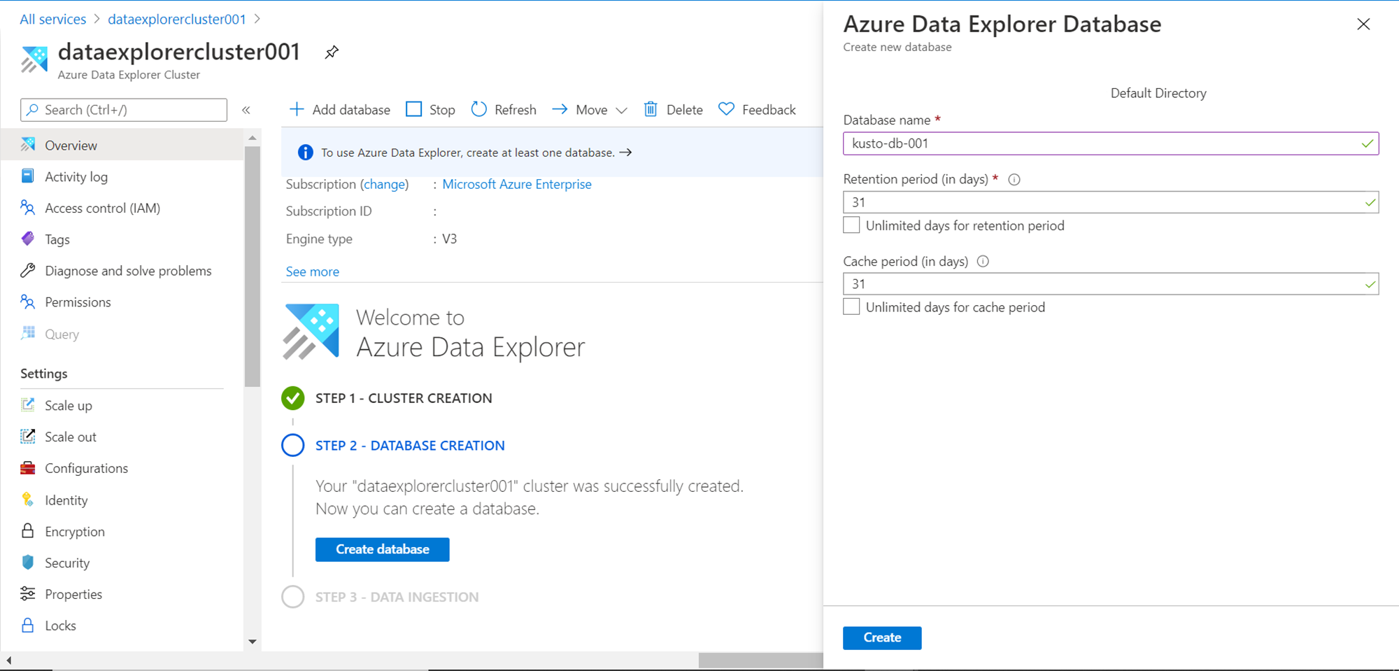
Also, make sure after you create the cluster, a database has been created and populated with some sample data. To visualize data, we need to have a database and some data at the minimum. Once we have this setup in place, we are good to start the dashboarding exercise.
Authoring Dashboards
Once the data population is complete, open the Query explorer web application from the Azure Data Explorer service dashboard. Once opened, the application interface would look as shown below. There are two tabs – one to query the data ingested into the cluster and another to author new dashboards that can visualize the data based on the datasets we define, using the kusto query language supported by the service. The dashboard tab would look as shown below.
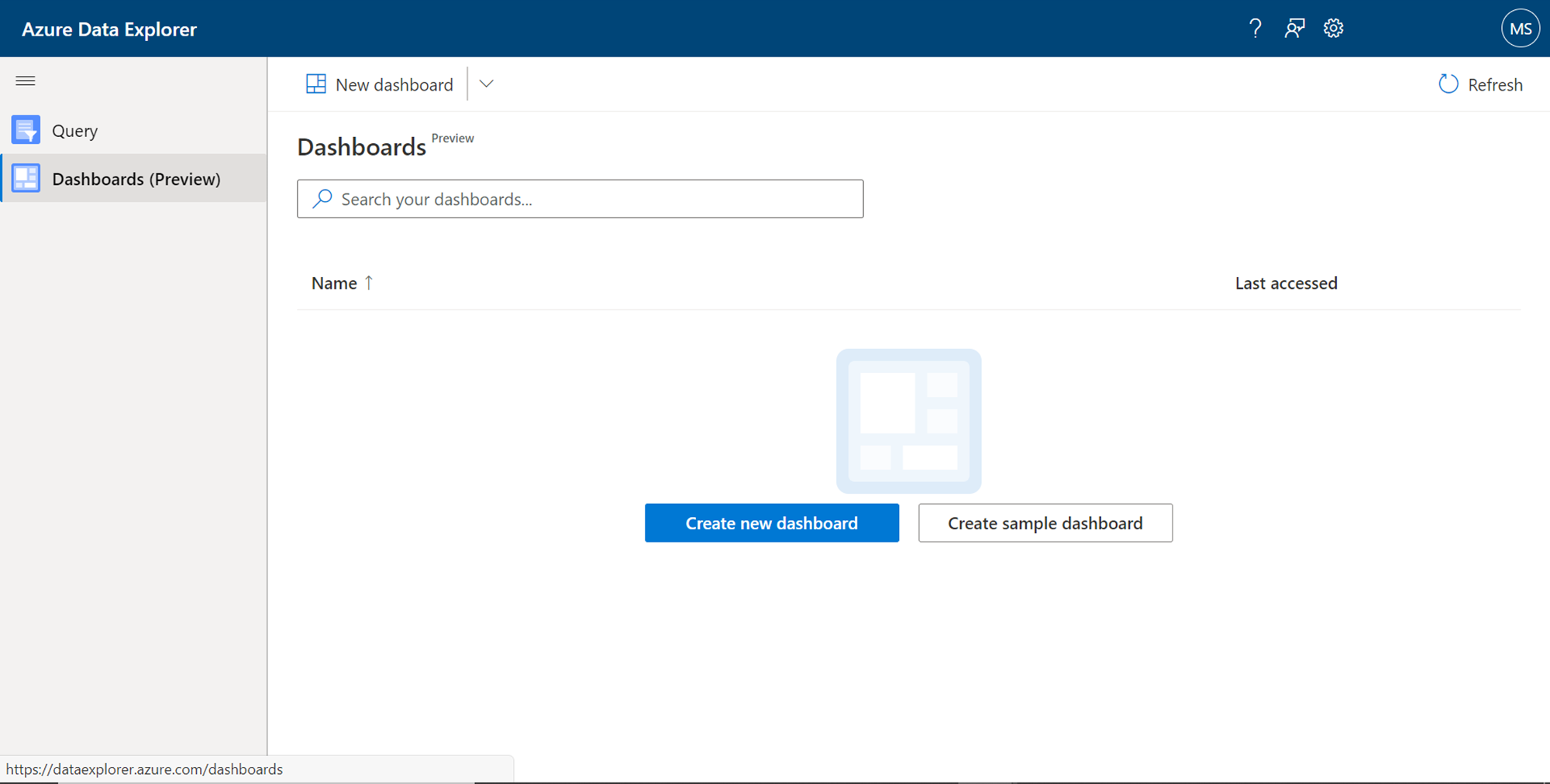
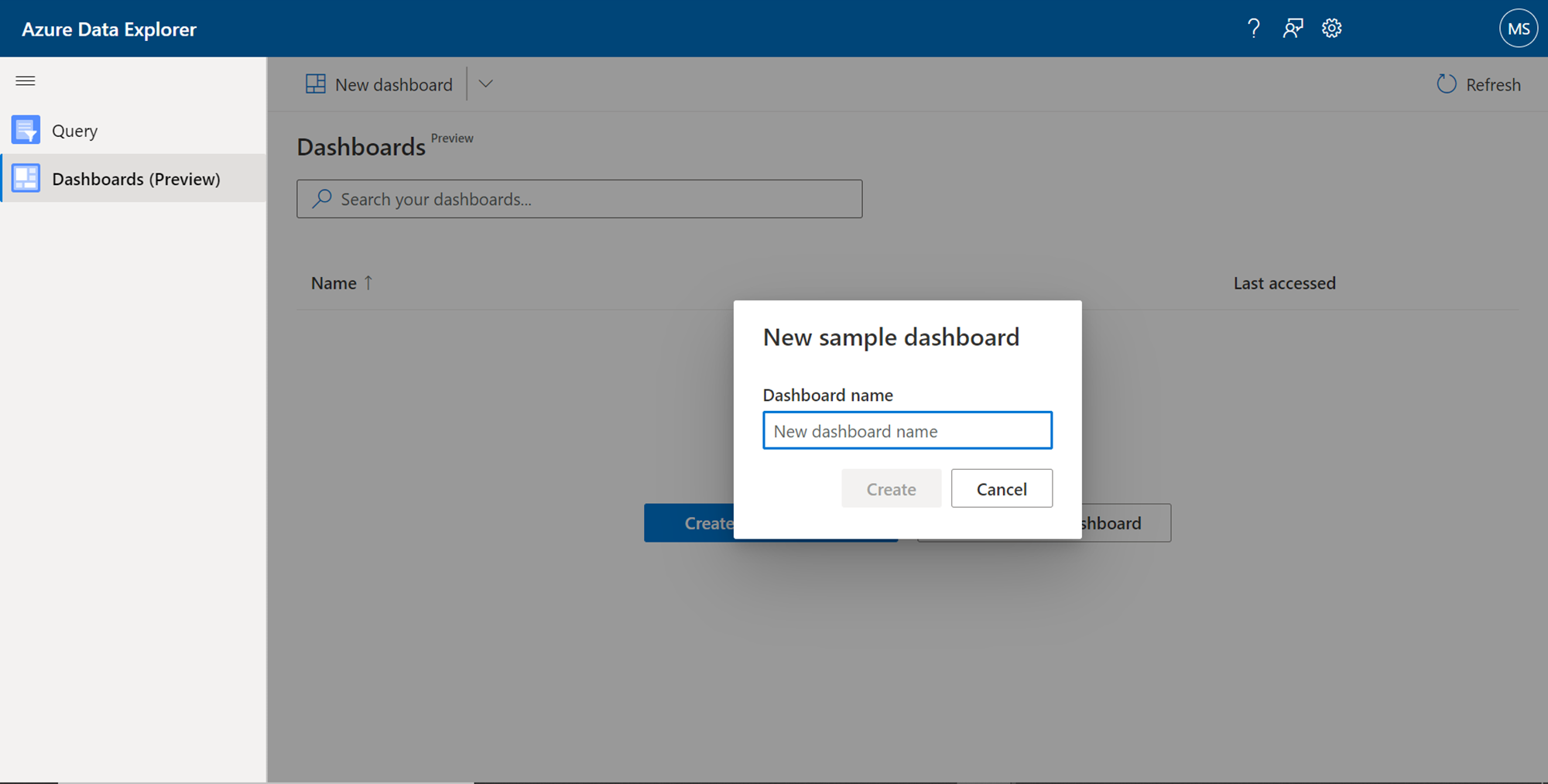
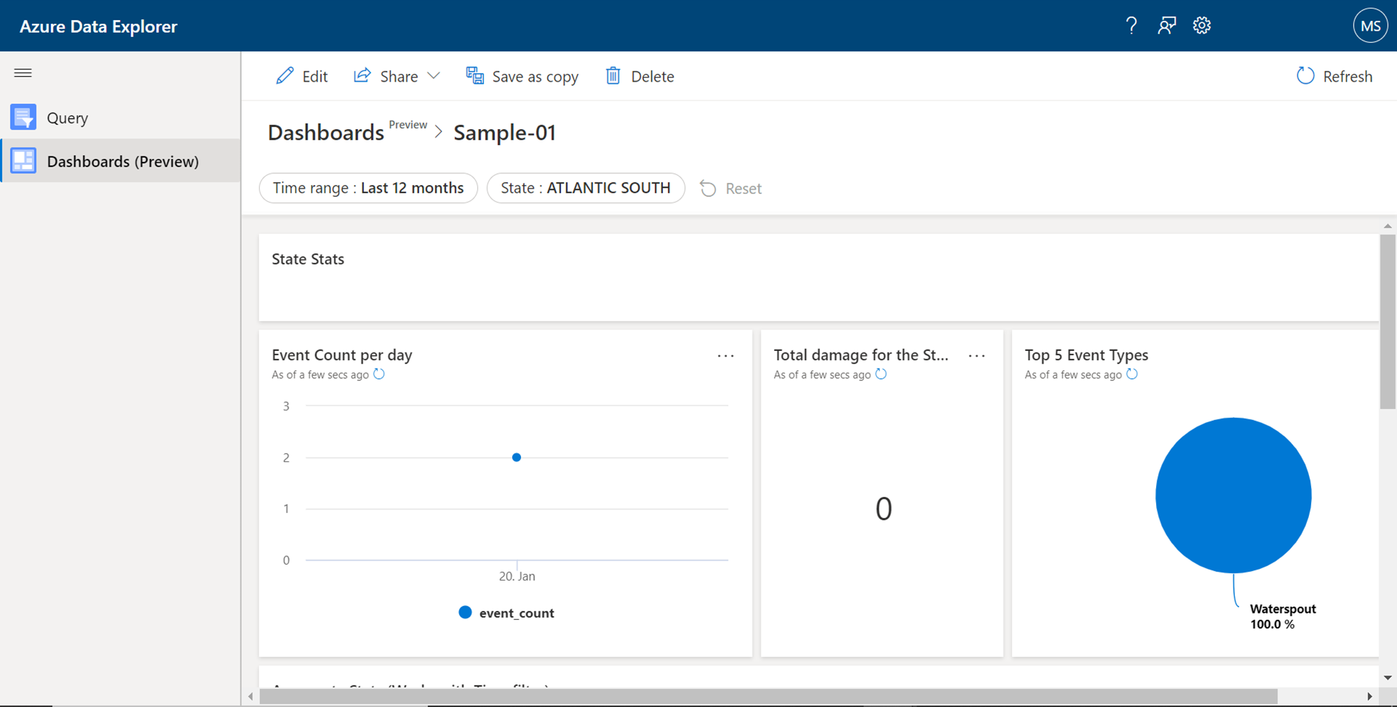
There are two types of dashboards that one can create from this tab. Beginners who intend to just explore what type of dashboard as well as dashboard elements can create using this interface, they can start with the creation of a sample dashboard. Click on the Create sample dashboard button to start with it. It would pop-up a box that asks for the name of the new dashboard as shown below. Provide a relevant name for the new sample dashboard and click on the Create button.
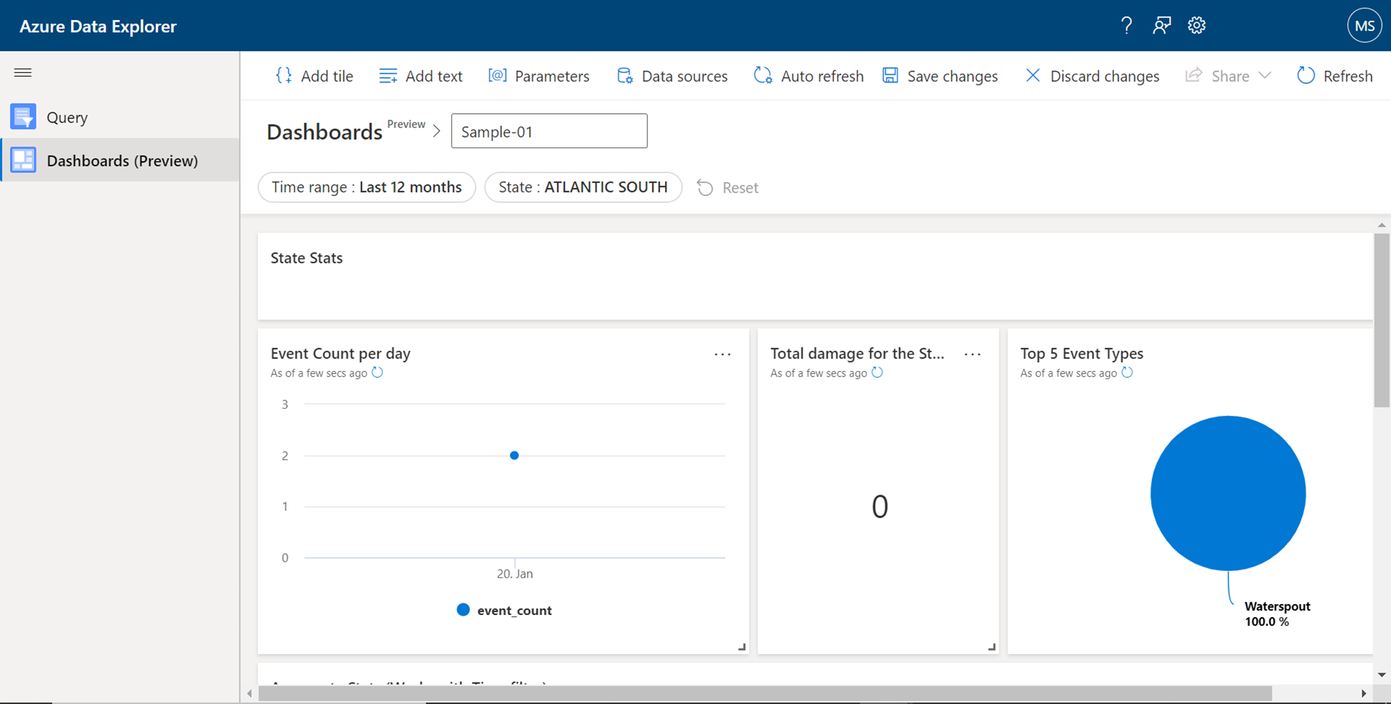
Once the new dashboard is created, it would look as shown below. It comes with built-in data and different types of charts already added in different tiles in the dashboard. On the menu bar, we can find options to add elements to the dashboard like title, text, and parameters. We can define the data sources for any given dashboard using the Data sources menu item. And we can save or discard changes that are made while editing the dashboard. Below the dashboard name, we get filters to filter the data as per the requirements.
We can choose the save this dashboard by clicking on the Save changes button. The menu bar would look as shown below once the dashboard has been saved.
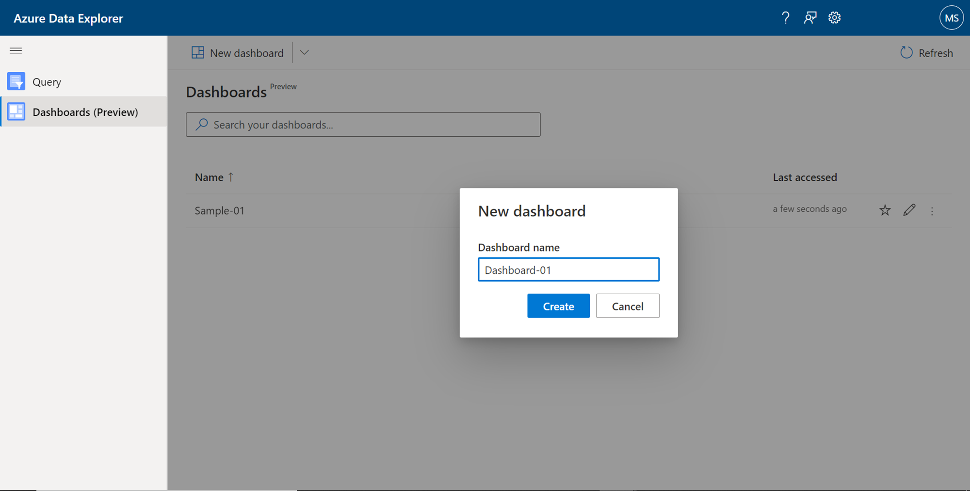
Now that we understand at a high-level, what the end-result of a dashboard may look like and what it offers, we can attempt to create a small dashboard authored by us. To do the same, navigate back to the dashboard tab and click on the New dashboard button. It would first ask for the name of the new dashboard as shown below. Provide a new name to create a new blank dashboard.
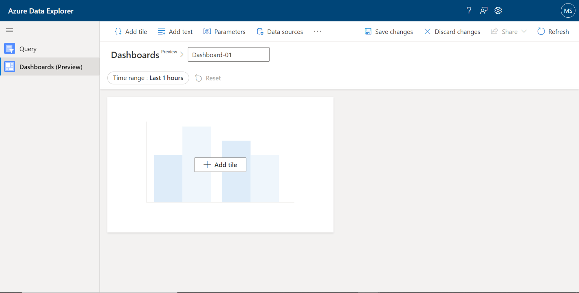
Once the new dashboard has been created, it would look as shown below. By default, it would not have any data source or data elements defined in the layout of the dashboard. The tiles would be empty and novisualization would have been added to the layout.
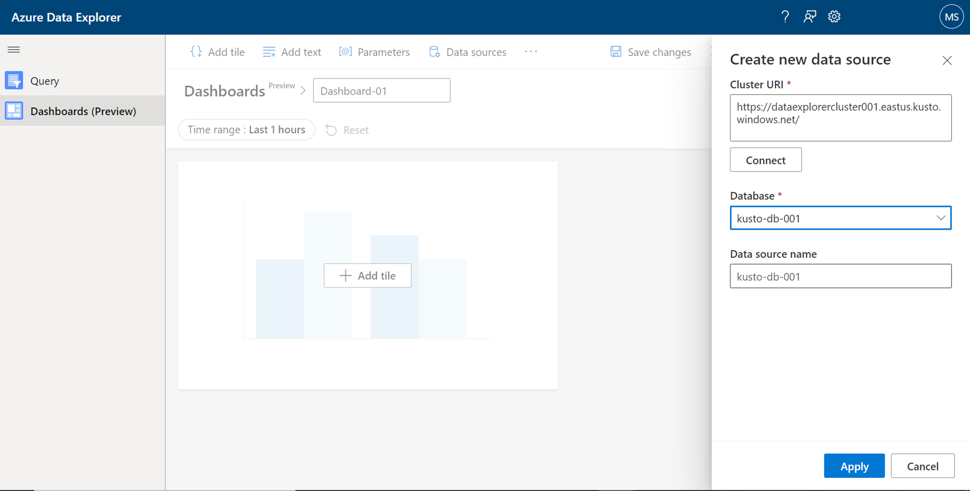
The first task to do while starting to author a dashboard in Azure Data Explorer is to add a data source to it. This data source would be a database populated with sample data, that we would have created in the Azure Data Explorer cluster, which was mentioned in the pre-requisite section. Click on the Data Sources button, and it would pop up a new window as shown below. Here we need to provide the details of the cluster. Provide the Azure Data Explorer endpoint name as the Cluster URI and click on the Connect button. If the connection is successful, we would be able to see the list of databases hosted on this cluster. Select the desired database, provide a new data source name and click on the Apply button. This would complete the creation of a new data source and make it available for using with the dashboard being authored.
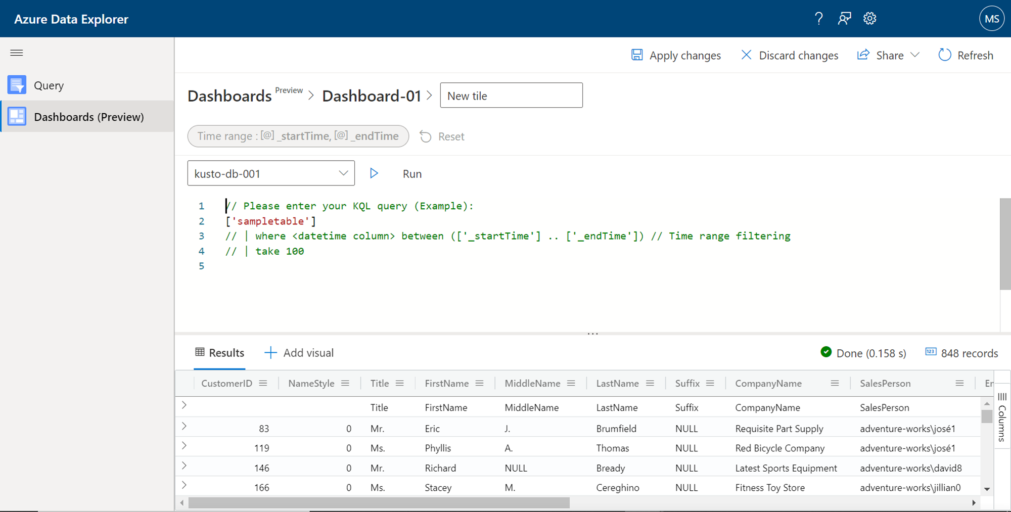
After the new data source is created, we can start adding new tiles to the dashboard layout. Click on the Add tile button on the dashboard layout, and it would open a new query editor interface as shown below. We have added a new data source to the dashboard, but we have not defined any dataset that the visual tile can consume and visualize the data. So, this interface is the first step to visualize the data by creating a new dataset. This query editor would have a sample syntax of the query that one can form. One can define the query with or without filters, click on the Run button, and preview the data before assigning it to the visualization tile.
After the dataset is formed, the next step is to add visual and bind the visual with the dataset. Click on the Add visual button, and it would pop-up a new window as shown below. By default, the visual type is Table – which means a data grid type of layout. We have the option to select from a variety of visual charts like Bar chart, Column chart, Area chart, Line chart, Pie chart, Scatter chart, Time chart, Anomaly Chart, and even spatial visualizations like a Map. Let’s say we want to use a Bar chart. Select the desired chart type.
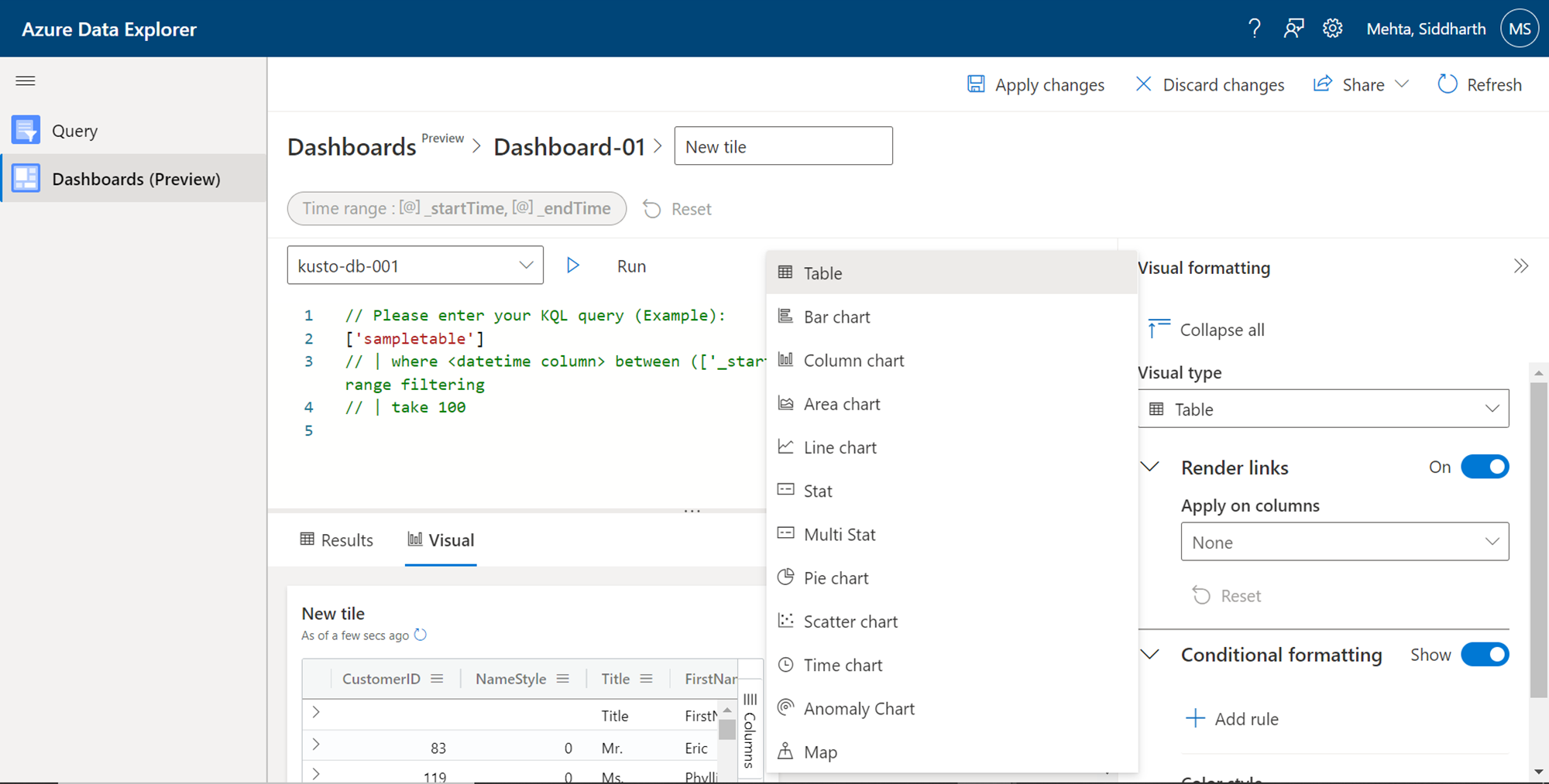
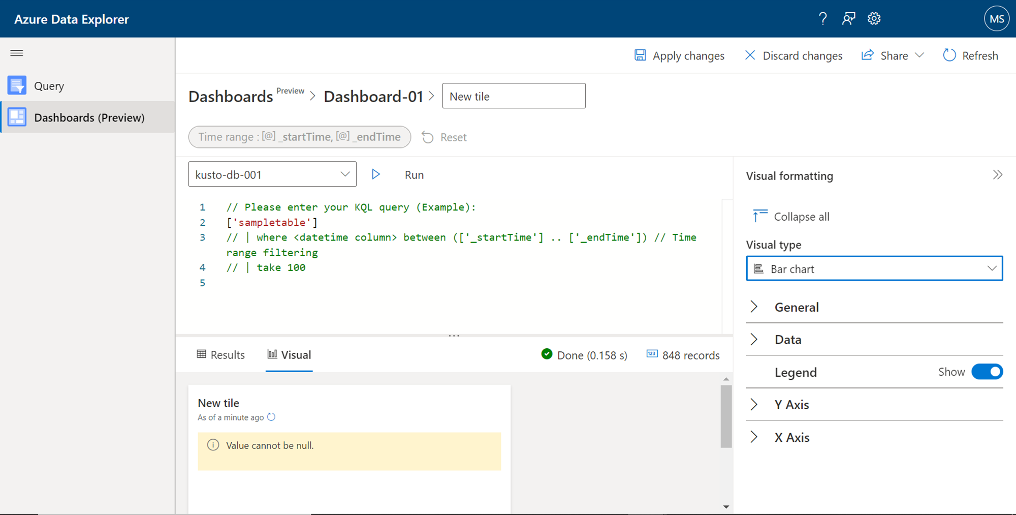
After selecting the desired chart type, we must configure the data elements that would form the different axis of a chart. For example, in a bar chart, we must define the X-axis, Y-axis, data value, and series information. Optionally we can also configure styling elements like header, footer, legend, colors, etc. We can change the name of the visual tile from the top section, and finally, save changes to visualize the tile that is configured with the dataset that we created earlier.
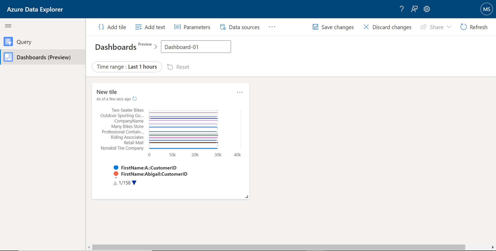
Once the chart gets rendered in the tile, it would look as shown below. Likewise, one can add more such visual elements to the layout and form a complete dashboard to visualize the data hosted in Azure Data Explorer clusters.
Conclusion
In this article, we started with a basic setup of the Azure Data Explorer cluster, with a database populated with sample data and hosted on this cluster. We learned how to created data sources, data sets and bind them to visual elements in the query editor interface of Azure Data Explorer to effortlessly visualize data in an intuitive manner.

She has a deep experience in designing data and analytics solutions and ensuring its stability, reliability, and performance. She is also certified in SQL Server and have passed certifications like 70-463: Implementing Data Warehouses with Microsoft SQL Server.
View all posts by Gauri Mahajan
- Oracle Substring function overview with examples - June 19, 2024
- Introduction to the SQL Standard Deviation function - April 21, 2023
- A quick overview of MySQL foreign key with examples - February 7, 2023