
Introduction
Intended audience
This document is intended for application developers and database administrators who are willing to learn how to generate charts from data stored in Microsoft SQL Server using PowerShell.
Context
In previous article entitled Overview of PowerShell Charting capabilities we’ve seen some components of an assembly called System.Windows.Forms.DataVisualization assembly that is part of the .NET Framework and how to load it inside PowerShell.
Now, it’s time to use what we’ve learned so far.
We will first build a general purpose methodology for building charts. In short, we will build a template script that we will then apply to practical examples and check we can build different kinds of charts using this template.
Creating a chart, general case
In next section, we will have a close look at some practical examples with sample data. While each example will show a different kind of chart, the same principle will be used all the time and it’s the subject of this section: presenting a generic script that can be specialized for each kind of chart.
Creating a chart object and setting some properties
Here is a generic function that will be used to build an empty chart object. We will limit to set following properties:
- Width
- Height
- Title
- Background color
- Title (if any)
It will also optionally create a default chart area.
|
1 2 3 4 5 6 7 8 9 10 11 12 13 14 15 16 17 18 19 20 21 22 23 24 25 26 27 28 29 30 31 32 33 34 35 36 37 38 39 40 41 42 43 44 45 46 47 48 49 50 51 52 53 54 55 56 57 58 59 60 61 62 63 64 |
Function New-Chart() { param ( [cmdletbinding()] [parameter(ValueFromPipeline = $false, ValueFromPipelineByPropertyName = $true, Mandatory = $True)] [int]$width, [parameter(ValueFromPipeline = $false, ValueFromPipelineByPropertyName = $true, Mandatory = $True)] [int]$height, [parameter(ValueFromPipeline = $false, ValueFromPipelineByPropertyName = $true, Mandatory = $False)] [string]$ChartTitle, [parameter(ValueFromPipeline = $false, ValueFromPipelineByPropertyName = $true, Mandatory = $False)] [string]$ChartTitleFont = $null, [parameter(ValueFromPipeline = $false, ValueFromPipelineByPropertyName = $true, Mandatory = $False)] [System.Drawing.ContentAlignment]$ChartTitleAlign = [System.Drawing.ContentAlignment]::TopCenter, [parameter(ValueFromPipeline = $false, ValueFromPipelineByPropertyName = $true, Mandatory = $False)] [System.Drawing.Color]$ChartColor = [System.Drawing.Color]::White, [parameter(ValueFromPipeline = $false, ValueFromPipelineByPropertyName = $true, Mandatory = $False)] [boolean]$WithChartArea = $true, [parameter(ValueFromPipeline = $false, ValueFromPipelineByPropertyName = $true, Mandatory = $False)] [boolean]$WithChartLegend = $true ) # Example: $Chart = New-Chart -width 1024 -height 800 -ChartTitle "test" $CurrentChart = New-object System.Windows.Forms.DataVisualization.Charting.Chart if($CurrentChart -eq $null) { throw "Unable to create Chart Object" } $CurrentChart.Width = $width $CurrentChart.Height = $height #TODO:$CurrentChart.Left = $LeftPadding #TODO:$CurrentChart.Top = $TopPadding $CurrentChart.BackColor = $ChartColor if($WithChartArea) { $CurrentChartArea = New-Object System.Windows.Forms.DataVisualization.Charting.ChartArea if($CurrentChartArea -eq $null) { throw "Unable to create ChartArea object" } $CurrentChart.ChartAreas.Add($CurrentChartArea) } if([String]::isNullOrEmpty($ChartTitleFont)) { $ChartTitleFont = "Arial,13pt" } if(-Not [String]::isNullOrEmpty($ChartTitle)) { [void]$CurrentChart.Titles.Add($ChartTitle) $CurrentChart.Titles[0].Font = $ChartTitleFont $CurrentChart.Titles[0].Alignment = $ChartTitleAlign } if($WithChartLegend) { $ChartLegend = New-Object system.Windows.Forms.DataVisualization.Charting.Legend $ChartLegend.name = "Chart Legend" $Chart.Legends.Add($ChartLegend) } $CurrentChart } |
Here is a sample call:
|
1 |
$Chart = New-Chart -width 1024 -height 800 -ChartTitle "test" |
Common ChartArea object creation and settings instructions
In this example, a default chart area is created. We will access it using following code:
|
1 |
$Chart.ChartAreas[0] |
We can create one using the code from above:
|
1 2 3 4 5 6 |
$CurrentChartArea = New-Object System.Windows.Forms.DataVisualization.Charting.ChartArea if($CurrentChartArea -eq $null) { throw "Unable to create CharArea object" } $CurrentChart.ChartAreas.Add($CurrentChartArea) |
In that case, it’s preferable to give a name to the areas:
|
1 |
$Chart.ChartAreas[0].Name = "DefaultArea" |
We could by the way set titles for X and Y axes of this area as follows:
|
1 2 |
$Chart.ChartAreas[0].AxisY.Title = "Y axis Title" $Chart.ChartAreas[0].AxisX.Title = "X axis TItle" |
We could also set visual attributes like the interval step to be used for one or both axes:
|
1 |
$Chart.ChartAreas[0].AxisX.Interval = 1 |
Or also precise the kind of data that is stored for that axis:
|
1 |
$Chart.ChartAreas[0].AxisX.IntervalType = <A type of interval> |
The type of interval is a value of the enumeration called:
|
1 |
[System.Windows.Forms.DataVisualization.Charting.DateTimeIntervalType] |
Please, refer to documentation page for further details about axis settings.
Defining a legend for our chart
We can create a Legend object and add it to the $Chart object we created.
|
1 2 3 |
$ChartLegend = New-Object system.Windows.Forms.DataVisualization.Charting.Legend $ChartLegend.name = "Chart Legend" $Chart.Legends.Add($ChartLegend) |
The name of the Legend object instance is pretty important. We will use it when adding data series.
Adding data series to an existing chart object
In order to create data it’s pretty simple and straight forwards:
|
1 |
$Chart.Series.Add("MyData") |
As we set a name to the series, here is a mean to get back to the object quite simply:
|
1 |
$Chart.Series["MyData"] |
Alternately, you could use following PowerShell function:
|
1 2 3 4 5 6 7 8 9 10 11 12 13 14 15 16 17 18 19 20 21 22 23 24 25 26 27 28 29 30 31 32 33 34 35 36 37 38 39 40 41 42 43 44 |
Function New-ChartSeries() { param ( [cmdletbinding()] [parameter(ValueFromPipeline = $false, ValueFromPipelineByPropertyName = $true, Mandatory = $True)] [String]$SeriesName, [parameter(ValueFromPipeline = $false, ValueFromPipelineByPropertyName = $true, Mandatory = $False)] [int]$BorderWidth = 3, [parameter(ValueFromPipeline = $false, ValueFromPipelineByPropertyName = $true, Mandatory = $False)] [boolean]$IsVisibleInLegend = $true, [parameter(ValueFromPipeline = $false, ValueFromPipelineByPropertyName = $true, Mandatory = $False)] [string]$ChartAreaName = $null, [parameter(ValueFromPipeline = $false, ValueFromPipelineByPropertyName = $true, Mandatory = $False)] [string]$LegendName = $null, [parameter(ValueFromPipeline = $false, ValueFromPipelineByPropertyName = $true, Mandatory = $False)] [string]$HTMLColor = $null, [parameter(ValueFromPipeline = $false, ValueFromPipelineByPropertyName = $true, Mandatory = $False)] [System.Windows.Forms.DataVisualization.Charting.SeriesChartType]$ChartType = [System.Windows.Forms.DataVisualization.Charting.SeriesChartType]::Column ) $CurrentChartSeries = New-Object System.Windows.Forms.DataVisualization.Charting.Series if($CurrentChartSeries -eq $null) { throw "Unable to create Chart Series" } $CurrentChartSeries.Name = $SeriesName $CurrentChartSeries.ChartType = $ChartType $CurrentChartSeries.BorderWidth = $BorderWidth $CurrentChartSeries.IsVisibleInLegend = $IsVisibleInLegend if(-Not([string]::isNullOrEmpty($ChartAreaName))) { $CurrentChartSeries.ChartArea = $ChartAreaName } if(-Not([string]::isNullOrEmpty($LegendName))) { $CurrentChartSeries.Legend = $LegendName } if(-Not([string]::isNullOrEmpty($HTMLColor))) { $CurrentChartSeries.Color = $HTMLColor } $CurrentChartSeries } |
Example usage
Following code will create a chart series that will be displayed as a histogram (bar columns) and add it to the $Chart object we defined previously:
|
1 2 |
$ChartSeries = New-ChartSeries -SeriesName "Series" $Chart.Series.Add($ChartSeries) |
Adding data points to a data series
If we look at the Series object documentation, we will see that it has a collection object called Points that stores all the data points of the chart. This object has multiple methods to add data to it and we will review two of them:
- DataBindXY(<XaxisValues>,<YaxisValues>)
- AddXY(<XaxisValue>,<YaxisValue>)
The former will allow you to bind data sets if you got all the values that go to the X axis separately from all the values that go to the Y axis. A good case usage for this is when your data is stored in a HashTable from which it’s easy to get back only keys and only values:
|
1 2 3 4 |
$Chart.Series["Series"].Points.DataBindXY( $MyHashMap.Keys(), $MyHashMap.Values() ) |
The latter will be used to add one point at a time. It’s pretty useful when you run a query that returns the (key,value) pair against SQL Server and you want to create a chart with the results of that query.
In that case, we will use following algorithm:
|
1 2 3 4 5 6 7 8 9 10 11 |
$SqlQuery = "<MyQuery>" # SELECT XAxisValue, YAxisValue ... $QueryDataSet = Invoke-SqlCmd -ServerInstance "<MyInstance>" ` -Database "MyDb"` -Query $SqlQuery Foreach ($SqlRec in $QueryDataSet) { [void]$Chart.Series["Series"].Points.AddXY ( $SqlRec.XAxisValue, $SqlRec.YAxisValue ) } |
Displaying a chart
Now we saw how to build a chart object instance and add data to it. That a good point, but we need to do something with that object and why not displaying it on screen?
To do so, we will define a PowerShell function that will create a window form and add the chart to it and display.
|
1 2 3 4 5 6 7 8 9 10 11 12 13 14 15 16 17 18 19 20 21 22 23 24 25 26 27 28 29 30 31 32 33 34 35 36 37 38 39 |
function Display-Chart() { param ( [cmdletbinding()] [parameter(ValueFromPipeline = $false, ValueFromPipelineByPropertyName = $true, Mandatory = $True)] [System.Windows.Forms.DataVisualization.Charting.Chart]$Chart2Display, [parameter(ValueFromPipeline = $false, ValueFromPipelineByPropertyName = $true, Mandatory = $False)] [string]$Title = "New Chart", [parameter(ValueFromPipeline = $false, ValueFromPipelineByPropertyName = $true, Mandatory = $False)] [int]$width, [parameter(ValueFromPipeline = $false, ValueFromPipelineByPropertyName = $true, Mandatory = $False)] [int]$height ) if($Chart2Display -eq $null) { throw "Null value provided for Chart2Display parameter" } $Chart2Display.Anchor = [System.Windows.Forms.AnchorStyles]::Bottom -bor [System.Windows.Forms.AnchorStyles]::Right -bor [System.Windows.Forms.AnchorStyles]::Top -bor [System.Windows.Forms.AnchorStyles]::Left $WindowsFormObj = New-Object Windows.Forms.Form $WindowsFormObj.Text = $Title if($width -eq $null -or $width -lt $Chart2Display.Width) { $width = $Chart2Display.Width * 1.2 } if($height -eq $null -or $height -lt $Chart2Display.Height) { $height = $Chart2Display.Height * 1.2 } $WindowsFormObj.Width = $width $WindowsFormObj.Height = $height $WindowsFormObj.Controls.Add($Chart2Display) $WindowsFormObj.Add_Shown({$WindowsFormObj.Activate()}) #$WindowsFormObj.CenterToScreen() $WindowsFormObj.ShowDialog() | Out-Null } |
Exporting a chart to an image file
Now, let’s say we just want to store the chart on disk. It’s pretty simple to accomplish using the SaveImage method from the Chart object class:
|
1 |
$Chart.SaveImage("<TargetPath>","<FileFormat>") |
The available file formats are defined in the System.Drawing.Imaging.ImageFormat class.
Amongst the 12 formats defined in this class, we will find:
- BMP
- GIF
- JPEG
- PNG
Putting everything together
You will find below as a summary a generic template that can be used to build any kind of chart.
|
1 2 3 4 5 6 7 8 9 10 11 12 13 14 15 16 17 18 19 20 21 22 23 24 25 26 27 28 29 30 31 32 33 34 |
# ------------------ # Script Settings $ChartTitle = "test" $ChartSeriesType = [System.Windows.Forms.DataVisualization.Charting.SeriesChartType]::Column $ChartSeriesHTMLColor = $null # ------------------ #Chart object creation $Chart = New-Chart -width 1024 -height 800 -ChartTitle $ChartTitle -WithChartArea $true -WithChartLegend $false # Chart area settings $Chart.ChartAreas[0].Name = "DefaultArea" $Chart.ChartAreas[0].AxisY.Title = "Y axis Title" $Chart.ChartAreas[0].AxisX.Title = "X axis TItle" #optional settings for axes # Chart Legend $ChartLegend = New-Object system.Windows.Forms.DataVisualization.Charting.Legend $ChartLegend.name = "Chart Legend" $Chart.Legends.Add($ChartLegend) # Chart Series creation $ChartSeries = New-ChartSeries -SeriesName "Series" -LegendName "Chart Legend" –ChartAreaName "DefaultArea" -ChartType $ChartSeriesType -HTMLColor $ChartSeriesHTMLColor $Chart.Series.Add($ChartSeries) # Get back data to set in series <# Choice #1: Data Binding commands #> <# Choice #2: Points settings #> # Do something with the chart object (display or save to disk) |
Example usages
In following, we will use AdventureWorks database and a different T-SQL query per example.
As we don’t want to give a good reading experience to our readers, we will use different queries and different data sets and generate charts.
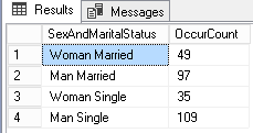
Creating a pie chart
We will take data from the HumanResources.Employee table and create a pie chart that will show the number of employees by gender and marital status. This is translated to following T-SQL query:
|
1 2 3 4 5 6 7 8 9 10 11 12 13 14 |
SELECT CASE Gender WHEN 'M' THEN 'Man' WHEN 'F' THEN 'Woman' ELSE Gender END + ' ' + CASE MaritalStatus WHEN 'M' THEN 'Married' WHEN 'S' THEN 'Single' ELSE MaritalStatus END as SexAndMaritalStatus, COUNT(*)as OccurCount FROM HumanResources.Employee GROUP BY Gender,MaritalStatus |
This query gives back following results:
Now, let’s build a chart object using following PowerShell script. We will use the general template and add two parameters for target server instance and database. We will choose the option of displaying the chart on screen.
Here is the PowerShell code:
|
1 2 3 4 5 6 7 8 9 10 11 12 13 14 15 16 17 18 19 20 21 22 23 24 25 26 27 28 29 30 31 32 33 34 35 36 37 38 39 40 41 42 43 44 45 46 47 48 49 50 51 52 53 54 55 56 57 58 59 60 |
# ------------------ # Script Settings $ChartTitle = "Pie Chart Example" $ChartSeriesType = [System.Windows.Forms.DataVisualization.Charting.SeriesChartType]::Pie $ChartSeriesHTMLColor = $null $TargetServer = "MyServer" $TargetDatabase = "AdventureWorks" # ------------------ $PieChart = New-Chart -width 1024 -height 800 -ChartTitle $ChartTitle -WithChartArea $true -WithChartLegend $false # Chart area settings $PieChart.ChartAreas[0].Name = "DefaultArea" $PieChart.ChartAreas[0].AxisY.Title = "Gender and marital status" $PieChart.ChartAreas[0].AxisX.Title = "Count in enterprise" #optional settings for axes # Chart Legend $ChartLegend = New-Object system.Windows.Forms.DataVisualization.Charting.Legend $ChartLegend.name = "Chart Legend" $PieChart.Legends.Add($ChartLegend) # Chart Series creation $ChartSeries = New-ChartSeries -SeriesName "Series" -LegendName "Chart Legend" –ChartAreaName "DefaultArea" -ChartType $ChartSeriesType -HTMLColor $ChartSeriesHTMLColor $PieChart.Series.Add($ChartSeries) # Get back data to set in series $SqlQuery = "SELECT `r`n" + " CASE Gender `r`n" + " WHEN 'M' THEN 'Man' `r`n" + " WHEN 'F' THEN 'Woman' `r`n" + " ELSE Gender`r`n" + " END `r`n" + " + ' ' +`r`n" + " CASE MaritalStatus`r`n" + " WHEN 'M' THEN 'Married' `r`n" + " WHEN 'S' THEN 'Single' `r`n" + " ELSE MaritalStatus `r`n" + " END as SexAndMaritalStatus, COUNT(*) as OccurCount`r`n" + "FROM HumanResources.Employee`r`n" + "GROUP BY Gender,MaritalStatus`r`n" + ";" $QueryDataSet = Invoke-SqlCmd -ServerInstance $TargetServer -Database $TargetDatabase -Query $SqlQuery -ErrorAction Stop <# Choice #2: Points settings #> Foreach ($SqlRec in $QueryDataSet) { [void]$PieChart.Series["Series"].Points.AddXY( $SqlRec.SexAndMaritalStatus, $SqlRec.OccurCount ) } # Do something with the chart object (display or save to disk) Display-Chart -Chart2Display $PieChart -Title "Pie Chart Example" |
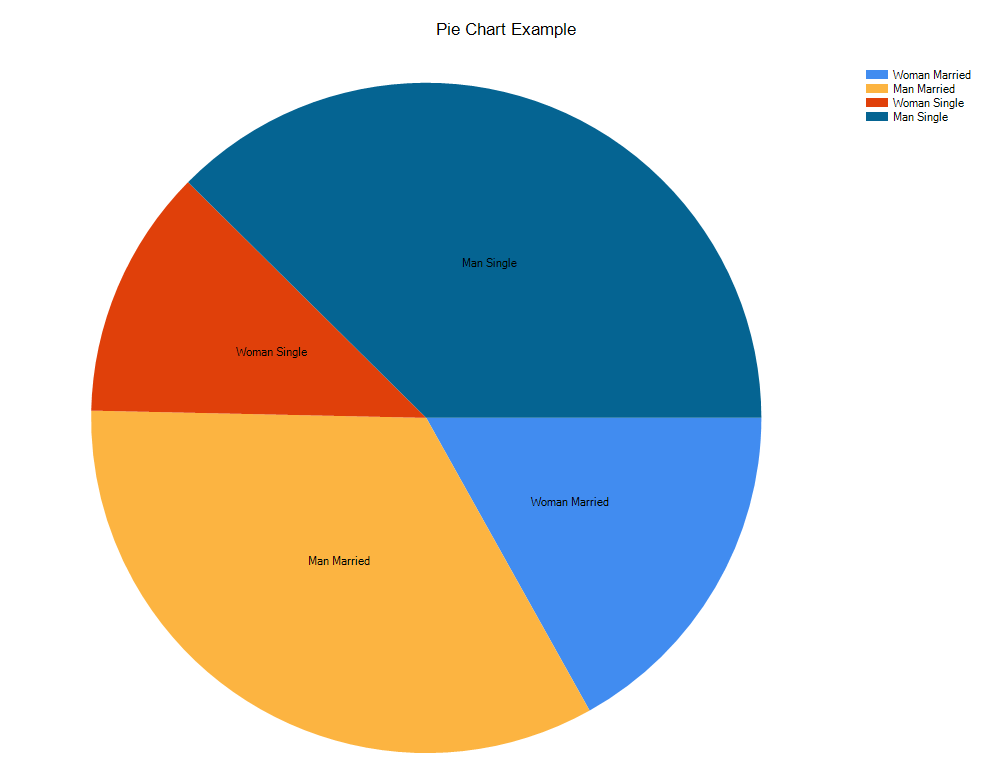
We can see that most employees are single men (what we could have noticed based on the results set).
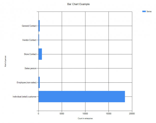
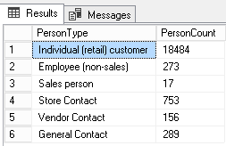
Creating a bar chart
We will use following query and same algorithm except that we will define a Bar chart and not a Pie chart.
|
1 2 3 4 5 6 7 8 9 10 11 12 13 |
SELECT CASE PersonType WHEN 'SC' THEN 'Store Contact' WHEN 'IN' THEN 'Individual (retail) customer' WHEN 'SP' THEN 'Sales person' WHEN 'EM' THEN 'Employee (non-sales)' WHEN 'VC' THEN 'Vendor Contact' ELSE 'General Contact' END as PersonType, COUNT(*) PersonCount FROM Person.Person GROUP BY PersonType ; |
This query gives back following results set:
Here is the corresponding PowerShell Code:
|
1 2 3 4 5 6 7 8 9 10 11 12 13 14 15 16 17 18 19 20 21 22 23 24 25 26 27 28 29 30 31 32 33 34 35 36 37 38 39 40 41 42 43 44 45 46 47 48 49 50 51 52 53 54 55 56 57 58 |
# ------------------ # Script Settings $ChartTitle = "Bar Chart Example" $ChartSeriesType = [System.Windows.Forms.DataVisualization.Charting.SeriesChartType]::Bar $ChartSeriesHTMLColor = $null $TargetServer = "MyServer" $TargetDatabase = "AdventureWorks" # ------------------ $BarChart = New-Chart -width 1024 -height 800 -ChartTitle $ChartTitle -WithChartArea $true -WithChartLegend $false # Chart area settings $BarChart.ChartAreas[0].Name = "DefaultArea" $BarChart.ChartAreas[0].AxisY.Title = "Count in enterprise" $BarChart.ChartAreas[0].AxisX.Title = "Kind of person" #optional settings for axes # Chart Legend $ChartLegend = New-Object system.Windows.Forms.DataVisualization.Charting.Legend $ChartLegend.name = "Chart Legend" $BarChart.Legends.Add($ChartLegend) # Chart Series creation $ChartSeries = New-ChartSeries -SeriesName "Series" -LegendName "Chart Legend" –ChartAreaName "DefaultArea" -ChartType $ChartSeriesType -HTMLColor $ChartSeriesHTMLColor $BarChart.Series.Add($ChartSeries) # Get back data to set in series $SqlQuery = "SELECT `r`n" + " CASE PersonType`r`n" + " WHEN 'SC' THEN 'Store Contact'`r`n" + " WHEN 'IN' THEN 'Individual (retail) customer'`r`n" + " WHEN 'SP' THEN 'Sales person'`r`n" + " WHEN 'EM' THEN 'Employee (non-sales)'`r`n" + " WHEN 'VC' THEN 'Vendor Contact'`r`n" + " ELSE 'General Contact'`r`n" + " END as PersonType, `r`n" + " COUNT(*) PersonCount `r`n" + "FROM Person.Person`r`n" + "GROUP BY PersonType`r`n" + ";" $QueryDataSet = Invoke-SqlCmd -ServerInstance $TargetServer -Database $TargetDatabase -Query $SqlQuery -ErrorAction Stop <# Choice #2: Points settings #> Foreach ($SqlRec in $QueryDataSet) { [void]$BarChart.Series["Series"].Points.AddXY( $SqlRec.PersonType, $SqlRec.PersonCount ) } # Do something with the chart object (display or save to disk) Display-Chart -Chart2Display $BarChart -Title "Bar Chart Example" |
And here is the corresponding chart:
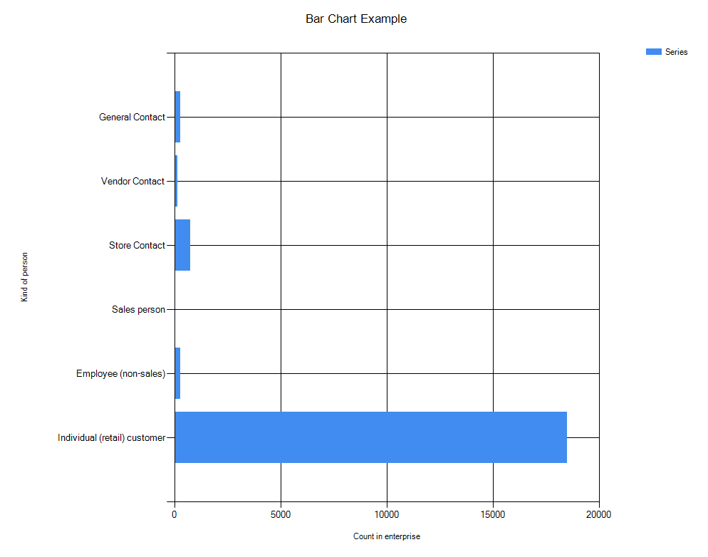
If you take a closer look to the code, you see that, except the query that is different, the only line that has changed is the assignment to the $ChartSeriesType variable.
Going further
These two examples will give you, I hope so, the knowledge necessary to be able to create advanced charts with multiple chart areas and/or multiple series into the same chart.
As a last advice, don’t forget that a chart area will need you to define the same values for X axis along all the series when you want to plot something like this:
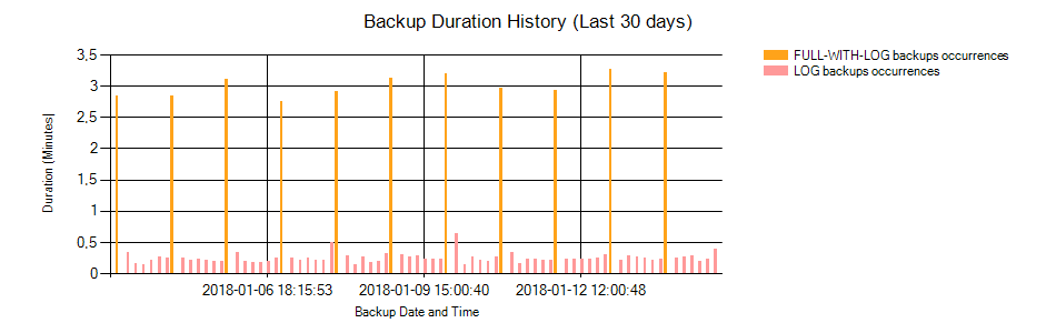
In this example, I set values of 0 for occurrences of LOG backups in the “FULL-WITH-LOG backups occurrences” series and 0 for occurrences of FULL-WITH-LOG backups in the “LOG backups occurrences” series.
By the way, if you are willing to get a more in-depth knowledge on the DataVisualization namespace, there are two ways to do so. Firstly, you can go through the documentation and test yourself on concrete examples (that would add some value to your job, it’s always a better way to learn). Secondly, you could also get into Visual Studio, try to build charts using WYSIWYG tools and look at the code used behind.
Previous article in this series:

I'm one of the rare guys out there who started to work as a DBA immediately after his graduation. So, I work at the university hospital of Liege since 2011. Initially involved in Oracle Database administration (which are still under my charge), I had the opportunity to learn and manage SQL Server instances in 2013. Since 2013, I've learned a lot about SQL Server in administration and development.
I like the job of DBA because you need to have a general knowledge in every field of IT. That's the reason why I won't stop learning (and share) the products of my learnings.
View all posts by Jefferson Elias
- How to perform a performance test against a SQL Server instance - September 14, 2018
- Concurrency problems – theory and experimentation in SQL Server - July 24, 2018
- How to link two SQL Server instances with Kerberos - July 5, 2018