
The project
This is the first article of a series dedicated to discovering geographic maps in Power BI using Bubble Map and Filled Map.
My goal is to illustrate to you the different visuals available in Power BI for making maps. Remember that Power BI is a product undergoing constant evolution; new features are added every month at a fast pace. And over time Power BI has gained more mapping capabilities compared to the starting point.
So I believe that it could be useful to make some order and give a complete overview of what the tool has now to offer. I’m going to show you each component, its features and the right way to achieve the correct result.
At the end of the series, you’ll have a clear understanding of how you can create maps in Power BI and which it the best visual to use according to your needs.
After introducing the project, let’s start with the first topic.
Bubble maps
Bubble maps and filled maps are the primitive visuals introduced since the first release of Power BI. They are based on the Bing map engine. Bing simply recognizes addresses, coordinates or any geographic attribute and plots it on a map. Behind the scenes, Bing converts the input into geographic coordinates (latitude and longitude) to be passed to the page. A well-known process called geocoding.
Bubble map and filled maps allow interactivity between objects in your report; highlighting a location in the map, applies a filter the other tiles on the report page and vice versa.
Power BI is capable of accepting most of the relevant location value we can pass; addresses, cities, zip codes, countries, airports, etc. Nevertheless, it’s advisable to follow some “best practices” in order to get a valid result. I’ll go more in detail later on.
To be immediately aware of how bubble map work, let’s try a simple test; open a new report in Power BI Desktop and click Enter Data.

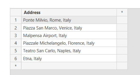
In the pop-up window you can enter values manually to create a table. Enter the data as shown in the picture below. Call the column Address, call the table bing_test and click Load.
Now drag the bubble map symbol  to the canvas and enlarge the visual for bubble map.
Into the Location box put Address from the bing_test table. You get the following result:
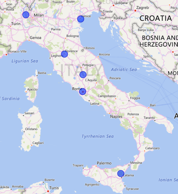
The Bing engine is clever enough to identify locations although of a different kind; two addresses, a bridge, an airport, a volcano (!). But it didn’t recognize a building, Teatro San Carlo a theater in Naples and placed the point somewhere else. We will address the issue later on.
For a complete demo of bubble map, I want to use some airports data collected from Openflights.org a free database with airports and airlines data. Click here, to download the full dataset with over 12000 rows of data. Download the file in either .dat or .csv format.
Alternatively, I prepared a smaller .csv dataset with the 50 world’s busiest airports that you can find at the end of the article, accompanied by the .pbix created for the demo.
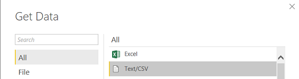
After downloading, open Power BI Desktop and create a new empty report. Click Get Data -> Text/CSV.
Click Connect and choose the location of your file. Power BI loads the file and shows you a data preview, based on file code page and delimiter.
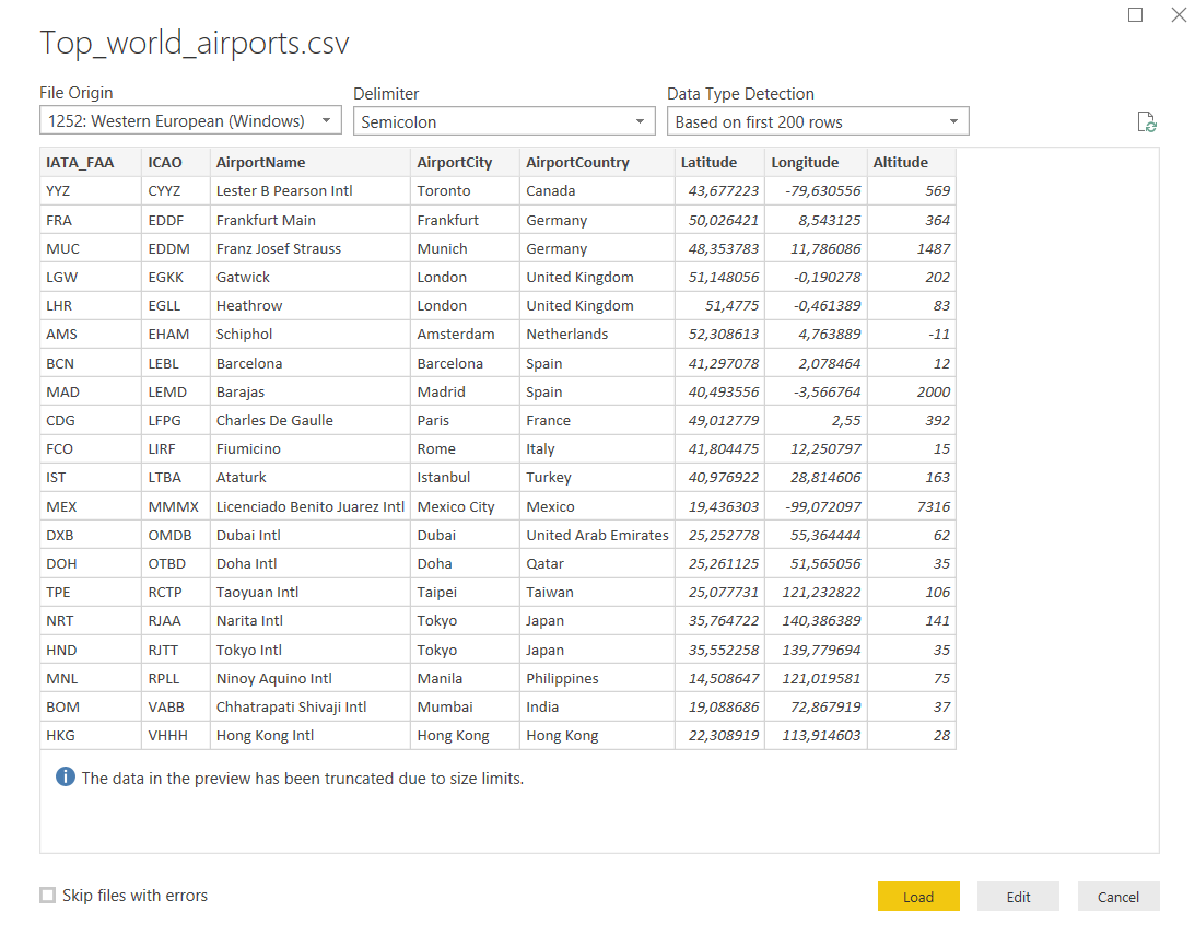
Choose Load if you want to import data into Power BI, Edit if you need to do some transformation before using it. For this demo click Load and the dataset is imported into Power BI.
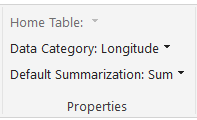
For each airport, the dataset contains geographic coordinates; latitude and longitude. To be sure that Power BI recognizes correctly the data, let’s force the data category.
In the dataset, click on the Latitude field:
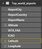
The ∑ symbol beside the field name means that a datatype is a number.
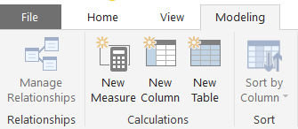
Then click the Modeling tab
In the drop-down menu Data Category: select Latitude:
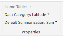
Repeat the same operation for the Longitude field:
When finished, you should notice the world symbol, next to the fields’ name:
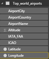
Power BI marked the contents of the fields as geographic values. So we are sure that data format is correctly evaluated by the Bing map.
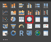
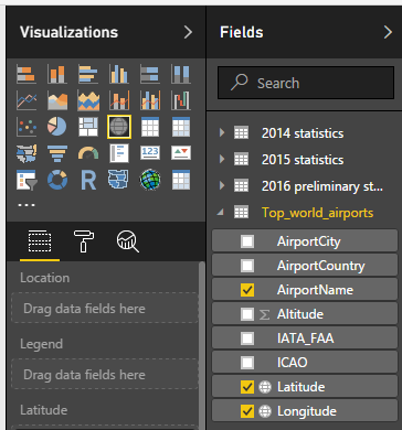
In the Visualizations pane, select the map visual. Enlarge the visual to fit the page size.
Drag and drop Latitude and Longitude data fields to create bubble map, into the visual’s matching fields and you can see the data point plotted on the map.
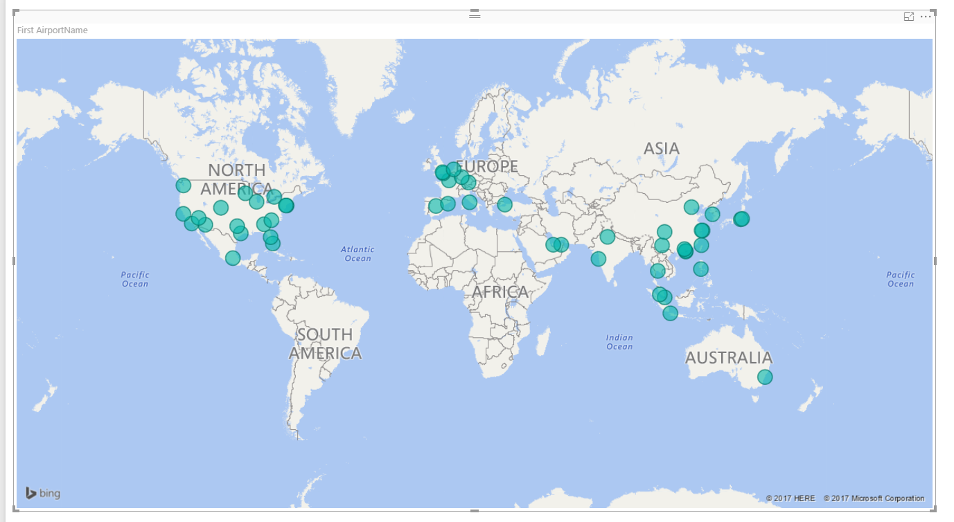
Passing the mouse over the points in the bubble map gives you the coordinates. If you want to have more details, for example, the airport name, add the AirportName field to the tooltip or the legend in the visualization toolbox.
The visual behaves like a Bing map. You can zoom in and out or scroll around the world, but you can’t change the map type.
There are few settings worth to mention; if you click on the Format icon you have the option to set on or off auto zoom.
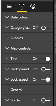
By exploding Data Colors, you can set the standard color for every point, or you can decide to assign manually a distinct color for each one.
Our first bubble map was very simple; few points plotted onto the world with the same size and same color.
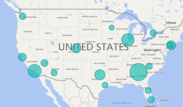
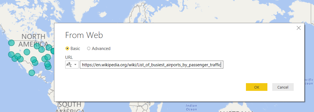
Now it’s time to get more info from our bubble map. Let’s say we want to know which is the world’s busiest airport and the amount of passenger traffic for each one in our list. Wikipedia provides the info we need.
In the Power BI menu select Get Data -> Web. In the pop-up window insert the following URL
https://en.wikipedia.org/wiki/List_of_busiest_airports_by_passenger_traffic and press OK.
In the Navigator panel, select 2016 preliminary statistics (at the time of writing).
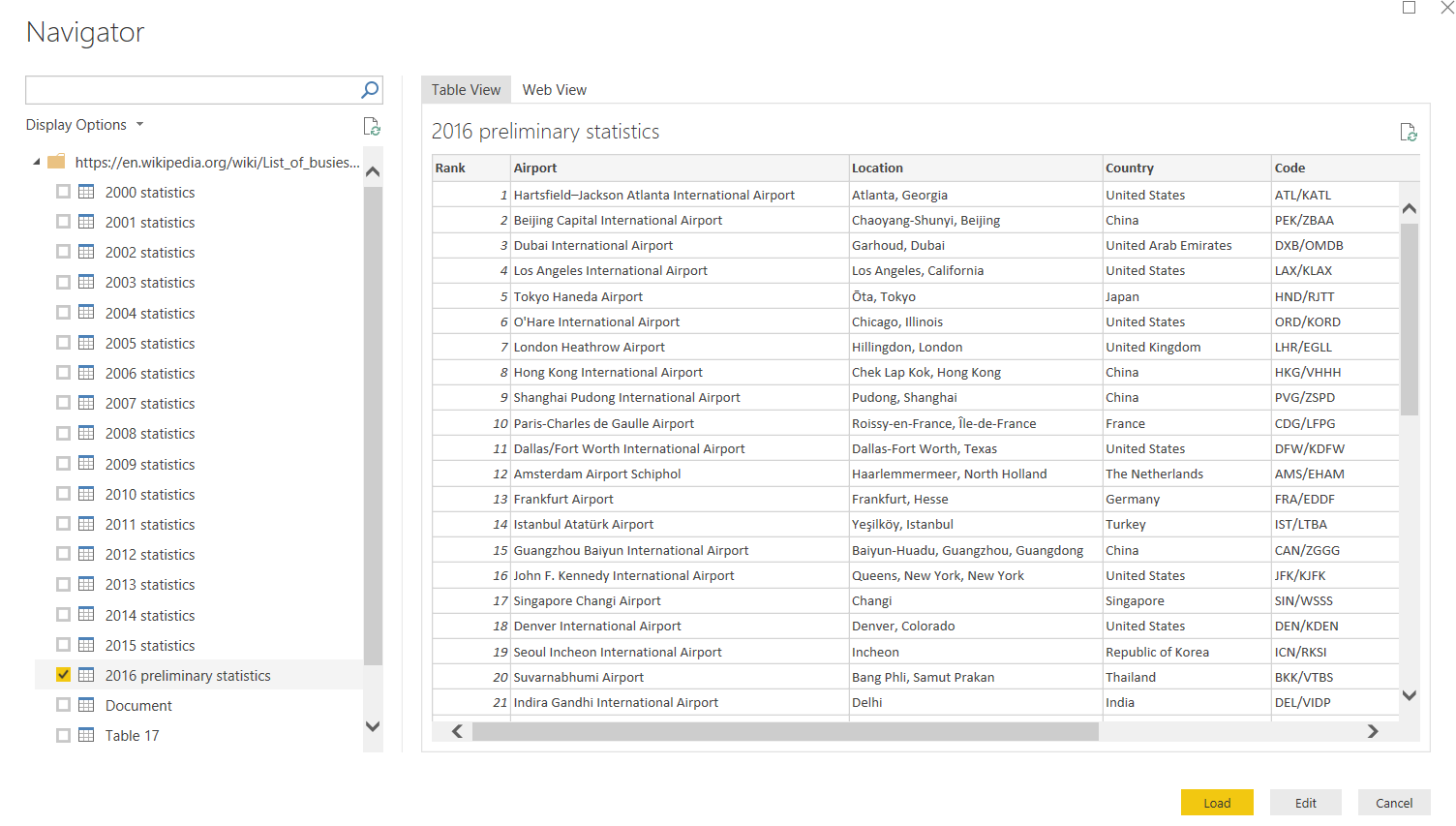
Power BI shows up a preview of the table with 2016 passengers traffic data. Click Load to import data into your model.
To correctly identify each airport, we need three-letter code (the IATA code), but in the Wikipedia table, both IATA and ICAO codes are merged into the same column.
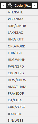
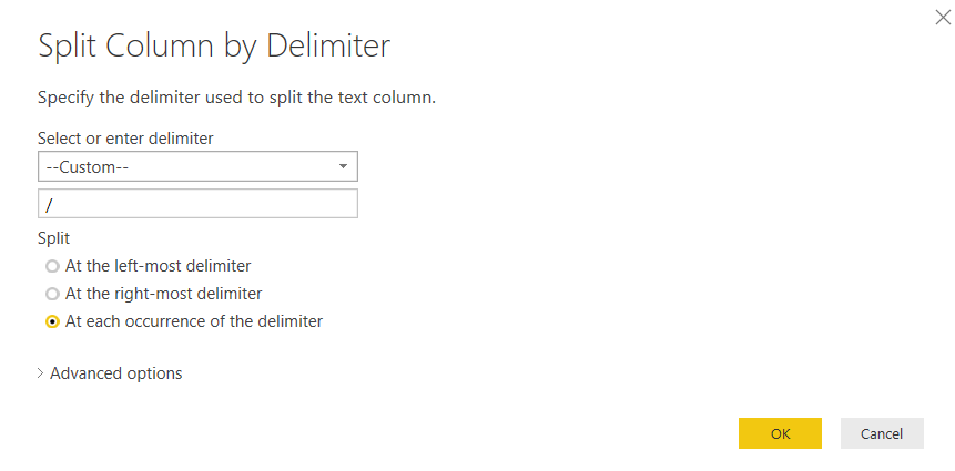
Click Edit Queries to open the Power BI Query Editor then select the Code (IATA/ICAO) column from the dataset. Click Transform -> Split Column -> By delimiter. In the dialog window select Custom as the delimiter and insert the “/” symbol into the empty field. Leave the selection for “At each occurrence of the delimiter” and click OK.
Power BI splits the columns by code. Rename both columns by right-clicking on the heading and choosing Rename … Call the first column CodeIATA, the second CodeICAO. If you wish, you can change the name of the table, by clicking in the Name field under the PROPERTIES window. I called mine “passengers traffic statistics”.
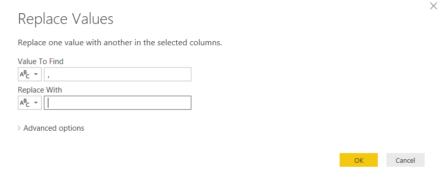
Depending on your PC settings, you could need another transformation regarding the Total passenger field. Numbers from the Wikipedia page are formatted in the English notation, with commas as the thousands separator. But my operating system, for example, is set to Italian and comma is the decimal delimiter. So Power BI treats the field as a text. If you are in the same situation, select the column Total passengers, click on the Transform tab and choose Replace values. Replace the comma with an empty space as shown in the figure and click OK.
Power BI removes the commas from the data. In order to convert it to a number click on Data Type- > Whole Number. The symbol in the column heading switches to a number, meaning that Power BI has changed the data type.

Finally, click back to the Home tab and select Close&Apply to apply changes to your model.
The next step is to join the two datasets, to combine geographical occurrences with business facts. Click on the Relationships icon.
![]()
We want to correlate the datasets through the IATA code, a unique field that identifies every airport without any possible ambiguity. Power BI tries to set up a relationship basis on similarity in data fields, but in this case, it doesn’t work for us.
Right click on the yellow line (if existing) and delete it.
Now drag and drop IATA_FAA from “Top_world_airports”, to CodeIATA in “passengers traffic statistics”
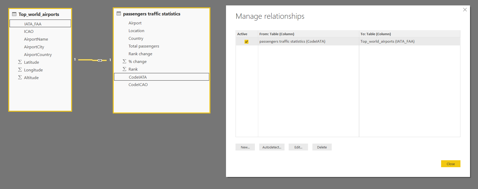
Click on the “Manage Relationships” menu and as you can see, the connection is correctly established.
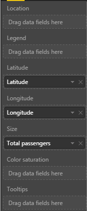
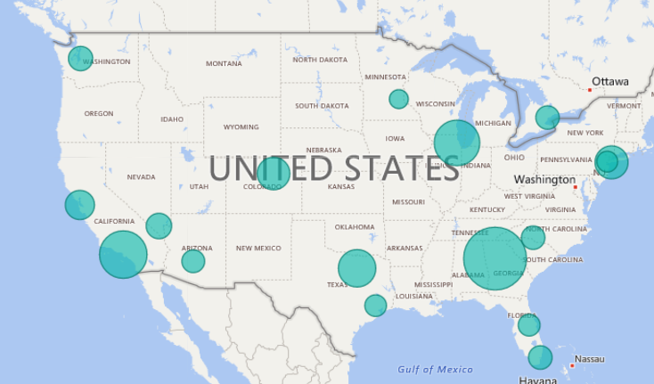
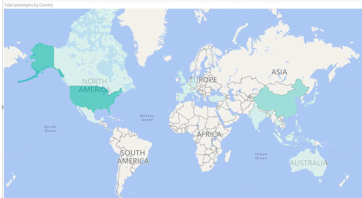
Switch to the report panel, select the bubble map visual, expand the “passengers traffic statistics” dataset and drop Total passengers to the Size box.
The bubbles size varies according to the number of passengers for each airport, giving an immediate perception of passengers flows in bubble map.
With the same principle you can set up a filling scale, dragging Total passengers into the Color saturation box in bubble map. Now the bubbles are filled with a lighter or darker color, based on the passengers number.
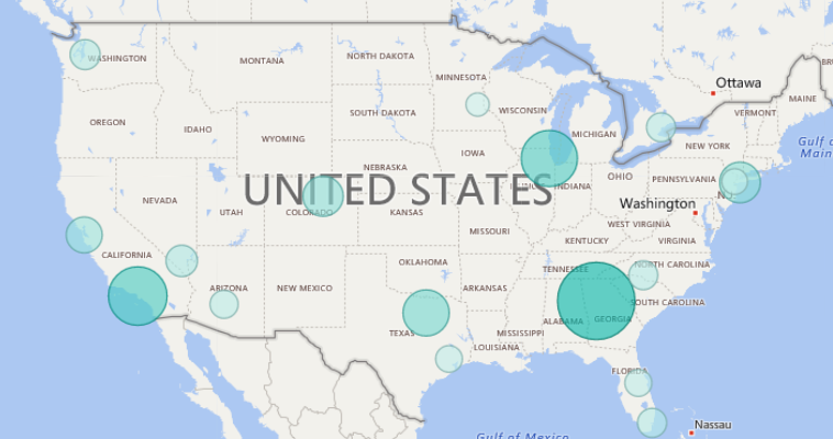
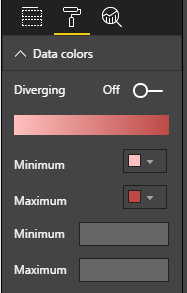
Colors can be customized by selecting the visual’s Format icon.
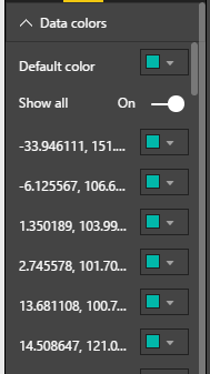
In the Data colors menu of bubble map, you can pick up the minimum and maximum color for your scale.
Filled maps
The filled map visual creates a choropleth, a thematic map in which areas are shaded and filled in proportion to the displayed measures.
The visual is based on Bing maps as well. It overlays regions with polygons and boundaries; again we have to pass an attribute that can be recognized as a significant geographic name. For example a city, a state, a country, postal code, etc. Latitude and longitude are not applicable as filled map works with areas, not points. Therefore we must train Power BI to identify one of our fields as a geographic location.
Add a new page to your previous Power BI file, by clicking the yellow + symbol at the bottom of the report. Make sure that the field Country in the dataset “passengers traffic statistics” is selected. Click Modeling tab -> Data category -> Country. Power BI marks the country name as geographic spot.
Click the Filled map visual  to create a new map in your report. Expand the dataset “passengers traffic statistics” and add the field Country to the Location bucket. Power BI recognizes the countries and displays the filled regions on the map.
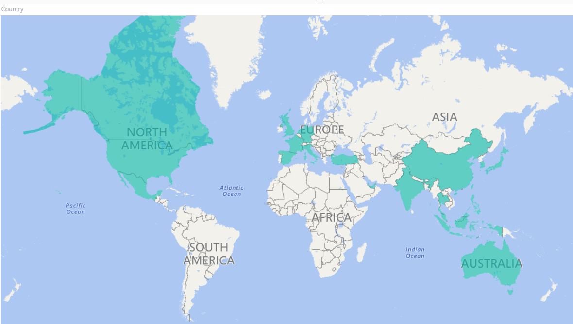
Now add Total passengers to Color saturation. As in the previous example, you got a color saturation scale. Note that Power BI automatically groups and sums the total number of passengers by country, so you don’t have to perform aggregations before plotting data.
As with bubble maps, likewise, you can change colors and few other settings through the Format icon.
Map visualizations best practices
As we have seen, the Power BI integrates the Bing engine to provide default map coordinates. But, if you don’t use precise geographic references, some ambiguity can occur and the likelihood of retrieving an exact result decreases.
What happens when you look for Washington? Do you expect a city or a state? Or if you search for Paris, Cambridge, Georgia, etc.?
Remember the wrong point localization for Naples in the first demo?
You must always keep in mind that some spots couldn’t be correctly identified. When it happens, Power BI warns you with an icon in the top left corner of your visual indicating that the map needs more location data to accurately plot values.
To avoid these pitfalls there are some tips and good habits to put into practice:
- When possible, bubble maps use latitude and longitude. If they aren’t available, try to make your location as distinguishing as possible. For example set the Data Category in the Modeling tab as a geographic attribute (Address, City. Continent, Country/Region, Zip…)
- Combine two or more columns into one and pass it as Location in the visual. For example “Paris, France”, rather than “Paris, Texas” or “Cambridge, Cambridgeshire, UK”. Use the DAX function CONCATENATE to bind multiple fields together and use to geocode locations
- For countries or regions, use the standard three-letter abbreviation. This internationally adopted code helps to properly recognize some locations. Do not use localized names or abbreviations
Summary – Map visualizations
Map visualizations are a good way to plot some locations on a map. They are quick and easy to use. No previous knowledge is requested. Both are based on Bing maps geocoding engine and both allow cross-filtering between the map elements and the other visuals in the report.
Bubble maps are used to plot single points. According to the data you’re displaying, size and color saturation of the bubbles may vary.
Filled maps are used to display data for areas with boundaries, such as countries, states. A solid polygon is plotted over the related area. Polygon’s color saturation may vary, depending on the data.
To avoid ambiguity in locations recognition use the appropriate data category. Mark your spot as a geographic attribute from the Data Category menu in Power BI. Alternatively, concatenate data from multiple columns, to pass to Power BI an unambiguous value. If available, bubble maps use latitude and longitude.
References
- How to use map visualizations
- Tips and tricks for Power BI map visualizations
- Filled maps (choropleths) in Power BI (Tutorial)
- How-To: Display 2-letter country data on a Power BI map
Downloads
Table of contents
| How to create geographic maps using Power BI – Filled and bubble maps |
| How to create geographic maps in Power BI using built-in shape maps |
| How to create geographic maps in Power BI using custom shape maps |
| How to create geographic maps in Power BI using ArcGIS |
| How to create geographic maps in Power BI using R |
| Customized images with Synoptic Panel |
| MapBox |
| Geocoding |

Common tasks: Database development and monitoring, data warehousing, creating BI solutions and reporting, data analysis.
MCTS certificated: SQL Server Developer.
Speaker at SQL Saturdays, and other conferences in Europe.
Author for SQLShack and UGISS (User Group Italiano SQL Server).
- How to create geographic maps in Power BI using R - August 1, 2019
- How to create geographic maps in Power BI using ArcGIS - August 11, 2017
- How to create geographic maps in Power BI using custom shape maps - June 22, 2017