

Introduction
This is the second article of a series dedicated to discovering geographic map tools in Power BI.
In the ToC below the article, you can find out references to the previous article and the project’s goal.
In this piece, I’m going to cover the default settings for the Shape Maps visual. In the next one, I’ll explain how to create and use custom shape maps.
Shape Maps
The shape map visual has been available in Power BI for several months, but it’s still in preview (at the time of writing). So, you need to enable it in Power BI Desktop.
Select File > Options and settings > Options > Preview features then select the “Shape map visual” check box and click OK. You need to close and restart Power BI Desktop to make the change effective.
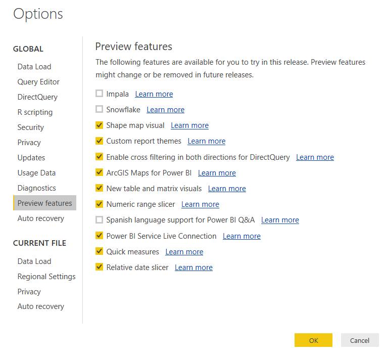
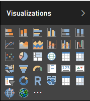
After restarting, you’ll find the visual into the “Visualizations” toolbox.
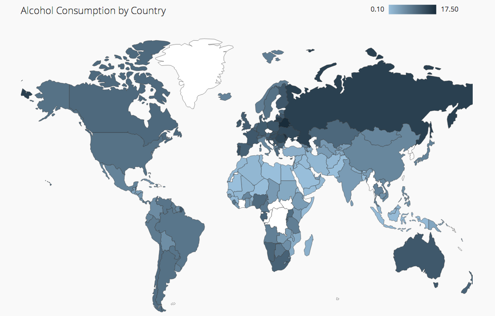
Shape maps are usually made of filled regions with delimited borders, that are used to compare values in different regions based on a color range. For example, you can show the distribution of the population in the world countries with different shades of the same color, according to the value intensity.
This is how a typical shape maps looks like:
Shape maps are based on the concept of shapefile a storage format developed by Esri (Environmental System Research Institute), nowadays universally recognized as standard for storing geospatial information.
A shapefile format spatially describes vector features: points, lines, polygons. It is therefore commonly used for representing geometric locations for data and its attributes. Storing together data and attributes allows the representation of geographic data on a map and makes some calculations possible.
A shapefile isn’t a “single” file but rather is a collection of files stored in the same directory. A shapefile at least must be made of three files each with a common name and different extensions. The mandatory files are:
.shp (the proper) shapefile;
.shx shape index format;
.dbf a table description for each shape.
Other common (optional) files are:
.prj projection format;
.sbn, .sbx spatial index;
.ain, .aix attribute index of the active fields in a table;
.shp.xml geospatial metadata in xml format;
But in Power BI you can’t use directly shapefiles as the visual supports only TopoJSON files. TopoJSON format comes from GeoJSON the most common open standard format designed for representing geographical features, based on JavaScript Object Notation.
TopoJSON inherits GeoJSON features and includes geospatial topology. Also, TopoJSON files are typically much smaller, up to 80% of the original size.
TopoJSON files are not very common. You can create your own file, converting from other formats (shapefile, geojson, ecc.), using, for instance, an online tool such as MapShaper (mapshaper.org). I’ll explain how-to-do later when talking about custom maps.
The shape map visual allows two different uses:
- Default built-in maps
- Custom maps
Default built-in maps
Few built-in maps are supplied inside the visual itself, ready for use. You can easily create some shape maps based on these existing templates.
First of all, we need a dataset. You can download an example from the bottom of the page. It is called ItalianRegions.csv and contains few quantitative data for the 20 Italian administrative regions (population, surface, a number of provinces inside the regions, a number of municipalities).
After downloading the dataset open a new empty report in Power BI Desktop. Select the menu Get Data and then Text/CSV.
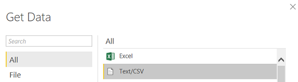
Click Connect and pick up the downloaded file. Power BI loads the .csv and shows you a data preview.
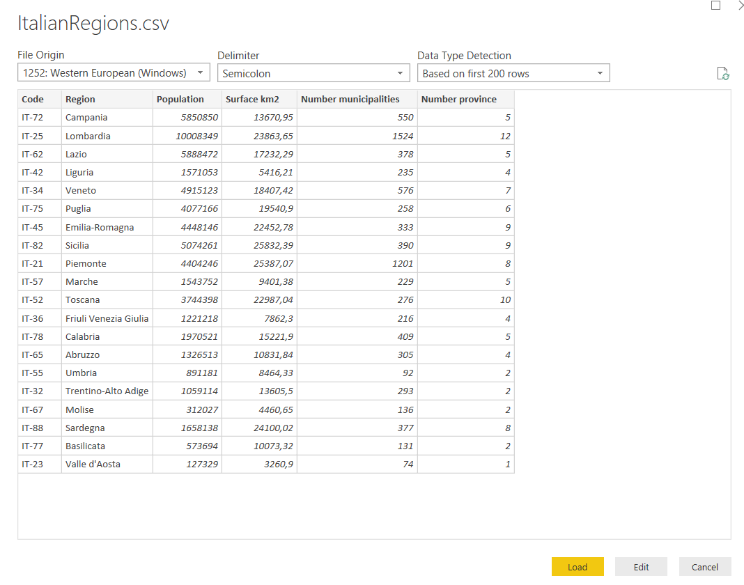
For this first demo we don’t need to do some transformations. Simply click Load and the dataset is imported into Power BI.
In the left tool bar select the Data icon.
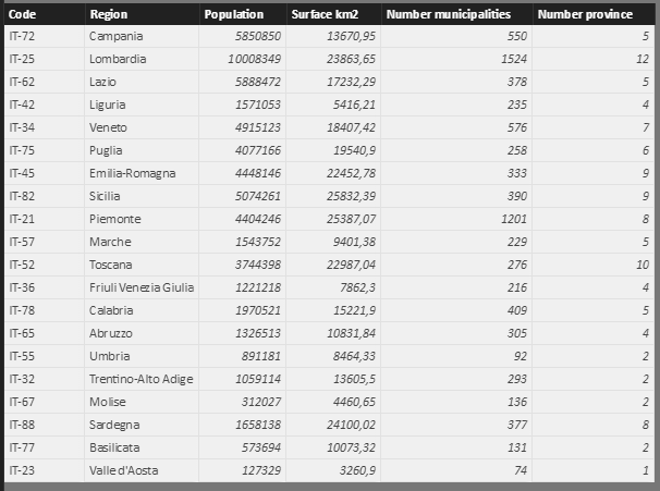
Power BI Desktop opens the dataset. Take a look at the first column; it contains the code for every region. This value is the key for matching your data with the shape map definition as we’ll see shortly.
Once loaded the dataset we can create our maps. Select the Shape map visual from the Visualization tools.

Power BI shows an empty object on the report. Move the Code field into the Location bucket and Population into Color saturation.
Now a grey map of United States shows up.
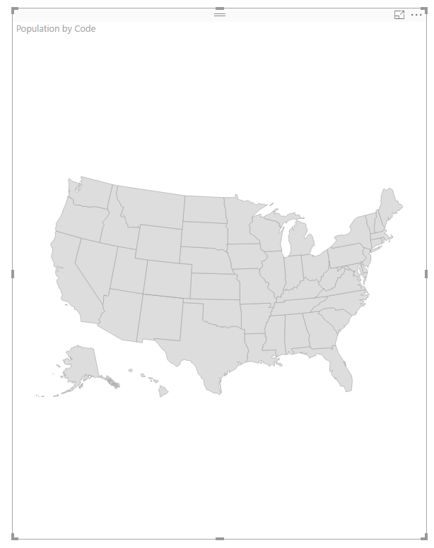
This isn’t what we expected. To get the desired map click the Format icon for the selected visual.

A new menu is available. Click to enlarge the Shape item.

Power BI prompts as default the USA states map. Click the down arrow and look at the other options available. These are built-map to use in our reports.
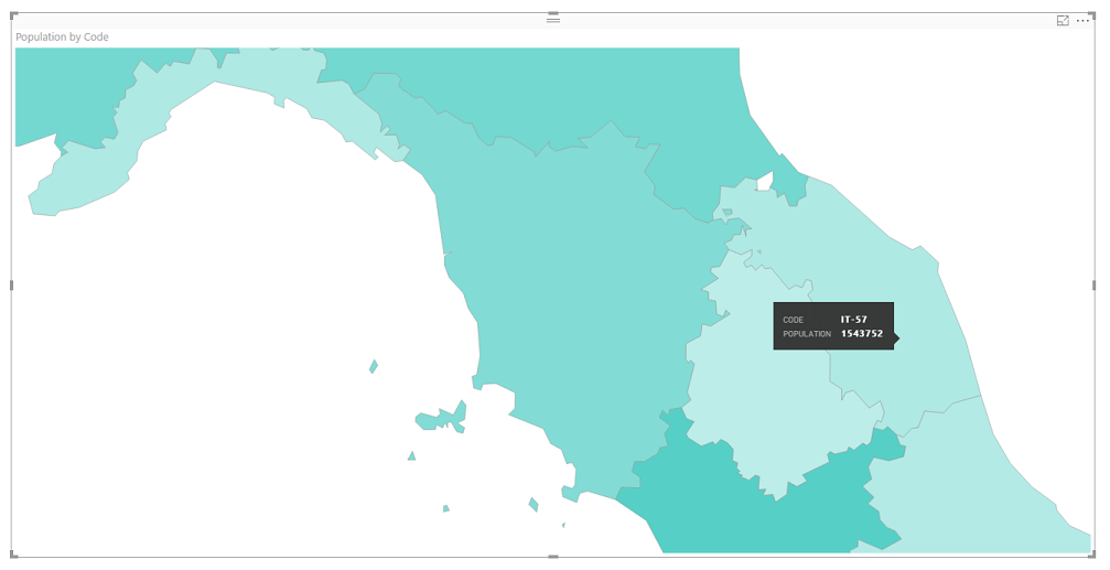
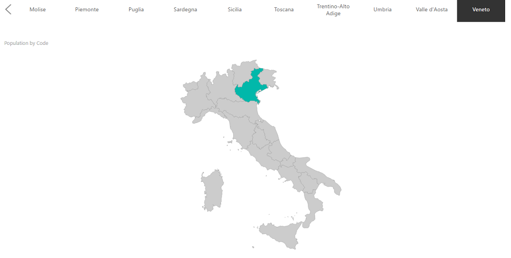
Select Italy: regions and notice that the visual on the reports immediately gets colored according to population values.
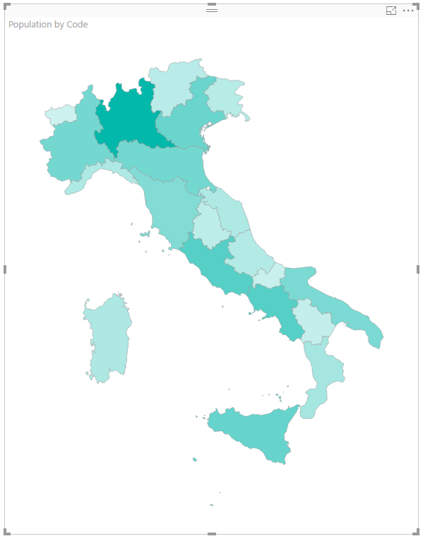
Why has this happened? Because we’ve correctly defined the match between the map and the dataset. To understand what I mean, click on View map keys …
A new window opens to display the key codes for this map. These are the inside values used by the shapefile as a key for geographical attributes of data. If you scroll laterally you can see all the existing fields.
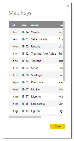
At least one of the fields of your dataset must match to one key values field. In my case I preferred to use the ISO coding for Italian regions, to stick to standard values.
This means that before building a dataset, you must know which are the keys defined in the shape map in order to correctly join your data to the shapefile’s definition.
If the shape map doesn’t find any match, the filled regions remain empty.
In case you’re wondering how to get values, in the article “Shape Maps in Power BI Desktop (Preview)” are reported all the key codes for built-in shape maps in Power BI.
Now that we have drawn a shape map, let’s explore some of the helpful options in the visual.
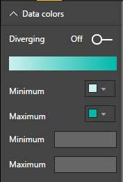
The “Data colors” menu allows changing the default colors; it’s possible to set the colors for the visualization range, by picking up one of the theme colors or creating a new one at your choice.
There are three types of projection available: 1) Equirectangular 2) Mercator 3) Orthographic.
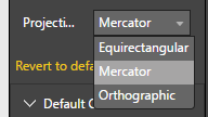
None of these is the “right” projection. It depends on your needs, the extension of your map and the data you want to represent. Please refer to the articles linked in the Reference section, for more details.
Usually, a “Mercator” projection is a good compromise for showing flat data on the Earth’s curved surface.
Expand the “Zoom” area. I’ll explain the behavior of the three filters by practical example. For now, switch Selection Zoom to On. Go back to the map and select any one of the regions. The zoom changes according to your selection.
Switch the Selection Zoom to Off and the map returns to natural size.
If you want to add legend, swap to the Field icon:

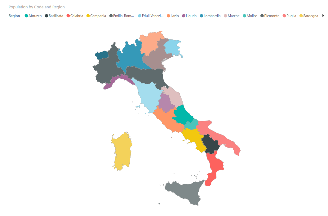
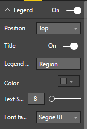
The legend appears as a row in the upper side of the visual. To change its settings, go to the Format icon and you find the new Legend menu, where you can set up Position, Title, Color, Text Font.
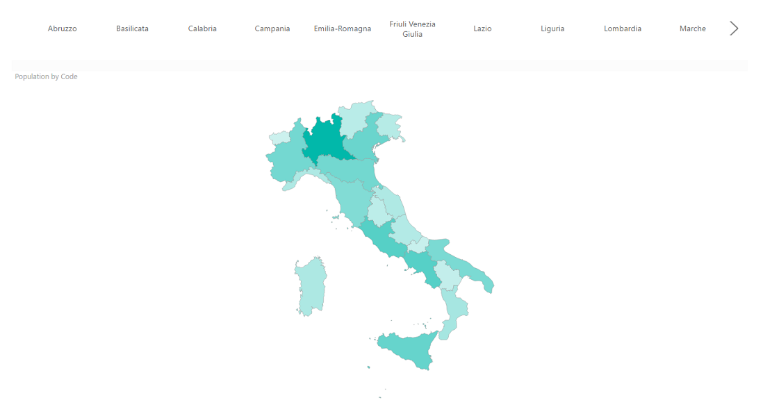
Bear in mind that the visual is full interactive that is data changes according to selections or filter you put in your report. For example, try to add a slicer and see what happens.
From the visual menu drag a slicer into your report then add Region to the Field bucket. I draw my slicer horizontally for the width of the page, over the map.
Keep sure the slicer is selected and select Format > General > Orientation > Horizontal.
The outcome should look like the picture below.
Now select the map visual, swap to Format > Default Color > Color and choose a light grey or whatever color you prefer. This is the color of the areas where there is no match to the dataset, i.e. the areas with no data.
Back to the report and select one region of your choice. The highlighted regions show up, while the others get the background color. Try to select another one or more regions (using CTRL) to have evidence of the interactivity between the visuals in the report.
References
- Shape Maps in Power BI Desktop
- Shapefile
- Esri shapefiles
- Map projections
- How to create geographic maps in Power BI using R - August 1, 2019
- How to create geographic maps in Power BI using ArcGIS - August 11, 2017
- How to create geographic maps in Power BI using custom shape maps - June 22, 2017
Downloads
Table of contents
| How to create geographic maps using Power BI – Filled and bubble maps |
| How to create geographic maps in Power BI using built-in shape maps |
| How to create geographic maps in Power BI using custom shape maps |
| How to create geographic maps in Power BI using ArcGIS |
| How to create geographic maps in Power BI using R |
| Customized images with Synoptic Panel |
| MapBox |
| Geocoding |

Common tasks: Database development and monitoring, data warehousing, creating BI solutions and reporting, data analysis.
MCTS certificated: SQL Server Developer.
Speaker at SQL Saturdays, and other conferences in Europe.
Author for SQLShack and UGISS (User Group Italiano SQL Server).