

Introduction
This is the third article of a series dedicated to discovering geographic maps in Power BI.
In the ToC below the article you can find out references to the previous articles and the project’s goal.
In the previous article, I gave you an overview of what a shape map is, which files it’s made of and I showed you how to use the standard built-in maps available in Power BI. Now it’s time to dig into the way to create your own shape map from the scratch and to display it in Power BI.
Custom shape maps
In order to use custom shape maps the same rule as built-in applies: there must be a matching field between data and maps attributes. It means that you must know the data definition under the hood of your maps or at least you must be capable of opening and reading a shape map’s data table.
To demonstrate custom shape maps let’s say we want to display the number of airport passengers in Europe, ranked by country.
First thing we need a shape map. You can download a sample from the bottom of the page; a .zip file called Europe_countries_shp_custom.zip.
Unzip the archive and use Excel (or another spreadsheet) to open the file Europe_countries_shp_custom.dbf. It is the table file for the shape that encodes all data description.

Columns ISO2 and ISO3 are the most interesting as they contain the ISO code for every country. Rather than the country name, we must take care that in our dataset there’s a field with the same ISO code.
The .zip archive holds the shapefile definition, but we need a TopoJSON file for using in Power BI.
Open a browser and go to www.mapshaper.org an online converter.
Click on the word select in the page box and pick up the .zip shapefile you want to convert, then click Import. Remember: the whole .zip archive not only the .shp file.
Mapshaper imports the file and shows you a preview.
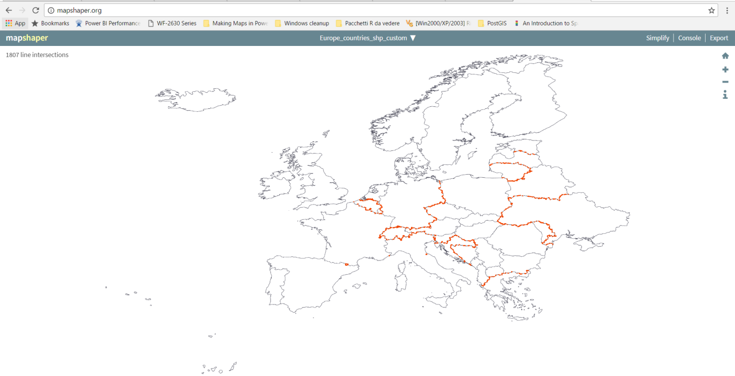
Click Export and choose the TopoJSON format. Save the. json file on your hard disk.
A good reference for where to find out shape maps, is Christopher Finlan’s blog. He created some geographic maps to use for Mobile Report Publisher. But they can apply to Power BI as well, once converted to TopoJSON.
Alternatively, there are some TopoJSON map already formatted from David Eldersveld. He started creating and collecting some maps for the community. You can download them from his GitHub repository.
Ok, up to this point we’ve got a map: now we need some data and we collect them from Wikipedia.
First step, the list of top 100 busiest airports in Europe.
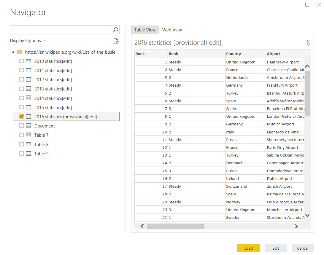
Open Power BI then select Get Data > Web. In the window insert the following URL: List of the busiest airports in Europe
In the preview window select 2016 statistics (provisional) [edit] and then click Load to import the table in Power BI.
The dataset must be edited before using it; click Edit Queries and do some changes.
Maybe you want to modify the name; I called mine 2016 statistics. On the left side of the page right-click the dataset and choose Rename.
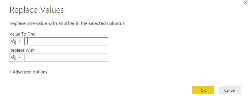
The fields Passengers 2015 and Passengers 2016 are imported as text, but we want them as number, because we are going to do some calculations. Open the dataset. In the upper menu click Transform > Replace Values. In Value To Find write a comma (,) and leave blank Replace With. Click OK.
Repeat the operation for both fields Passengers 2015 and 2016. After that, modify the data type. Go to Data Type and select Whole Number. Repeat for both fields.
Select the whole column Rank change 2015-16, right-click > Remove.
Then we must perform some data cleansing. Scroll the dataset up to row 67, Mulhouse. The country is tripled, but the correct one is France. Highlight the cell.
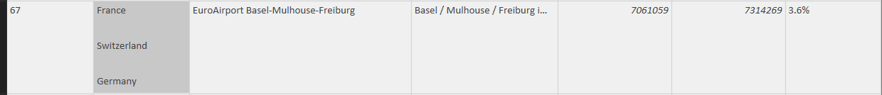
Transform > Replace Values and replace the string
“France#(cr)#(lf)#(lf)Switzerland#(cr)#(lf)#(lf)Germany” simply with “France”.
There’s another wrong value in the country from row 86.

Ukraine/Russia must be converted in Ukraine with Replace Values.
Once you’ve completed the transformations Home > Close and Apply, then save the Power BI file. Now we are ready to import the second dataset we need: the ISO Country mapping list.
Select Get Data > Web and insert the following URL:
https://en.wikipedia.org/wiki/ISO_3166-1
In the preview window select the table Officially assigned code elements [edit] and click Load.
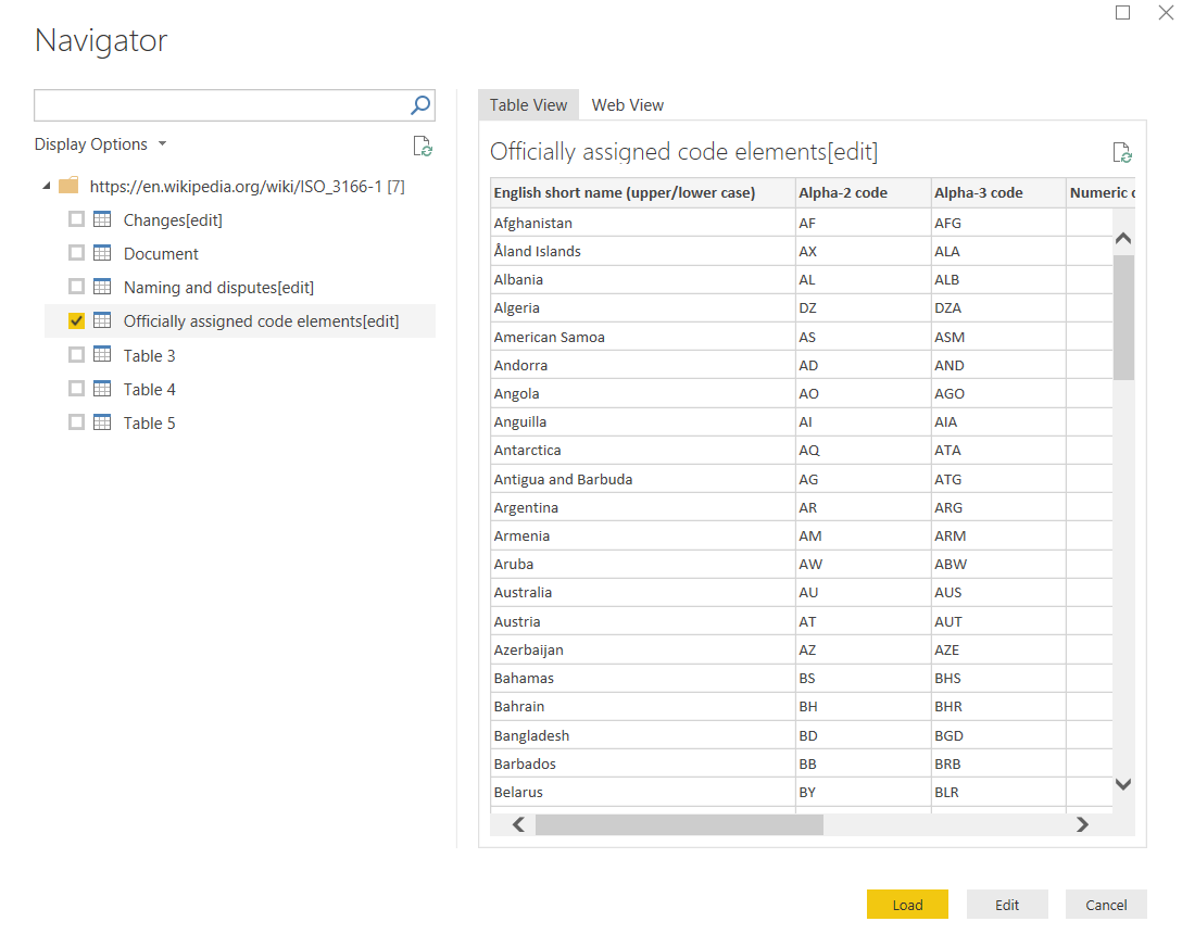
This table needs some modifications, too. Click Edit Queries.
As you can see, the dataset contains a country name and country ISO code. The key codes are Alpha2 and Alpha3 ISO standard definition of 2 or 3 characters for a country.
If you wish, change the name of the dataset: I turned mine into CountryCodeISO.
Select the whole column Link to ISO 3166-2 subdivision codes right-click > Remove. Do the same for column Independent.
Select the column English short name (upper/lower case) right-click > Rename … and change the name into Country.
There are some countries names that don’t match to other datasets; we need to modify them.
Make sure you selected the Country column; then from the menu bar Transform > Replace Values > Value To Find: “United Kingdom of Great Britain and Northern Ireland” / Replace With: “United Kingdom”.
Same pattern for “Russian Federation” > to replace with “Russia” and for “Czechia” > to replace with “Czech Republic”.
Now the CountryCodeISO dataset is ready and can be bind to the 2016 statistics. Menu Home > Merge Queries > Merge Queries as new
Merge two datasets as shown in the picture below: 2016 statistics CountryCodeISO bound by country. Choose Inner Join as kind of join.

In this way we get a new dataset; call it EU_2016_passengers_stats. If you scroll the dataset to the right you can notice a new column called generically table.
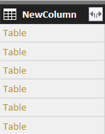
Click on the double-arrow icon to expand the table and you can see the list of the new columns added from the joined dataset. Select the columns you want to keep and click OK.
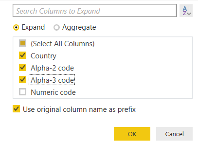
The lately fields have a NewColumn. prefix in their names. Cut off the prefix by renaming the two columns for Alpha code:
NewColumn.Alpha-2 code > Alpha-2 code.
NewColumn.Alpha-3 code > Alpha-3 code.
When finished Home > Close & Apply and save the file.
After long preparation, we are ready to create a custom shape map. Go to the report visualization drag and drop the Shape map visual onto the page. From the dataset EU_2016_passengers_stats put the field Alpha-3 code into the Location box and the Passenger2016 field into Color saturation. Swap to the format menu Shape > Map > + Add Map. In the dialog window select the TopoJSON EU file we’ve created before and press Open. The map shows up on the screen with different color saturation per country, according to the total number of passengers.
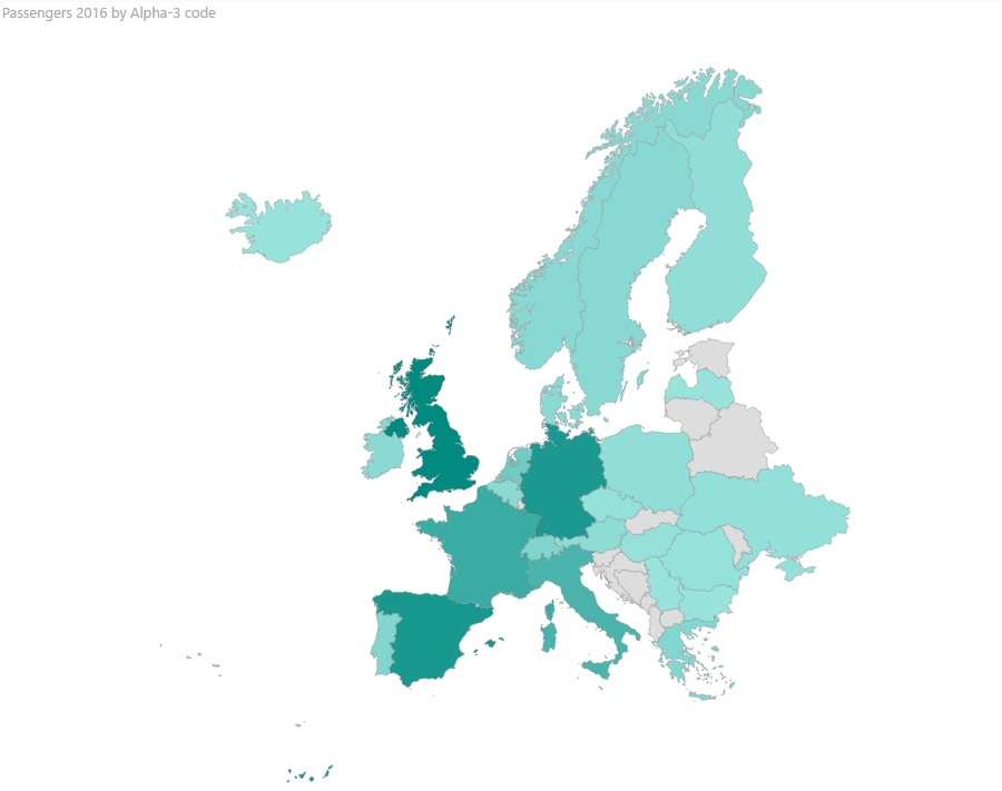
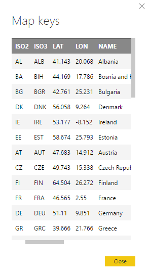
Stay on the visual’s format menu; under Map select View map keys … A pop-up window opens showing the key values for our TopoJSON map.
As I already mentioned, at least one of these keys must have a corresponding value in the dataset. In my example, the matching field is the three-letters country code. The countries where there isn’t any correspondence are in light-grey. It can depend on:
a) there aren’t rows for that value in the dataset;
b) there’s no match among the country code and the dataset.
You should be aware of this potential issue and prepare accurately your datasets.
If you want to change the appearance for non-matching countries, expand the Default Color menu in the Format section for the visual. Switch Show On or Off to display or not the non-matching countries. Color sets the background color and Border Color and Border define the settings for the countries border line.
Remember that the map is fully interactive; it reacts to the selection made in the other visuals of the report. Create a slicer and punt in the Field box the Country from the dataset EU_2016_passengers_stats. Your report should look like this:
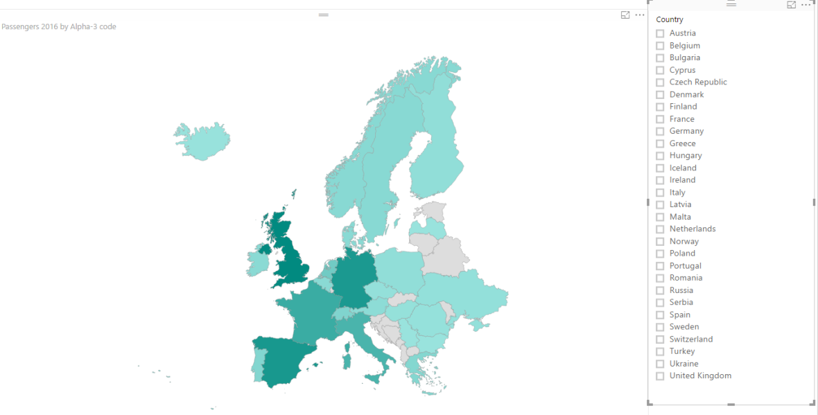
Try to select one or more country (by pressing CTRL when selecting a country) and notice how the map adapts based on the selection you made.
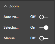
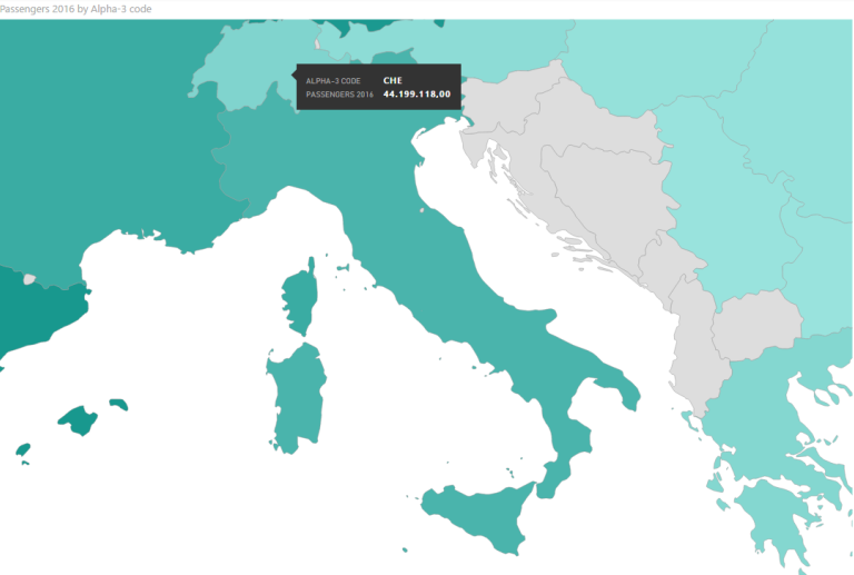
As for the built-in maps if you switch On the option Zoom > Selection zoom, the focus moves on the selected country.
Now you know how to create and import a custom shape map. What If you want to add more customizations? There are some features that aren’t available in Power BI, but you can get what you want by some workarounds. For complex layouts, you should use an external software for shape file manipulation, such as ArcGIS Desktop or QGIS.
Let’s have a simple example of what I mean. Say you want to add a legend with color ranges and countries grouped by passenger number intervals. It isn’t a feature available in Power BI, but there’s a way to get the result. You can create a new column in the dataset, with a series of nested IF to evaluate for every value in which interval it falls.
First of all, we need to group the original dataset by countries. For every country, we must have a single row with the total number of passengers in 2016. So let’s create a new dataset based on the previous one.
Click Home > Edit Queries > Edit Queries.
Right-click on dataset EU_2016_passengers_stats > Duplicate. Rename the new dataset: EU_2016_pass_grp.
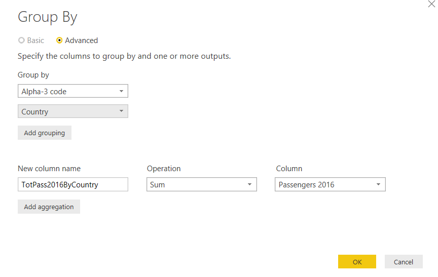
Go to Transform > Group By > Advanced. In the Group By Window set the following options:
Group By > Alpha-3 Code then Add grouping > Country. New column name > TotPass2016ByCountry. Operation > Sum. Column > Passengers 2016.
Click to Home > Close & Apply. Save your file.
Switch to Data tab. Select the dataset EU_2016_pass_grp then Modeling > New Column.
In the formula bar insert the following function:
Range = IF(EU_2016_pass_grp[TotPass2016ByCountry] < 10000000;”a) < 10
millions”;IF(AND(EU_2016_pass_grp[TotPass2016ByCountry] >=
10000000;EU_2016_pass_grp[TotPass2016ByCountry] < 50000000);”b) between 10 and 50 million”;
IF(AND(EU_2016_pass_grp[TotPass2016ByCountry] >=
50000000;EU_2016_pass_grp[TotPass2016ByCountry] <100000000);”c) between 50 and 100
millions”;IF(AND(EU_2016_pass_grp[TotPass2016ByCountry] >=
100000000;EU_2016_pass_grp[TotPass2016ByCountry] <= 200000000);”d) between 100 and 200
millions”;”e) > 200 millions”))))

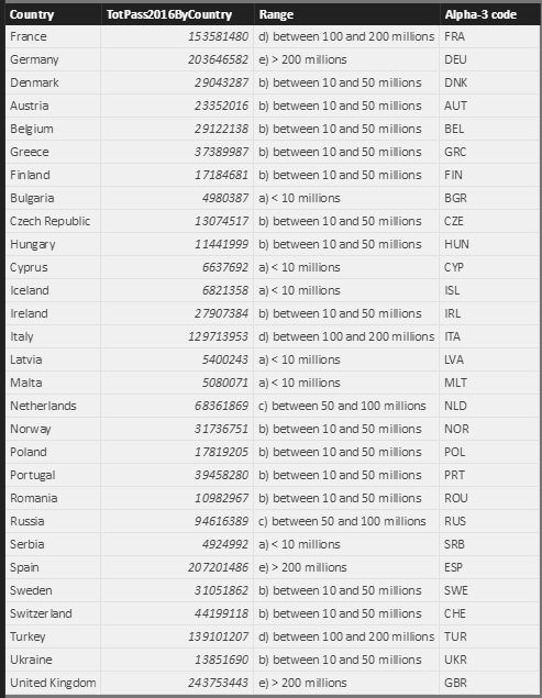
Review the dataset. For every row, you’ve a calculated interval in the Range column.
Back to the report visualization. Add a new report page to your PBI file. I called mine Custom shape map legend.

Create a new shape map. In the Location box put the field Alpha-3 code. In the Legend box drag and drop Range.
Move to Format menu for the visual. Expand Shape > Add map and select again the custom TopoJSON file Europe_countries_shp_custom.json
Expand Legend and set the position you prefer, for example Center Right. You can switch title on or off.
Expand Data Colors and select a custom color for every interval in the range. By default, Power BI plots colors which are not correlated, but probably you want to set different shades of the same color.
Once you’ve done back to Fields menu for the visual and add TotPass2016ByCountry to the Color Saturation box.
The final outcome should look like this:
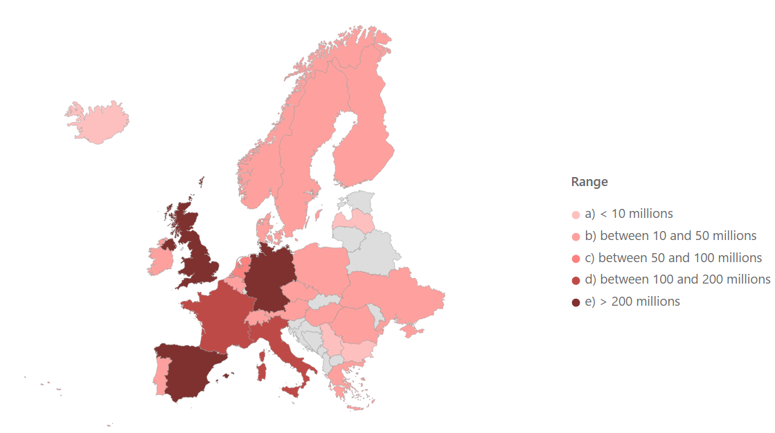
Now you’ve drawn a custom shape map with a custom legend. If you pass the mouse over a country, you can notice a tooltip with code, value, and range.
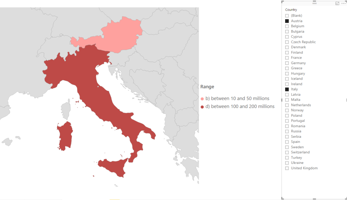
The map keeps its interactivity. Try to add a slicer and select one or more countries. Remark that the legend changes according to your selection.
Different formats for shape files
When I introduced shape files, I mentioned that they are vectors. It means that basically they are made of lines and points. Although a shape file is usually used for showing filled areas, you could draw lines, points, etc. for describing geographic attributes for relevant hotspots.
Just to give you an example, I prepared a different kind of shape file to import into Power BI; the map of main European cities represented as points. The file EuropeanCities.json is available as a download at the end of the article.
Open a new report page. I called mine Custom shape map points.

Add a new shape map. The dataset to refer to is EU_2016_passengers_stats. In the Location box drag and drop the field City served. Optionally, you can add the field Passenger 2016 to the Color saturation box. Go to Format > Shape > Add map and select the map you’ve downloaded before: EuropeanCities.json. If you prefer, change the default color for the points.
The new map should look like this one:
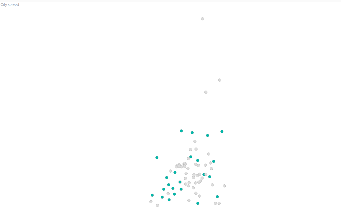
Maybe you can recognize the silhouette of Europe through its main cities. The colored spots are those with a correspondence among the dataset and the map keys; for the gray ones either we don’t have data or the keys don’t match. Try to move the mouse over the point to show up tooltips displaying data.
If you want to know which are the value keys used on the map, click on View map keys, to open the pop-up windows with keys. The cities names in your dataset must be equal to the column NAME in the map, in order to show some data.

Expand Zoom and set Manual zoom to On; you realize that you can move the shape map with the mouse or you can zoom in or out by turning the mouse wheel.
This is just a simple example of a different shape map type you can display in Power BI.
I bet you are wondering whether you can overlay two or more layers in a single shape map. Let’s say we would like to bind together the European countries boundaries map with the point cities map.
Well, the answer is no. At least not in Power BI. You might use a GIS tool such as QGIS or ArcGIS Desktop to add layers into a map project, merge as a single object and then export it as shape file to be converted in TopoJSON format before using it in Power BI.
References
- GeoJSON & TopoJSON
- Christopher Finlan’s blog: SQL Server 2016 Mobile Reports – Free Maps of the Week, Final Edition!
- TopoJSON repository
- TopoJSON converter – Mapshaper.org
Downloads
Table of contents
| How to create geographic maps using Power BI – Filled and bubble maps |
| How to create geographic maps in Power BI using built-in shape maps |
| How to create geographic maps in Power BI using custom shape maps |
| How to create geographic maps in Power BI using ArcGIS |
| How to create geographic maps in Power BI using R |
| Customized images with Synoptic Panel |
| MapBox |
| Geocoding |

Common tasks: Database development and monitoring, data warehousing, creating BI solutions and reporting, data analysis.
MCTS certificated: SQL Server Developer.
Speaker at SQL Saturdays, and other conferences in Europe.
Author for SQLShack and UGISS (User Group Italiano SQL Server).
- How to create geographic maps in Power BI using R - August 1, 2019
- How to create geographic maps in Power BI using ArcGIS - August 11, 2017
- How to create geographic maps in Power BI using custom shape maps - June 22, 2017