
Introduction
This is the fourth article of a series dedicated to discovering geographic map tools in Power BI.
In the ToC below the article you can find out references to the previous article and the project’s goal.
So, this time I want to introduce another visual that goes beyond the simple concept of mapping as it provides tools and features for spatial analysis: ArcGIS.
What is a GIS?
A GIS (Geographical Information System) is a computer-based tool that analyzes, stores, manipulates and visualizes geographic information on a map. GIS main purpose is to show correlation among spatial data, analyze spatial information, query geographic data and show the results in form of reports, maps, tables or any other output is suitable for you.
GIS analysis can be used in various fields of activity as it is powerful and flexible enough to address many needs in different disciplines. Just to mention few examples: business, public and private transport, education, natural hazards assessment, public health, resources optimization…
ArcGIS Maps for Power BI
ArcGIS is the software developed by Esri (Environmental System Research Institute), for creating and using maps, performing spatial analysis, sharing and discovering geographic information.
Recently the visual came into General Availablity, so it can also be used in PowerBI Service (www.powerbi.com).
The visual includes a set of map tools that let you use powerful spatial capabilities going beyond the simple representation. For instance, you can change the map theme, make area-based selections, add layers with demographic data, etc. Going forward in the explanation, you’ll got the right feeling on how you can “Take Your Map Visualizations to the Next Level”.
To start with demo, as usual we need some data. Download the same .csv dataset with 50 world’s busiest airports we used in the first article. You can find at the end of the article.
Once downloaded, start Power BI open a new report and click Get Data > Text/CSV. Select the location for the dataset and then in the dialog click Load to import it. For this dataset we need to perform the same transformation as in the first article How to create geographic maps using Power BI – Filled and bubble maps. ArcGIS is capable of geocode many kinds of geographic attributes such as addresses, cities, postal codes, etc. but it’s preferable to retrieve coordinates when available, for having a perfect matching with locations.
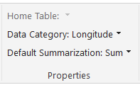
Select the field Latitude then in the menu bar click Modeling > Data Category > Latitude
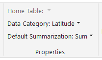
Repeat the same steps for the field Longitude.
Notice the globe sign beside the fields’ name.
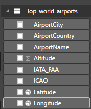
It means that Power BI marked the two fields as containing geographic coordinates.
The second group of data is the “List of busiest airport by passenger traffic” from Wikipedia, we already used in the first article. You can either refer to the article for data handling or download the ready-made dataset “passengers traffic statistics 2016.csv” at the end of the article.
Once downloaded and imported the dataset, one step more is needed in order to have some data to display.
Switch from report view to Relationship

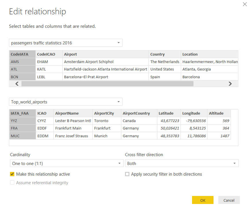
Power BI tries to establish a connection between the two datasets and suggests the ICAO code as common key.
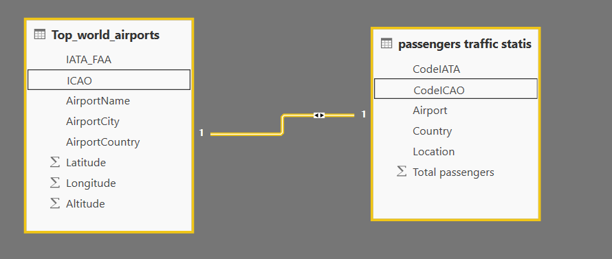
This could work for us, although I prefer the standard three-letters IATA code. So double click on the connection’s yellow line and in the Edit Relationship dialog select the IATA field from both datasets, then click OK. Don’t forget to save your file and get back to the report page.
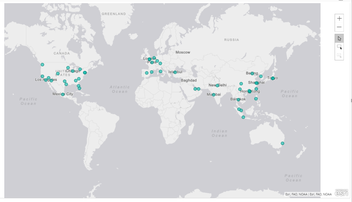
Now that we have some data, let’s see the visual in action. Click on the ArcGIS map icon
 and a blank object appears onto the canvas.
Drag and drop Latitude and Longitude from “Top_world_airports” into the respective boxes; a simple world maps shows up where the points represent the airports location.
If you don’t have the coordinates, you can insert your data into the Location box, as it is a relevant geographic attribute that ArcGIS is capable of geocoding (a country, a city, a zip code, etc.). As mentioned before, my advice is to try to always use the pair Latitude/Longitude. If they aren’t available, be sure that your values are correctly categorized in Power BI.
Bear in mind that this map is powered by Esri and is therefore totally different from Bing’s map. It offers much more features and capabilities that we’re going to explore.
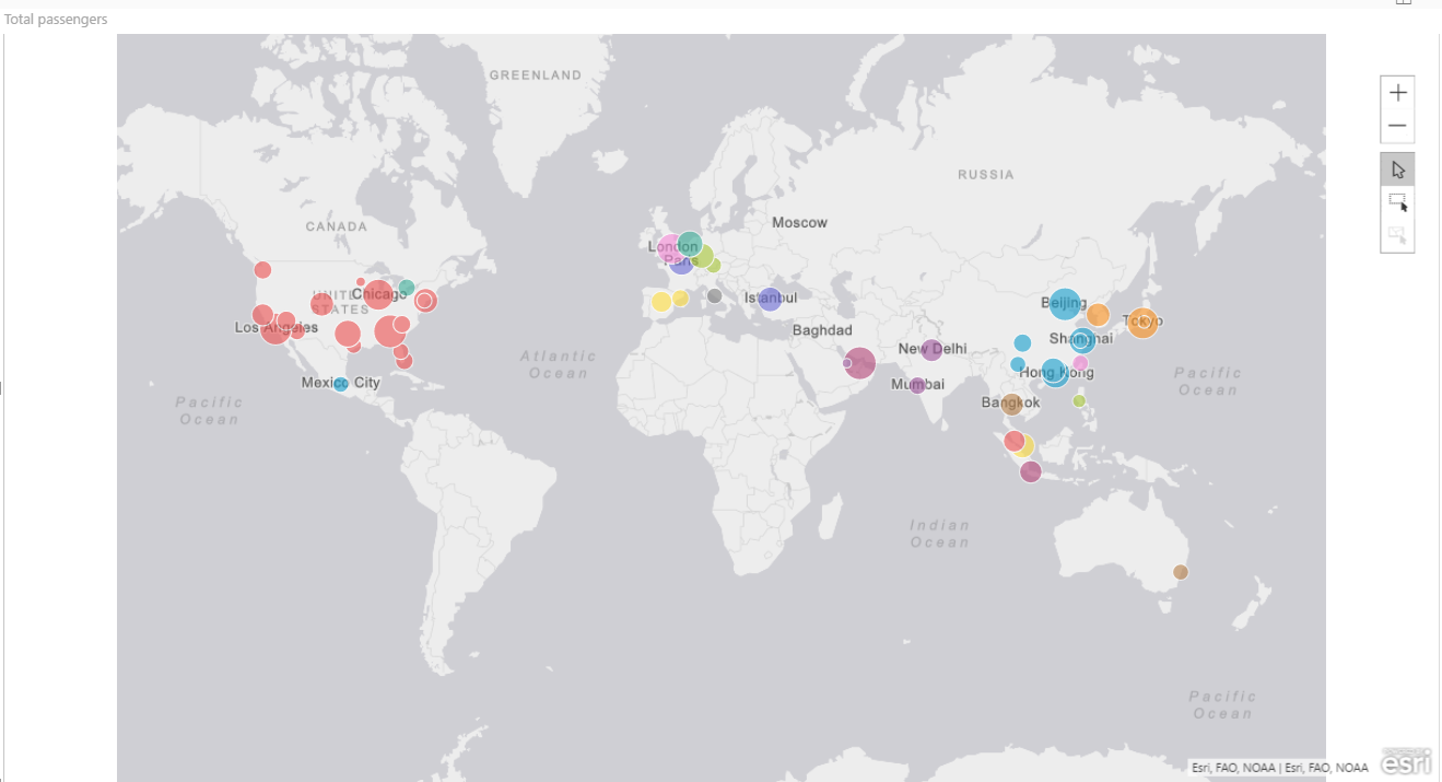
If you want to have evidence of the relative amount of traffic for each airport, drop the Total passengers value into the Size box. Every bubble gets a different size according to the value, as we’ve seen for bubble maps visual. But there’s much more. For instance, you can visually cluster the data by category. Drag the Country field and drop it into the Color bucket. The bubbles color changes for every country making it easy to identify each of them at a glance.
The default basemap is based on a light grey canvas, but there are other backgrounds available. Select the visual, click the ellipse (…) on the upper right side and select Edit
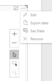
This command opens the map’s editor where you can set up many settings for customization or spatial analysis.
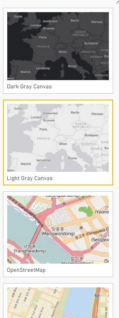
Click on Basemap
 and you can choose among four different canvas: Dark Grey, Light Grey, OpenStreetMap, Streets.
Map theme  option sets the way the “bubbles” are represented on the map:
- Location only -> Small points on the same size and color
- Heat map -> color gradient showing the relative density of points on a map, ranging from cold colors (low density) to hot (high density). Especially useful when the points are close together or overlapping.
- Size -> points of the same color and different size according to the measure, in our example Total passengers.
- Color -> points of the same size and different color according to the category, in our example Country.
- Size & Color -> points of different sizes and colors according to measure and category, as we set up in the example
- Clustering -> another visualization mode when points are very close and it’s hard to distinguish the exact location. Points are grouped together into a circle which shows the number of occurrences in the area.
The Symbol style menu lets customize the look of the map markers: dimension, shape, transparency, etc. It is worth spending a word about Classification type, i.e. the way ArcGIS creates clusters from your data.
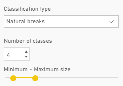
You can choose the classification type, the number of classes in which every measure falls, and the relative dimension for your bubbles by setting up graphically the minimum and maximum size.
Pins  menu allows to add some interactivity to our map and to perform some sort of spatial analysis.
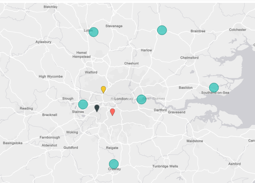
Let’s say you’re a sports enthusiast and you want to go London to visit some “sports temples”: Wembley for football, Twickenham for rugby and Wimbledon for tennis.
As you know, London is served by many airports. Which one is best located with respect to your destinations? Here’s where ArcGIS can help you.
First of all, let’s place the airports on a map. I prepared a small dataset with London airports name and coordinates. You can download it from the bottom of the article. Import the dataset in Power BI as usual as Text/CSV. Then, select the Latitude field got to Modeling > Data Category > Latitude. Do the same for Longitude.
Now plot the points on the map. Click on the ArcGIS visual and an empty rectangle shows up on the canvas. Drag and drop Latitude and Longitude from the dataset to their respective boxes and you’ll have the airports on the map. Add Airport to Location, just for having the airport’s name as well.
But the points are too small; we want to make them bigger. Click Edit and in the map’s menu select Symbol style. set the Symbol size to 30px. The next step is to add the relevant points on the map, in order to have a visual comparison. In the map’s menu select Pins. With this feature you can find some POI (points of interest) and place them as markers on the map.
In the box Search for locations
 start typing the first POI: Wimbledon.
Write Wimbledon and the combo suggests you some results: the right one is “Wimbledon Park Tennis Court, Home Park Road, London, England, SW19 7, GBR”. Select it from the dropdown and you’ll see a red marker placed on the map. Do the same search for
- Twickenham Rugby Ground, Rugby Road, Twickenham Middlesex, England, TW1 1 GBR
- Wembley Stadium, Olympic Way, Wembley, Middlesex, England, HA9 0, GBR
The final outcome is a map with three markers showing the position of our destinations compared to airports. Turns out that the closest airport to all sites is Heathrow, which should be our first choice when planning the trip.
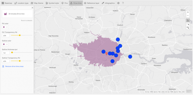
With the Drive time  menu item you can create a search area for features that are either drive-time or distance areas from a selected POI.
To continue with the previous example, after visiting sporting spots, you are tired and thirsty. What’s better than visiting a brewery to get some rest and taste a good craft beer?
The file LondonBrewery.txt lists some breweries in London and surroundings. How many of them fall within a driving distance of 30 minutes or a radius of 3 km?
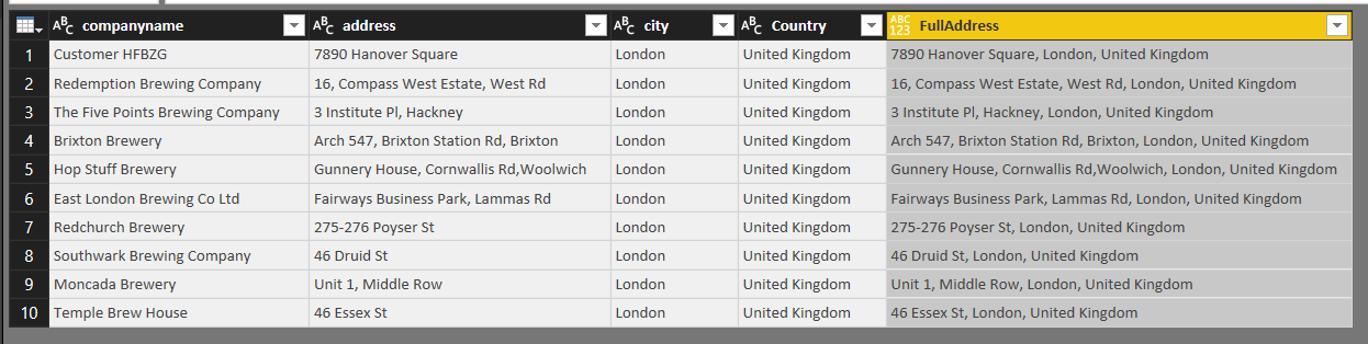
Let’s start getting some data. Import the file LondonBrewery.txt as Txt/CSV. Note that the file has a custom pipe symbol as delimiter. While importing select Edit, we have to make some changes. Power BI opens the file in the Query Editor. In the Home ribbon select Use First Rows as Headers. The file is made of four columns: companyname, address, city and Country. In order to pass geographical location to ArcGIS, we need to gather all infos in one single column. Click Add Column > Custom Column. In the dialog Add Custom Colom rename the column as FullAddress. In the Custom column formula box enter the following formula:
[address] & “, ” & [city] & “, ” & [Country]
This creates a new column with the full address for every row in the dataset.
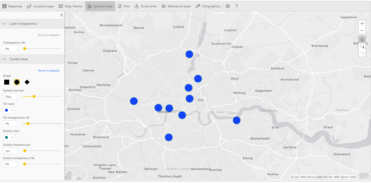
Save your changes. Then click Home > Close & Apply. Create a new page in your report and click the ArcGIS visual. This time we don’t have coordinates, but addresses to pass to the geocoding engine. If the address is properly formatted, ArcGIS can geocode it. Drag and drop FullAddress into Location. Some points are plotted onto the map. Just for knowing the brewery name, drag and drop companyname into Tooltips.
The points are too small. We want to enlarge them and to change the default color. Click Edit > Symbol style and set the dimension to 30px. Then on Fill color set the color you want. I’ve chosen a deep blue, with no transparency.
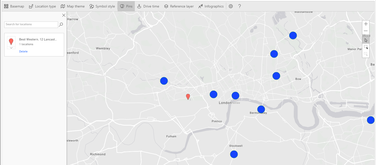
Now we got destinations; what is the starting point? Suppose, for instance, that you’re based in a Best Western hotel in Lancaster Gate. Select Pins on the map’s menu and start typing Best Western Lancaster Gate. ArcGIS should find for you the following address: “Best Western, 12 Lancaster Gate, London, England, W2 3, GBR”. Select the hotel and a red marker appears on your map.
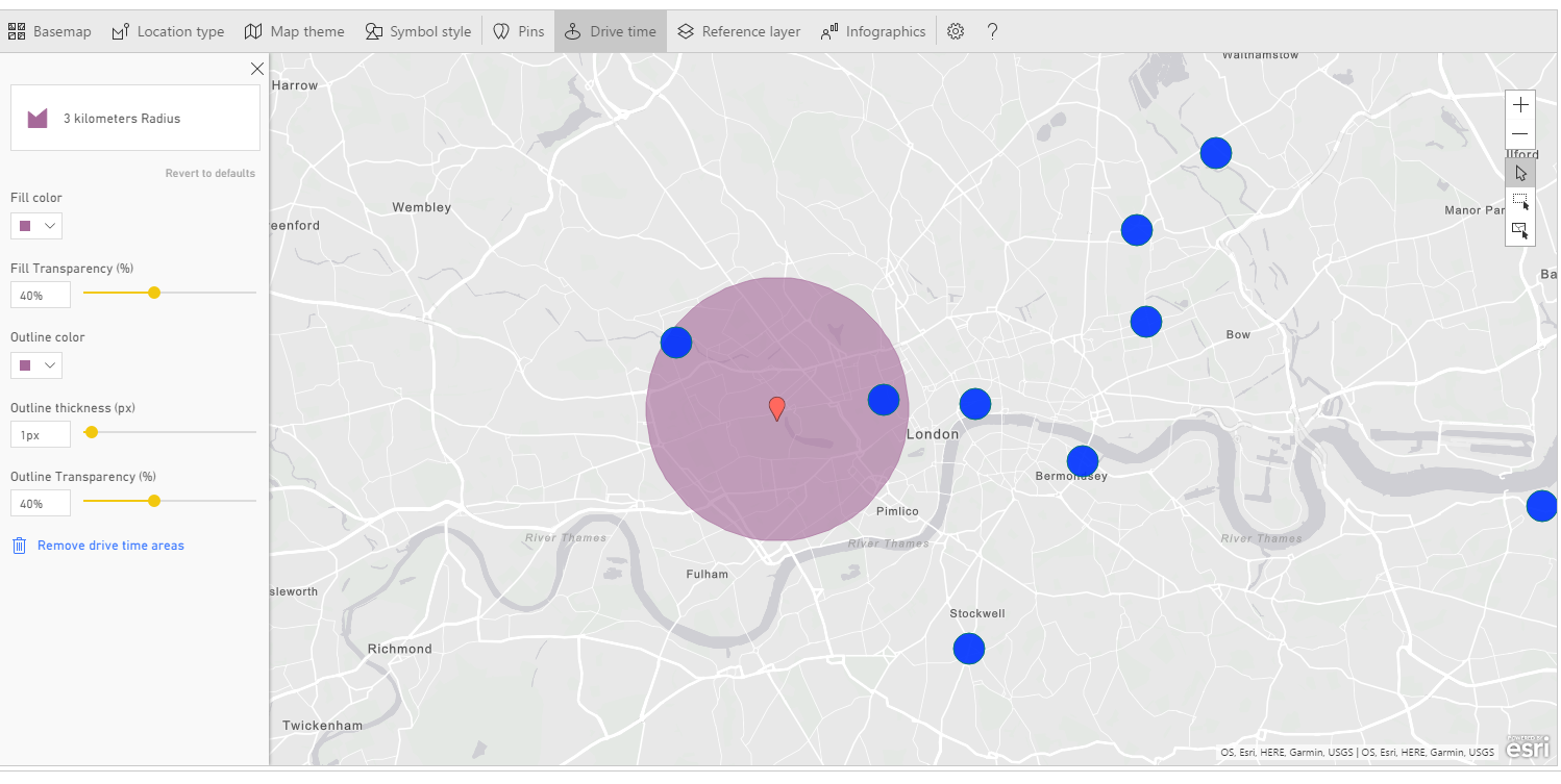
This in the starting point. Select the menu item Drive Time, and then select the marker on the map. When one point is selected the menu on the left changes.
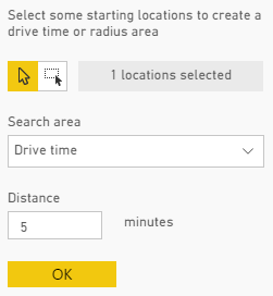
You can choose among Drive time or Radius. Write 30 instead of 5 in the white box and press OK. ArcGIS displays a filled area representing all the streets within a 30 minutes driving distance from the starting point. As you can see, some breweries are inside the highlighted zone, some aren’t. This gives us a clear understanding of accessibility for the sites, based not only on their spatial location, but also on journey calculation.

The other available option is about geographic distance. Click Remove drive time areas to reset the map and select again the red marker.
This time choose a radius of 3 kilometers (note you have many options as measure unit) and press OK. Note the different outcome. This is the circumference around your starting point inside the set radius.
According to the type of analysis you’re performing, you can prefer one or the other visualization.
Another powerful feature of ArcGIS is Reference Layer  , which allows you to add a layer to a map. This is a key feature, as layering is a very effective way to visualize and compare data. Just figure out that you can overlap filled areas along with points to show how continues and discrete distributions are correlated.
Open a new Power BI Desktop report, or add a new page to an existing one. Click on the ArcGIS visual and add it to the canvas. Drag and drop the following fields into the visual’s boxes:
Dataset Top_world_airports:
Latitude > Latitude
Longitude > Longitude
Dataset passengers traffic statistic 2016
Total passengers > size
Country > Color
For a better understanding of the example, filter the map only for USA. Scroll down the Filters menu, expand Country and check the voice United States.
Now edit the visual and click on Reference Layer. It shows up a lateral frame with two options: Demographic and ArcGIS. Demographic refers to a series of ready-made layers from Esri with data such as income, population, density, education etc.
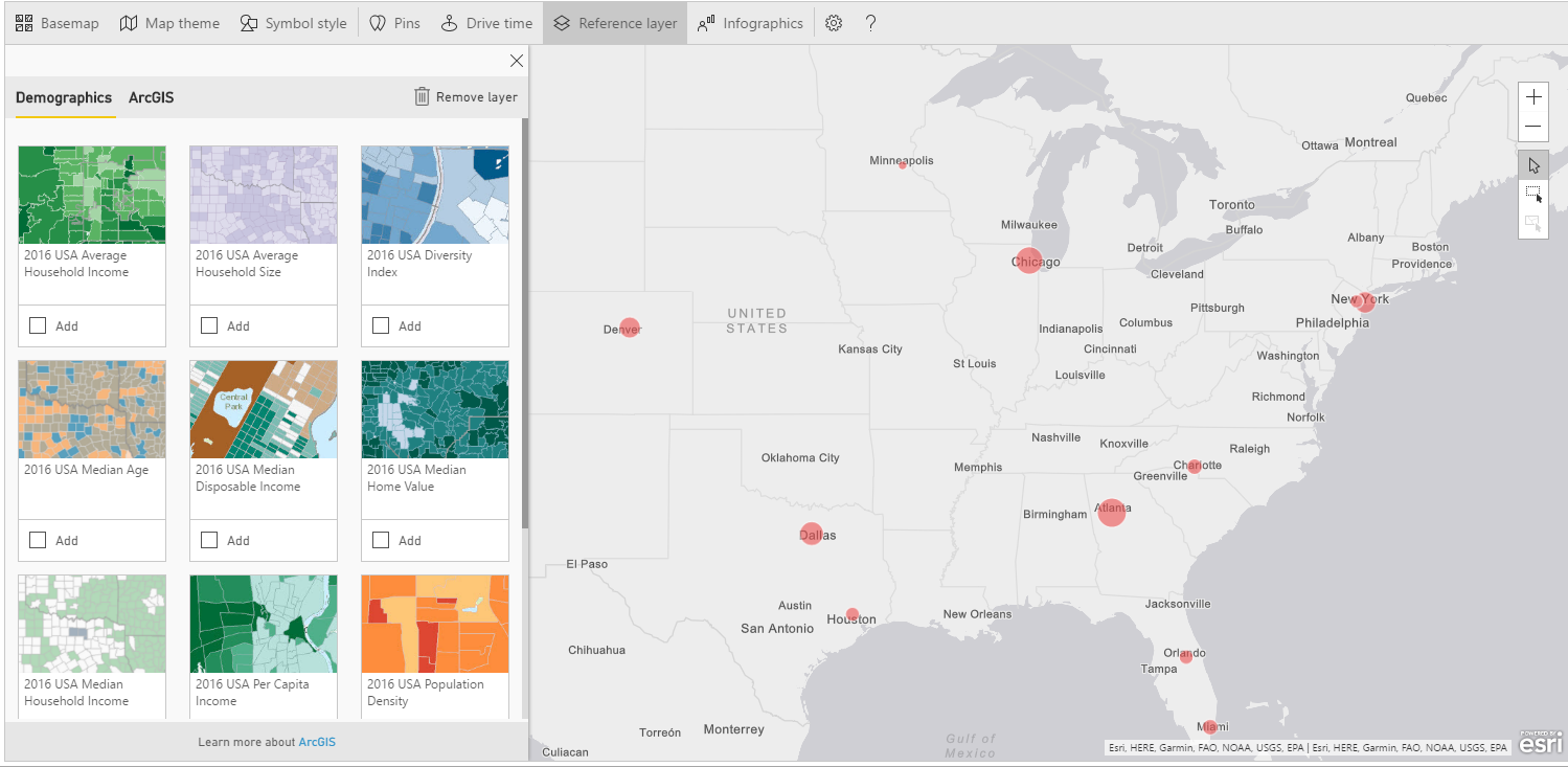
Let’s say we want to compare the number of passengers to the population distribution to get evidence of any correlation. Scroll the layers until the one called “2016 USA Population Density” and click Add.
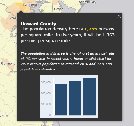
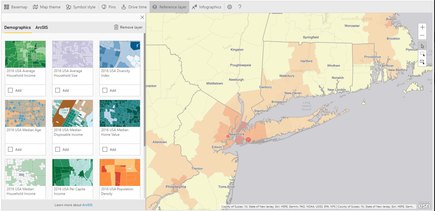
A new layer is added to the map showing population density for every county in USA. Color ranges from yellow (lower density) to dark orange (higher density). By clicking on a single county, you get population related data.
If you zoom into the airports surrounding areas (i.e. New York), you can actually see that the counties are darker, showing a direct correlation between airport traffic and population.
More or less, we have got the same outcome adding the “2016 USA Average Household Income” layer, from which we can see that wealth is mainly distributed around big cities.
Take into account that you can display only a layer at time. Furthermore, built-in data are available only for USA. If you wish to add a different layer you can turn to ArcGIS Community and Reference Layers.
To delete a layer simply click Remove Layer

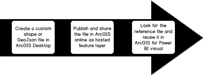
The other Reference Layer’s option ArcGIS allows you to search for publicly shared feature layers on ArcGIS Online. These are layers created by users and made available for the community by publishing them on ArcGIS Online. Custom reference layers can contain any kind of geographical information in any format (shape file, GeoJson, etc.). If you aim to add more than two layers to your visualization, this is the only way. But, of course, you must be capable of manipulating files using a GIS tools (ArcGIS Desktop, QGIS….).
Once you’ve created the layer, you can import it into ArcGIS Online and share it. Another downside is that you need an ArcGIS account and you have to pay for it.
If you want to try, you can sign up for a free 60 days demo. Once the period is expired, the account becomes unavailable unless it is turned into a paid subscription.
Just to give you a quick recap, these are the steps for creating a custom reference layer.
For the demo of the custom reference layer, let’s move to Europe. Create a new report with the same settings as below:
Dataset Top_world_airports:
Latitude > Latitude
Longitude > Longitude
Dataset passengers traffic statistic 2016
Total passengers > size
Country > Color
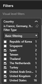
And filter for European countries: France, Germany, Italy, Spain, The Netherlands, Turkey, United Kingdom.
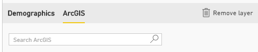
Edit the map click Reference Layer > ArcGIS. You’ll be prompted to a search window.
If you write some words and click the lens, you’ll get the layers that match your search as output. Type for example, river, train, volcanoes.
For this demo, we want to compare the amount the population along with airports passengers, so search for the following layer: Demography_of_Europe_1
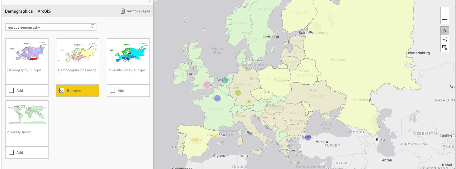
Add the layer to the map; as in the previous example you can get demographics info by clicking on each country. Even in this case we can found out a direct correlation between population and passengers.
The last item in the menu bar for ArcGIS visual is Infographics. Basically, it consists of “cards” placed on a map to display some kind of info. If you click on the voice, you can see all the available data.
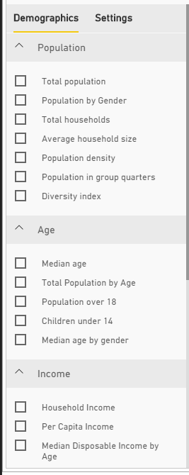
To test the operation of Infographic, filter again USA as country in the report. Then try to add an infographic “Total population” for instance. White windows shows up in the upper right corner with the Total population number.
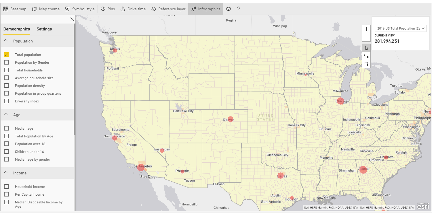
Note that infographics is responsive and interacts with the map itself. The number displayed in the card changes according to your selection. Try to zoom in or out into the maps and see how the Total population varies to display only data for the highlighted area.
You can even add more infographics to you map by simply selecting and deselecting each one.
Unfortunately, this feature is available only with data for USA. If you change the map’s focus to another area, you won’t be able to see any data.
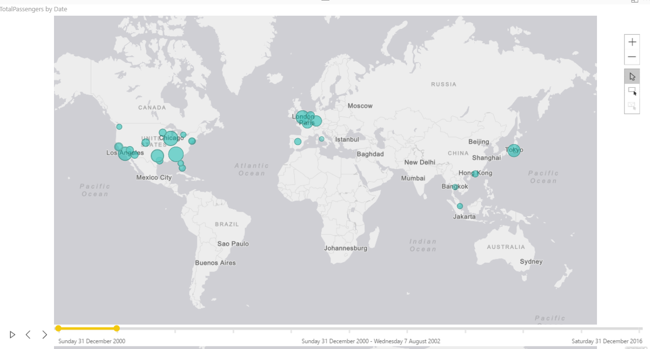
The last feature, Time, performs a time analysis of the map, showing the evolution of a certain measure over the time. For this demo, download and import the dataset airport_passengers_time.csv: Get Data > TXT/CSV > Load.
The dataset contains the number of passengers for the world’s busiest airports ranging from 2000 to 2016. The source is as usual Wikipedia. I’ve added a Date set by default to the end of every year (31/12/2000, 31/12/2001, …) as ArcGIS requires a date/time format field for time analysis.
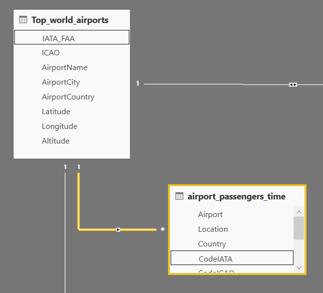
Join the airports’ code to the dataset Top_world_airports in order of getting coordinates for every airport.
Go to Relationships and set the following relationship:
Top_world_airports/IATA_FAA -> airport_passengers_time/CodeIATA
Create a new report, click on ArcGIS visual and add the following fields:
Dataset Top_world_airports:
Latitude > Latitude
Longitude > Longitude
Dataset airport_passengers_time
Total passengers > Size
Date > Time
ArcGIS adds a timeline at the bottom of your map, with interval dates at every end.
You can either move the yellow slider over the control, or click play for continuous animation. The map rolls by the years showing a clear shift of traffic volumes from Western countries (USS, Europe) to Asia.
By default, ArcGIS divides the time frame into 10 intervals. Drag the handles at the end of the slider if you want to change the visible intervals.
Wrap up
ArcGIS takes maps visualization in Power BI a leap forward. It is the visual you should rely on for drawing maps, based on industry leader cartography. Furthermore, you can perform some spatial analysis for a better understanding of your data and for revealing relationships and patterns that can help stakeholders to make the right decisions.
References
- What is GIS?
- Geographic Information System
- Announcing ArcGIS Maps for Power BI by Esri (Preview)
- ArcGIS Maps for Power BI is now Generally Available on PowerBI.com
- Power BI and Esri ArcGIS
- ArcGIS Maps for Power BI 1
- ArcGIS Maps for Power BI 2
- List of busiest airports by passenger traffic
Downloads
- Top_world_airports.csv
- passengers traffic statistics 2016.csv
- LondonAirports.txt
- LondonBrewery.txt
- airport_passengers_time.csv
Table of contents
| How to create geographic maps using Power BI – Filled and bubble maps |
| How to create geographic maps in Power BI using built-in shape maps |
| How to create geographic maps in Power BI using custom shape maps |
| How to create geographic maps in Power BI using ArcGIS |
| How to create geographic maps in Power BI using R |
| Customized images with Synoptic Panel |
| MapBox |
| Geocoding |

Common tasks: Database development and monitoring, data warehousing, creating BI solutions and reporting, data analysis.
MCTS certificated: SQL Server Developer.
Speaker at SQL Saturdays, and other conferences in Europe.
Author for SQLShack and UGISS (User Group Italiano SQL Server).
- How to create geographic maps in Power BI using R - August 1, 2019
- How to create geographic maps in Power BI using ArcGIS - August 11, 2017
- How to create geographic maps in Power BI using custom shape maps - June 22, 2017