

In this article, we will explore charts in an Azure Data Studio using data stored in SQL Server tables.
Introduction
Images, charts help to visualize the data in an informative way. It is an easy way to understand the data and perform analysis on it. An image is worth thousands of words. Suppose you have an employee data set and your management wants to view a high-level summary of it. You might create a Microsoft PowerPoint presentation. It is not feasible to share the data in a tabular format. Your audience might not understand the data if we share the data itself.
Usually, we use to extract the data from a SQL database, copy it in Microsoft excel and creates the required Chart from it. We can also use various tools such as SQL Server Reporting Service ( SSRS), Power BI to import data and create charts, visuals from it directly. These tools work fine; however, it requires additional steps to install these tools, have intermediate knowledge of it. You might require to do this with different data set, and every time, you cannot create a separate visual using Power BI or SSRS. In this type of requirement, the most common useful tool is Microsoft Excel. You can also use PowerShell, but it again requires you to have PowerShell script knowledge. You can go through the article How to create charts from SQL Server data using PowerShell to create charts from PowerShell.
In this article, we will explore creating charts from SQL Server data without exporting it to separate tools Microsoft Excel, SSRS or Power BI.
An overview of SQL Server client tools
SQL Server Management Studio
SSMS is a popular client tool to work with SQL Server. It is a helpful tool for both SQL developers and DBAs. It is a standalone application and receives regular updates, bug-fixes. You can download the SSMS from the Microsoft Docs.
Azure Data Studio
It is a new cross-platform client tool that works on both Windows and Linux operating systems. It also provides features such as integrated terminal( SSH, PowerShell), extensions features, code snippets, source control integration. You can download Azure Data Studio from the link.
I would recommend you to go through Azure Data Studio articles to learn more about its useful features.
Azure Data Studio for creating charts using SQL Server data
ADS provide you with an integrated output terminal to prepare various kinds of Chart from SQL Server data.
Launch ADS, connect to a SQL instance and execute the following query in the [AdventureWorks] database. If you do not have this sample database, download the backup file from the link.
|
1 2 3 4 5 6 7 8 9 10 11 12 13 14 |
SELECT CASE Gender WHEN 'M' THEN 'Man' WHEN 'F' THEN 'Woman' ELSE Gender END + ' ' + CASE MaritalStatus WHEN 'M' THEN 'Married' WHEN 'S' THEN 'Single' ELSE MaritalStatus END as SexAndMaritalStatus, COUNT(*)as OccurCount FROM HumanResources.Employee GROUP BY Gender,MaritalStatus |
It gives you Employee data records from the [HumanResources].[Employee] table and group them according to the Gender and MartialStatus column.
You get query outputs in the results tab.
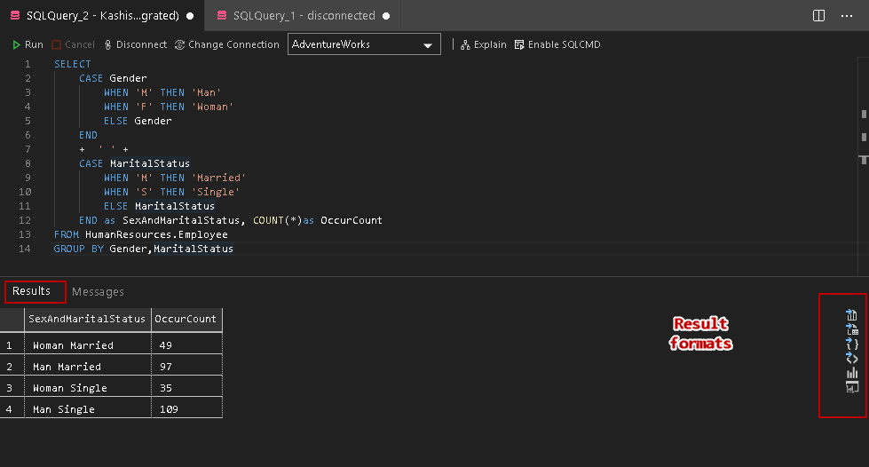
In the above image, you get many result formats:
- Save results in CSV format
- Save results in Excel format
- Save results in a JSON format
- Save results in XML format
- Charts
- Visualizer
Explore charts features in the query results
In the results format, click on Chart, and you immediately get the following bar chart with default properties.
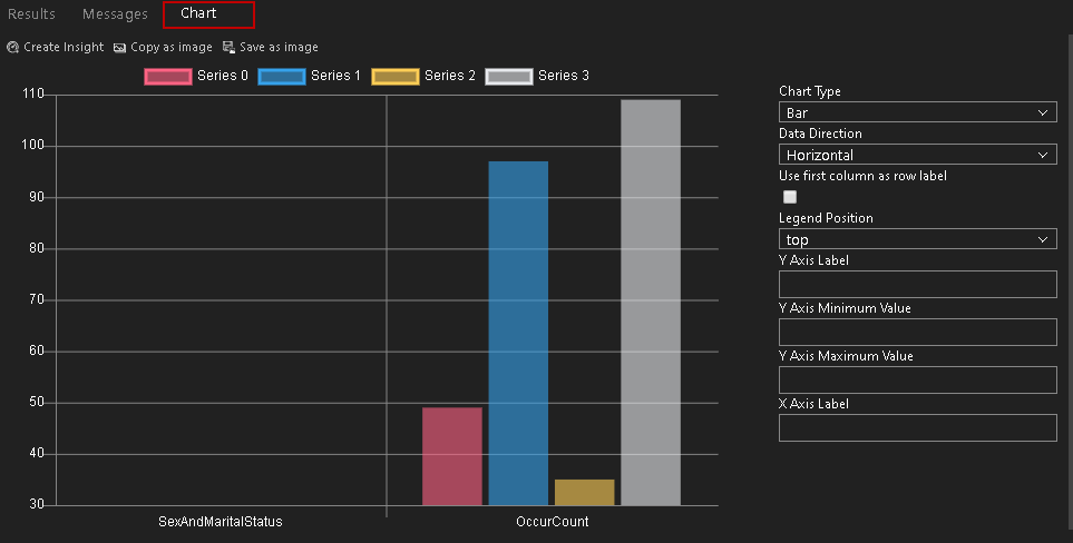
You get the following charts type in Azure Data Studio:
- Bar
- Horizontal Bar
- Line
- Scatter
- Time series
- Table
- Count
- Image
- Doughnut
- Pie
Let’s explore a few of useful charts and their configurations.
Bar and Horizontal charts in Azure Data Studio
We get various configuration options to get the charts suitable for our data.
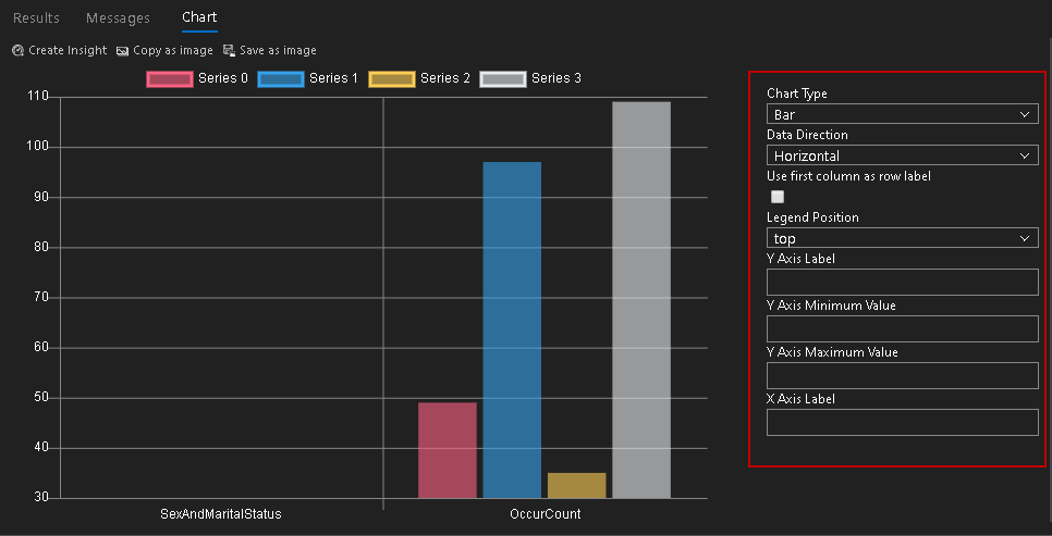
Data Direction: In this column, we can choose horizontal(default) or vertical data direction. In the above image, we do not get the correct bar chart because it shows all columns horizontally
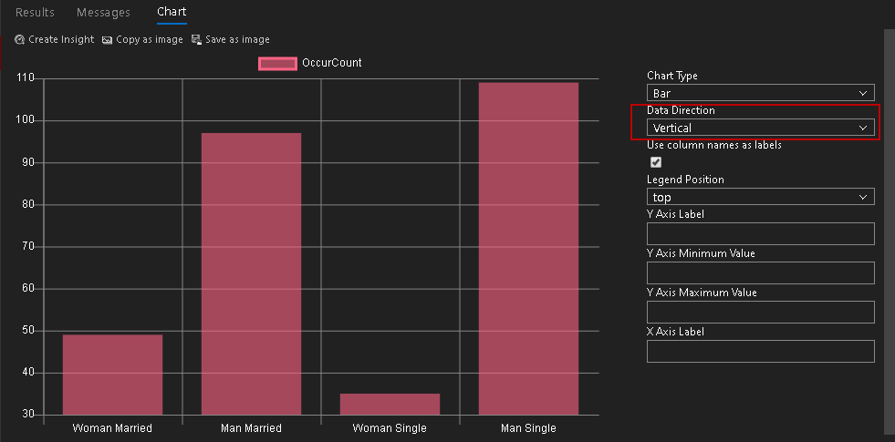
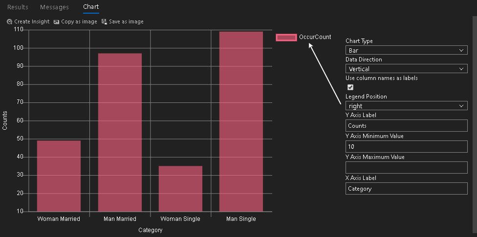
Let’s change it to Vertical data direction, and you get the following chart

It automatically put a tick on the Use column names as labels. We can see that it shows employees’ data according to the [MaritalStatus] column.
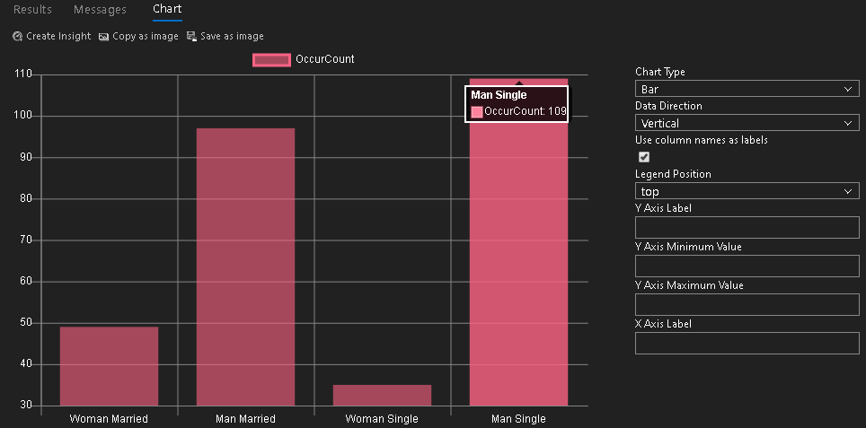
We can hover the mouse in the chart area to check the actual data points
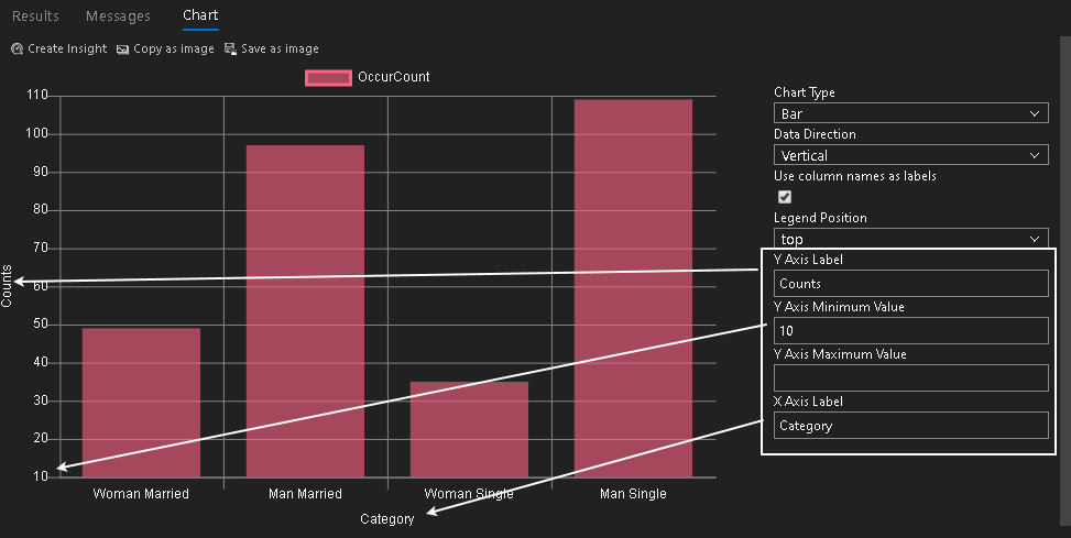
Apart from this, we can choose the labels for both the X and Y-axis. It also allows us to set minimum and maximum value for the axis. For example, in the above image, we can see it starts minimum value for the y-axis from 30. In the below screenshot, I change it to 10
Legend position by default, chart shows legend at the top of the chart. We can change this position to bottom, left, right and none (disable). In the below image, we see the right legend position. In this position, it places the legend to the right side of the chart
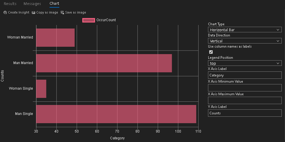
Let’s switch the chart type to Horizontal Bar. It arranges the bars from a vertical position to horizontal
We have similar configuration options in the horizontal chart type as well. You can note here that in the above image, we get configurations for x-axis minimum and maximum values while in the bar chart it gives Y-axis configurations
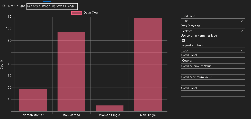
You can also copy this chart or save it as an image using from the chart area
Copy as image: It copies the Chart as an image in the clipboard. You can paste this image in other programs such as Microsoft Word, Excel, paint
Save as an image: Click on Save as image and specify a directory to save this image file
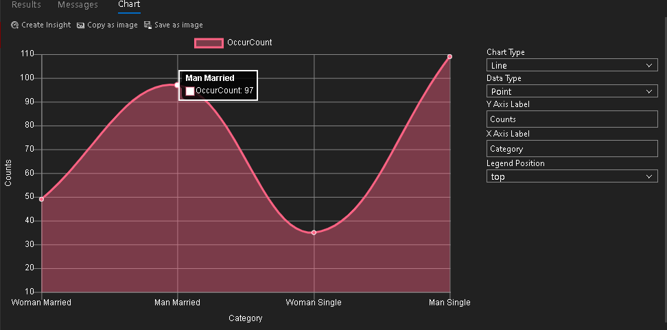
Line chart
A line chart generates a plot or curve chart according to the data points. We can change the chart type from the default bar type to the line Chart, and it generates the following line chart for our result set.
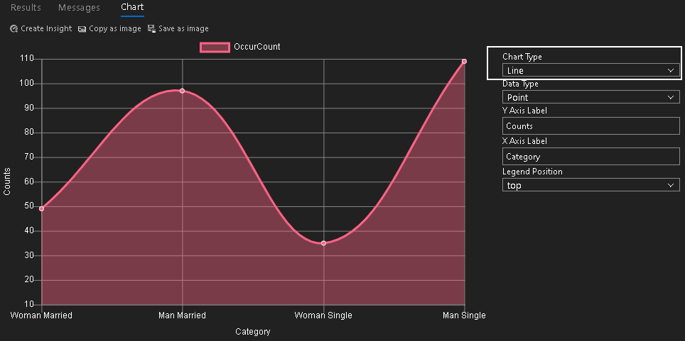
We can point over any data point, and it shows you values for it in a tooltip.
Pie and Doughnut chart in Azure Data Studio
A Pie chart provides a circular statistical graphic. It divides the circle based on the data frequency. In our example, it divides the Chart as per the count of each category.
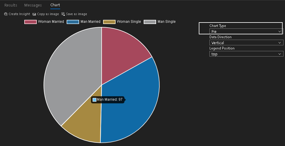
You can see different area size for each category. For example, we have the lowest count for women single, and it gets the lowest area in the pie chart.
We can quickly move to the Doughnut chart from a pie chart. It is also known as the Donut chart. It looks similar to a pie chart except it provides a round hole in the center. It got its name from Doughnut because it looks similar to a Doughnut.
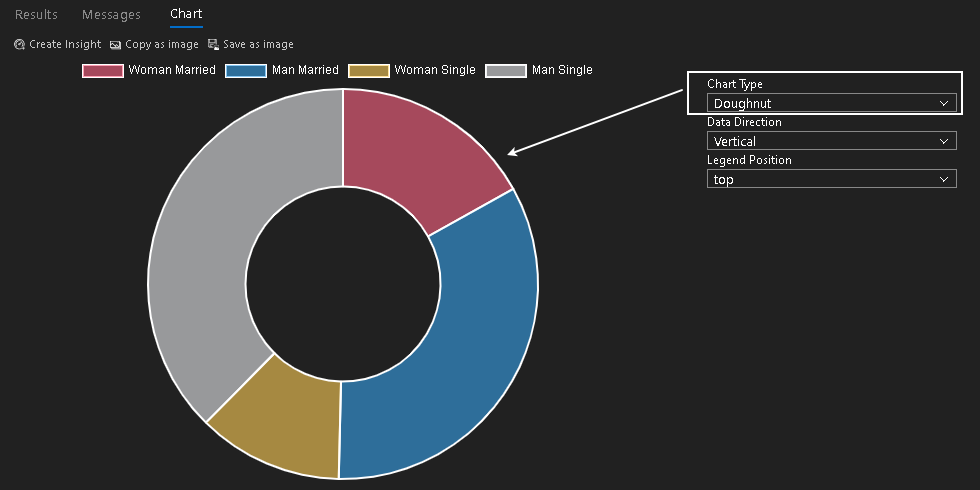
Table chart
In the table chart, we get the same in a tabular format, as shown below. It might look similar to a query out. The difference here is that you can create insight from this Chart. A chart insight is not in the scope of this article. I will cover it in a separate article. Meanwhile, you can go through a custom insight widget article on Microsoft docs.
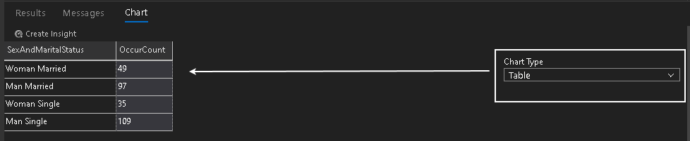
Image chart in Azure Data Studio
It is a new chart type. Click on it, and you get following a big cross image because our result does not contain the binary form of an image.
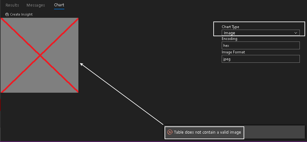
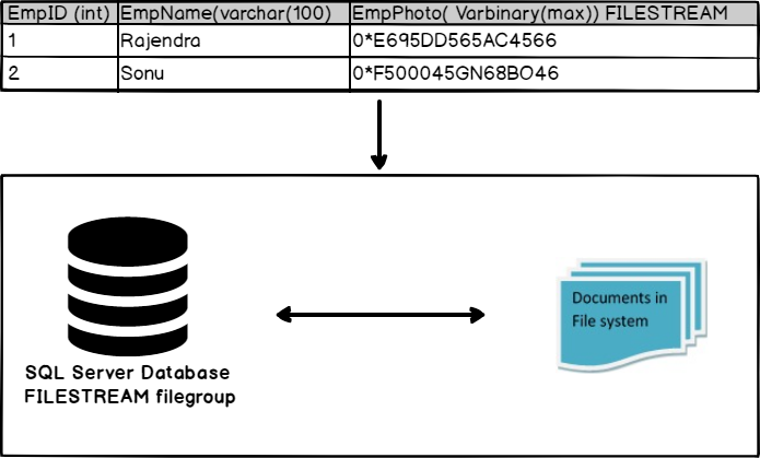
It requires binary data for an image file to retrieve the image and show it in the Chart. SQL Server FILESTREAM and FILETABLE allow us to store the BLOB(Binary Large objects) in the file system with keepings its metadata into SQL tables. You can refer to FILESTREAM staircase on SQLShack.
In the following image, we get a high-level overview of SQL Server FILESTREAM.
Let me outline the high-level steps in this article.
- Enable FILESTREAM and configure access levels
- Create a new database or add a FILESTREAM filegroup in the existing database
- Insert metadata from the objects stored in a local disk
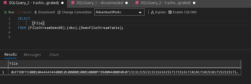
You can go through the FILESTREAM articles and prepare a SQL table for it. I have the following binary data in the [DemoFileStreamTable].
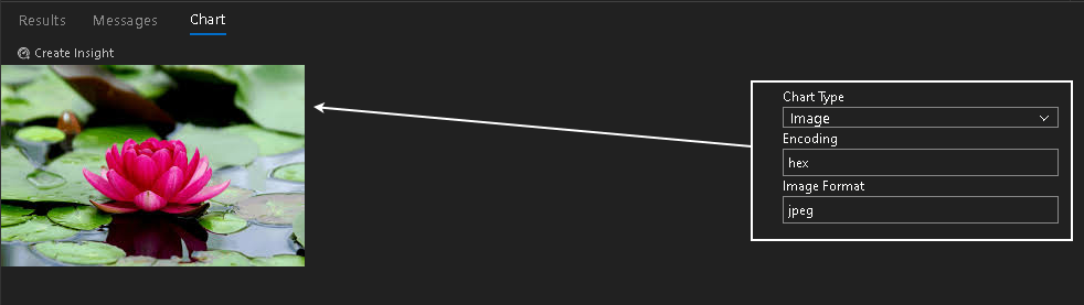
Now, move on to the Image chart, and you can see it retrieves the image.
Conclusion
In this article, we explored that Azure Data Studio provides an integrated option for charts in the query results. We can create various charts without exporting data to Microsoft Excel or other client tools. I found it as a cool feature of ADS. You should explore it and be familiar with it.

I am the author of the book "DP-300 Administering Relational Database on Microsoft Azure". I published more than 650 technical articles on MSSQLTips, SQLShack, Quest, CodingSight, and SeveralNines.
I am the creator of one of the biggest free online collections of articles on a single topic, with his 50-part series on SQL Server Always On Availability Groups.
Based on my contribution to the SQL Server community, I have been recognized as the prestigious Best Author of the Year continuously in 2019, 2020, and 2021 (2nd Rank) at SQLShack and the MSSQLTIPS champions award in 2020.
Personal Blog: https://www.dbblogger.com
I am always interested in new challenges so if you need consulting help, reach me at rajendra.gupta16@gmail.com
View all posts by Rajendra Gupta
- Understanding PostgreSQL SUBSTRING function - September 21, 2024
- How to install PostgreSQL on Ubuntu - July 13, 2023
- How to use the CROSSTAB function in PostgreSQL - February 17, 2023