
This article is next in the Azure Databricks series, where we will learn how to connect data in Azure Databricks to the Power BI Desktop. We will also talk briefly about visualizations in the Databricks service.
Azure Databricks (an Apache Spark implementation on Azure) is a big data analytics platform for the Microsoft cloud – Azure. This fast service offers a collaborative workspace for data scientists & Business analysts and also integrates seamlessly with Azure services and several BI tools like Power BI, Tableau, etc.
With boatloads of data being generated each second and still growing as I am writing, visual representation (like graphs, charts, maps, etc.) of this data provides a comprehensible approach for data engineers to discover quick insights about it by detecting patterns, trends, and outliers.
When talking about visualizations, Power BI Desktop is one of the powerful tools that provide rich and interactive visualizations with a plethora of default and custom visuals. This tool is not only limited to creating visualizations but also lets you transform, clean the data, and also publish it to the Power BI Service, which is a cloud-based service.
In a nutshell, both Azure Databricks and Power BI are powerful chambers for big data exploration, analysis, and visualization. Using Databricks in Power BI Desktop allows us to lever fast performance benefits of it for all business users. Since all business users won’t be comfortable in using Azure Databricks, Power BI Desktop, being a drag and drop software, is a relatively simpler interface for all business users to use.
Pre-requisite
I assume you are familiar with Azure Databricks and how to create a Cluster and notebooks in it. In case you are not sure about this, I would recommend to quickly run through this article: A beginner’s guide to Azure Databricks to understand these basics.
Before we go ahead and see the integration of Databricks data with the Power BI Desktop, I would like to take a few minutes to quickly demonstrate some examples of data visualizations available in Azure Databricks.
Make sure you have a Databricks cluster up and running, and a notebook, either Python or Scala is in place. Here I have created a cluster (azdbpowerbicluster) with Python (azdbpython) notebook.
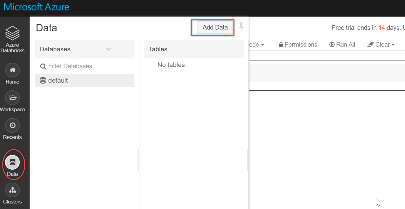
Getting our data
Let’s quickly import data in the Databricks service. To do this, click on the Data icon on the left vertical menu bar and select Add Data:
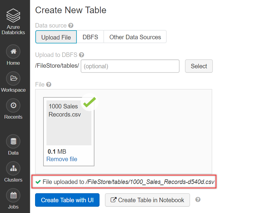
Browse and upload your file, as shown below. In case you want to refer to the file used here in this article, you can get it from here. We are using the one that we have used in our series. This is Sales data per region for different items and channels.
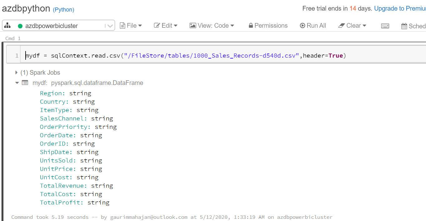
The following code helps to read our csv file into mydf data frame:
|
1 |
mydf = sqlContext.read.csv("/FileStore/tables/1000_Sales_Records-d540d.csv",header=True) |
We are using the display() function to display the results of the CSV file. You may notice the bar chart icon at the bottom side in the below screenshot. Click on the drop-down arrow, located right next to the bar chart icon, this button allows us to visualize data in Databricks and supports a rich set of plot types (like Bar, Scatter, Map, Line, Area, Pie, etc.).
|
1 |
display(mydf) |
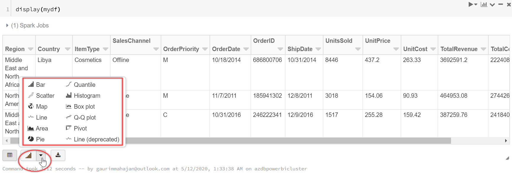
Data Visualizations in Azure Databricks
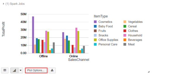
To configure a bar chart, click on the Plot Options… and select fields for Keys, Series groupings, and Values, as shown below. It shows the preview of the chart. Select Apply to plot these values for the bar chart:
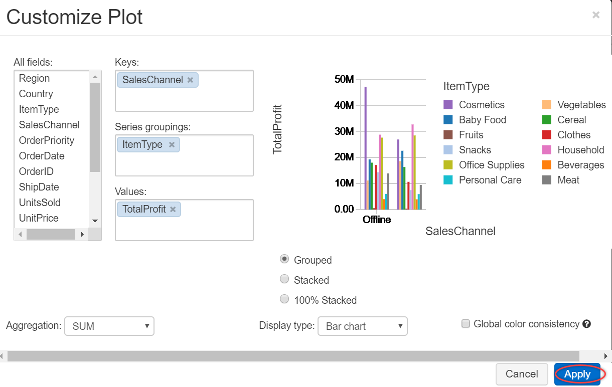
The below bar chart is displayed showing Total Profit values for each Item Type (Cosmetics, Fruits, etc.) and sales platform (Online/Offline)

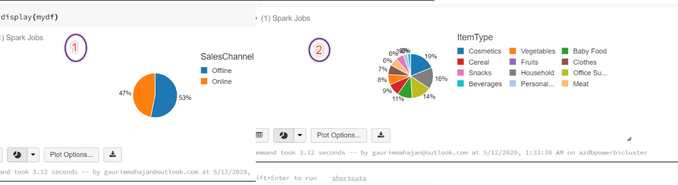
In case you want to choose another chart type, click on the drop-down arrow right next to the bar chart icon, and select the chart type. Suppose, we selected the Pie chart visualization, with customized fields in the Keys, groupings, and Values section, we can plot these charts with a few clicks. Below are a few examples of pie charts:
The above examples were the basic visualizations that are supported natively to visualize data in Databricks service. This quick demo intended to give an idea about its potential and how we can customize the fields to display a variety of charts in the Databricks portal.
If you are interested in learning more about this, you can refer to the Visualizations article. Now let’s move forward and take a peek at how we can integrate data in Databricks with Power BI Desktop and analyze data using powerful visualizations that Power BI has to offer.
Connecting Azure Databricks data to Power BI Desktop
We need to make sure the Databricks cluster is up and running. The following are the steps for the integration of Azure Databricks with Power BI Desktop.
Step 1 – Constructing the connection URL
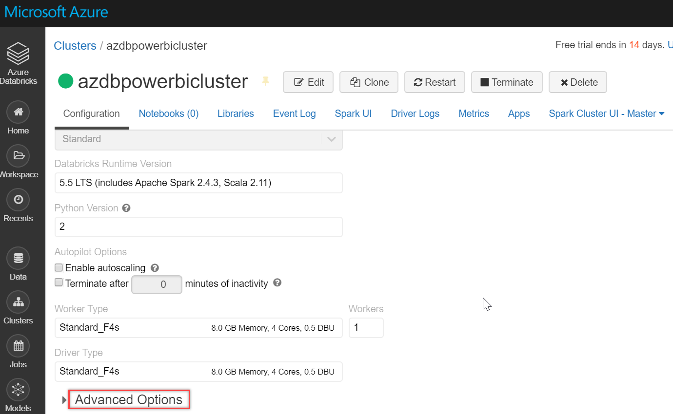
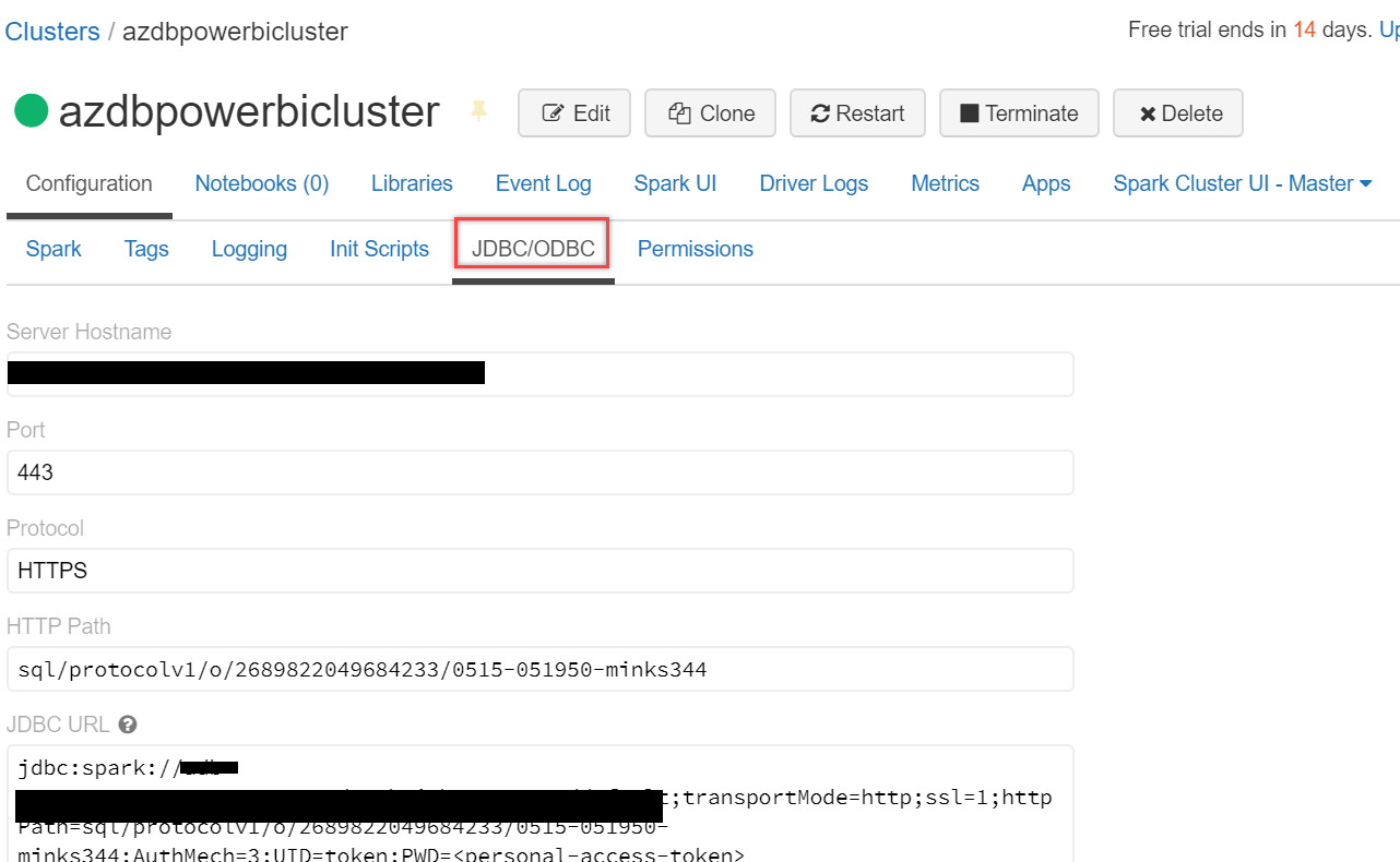
Go to the cluster and click on Advanced Options, as shown below:
Scroll down a little and select the JDBC/ODBC tab. Copy and paste the JDBC URL in a notepad. We will have to tweak this URL to set up a Spark cluster connection in Power BI Desktop:
- First of all, replace jdbc:spark with https:
- Next, we will have to delete a few sections from it, delete from default;transportMode…to ..Path= and again from Authmech… to …token>
- Your final URL should look somewhat like this – https://<region>.azuredatabricks.net:<port>/sql/protocolv1/o/<key>/<key>
- Save it somewhere; we will be using it in Power BI for the connection
Step 2 – Generate a personal access token
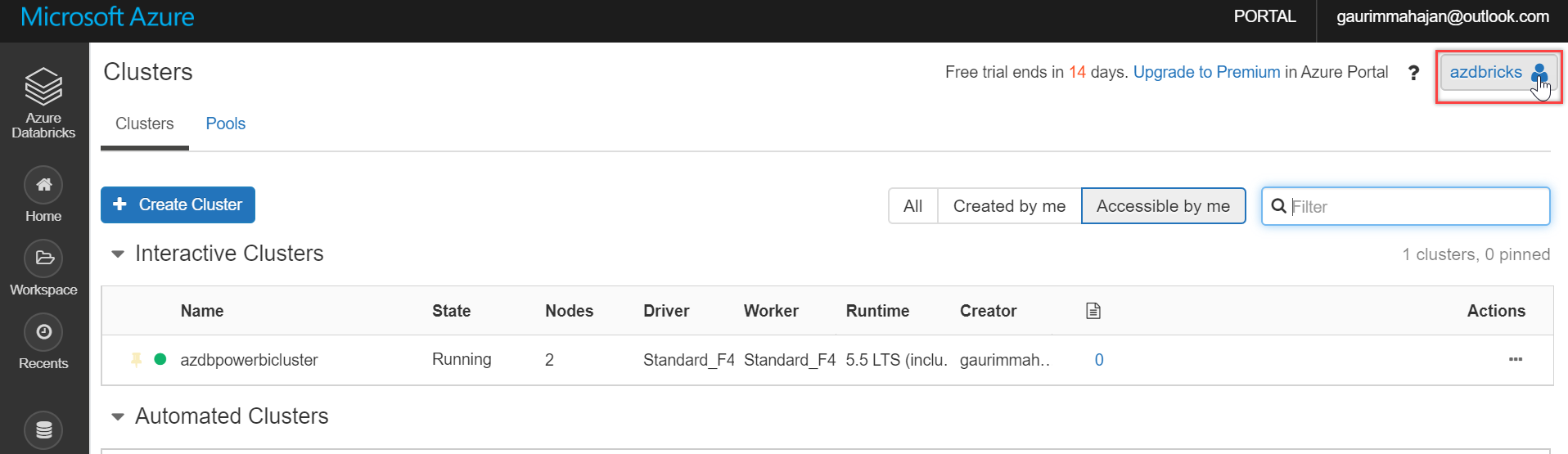
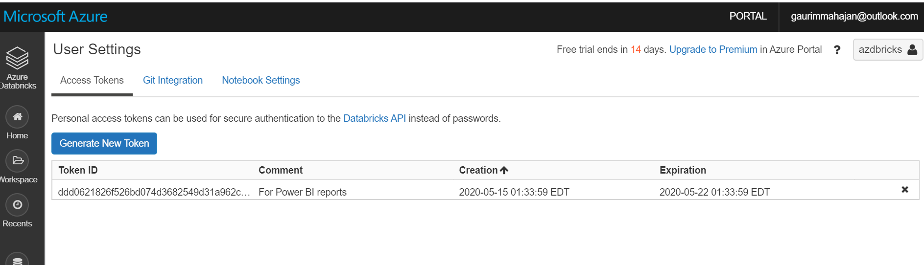
To connect to our clusters, we will need a personal access token in Databricks. To do this, go to the Databricks portal and click the user profile icon in the top right corner of it, as shown below:
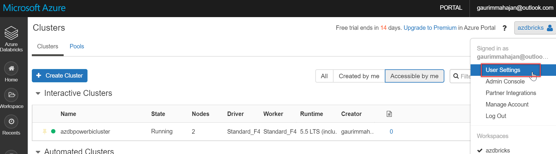
And select User Settings:
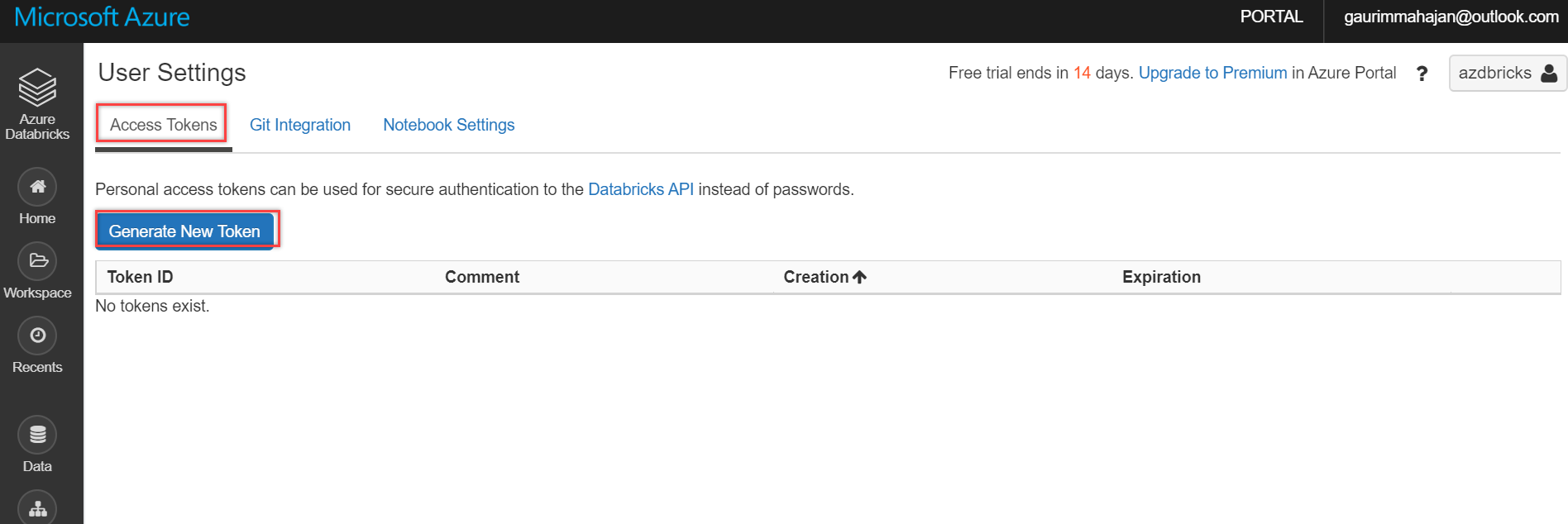
Click the Generate New Token button on the Access Tokens tab, as shown below:
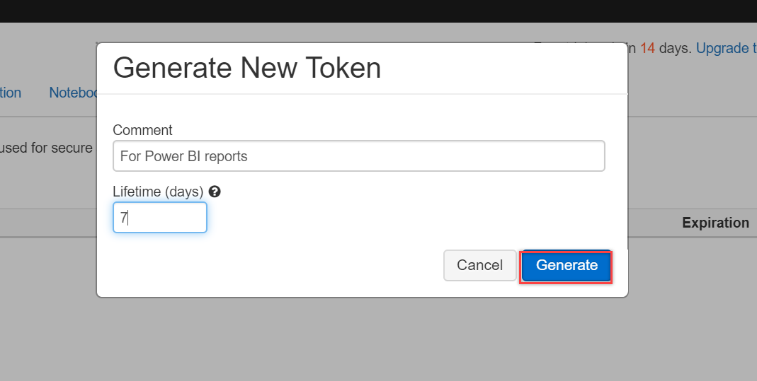
Type in a description for this Token and also mention the period of this Token. For this demo, I am entering the expiration period as 7 days. You can select this value per your business needs. And finally, click the Generate button to create one for you:
Copy and paste the Token in a notepad as you won’t be able to see it again. Once, it is saved, click Done:
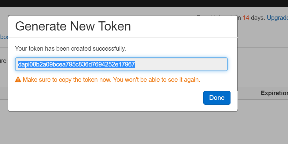
You can see the Token is generated successfully:
Step 3 – Connect with Power BI Desktop
For the integration, we will first have to open the Power BI Desktop app. In case you don’t have it, you can download the latest version from here. We will use the same CSV file, (1000 Sales Records.csv) used earlier in this article, and upload it on the Databricks portal using the Create Table with UI option.
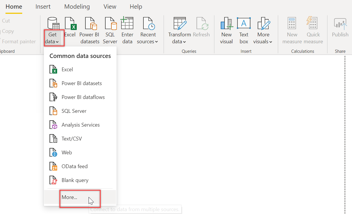
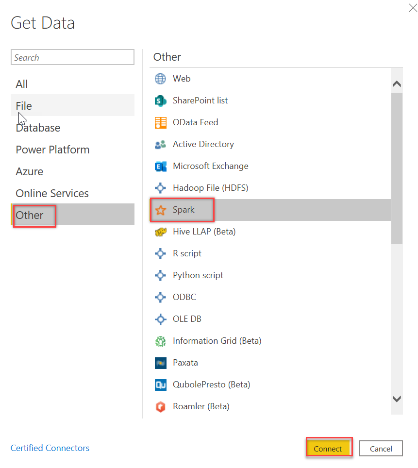
On Power BI Desktop, click Get data drop-down list and choose More… on the Home ribbon:
On the Get Data dialog box, select Other and choose Spark connector. Click Connect:
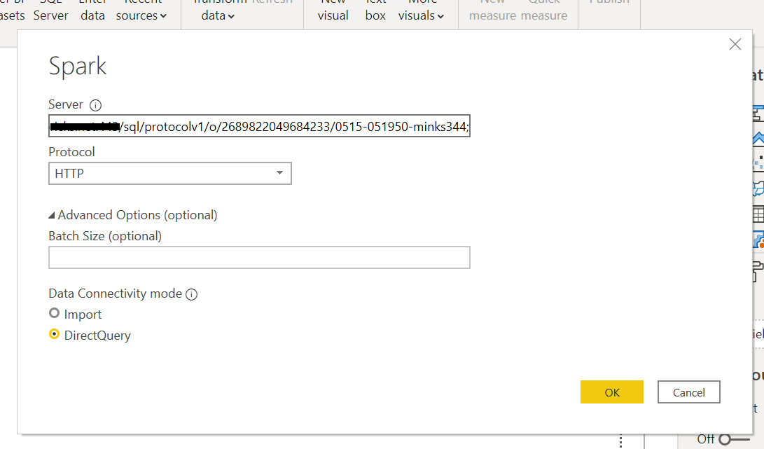
On the Spark dialog box, copy-paste the JDBC URL (created in Step 1) in the Server field. Select HTTP as the Protocol and DirectQuery in the Data Connectivity mode, and click OK:
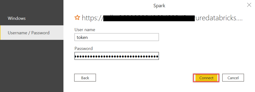
In the next dialog box, type in token as the User name and paste Token value that we generated in Step 2 in the Password field. Then click Connect:
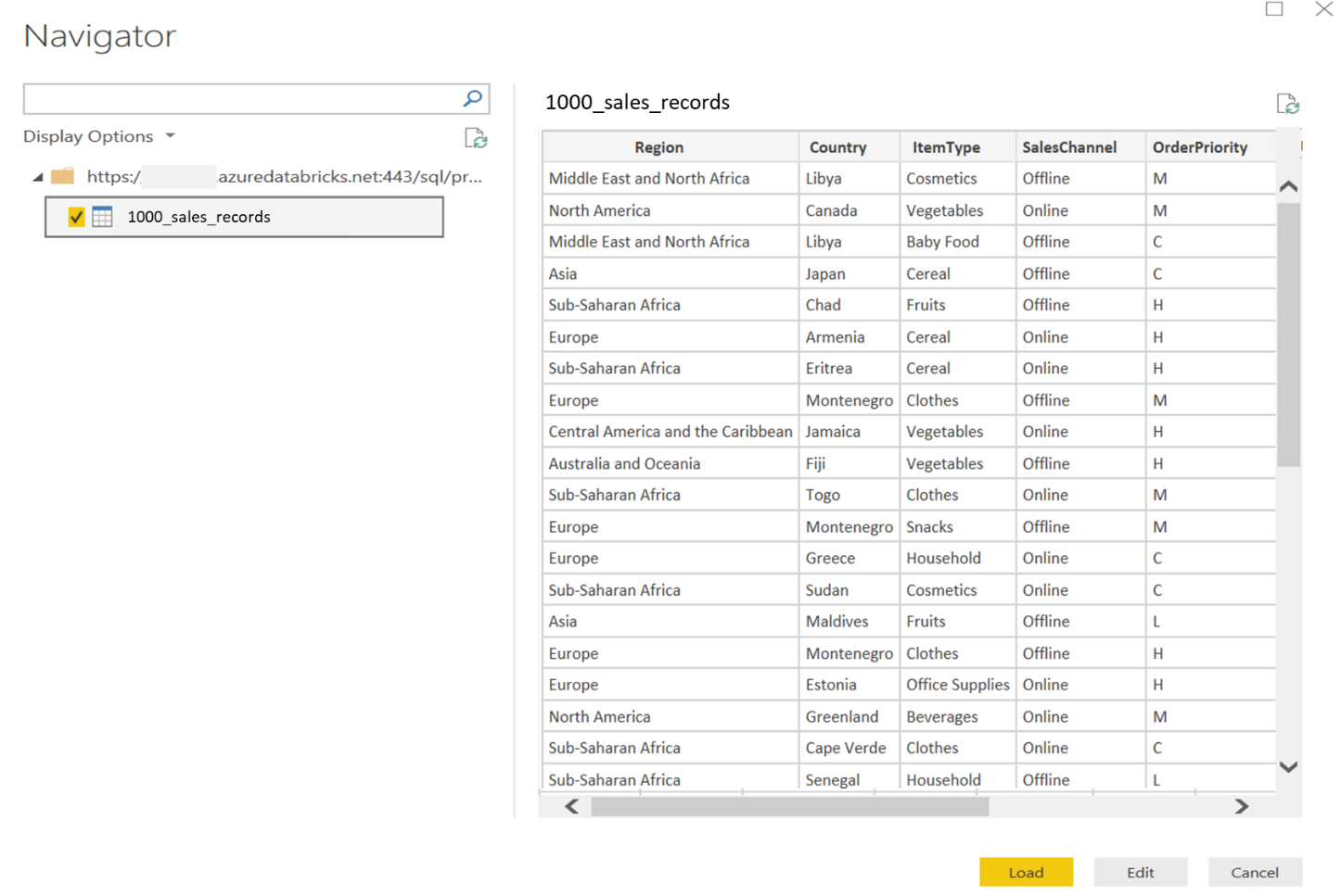
If everything was in place, you should be able to see all the tables available in your Databricks cluster in the Power BI Navigator dialog. You can select the data table(s) and select the Load option to load data or the Edit option to edit this data before loading in Power BI Desktop:
Now you can explore and visualize this data as you would do with any other data in Power BI Desktop. In case you are new to Power BI Desktop visualizations, I would recommend the Visualization types in Power BI article.
Summary
In this article, we learned how, with a few clicks, we can connect Azure Databricks data to Power BI Desktop quickly for rich visualizations to gain better insights about the data. We also covered a few data visualizations available in Databricks service. If you have any questions, please feel free to ask in the comments section below.

She has a deep experience in designing data and analytics solutions and ensuring its stability, reliability, and performance. She is also certified in SQL Server and have passed certifications like 70-463: Implementing Data Warehouses with Microsoft SQL Server.
View all posts by Gauri Mahajan
- Oracle Substring function overview with examples - June 19, 2024
- Introduction to the SQL Standard Deviation function - April 21, 2023
- A quick overview of MySQL foreign key with examples - February 7, 2023