
Introduction
In the two-part SQL Shack article, Build a Google BigQuery Resource, I showed how to build a Google BigQuery resource, and then link it to an Azure SQL Server resource. This article will expand on that first part, showing how to build a BigQuery report with Google Data Studio.
Google Data Studio – an overview
With Google Data Studio, we can build reports and dashboards that visualize data. Data Studio can handle data from many different data platforms, including BigQuery. To build a Data Studio report, first, build the data source. Next, design, build, and configure the report over that data source. Finally, deploy the report.
The Google Data Studio tool
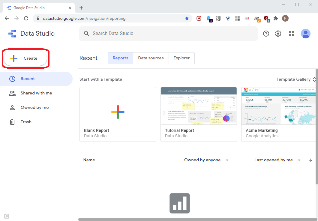
For this article, we’ll build the BigQuery data source and the Data Studio report with the same Google account. First, create the BigQuery ZIP code data resource as explained in part one of the two-part article linked in the first paragraph above. After building the data source, open the Data Studio product and click Create, as shown in this screenshot:
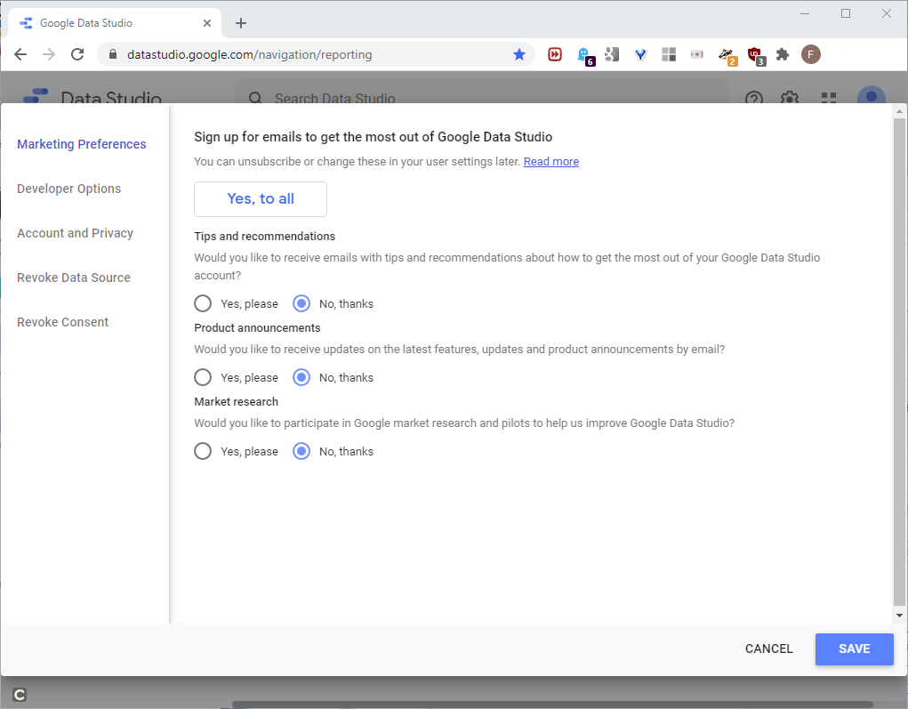
If a marketing preferences panel opens, pick the preferences, and click SAVE, as shown in this screenshot:
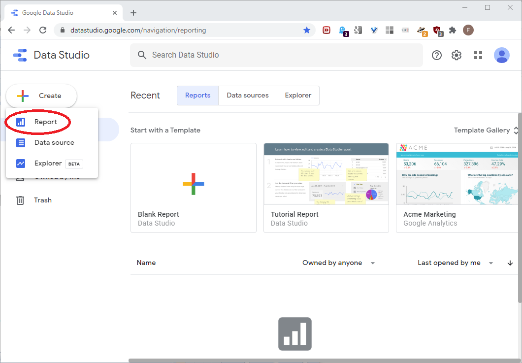
Back at the main page, drill down to Create -> Report, as shown in this screenshot:
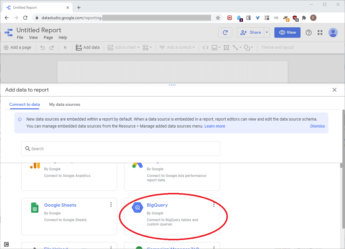
The report design tool will open. First, we’ll connect to the data source we want. Pull the inner scrollbar down a little, and click the BigQuery connector, as shown in this screenshot:
The Data Source
This BigQuery query written below returns the basic, unfiltered data we’ll use for the report, as shown in this screenshot below.
|
1 2 3 |
SELECT ZIP, NAME, EMPFLAG, EMP_NF, EMP, QP1_NF, QP1, AP_NF, AP, EST, CITY, STABBR, CTY_NAME FROM BigQueryDemoAppDS.zbp11totals |
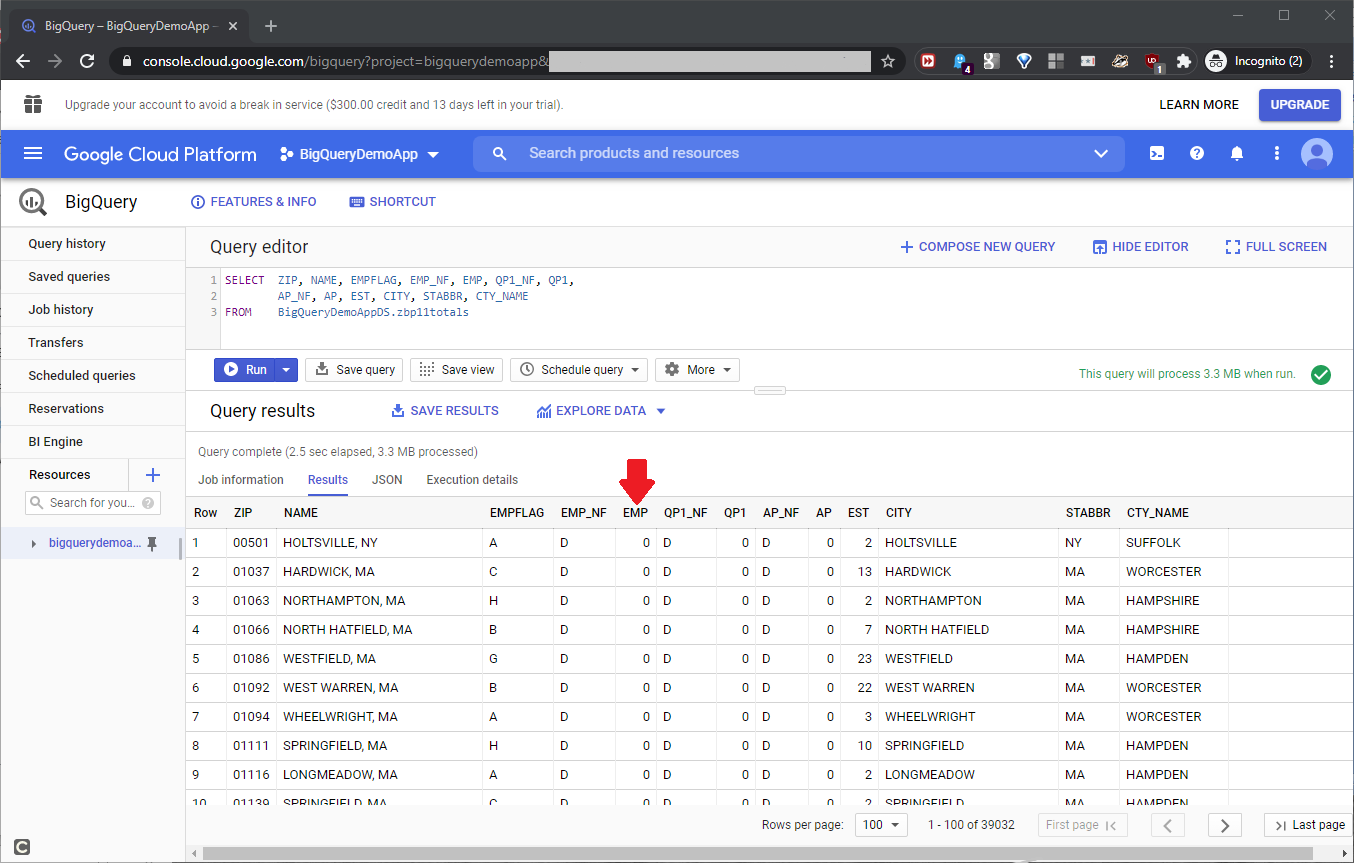
In the result set, the EMP column has the employee count value for each row. To make the report more flexible, we’ll add a filter on the highlighted EMP column in the above screenshot, and we’ll do this in Data Studio. After clicking the BigQuery connector, we can configure the query we’ll use. The query window will open; drill down to the below:
|
1 |
CUSTOM QUERY -> BigQueryDemoApp |
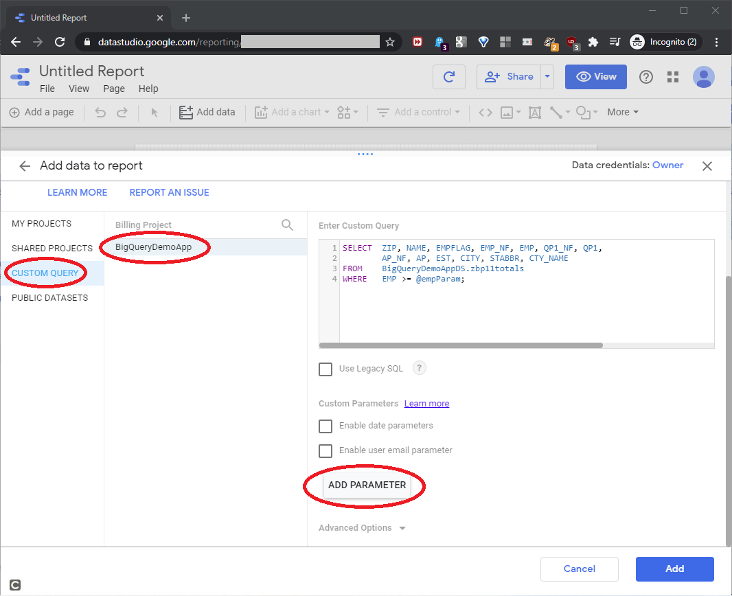
Since we use a Google account that also “owns” the BigQuery resource, we can see that resource as the BigQueryDemoApp billing project. In this custom query below, the WHERE clause filters the EMP column, defined in the SELECT clause, with the @empParam parameter.
|
1 2 3 4 |
SELECT ZIP, NAME, EMPFLAG, EMP_NF, EMP, QP1_NF, QP1, AP_NF, AP, EST, CITY, STABBR, CTY_NAME FROM BigQueryDemoAppDS.zbp11totals WHERE EMP >= @empParam; |
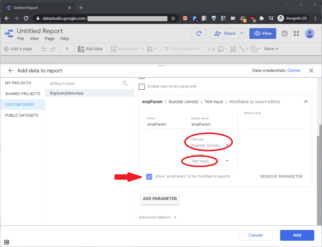
The query will return all rows with an EMP value greater than or equal to the @empParam value. If the user runs the report with an empty @empParam value, the query will ignore it and return all available rows. To build the actual parameter for the report, click ADD PARAMETER, and click the dropdown, as shown in this screenshot:
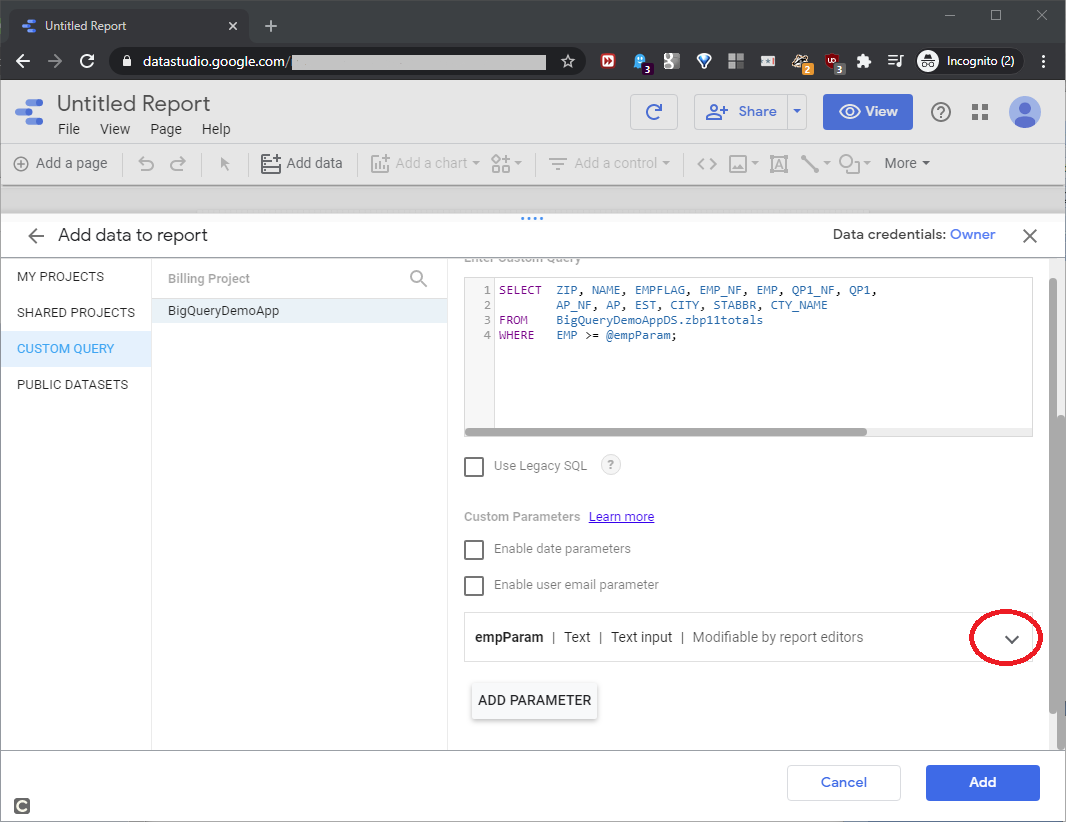
To configure the empParam parameter, pick the Number (whole) Datatype, and Text input Input type, as shown in this screenshot:
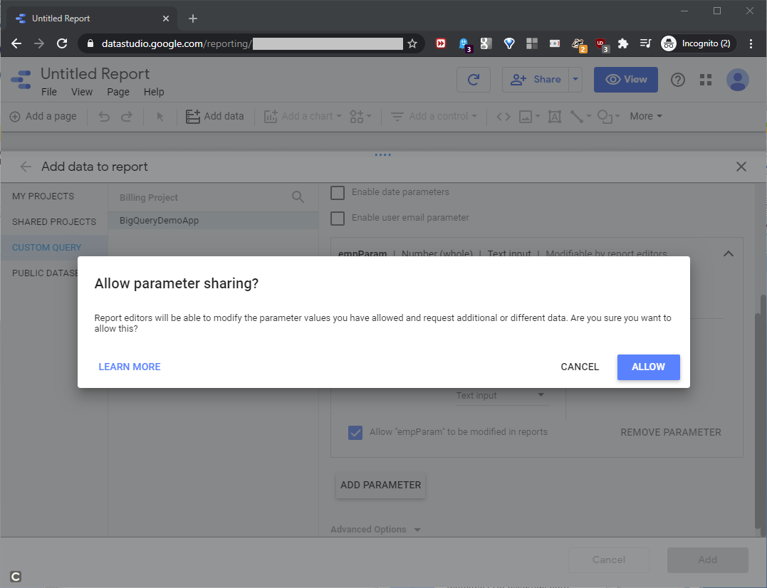
Click Add. In the next screen, click Allow to allow parameter sharing, as shown in this screenshot:
This will return us to the report definition, as shown in this screenshot:
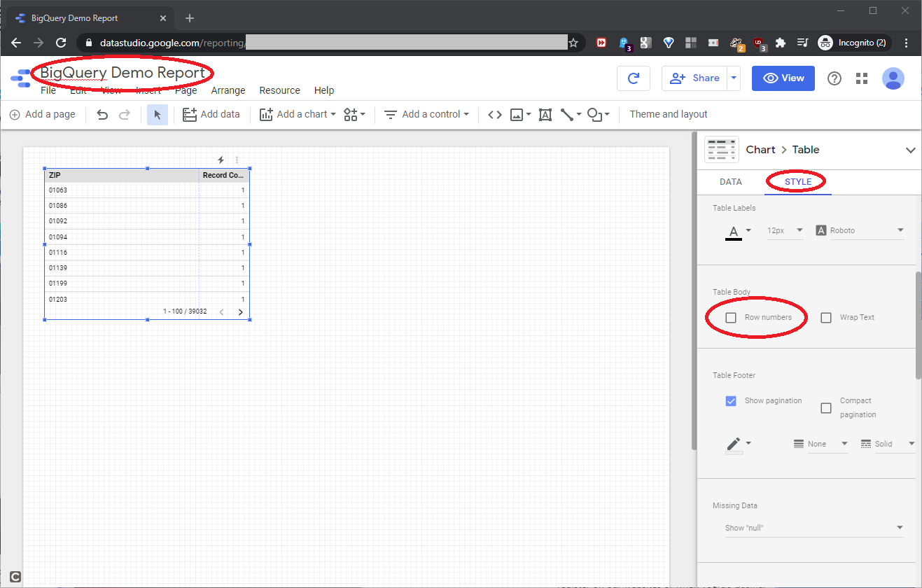
As our goal, we want to build a “basic” report that shows all the columns of the data source, with some way to filter the data, based on the @empParam parameter we defined in the data source step above. At the upper left, name the report BigQuery Demo Report, and on the right, click the STYLE tab and uncheck Row numbers, as shown in this screenshot:
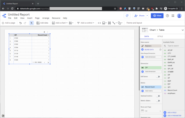
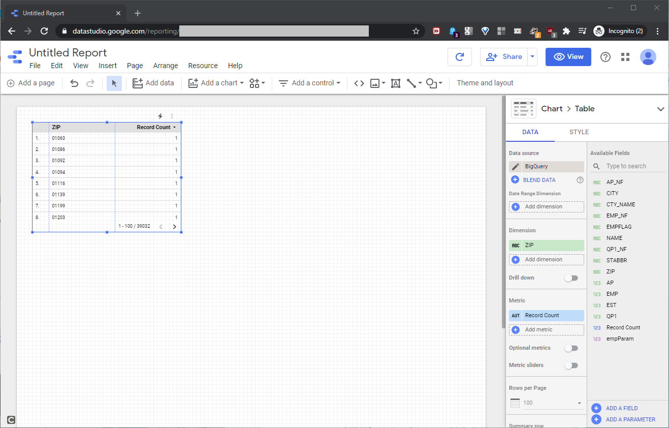
Back at the DATA tab, delete the Record Count column from the Metric block, as shown in this screenshot:
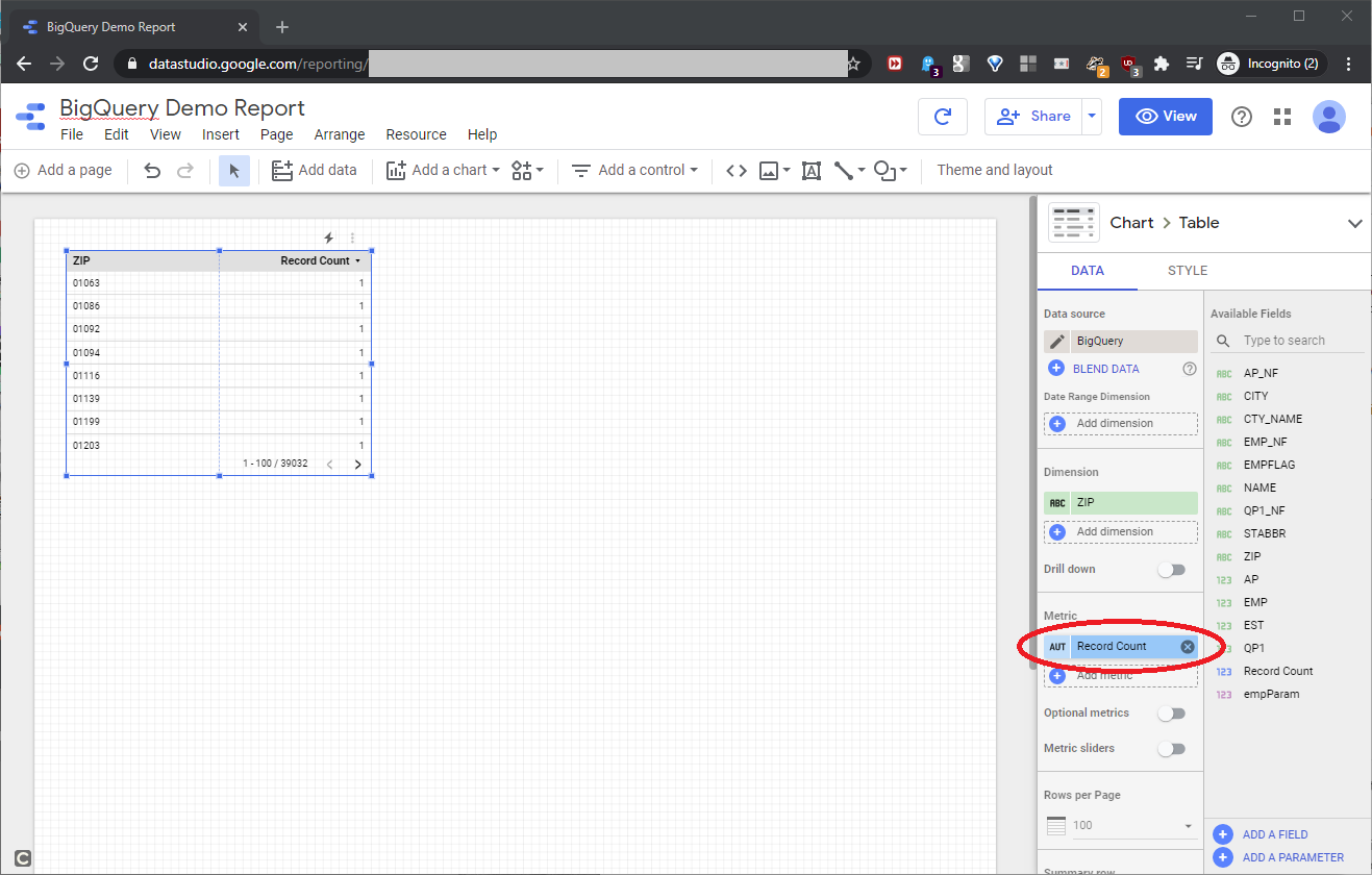
This will remove the Record Count column from the report. To add data resource columns to the report itself, drag the columns (mentioned below) from the Available Fields box to the Dimension block, as shown in this screenshot:
- NAME
- EMPFLAG
- EMP_NF
- EMP
- QP1_NF
- QP1
- AP_NF
- AP
- EST
- CITY
- STABBR
- CTY_NAME
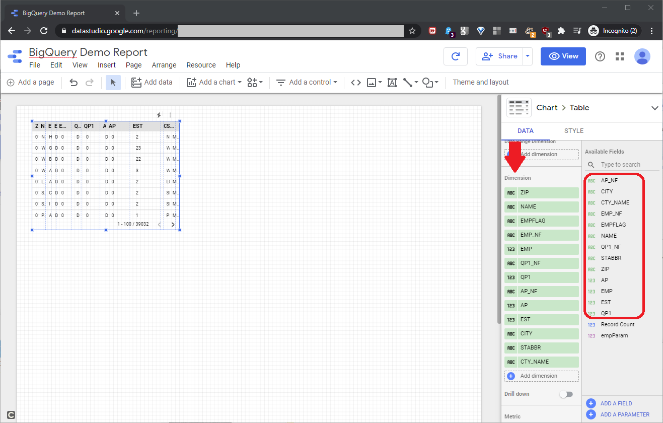
We have a lot of flexibility here. We can click and drag columns in the Dimension block to reorder them, and even add the same column more than once from the Available Fields block.
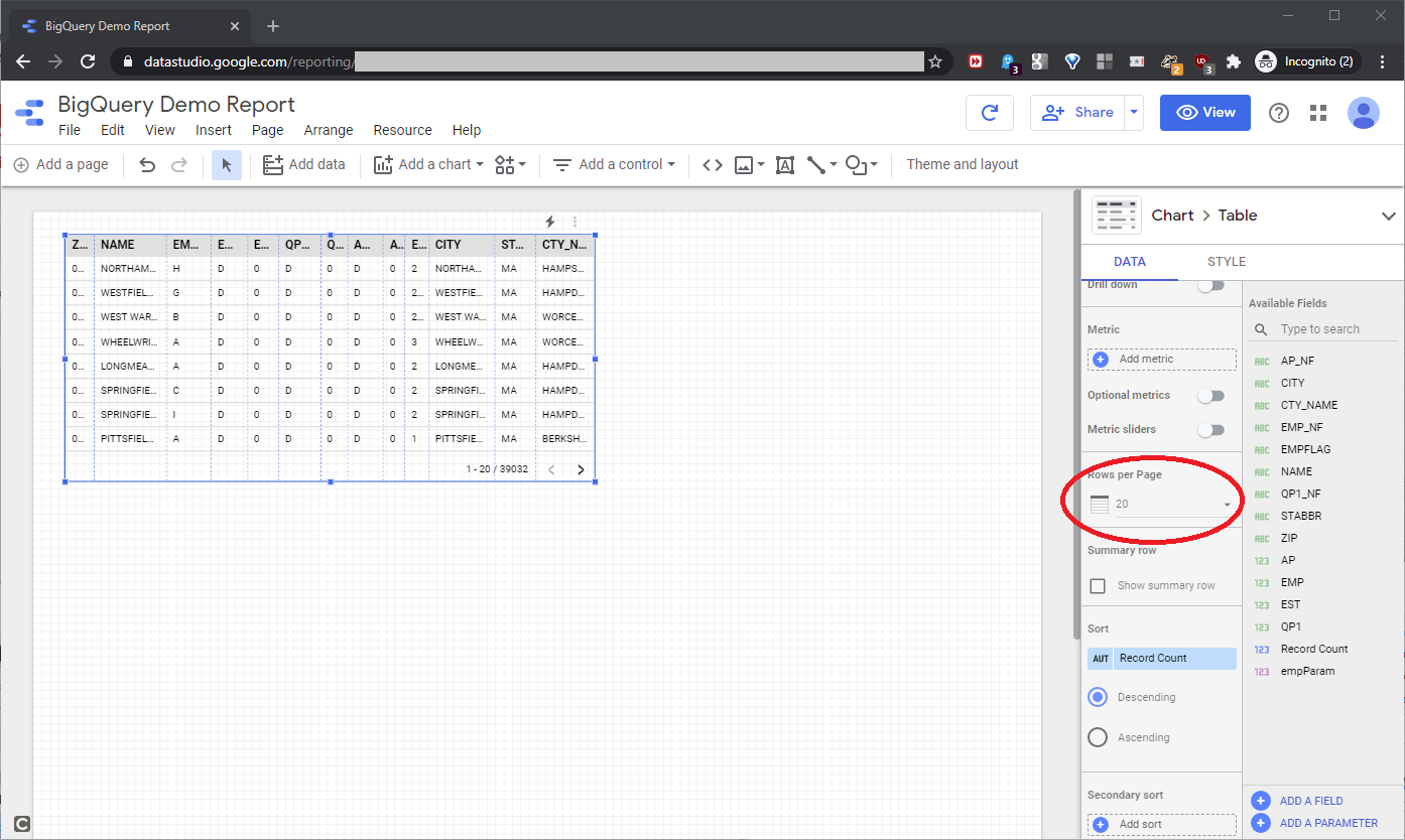
Now, we’ll make basic report format changes. For this article, we can more easily work with a report that has twenty rows per page. At the DATA tab, scroll down to Rows per Page and pick 20, as seen in this screenshot:
On the canvas, expand the report data element, resize the columns, and on the STYLE tab, resize and text-wrap the header text, as shown in this screenshot:
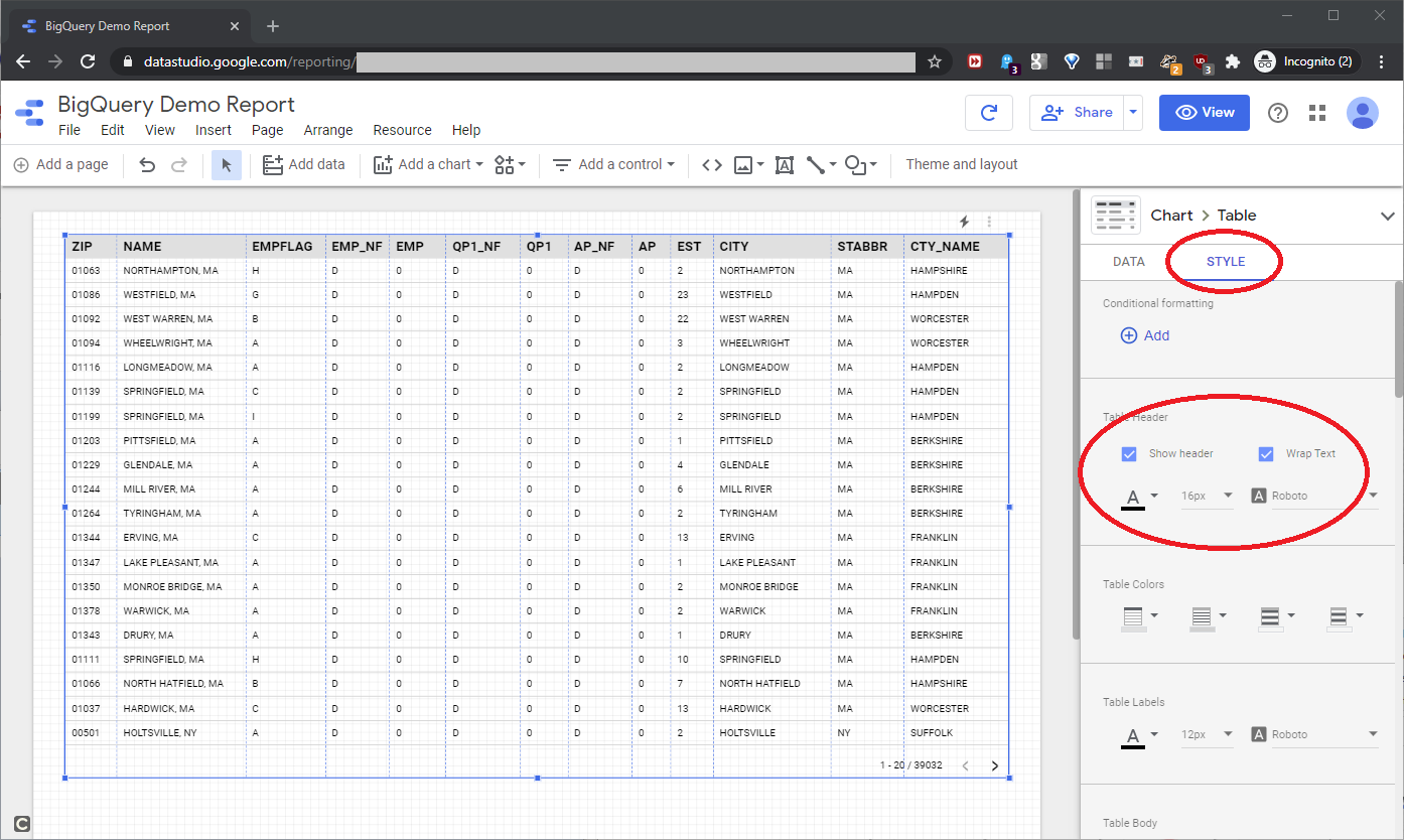
The text-wrap might become important later, if we change the column headers. Now, in the edit screen shown above, click View to see the production report, as shown in this screenshot:
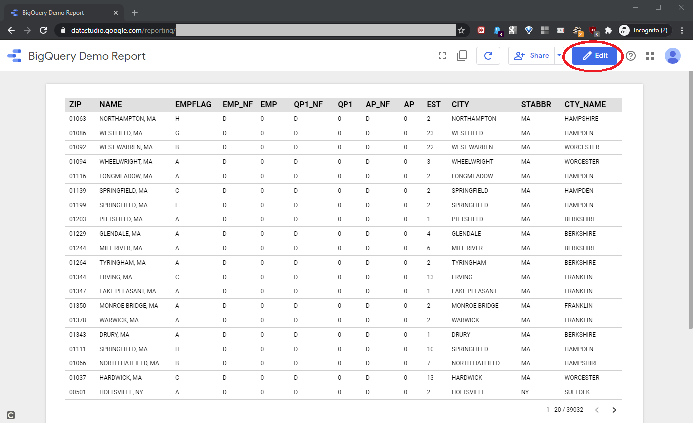
It looks pretty good. Click Edit to toggle back to the edit screen.
When we built the BigQuery data source for this report, we included the @empParam parameter. Now we’ll add this parameter to the report, so the users can filter on the EMP column values. Click the report data element to activate it, and then grab empParam in the Available Fields, as shown in this screenshot:
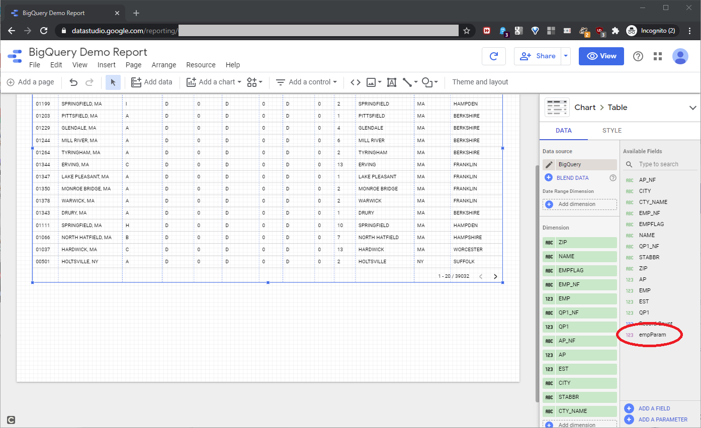
Drag it onto the design canvas, as shown in this screenshot:
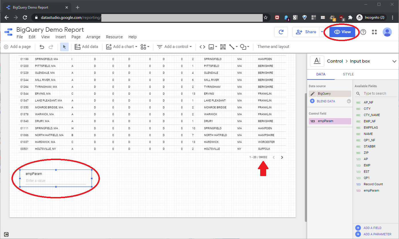
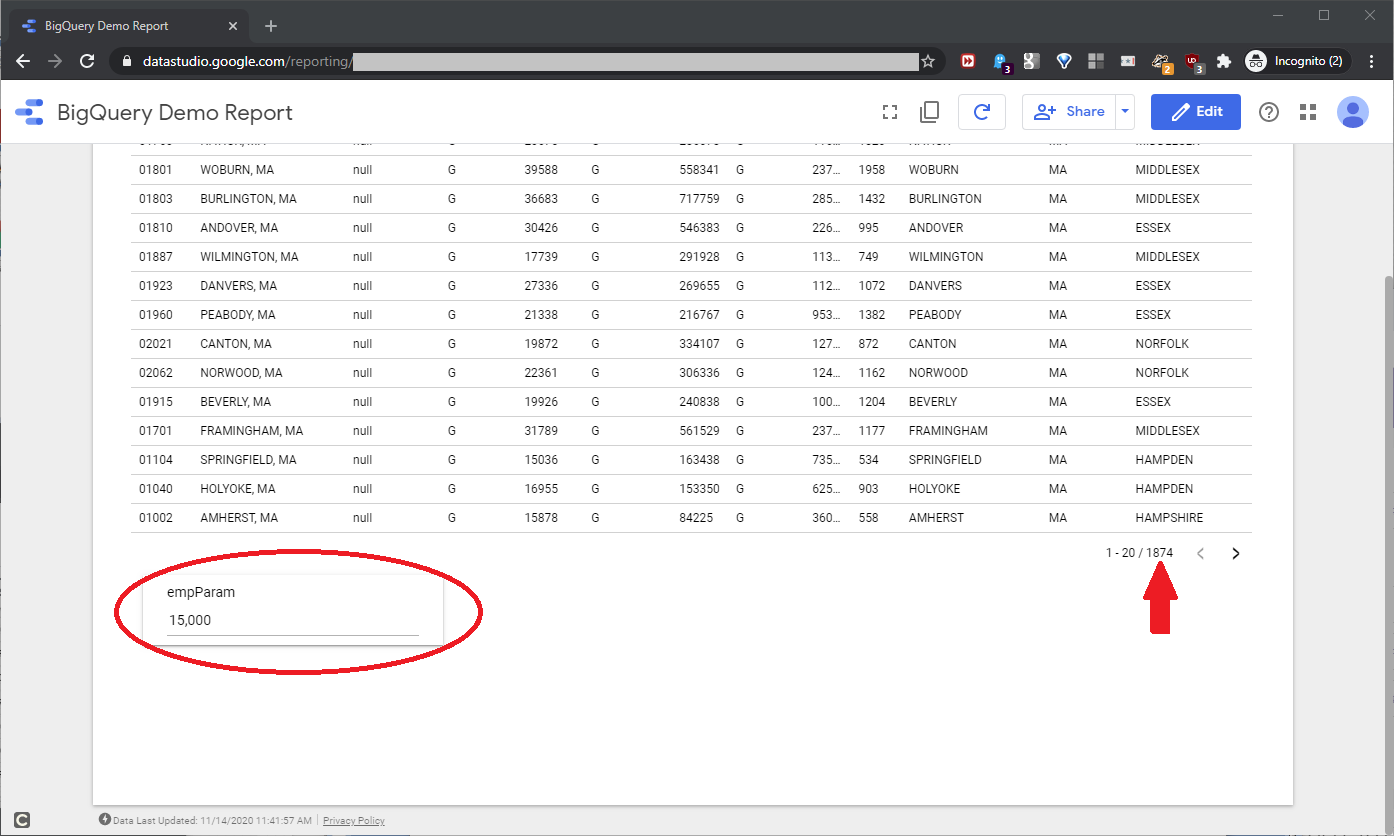
Note the 39032 record count value. Now, click View to run the report, and scroll down a little to see the empParam input box, as shown in this screenshot:
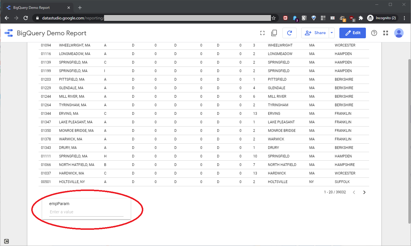
For an empParam value of 15,000, the report showed 1874 records, as seen in this screenshot:
Deploy the report
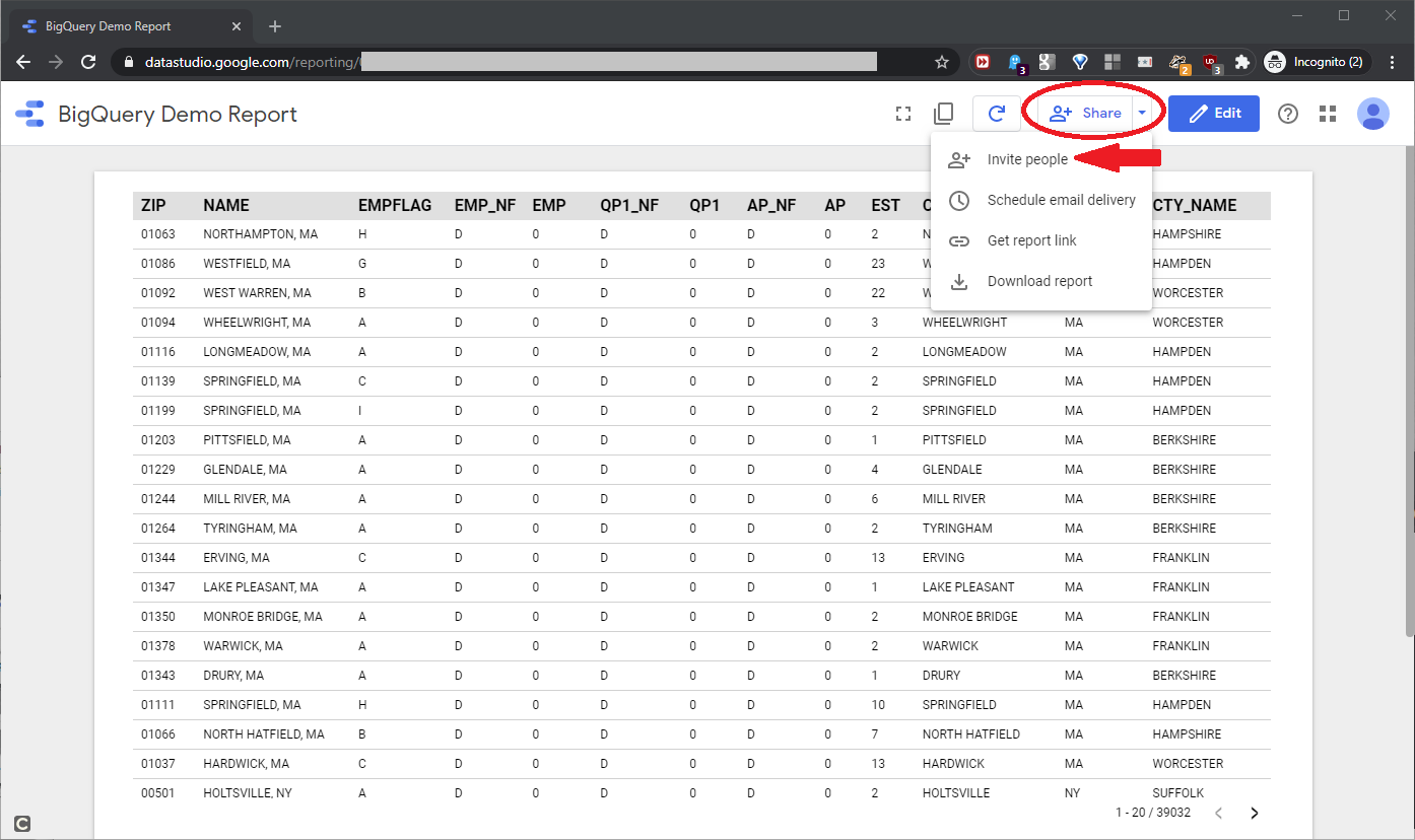
Now that we built the report, we need to deploy it to the users. As a Google Cloud product, deployment operates a lot like classic Google Drive files: Docs, Sheets, etc. We have a few ways to handle sharing and access. First, in either Edit or View modes, click Share and drill down to Invite people, as shown in this screenshot:
The Sharing with others tool will open, as seen in this screenshot:
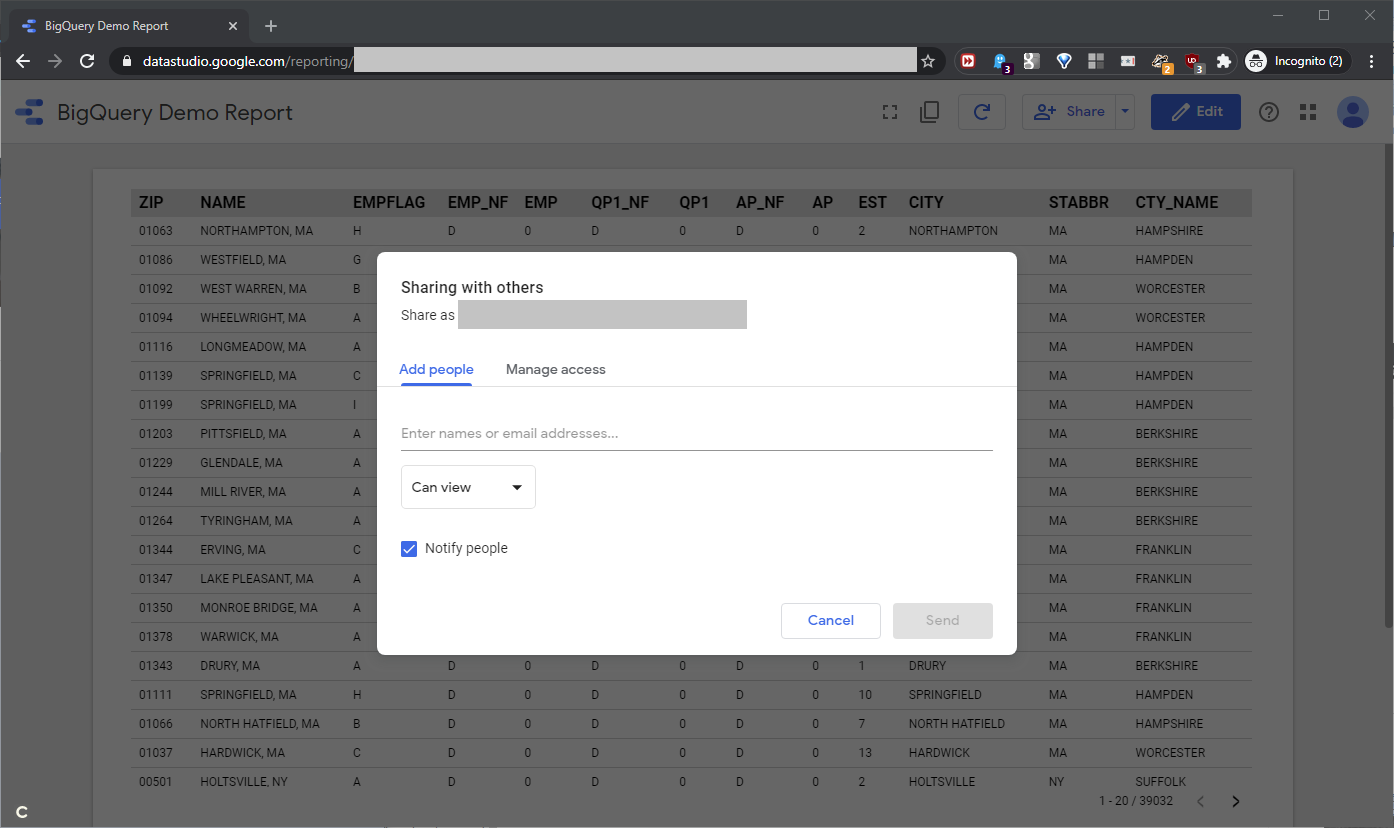
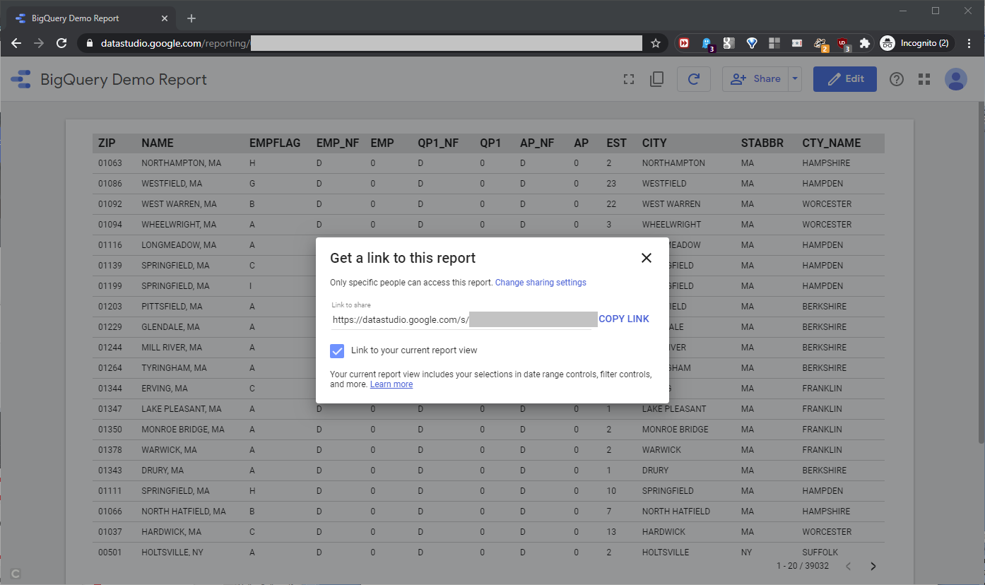
Use this tool to configure access rights, view/edit permissions, etc. We can also drill down to the Get report link, as shown in this screenshot:
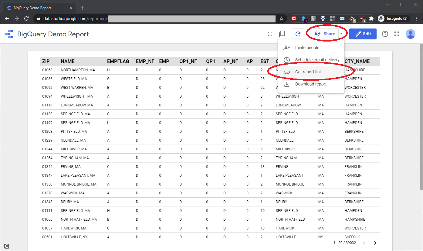
This opens a panel which shows a direct URL link to the report, and offers other configuration options, as shown in this screenshot:
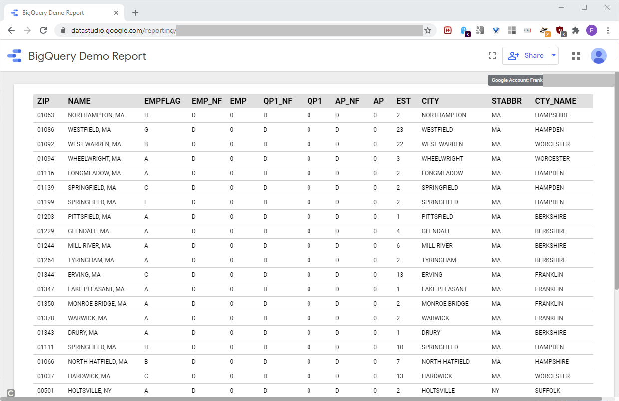
When shared with a different Google account that has View rights for the report, it opened as expected, as shown in this screenshot:
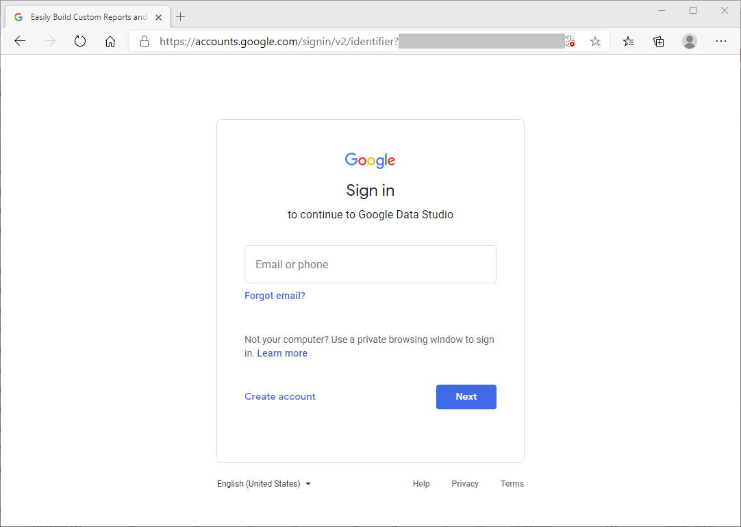
We can set up sharing that forces a Google account login, as shown in this screenshot:
For this report, Google file sharing will also handle open access to the file, for anyone with the file URL. With a little digging, we can tune the file-sharing options to cover the use cases we need.
Going Further
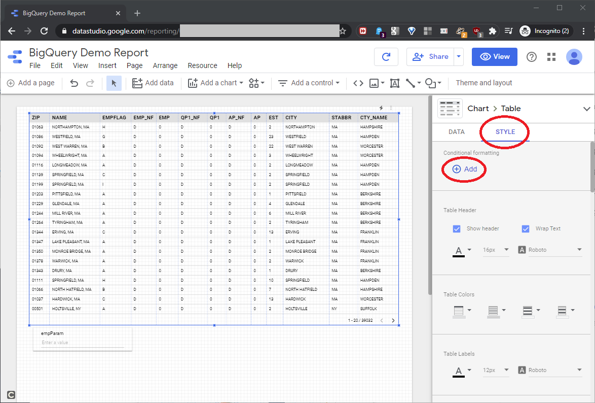
We can easily customize the reports we build. For example, we might want conditional row formatting, that highlights the Alaska rows returned from the BigQuery data. In the report edit screen, highlight the report data element, click STYLE on the right, and add a new Conditional formatting rule, as shown in this screenshot:
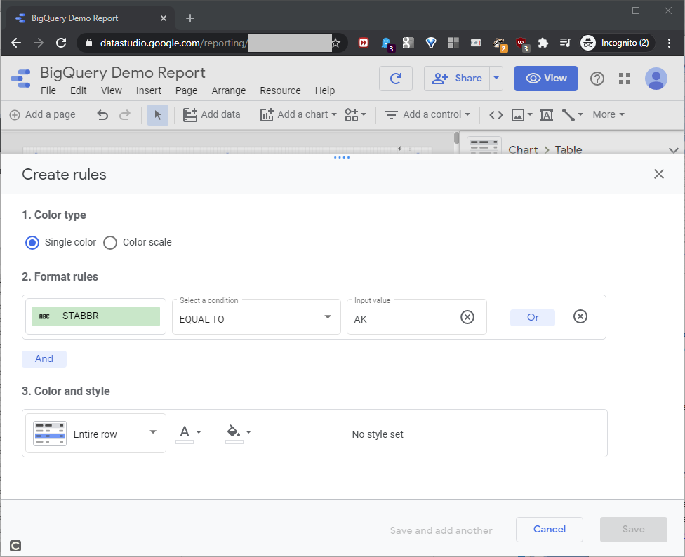
The Create rules screen opens. The STABBR field has the state abbreviation values, and for this rule, we’ll look for the “AK” values. To build the format rule, fill in the values as shown in this screenshot:
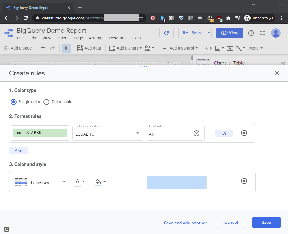
For the actual formatting, we’ll set the Color and style as shown in this screenshot:
If necessary, we can add more formatting rules. To test the rule, open the report, and sort it by STABBR, as shown in this screenshot:
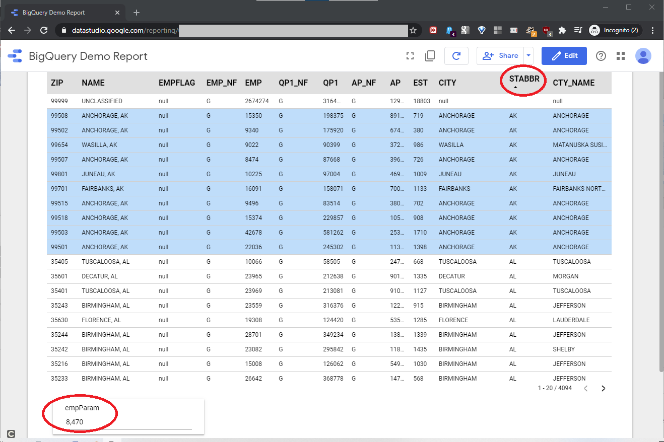
For an empParam value of 8470, the report formatted the rows based on the business rules we defined.
Conclusion
As we saw, we can easily build Data Studio reports to front-end a BigQuery resource. The BigQuery connector makes this possible. However, Data Studio offers connectors to many different data resources – 18 at last count – including
- Cloud SQL for MySQL
- Google Analytics
- MySQL
- PostgreSQL and more
Independent Google partners offer almost 300 connectors, and the available data connectors will likely cover more data products over time. With little to no required programming, the Data Studio product provides a clean, flexible way to build the basic reports we need, over BigQuery and the other data sources available to us.
Table of contents
| Build a Google BigQuery Resource |
| Link Google BigQuery resources into an Azure SQL resource |
| Build a Google BigQuery report with Google Data Studio |

See more about Frank at LinkedIn.
Remove the non-standard characters from this address: fb} <s.author@gmail.com to reach him by email.
- Lever the TSQL MAX/MIN/IIF functions for Pinpoint Row Pivots - May 16, 2022
- Use Kusto Query Language to solve a data problem - July 5, 2021
- Azure Data Explorer and the Kusto Query Language - June 21, 2021