
Introduction
A few weeks back I had been working on an interesting proof of concept for a client within the food / grocery industry. The objectives were to be able to provide the client with information on sales patterns, seasonal trends and location profitability. The client was an accountant and was therefore comfortable utilizing spreadsheets. This said, I felt that this was a super opportunity to build our proof of concept utilizing a SQL Server Tabular Solution and by exploiting the capabilities of Excel and Power Reporting for the front end.
In today’s “fire side chat” we shall be examining how this proof of concept was created and we shall get a flavour of the report types that may be generated, simply by utilizing Excel.
In the second and final part of this article, we shall be examining the power of utilizing SQL Server Reporting Services 2016 to generate user reports.
However, before getting carried away with Reporting Services, let us look at the task at hand, that being to work with the tabular model and Excel Power Reporting.
Thus, let’s get started.
Getting Started
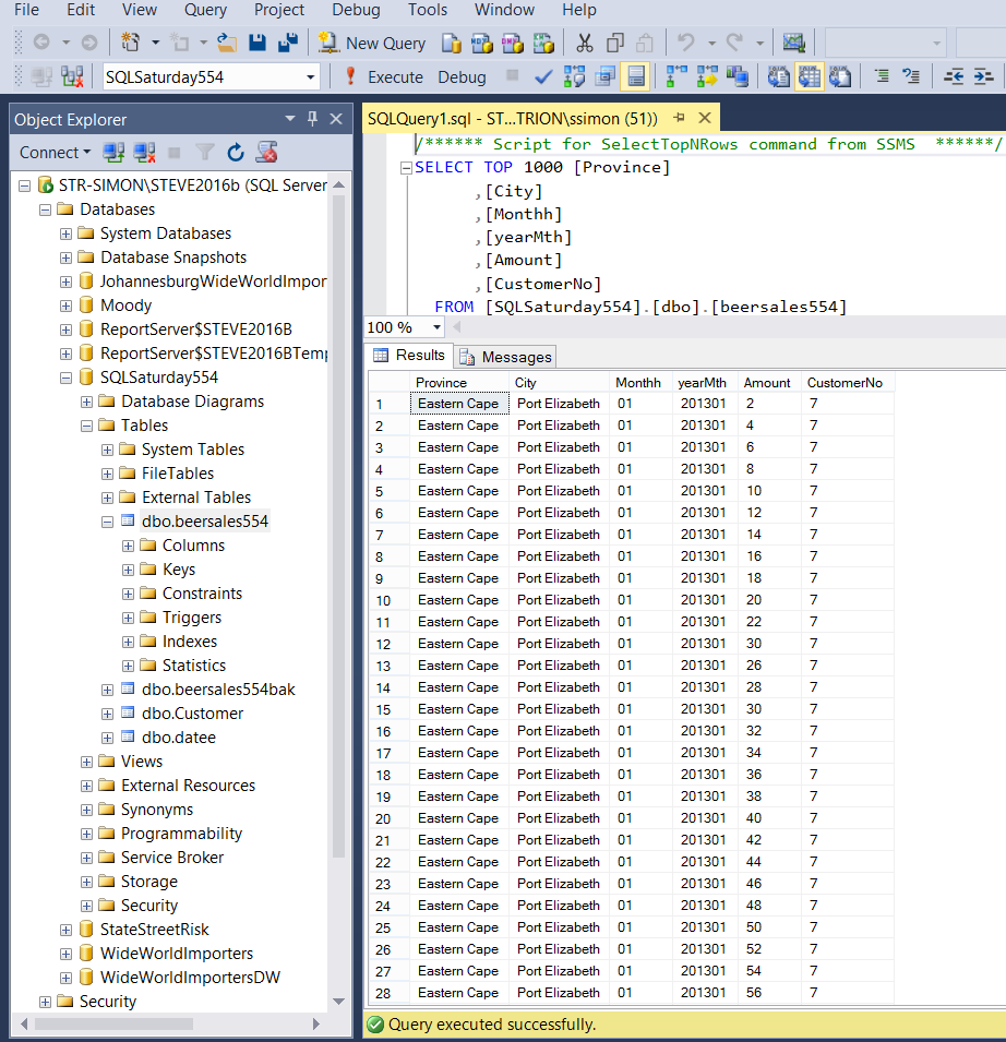
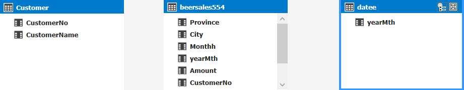
Our journey begins with the raw data. Opening SQL Server Management Studio 2016, we locate a database which I have called SQLSaturday554. In the screenshot below, the reader will note that we have the beer sales from major South Africa cities for several years.
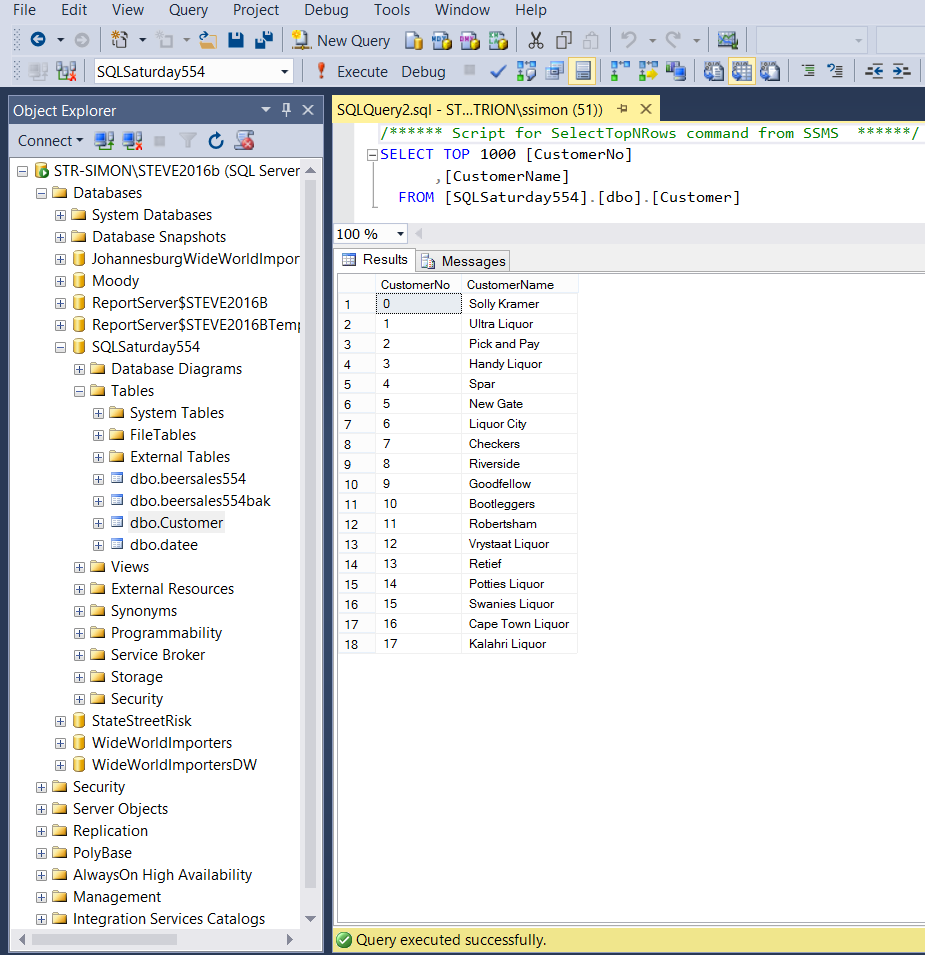
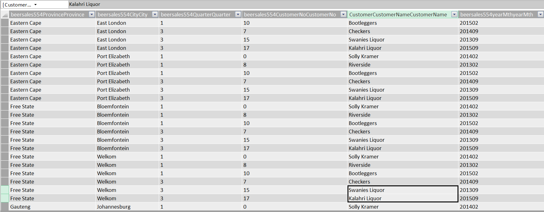
We also have customer data within our “Customer” table (see below).
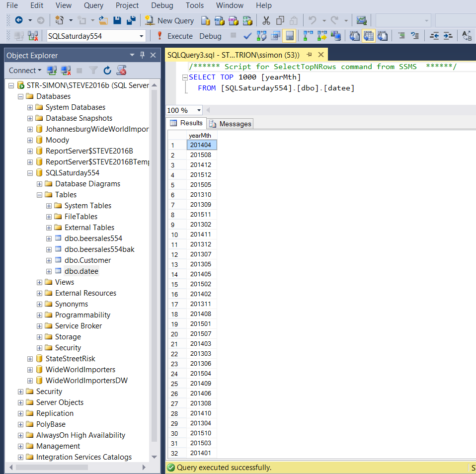
Last but not least, we have a “year month calendar table” (to add a time dimension) to our exercise (see below).
For our exercise, we shall be working with these three tables.
Creating our tabular model
Should you not have a tabular instance installed upon your work server, you may want to install one from the media supplied from Microsoft. One merely adds another instance and select ONLY the Analysis Services option and then the “Tabular” option. The install is fairly quick.
Should you be unfamiliar with the Tabular Model itself, fear not as we shall be working our way through the whole process, step by step.
From this point on I shall assume that we all have a tabular instance installed upon our work servers.
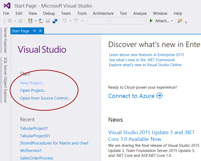
Opening Visual Studio 2015 or SQL Server Data Tools (2010 and above) we create a new project by selecting “New Project” under the Start banner as shown below.
The “Project Type” menu is brought up (see below).
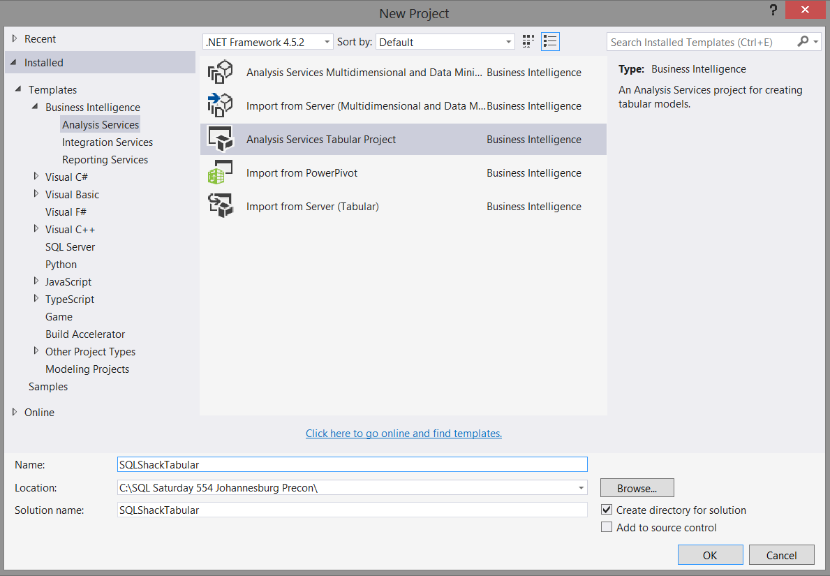
We select an “Analysis Services Tabular Project” project (as shown above) and give our project an appropriate name. We click “OK” to create our project.
The “Tabular Model Designer” now appears (see below).
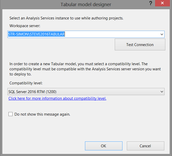
What the project wishes to know is to which TABULAR server and workspace we wish to deploy our model. We must remember that whilst our source data originates from standard relational database tables (for our current exercise), the project itself and the reporting will be based off data within Analysis Services.
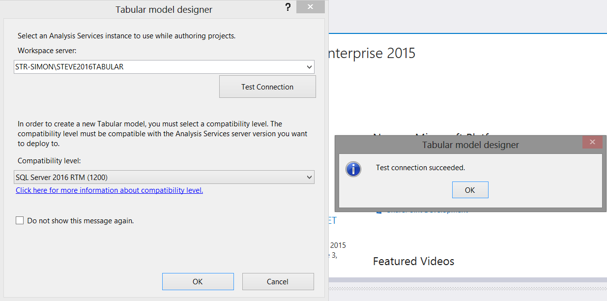
We set the “Workspace Server” and test the connection as shown above. We click OK to create the model and we are then brought to our design and work surface (see below).
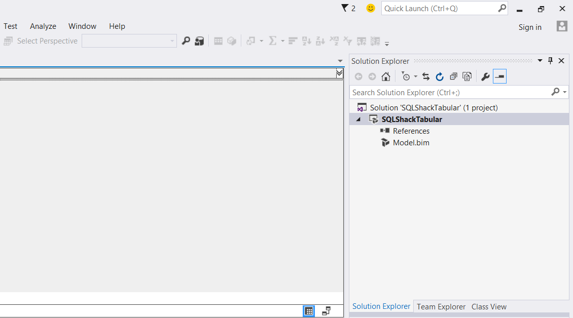
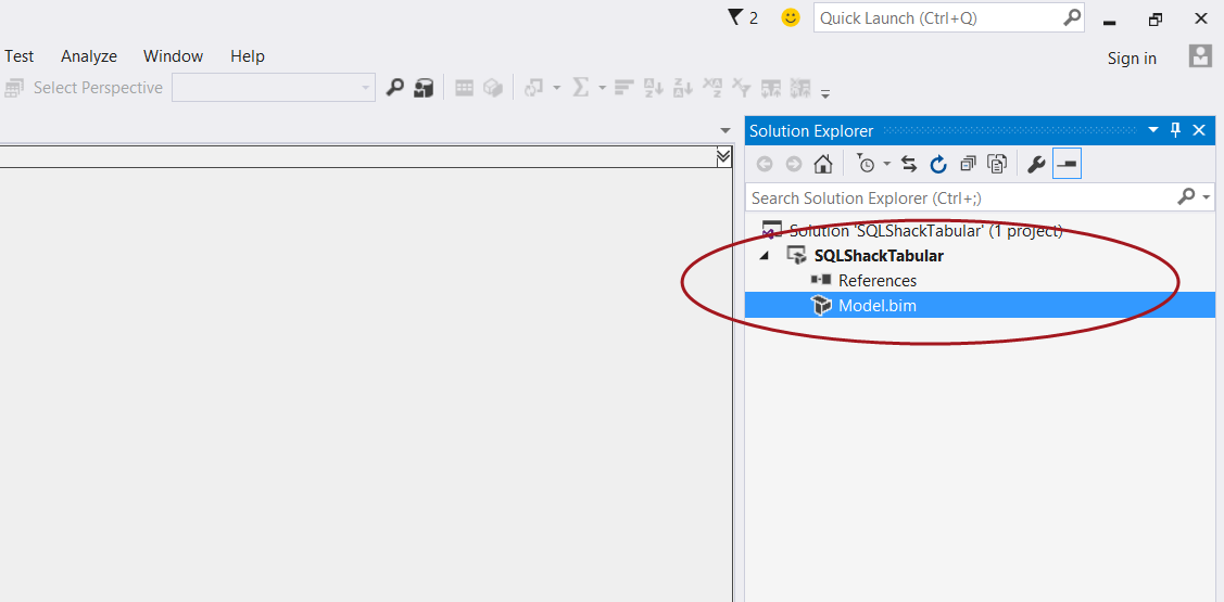
We now double click on the “Model.bim” icon, shown in the screen shot below.
The model designer opens (see below).
Adding data to our model
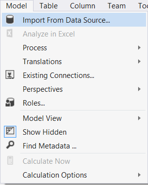
Clicking upon the “Model” tab on the menu ribbon (see below) we select “Import from Data Source”.
The “Table Import Wizard” appears (see below).
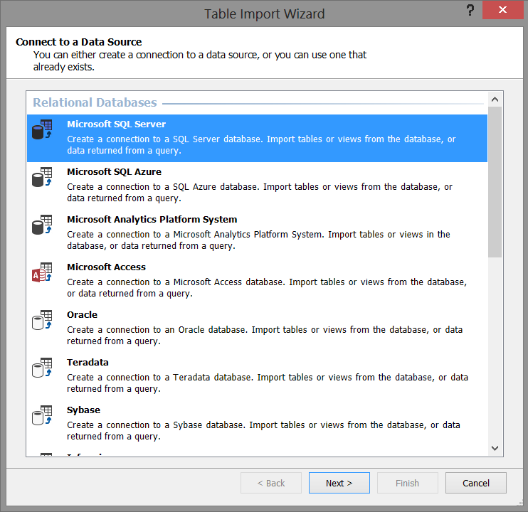
We select “Microsoft SQL Server” as shown above because our source data is from the relational database tables that we saw above. We then click “Next”.
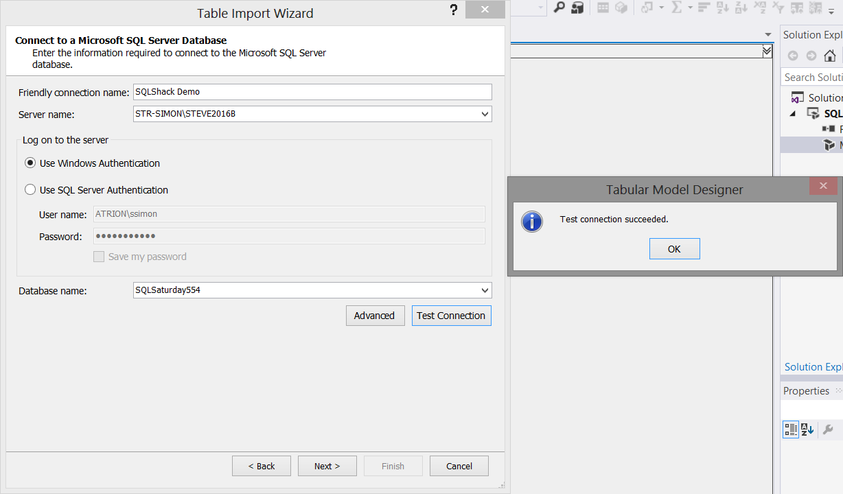
We now select our “source” database server, our database and test our connection (see above). Once again, we click “Next”.
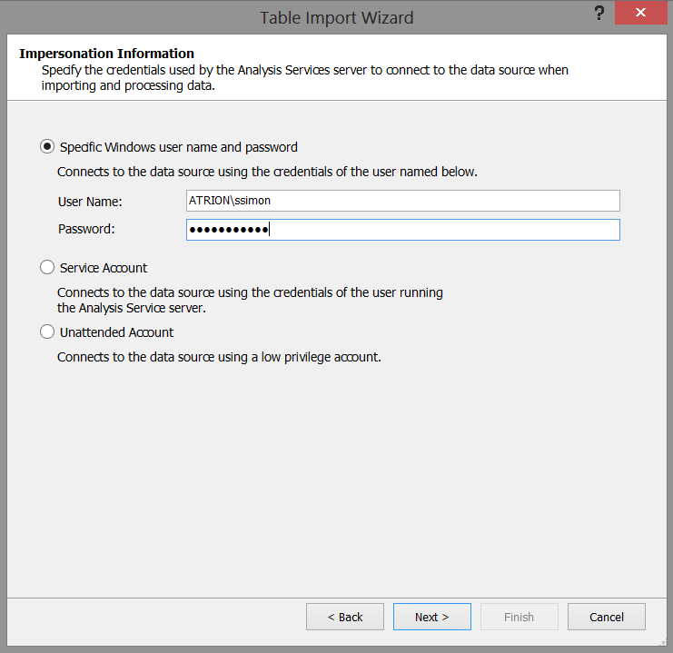
We must now set out “Impersonation Information” (see the screenshot above). In our case I have chosen to utilize a specific Windows user name and password. Once set, we click “Next”.
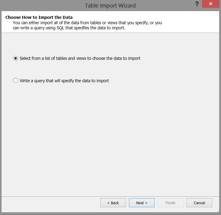
The system now wants us to select the relational tables that we wish to import into our model. We select the “Select from a list of tables and views to choose the data to import” option (see above). We then click “Next”.
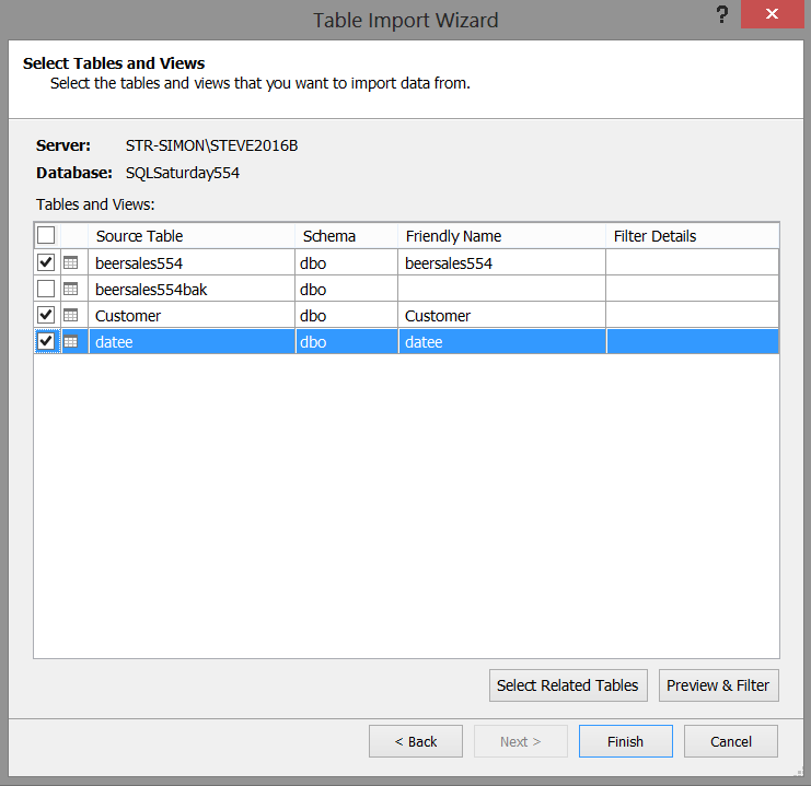
We select the “beersales554” (Our sales figures), “Customer” (our list of clients), and “datee” (our time dimension) tables (see above) and then click “Finish”. The project will then begin the import into our model (see below).
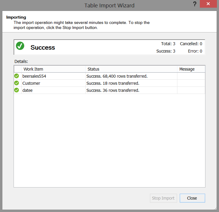
Should our load was successful, then we receive the message shown above. We now click “Close”.
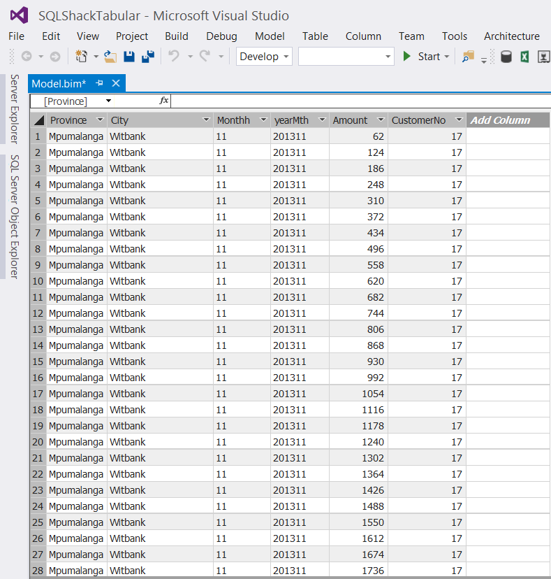
Our data will now appear within our design window (see the screenshot above). WOW, it looks like a spreadsheet. Those finance folks are going to love this!
Let the fun begin!!
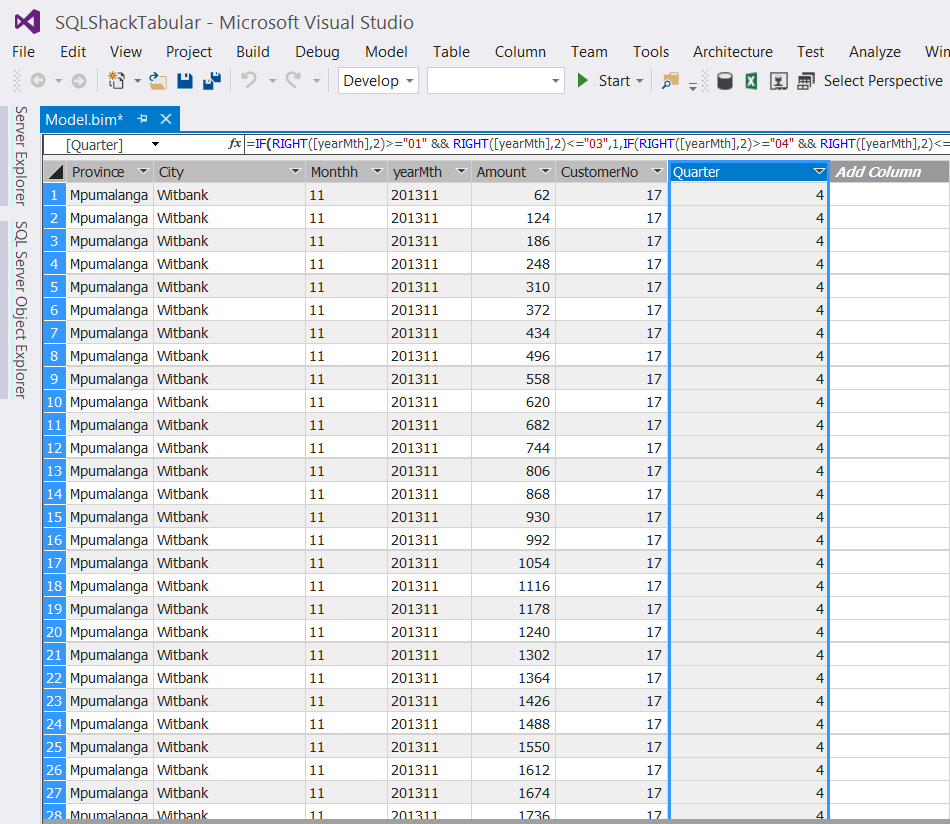
The astute reader will note that in addition to the “Province”, “City” and “CustomerNo”, we also have a “yearmth” field and a field containing the Rand value of beer sales.
This breakdown is on a monthly basis and oft times folks wish to see results by quarter. GOTCHA!!!!
The one thing that we must remember is that now that we are working with the tabular model, calculations or defined fields cannot be created utilizing standard T-SQL. We must utilize DAX (data analysis expressions).
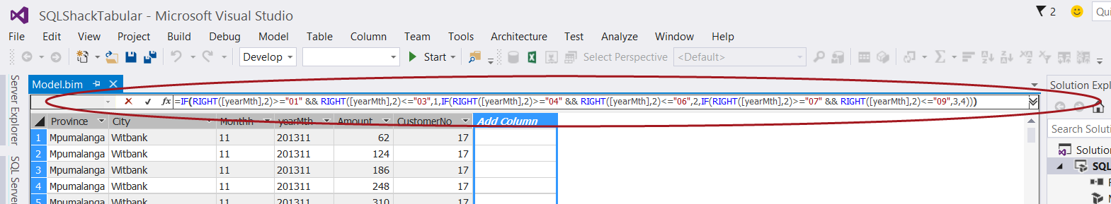
We select “Add Columns” (as shown above) and add our DAX expression
|
1 2 3 4 5 6 |
=IF(RIGHT([yearMth],2)>="01" && RIGHT([yearMth],2)<="03",1,IF(RIGHT([yearMth],2)>="04" && RIGHT([yearMth],2)<="06",2,IF(RIGHT([yearMth],2)>="07" && RIGHT([yearMth],2)<="09",3,4))) |
to the “function box” below the menu ribbon (see above).
The “Quarter” has now been created (see below).
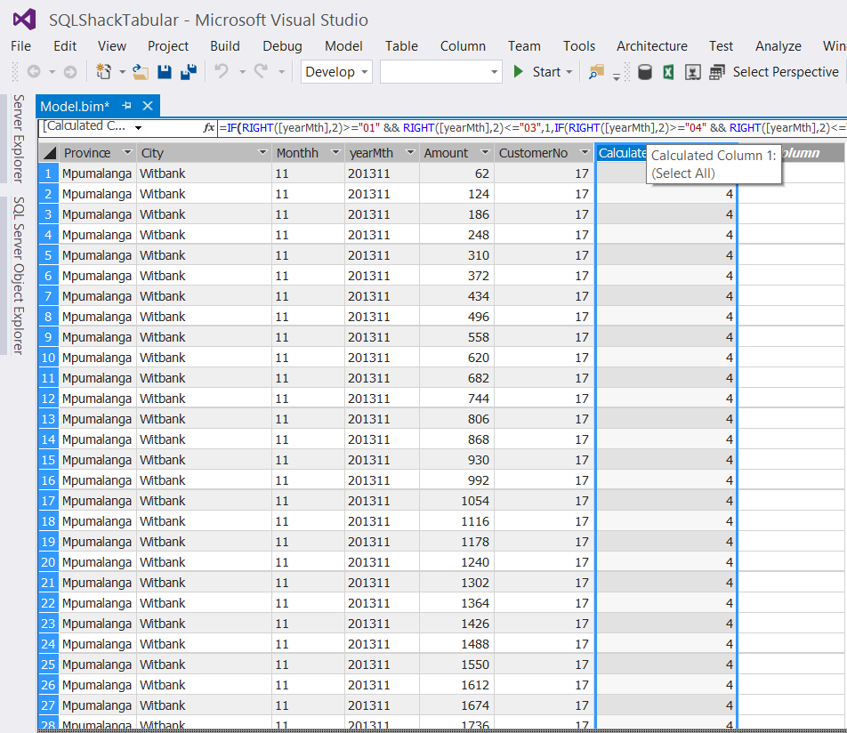
Once again, the eagle – eyed reader will question the financial year calendar. Fear not, the same DAX expression may be used for a fiscal year starting July 1 and ending June 30th. Such is the beauty of the DAX language.
We now rename the column to “Quarter” (See below).
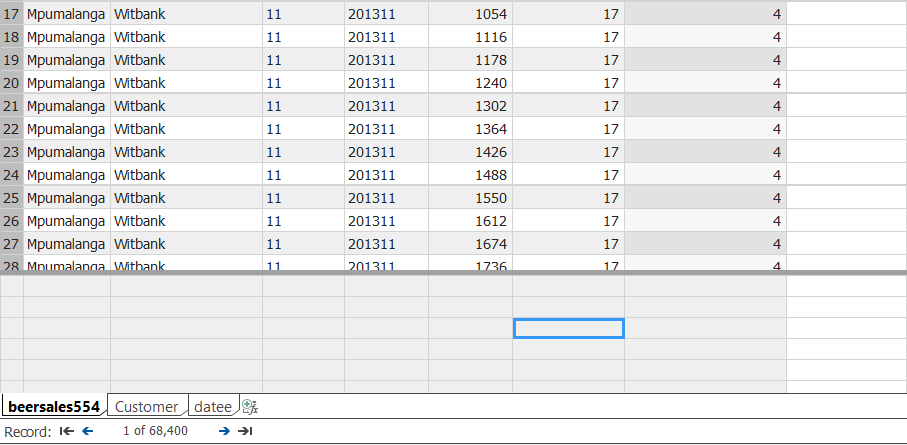
Aggregating our “Amounts”
As “champions of reporting”, we all know that the decision makers will want to view reports which have aggregated results, by region and by time. This said we now aggregate our “Amount” field so that when we report from our tabular “cube”, the results will be aggregated at the appropriate level.
We place our cursor in any cell below our data display (see the blue highlighted cell in screen shot below). It should be understood that “any cell below the data is adequate”.
We now create the DAX formula to aggregate the data.
|
1 2 3 |
GrandTotal := Sum([Amount]) |
The DAX formula is created in the same function box that we utilized for the “Quarter”, and a grand total will display in the blue cell (shown below).
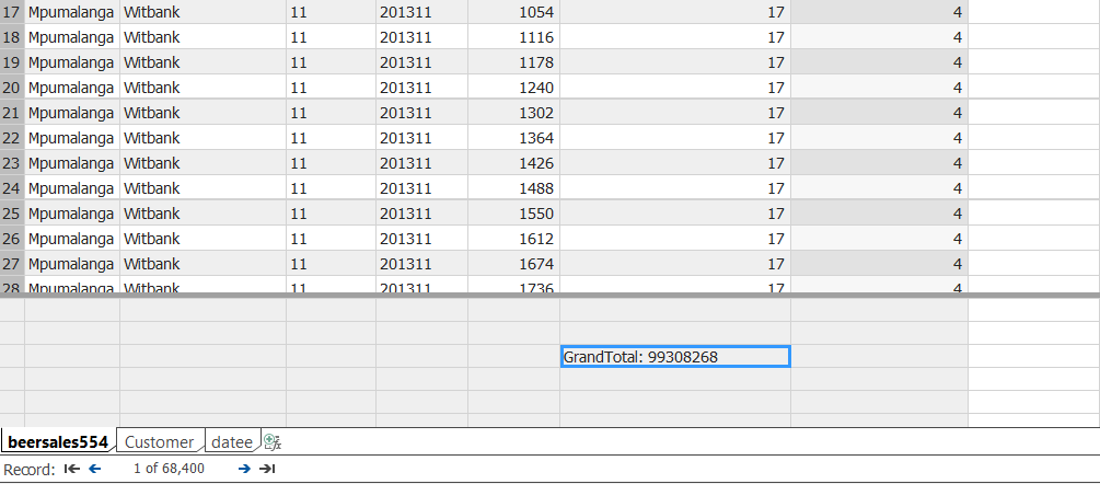
It should be remembered that at this point in time that the result is meaningless as we have not linked “Amount” to our date and customer dimensions 🙂
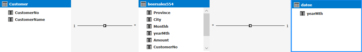
We shall now create these linkages by clicking on the “Diagram” box located at the bottom right of the screen shot below (see the red circle).
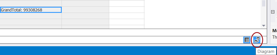
Having clicked upon the “Diagram /Relationship” icon (discussed imediately above), we are brought to the “Relationship” work surface.
We note that our three tables /entities are displayed (see above). We now create the necessary relationship links by dragging the corresponding fields within the Customer entity to the customer number within the BeerSales entity. We do the same for the “Datee” entity (see below).
This completes the development portion of our exercise. The only thing remaining is to deploy our model.
Deploying our model
To begin the deployment process we must set a few properties.
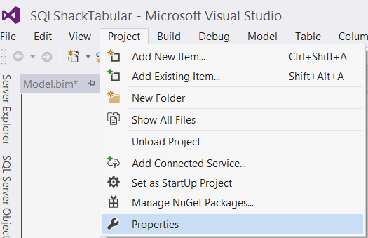
We click on the “Project” tab on the menu ribbon and select “Properties” (see above).
The “Properties” dialog box is now displayed (see below).

We set the TABULAR Analysis Server name and set a name for the target database that will reside on the Tabular Analysis Services server. In our case the server is “STR-SIMON\STEVE2016TABULAR” and the database name will be “SQLShackTabularBeer” (see above). We then click “OK”.
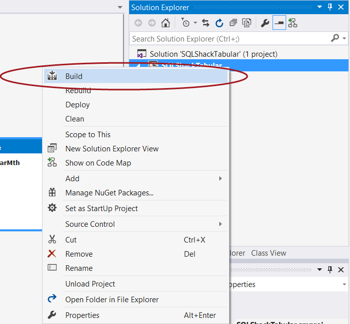
Our next step is to “Build” our solution prior to deploying it. This step will help detect any errors or other issues. We simply right click the project name and select “Build” (see below).
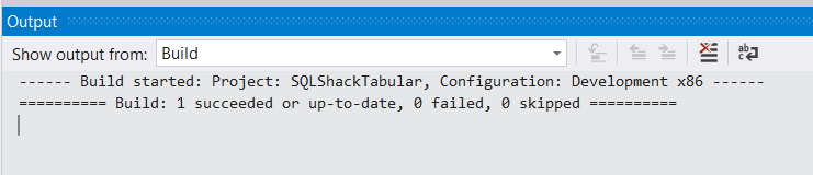
We are notified our the status of our “build” as may be seen in the screen shot below:
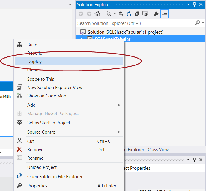
Having “Built” the solution, we are now in a position to deploy our solution and create our Analysis Services tabular database.
Once again we “right click” on the project name and select “Deploy” (see below).
The “Impersonation” dialog box is displayed as may be seen below:
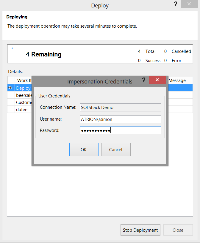
We pass the necessary credentials to the system (as we have done above) and deployment commences.
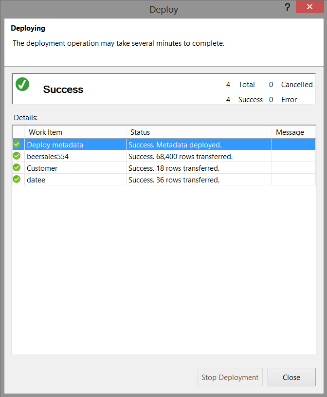
With deployment successful, we now closed Visual Studio or SQL Server Data Tools 2010 and we shall go back into SQL Server Management Studio, however this time into our Analysis Services tabular instance.
Verifying that our database has been created
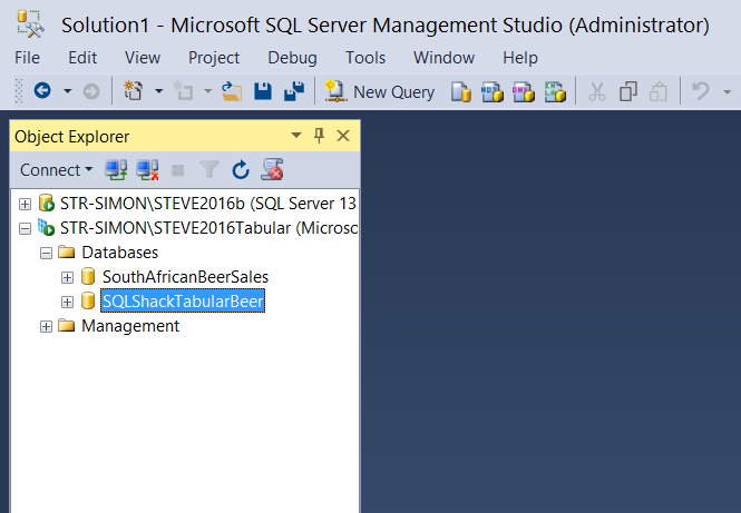
Opening SQL Server Management Studio we select our Analysis Services tabular instance.
Expanding the database tab, we note that our database has been created (see below).
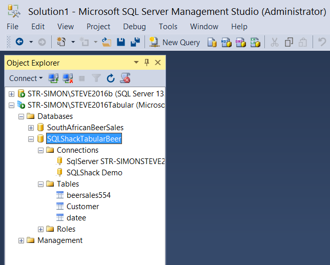
Expanding the SQLShackTabular database tab we find our three tables.
We can now run a few simple DAX queries to ascertain if our results look reasonable. DAX is an amazingly powerful “beast”. It is complex to learn and understand, and this is beyond the scope of this article. Enough said, let us get busy with those small test queries!
We simply open a new query by selecting the “New Query” button on the banner. The query editor now opens (see below).
Using a very elementary DAX statement, we shall calculate the total beer sales by our client base,
The DAX statement is
|
1 2 3 4 5 6 7 8 9 10 11 12 13 14 15 |
DEFINE //We define a TOTAL FIELD MEASURE beersales554[Total] = CALCULATE( SUM( Beersales554[Amount] ), ALL( Beersales554[CustomerNo] ) ) EVALUATE ADDCOLUMNS( ALL( Beersales554[CustomerNO] ), "Total for Customer",sum(Beersales554[Amount]) ) Order by BeerSales554[CustomerNo] |
When we execute this query we obtain the following results (see below).
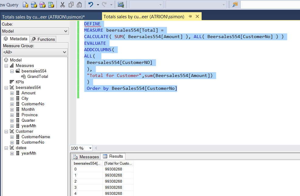
The eagle – eyed reader will have noted that the values for all customers appear the same and that is because we requested the “GrandTotal” be displayed with each customer (which is really not that informative, to say the least!).
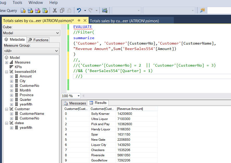
Changing the query slightly by adding the Customer Name and utilizing the “Amount” field instead of the “GrandTotal”, we can now see the total sales for the whole period for all customers (customer by customer).
The code to achieve this is below as is the result set.
|
1 2 3 4 5 6 7 8 9 10 11 |
EVALUATE //Filter( summarize ('Customer', 'Customer'[CustomerNo],'Customer'[CustomerName], "Revenue Amount",Sum('BeerSales554'[Amount]) //) //, //('Customer'[CustomerNo] = 2 || 'Customer'[CustomerNo] = 3) ) |
In short, working with DAX is similar to working with MDX. It has its rules and ways of traversing the data tree and is frankly not for the faint of heart.
This said, let us have a look at reporting based upon our tabular model.
Reporting
For today’s reporting exercise, we shall be utilizing Excel. In part two of this article, we shall be utilizing SQL Server Reporting Services.
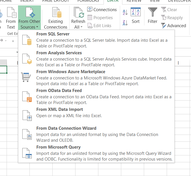
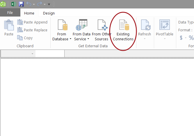
Opening a new workbook, we click upon the “Data” tab and select “From Other Sources” (see below).
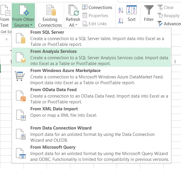
We select “From Analysis Services” (see below)
The “Data Connection Wizard” now appears. We configure this to point to our Tabular Analysis Database (see below).
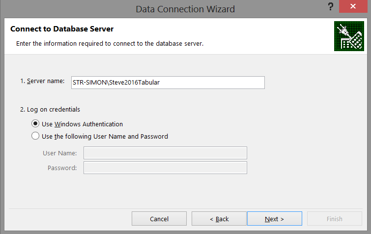
We click “Next”.
The next screen shows our Model that we created in Visual Studio or SQL Server Data Tools (see below).
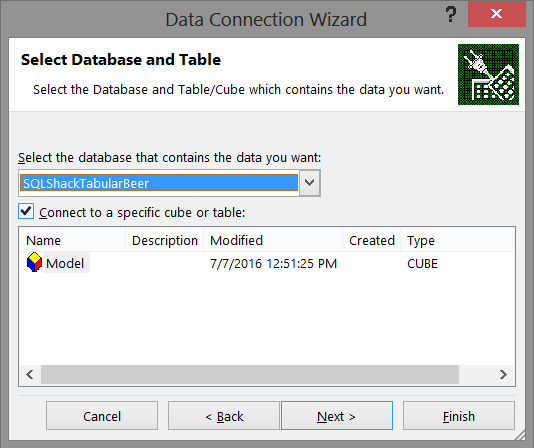
Having selected our database, we click “Next”.
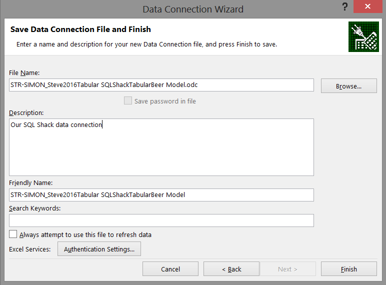
We now save our data connection and click “Finish” to complete the connection process (see below).
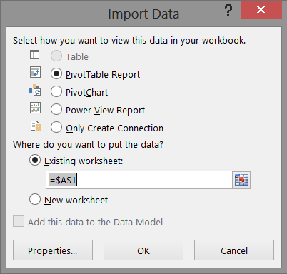
Having achieved all of this, we are now at the stage where we can import all the data that we have assembled (see below). We shall accept to create a “PowerTable” report for this exercise and click “OK” (see below).
Having completed this we find our work area looks similar to my view shown below:

This is where we are going to work our magic!!
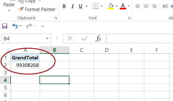
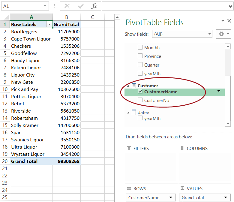
We shall drag the measure “GrandTotal” (see above) which now appears among the Pivot Table Fields and which originates from our Visual Studio / SQL Server Data Tools project; onto the Pivot Table (occupies cells A1 to C18) (see below).
To this we now add our “CustomerName” from the customer table. Our canvas appears as follows:
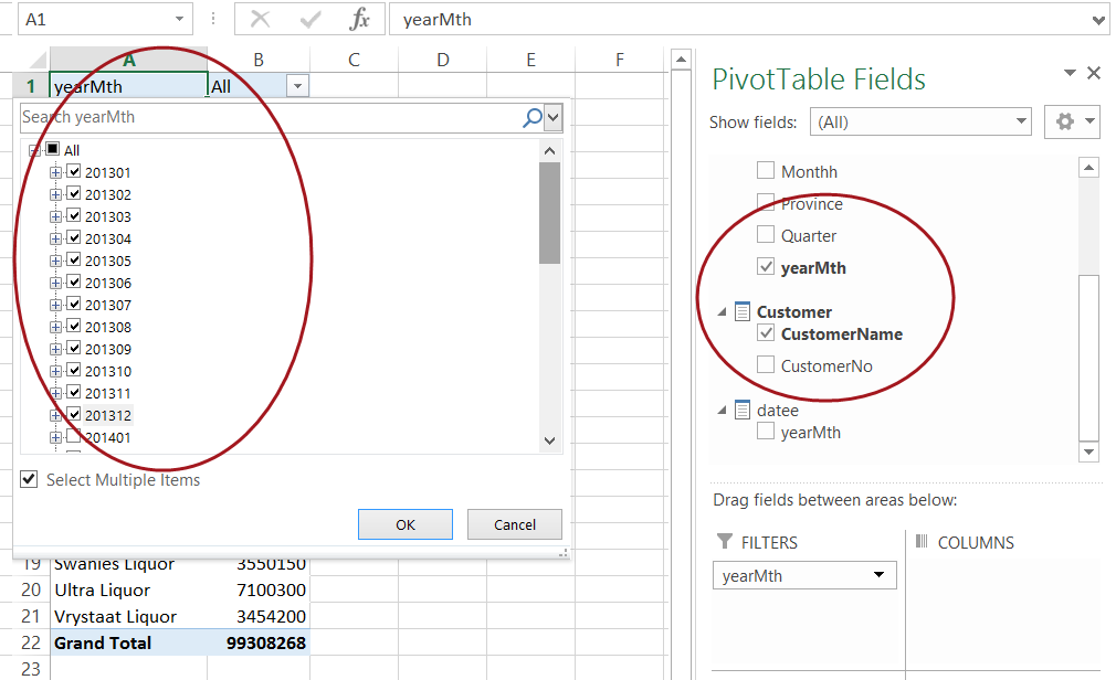
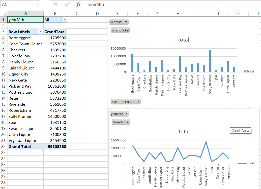
Now let us look at the financial year 2013 solely to see the results for those clients listed above. To achieve this, we add a filter to the “Filters” box seen above and enclosed within the circle.
The change in the values may be seen in the following two screen shots.
and
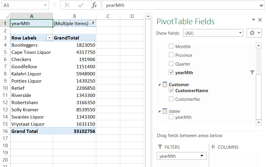
Now naturally we could have chosen any year, the point being do note that because the values are aggregated by a “date time”, changing the “what if” scenario is fairly easy and rapid.
We take our exercise one step further by inserting a Pivot Chart. This is achieved by selecting “Insert“ from the main menu ribbon. We select a “Pivot Chart” (see below).
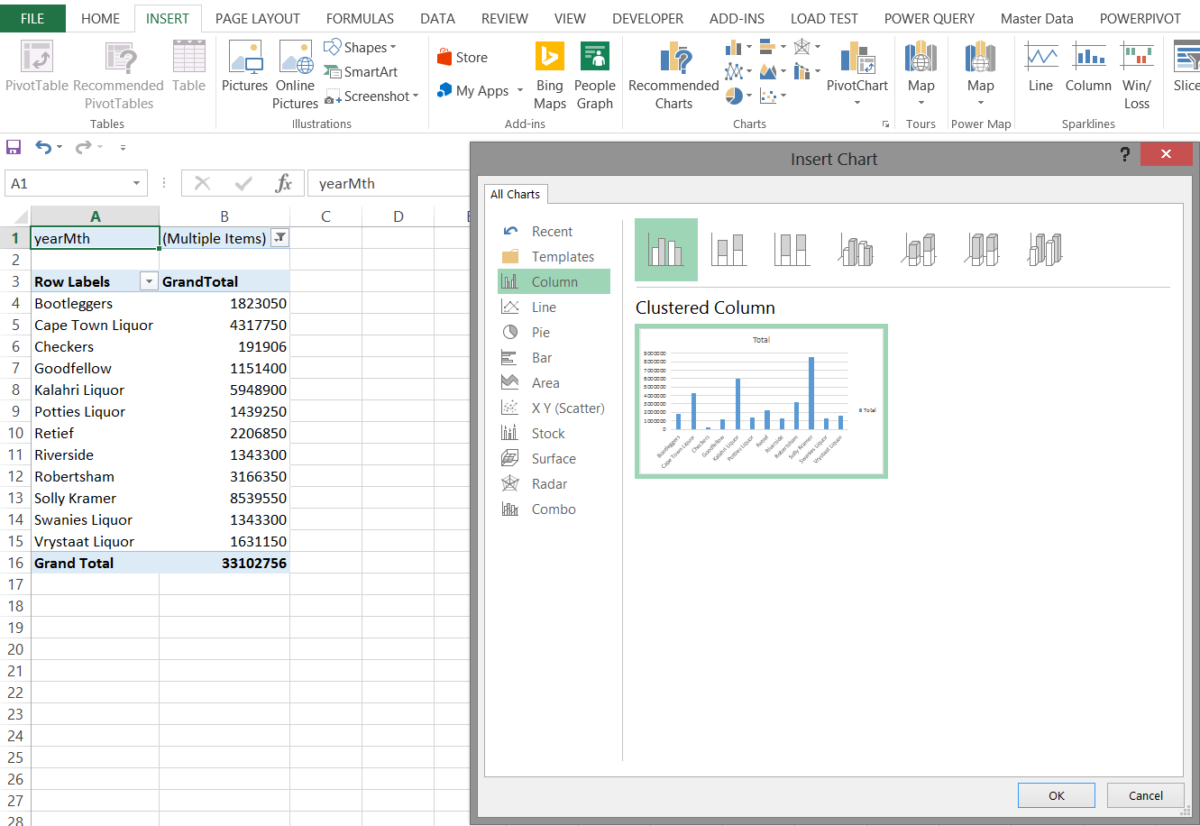
The results may be seen in the following screen shot.
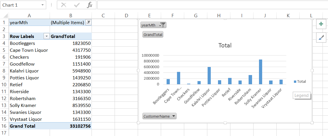
The screenshot above shows a bar chart and the following screenshot as simple line graph
Our final report appear below and is quite comprehensive.
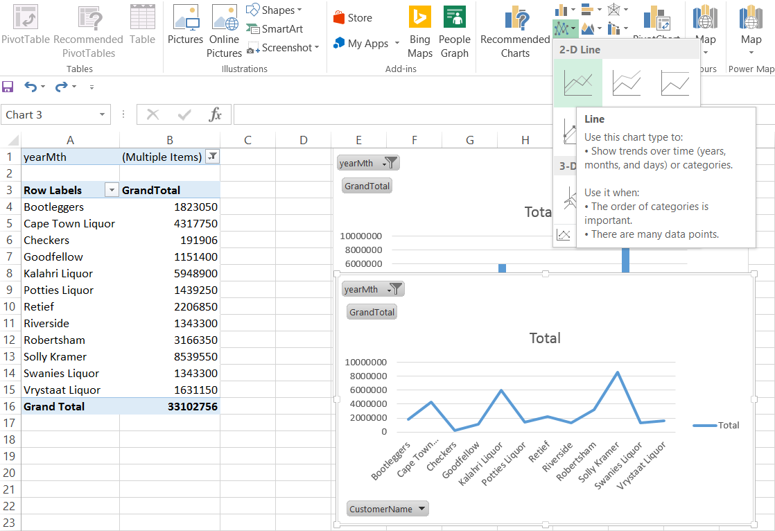
It should be noted that once the filters are removed or altered (within the matrix), that both the chart and the line graphs will reflect the changes as may be seen below.
Demographic Consumption
Now what would be interesting is to view the sales relative to geography.
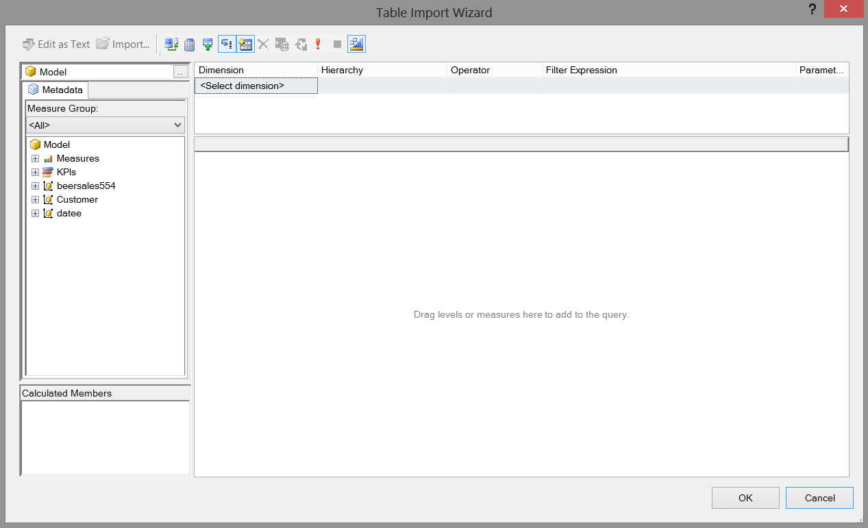
To do so we shall utilize “Power Map”. Before we can do this though we must add these tables to our data model within our Excel Workbook.
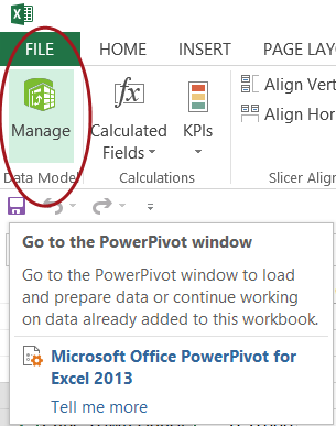
We click upon the PowerPivot tab and select “Manage Data Model” as may be seen below:
The blank “Manage Model” worksheet appears (see below).
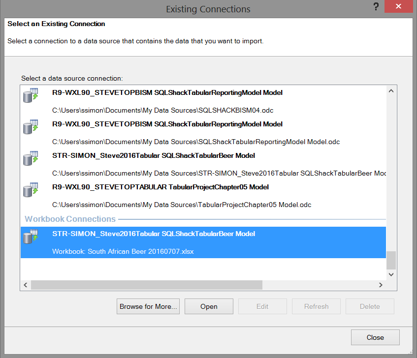
We click the existing connection to create a “View” from the tables in the Tabular Model that we created (see below).
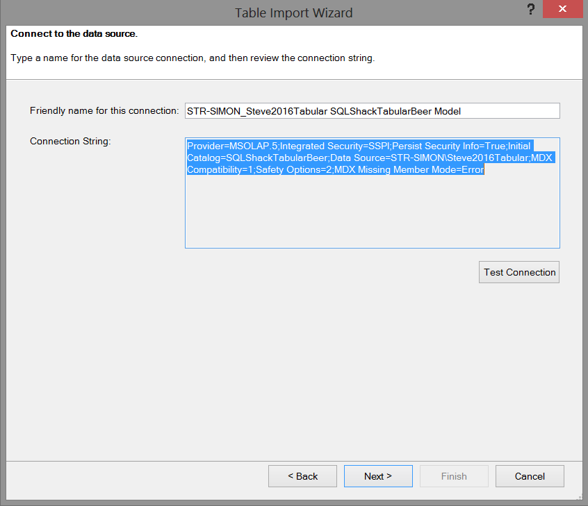
We click “Open” and note that Excel shows us the necessary connection string which will enable us to “communicate” with our Analysis Services database.
The next step in the process is a real GOTCHA and the author has been caught on this one numerous times. The following screen appears asking for a MDX expression with which to work. “What the heck!!!”
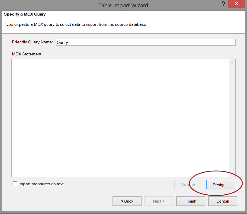
We simply click the design button and the contents of our cube automatically appear (see below).
Dragging our “Grand Total” field, the province, the city, the quarter onto our work surface we now have the following view.
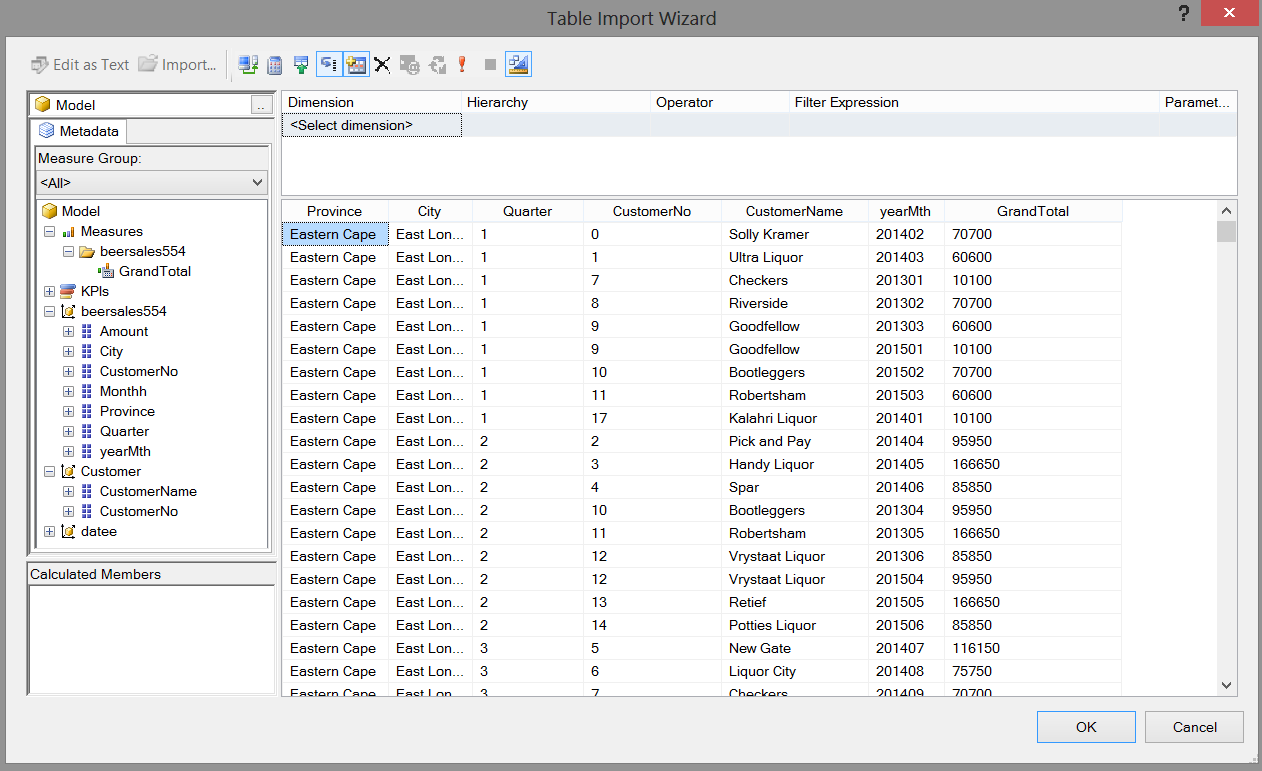
We click OK to accept our data choices whose data originates from the BeerSales554 and customer tables. The wonderful thing is that the MDX expression from our field selection is now displayed in that blank MDX expression box, as may be seen below:
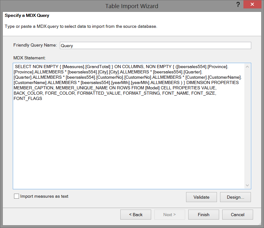
The MDX expression is also shown below.
|
1 2 3 4 5 6 7 8 |
SELECT NON EMPTY { [Measures].[GrandTotal] } ON COLUMNS, NON EMPTY { ([beersales554].[Province].[Province].ALLMEMBERS * [beersales554].[City].[City].ALLMEMBERS * [beersales554].[Quarter].[Quarter].ALLMEMBERS * [beersales554].[CustomerNo].[CustomerNo].ALLMEMBERS * [Customer].[CustomerName].[CustomerName].ALLMEMBERS * [beersales554].[yearMth].[yearMth].ALLMEMBERS ) } DIMENSION PROPERTIES MEMBER_CAPTION, MEMBER_UNIQUE_NAME ON ROWS FROM [Model] CELL PROPERTIES VALUE, BACK_COLOR, FORE_COLOR, FORMATTED_VALUE, FORMAT_STRING, FONT_NAME, FONT_SIZE, FONT_FLAGS |
We click “Finish” and the system imports the necessary raw data (see below).
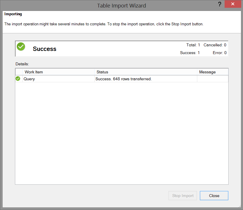
We close the “Table Import Wizard” and ascertain that our data has been imported as may be seen below:
We “Save”, “Close” and “Exit” (see below).
We are now in a position to create our “Power Map”!
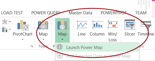
We select “Insert” from the main menu ribbon and click “Map” and “Launch Power Map”.
Opening Power Map we are greeted with our drawing surface (see below).
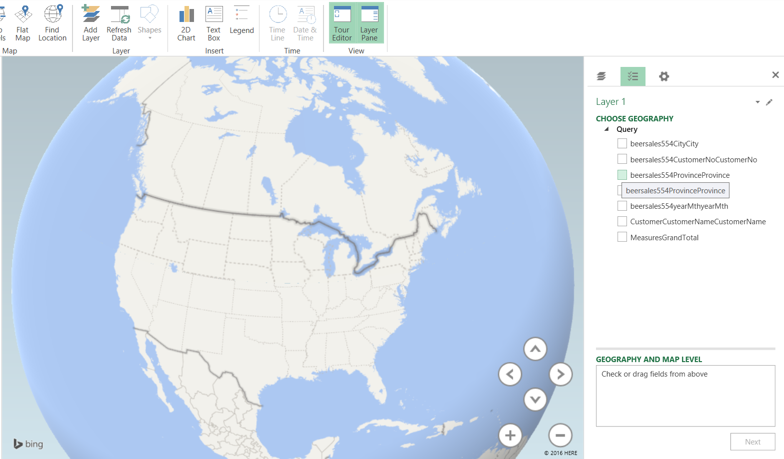
We now set the “Geography” by clicking on the City field within the “Choose Geography” box (see above).
We note that upon doing so that the map changes to show southern Africa.
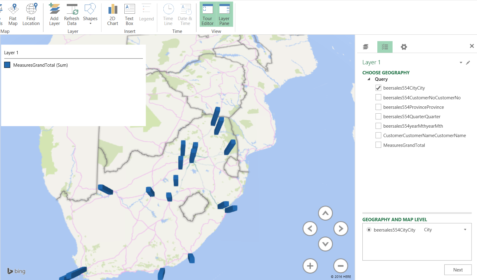
We click the “Beersales554CityCity check box and the cities for which we have data are now visible on the map.
Our next task is to plot the amount of sales that were recorded. We click “Next”.
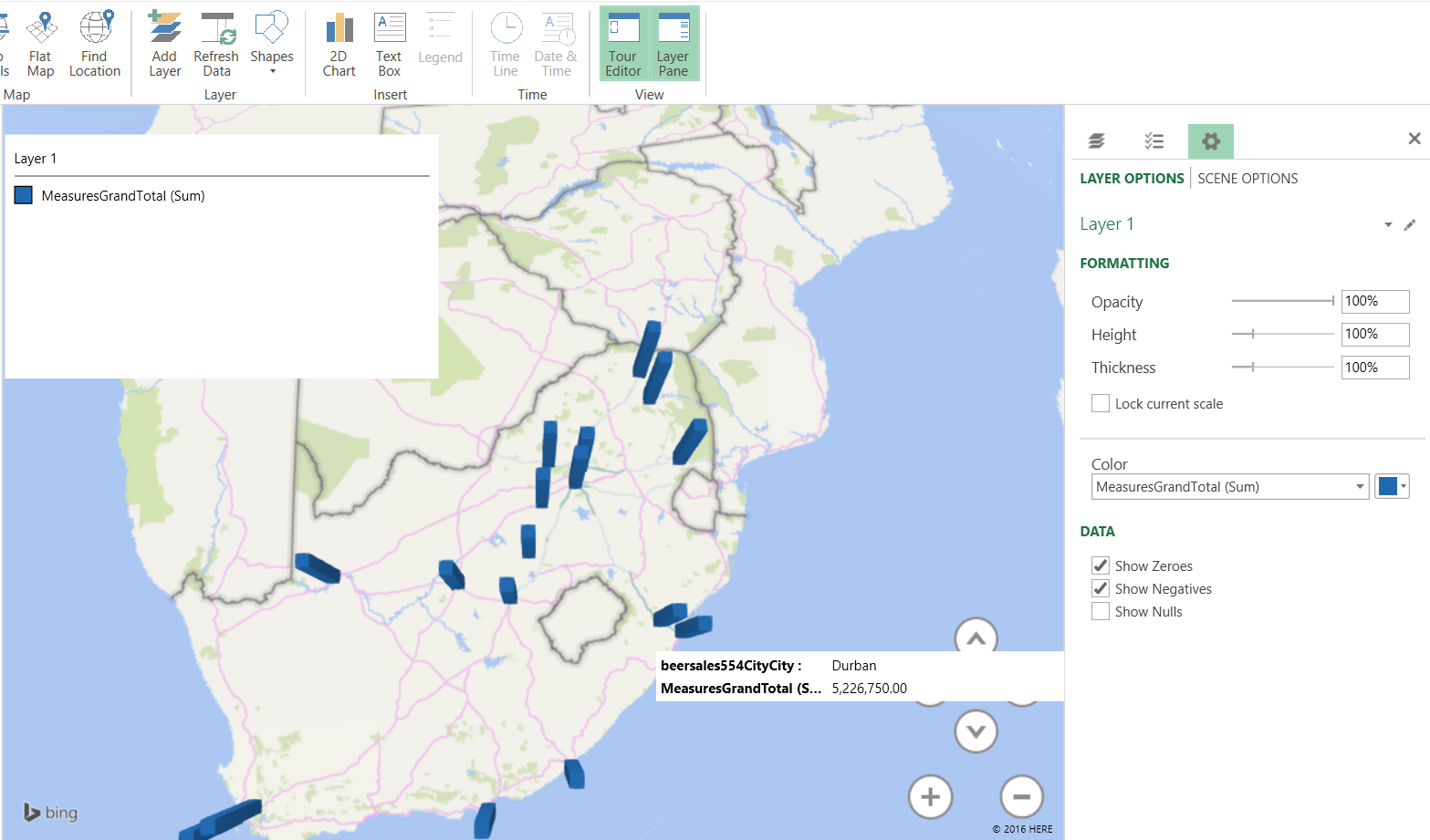
By checking the “MeasureGrandTotal” box we see the value of the total sales (see above) and by adding a time dimension, we can gage beer sales for the period of time under consideration (see below).
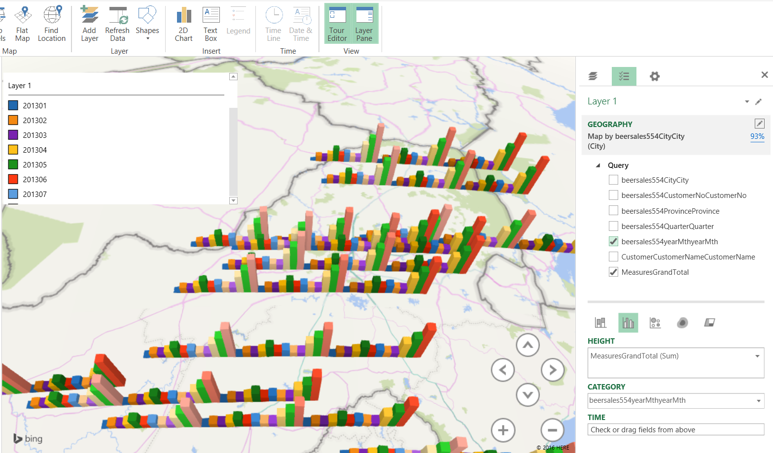
These types of charts are extremely useful to the decision maker who really wants to understand seasonal fluctuations and their effect on the bottom line.
Once again we have come to the end of our “get together” and I sincerely hope that this project has stimulated you, the reader, to try some topics that we have discussed. I honestly believe that you will be surprised.
Conclusions
Decision makers oft times are faced with difficult decisions with regards to corporate strategy and the direction and correction that must be made in order for the enterprise to achieve its mission and objectives. Many of today’s decision-makers have had extensive experience utilizing Microsoft Excel and it often gives them a “feeling of comfort”. The SQL Server Tabular project projects the “spreadsheet” image and often installs confidence in those that take advantage of its capabilities. While Excel is merely one manner in which data may be turned into information, SQL Reporting Services may achieve the same results, and in the second and last part of this series, we shall be utilizing this same project however our reporting will come from our Reporting Server.
In the interim, happy programming.
See more
For SQL Server and BI documentation, consider ApexSQL Doc, a tool that documents reports (*.rdl), shared datasets (*.rsd), shared data sources (*.rds) and projects (*.rptproj) from the file system and web services (native and SharePoint) in different output formats.
References:
- Microsoft Power BI Blog
- Automated administration across Multi-server environment
- Event forwarding between target and master servers
Steve has presented papers at 8 PASS Summits and one at PASS Europe 2009 and 2010. He has recently presented a Master Data Services presentation at the PASS Amsterdam Rally.
Steve has presented 5 papers at the Information Builders' Summits. He is a PASS regional mentor.
View all posts by Steve Simon
- Reporting in SQL Server – Using calculated Expressions within reports - December 19, 2016
- How to use Expressions within SQL Server Reporting Services to create efficient reports - December 9, 2016
- How to use SQL Server Data Quality Services to ensure the correct aggregation of data - November 9, 2016