

This article demonstrates Power BI visuals for visualizing Coronavirus impact worldwide using various visuals such as a filled map, Word Cloud, Slicer, Q&A.
Introduction
World health organization declared Coronavirus (COVID-19) a pandemic. It is a disease spread in most of the countries. It is causing countries to seal their borders, cancel any mass gathering events, cancellation of concerts, meetings, sporting events, people to stay home, stock up groceries. It is impacting almost all categories economically like tourism, travel, aviation, petroleum. As per the recent article on Guardian, Corona could cut the world economy by $1tn.
You should follow the general guidelines offered by the WHO for ensuring safety from Coronavirus. In this article, we will focus on creating a Power BI Dashboard showcasing the Coronavirus impact worldwide.
Note: We are creating this dashboard for demo and educational purposes only. You should validate the data from verified sources and stay safe!
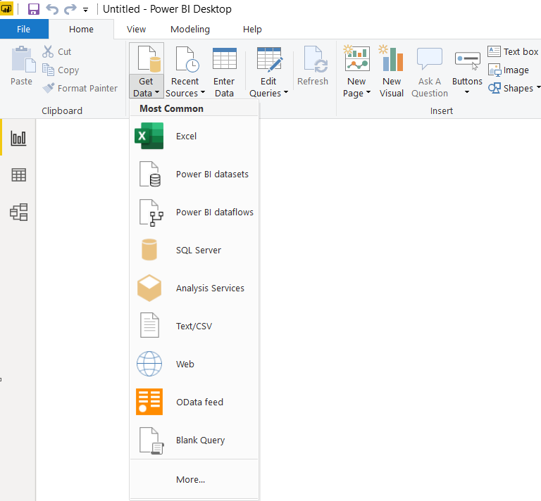
For this article, I am taking data from the 2019–20 coronavirus pandemic page of Wikipedia. First, let’s import the data into Power BI dashboard. Our data is in a web page so we can use a web data source. Launch Power BI Desktop and click on Get Data -> Web
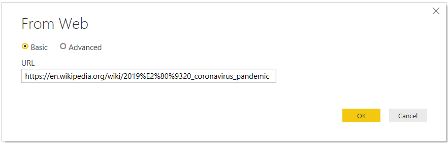
In the Web source, specify the reference URL and click OK.
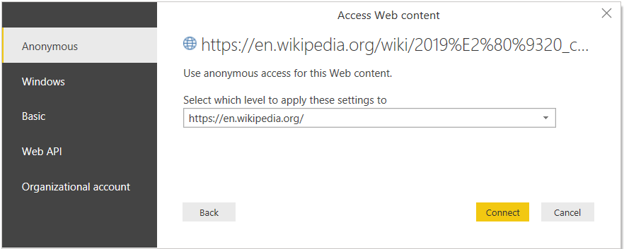
On the next page, allow anonymous access for the web content. Click on Connect, as shown below.
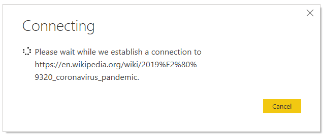
It establishes a connection to Web URL.
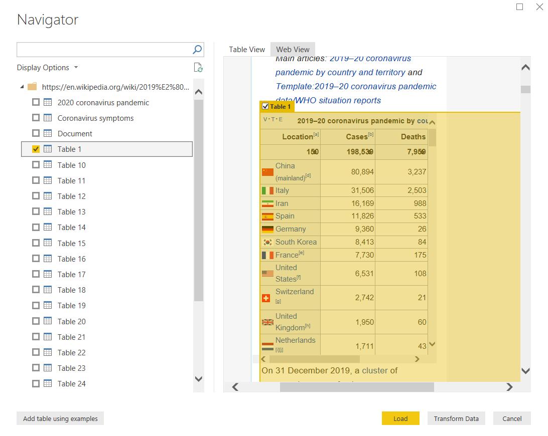
You get a table and a web view of the web page. Let’s go to Web view and select the table showing data that we want to import for our report. In this following screenshot, you can notice table 1 contains the required data for our dashboard.
We can directly load this data or modify it per our requirement using Transform data. Let’s click on the transform data, and it opens Power Query Editor.
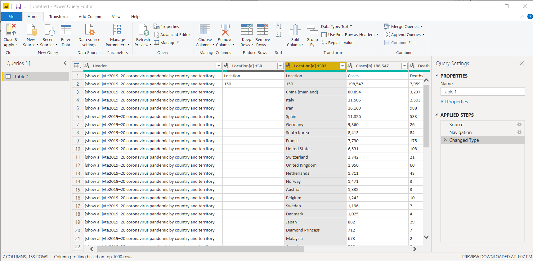
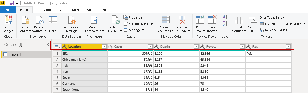
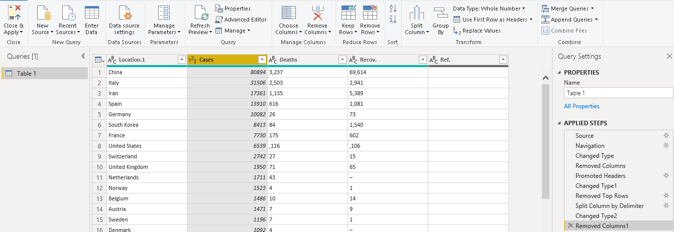
We do not require the first two columns in the report. Select these columns and click on Remove Columns.
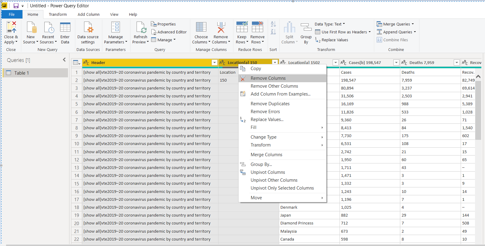
Once we removed the unwanted columns, we can make the first row as the column header. Click on Use first row as header as shown below.
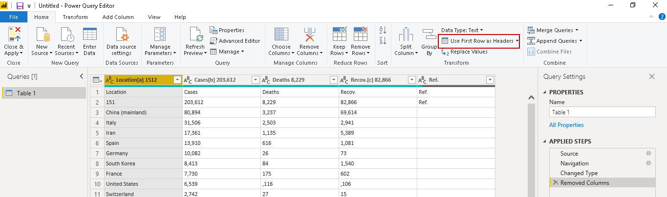
It changes the column header as per the following image.
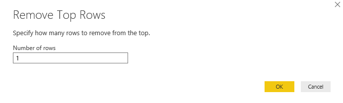
We need to remove top rows as well in the data. Click on Remove Rows-> Remove Top Rows and specify 1 in the number of rows as shown below.
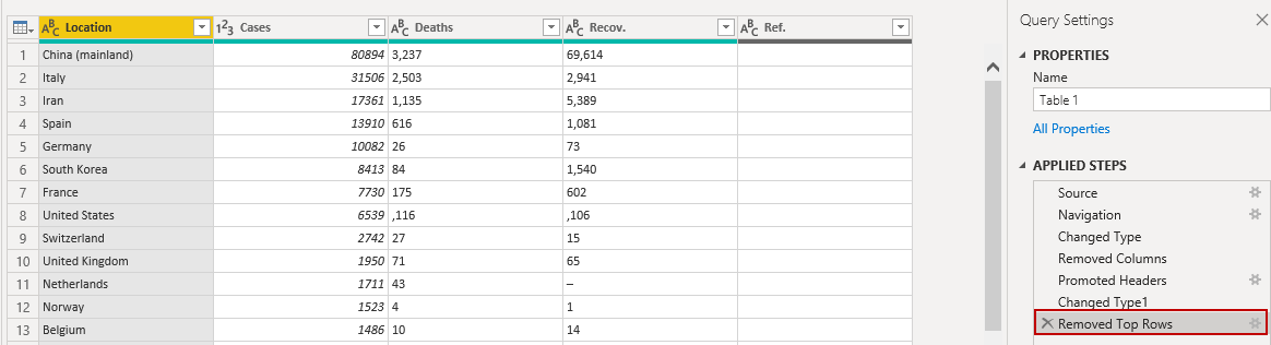
It removes the top row, as shown below.
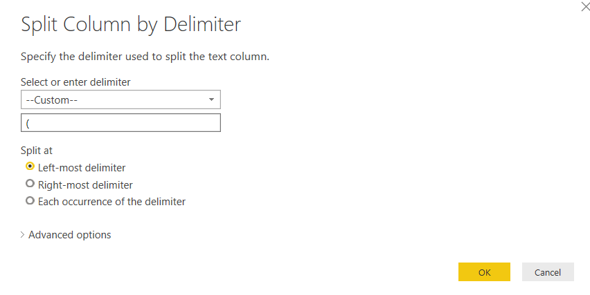
In the Location field, we have a few countries with the name in small brackets () as well. Let’s eliminate the small brackets text as well. Right-click on the Location column and select Split Column-> By Delimiter.
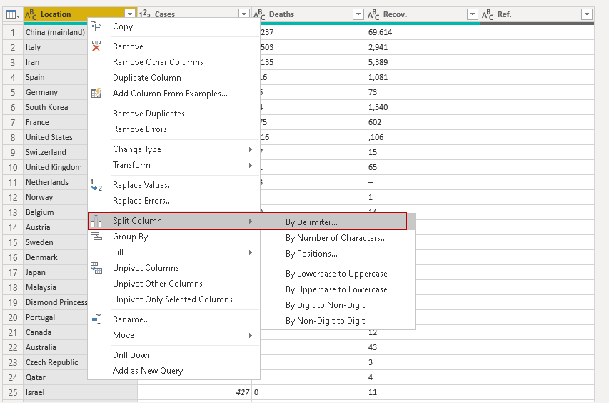
In the split column by delimiter menu, click on custom and specify small bracket[(] as a delimiter. We can use left-most delimiter in this case as it will split the text on the first occurrence of a small bracket.
Click OK, and you get a new column for split data.
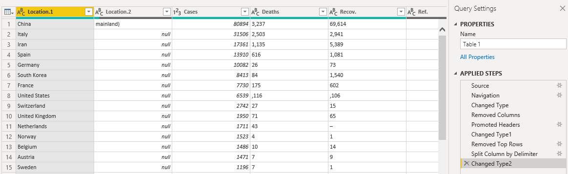
Right-click on the new column and Remove this column. Our data looks like below.
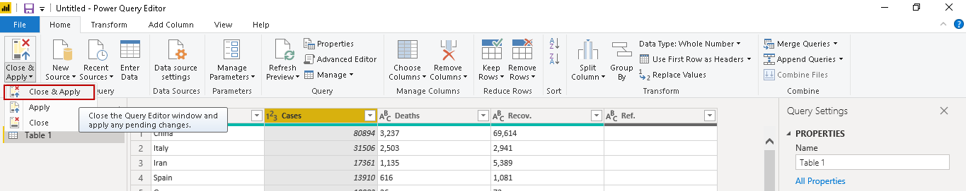
Click on Close & Apply. It saves the data and takes us back to the designer pane.
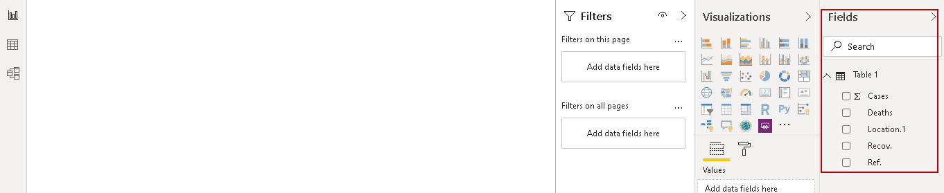
You can see data fields in the following image.
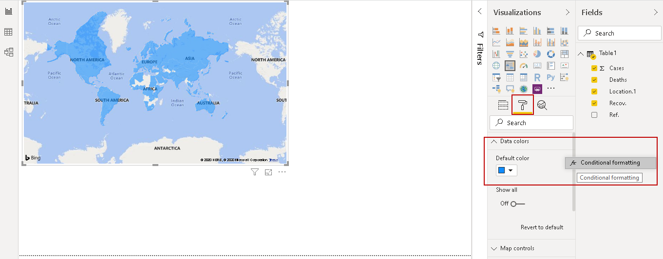
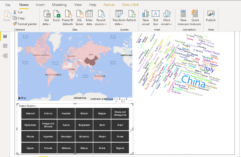
Add a Filled Map Visualization in Power BI Report
Click on a filled map visualization icon, adjust the position of the map visual and drag the fields into field map data columns as shown below. We get the following visual in the report.
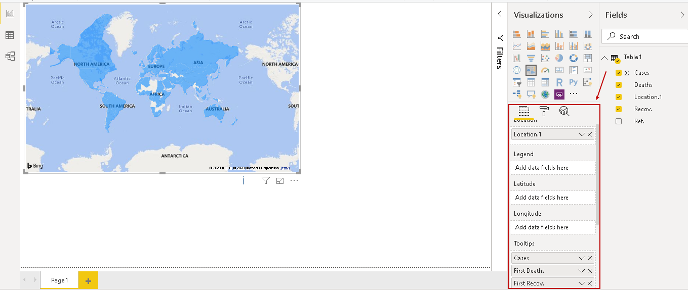
Rename the column from the map column as shown below.
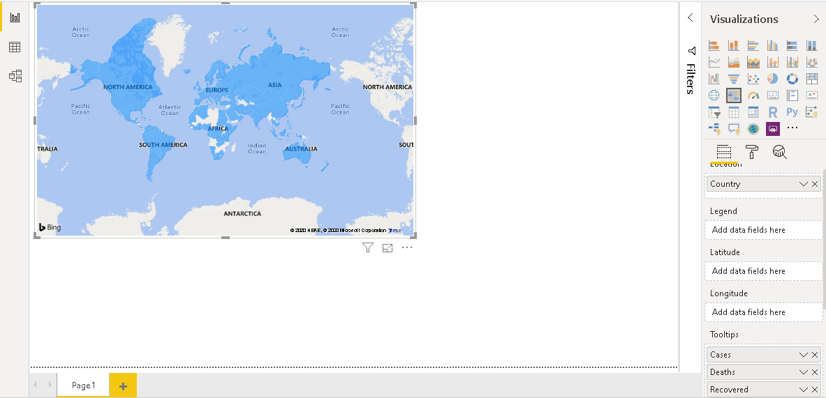
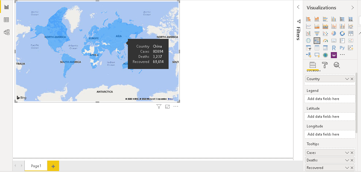
If we take the mouse pointer over any country, it shows the details in a tooltip.
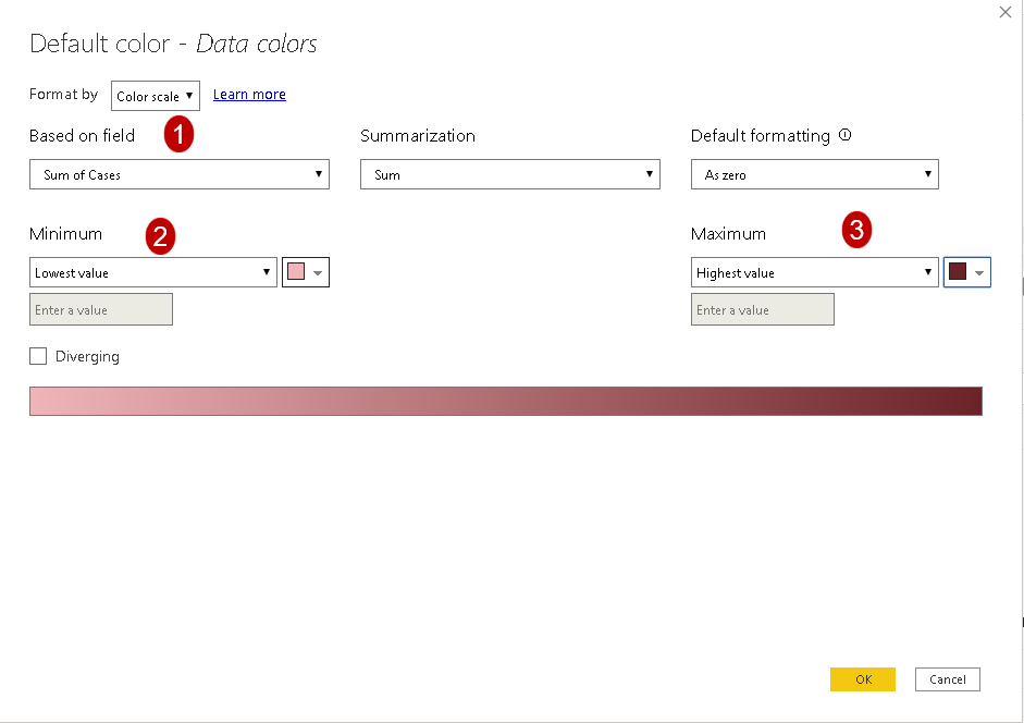
Currently, The Power BI Desktop report shows different colors for each country. We can define a color coding for better visualization. Go in the format area and click on Data colors-> Conditional formatting.
Here, select the field such as cases and select the color range for the minimum to maximum values. You can choose the color coding as per your requirements.
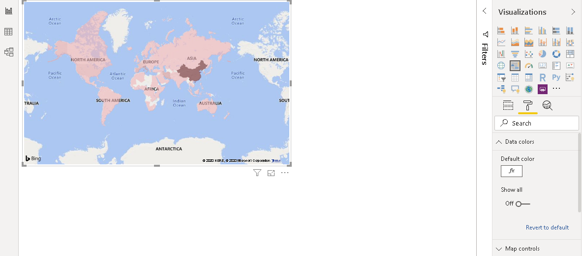
Now, you can visually distinguish the country based on the color code. For example, it shows the darkest color for China that is most impacted.
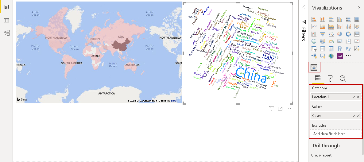
Add a Word Cloud Visualization
In the next step, we add a Word Cloud in this visual. You can refer to the article How to create a Word Cloud generator in Power BI Desktop. Word Cloud shows impacted countries based on total cases. Here, we see the largest font size for China as per the total reported cases.
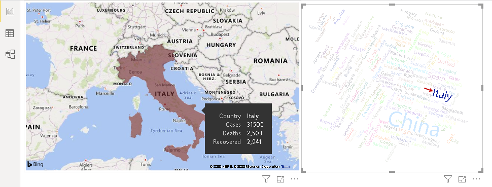
We can click on a particular country and the map chart zooms over that particular country. For example, let’s click on Italy, and it changes the visual as shown below.
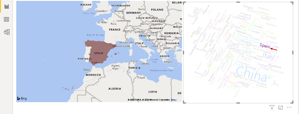
Similarly, click on Spain and map zooms over Spain. You can click on a blank area in the Word Cloud to move back to the original state.
Add a slicer in Power BI Desktop report
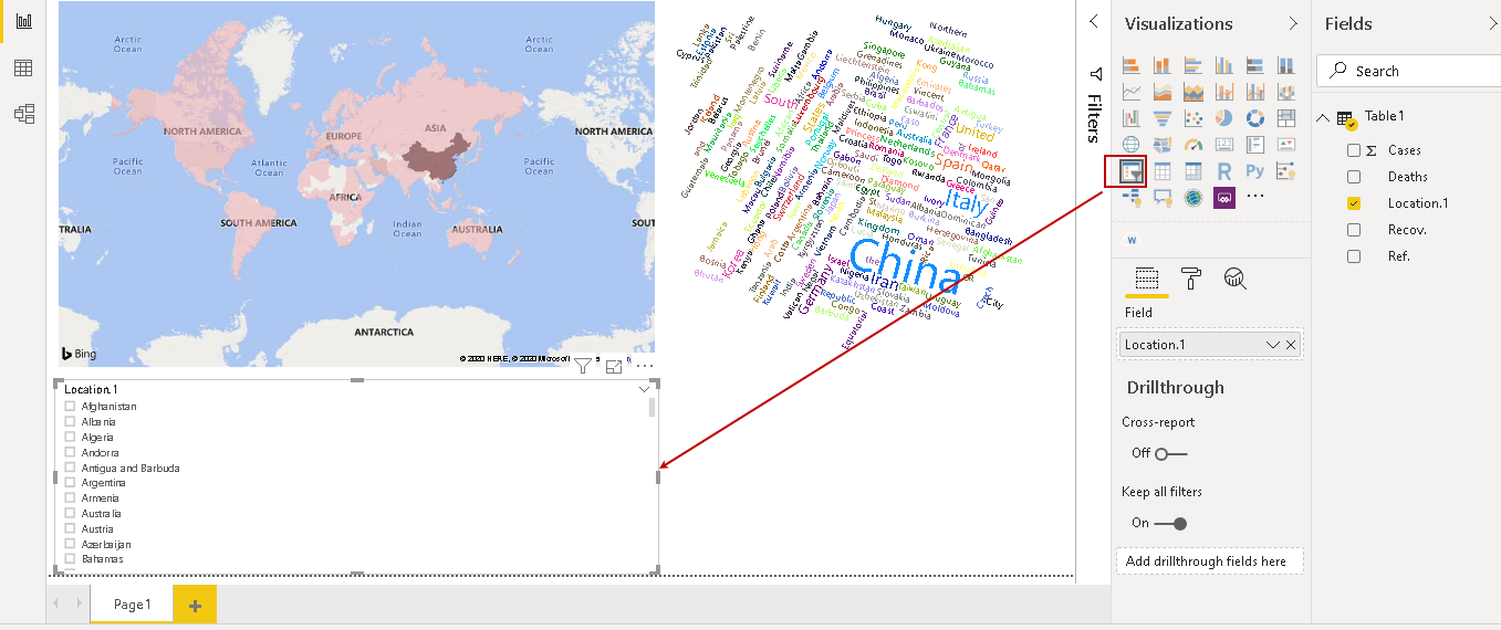
We might want to look at data for a specific country. It might not be feasible for you to search on the map for a specific country. We can add a slicer visual for this purpose. Click on a slicer and drag the location column in the slicer data column. You get the following visuals.
Let’s do some formatting for better visualization and gain insights.
-
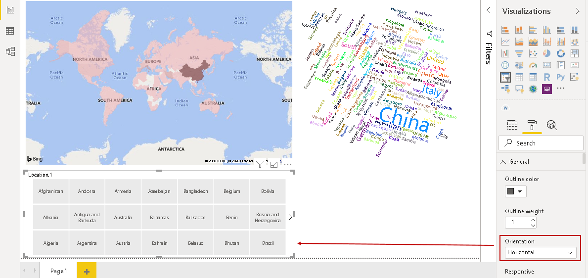
Change Orientation from vertical to horizontal in format chart property. It arranges the country names in a Horizontal tile format

-
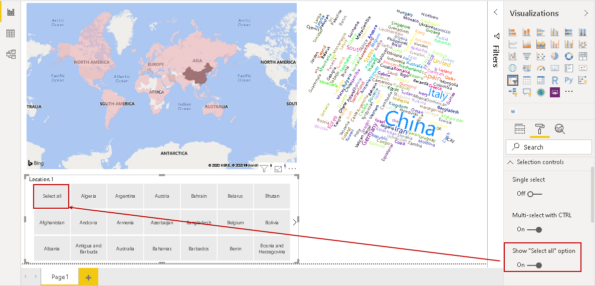
Add a Select all selection tile. By default, the slicer does not show select all selection tile. It is a good practice so we can look at all countries’ data together
-
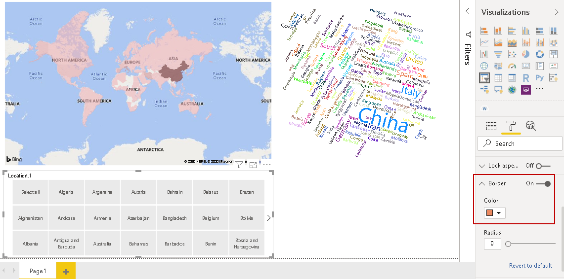
Enable border for slicer and choose a border color. It helps to distinguish slicer from other visuals in the report
-
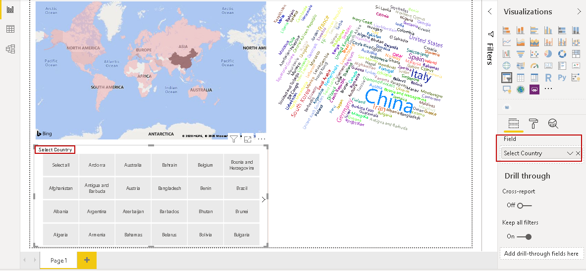
Change the heading to an appropriate name. In the following screenshot, we renamed it to Select Country
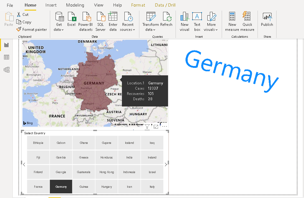
Now once we have done the formatting, click on a tile in the slicer. For example, once we click on Germany, it changes the Word Cloud and maps visually for that country.
Now, click on Select all tile and it moves back to the original state showing all countries data in both Word cloud and Maps visual.
Add a card visual in Power BI Desktop
We can add a card in the report to showcase details such as the total number of cases, total recoveries. Click on a card, add the field (case), and it shows up the total cases in the tile.
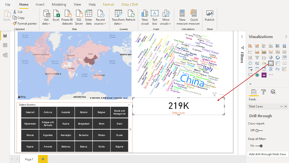
Similarly, based on the requirement, you can add further card to add more details in your report.
Add interactive Q&A in Power BI report
Power BI allows you to add the Q&A feature in the report, and you can ask questions against data set interactively. You can refer to the article Ask a Question feature in Power BI Desktop and Power BI Desktop Q&A data interaction examples for more details. Click on the Q&A icon in the visualizations and adjust the size of the Q&A pane.
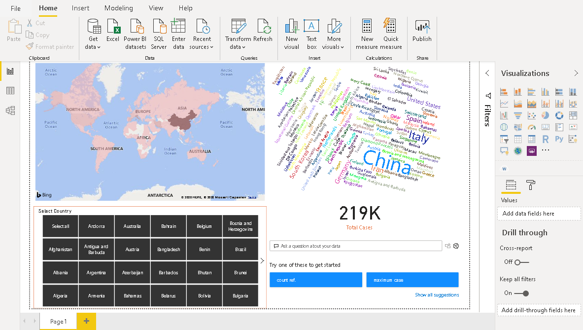
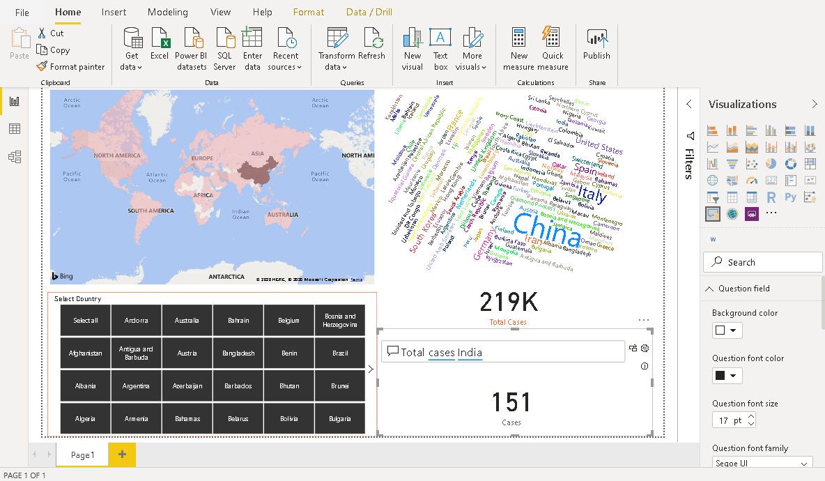
Suppose we want to know the total cases of a specific country. Once we start typing, it gives us suggestions to choose from a variety of options.
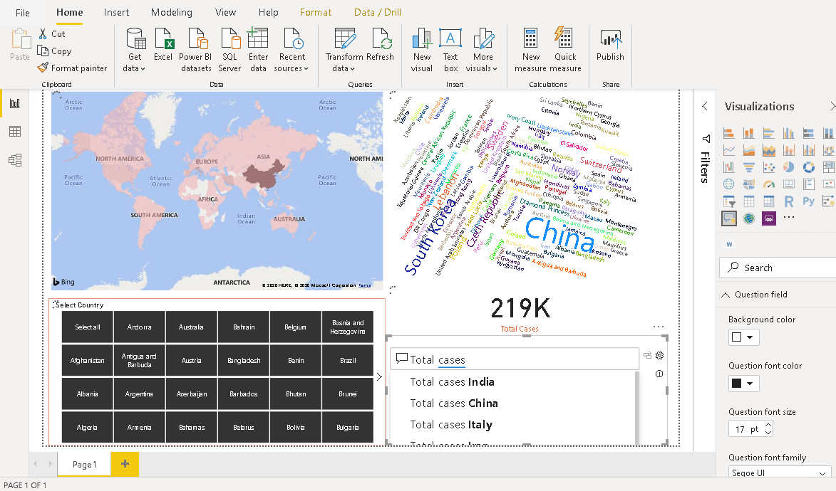
For example, we are interested to know the total cases in India. We can select this from suggestion or type it, and it gives you an answer for it.
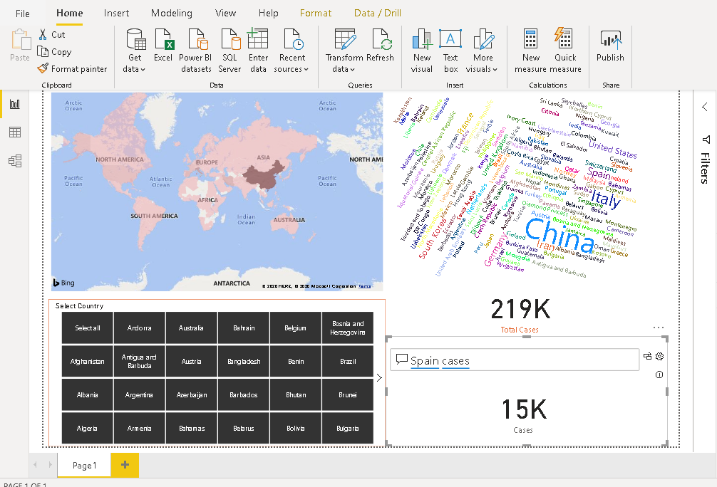
Similarly, in the following image, it shows total cases in Spain.
Add Coronavirus symptoms and preventions chart in the report
As we all know, Prevention is better than cure. It applies to the coronavirus disease as well. You might be interested in adding such information in your report for the informational purpose to users. To visualize it better, I removed Q&A and Card visualization from the report.
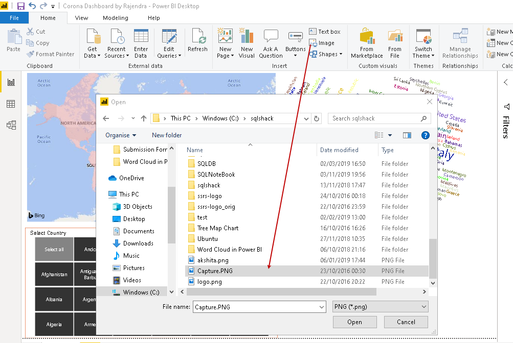
For this section, I am taking an image from a specified URL.
Click on an image in the menu and browse to the image location.
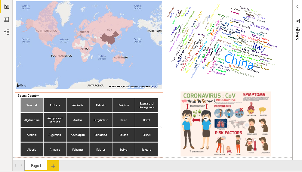
It imports the image in the Power BI report, and we can see Coronavirus preventions and symptoms in the visualization.
Conclusion
In this article, we created a Power BI Desktop dashboard for visualizing the impact of Coronavirus worldwide. It is a severe concern in all countries at this time. You should take necessary precautions and consult your doctor in case, you see any symptoms.

I am the author of the book "DP-300 Administering Relational Database on Microsoft Azure". I published more than 650 technical articles on MSSQLTips, SQLShack, Quest, CodingSight, and SeveralNines.
I am the creator of one of the biggest free online collections of articles on a single topic, with his 50-part series on SQL Server Always On Availability Groups.
Based on my contribution to the SQL Server community, I have been recognized as the prestigious Best Author of the Year continuously in 2019, 2020, and 2021 (2nd Rank) at SQLShack and the MSSQLTIPS champions award in 2020.
Personal Blog: https://www.dbblogger.com
I am always interested in new challenges so if you need consulting help, reach me at rajendra.gupta16@gmail.com
View all posts by Rajendra Gupta
- Understanding PostgreSQL SUBSTRING function - September 21, 2024
- How to install PostgreSQL on Ubuntu - July 13, 2023
- How to use the CROSSTAB function in PostgreSQL - February 17, 2023