
One of the most powerful reporting tools is Microsoft is SQL Server Reporting Service, also known as SSRS. SSRS offers various, impressive features including reports subscriptions, custom code, paginated reports etc. In this article, we are going to review some key features in SSRS, with a highlight on Bollinger Bands
Calculated series
A little-known feature known as a calculated series is very handy for financial and statistical analysis when working with SSRS. Calculated series lets us add statistical analyses to SQL Server Reporting Service report charts. The advantage of this calculated series is that we don’t need to create any complex expressions or calculations. We can add this statistical analysis to SSRS reports very easily.
You can find these calculated series in SSRS
- Mean
- Median
- Bollinger bands
- Moving average
- Exponential moving average
- Triangular moving average
- Weighted moving average
- MACD
- De trended price oscillator
- Envelopes
- Performance
- Rate of change
- Relative strength index
- Standard deviation
- TRIX
After this, calculated series shield SSRS charts are more useful because these type of charts do not only illustrate data, because statistical methods convert pure data into more meaningful than before and let us make estimations.
The intent of this article is to highlight how to create a calculated series in SSRS reports and usage details. Because this feature can be useful in advanced analyses, for example, you can find several types of moving average calculations and these methods can help to determine the trend of a data series.
Bollinger Bands
As client requirements increase day by day and they want to see more and more details in their reports. Especially in the financial trading and investing ecosystem, traders and investors need to make proper decisions in a timely manner and they require statistics reports to take these decisions. In this article, we will mention about Bollinger Bands technique and how to apply this method in Reporting Service reports.
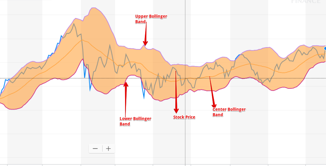
In financial market analysis, the Bollinger Band method has very common usage. Bollinger Bands were first used by the famous analyst and trader by John Bollinger in 1980. This technique is designed to measure price changes in the market. The essential usage of Bollinger Bands include estimating the future price of the investment instrument, seeing the market volatilities and assisting in determining buy and sell signals. The Bollinger Band technique can determine
- the investment instrument direction of the trend
- the price movements of volatility
- top and bottom levels of price
- the price targets
When we look at the Bollinger Bands calculation details; it uses two main statistical methods, one of which is a standard deviation and the other one is moving average. Standard deviation is a statistical formula which measures volatility. Bollinger Bands measure price volatility and adjust themselves to market conditions. Bollinger Bands include three different curves; lower, center and upper. The center curve is based on a 20-day simple moving average. The lower and upper bands are formed by shifting the 20-day moving average by 2 standard deviation values in the up and down direction.
Calculation Formula of Bollinger Bands:
Center Bollinger Band: 20 days of moving average
Lower Bollinger Band: 20 days of moving average – (2 x 20 days standard deviation)
Upper Bollinger Band: 20 days of moving average + (2 x 20 days standard deviation)
How to create Bollinger Bands on SQL Server Reporting Services reports charts
After this brief introduction about Bollinger Bands, we can focus how to create calculated series of Bollinger Bands in SQL Server Reporting Service reports. First of all; we need a dataset like this because this structure of data is the default for financial analyses.
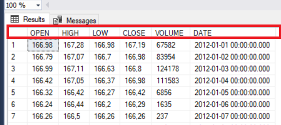
The following SQL script enables to create synthetic demo data or you can import this data from any financial websites to SQL Server.
|
1 2 3 4 5 6 7 8 9 10 11 12 13 14 15 16 17 18 19 20 21 22 |
DROP TABLE IF EXISTS BollingerBandSample CREATE TABLE BollingerBandSample ([OPEN] FLOAT, HIGH FLOAT, LOW FLOAT, [CLOSE] FLOAT, VOLUME FLOAT, [DATE] DATETIME) DECLARE @J AS INT=0 DECLARE @Dt AS DATETIME ='20120101' WHILE @J<=100 BEGIN SET @J= @J+1 INSERT INTO BollingerBandSample ([OPEN],HIGH,LOW,[CLOSE],VOLUME,[DATE]) VALUES(round(RAND()*1,2) + 167,round(RAND()*1,2) + 168,round(RAND()*1,2) + 167,round(RAND()*1,2) + 167,TRY_CAST(RAND()*10000 AS INT) ,DATEADD(DAY,@J*+1,@Dt)) END SELECT * FROM BollingerBandSample |
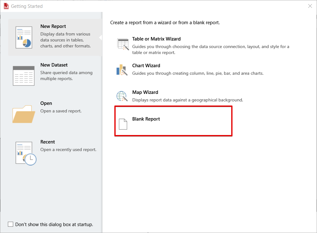
In this step, we will create a SQL Server Reporting Service report with Microsoft SQL Server Report Builder.
We will open a blank report.
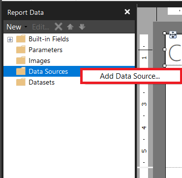
Right click Data Sources and click Add Data Source
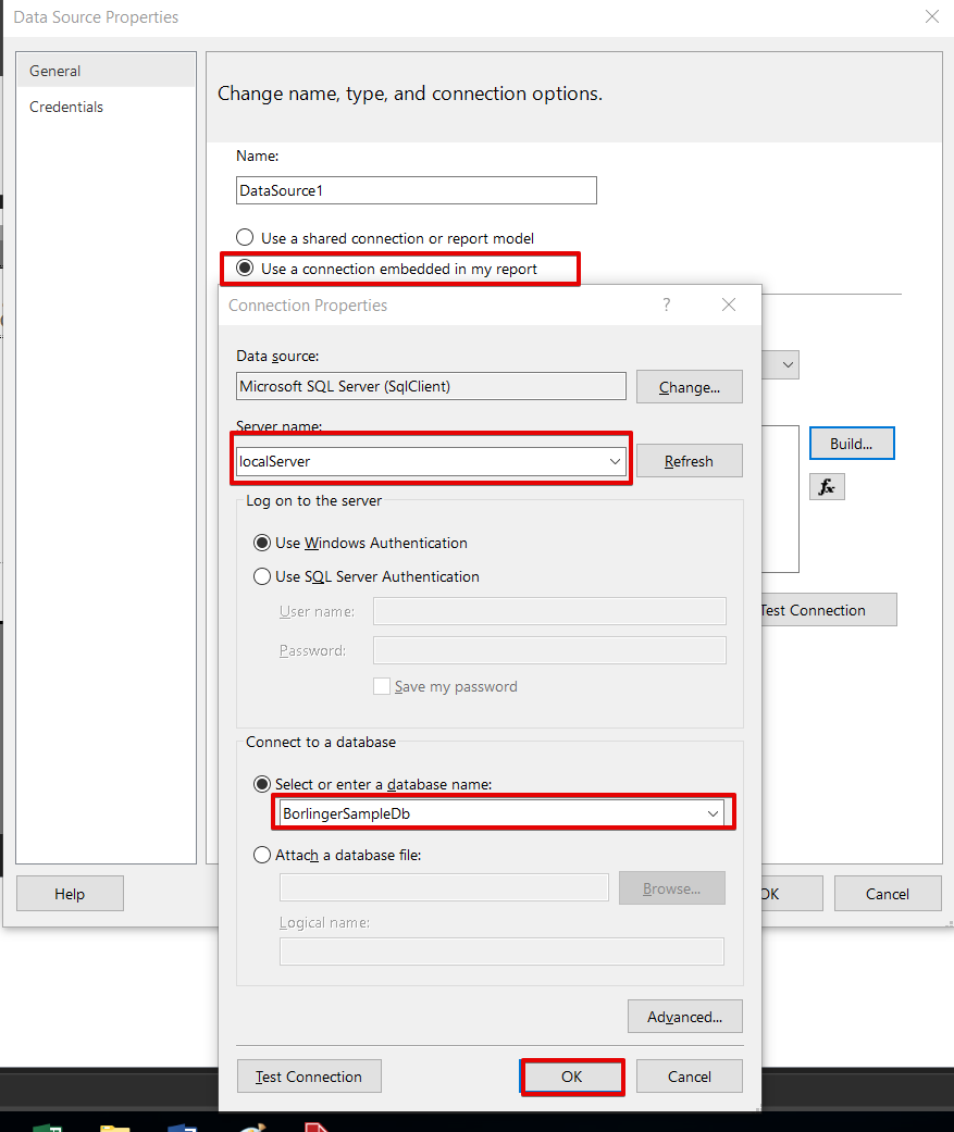
Chose Use a connection embedded in my report and define SQL Server connection settings.
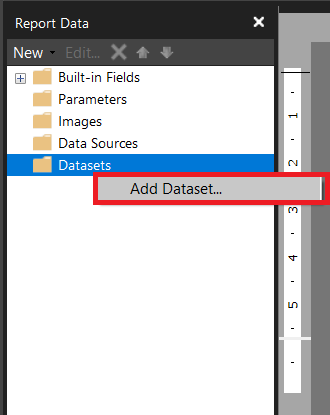
Right click datasets and click Add Dataset
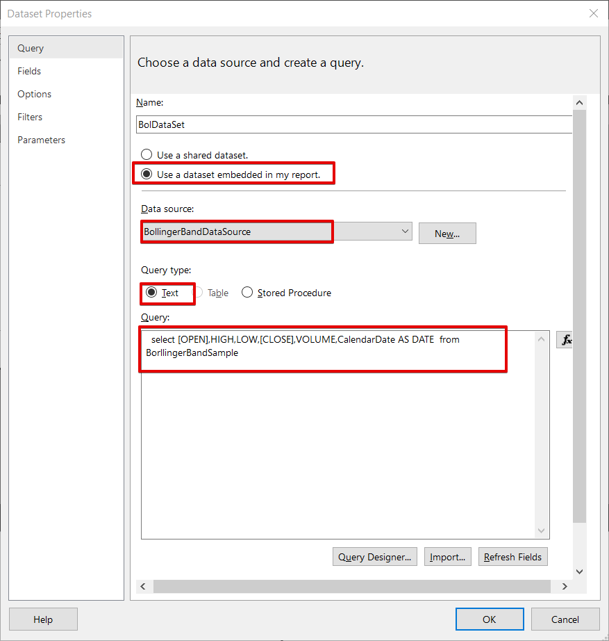
Chose Use a dataset embedded in my report and select data source which created the previous step. Select Query type as text and paste the query.
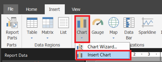
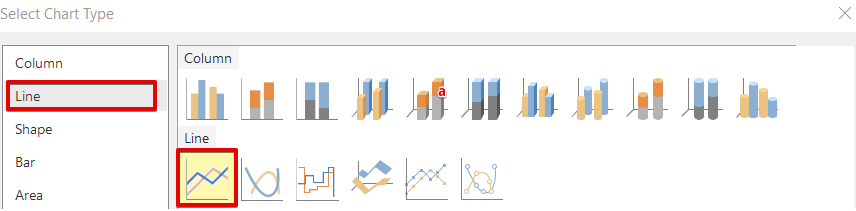
Click Insert Chart and select line chart.
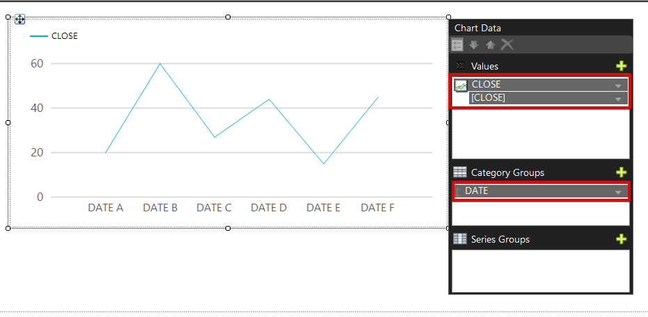
Set the Values and Category Groups fields like this.
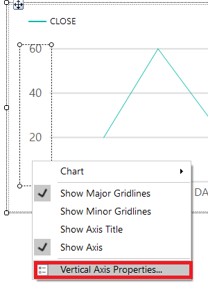
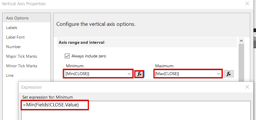
Right click the Vertical Axis Properties and change the axis maximum and minimum range values with these expressions.
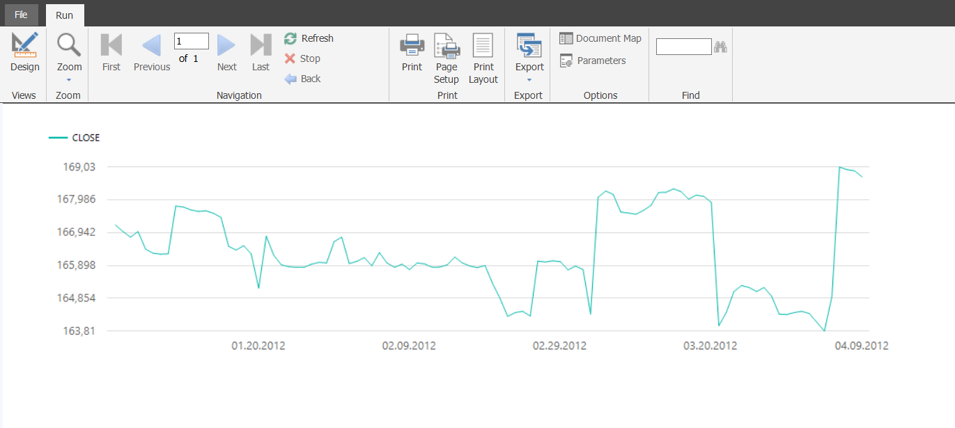
After completing all these steps; we will run the report and our report will look like this.
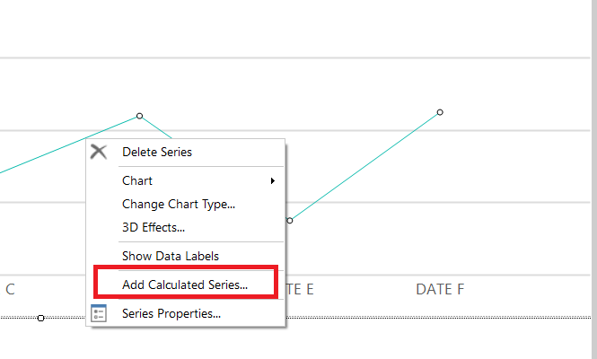
And we will return design panel and add Bollinger Bands to this chart. Right click on the chart design and select Add Calculated Series.
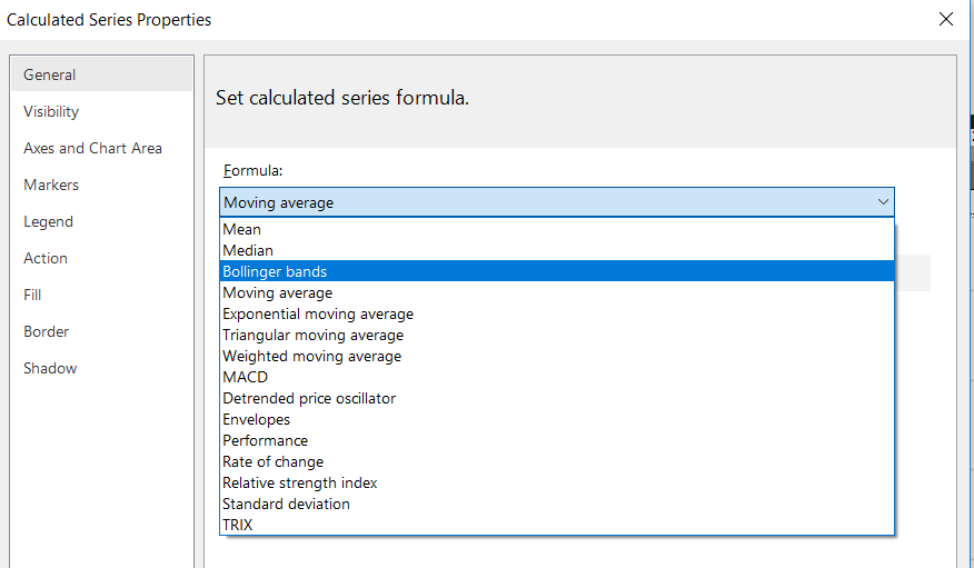
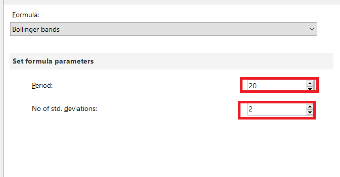
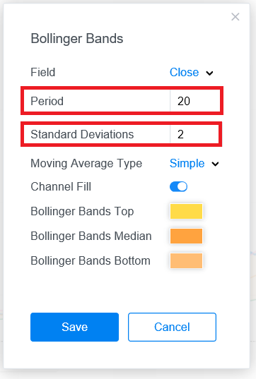
Select Bollinger bands.
In this step we have to set two parameters. These parameters directly affect the Bollinger Bands calculation.
Period parameter defines the day number of moving average period. We will set this parameter 20 as in general usage.
No of std. devastations parameter can be defined as standard deviation multiplier or coefficient in the upper and lower bands. When we increase this parameter there will be more data between the upper and lower band. In the standard formula of Bollinger this parameter is 2 and we will also set this parameter as 2.
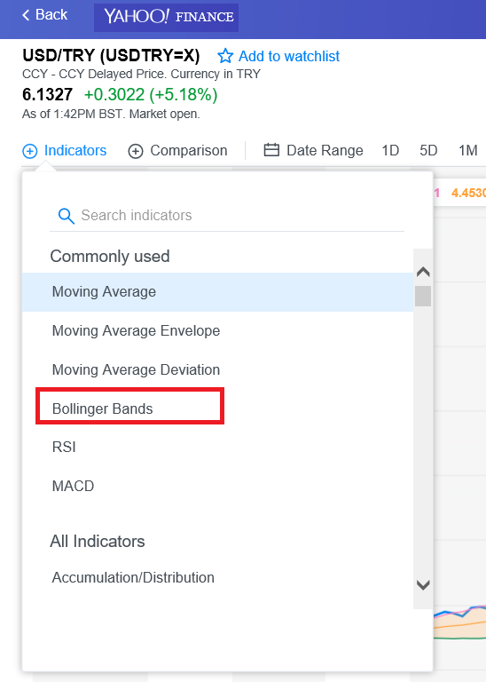
I want to add this note at this point that if you want to add Bollinger Bands in the Yahoo Finance you can see the default parameter of Bollinger Band as
Period: 20
Standard Deviations: 2
After this setting our chart design will look like this.

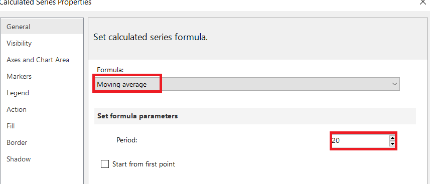
Now, we need to add central Bollinger band to our report. The central band illustrates the moving average and for this reason we will add new calculated series and select moving average.
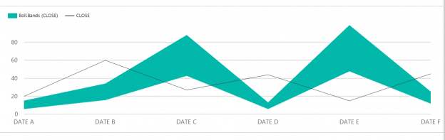
And finally, we will run the report and it will appear like this.
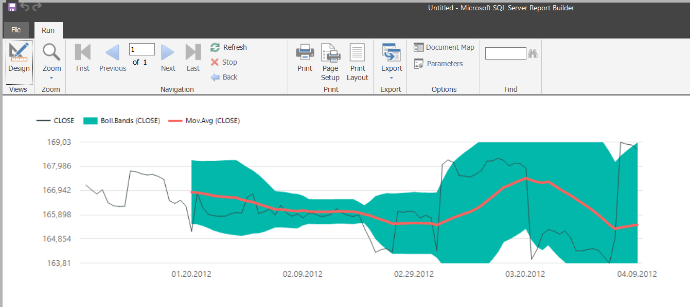
The above image shows a non-green area. This area defines the first 20 days because upper and lower Bollinger bands do not calculate these first 20 days.
Summary
In this article, we discussed Bollinger Bands and how to apply this method to SQL Server Reporting Service reports charts. But I want to add this major advice to report authors: don’t use these statistical functions in a production environment unless you have enough experience.

Most of his career has been focused on SQL Server Database Administration and Development. His current interests are in database administration and Business Intelligence. You can find him on LinkedIn.
View all posts by Esat Erkec
- SQL Performance Tuning tips for newbies - April 15, 2024
- SQL Unit Testing reference guide for beginners - August 11, 2023
- SQL Cheat Sheet for Newbies - February 21, 2023