
Introduction
In past chats, we have had a look at a myriad of different business intelligence techniques that one can utilize to turn data into information. In today’s “get together” we are going to try to pull all these techniques together, rationalize our development plans, and moreover, look at some good habits to adopt or for the want of better words utilize SQL Server Reporting Services Best Practices.
During today’s discussion, we shall be touching upon the following issues.
- Discussing the pros and cons of utilizing shared datasets.
- The ‘pluses’ and pitfalls of utilizing embedded reports.
- Report utilization logging.
- Utilization of graphics.
- Caching of data.
So let us get to it!
Utilization of datasets (shared vs. embedded)
To refresh our minds as to what a dataset is, I prefer to utilize a metaphor.
In ‘attaching’ any report to the data from the database, one requires two critical components.
- A data source
- A data set
Imagine that we have a house (our database) that has an outside water tap. This water tap will be used to water five house plants 20 m from the house. What we really need is a water hose (data source) to get the water to the plants. The five pot plants (datasets) are watered with the water from the hose. The datasets provide data for our reports, charts, and matrices and these datasets are populated at runtime.
There are two ways that our plants may be watered. I fill each pot separately (create five embedded or local datasets) or utilize a big bucket and fill each pot from the big bucket (shared datasets). Shared datasets are global dataset and may be utilized for all reports within the project. Embedded or local datasets are available exclusively to the current report.
In order to decide which method of report data storage is most optimal (for our current needs), we must look at a scenario where both are utilized and then ask ourselves some very important questions.
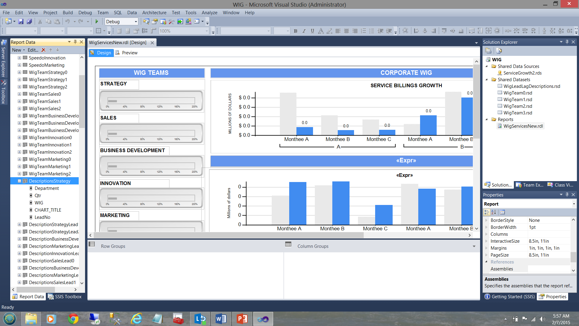
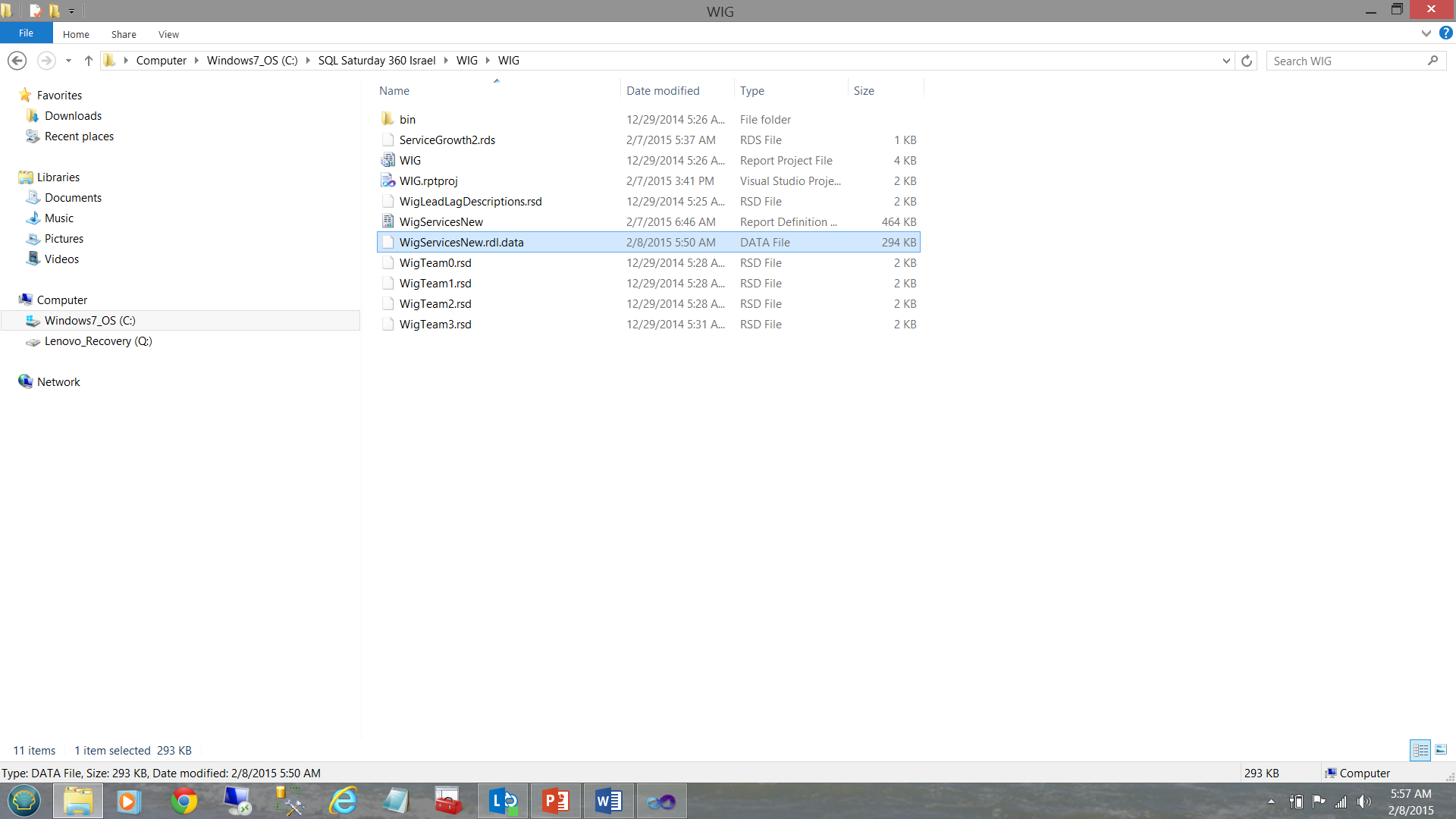
In the screen dump below, we see a typical report, (created for a user) that shows the varied goals and performance results for a period of time.
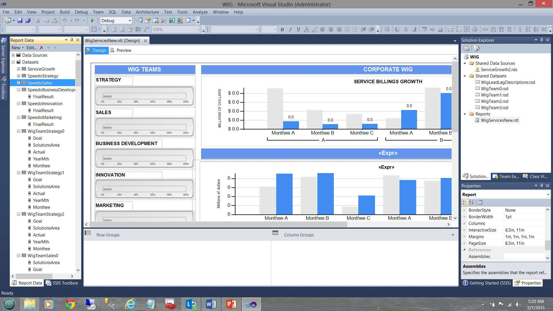
A WIG (see the term in the screen dump above) is a “wildly important goal”.
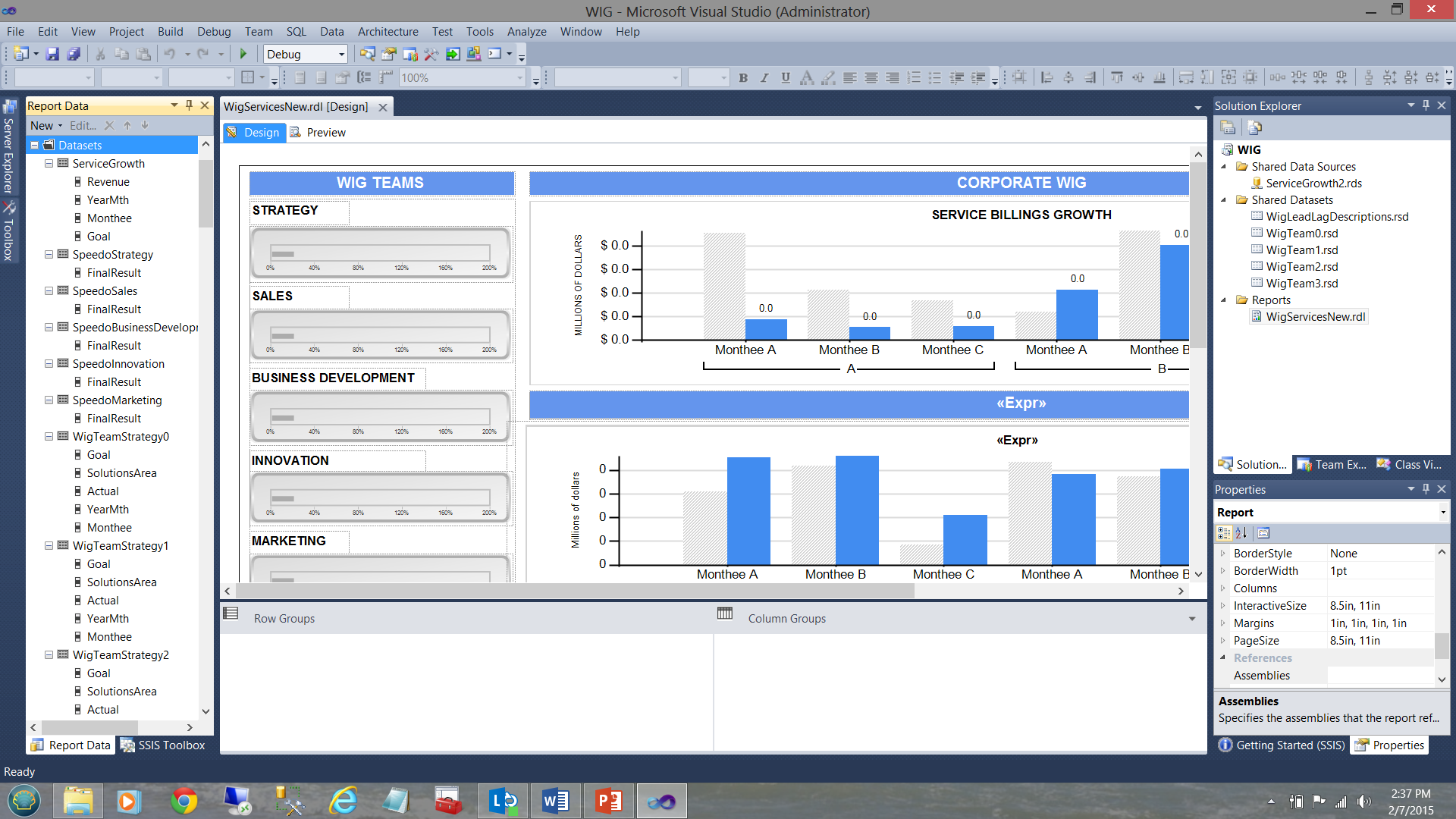
Note that we have five shared datasets in the upper right-hand side of the screen dump. Note too, the datasets in the “Report Data” window on the left-hand side of the screen dump. The trick is to understand how the pieces fit together. Armed with this knowledge we can make some intelligent decisions as to what type of dataset should be utilized for each of our charts shown in the screen dump above.
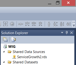
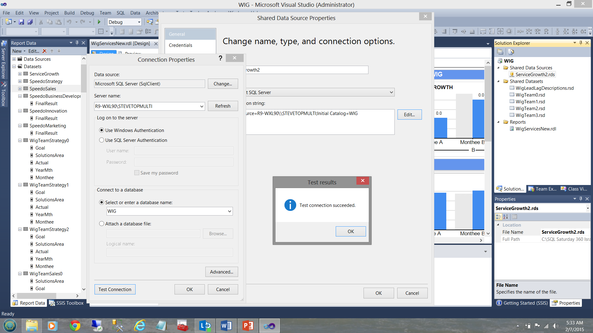
Below, we see a data source created to tap data from the WIG database.
The connection information is stored within the data source (see below).
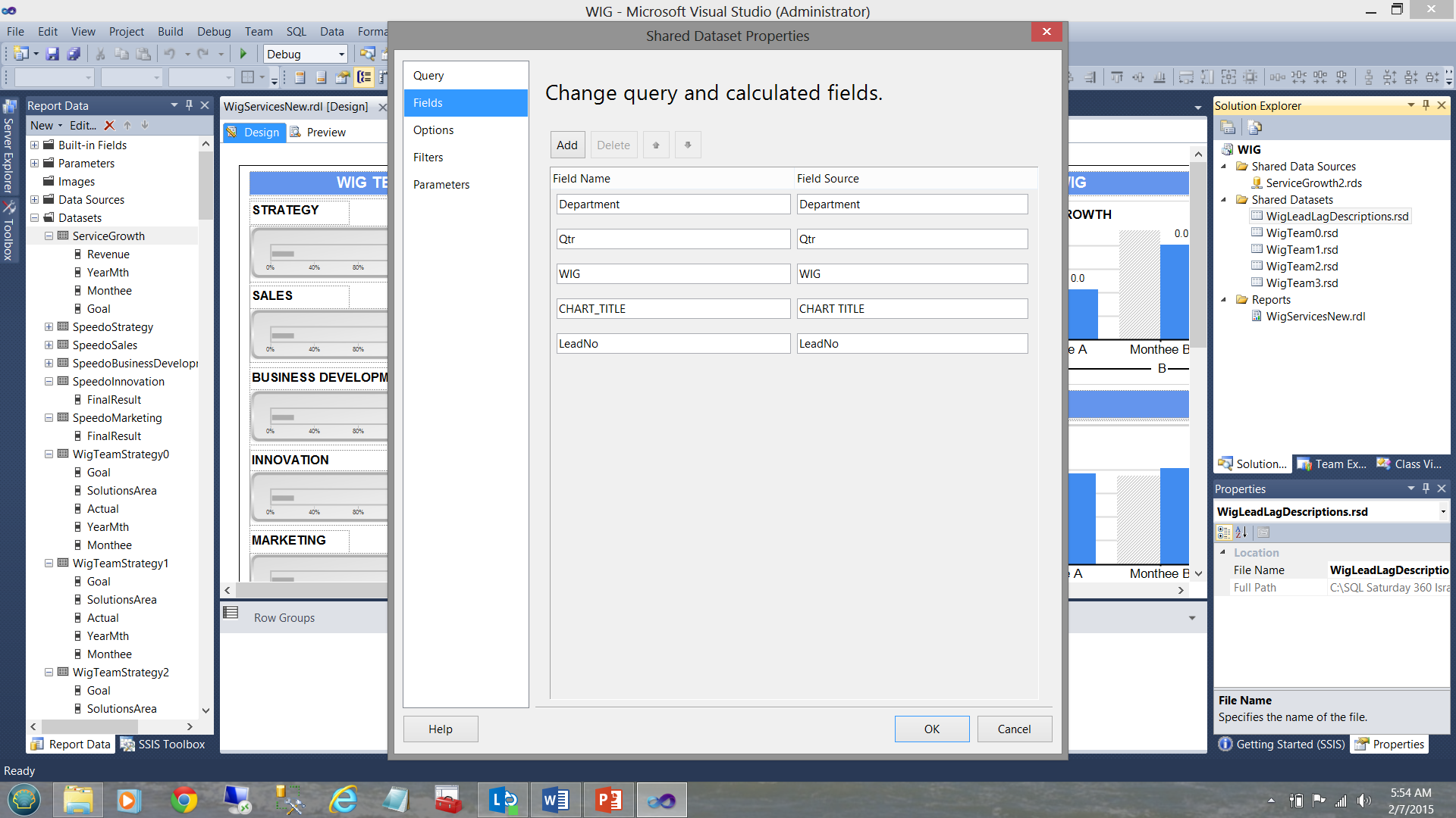
Our shared dataset “WigLeadLagDescriptions” (see above and to the top right under the “Shared Datasets” Folder) is connected (“filled”) by our datasource ”ServiceGrowth2” (see below).
Finally, our “DescriptionStrategy” local / embedded dataset (see below and left) derives its data from the shared “WigLeadLagDescription” dataset (see below to the top right).
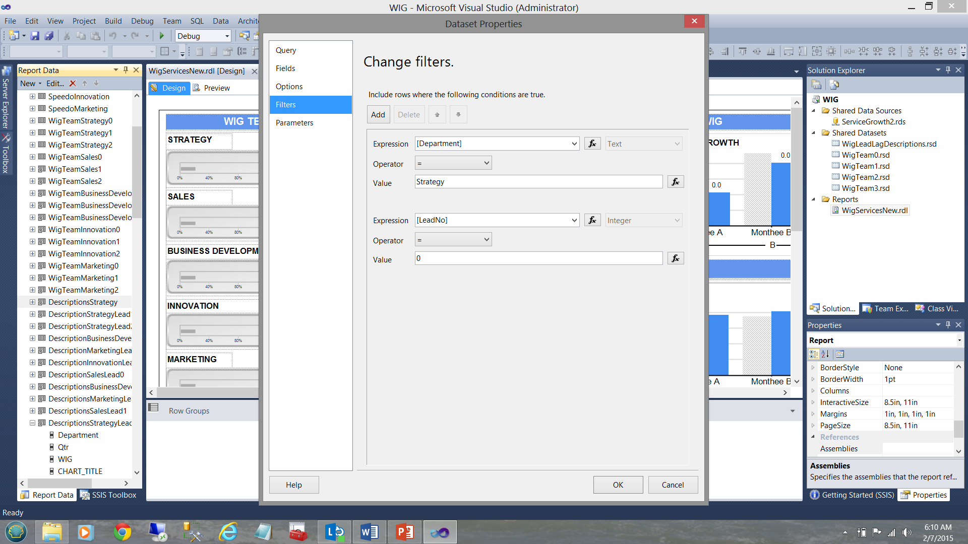
Now as this local dataset is exclusively utilized by the Strategy team charts and as the data in the shared dataset contains the descriptions for all the departments, we needed to apply the filter to the local dataset to ensure that the only data within that dataset, is related solely to strategy. This was achieved as follows:

Stepping back from all this garble, this is how the data distribution was organized looking at it from a “bird’s eye view”.
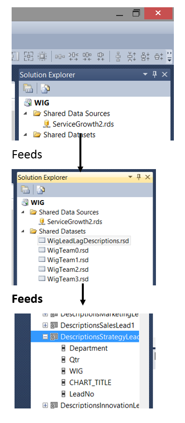
In short, each local dataset or “embedded” dataset will contain a subset of the shared dataset. This subset is obtained by FILTERING the data pulled from the shared dataset. This is achieved by placing a filter constraint in the local dataset definition (see below).
So how do we decide which type of dataset is appropriate? Much depends upon how much data will be pulled and DO YOU REQUIRE it all for each chart and/or matrix within the report.
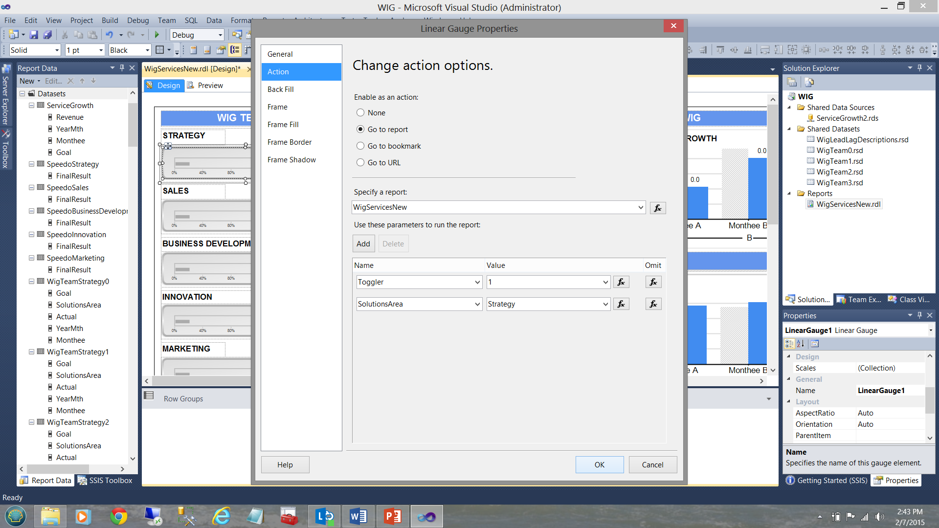
What I have not disclosed until now is that WIG team horizontal gauges (see below) have an ‘action’ attached to them.
Clicking on one of these horizontal gauges results in a recursive call to the same report and passes an integer value to the report. Had we clicked upon the Strategy gauge (see above), the same report is called and a value of 1 is given to a variable called “Toggler” and the name of the solutions area is also passed via the variable SolutionsArea (see below).
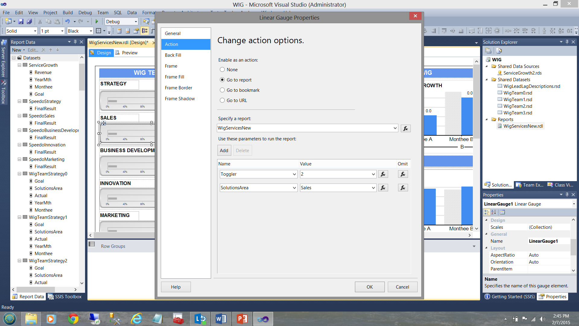
Now had we clicked upon the “Sales” horizontal gauge, once again a recursive call is executed however this time “Toggler” is set to “2” and the “SolutionsArea” is set to “Sales” (see below).
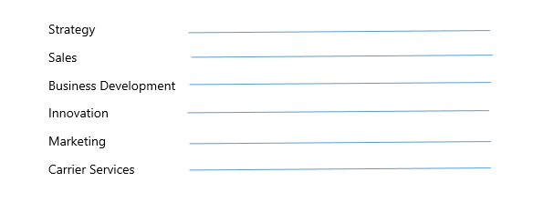
There are 4 more “WIG Teams” in addition to the two that we just discussed making 6 in total.
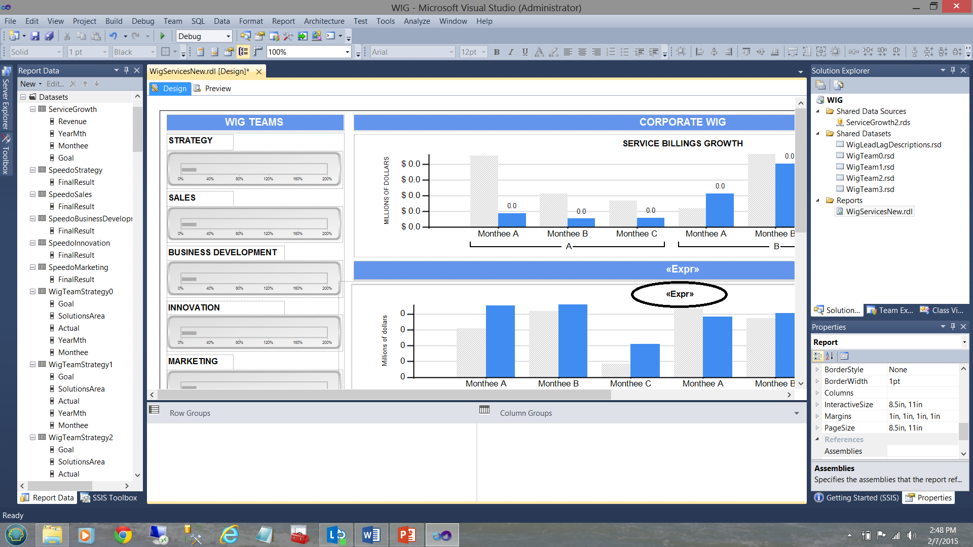
The astute reader will note that in the screenshot above that the bottom bar chart has a title “<Expr>” (see the circle in the screenshot above). What is not immediately apparent is that there in fact 6 bar charts superimposed upon each other (as shown diagrammatically below):
This said, when the user clicks upon the Strategy gauge, the “solutions area” variable is set to ‘Strategy’ and the toggle variable set to 1. The trick is that at any one time only one chart may be visible and utilizing the visibility property of the charts we are able to show or hide the chart depending upon which “Toggler” value is passed by the user’s solutions area selection.
To learn more about how this is technique is handled, please do have a look at an article that I recently published on SQLShack entitled “Now you see it, now you don’t”
For this report, we chose to utilize embedded or local datasets (local to this report), as each dataset is solely utilized and attached to one and only one vertical bar chart. The important point is that we take a runtime hit ONCE by having the individual data sets populated from the shared datasets and these local or embedded datasets are being persisted within the cache. As we saw above, each is filtered for a particular solutions area. Once again, the astute reader will note that it would be most difficult to implement an equivalent and efficient filtering mechanism on the shared data set (especially should this shared dataset contain hundreds of thousands of records).
Many people say that a picture is worth a thousand words and with regards to the lengthy discussion that we have just had, we can summarize it all, in the slide shown below:
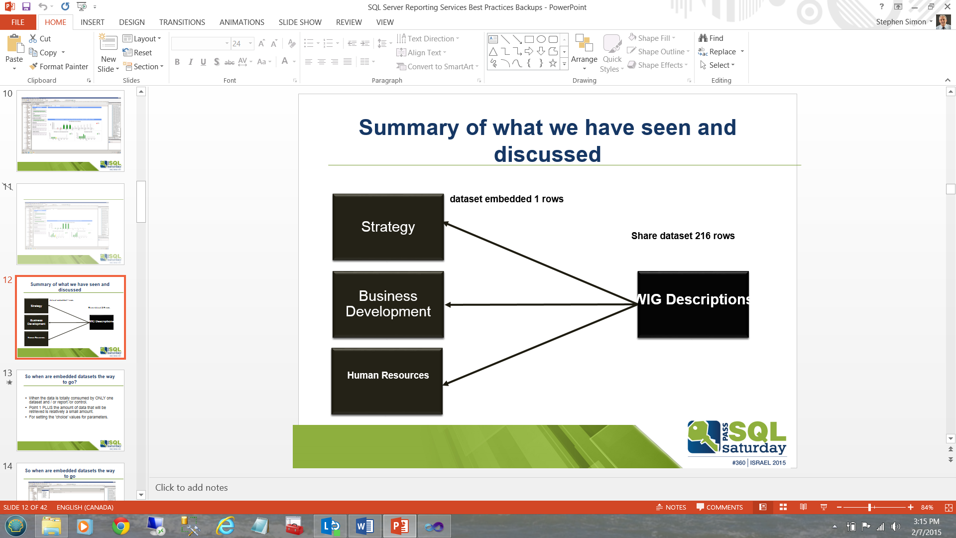
Instead of executing a major table based query or stored procedure six times to populate each of boxes (local datasets) on the left and potentially have to do a table scan or at best and indexed scan on the ALL the table records (looking for these six solutions areas from the myriad of subject areas present in the table), we pull once into the “WIG Descriptions” box/dataset on the right and then populate the left hand boxes utilizing 6 queries drawn from the subset dataset “WIG Descriptions”.
Cases in which shared datasets are the answer
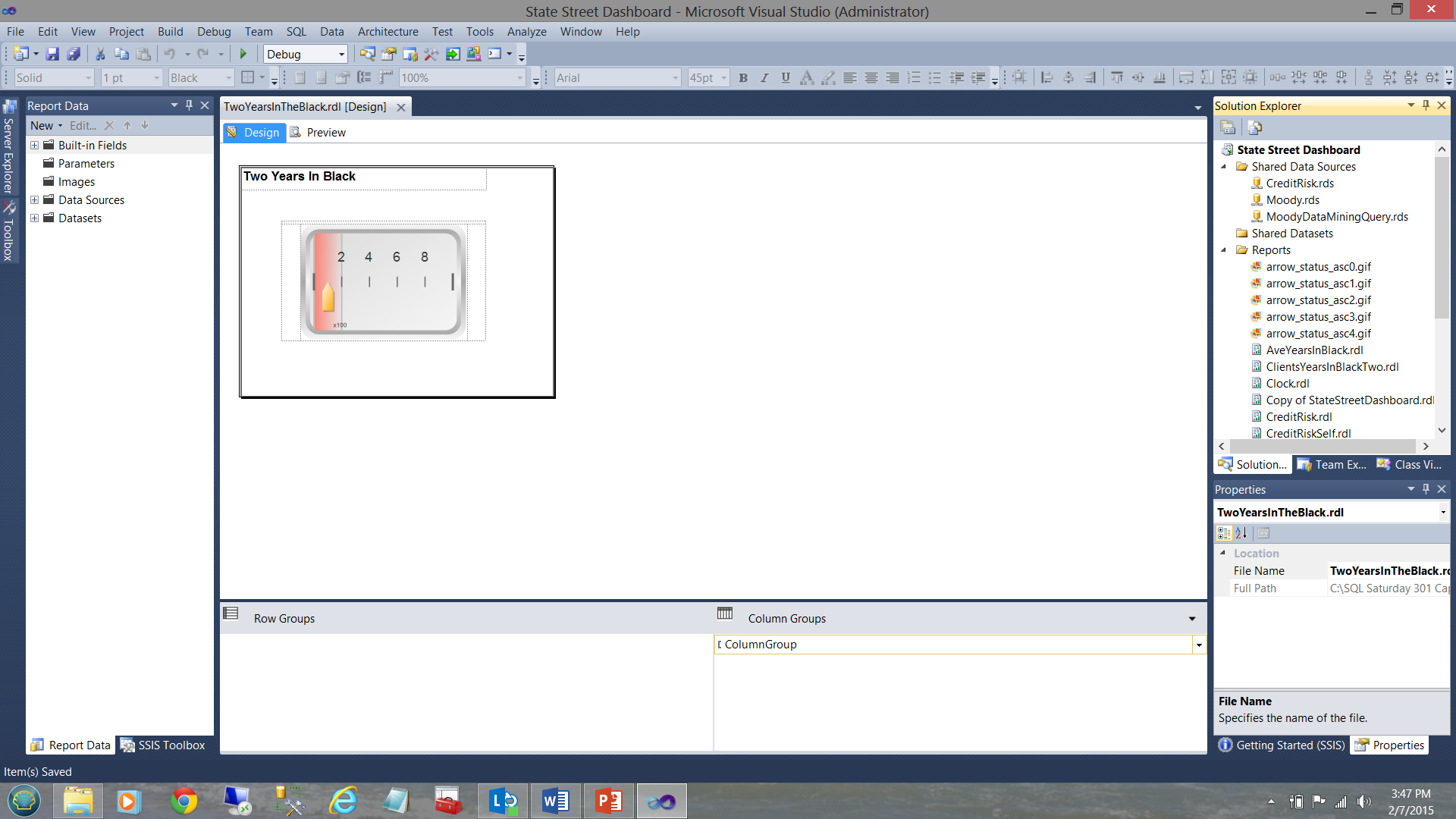
In our next example, we shall be looking at a dashboard that I created for a major financial institution (as a prototype) a few years back. The dashboard may be seen below:
The dashboard functions with numerous subreports as may be seen above. Each sub-report has its own shared datasets and NO local nor embedded datasets as may be seen in the screen dump below.
Opening the dataset tab on the left, the reader may see that the dataset providing the data originates from the shared dataset “SQLShackYeaarsInBlackIsTwo” (see below).
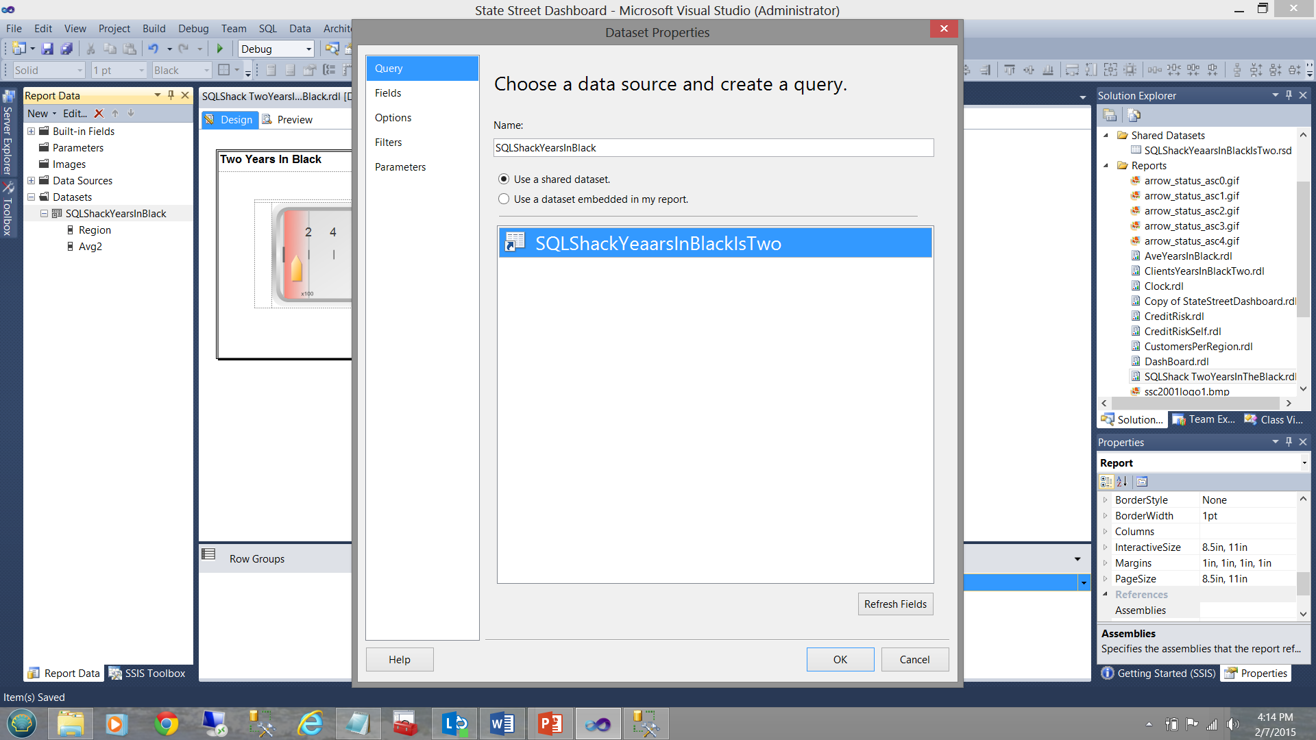
The important point to understand is that while a local dataset “SQLShackYearsInBlack” is stubbed off, no further query is defined to pull the data from the database tables and there is merely a connection made between the “local dataset” (which will be utilized by the gauge see above) and the shared dataset.
The differences are fine and subtle. More over the correct decision is vital to insure maximum efficiency in rendering the report results.
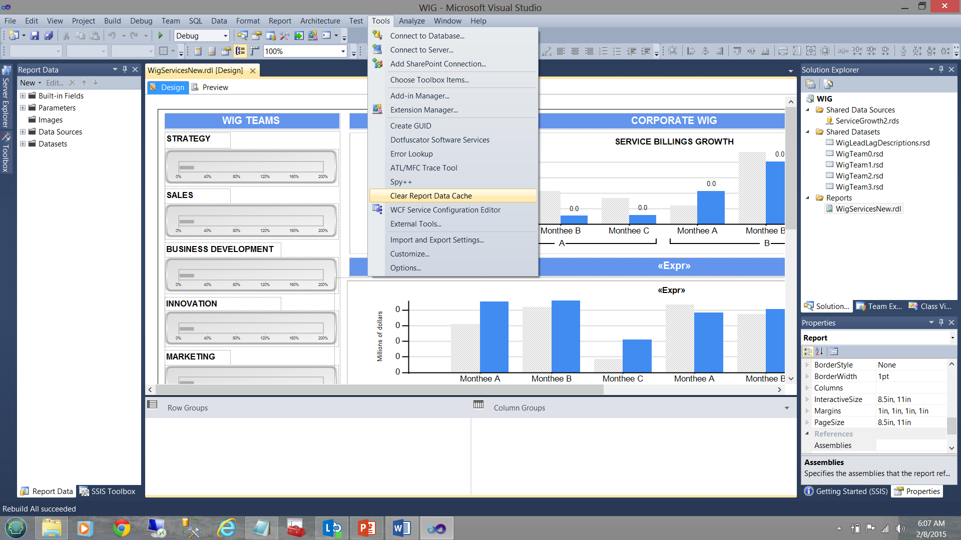
Clearing of the report cache
One of the pitfalls or gotcha’s (for want of better words) when it comes to developing our reports within the Visual Studio environment, is the caching of data within the system generated “.rdl.data” file. The nuances of this are fine in that we may make cosmetic changes to the report with regards to the filtering etc. and when we preview the report after having made these changes, what is rendered is definitely NOT what we expected to see. This may include changes that we may have made to the stored procedures that feed the datasets. Whilst running them within the SQL Server Management Studio environment the correct results are obtained, the instant that your report is run and is rendered, one notes that the results are the “same old, same old”. This can be most disconcerting at times.
The reason for this is that our report is sourcing its data from a cached disc file (see below).
This Reporting Services generated file must be removed and regenerated by Reporting Services in order for the changes to be rendered. A build or rebuild of the project does NOT achieve this!
Jason Faulkner has a super little routine that he wrote that helps us find a quick and dirty way of purging this data file.
- Go to Tools > External Tools
- Add a new tool and set the parameters as follows:
- Title: Clear Report Data Cache
- Command: "%WinDir%\System32\cmd.exe“
- Arguments: /C DEL /S /Q "$(SolutionDir)\*.rdl.data
- Check options: Use Output window & Close on exit
http://jasonfaulkner.com/ClearDataCacheBIS.aspx
The “Clear Report Data Cache” feature (once constructed) may be seen in the screen dump below:
Report Utilization Logging
How often have you been asked to create a report which is so important that the report is required, “yesterday or sooner” only to find out that the report was used once and never again? In fact, your Visual Studio Reporting Services project may look similar to the one shown below:
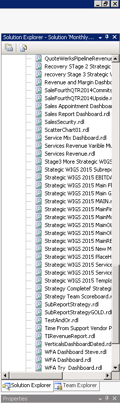
This project has a plethora of unused/redundant/obsolete reports. In short, the project should be cleaned up and report server refreshed. The tough question is just how do we ascertain which reports are being utilized and which are not.
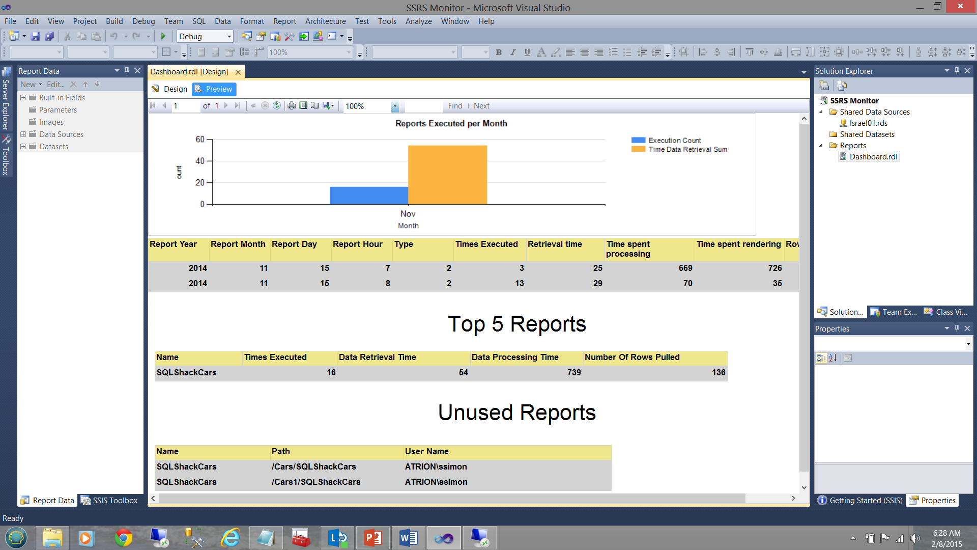
One manner to obtain these statistics is to construct a quick and dirty SQL Server Reporting Services monitoring application (see below).
In fact, this is the topic for my next article and we shall be going through the steps to create this application / report.
In the interim though, please note that
- The vertical bar chart (above) shows the number of reports executed for the current month.
- The matrix (immediately below the vertical bar chart) shows the execution times etc. for all reports that were run this month.
- The “Top 5 Reports” matrix shows the five most executed report during the current month.
- The “Unused Reports” feature is what is of interest to us in our present exercise and this will tell us which reports have not been used for some time and are therefore candidates for removal and clean up.
The use of graphics within reports
Let us ask ourselves the question “Why should we consider the use of graphics as a best practice?” If we are honest with ourselves, the following points should come to mind.
- Graphics permit the decision maker to glean information in a minimal amount of time.
- Anomalies become immediately apparent.
- No decision maker has the time to sift through reams of data.
- A picture is worth 1000 words. In short: Information, NOT data is required.
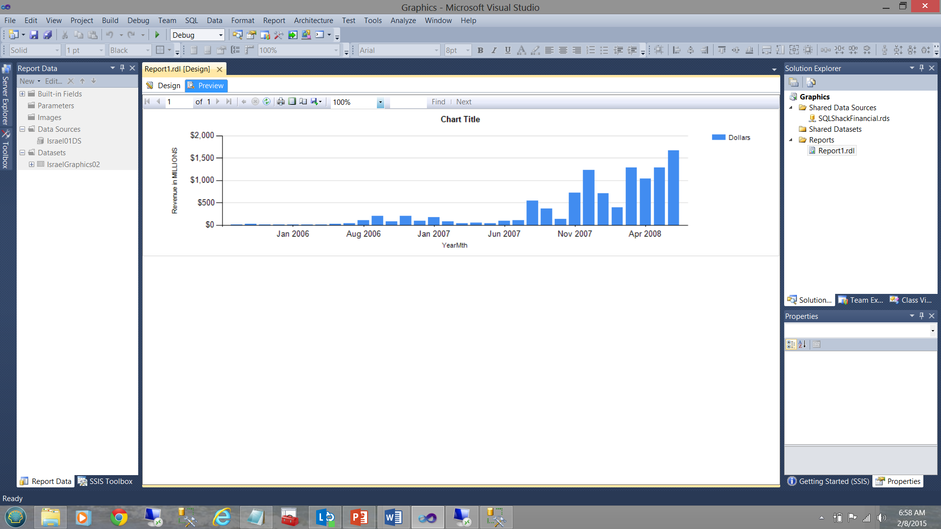
In the screen dump shown below, the financial results for SQLShackFinancial’s past few years are shown. In the first screen dump, the vertical bar chart’s fill color is generated by the system. In our case the colour blue. While the vertical bar chart does show income increasing with time, it does not tell us anything about how the “actuals” compare with the “planned”.
In our next screen dump, which is generated from the same query and from the same SQL Server Reporting Services project, the data becomes more informative. Note the usage of “our selected colours” to tell us the whole story (see below).
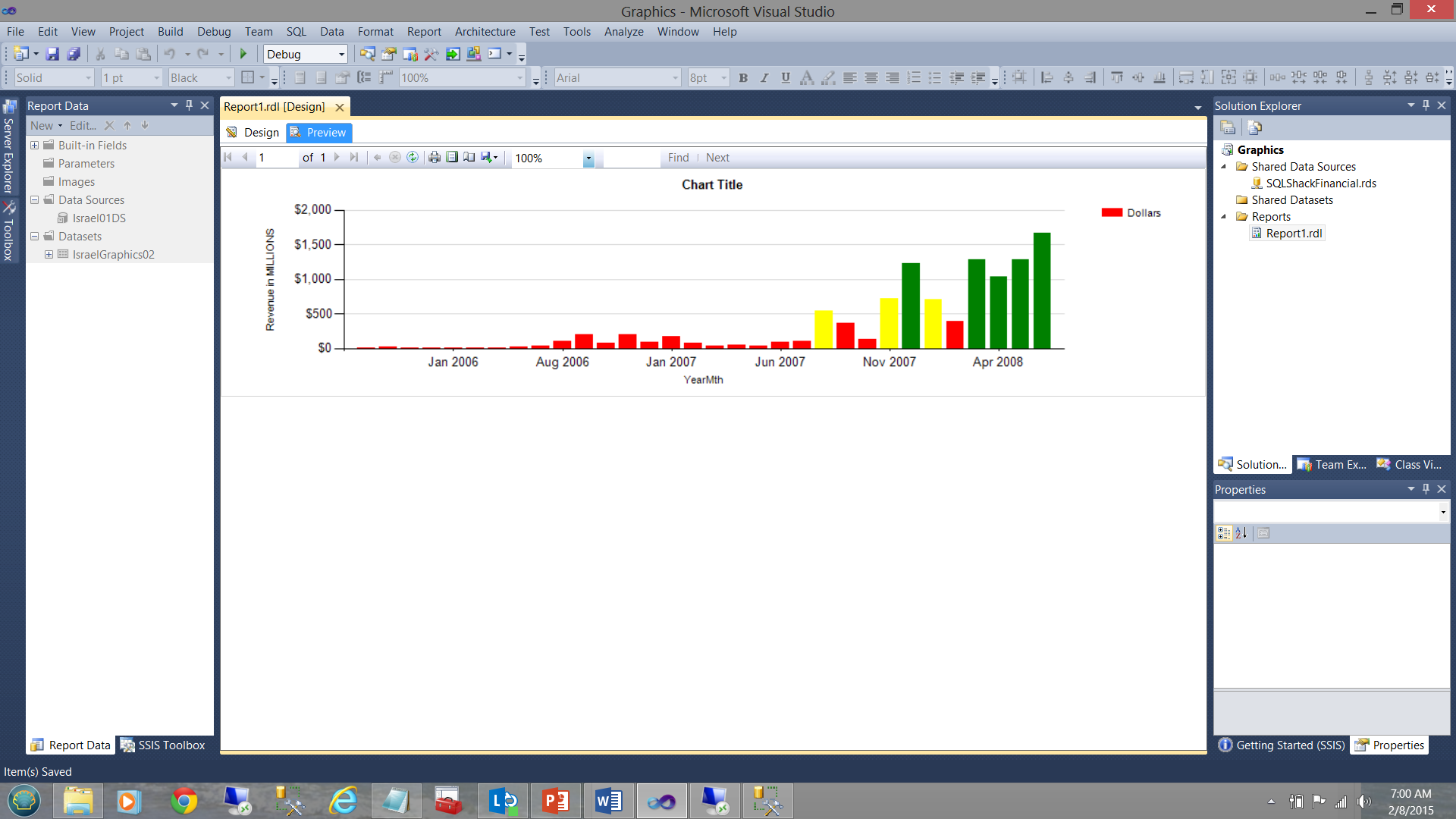
Up until July 2007, we were doing extremely poorly HOWEVER business started to ‘turn around’ going forward.
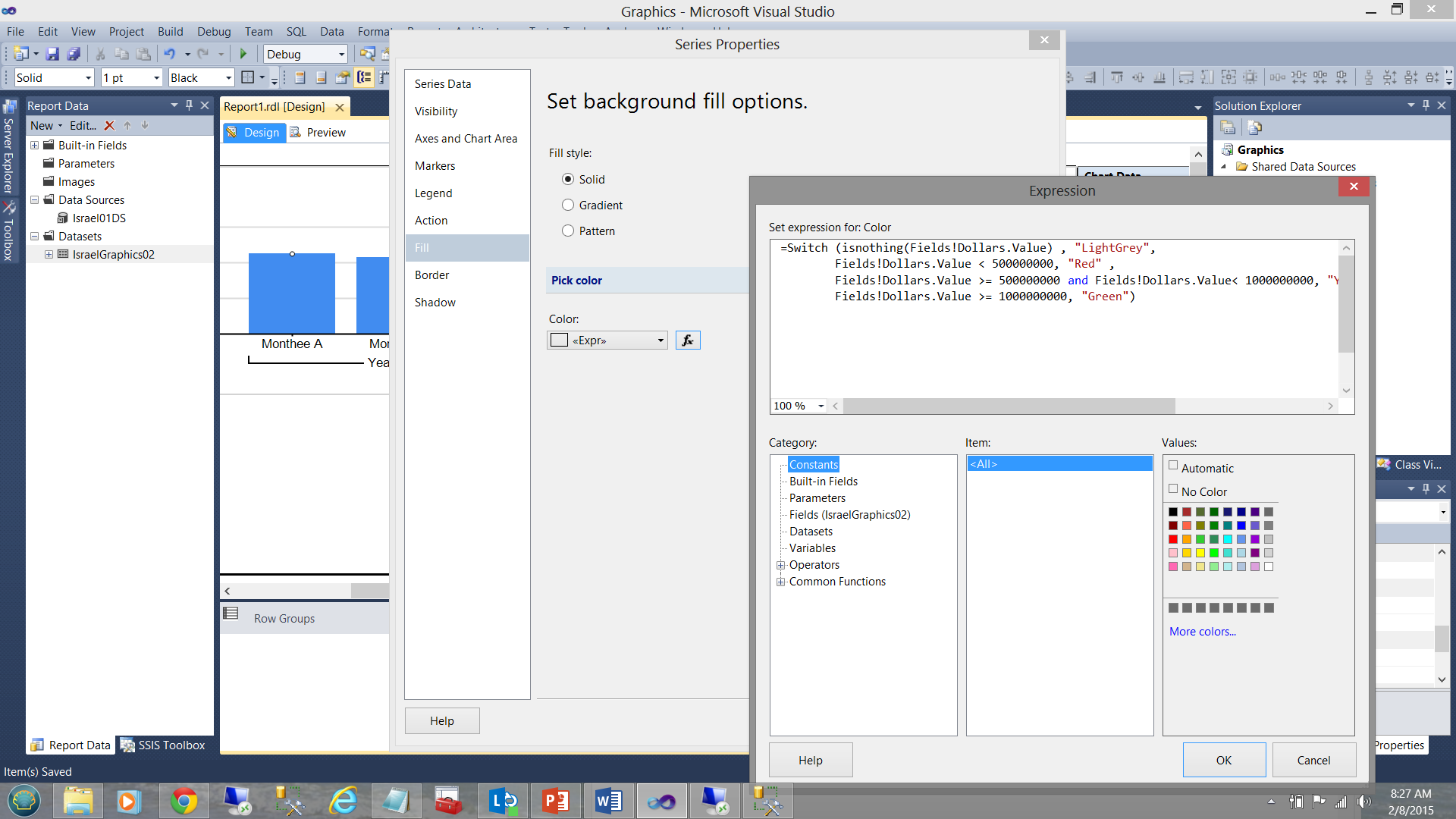
The business rules for the color fill for the vertical bars were defined as follows.
For each month
| Amount | <$500000000 | >= $500000000 and < $1000000000 | >= $1000000000 |
| Fill colour | Red | Yellow | Green |
In terms of coding:
|
1 2 3 4 5 6 |
=Switch (isnothing(Fields!Dollars.Value) , "LightGrey", Fields!Dollars.Value < 500000000, "Red" , Fields!Dollars.Value >= 500000000 and Fields!Dollars.Value< 1000000000, "Yellow", Fields!Dollars.Value >= 1000000000, "Green") |
Conclusions
SQL Server Reporting Services has its quirks and may often seem a difficult tool to utilize to obtain efficient and effective information from our data. Knowing how to best work with the product is important as are the ways to work around the varied “gotcha’s”.
Datasets are the key to efficient rendering of reports. Local datasets help us when we are taking a “narrow view” of the data. “Show me the one record out of 100,000,000 that must be shown for the title of my vertical bar chart”.
The shared dataset is more conducive to environments where all the extracted data will be utilized by all the matrices and charts, where filtering is done on initial data extraction from the table and the resulting data set contains all that is needed.
As everything else in life generalizations are never 100% true.
Happy programming!
Steve has presented papers at 8 PASS Summits and one at PASS Europe 2009 and 2010. He has recently presented a Master Data Services presentation at the PASS Amsterdam Rally.
Steve has presented 5 papers at the Information Builders' Summits. He is a PASS regional mentor.
View all posts by Steve Simon
- Reporting in SQL Server – Using calculated Expressions within reports - December 19, 2016
- How to use Expressions within SQL Server Reporting Services to create efficient reports - December 9, 2016
- How to use SQL Server Data Quality Services to ensure the correct aggregation of data - November 9, 2016