

In this article, we will learn how to create dashboards using the data that is typically processed using notebooks in Azure Databricks.
Introduction
In this article, we will learn how to create dashboards using the data that is typically processed using notebooks in Azure Databricks. Databricks is a data platform that provides features for data engineering, data science, machine learning, and other data requirements. One common need after processing data for any types of workloads is to visualize data. Right from analyzing data to reporting data to end-users, data visualization is a common way of consuming the data during processing as well as post-processing. Data from a variety of repositories is sourced into Azure Databricks and is typically processed using Notebooks with Python, SQL, and other such runtimes. We will explore the different types of visualization that are available in Azure Databricks notebooks as well as we will create a dashboard using some of the available visualizations.
Azure Databricks Setup
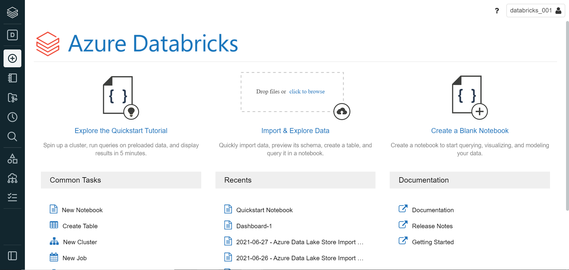
As a pre-requisite to follow the exercise explained in this article, we need to have some initial setup created so we can focus on the exercise. We need an Azure account with the required privileges to access and administer the Azure Databricks service. It is assumed that such an account is already in place. Navigate to the Databricks service dashboard and create a new workspace. Once the workspace is created, navigate to the dashboard, and click on the Launch button to launch the workspace portal. It would open a new window with the home page as shown below.
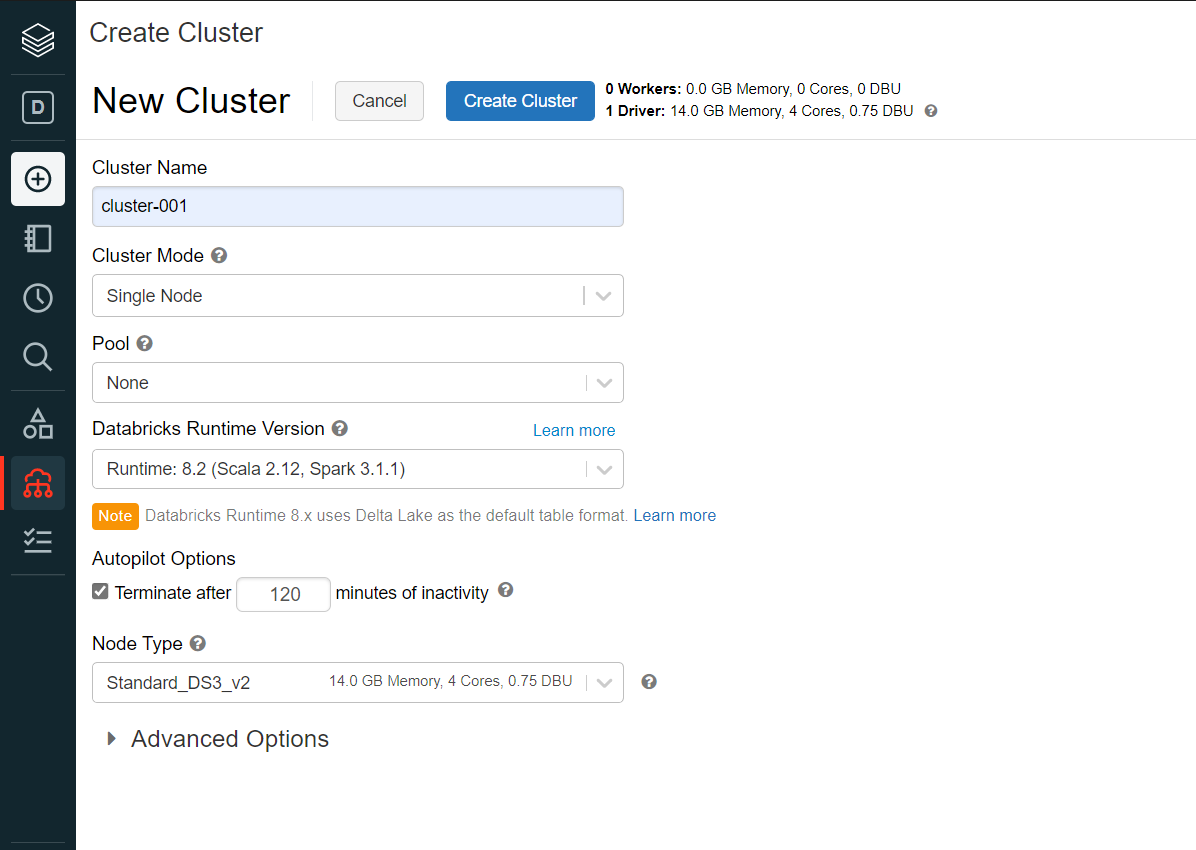
We also need to create a new cluster as we intend to work with the data that may be coming from a variety of sources. Click on the Create menu item and select Cluster menu item. This will open a new page where we can provide the details to create a new cluster as shown below. For this exercise, we can create a small single node cluster using the configuration settings shown below.
Once the cluster is created, we have the necessary pre-requisites in place to start focusing on the exercise to source data and visualize the same using a variety of visualizations.
Visualizing Data in Azure Databricks
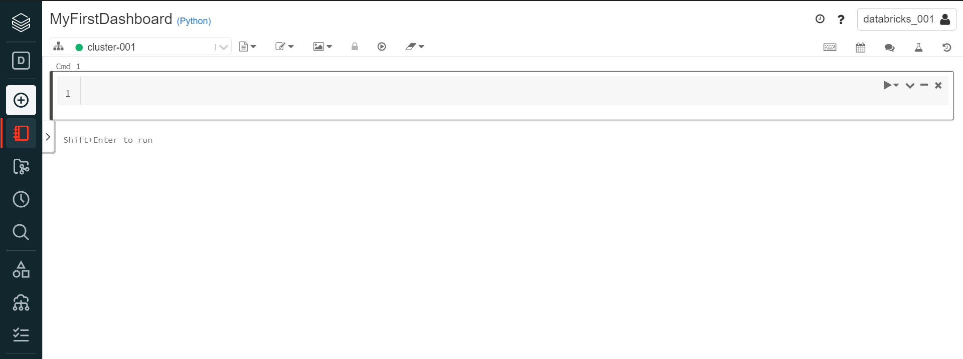
We can start by creating a new notebook which would be our console to execute our code to process and well visualize data. Click on the Create menu icon on the left-hand side and select the Notebook menu item. It would provide a prompt to select the runtime and the name of the notebook. We will be using the python runtime which should be selected already by default in the runtime list. Provide an appropriate name for the notebook and click on Create button and it would create a new blank notebook as shown below.
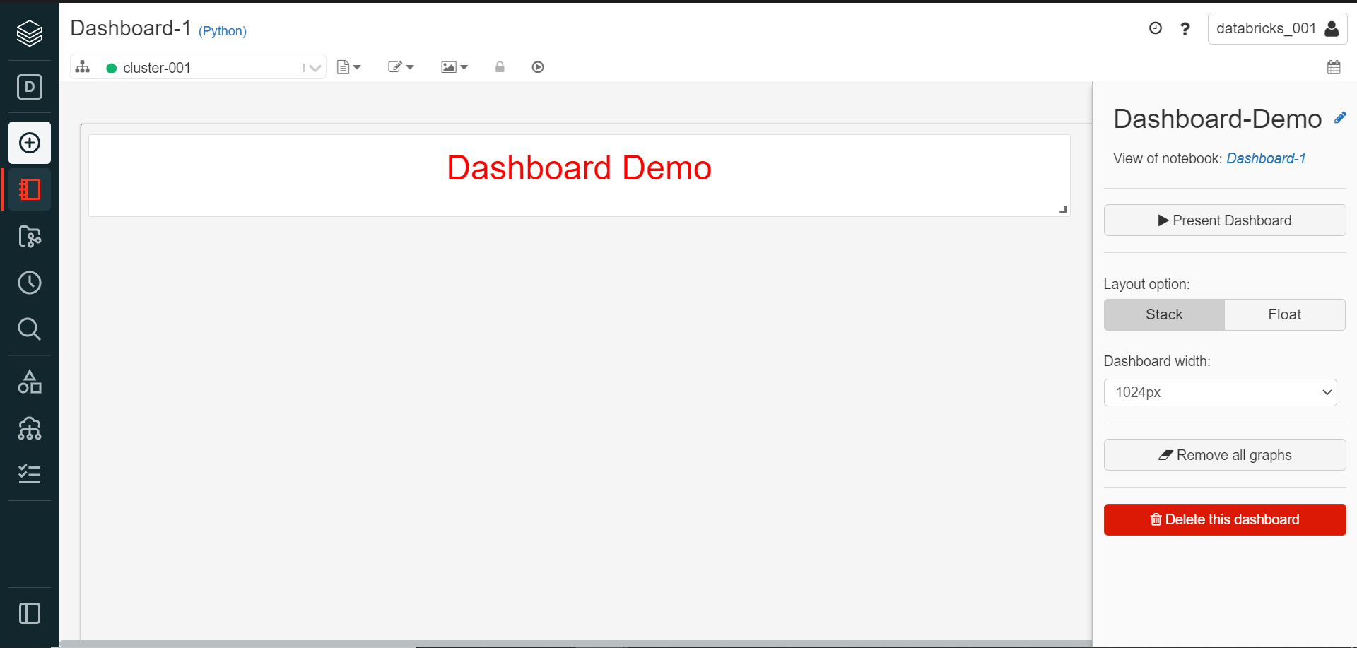
The first thing we need to do is source some sample data from a data repository. We can source data from any data files uploaded on DFBS or create a data pipeline to source data from data sources like Azure Data Lake Storage, Azure Blob Storage, Azure SQL Database and many more. But to keep the focus of our exercise on the data visualization, we would source data from some of the built-in datasets available from Azure Databricks itself, so we do not have to spend time on sourcing data. Before we start sourcing data, as we are going to create a dashboard, we can create a title for the dashboard using a simple HTML dashboard as shown below.
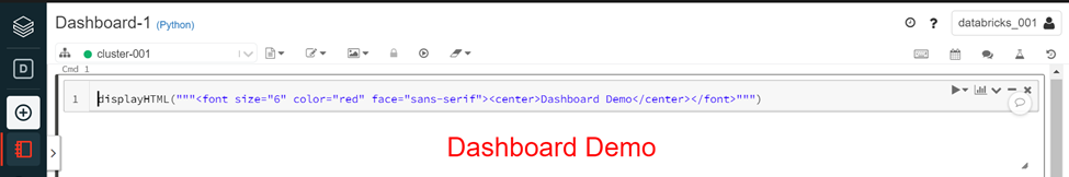
displayHTML(“””<font size=”6″ color=”red” face=”sans-serif”><center>Dashboard Demo</center></font>”””)
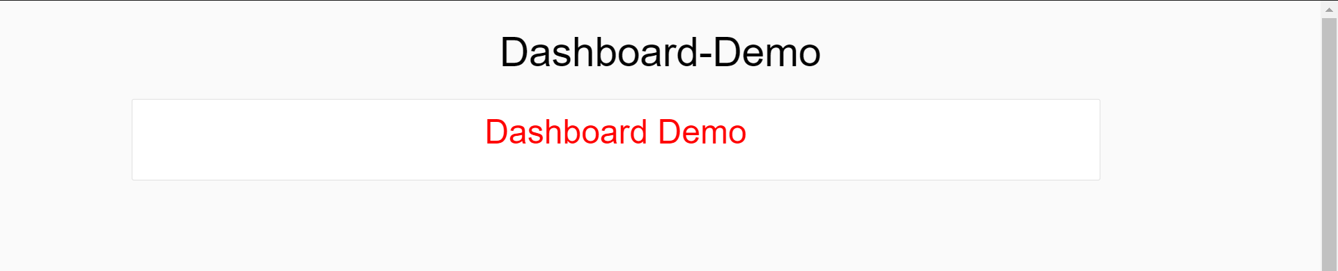
Once the code is executed and the result appears, it would look as shown above. We can add this result right away to a new dashboard by clicking on the graph icon on the top-right menu and selecting Add to a new dashboard menu item. This would open a new dashboard as shown below. Provide an appropriate name to the dashboard as shown below.
We can view this dashboard by clicking on the Present Dashboard button. It would open a new page as shown below. This is how we can create the dashboard part by part by executing different pieces of code, creating data visualizations, and adding it one by one to this dashboard.
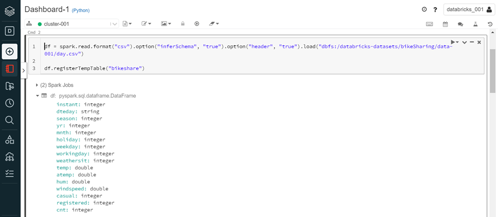
Navigate back to the notebook and type the code shown below. Using this piece of code, we are sourcing BikeShare datasets which is one of the built-in datasets available on DBFS from Azure Databricks. We are reading this data in the data frame variable named df. After that in the next life of code, we are registering a temporary table named “bikeshare”.
df = spark.read.format(“csv”).option(“inferSchema”, “true”).option(“header”, “true”).load(“dbfs:/databricks-datasets/bikeSharing/data-001/day.csv”) df.registerTempTable(“bikeshare”)
Once the code executes successfully it would look as shown below. We can view the schema of the resulting dataset in the execution output.
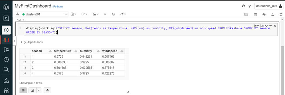
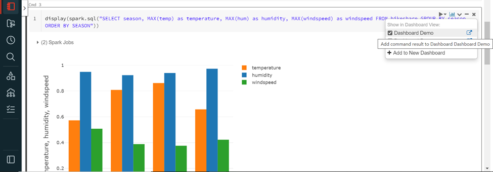
In the next step, we can start visualizing the data. Execute the query shown below to aggregate the data by season for the fields named temperature, humidity, and wind speed.
display(spark.sql(“SELECT season, MAX(temp) as temperature, MAX(hum) as humidity, MAX(windspeed) as windspeed FROM bikeshare GROUP BY season ORDER BY SEASON”))
Once the code executes successfully the result would look as shown below. By default, the visualization type is a data grid or in tabular view, so the results would be present in a tabular format as shown below.
We intend to visualize the data using charts or graphs. Click on the graph icon below the results to expand it, and we should be able to see the list of charts and graphs supported by Azure Databricks as shown below. Some of the most used charts are very well supported here like Bar chart, Scatter chart, Maps, Line chart, Area chart, Pie chart etc. Charts that are specific to data science and exploratory data analysis are also available like Quantile chart, Histogram, Box plot, Quantile-Quantile (Q-Q) plot, and pivotable charts.
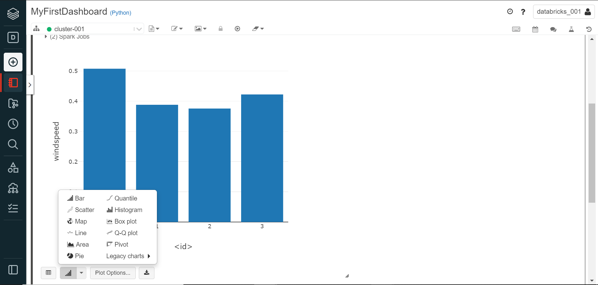
By default, the data would be visualized in the form of a bar chart as the nature of data suits this chart as shown above. In most cases, data is not simple enough to be displayed using a simple bar chart. One would need variations of bar chart like a stacked bar chart, grouped bar chart, etc. Also, one would need to edit other options like the values, series, and other items that need to be shown on a different axis. Click on the Plot Options button to customize this chart. It would open a new pop-up window with graph customization options as shown below.
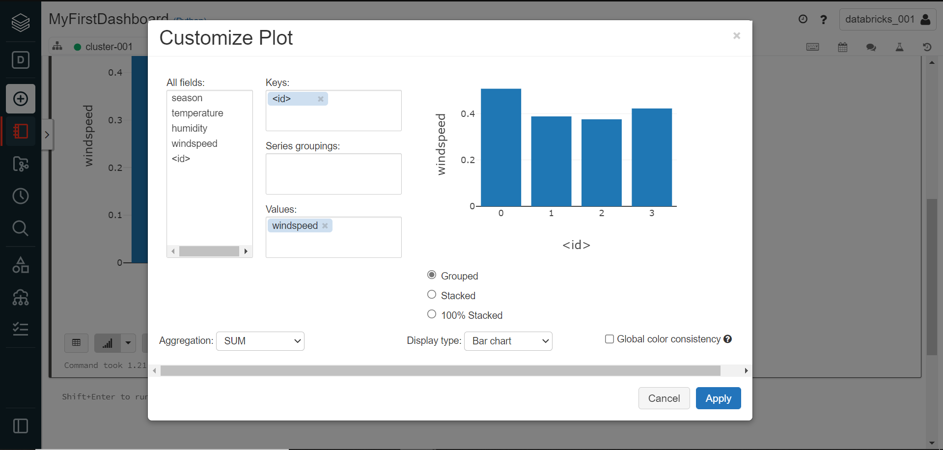
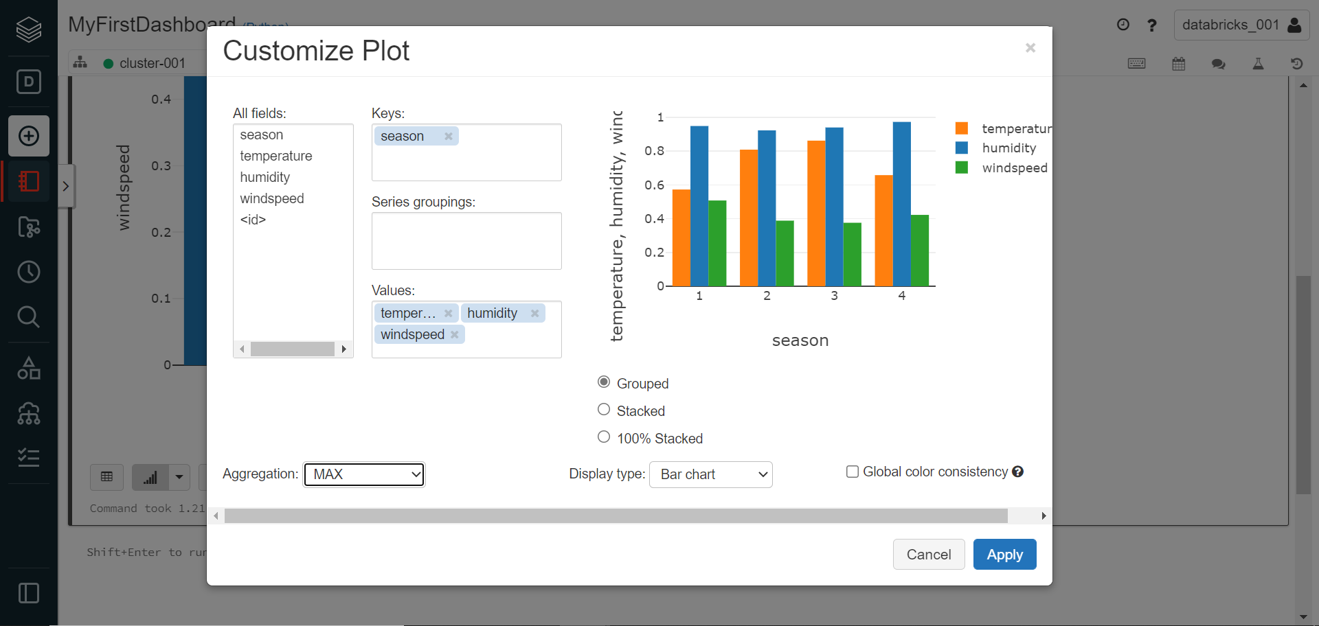
Change the configuration in the Keys, Series and Values section as shown below. Also, change the value of the aggregation function to MAX instead of using SUM as we have derived our query result using the SUM function. We can optionally also change the type of bar chart to be stacked or even 100% stacked depending on the user’s preferences.
Click on the Apply button to view the changes to the visualization in the notebook. Once again, click on the graph icon on the top-right menu of the cell to add this to the dashboard that we created earlier. Select the dashboard that we created earlier, and this graph would be added to the dashboard.
Open the dashboard and it would now look as shown below. We have now the title of the dashboard as well as the graph added as the dashboard elements.
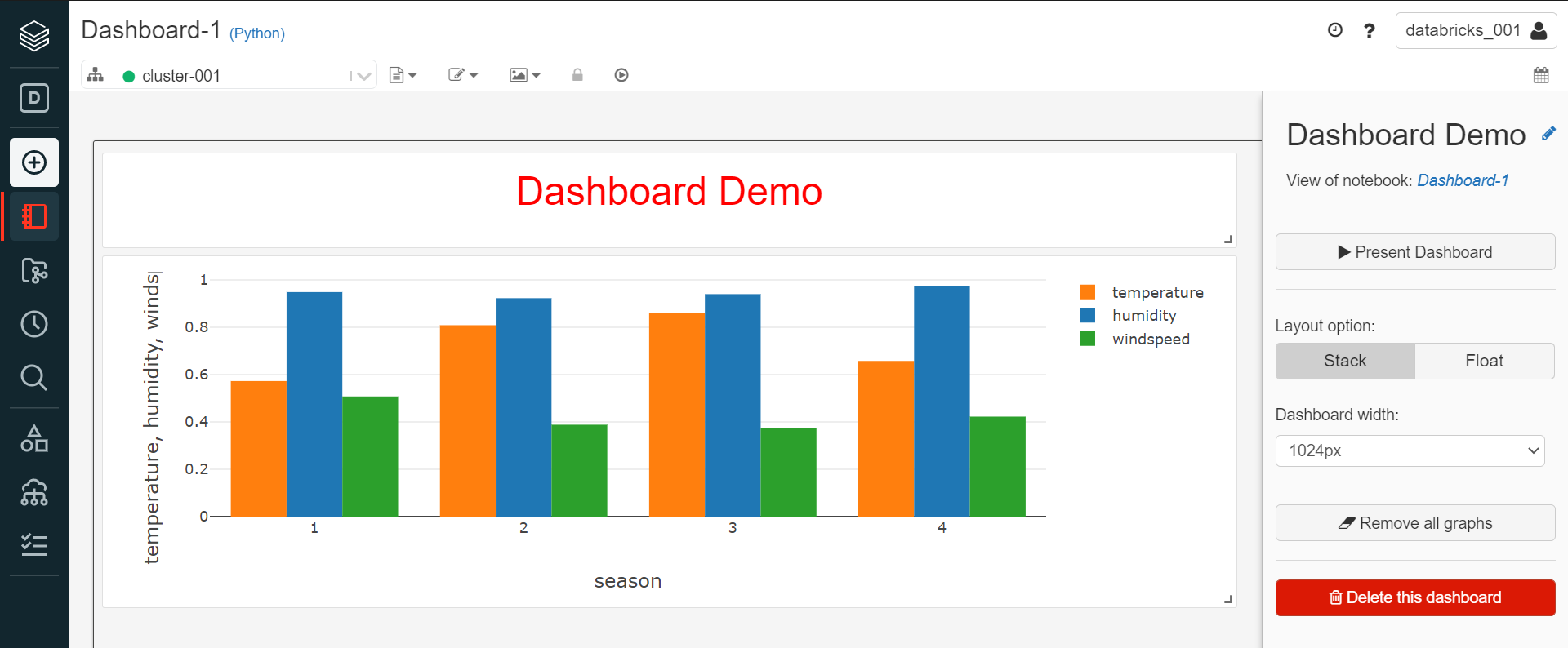
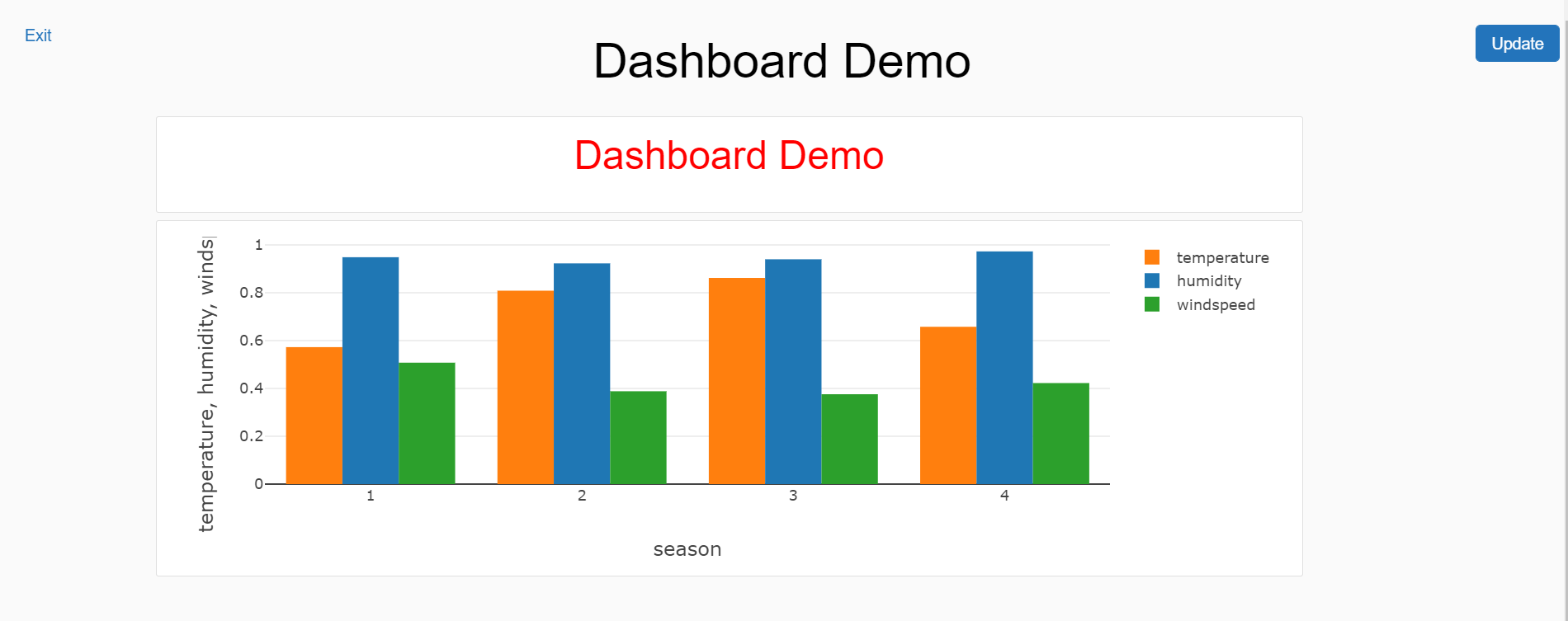
Click on the Present Dashboard and the final view of the dashboard would look as shown below.
In this way, we can visualize data in Azure Databricks as well as easily create dashboards right from the notebook.
Conclusion
In this article, we created an instance of Databricks workspace with a cluster. We created a new notebook, imported sample data, and created new visualization as well as added the same to a new dashboard. We also explored a variety of visualizations supported by Azure Databricks and the way to customize these visualizations.

She has a deep experience in designing data and analytics solutions and ensuring its stability, reliability, and performance. She is also certified in SQL Server and have passed certifications like 70-463: Implementing Data Warehouses with Microsoft SQL Server.
View all posts by Gauri Mahajan
- Oracle Substring function overview with examples - June 19, 2024
- Introduction to the SQL Standard Deviation function - April 21, 2023
- A quick overview of MySQL foreign key with examples - February 7, 2023