

Introduction
Power BI is enriched with many useful visualizations and helps to represent data in various forms. We have explored many use cases of PowerBI in SQLShack articles.
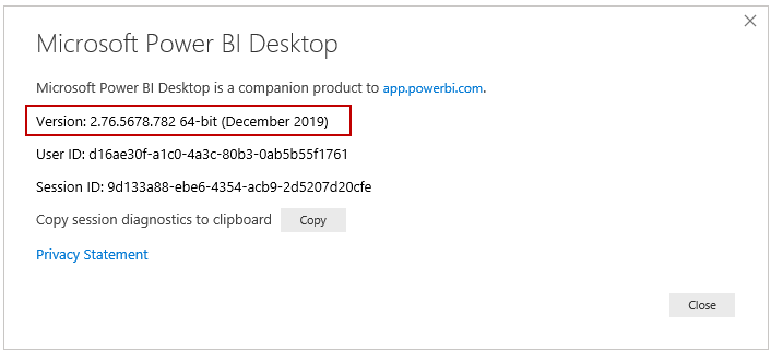
Microsoft regularly provides updates to Power BI desktop and comes up with new enhancements, features. You should always work with the latest version. In this article, I am using the December 2019 Power BI desktop version.
You can check the Power BI desktop from Help->About.
In November Power BI Desktop release, we have a new decomposition tree visual with the capability of artificial intelligence (AI). Yes, it is having inbuilt AI functionality and helps you to drill down the data.
Decomposition Tree Visual in Power BI desktop
We can use the decomposition tree to visualize data in multiple dimensions. We can drill down and analyze data in the hierarchy for a quick analysis. Its’s artificial intelligence (AI) capability enables you to find the next dimension data as per defined criteria. We breakdown (decompose) data into individual categories and determine the high, low values using AI functions in this decomposition visual.
It is a preview feature as of now and does not automatically show in the visualization pane.
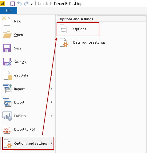
Launch Power BI dashboard and click on File -> Options and settings -> Options:
It opens an options page with different configurations. Navigate to the Preview features tab, and you see the checkbox for the Decomposition tree visual feature:
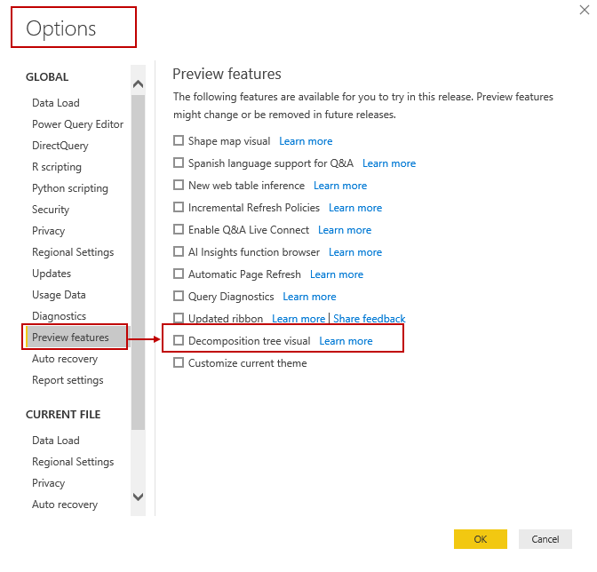
Put a check on the Decomposition tree visual feature and click the OK button:

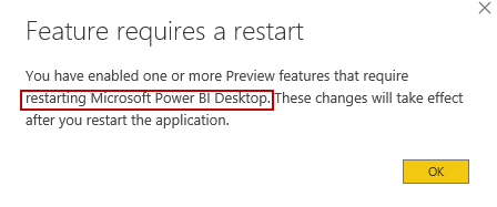
Once you click the OK button, it pops us a message that Power I Desktop restart will enable this preview feature:
After the restart, you get the Decomposition tree visualization icon as shown below:
![]()
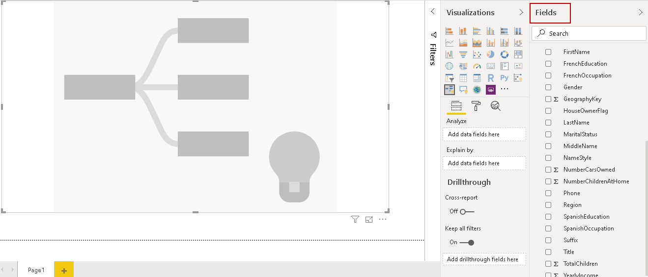
Click on this visual, and it opens the visual layout. You can adjust the layout for a better visual. It consists of two parts – Visual shape and a bulb that represents artificial intelligence:

Decomposition tree requires two inputs:
- Analyze: In this input, we specify a column for that you require a breakdown of the tree
- Explain by: We can add multiple dimensions in this column. We can analyze tree further using these breakdown columns
We will use the AdventureWorksDW2017 sample database for this demonstration. If you do not have this database, visit GitHub and download the backup copy of this database.
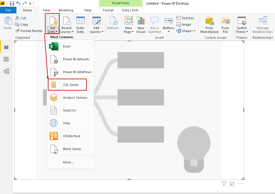
Click on the Get Data button in the Home tab and choose the data source as SQL Server:
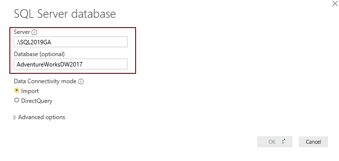
It opens a pop-up window, and you can specify the SQL Server instance, database details. We can specify the Data Connectivity mode, either Import or DirectQuery:
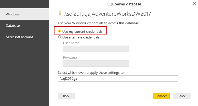
Click the OK button and specify the credentials. We can use either Windows credentials (option – Use my current credentials) or specify alternate credentials:
You get warning message of unencrypted connection:

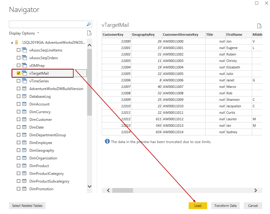
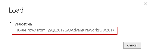
Click the OK button to ignore this. You get a list of database objects after authentication. Select the appropriate object and load it. In this article, we use vTargetMail view of AdventureWorksDW2017 database:
It creates connections and loads data, as shown below:
Once the data load is complete, we get the fields (output columns) in the field section of Power BI Desktop:
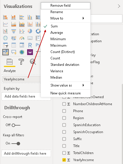
Now, we need to drag the fields into Analyze and Explain by columns for the decomposition tree. First, drag the [YearlyIncome] field into the Analyze section. It shows the sum of the [YearlyIncome] into the visual:
![Drag the [YearlyIncome] into Analyze section](/wp-content/uploads/2020/01/drag-the-yearlyincome-into-analyze-section.png)
By default, we get the sum for the column in the Analyze column. We can change it as per requirement such as average, minimum, maximum, variance, median, standard deviation. For this article, we can go with the default option sum:
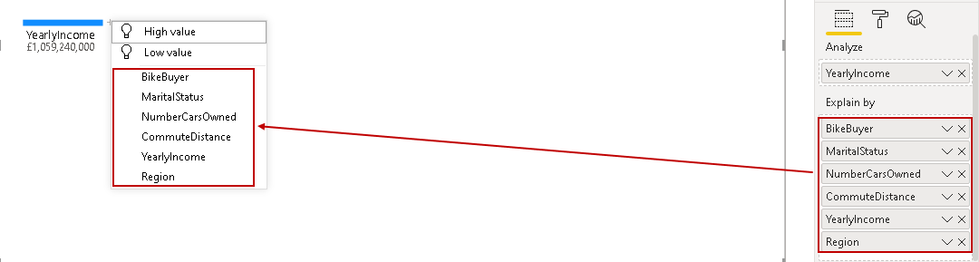
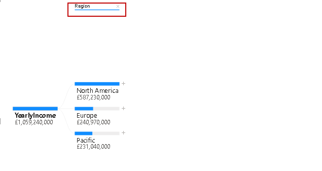
The next requirement is to add the fields to Explain by section. We can add multiple fields in this section. Let’s drag few columns – BikeBuyer, MaritialStatus, NumberCarsOwned, YearlyIncome and CommuteDistance and Region.
We can drag the fields in any order. The decomposition chart does not get any influence on the order of columns:

In the above screenshot, we can see that we have selected the fields in explain by column, but it does not show in the decomposition tree visual.
You can notice a plus (+) symbol on the sum of [YearlyIncome] column in the chart:

Click on plus (+) icon, and you get columns that we drag into the explain by section. You also get the column order the same as well. If we want to change the order of the columns in which they should appear in the chart, drag those columns in the same order in the explain by section:
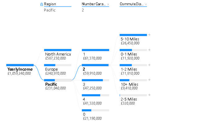
Now, from the chart column, click on any column for adding details in the chart. Let’s click on the Region, and it adds regions into the chart.
Now, to add further details, click on plus (+) sign on the region and it again populates rest of the fields list:
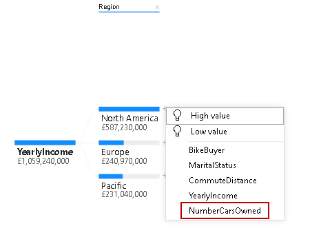
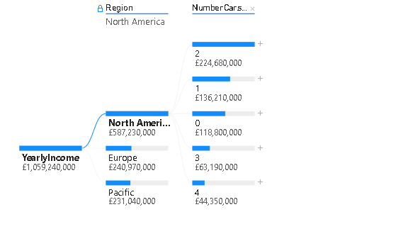
Click on the [NumberCarsOwned], and you get it in the chart. In the below chart, you can see [NumberCarsOwned] for North America:
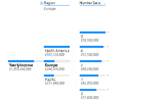
Click on Europe, and you get details of it:
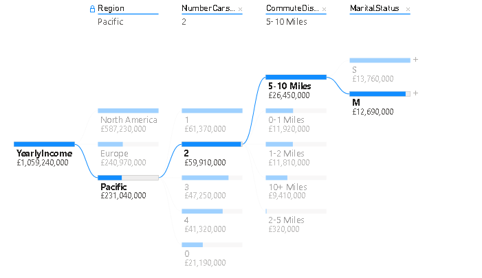
Similarly, we can add further details to the decomposition tree:
We added further details for [MaritialStatus] in the decomposition tree:
![Added further details for [MaritialStatus]](/wp-content/uploads/2020/01/added-further-details-for-maritialstatus.png)
Once you click on any tree path, it highlights that particular path and fades color for others, as shown below:
In case we do not want any particular level in the tree, we can remove it as well. For example, let’s say we do not want [CommuteDistance] section, then click on cross (x) on from the top layer:
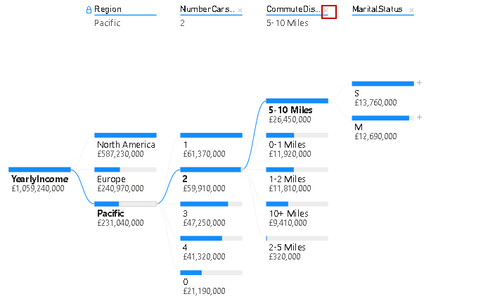
It removes the field, and the decomposition tree automatically relates to the next level that is [MaritialStatus] in my example:
Artificial Intelligence decomposition tree split in Power BI Desktop
As highlighted earlier, Microsoft added artificial intelligence (AI) as well in the decomposition tree visual. Once we click on plus (+) symbol, we get a list of columns along with two fields having bulb icon as well as shown below:
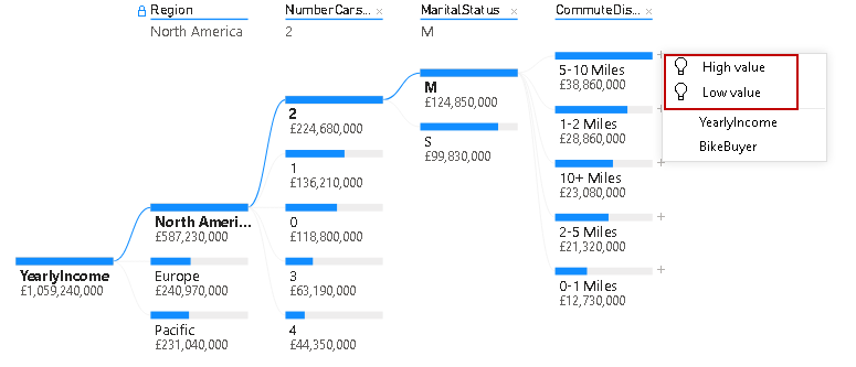
Let’s click on the high value and view the visual. It adds a new split [BikeBuyer] along with a bulb icon indicating that it is an AI split:
You might think why it added this column into the decomposition tree. It gives you an answer for it as well in the visual. Hover your mouse to the bulb icon, and you get the answer:
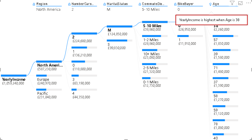
Our decomposition tree starting point is [YearlyIncome]. Once we use AI split in the tree, it finds the way to find out the highest [YearlyIncome] with available elements.
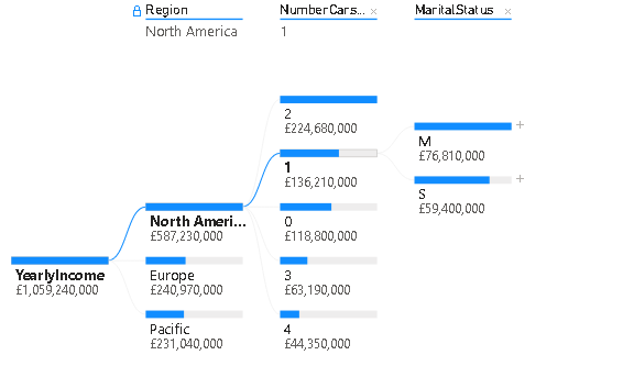
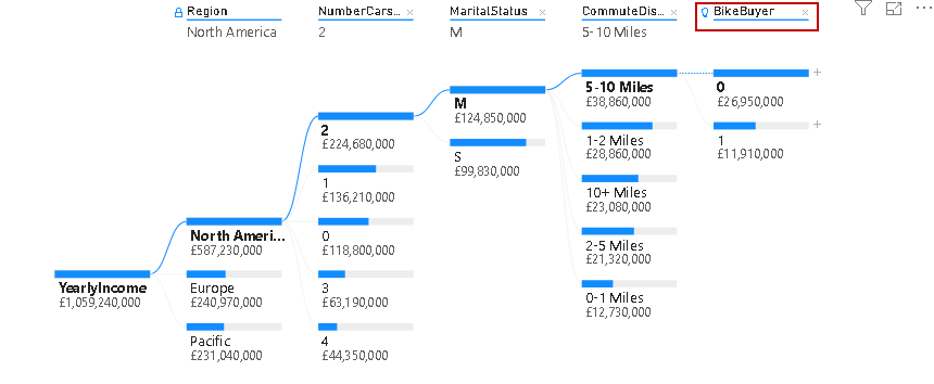
Now, add another column [Age] into explain by section and remove the [YearlyIncome]. Let’s add another high value (AI) split from the [BikeBuyer] AI column:
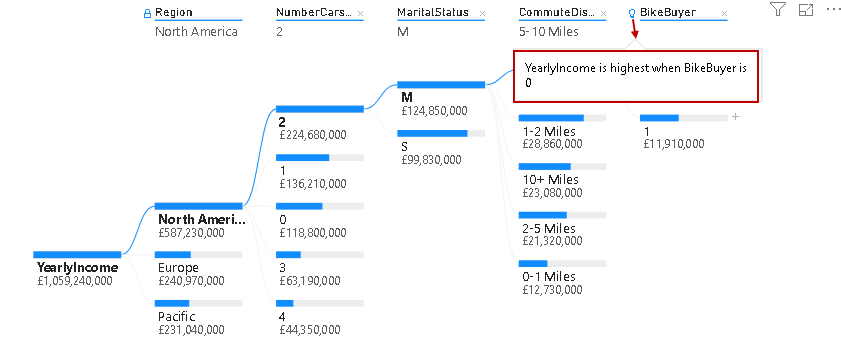
Once we hover mouse on bulb icon for Age, we get the answer of this AI split. [YearlyIncome] is highest when Age is 38:
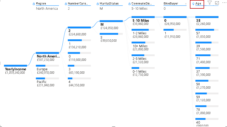
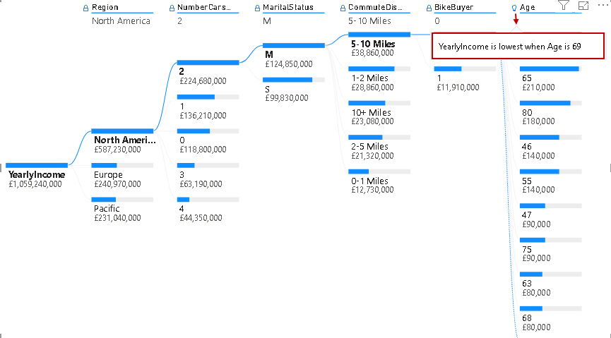
Now, remove this Age AI split and click on Low Value field. It automatically checks for the lowest yearly income based on Age:
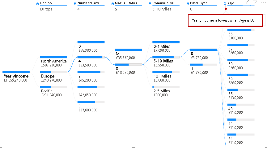
It dynamically calculates the value for the selections. For example, once we change the selection to the Europe region, we can see the lowest yearly income when Age is 66:
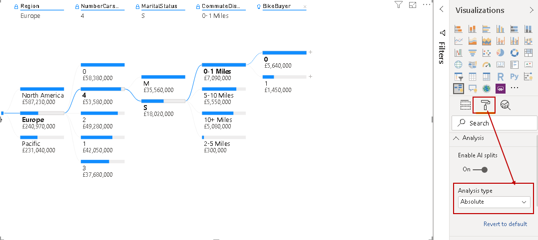
Artificial intelligence Analysis type
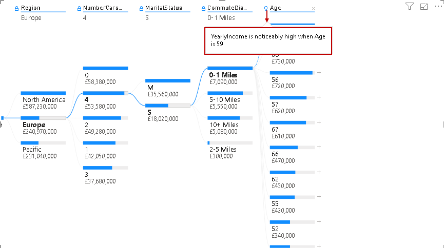
By default, the Decomposition tree analyzes the AI value mode as Absolute. We can view it from the chart format options:
Let’s change the AI split mode from Absolute to Relative. It changes the AI split in the decomposition tree. You get the answer of the calculation – YearlyIncome is noticeably high when Age is 59:
In the Relative mode, add a new high value AI column, and you see that it adds the Age column as shown below:
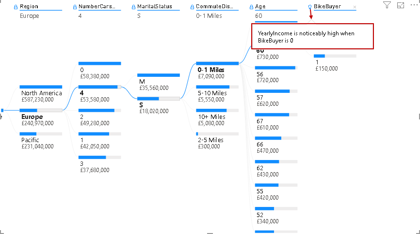
You can see the answer- YearlyIncome is noticeably high when BikeBuyer is 0. You can compare this with the absolute AI mode in which we get the same calculations at first place. You should use the required AI mode as per your requirements. We can add high value and low value in the same decomposition tree. As shown below, we added another low value AI split:

Locking behavior for decomposition tree in Power BI Desktop
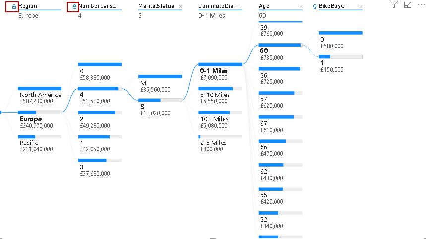
You can notice a small lock icon in the report. By default, the lock is opened for all levels:
What is the lock in the decomposition tree? Power BI Desktop allows the content creator to lock the level so that the user cannot remove it. Suppose we want to lock first two levels of the tree, click on the open lock icon and it changes to lock as shown below:
Once we lock any level, users do not get any option to remove that level. You do not get a cross (x) icon to remove the level.
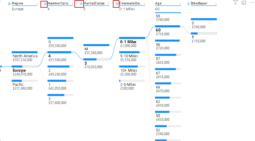
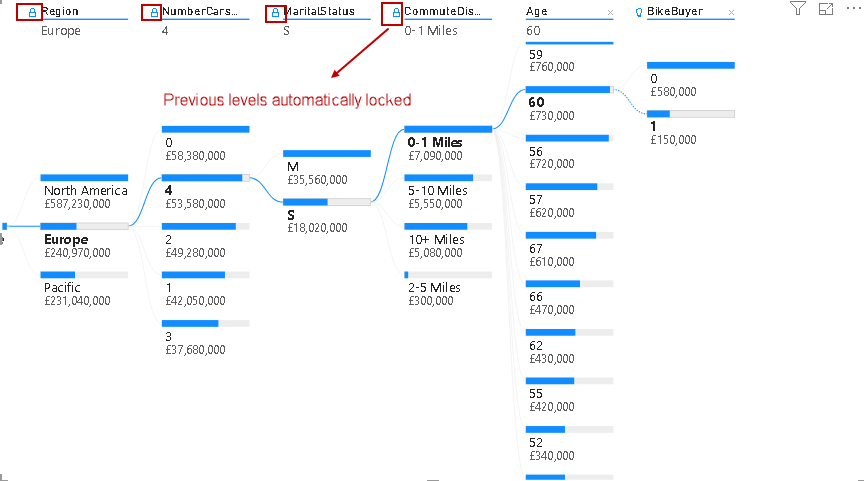
We can lock many levels, but suppose we lock level 4; then, it automatically locks the previous level for you.
For example, in the following screenshot, we have all the lock levels open:
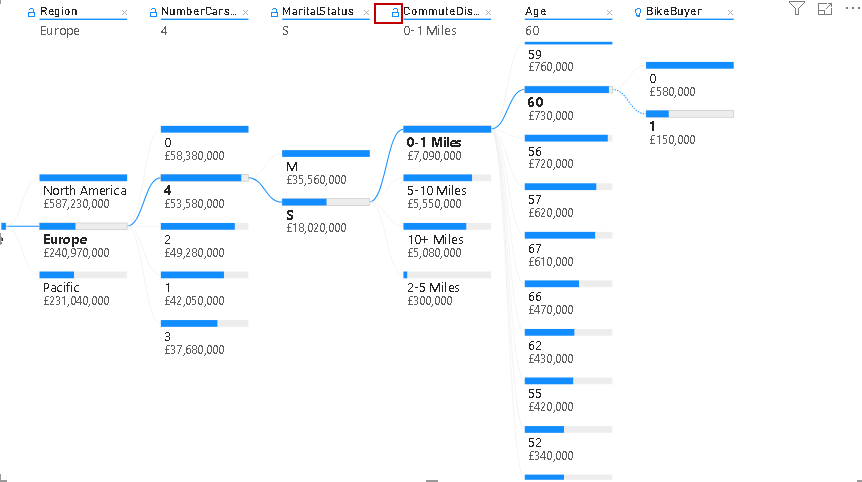
Let’s lock level for [CommuteDistance] and notice that all previous levels locked automatically:
Limitations of the decomposition tree in Power BI Desktop
- We can have a maximum of 50 levels in a decomposition tree
- It supports maximum 5000 data points at one time in the tree
- It does not support On-premises Analysis Services, Power BI Report Server, Direct Query, Azure Analysis Services
- We cannot use features Q&A, Power BI Mobile, Show Data functionality, and Pinning to dashboard with the decomposition tree
- It is a preview feature while writing this article and it might have few feature changes in the upcoming releases of Power BI Dashboard
Conclusion
In this article, we explored the useful decomposition tree and its useful artificial intelligence (AI) features. It is an excellent visual for breakdown data into certain levels and performs root cause analysis.

I am the author of the book "DP-300 Administering Relational Database on Microsoft Azure". I published more than 650 technical articles on MSSQLTips, SQLShack, Quest, CodingSight, and SeveralNines.
I am the creator of one of the biggest free online collections of articles on a single topic, with his 50-part series on SQL Server Always On Availability Groups.
Based on my contribution to the SQL Server community, I have been recognized as the prestigious Best Author of the Year continuously in 2019, 2020, and 2021 (2nd Rank) at SQLShack and the MSSQLTIPS champions award in 2020.
Personal Blog: https://www.dbblogger.com
I am always interested in new challenges so if you need consulting help, reach me at rajendra.gupta16@gmail.com
View all posts by Rajendra Gupta
- Understanding PostgreSQL SUBSTRING function - September 21, 2024
- How to install PostgreSQL on Ubuntu - July 13, 2023
- How to use the CROSSTAB function in PostgreSQL - February 17, 2023