
In the article, Candlestick chart for stock data analysis in Power BI Desktop, we explored Power BI Desktop to analyze stock prices. If you follow the stock market, you might have noticed a ticker (similar to the following image) showcasing stock prices and changes since the last close price. It shows an up and down indicator depending upon the positive or negative change in the stock price.

Recently while following the stock prices, I thought if we could create a similar stock ticket using Power BI. Let’s explore the solution in this article.
Sample data – Load data from a PDF file
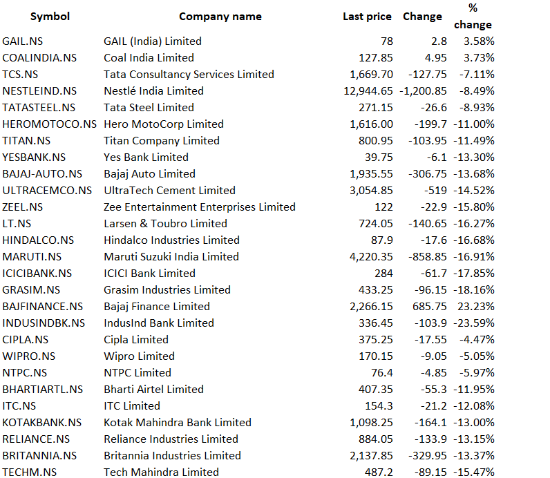
For this article, I will use the sample data in a PDF file. This data is for reference purposes only and does not contain the actual figure of the stock prices.
The first step to create a report is to import this data. Click on Get Data -> PDF.
You can refer to Importing data from a PDF file in Power BI Desktop article to learn how to import data from a PDF file. If you use the latest Power BI Desktop version, you do not require enabling feature from the preview features. PDF data import is in general availability now.
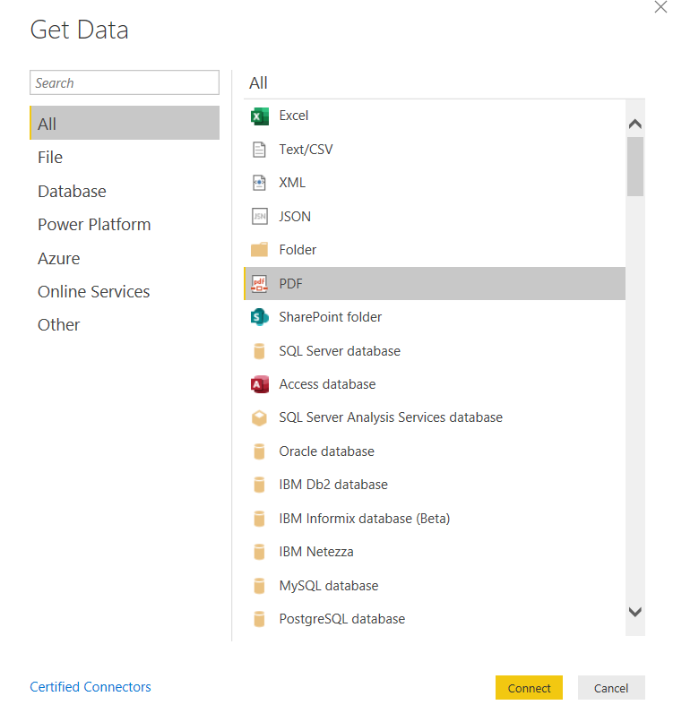
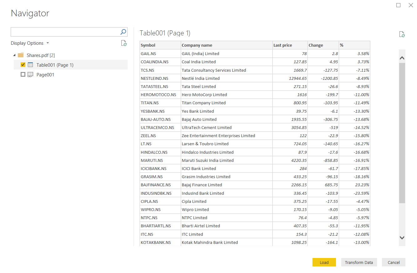
Click on Connect, browse to the directory, and provide the PDF file path. It connects to a PDF file and fetches the stocks table, as shown below. You might get multiple tables depending upon the PDF file data. You should preview it first and load appropriate data.
We require some changes in the data, so click on Transform Data. It opens Power Query Editor to customize data.
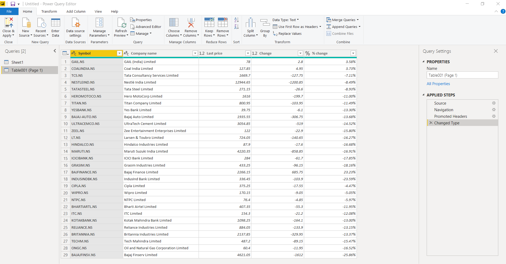
We require to remove suffix .NS from data in symbol column. For this requirement, right-click on the Symbol column and choose Split Column -> by delimiter.
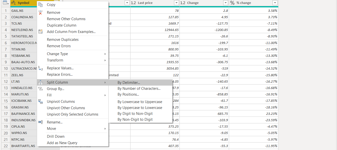
Specify split condition in the delimiter window and click OK. We can split the symbols using the dot (.) symbol. Here we have only one occurrence for the dot character, so it does not matter we select Left-most delimiter or Right-most delimiter.
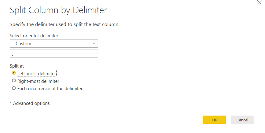
It splits the data and creates a new column for spit text, as shown below.
Remove the unwanted column (in this case Symbol.2) and rename Symbol.1 column to Symbol
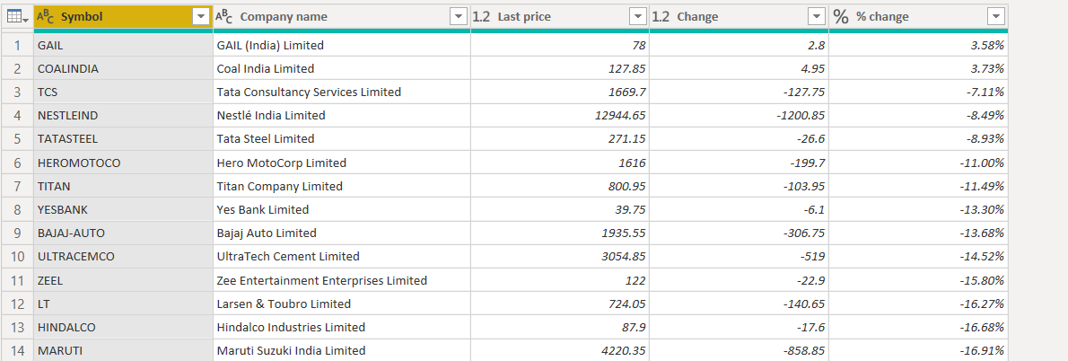
Save the changes, and we have data ready for visualization.
Create a Stock ticker visual in Power BI
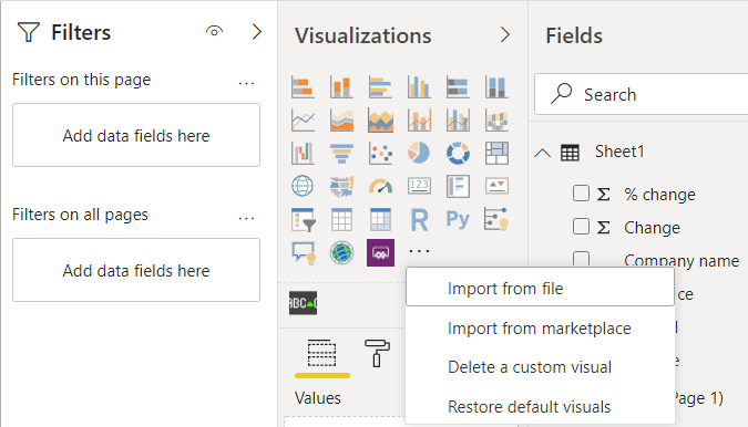
We need to import a custom visual Scroller for this. Click on Import from MarketPlace, as shown below. It might ask to login from a business account in case you are not signed in already.
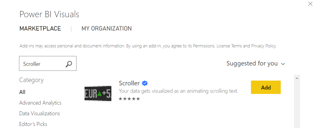
Here search for the Scroller visual and click the Add button to add it into the visualizations pane.
Once added, you can see the Scroller icon at the bottom of the Visualizations pane.
![]()
Click on the Scroller icon and adjust the size of it.
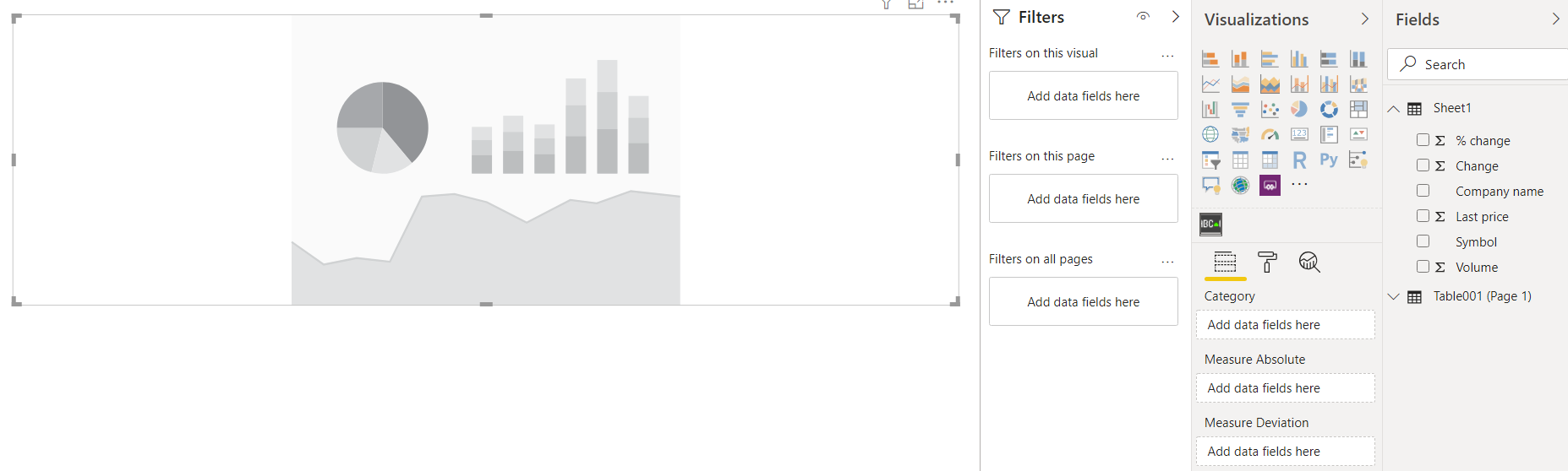
We need to define values for the following columns for this visual.
- Category: It is the category that we wish to display in the visual. For my data, it is the stock symbol
- Measure Absolute: It is the absolute value that we wish to display. It is the close price of the stock
- Measure Deviation: Any change to the stock price ( positive or negative) is the measure deviation from the final(closed) price ( Measure Absolute value)
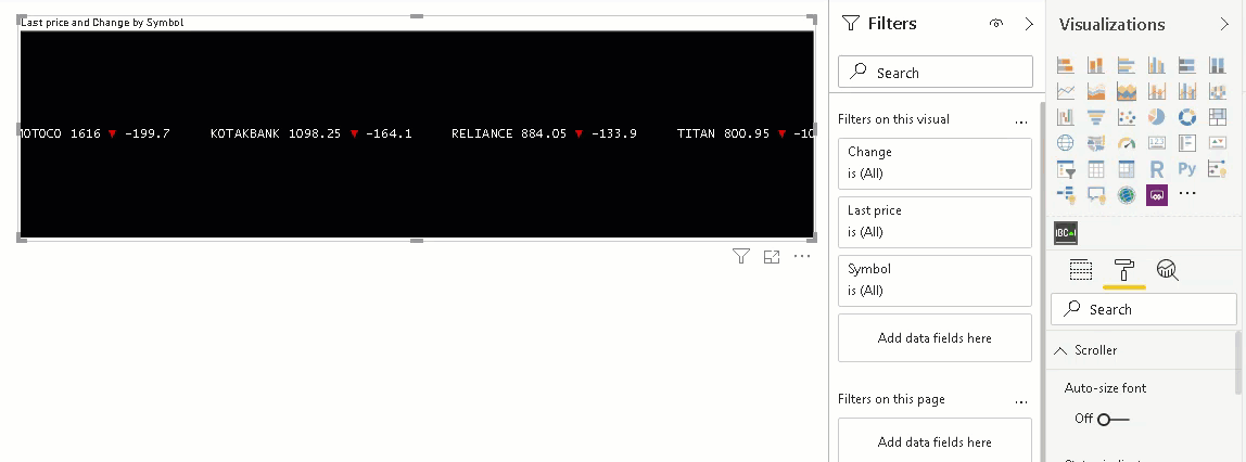
Let’s drag the column Symbol in the Category field and Last price in the Measure Absolute column, as shown below.
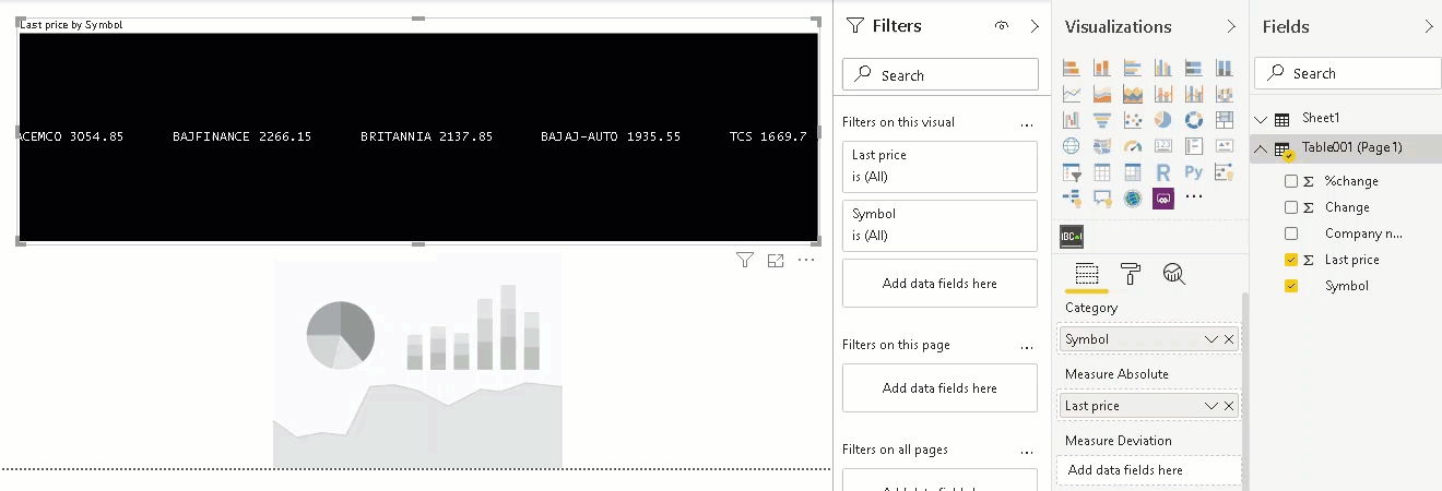
It shows stocks symbol and their prices in the stock ticker. Currently, it does not show any color codes and indicators (symbol for decrease or decrease price).
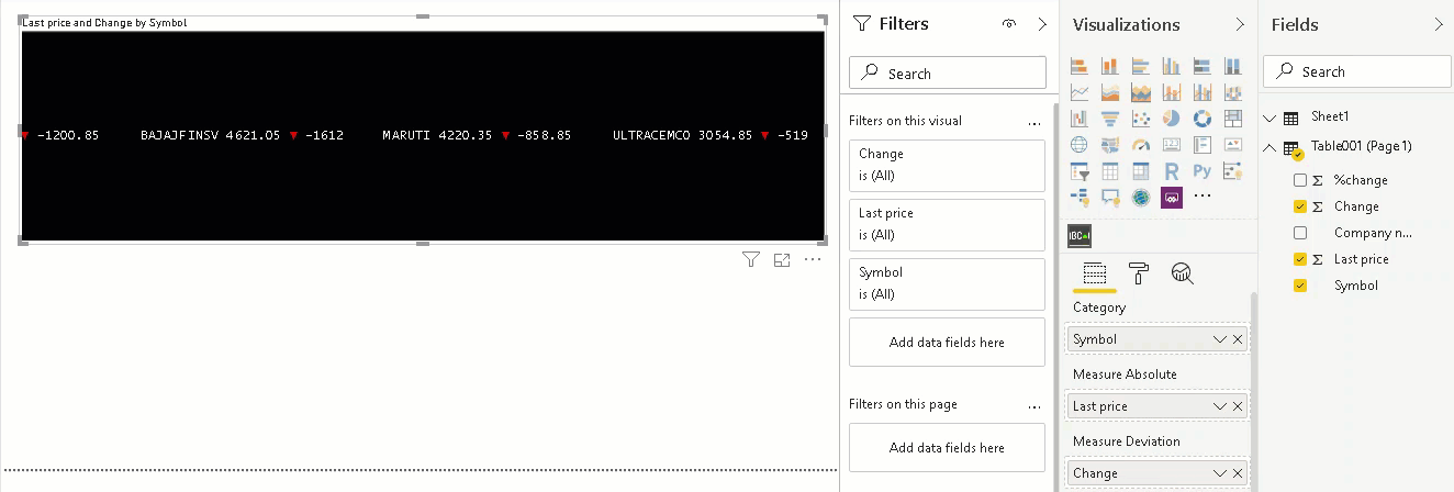
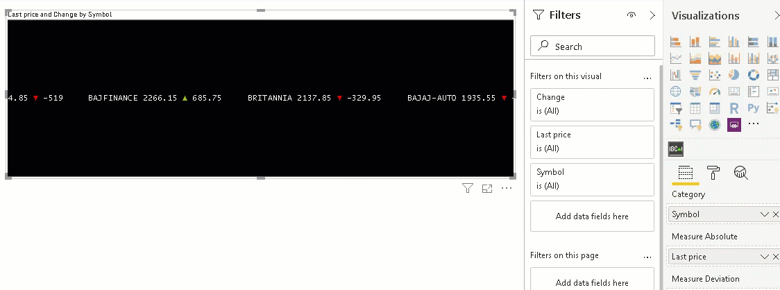
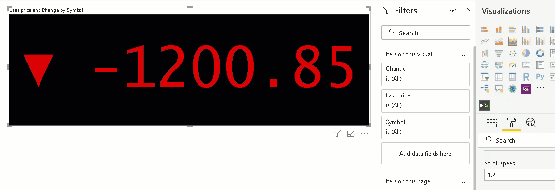
Now, drag the column Change to the Measure deviation, and it starts showing the indictor for the stock prices.
- Green up indicator: in case the stock prices increased from the closed price
- Red down indicator: in case the stock prices decreased from the closed price
Once we move the cursor over the scroller, it stops scrolling. It is helpful to stop the scroller at a specific stock. As soon as we remove the cursor, it starts scrolling again.
Formatting in the Scroller visual of Power BI Desktop
We have various formatting options available in the Stock ticker of Power BI. Click on the visual and navigate to the Format section.
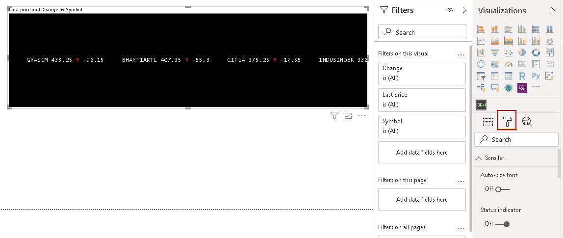
Let’s look at a few useful formatting options:
Auto-size font
By default, this property is turned off. If we change the scroller’s visual size, it does not change the font size. Let’s turn it on and change the window size. In the following gif, we can look that as soon as we change the visual size, it changes the font size automatically.
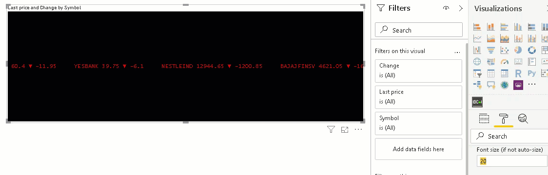
Font size
We may not enable auto-size property for stock ticker text and give a static font size to visualize better. In this case, we can specify the font size, and it changes the font sizes. Here, if we change the visual window size also, it does not change the font size.
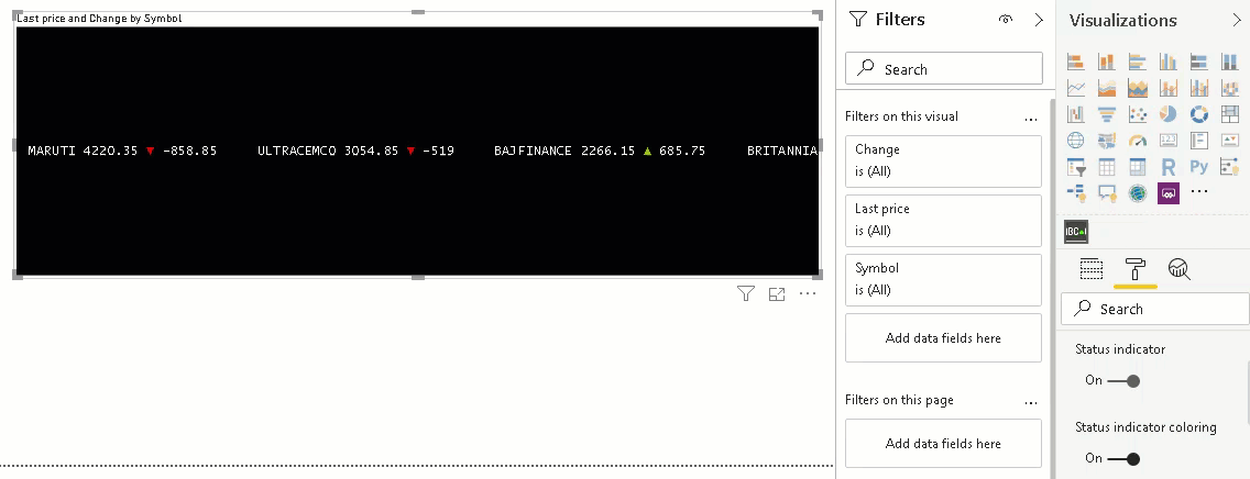
Status indicator
If we do not want the status indicator, we can turn it off. By default, it is turned on.
Status indicator coloring
As shown earlier, an indicator shows green and red color based on the stock price movement. If we do not want indicator color-coding, we can turn this property off. We can see this configuration behavior in the following image.
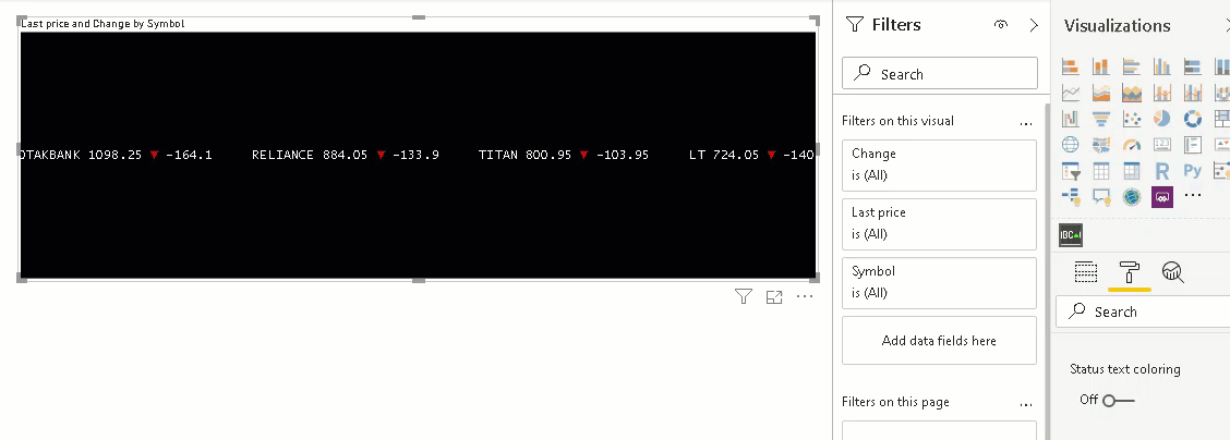
Status text coloring
By default, the scroller visual in Power BI Desktop shows stock color in white font irrespective of stock price movement. Once we turned on Status text coloring, it changes the stocks font in green or red color as per stock price movement.
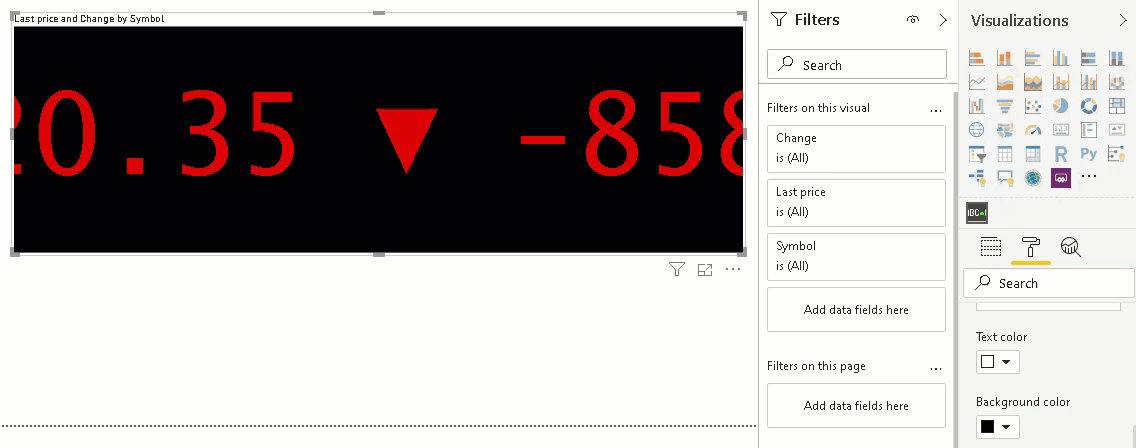
Scroll speed
We can change the text scroll speed as well. By default, it has a scroll speed of 1.2. Changing the scroll speed increases or decreases text scroll speed. In the following image, we can see different scrolls’ speed.
Background color
As shown above, the scroller has a black background. Although it works in most cases, we can still configure it as per our requirement. In this image, we see a few background colors. We can anytime revert to a default configuration using revert to default option shown here.
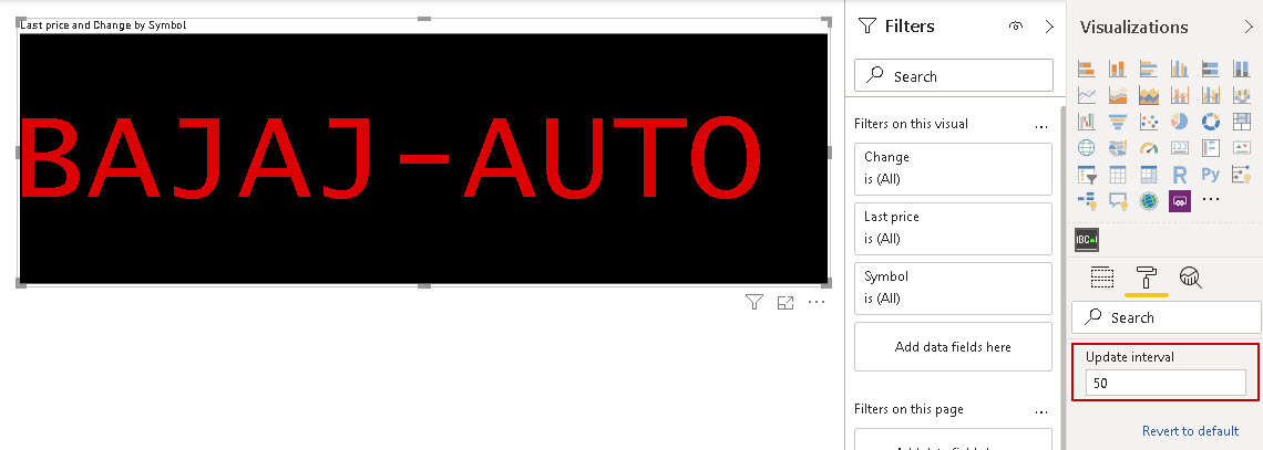
Update interval
Suppose we are doing a live feed of the stock prices from a web data source. In this case, we may want to refresh the stock prices at regular intervals. We can specify the update interval using this configuration.
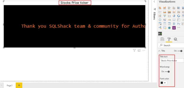
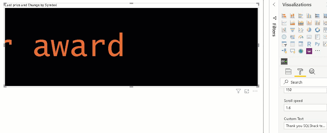
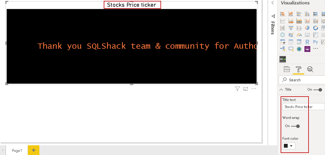
Custom Text
We can specify text in the Custom Text box. Once we specify a text, it overrides the data set that we wish to visualize, for example, stock ticker. It adds additional usage of the stock ticker that you can use it to display some scrolling text in the Power BI report. You can highlight important messages for the users, such as report unavailability or refresh timings. Here, I added a text to say thanks to SQLShack and community members for my Autor of the year award.
Title
By default, the scroller adds a title as per the columns selected from the data set. Certainly, we do not want the default title in the report. We can use the title section in the format area to turn on/off title, change title font, font color, font size, alignment.
Conclusion
In this article, we explored the scroller visual in Power BI desktop to create a stock ticker along with a price change indicator. Similarly, we can use it for text scroller as well. It provides various formatting and customization options to make it suitable as per your requirement.

I am the author of the book "DP-300 Administering Relational Database on Microsoft Azure". I published more than 650 technical articles on MSSQLTips, SQLShack, Quest, CodingSight, and SeveralNines.
I am the creator of one of the biggest free online collections of articles on a single topic, with his 50-part series on SQL Server Always On Availability Groups.
Based on my contribution to the SQL Server community, I have been recognized as the prestigious Best Author of the Year continuously in 2019, 2020, and 2021 (2nd Rank) at SQLShack and the MSSQLTIPS champions award in 2020.
Personal Blog: https://www.dbblogger.com
I am always interested in new challenges so if you need consulting help, reach me at rajendra.gupta16@gmail.com
View all posts by Rajendra Gupta
- Understanding PostgreSQL SUBSTRING function - September 21, 2024
- How to install PostgreSQL on Ubuntu - July 13, 2023
- How to use the CROSSTAB function in PostgreSQL - February 17, 2023