
In this article, we will learn how to add natural language-based data exploration capability to Power BI reports.
Introduction
The speed at which the options for data hosting, data processing and data management keep growing, the options for data consumption have also been growing at the same pace. Traditionally, applications and reports used to be the most common and most frequent means of consuming data. As data consumption means matured with time, chatbots, analytics engines, machine learning and artificial intelligence tools and many others. Traditionally, to explore the data, some of the common mechanisms have been using database query languages, preparation of reports by report designers and data exploration in a self-service manner by power users. With the evolution of capabilities like machine learning, artificial intelligence, natural language processing and others, some of the popular and modern methods of data exploration includes natural language-based data analysis, voice-enabled data exploration using smart devices, computer vision-based data analysis, etc. While many of these methods are highly sophisticated and need user training for a user to employ these data exploration methods, natural language-based data exploration is one of the most popular data exploration methods. This method is offered out-of-box by many reporting tools including Tableau and Power BI as well.
Adding Natural Language capability in a Power BI Report
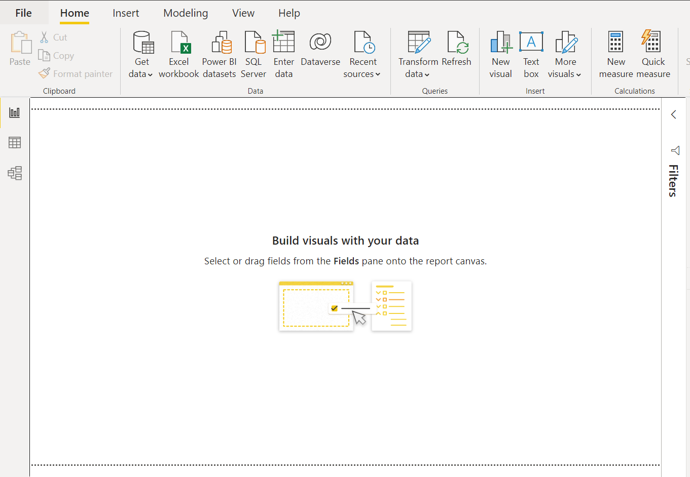
It is assumed that Power BI Desktop (latest version) is already on the local machine and launched for authoring reports. The landing screen of the Power BI Desktop would look as shown below.
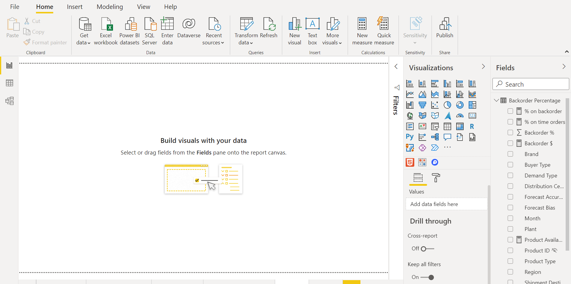
We need to source data in the report, so that we can use the capabilities in Power BI to explore the data. Power BI supports a variety of data sources, and it is assumed that one has sourced at least one dataset in Power BI. Once the data is sourced and populated in the report model, the fields would get listed in the fields pane as shown below. Once this step is complete, we are ready to explore the data.
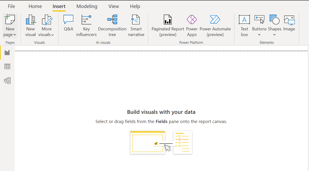
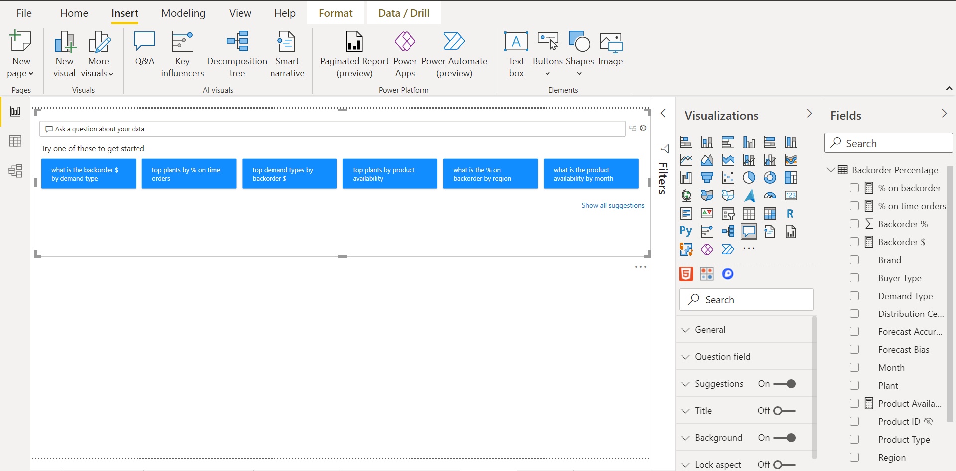
Power BI has a category of visualization knows as AI visuals. Some of the examples of such visuals are decomposition trees which were discussed in my last article, Analyzing data with decomposition trees in Power BI. Another example of this category of visualization is Q&A i.e., Question and Answer. Click on the Insert menu and we would be able to find the Q&A control under the AI visuals section as shown below.
Click on the Q&A control and it would get added to the report layout. Expand the control to occupy the screen space, and instantly we would be able to see a few suggestion boxes as shown below. These suggestions relate to the dataset that we have sources in the report.
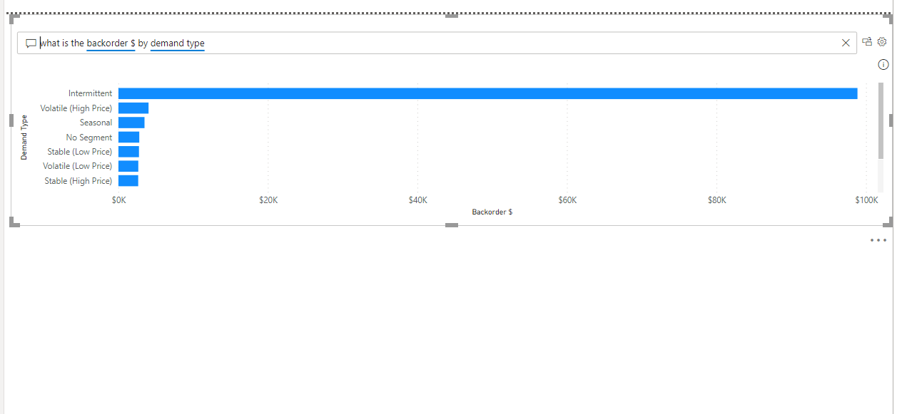
Click on the first suggestion which is – “what is the backorder $ by demand type”. Here the question involves exploration of two attributes – backorder $ sliced by demand type, which are two attributes in the dataset. One of the attributes is numerical while the other is categorical. One of the best-suited charts to display these attributes is a simple bar chart. Once we click on the suggestion, a visual would appear as shown below. Just by typing a question in a natural language, we got a chart with the desired data without the need to technically format any visualization. Such functionality can be extremely useful for a non-technical user who intends to explore the data using the usual business or natural language.
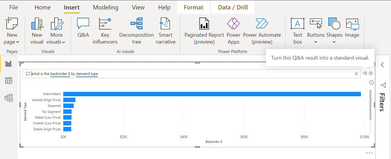
While the end-users can benefit from the natural language mode of data exploration, even report designers can use this visual for automating the generation chart elements. We can click on the icon on the top-left which would result in turning the Q&A result into a standard visual.
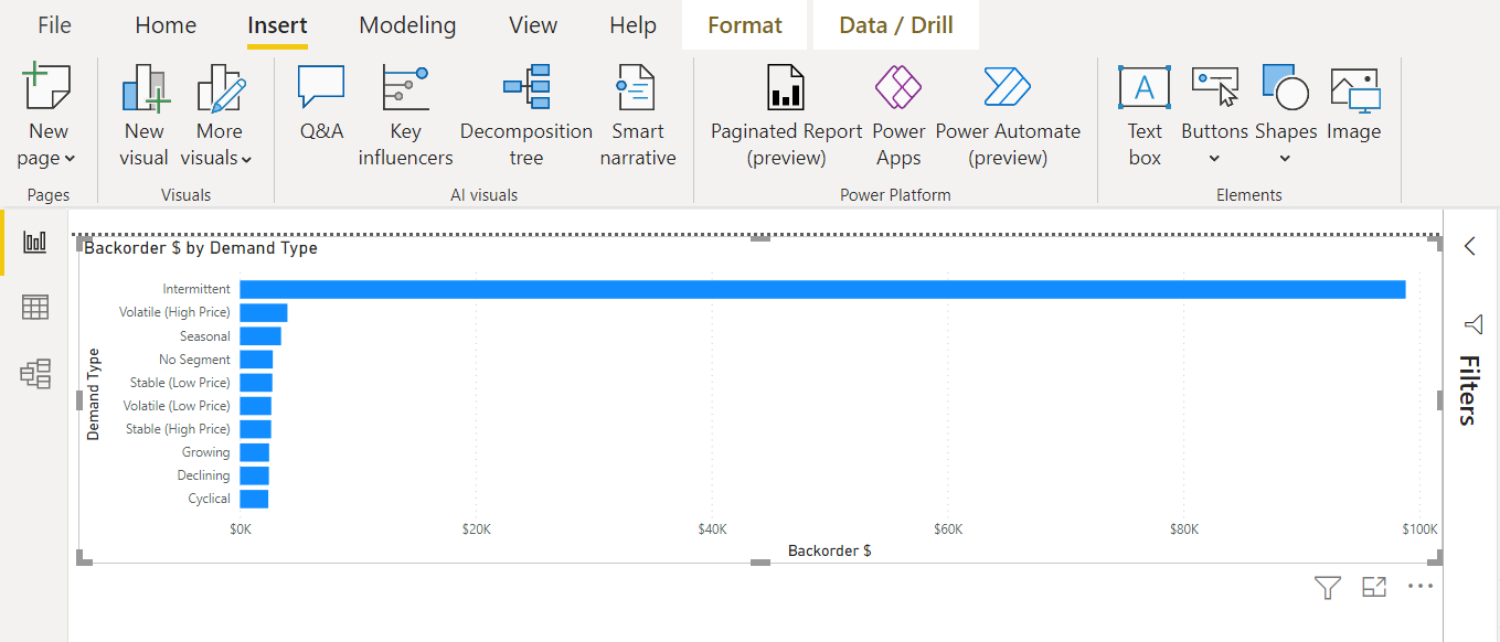
Once we click on the button, it would result in the Q&A control being replaced with an actual bar chart which would have the same data that we saw above. The newly generated visual would look as shown below. This can be a very effective means of partially automating report designing for a report designer as instead of configuring each visual and its properties, the visual gets generated just by typing a natural language-based question and converting the result into a visual.
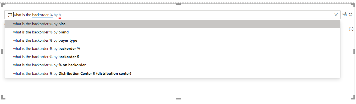
Though Q&A is a natural language-based visualization that can generate question suggestions, at times those suggestions may not be enough, and one may want to type the question and as to get type-ahead style suggestions to form the right question. Type the question in the question bar and we would be able to find type-ahead suggestions as shown below. As we type the question, even if the question is partial but can generate a result, the visual would show the result instantly as shown below. Also, the type-ahead suggestions can be seen in the drop-down.
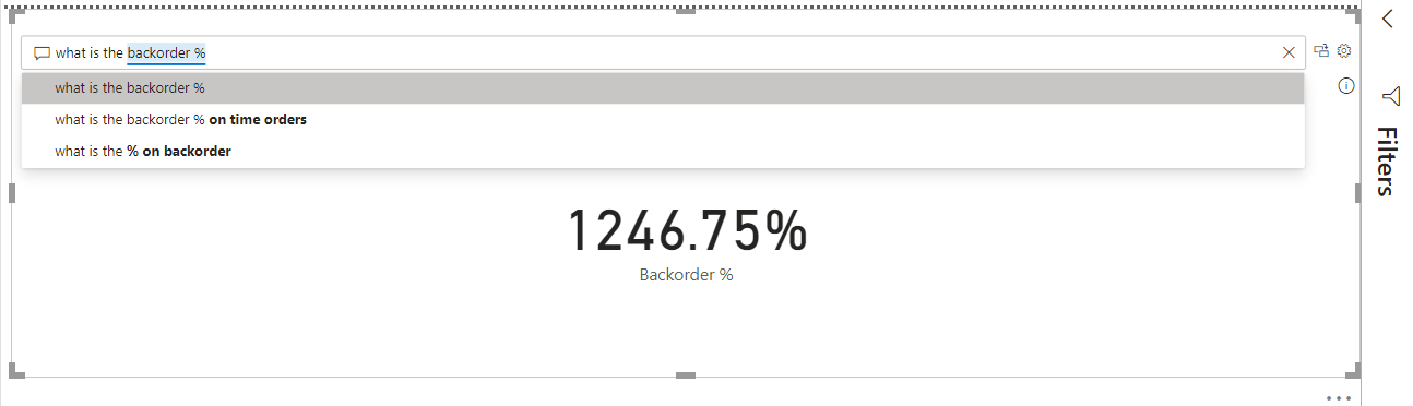
As we type along to analyze the data by other attributes, it would also suggest the attribute names depending on the text that matches the name of the attributes as shown below. This feature helps to expedite the question formation instead of having to explore the entire data model before forming the question.
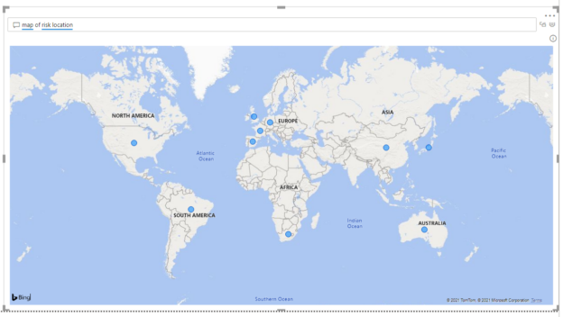
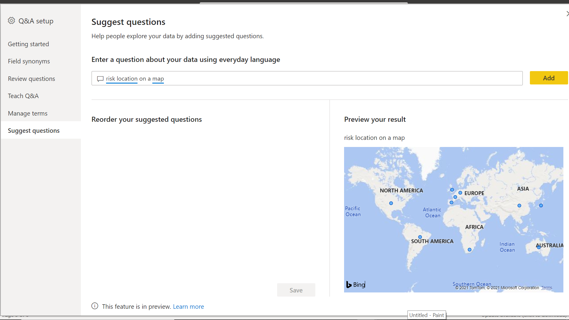
We already saw how the Q&A visual can easily plot numeric and categorical attributes on a chart. At times, we need data to be plotted on visuals that are very specific to the nature of the data in the attribute. For example, it would make sense to plot spatial data on a map. If we ask the question using the right keyword like “map or risk location”, it would plot the visual on an actual map control as shown below.

Q&A is an AI category of visual that has some intelligence of its own to explore or analyze the data and report the result in the form of a visual. But like any other AI-based program, this visual is not versatile to get each data-related question and generate perfect results. AI-based engines need to train when it is not able to get the desired results using the built-in limited intelligence contained in the visual. To train the Q&A control, click on the right-most icon in the top right corner and it would pop up a wizard as shown below.
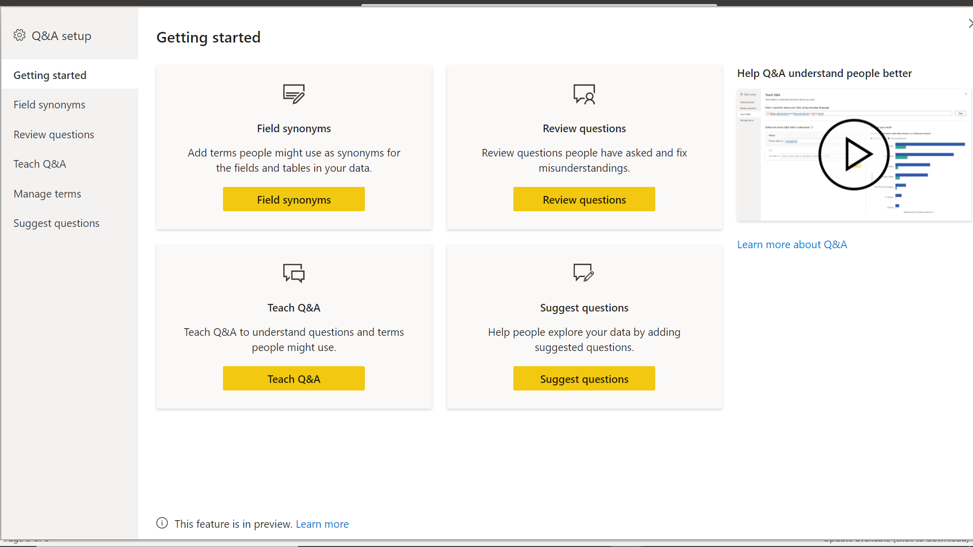
We can add field synonyms so that one can use the natural or business terms while forming the question and this visual would map to the actual field using the provided synonyms. We can review the questions that were used by the users to generate visuals and identify the questions that did not generate the desired result. This data would be collected in the Microsoft account one has used to log into Power BI. Finally, we can train or teach Q&A control with questions and terms that others can use or the questions that would be suggested when a user is attempting to form a question. Click on the suggested questions button and it would show a screen as shown below to suggest the question.
In this way, we can use out-of-box AI capabilities of Q&A control as well as train it to deliver the desired result in the form of visuals. While Q&A is a very powerful visual in Power BI, as of the draft of this article, it is still in preview state and the features, as well as User Interface offered by this visualization, are subject to change.
Conclusion
In this article, we learned the use of Q&A visualization in Power BI Desktop to explore data using natural language, automate the generation of visuals, as well as training the visualization to adapt to the natural language used by users to explore data.

She has a deep experience in designing data and analytics solutions and ensuring its stability, reliability, and performance. She is also certified in SQL Server and have passed certifications like 70-463: Implementing Data Warehouses with Microsoft SQL Server.
View all posts by Gauri Mahajan
- Oracle Substring function overview with examples - June 19, 2024
- Introduction to the SQL Standard Deviation function - April 21, 2023
- A quick overview of MySQL foreign key with examples - February 7, 2023