
Introduction
Over the past few months we have covered a lot of ground in our little “get togethers”. We have seen a few of my favorite tips and tricks. In today’s discussion we are going to have a look at a few gotcha’s upon which I have banged my head many times.
We shall be looking at line charts where the dataset is missing data and the line charts reflect this data loss with gapping gaps. Further we are going to see how we may ‘smooth out’ these line charts.
Often when dealing with bar charts, the default colours are system set. Oft times this does not produce a satisfactory solution as we may wish set the colours of the bars ‘on the fly’ or dynamically. The case of earned income is a great example especially when we may wish to point out poor performance.
Finally, we shall be looking at a nifty way of selecting the data that must appear on the screen for the user.
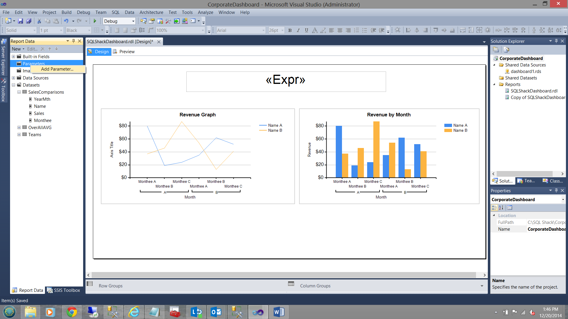
All of this is our challenge for today! The finised dashboard that we are going to create may be seen below:

Enough said, let us get to it!!!
Preparing our data
The SQLShack Industries financial year runs from July 1st throught June 30th. Prior to utilizing the data within reports we must create a piece of code that will
- Based upon the ‘year’ part of the current day set the start and end dates for the ‘year to date’ data extract.
- Create a “YearMth” dummy field to ensure that the ‘months’ correctly sorted when data extraction occurs ( i.e. we do NOT want to see
Apr,Aug,Dec,Feb,Jan,Jul,Jun,Mar,May,Nov,Oct,Sep but rather
Jul,Aug,Sep,Oct,Nov,Dec,Jan,Feb,Mar,Apr,May,Jun
Whilst there are many methods of achieving this, I prefer the method shown below:
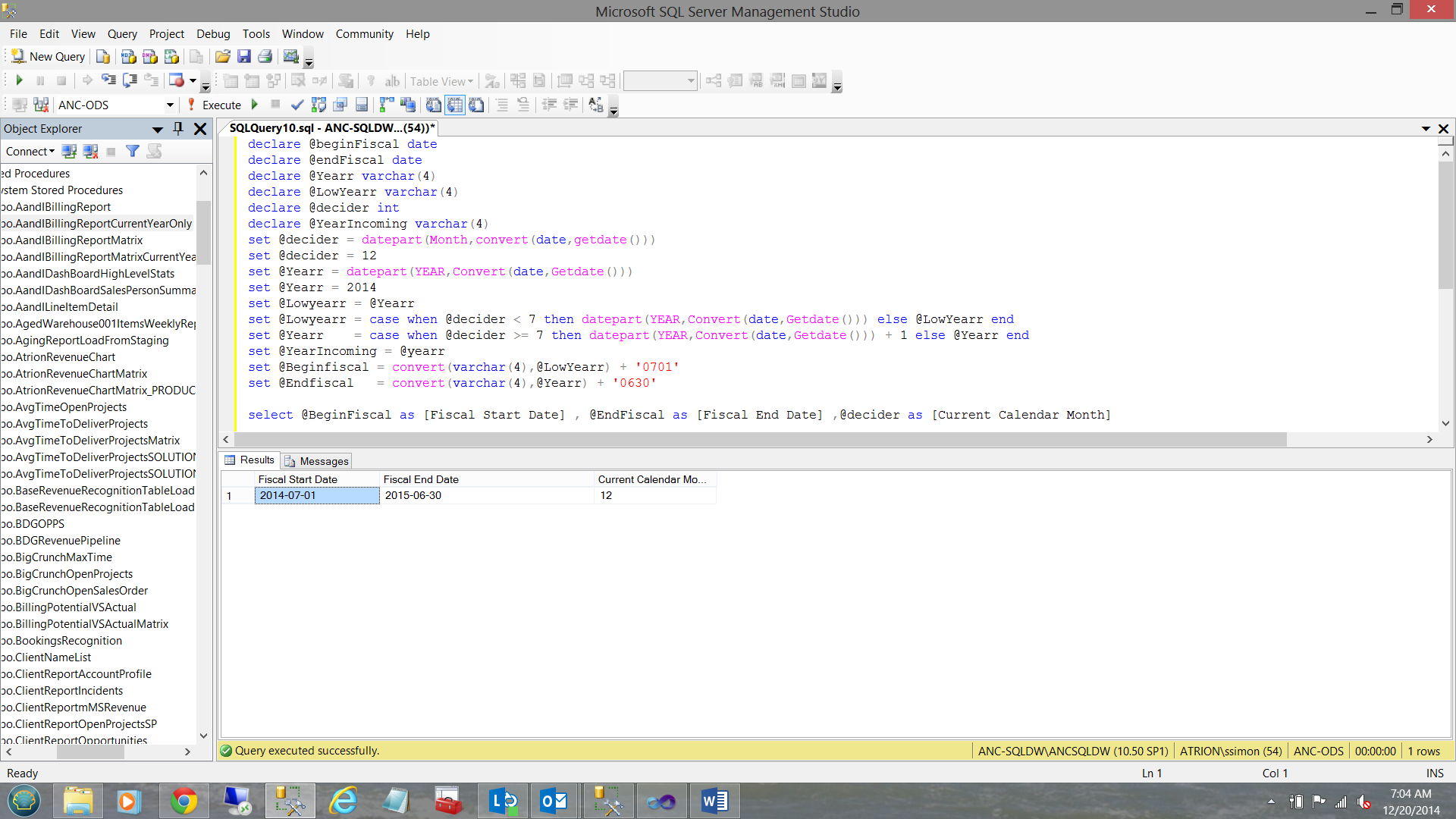
The code below shows how we obtain the start and end dates of our current fiscal year.
|
1 2 3 4 5 6 7 8 9 10 11 12 13 14 15 16 17 |
declare @beginFiscal date declare @endFiscal date declare @Yearr varchar(4) declare @LowYearr varchar(4) declare @decider int declare @YearIncoming varchar(4) set @decider = datepart(Month,convert(date,getdate())) set @Yearr = datepart(YEAR,Convert(date,Getdate())) set @Lowyearr = @Yearr set @Lowyearr = case when @decider < 7 then datepart(YEAR,Convert(date,Getdate())) else @LowYearr end set @Yearr = case when @decider >= 7 then datepart(YEAR,Convert(date,Getdate())) + 1 else @Yearr end set @YearIncoming = @yearr set @Beginfiscal = convert(varchar(4),@LowYearr) + '0701' set @Endfiscal = convert(varchar(4),@Yearr) + '0630' |
An explanation of this code is in order.
- We first obtain the current month from the GetDate() function which returns the current Month. This is placed in the @decider variable.
- We next determine the current year and place the value of the year into @Yearr.
- We now set @LowYear to the value of @Year. ( the reason for this will be seen in a second).
- If @decider is less than 7 then we accept the current year FROM GetDate otherwise we leave the value of @LowYearr as it was (i.e. @Yearr)
- Similarily if @decider >= 7 then we increment the value @Yearr by 1.
- Finally, we set the variable @BeginFiscal to the value of July 1 of the low year.
- Finally, we set the variable @EndFiscal to the value of June 30 of the high year.
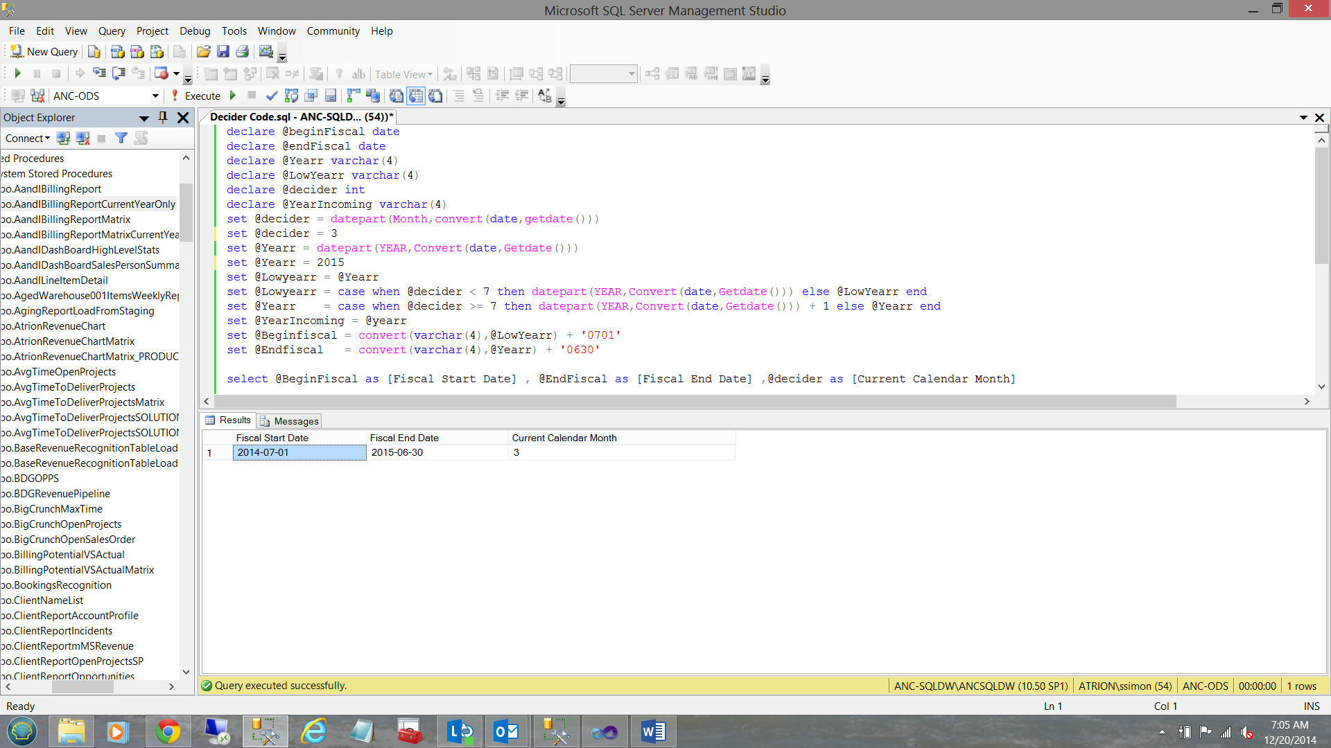
The next two screen dumps show the process in action (run in December). Note the override that I placed within the code to force the value of @decider to be 12 and @Yearr to be 2014
Into the first part of next year.. the month is set to 3 and the year to 2015.
Having obtained our fiscal year limits, we must now create a sort key to ensure that when we report upon our financial figures that we do not have the sorted data start in April and end in September.
We create 12 variables which will eventually contain the year and months for the current fiscal year.
|
1 2 3 4 5 6 7 8 9 10 11 12 13 14 |
declare @month01 varchar(6) declare @month02 varchar(6) declare @month03 varchar(6) declare @month04 varchar(6) declare @month05 varchar(6) declare @month06 varchar(6) declare @month07 varchar(6) declare @month08 varchar(6) declare @month09 varchar(6) declare @month10 varchar(6) declare @month11 varchar(6) declare @month12 varchar(6) |
Having declared our variables, we now set the values for each of the variables. Let us have a look at how @month01 is defined.
|
1 2 3 4 5 6 7 8 9 10 11 12 13 |
set @month01 = --Set @month01 = the year part of the beginning of the fiscal year. convert(varchar(4),datepart(Year,@beginFiscal)) + --Now if the month number is one character long then we add a ‘0’ to the --number i.e. ‘3’ become ‘03’ otherwise if it is 10 then leave it alone. case when len(convert(varchar(2),datepart(Month,@beginFiscal))) = 1 then convert(varchar(2),'0' + convert(varchar(2),datepart(Month,@beginFiscal))) else convert(varchar(2),datepart(Month,@beginFiscal)) end |
The astute reader will note that for the ensuing months, that the length test is executed against the result of adding one more month to the month that came before and then testing its length.
As an example if the month was September (month 9 in our case and length of 1), October will be month 10 THEREFORE before performing the test, we add one month and then perform the length test. The code for each month is shown below:
|
1 2 3 4 5 6 7 8 9 10 11 12 13 14 15 16 17 18 19 20 21 22 23 24 25 26 27 28 29 30 31 32 33 34 35 36 37 38 39 40 41 42 43 44 45 46 47 48 49 50 51 52 53 54 55 56 57 58 59 60 61 62 63 64 65 66 67 68 69 70 71 72 73 74 75 76 77 78 79 80 81 82 83 84 85 86 87 88 89 90 91 92 93 94 |
set @month01 = convert(varchar(4),datepart(Year,@beginFiscal)) + case when len(convert(varchar(2),datepart(Month,@beginFiscal))) = 1 then convert(varchar(2),'0' + convert(varchar(2),datepart(Month,@beginFiscal))) else convert(varchar(2),datepart(Month,@beginFiscal)) end set @month02 = convert(varchar(4),datepart(Year,@beginFiscal)) + case when len(convert(varchar(2),datepart(Month,dateadd(mm,1,@beginFiscal)))) = 1 then convert(varchar(2),'0' + convert(varchar(2),datepart(Month,dateadd(mm,1,@beginFiscal)))) else convert(varchar(2),datepart(Month,dateadd(mm,1,@beginFiscal))) end set @month03 = convert(varchar(4),datepart(Year,@beginFiscal)) + case when len(convert(varchar(2),datepart(Month,dateadd(mm,2,@beginFiscal)))) = 1 then convert(varchar(2),'0' + convert(varchar(2),datepart(Month,dateadd(mm,2,@beginFiscal)))) else convert(varchar(2),datepart(Month,dateadd(mm,2,@beginFiscal))) end set @month04 = convert(varchar(4),datepart(Year,@beginFiscal)) + case when len(convert(varchar(2),datepart(Month,dateadd(mm,3,@beginFiscal)))) = 1 then convert(varchar(2),'0' + convert(varchar(2),datepart(Month,dateadd(mm,3,@beginFiscal)))) else convert(varchar(2),datepart(Month,dateadd(mm,3,@beginFiscal))) end set @month05 = convert(varchar(4),datepart(Year,@beginFiscal)) + case when len(convert(varchar(2),datepart(Month,dateadd(mm,4,@beginFiscal)))) = 1 then convert(varchar(2),'0' + convert(varchar(2),datepart(Month,dateadd(mm,4,@beginFiscal)))) else convert(varchar(2),datepart(Month,dateadd(mm,4,@beginFiscal))) end set @month06 = convert(varchar(4),datepart(Year,@beginFiscal)) + case when len(convert(varchar(2),datepart(Month,dateadd(mm,5,@beginFiscal)))) = 1 then convert(varchar(2),'0' + convert(varchar(2),datepart(Month,dateadd(mm,5,@beginFiscal)))) else convert(varchar(2),datepart(Month,dateadd(mm,5,@beginFiscal))) end set @month07 = convert(varchar(4),datepart(Year,@endFiscal)) + case when len(convert(varchar(2),datepart(Month,dateadd(mm,-5,@endFiscal)))) = 1 then convert(varchar(2),'0' + convert(varchar(2),datepart(Month,dateadd(mm,-5,@endFiscal)))) else convert(varchar(2),datepart(Month,dateadd(mm,-5,@endFiscal))) end set @month08 = convert(varchar(4),datepart(Year,@endFiscal)) + case when len(convert(varchar(2),datepart(Month,dateadd(mm,-4,@endFiscal)))) = 1 then convert(varchar(2),'0' + convert(varchar(2),datepart(Month,dateadd(mm,-4,@endFiscal)))) else convert(varchar(2),datepart(Month,dateadd(mm,-4,@endFiscal))) end set @month09 = convert(varchar(4),datepart(Year,@endFiscal)) + case when len(convert(varchar(2),datepart(Month,dateadd(mm,-3,@endFiscal)))) = 1 then convert(varchar(2),'0' + convert(varchar(2),datepart(Month,dateadd(mm,-3,@endFiscal)))) else convert(varchar(2),datepart(Month,dateadd(mm,-3,@endFiscal))) end set @month10 = convert(varchar(4),datepart(Year,@endFiscal)) + case when len(convert(varchar(2),datepart(Month,dateadd(mm,-2,@endFiscal)))) = 1 then convert(varchar(2),'0' + convert(varchar(2),datepart(Month,dateadd(mm,-2,@endFiscal)))) else convert(varchar(2),datepart(Month,dateadd(mm,-2,@endFiscal))) end set @month11 = convert(varchar(4),datepart(Year,@endFiscal)) + case when len(convert(varchar(2),datepart(Month,dateadd(mm,-1,@endFiscal)))) = 1 then convert(varchar(2),'0' + convert(varchar(2),datepart(Month,dateadd(mm,-1,@endFiscal)))) else convert(varchar(2),datepart(Month,dateadd(mm,-1,@endFiscal))) end set @month12 = convert(varchar(4),datepart(Year,@endFiscal)) + case when len(convert(varchar(2),datepart(Month,dateadd(mm,0,@endFiscal)))) = 1 then convert(varchar(2),'0' + convert(varchar(2),datepart(Month,dateadd(mm, 0,@endFiscal)))) else convert(varchar(2),datepart(Month,dateadd(mm,0,@endFiscal))) end |
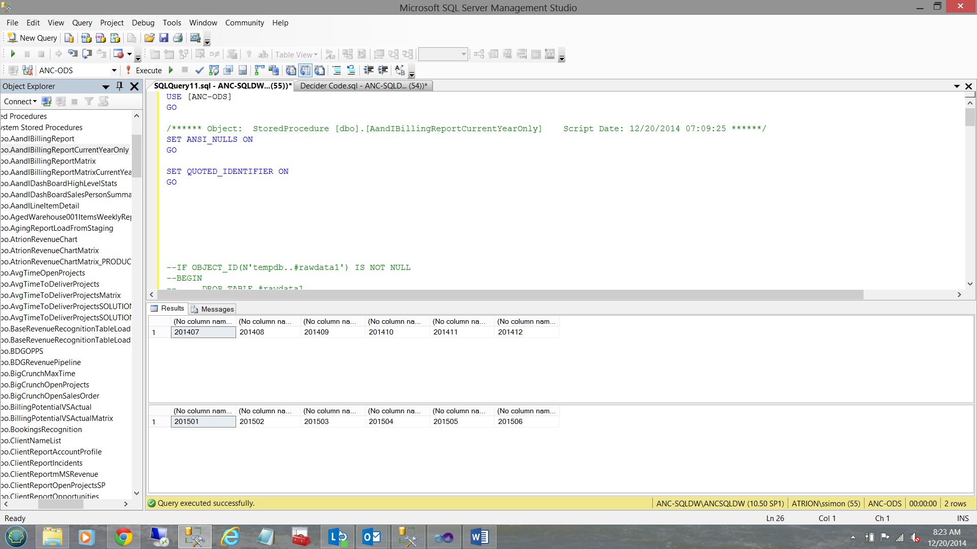
When this code is run, the following results are obtained.
Now SQLShack management does not wish to have their reports showing the monthly sales as having come from 201407 etc. What they wish to see may be seen within the table below:
| What we now have | What we want |
| 201407 | Jul |
| 201408 | Aug |
| 201409 | Sep |
This may be achieved in the following manner.
|
1 2 3 4 5 6 7 8 9 10 11 12 13 14 15 16 17 18 19 20 21 22 23 24 25 26 27 28 29 30 31 32 |
Select Revenue, YearMth, Case when right(Yearmth,2) = ‘07’ then ‘Jul’ when right(Yearmth,2) = ‘08’ then ‘Aug’ when right(Yearmth,2) = ‘09’ then ‘Sep’ when right(Yearmth,2) = ‘10’ then ‘Oct’ when right(Yearmth,2) = ‘11’ then ‘Nov’ when right(Yearmth,2) = ‘12’ then ‘Dec’ when right(Yearmth,2) = ‘01’ then ‘Jan’ when right(Yearmth,2) = ‘02’ then ‘Feb’ when right(Yearmth,2) = ‘03’ then ‘Mar’ when right(Yearmth,2) = ‘04’ then ‘Apr’ when right(Yearmth,2) = ‘05’ then ‘May’ when right(Yearmth,2) = ‘06’ then ‘Jun’ end as Monthee from ( select case when datepart(month,Invoicedate) = 7 then @month01 when datepart(month,Invoicedate) = 8 then @month02 when datepart(month,Invoicedate) = 9 then @month03 when datepart(month,Invoicedate) = 10 then @month04 when datepart(month,Invoicedate) = 11 then @month05 when datepart(month,Invoicedate) = 12 then @month06 when datepart(month,Invoicedate) = 1 then @month07 when datepart(month,Invoicedate) = 2 then @month08 when datepart(month,Invoicedate) = 3 then @month09 when datepart(month,Invoicedate) = 4 then @month10 when datepart(month,Invoicedate) = 5 then @month11 when datepart(month,Invoicedate) = 6 then @month12 end as Yearmth, Revenue from SQLShackinvoicing)a |
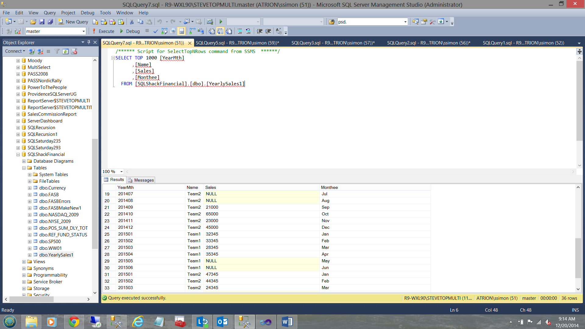
Having achieved all this, SQLShack Industries summarizes its data by team and month and places the data (via an overnight load process) into a SQL Server table used exclusively for reporting. The content of the table may be seen below:
Our data is now in the desired format, so let us get back to what we started out to do and that was to create a report dashboard!!
Getting Started
We start by creating a new Reporting Services Project from SQL Server Data Tools. Should the reader be unfamiliar with this process, please do have a look at one of my earlier SQLShack articles such as “Now you see it, now you don’t”. The hyperlink to the article is
/now-see-now-dont/
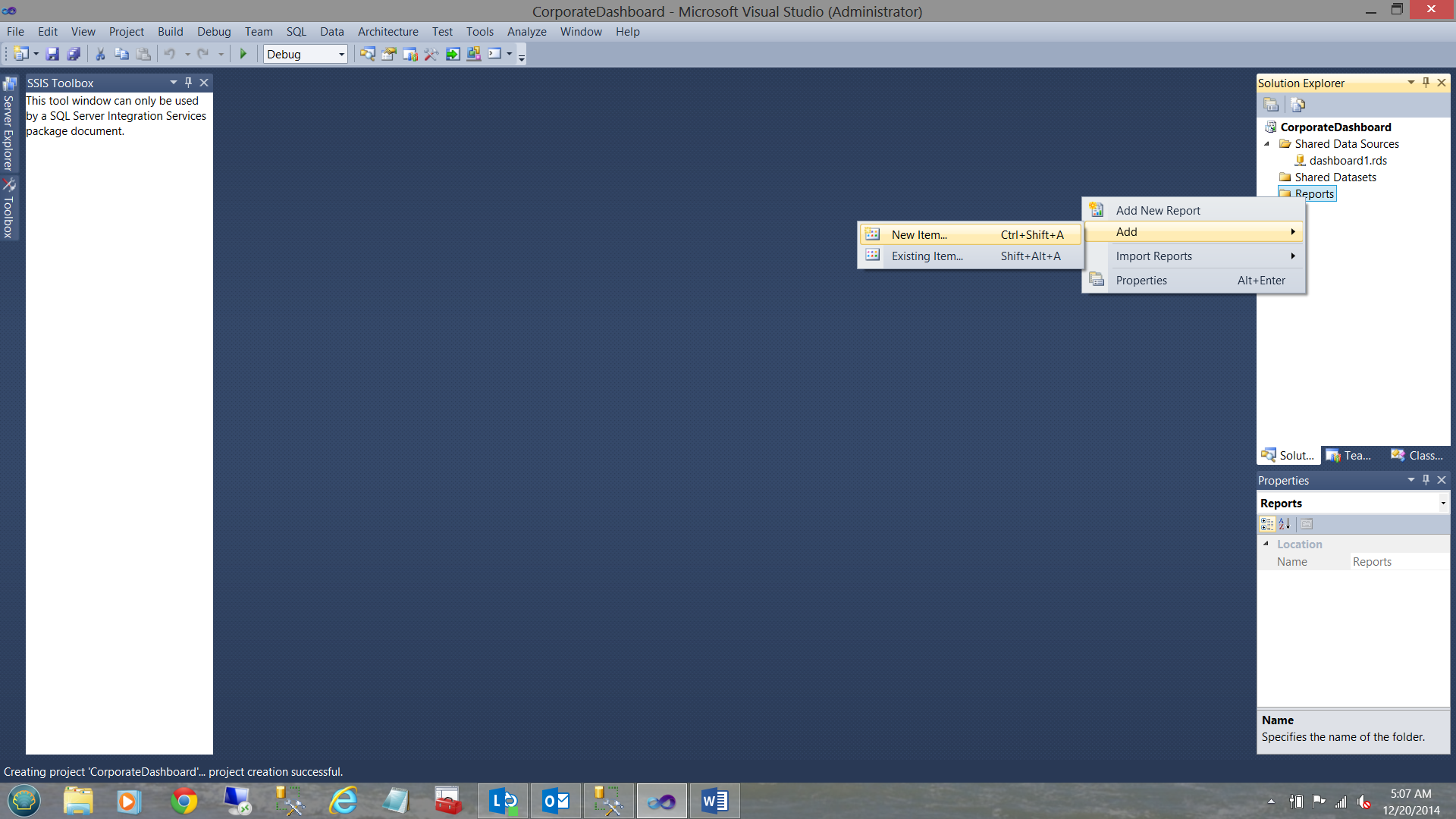
We right click on the “Reports” folder, select add and then “New Item”.
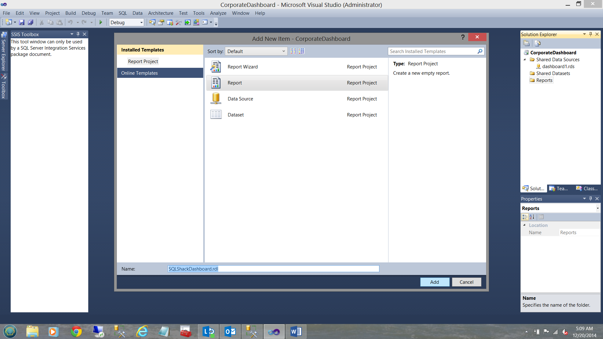
We choose “Report” and give our report a name. We then click “Add”. We now find ourselves returned to our work surface.
Our first task is to create our first line graph/line chart report. We begin by creating a dataset with the monthly sales figures from our SQLShack Industries financial database. Should you be uncertain on how to create a dataset please do have a look at an earlier article that I created entitled “Now you see it, now you don’t” where I take you through the creation of a data source and datasets in great detail. The link to this article may be seen below:
/now-see-now-dont/
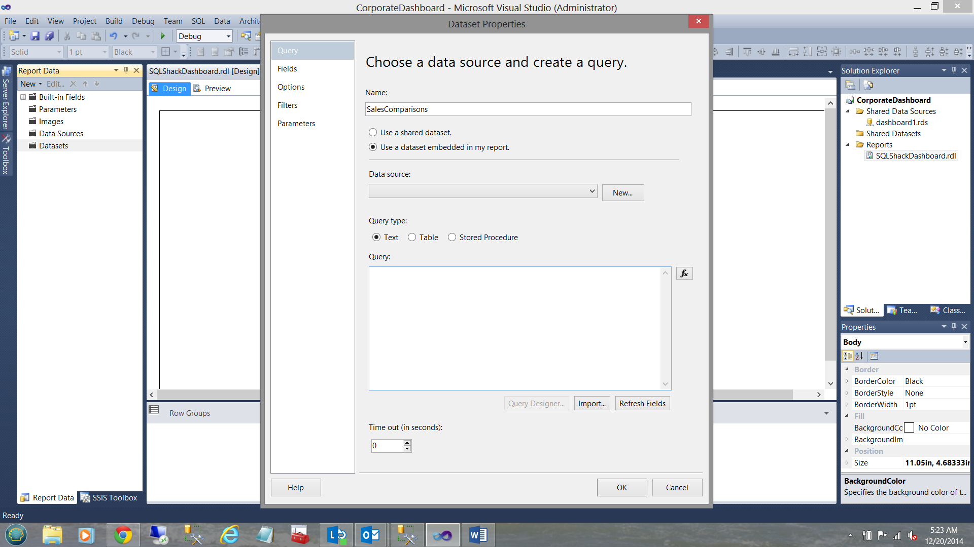
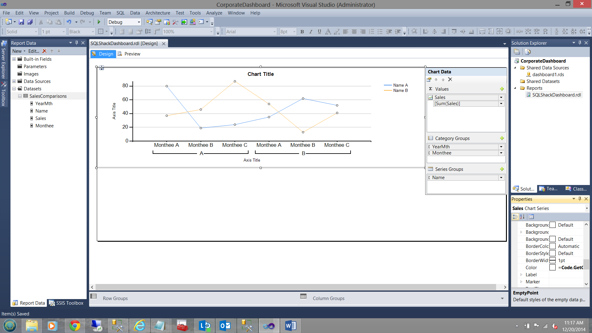
I now create my dataset “SalesComparisons”, embedding the dataset within my report:
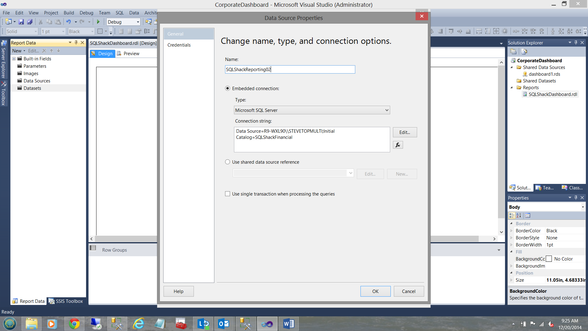
In the “Data source” drop down I create a new local “Data source”. Once again and as discussed above, should you be uncertain of how this is done, please do have a look at the link above where the process is described in detail.
I click OK to return to the “Dataset Properties” window.
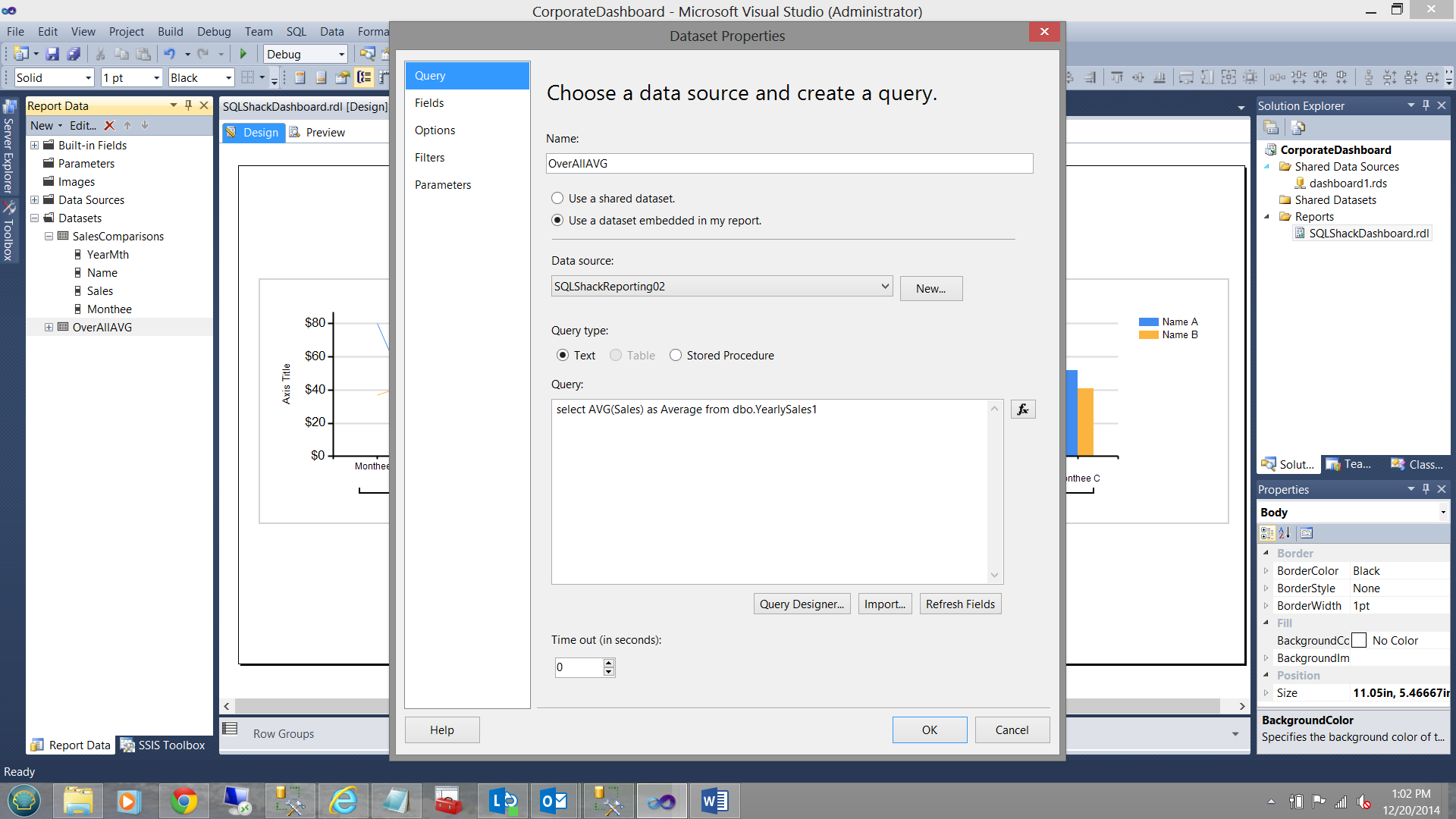
As this first report is fairly simple, my query type will be a text statement:
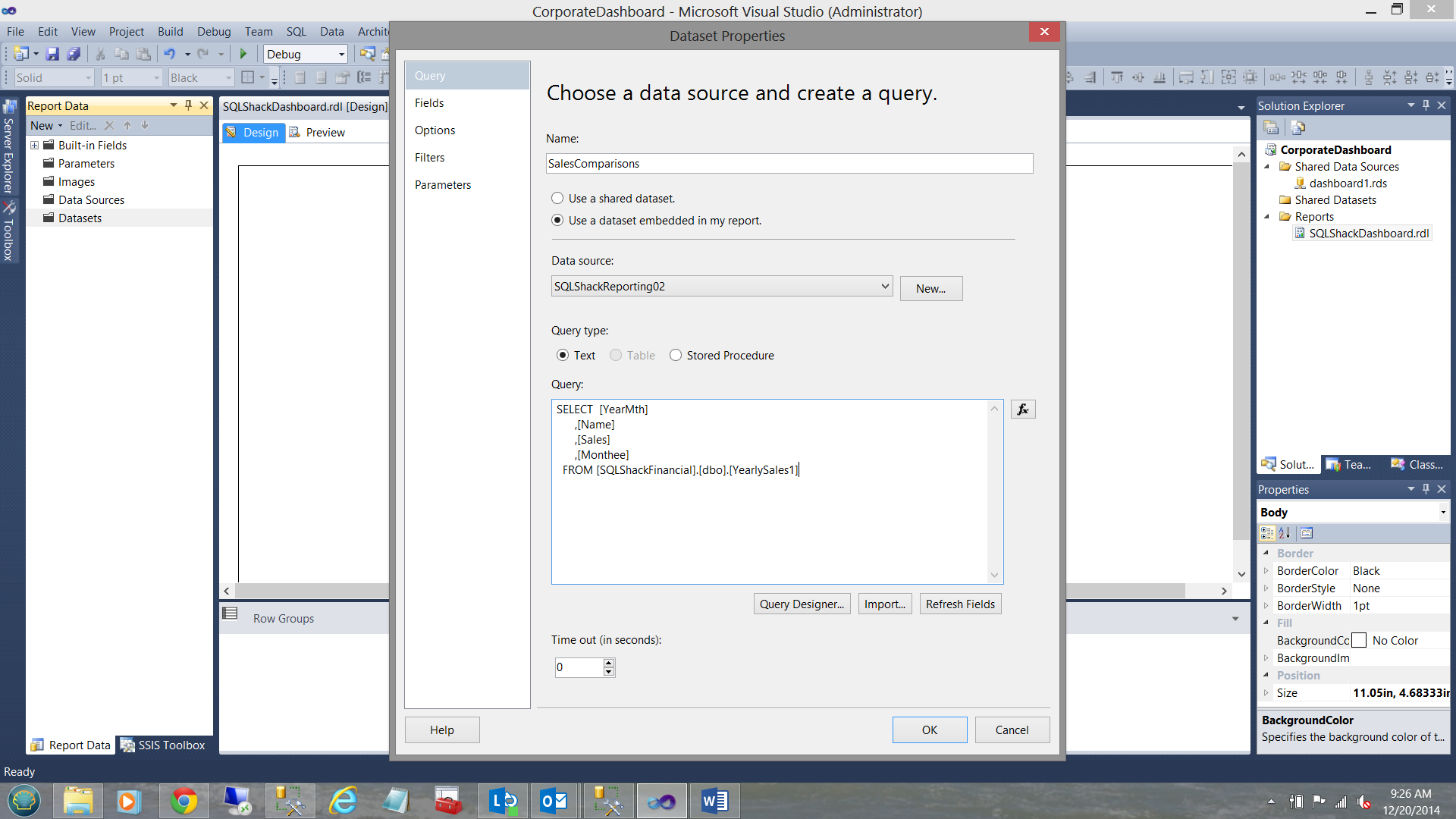
Above, we see the query for our first dataset. I click “Refresh Fields” and then check under the “Fields” tab (upper left in the screen dump above) to verify that the required fields have been successfully added to the dataset.
Creating Report Number 1
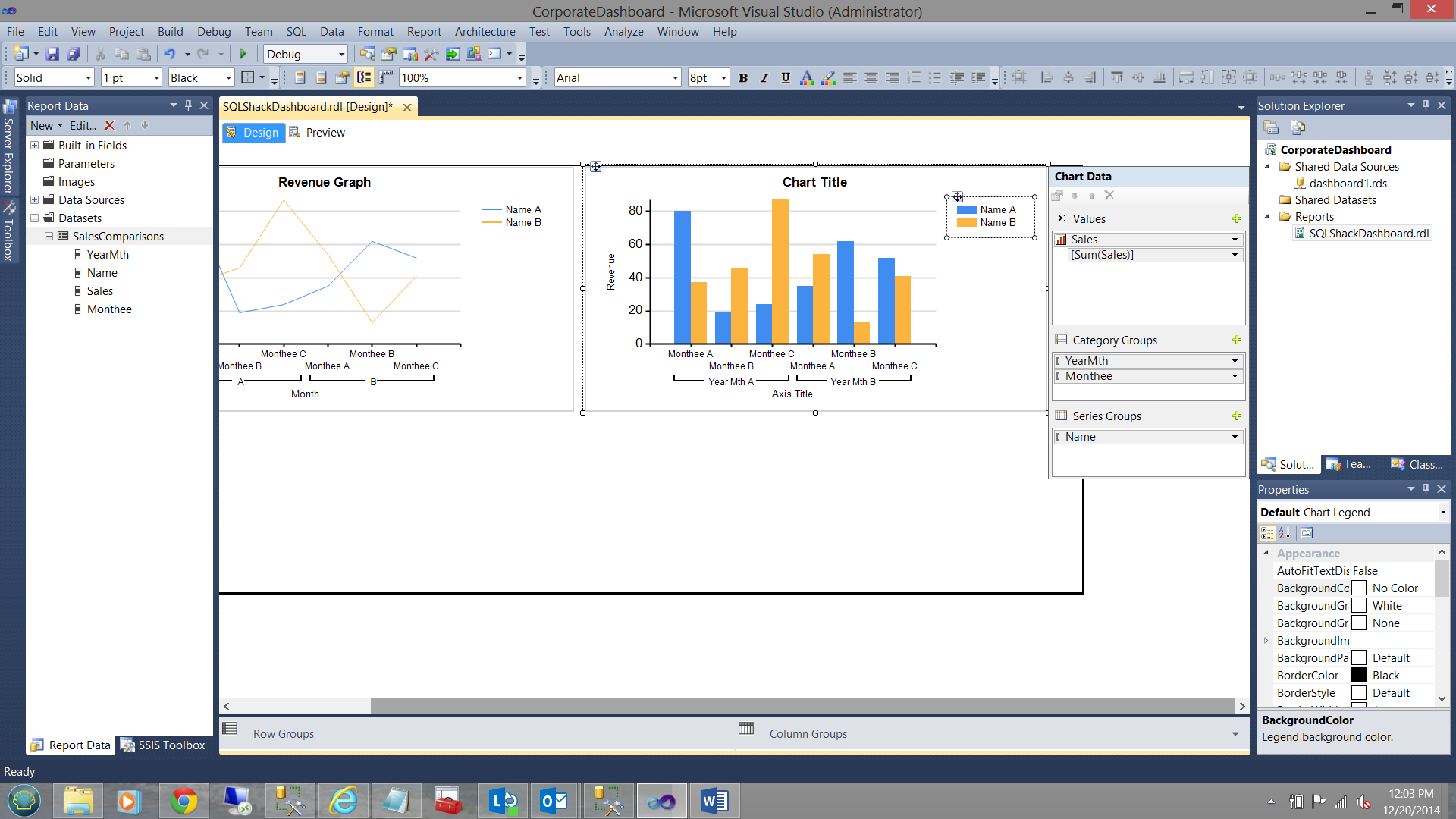
Report number 1 will be a simple line graph to show the sales for SQLShack Industries teams for the current fiscal year.
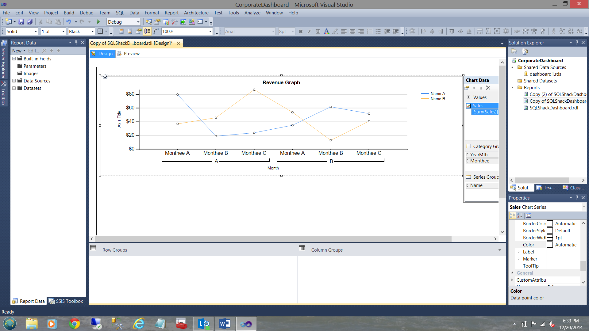
We ‘drag’ a line chart on to our working surface (see below).
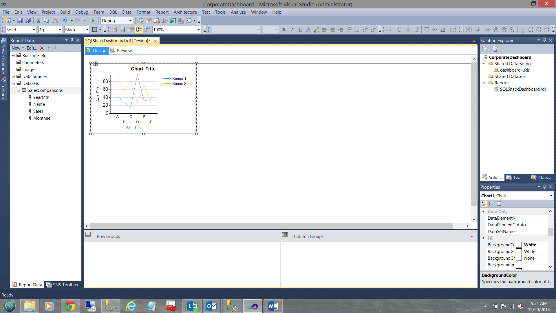
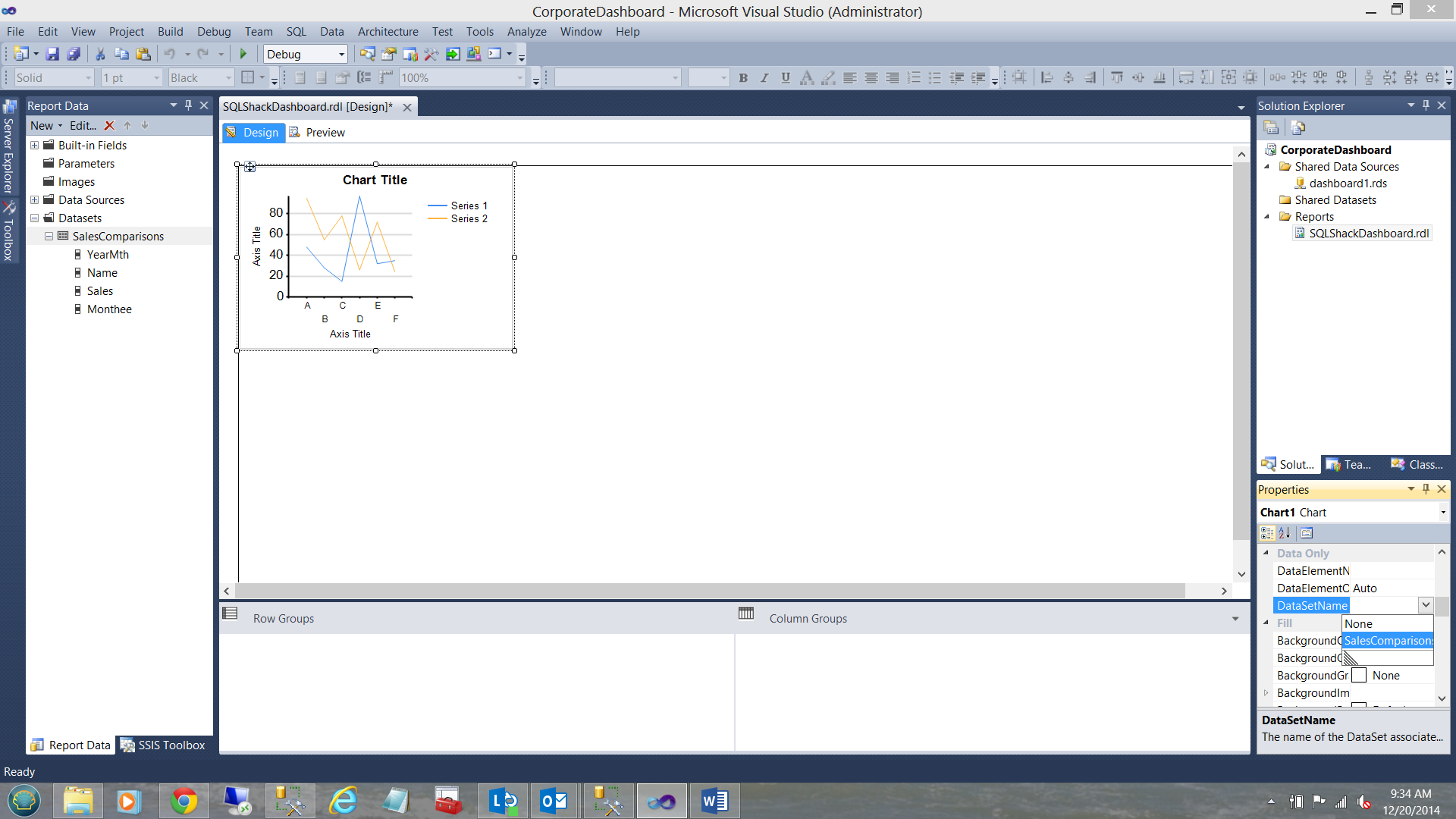
The chart knows nothing of the dataset that we just created, thus we must assign our dataset to the line chart (see below and to the bottom right).
We are finally in a position to configure our chart.
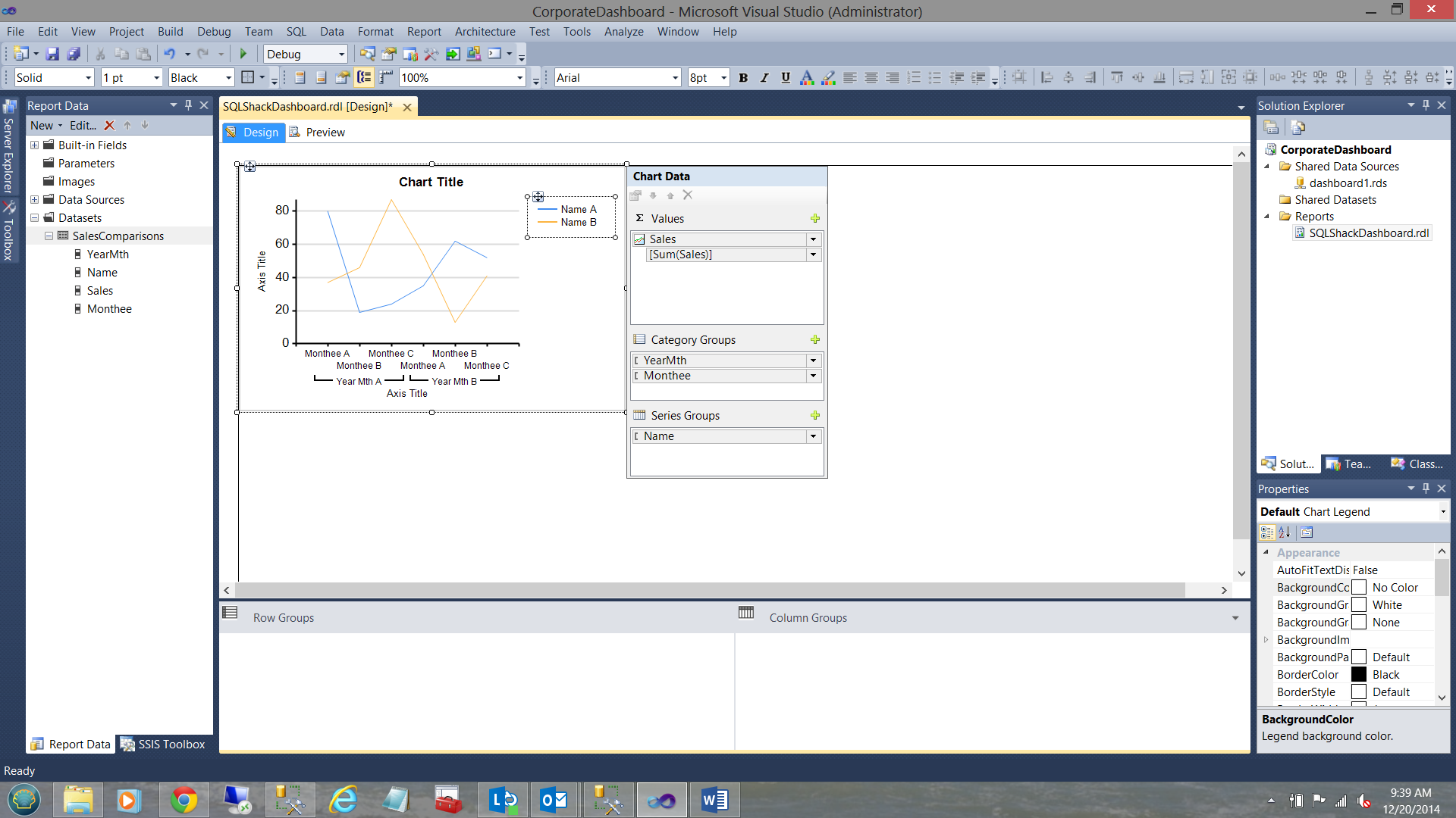
Note that the “Sigma” drop down is set to Sum(Sales) (see above).
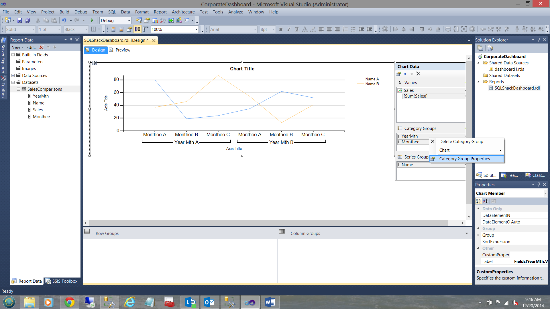
The “Category Groups” have been set to group upon “YearMth” and then to subgroup on “Monthee”. Finally the ‘Series Groups’ have been set to the “Name” field i.e. our Team1 and Team2.
Our report looks similar to the one above. Note the “YearMth” ‘garbage’ immediately above the “Axis Title”. Remember the only reason that we are pulling the “YearMth” field is to ensure that the data is correctly sorted on the X axis.
Let us clean up this graph slightly.
I right click on the “YearMth” Category group and bring up its properties box
The “Category Groups” properties dialog box is shown (see below).
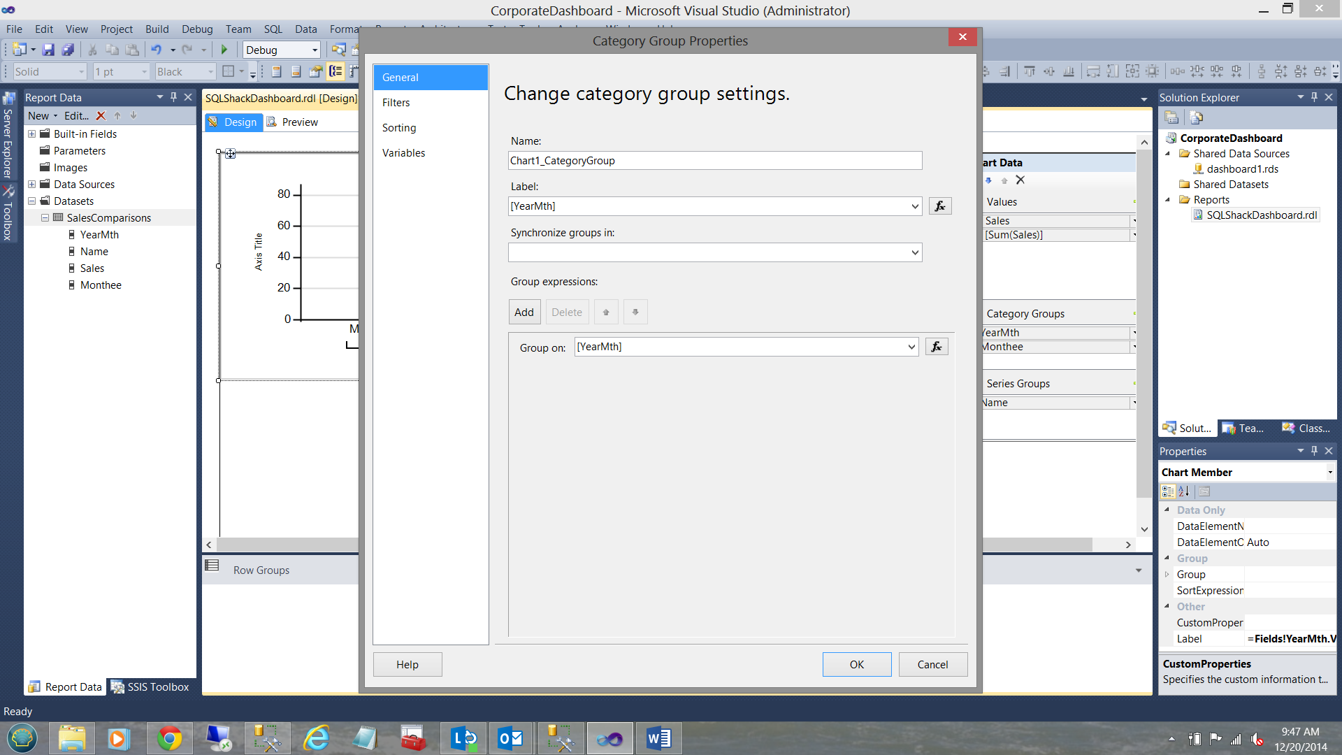
We open the “Label” function via the expression button and see the following:
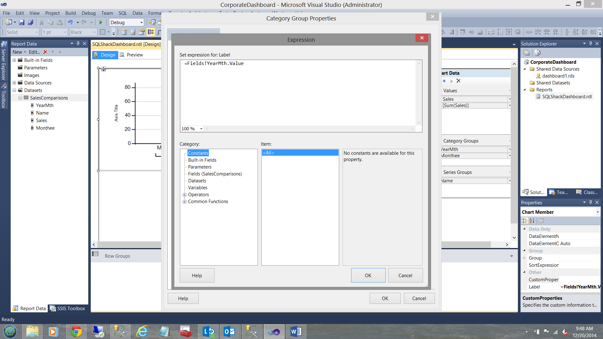
We change “=Fields!YearMth.Value” to “=Nothing” as may be seen below:
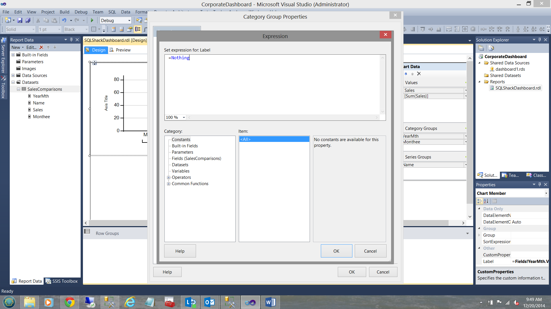
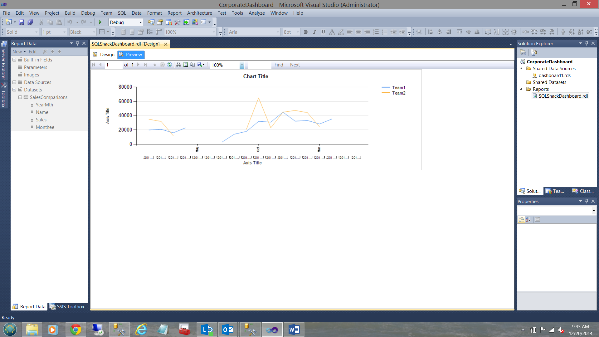
We click OK and OK to leave the “Category Group Properties” dialog box. Let us re-run our report.
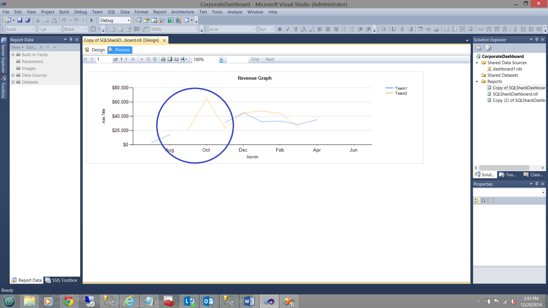
Note the change of appearance of the report.
Now comes the FUN!! Note that there is a hiatus in the line graphs/charts where there is no data (see above). It should be understood that while it appears that a portion of the lines are missing, they are not in fact missing.
When Reporting Services encounters missing data, it alters the line colour of this portion of the graph/chart to TRANSPARENT. It is this behavior that we are going to change. This requires the creation of a small function.
![]()
To begin the changes that we need to effect, we right click anywhere on the Report Surface BELOW the thick black horizontal line that we see in the screenshot above. We select “Report Properties”.
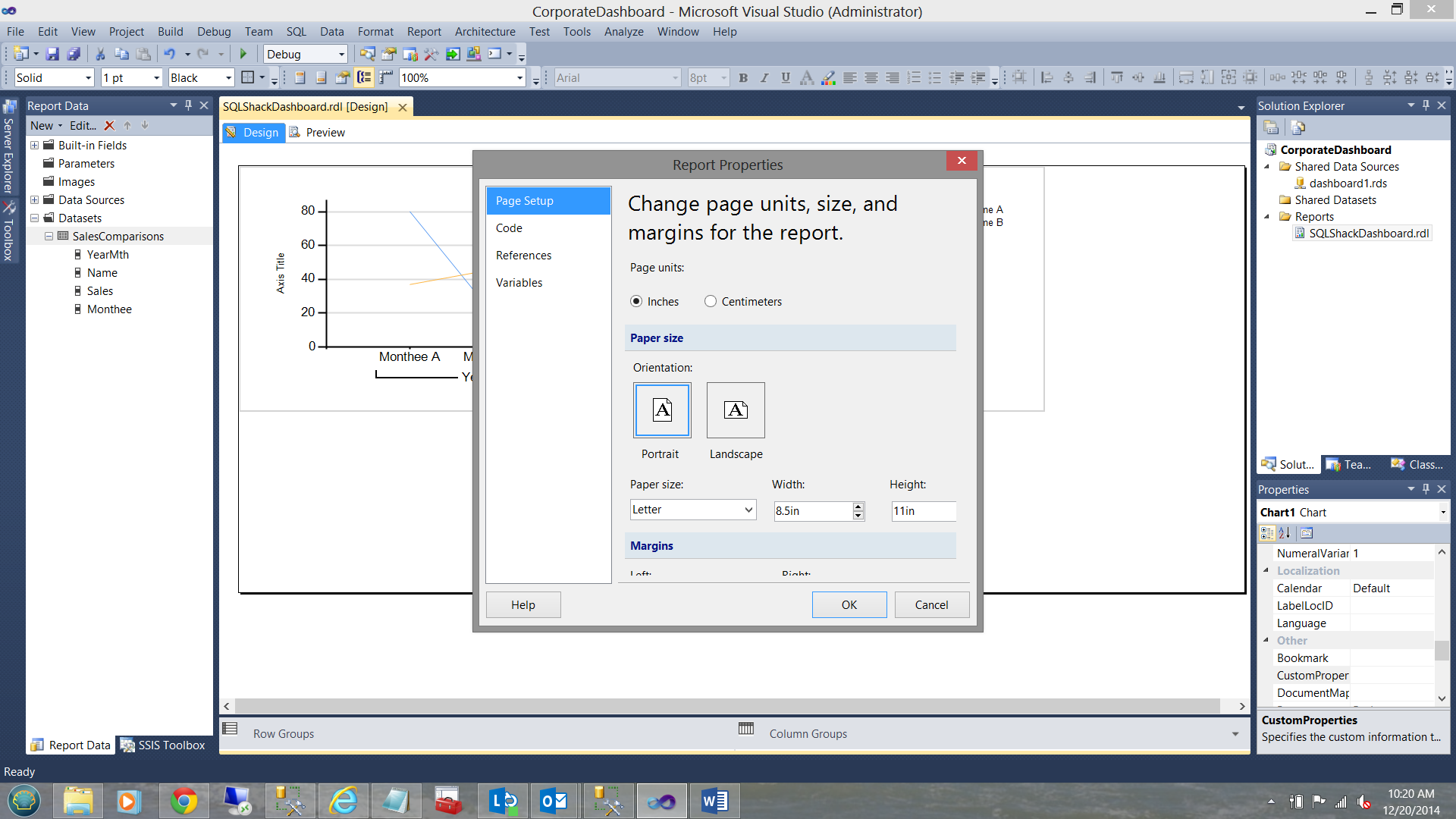
The “Report Properties” dialog box is brought into view (see above). We select the “Code” option (see below).
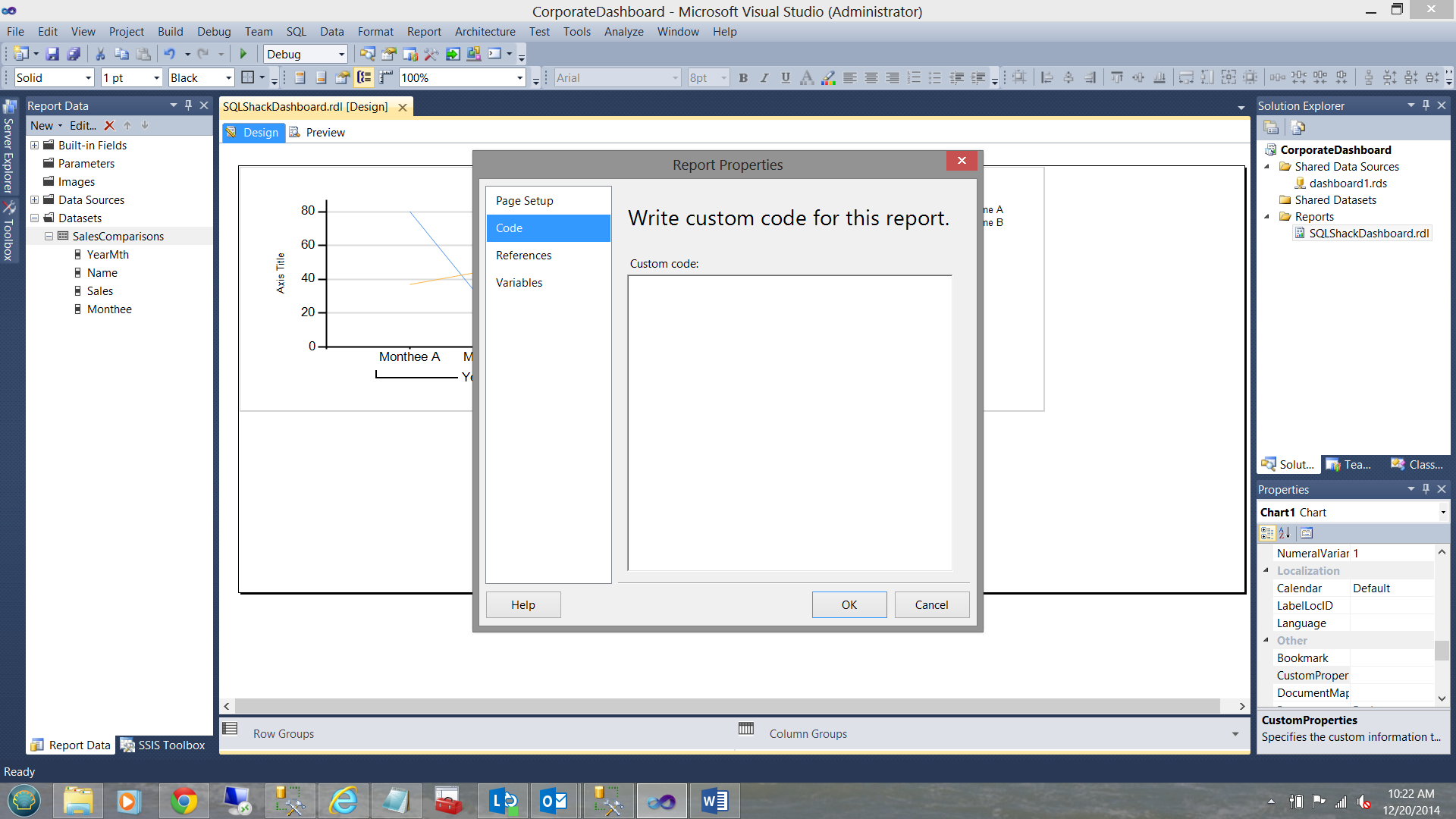
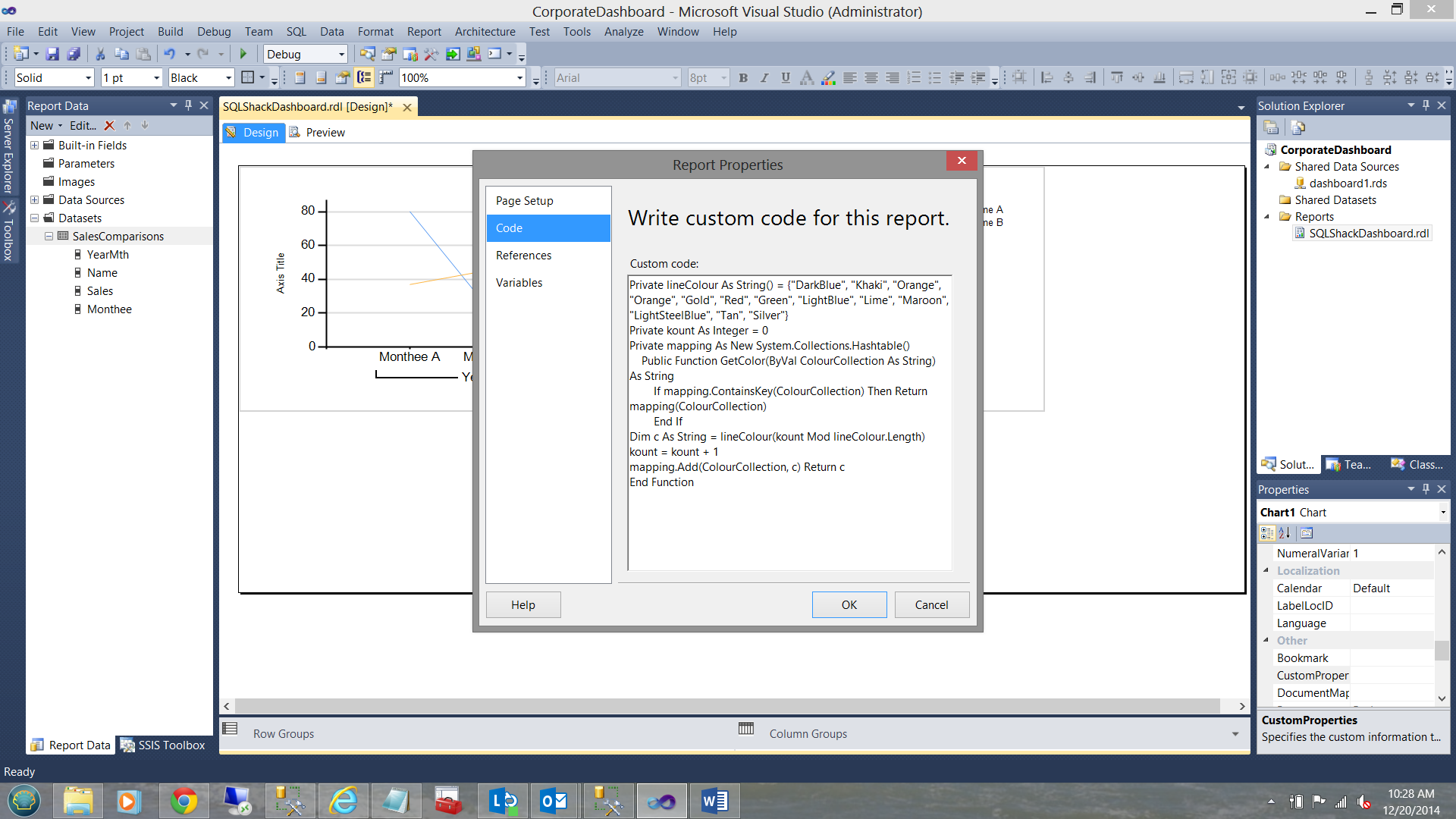
We place the following code into the “Custom Code” dialogue box (see below the code snippet).
|
1 2 3 4 5 6 7 8 9 10 11 |
Private lineColour As String() = {"DarkBlue", "Khaki", "Orange", "Orange", "Gold", "Red", "Green", "LightBlue", "Lime", "Maroon", "LightSteelBlue", "Tan", "Silver"} Private kount As Integer = 0 Private mapping As New System.Collections.Hashtable() Public Function GetColor(ByVal ColourCollection As String) As String If mapping.ContainsKey(ColourCollection) Then Return mapping(ColourCollection) End If Dim c As String = lineColour(kount Mod lineColour.Length) kount = kount + 1 mapping.Add(ColourCollection, c) Return c End Function |
We are now almost complete.
We MUST now right click on the “Series Group” for Sales and select “Series Group Properties” (see below, bottom right).
In the “Properties Box” at the bottom right, find the “EmptyPoint” property box (see the screen shot below).
![]()
Under the “Color” property of the “EmptyPoint” property we call our GetColor function(see below).
Note the call to the function. “Code.GetColor(Fields!Name.Value)” (see above under Color).
When we run our report again, we find the following.
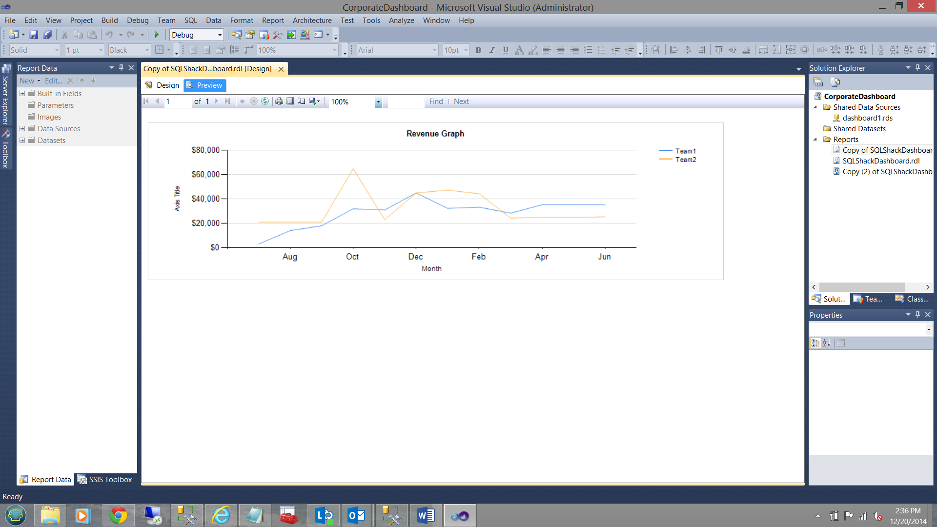
The lines are joined where the data was missing PLUS the whole graph has a more pleasing appearance.
Creating Report Number 2
The folks at SQLShack Industries wish to examine the same data, however this time in chart format. Further, the colour of the vertical bars of the chart must reflect the sales income for the month.
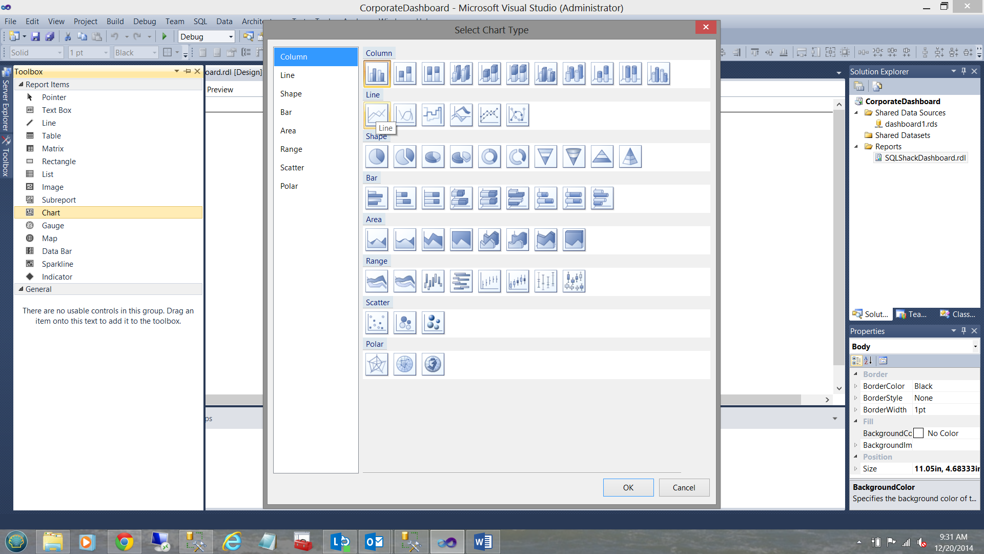
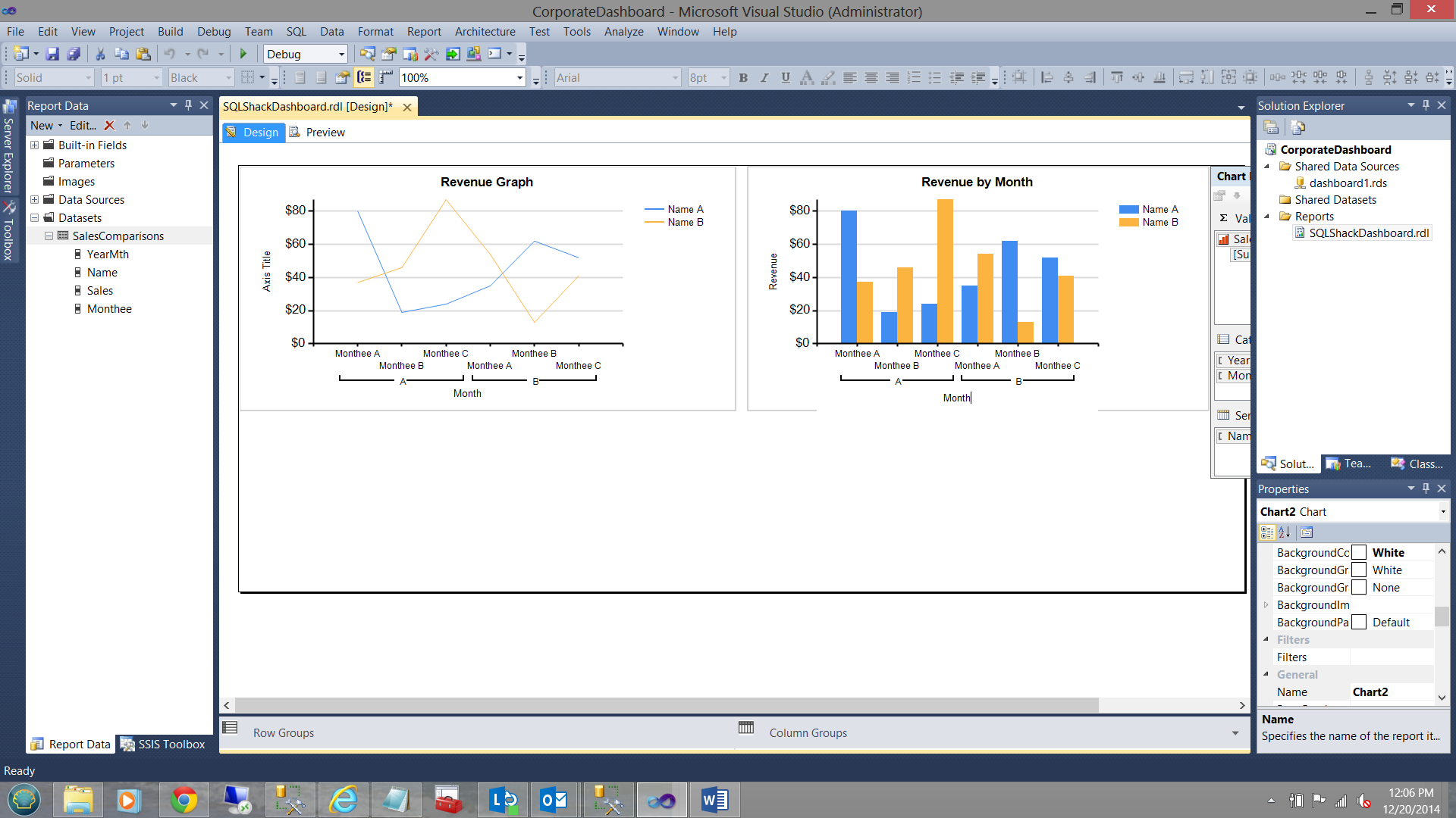
After having re-sized our first graph, we are now in a position to add a bar chart. I drag a bar chart (column chart) onto the work surface (see the next two screen dumps below).

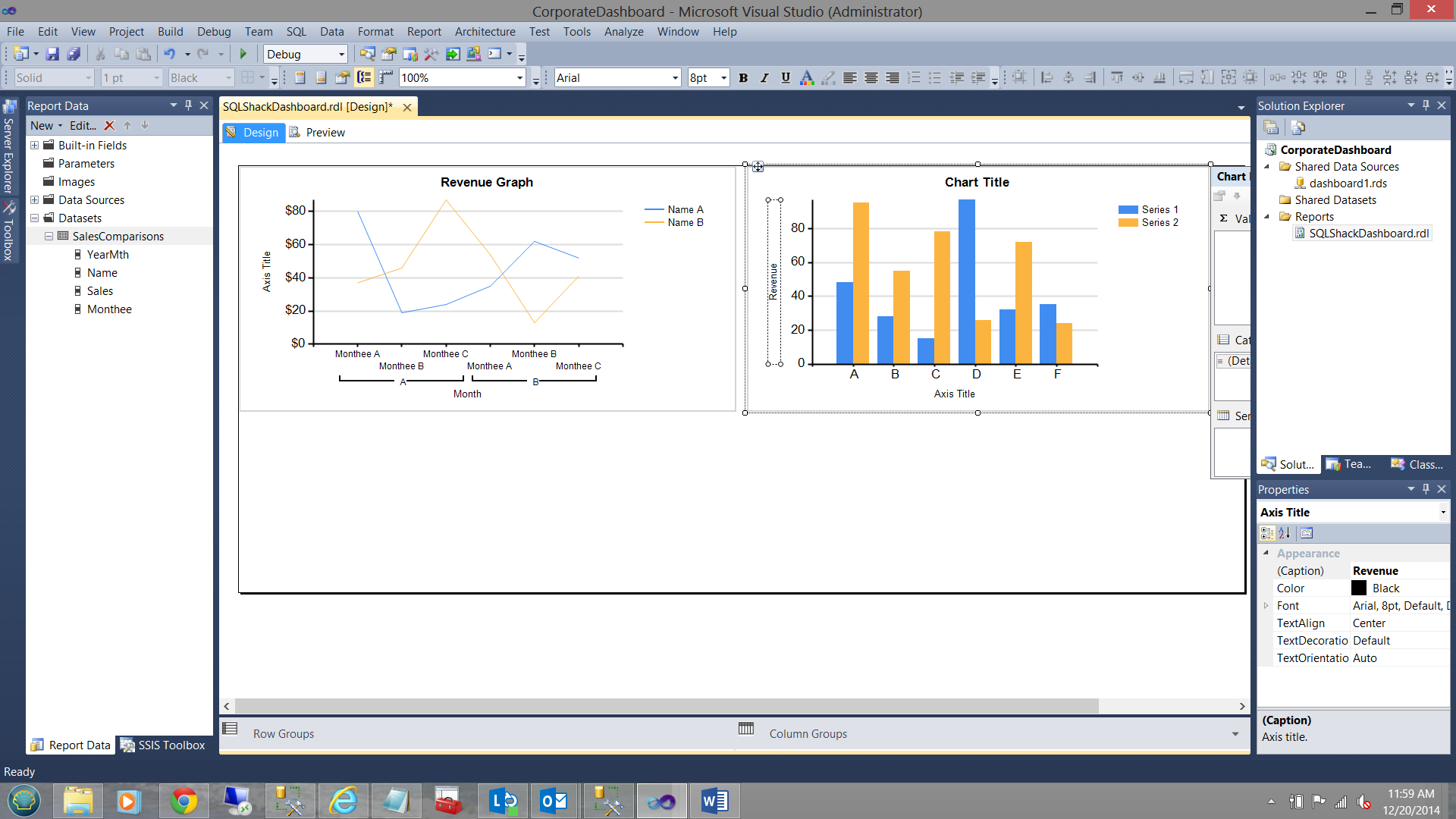
Note the vertical bar chart above. We now need to inform this bar chart that the data that it must utilize, may be found within the dataset that we created for the line chart (see the bottom right of the screen dump below).

Once again I set up the chart properties in a similar fashion to the line graph/chart that we created in the section above. These properties may be seen in the screen dump below:
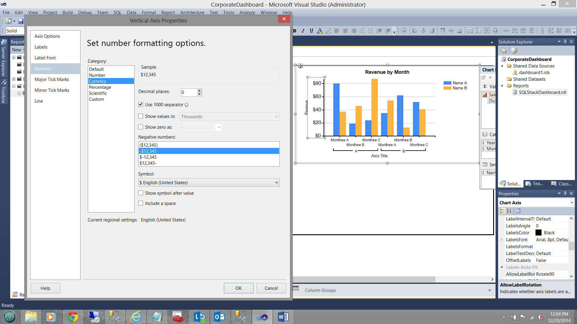
We rename and format the Y axis of our chart to reflect Sales (in dollar) and change the x axis to reflect the months under consideration (see below).
Let us give our report a whirl!
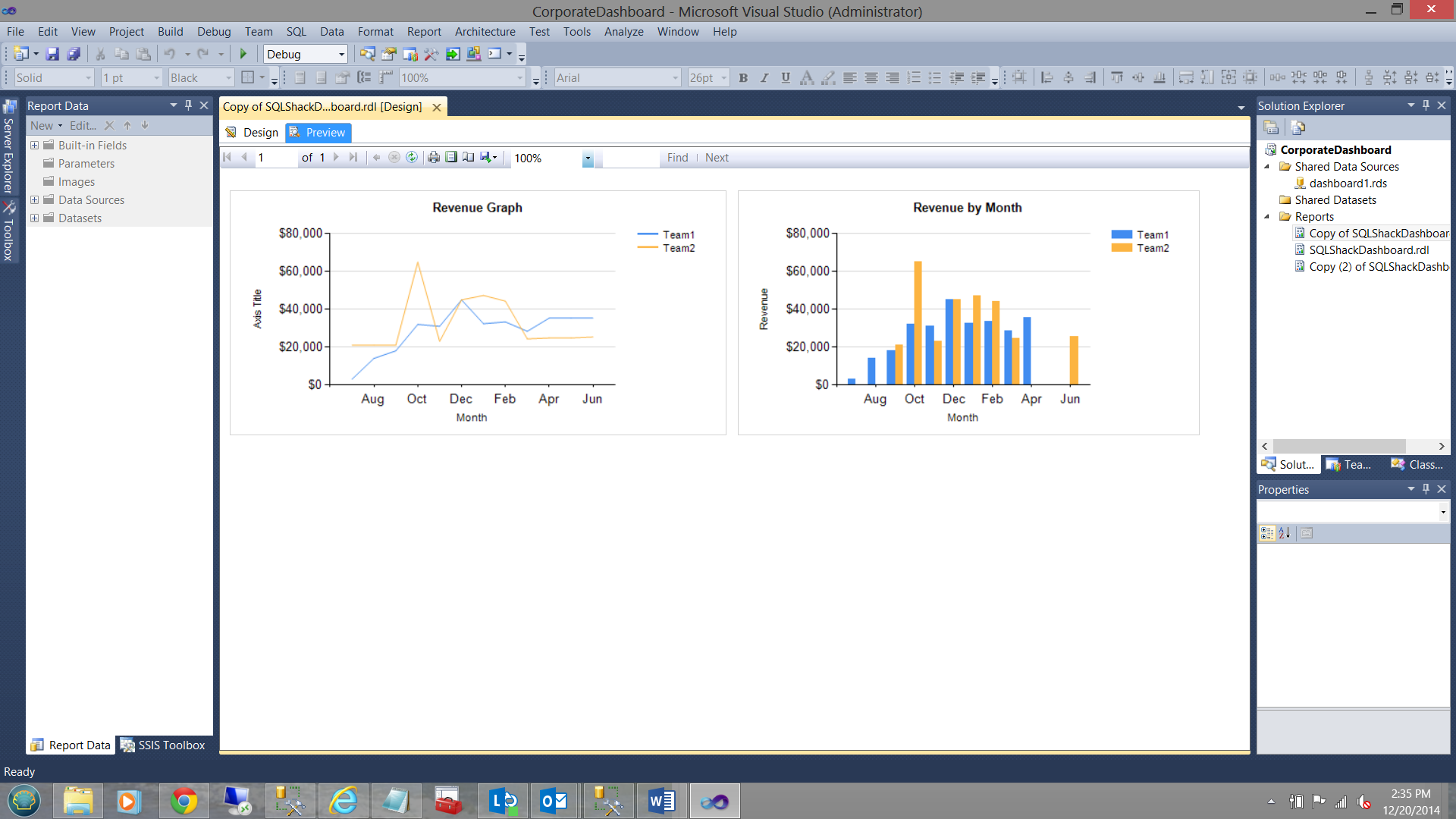
Note that the colour scheme of the chart reflects the team numbers and NOT the value of the sales revenue that was generated. This is what SQLShack Industries expected to see. Let us fix this now.
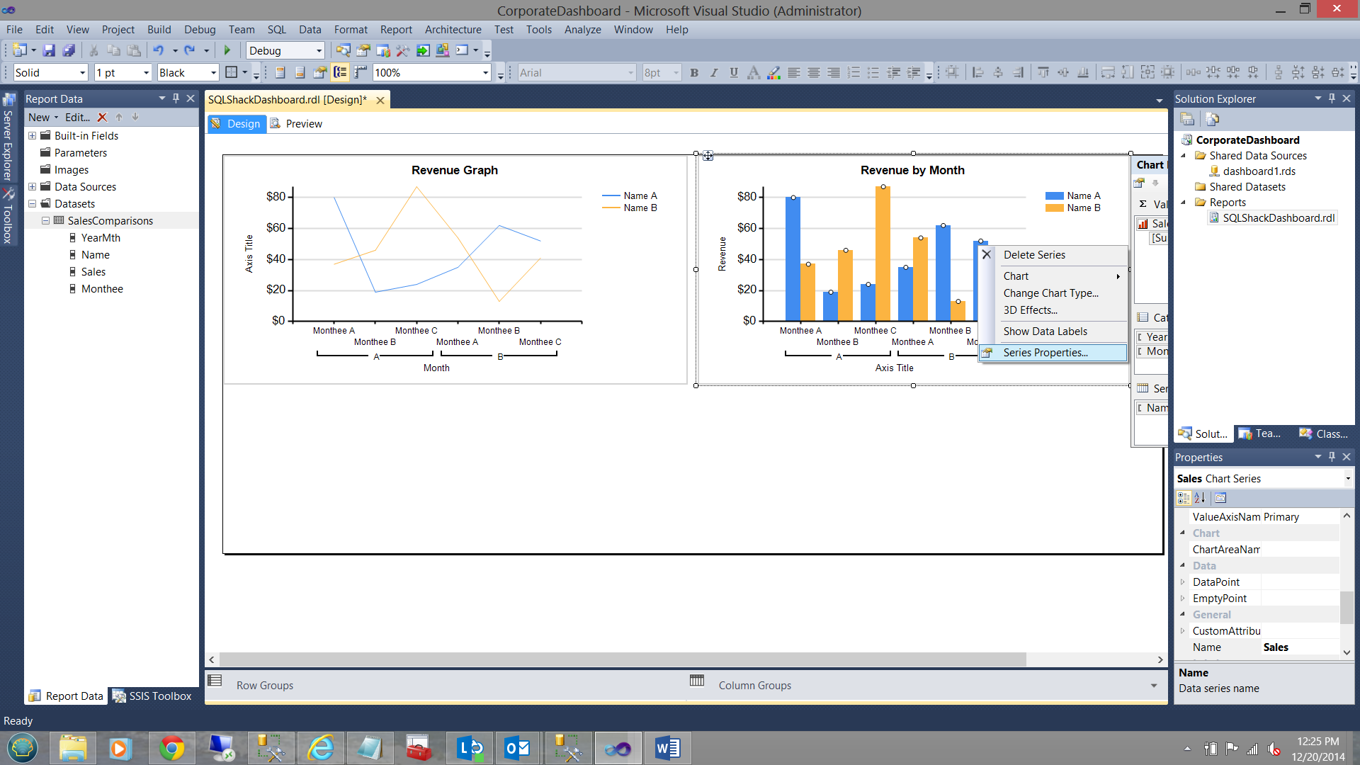
We right click on the blue vertical bars and select “Series Properties”
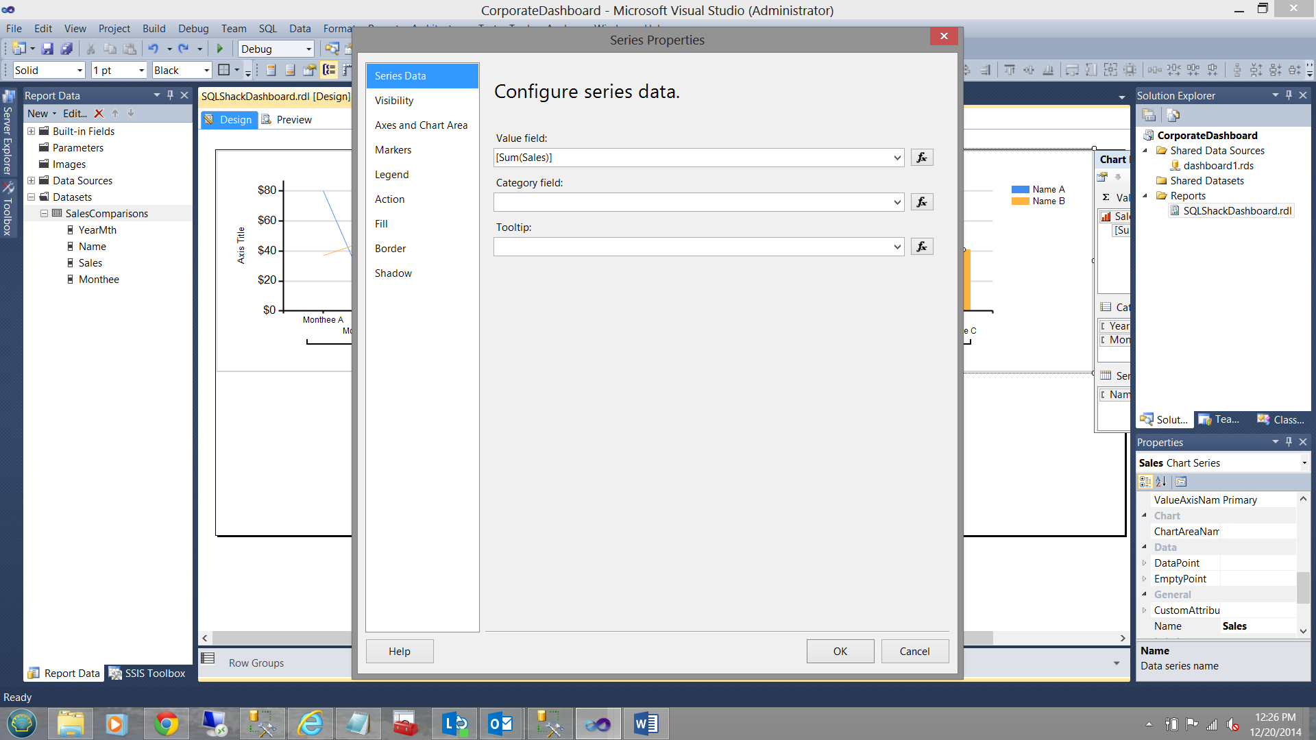
The “Series Properties” dialog box opens (see above). We select the “Fill” tab. We then select the color expression tab (see below). The “Expressions” dialog box opens.
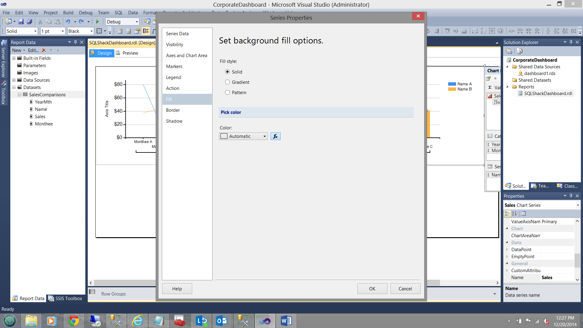
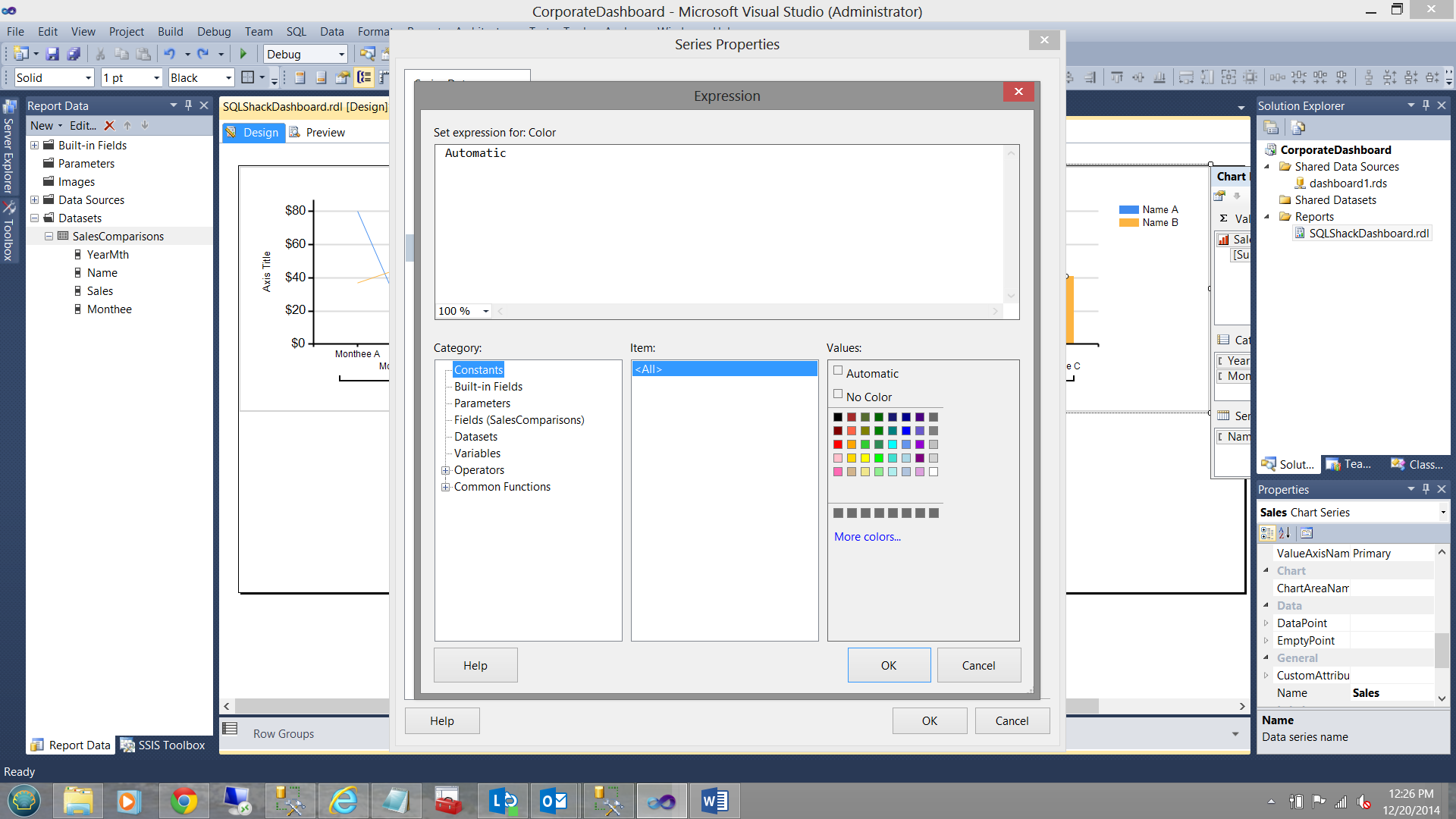
We remove the “Automatic” value and replace it with the following code:
|
1 2 3 4 5 6 |
=Switch (isnothing(Fields!Sales.Value) , "LightGrey", Fields!Sales.Value < 20000, "Red" , Fields!Sales.Value >= 20000 and Fields!Sales.Value< 40000, "Yellow", Fields!Sales.Value >= 40000, "Green") |
Running our report again:
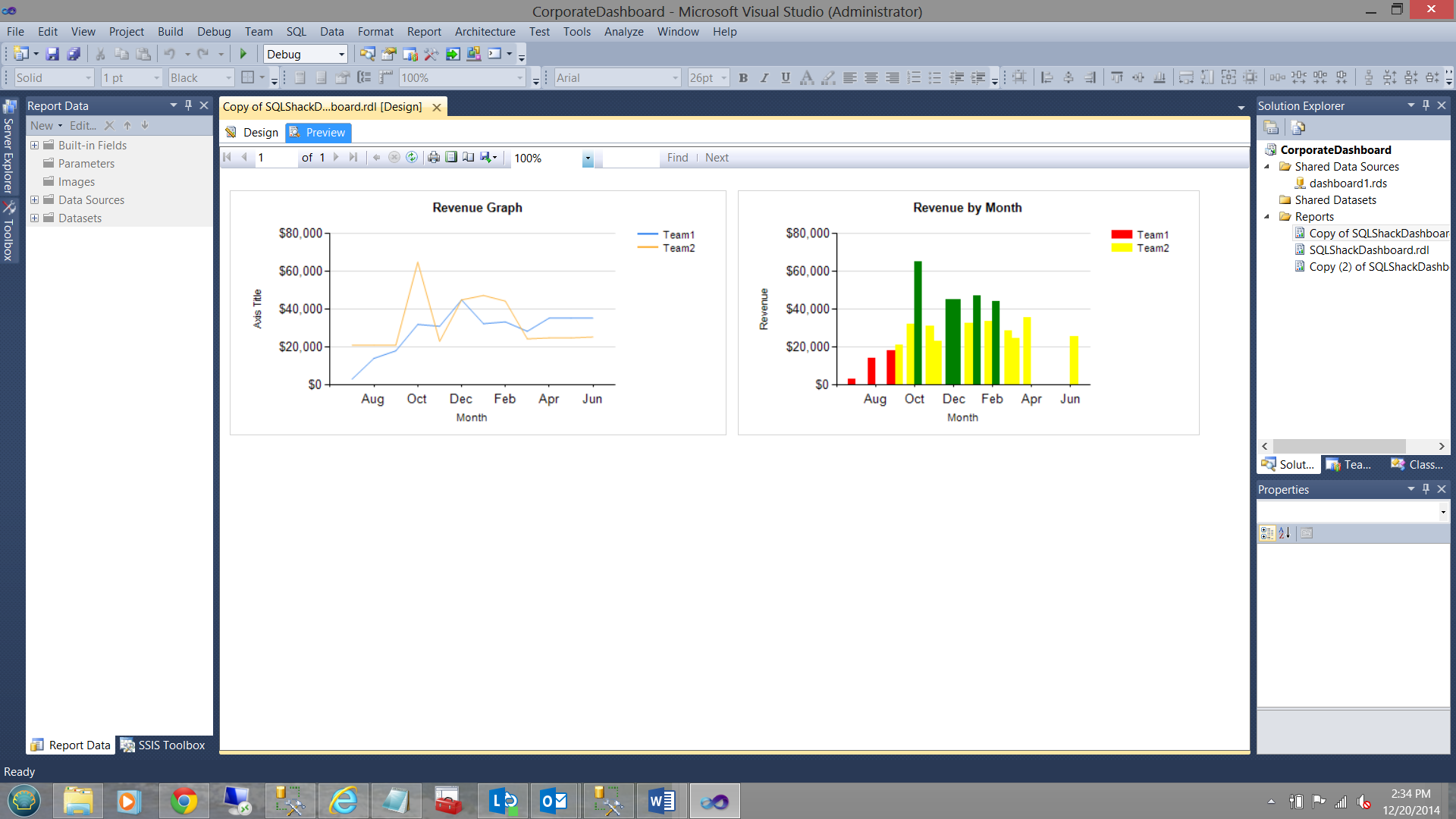
Note that the colors of the vertical bars are NOW based upon the sales revenue and enable SQLShack Industries management to detect any anomalies.
Creating Report Number 3
SQLShack Industries wishes to know at all times what the average income is (throughout the year).They have charged us to display this in some manner.
In order to achieve this we are going to create an additional dataset called “OverAllAvg” (see below).
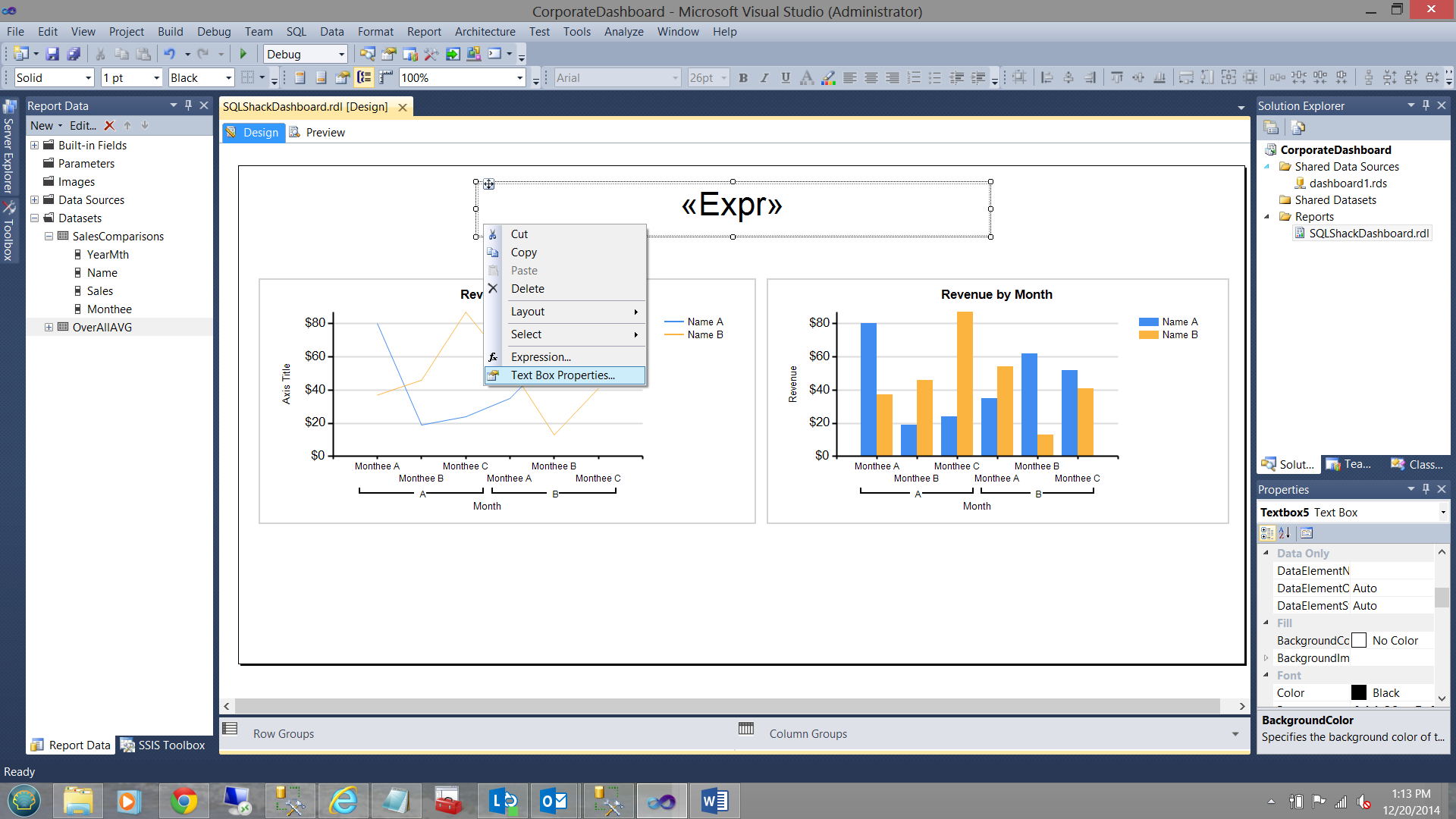
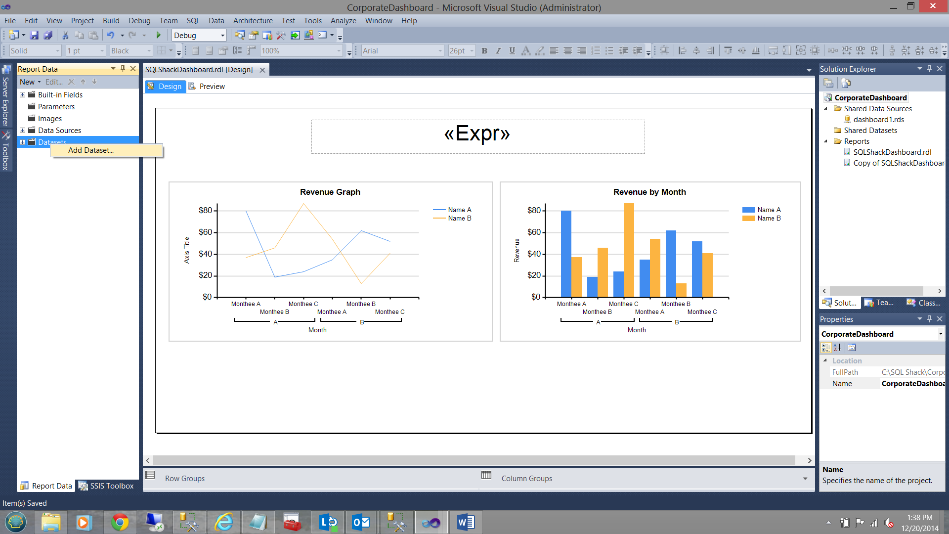
The dataset created, we now re-arrange our report controls as shown below: Further, we insert a text box above our charts.
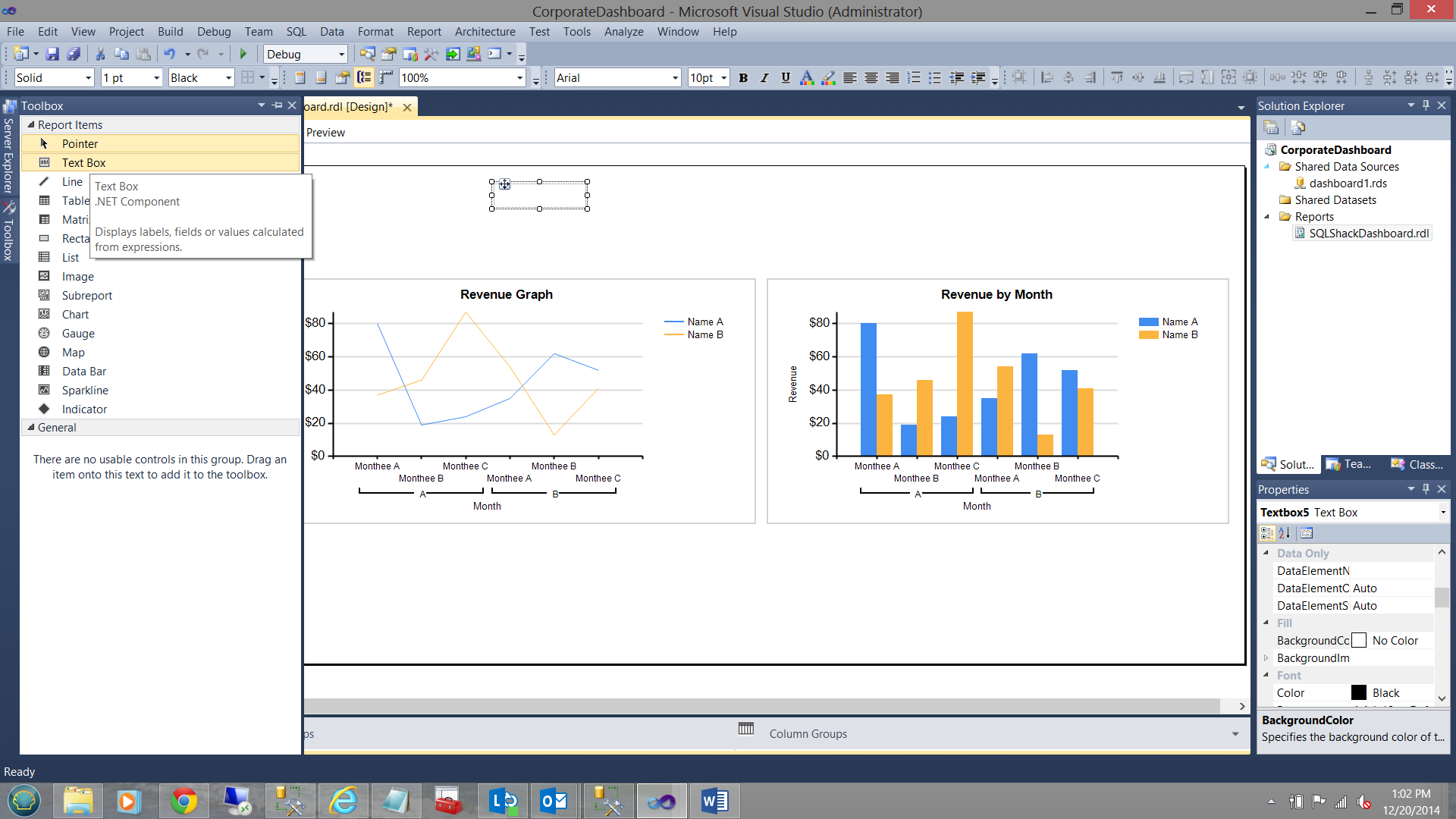
After having resized the textbox, I now place the following text into the box.
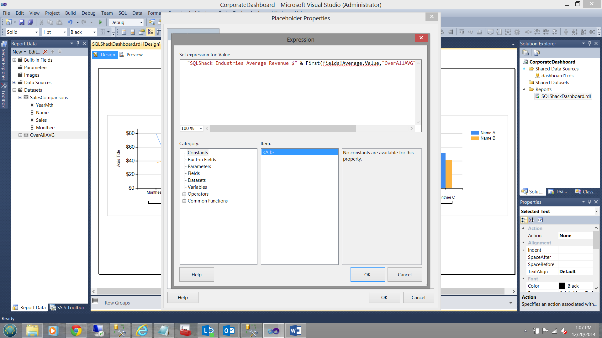
Note the syntax shown in the screen dump above. I am utilizing the first function to retrieve the first value in the dataset. There is one and only one value in the set (in any case).
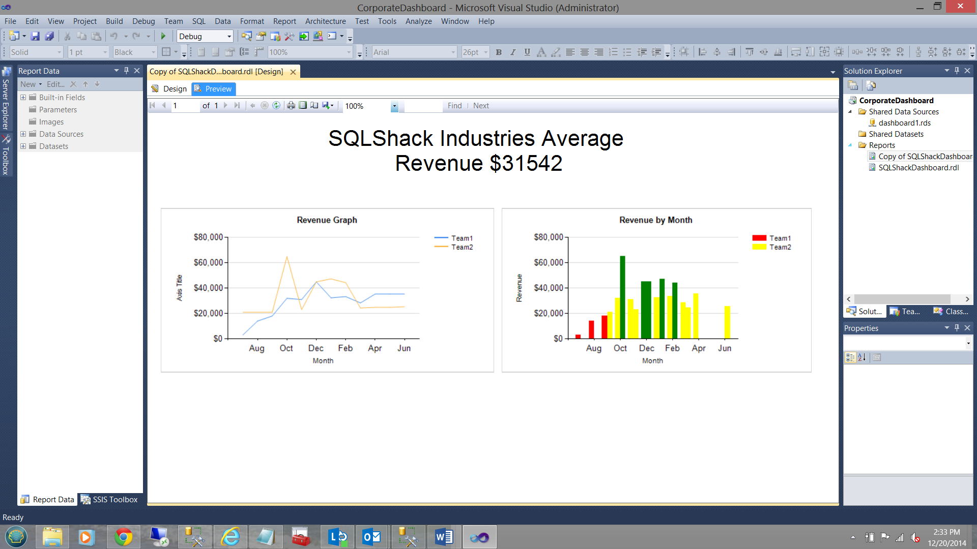
Thus the screen appears as above when the report is run.
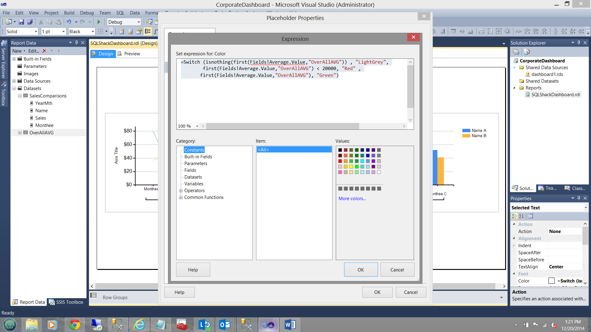
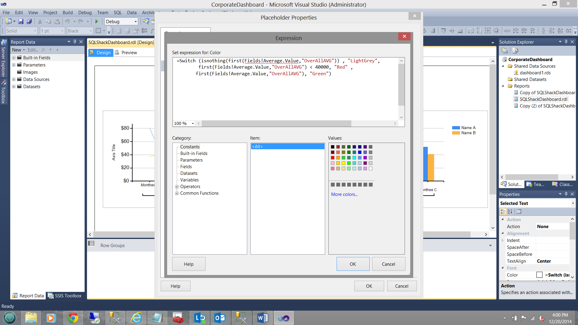
Now management has asked us to enhance the textbox which displays the average value. Should the average value fall below USD 20,000 then the text must be in red, otherwise green. Once again we utilize a variation of the code that we utilized for the vertical bar chart that we discussed above.
Opening the textbox property box (see below),
we find the “Font” page and select the “Color” expression box. We insert the following code.
|
1 2 3 |
=Switch (isnothing(first(Fields!Average.Value,"OverAllAVG")) , "LightGrey", first(Fields!Average.Value,"OverAllAVG") < 20000, "Red" , first(Fields!Average.Value,"OverAllAVG"), "Green") |
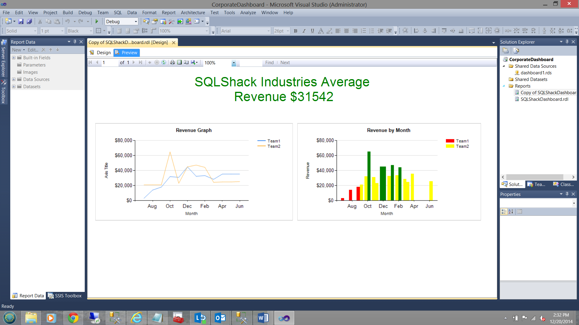
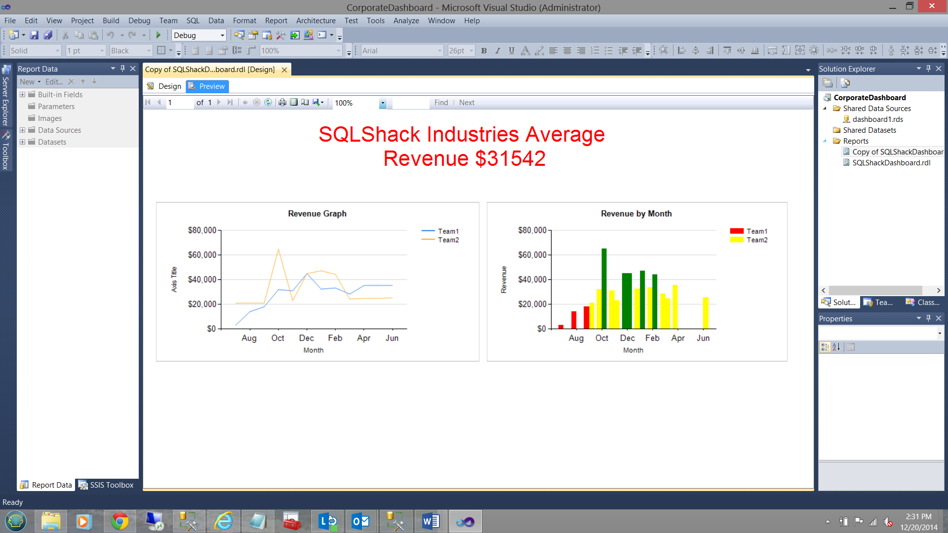
Now running our report again, we find that the average value is over USD 20,000 as the text is now in green (see below).
Should I have chosen to make the dividing point between red and green USD 40,000 (see below) then
our textbox would appear as follows:
A last management request
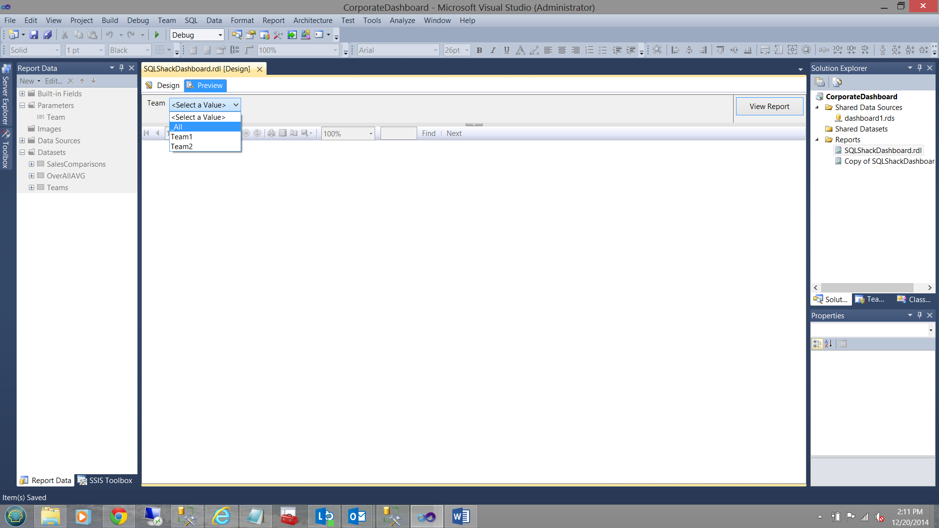
Management has asked us to cater for the possibility that the staff may wish to view the results for a single team; and also to have the ability to view the results for the whole enterprise.
In order to achieve this, we are going to create one last dataset called “Teams”.
“Teams” is constructed as shown below:
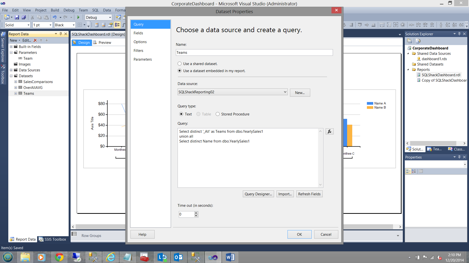
The astute reader will note the usage of “_All” as the first portion of the “union all” statement. This give the user the option to view all the results. The usage of the underscore will ensure that the “_All” option occurs at the top of the parameter drop down list.
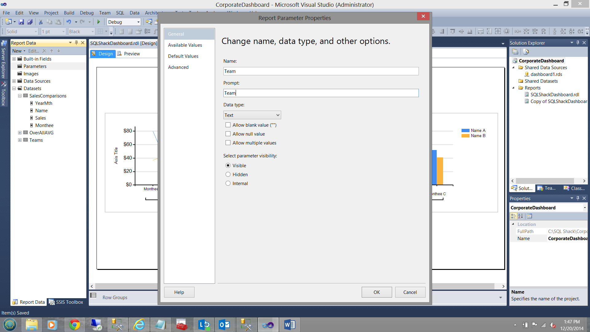
Next, we create the parameter:
We right click on the Parameters folder and select add a parameter. The parameter dialog box appears and we complete the “General” tab as shown below:
Moving to the “Available Values” tab, we complete this in the following fashion:
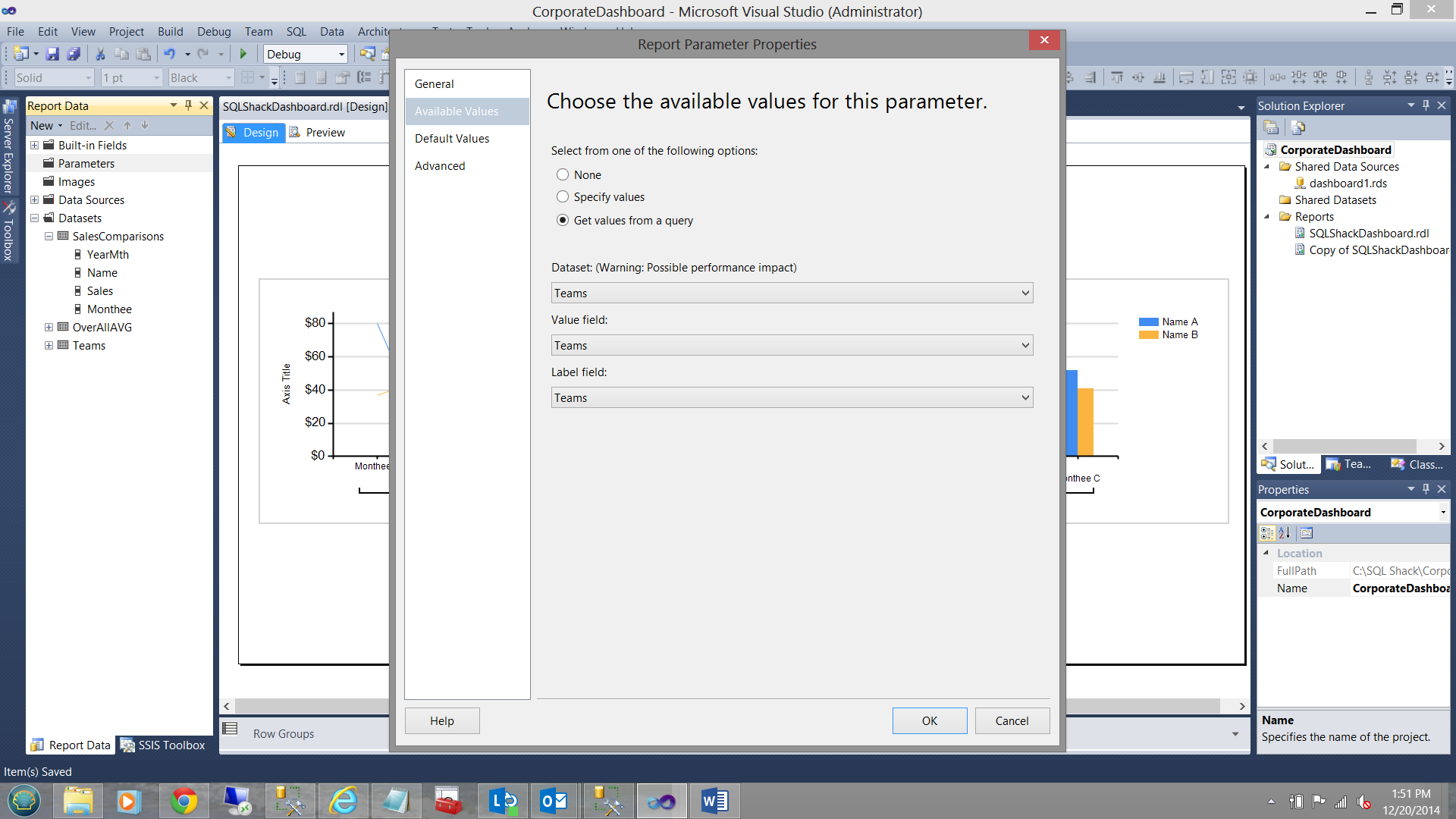
Note that we set the “Select from one of the following options” radio button to “Get values from a query”. The dataset is the “Teams” dataset that we just created. The “Value field” is set to “Team” as is the “Label” field.
Thus far, so good.
There is one more chore that we have to do and that being to add a predicate / “where clause” to our “SalesComparisions” dataset. Once the user sets the “Team” parameter, only the data for that team will be extracted.
The important point being:
- Should the user choose “Team1” then the only data that is returned is for Team1.
- Should the user choose “Team2” then the only data that is returned is for Team2.
- 3) Should the user choose the “_All” option then all the data is returned.
Let us now incorporate a predicate/”where clause” into our “SalesComparisons” dataset.
This predicate is as follows:
Where (1 = (Case when @Team = ‘_All’ then 1 else 2 end) OR (Name = @Team))
This requires an explanation. First off, SQL Server will parse from left to right. Should the user have selected the ‘_All’ option, then 1= 1 which is true, parsing stops (the statement to the right of the ‘OR’ is NOT PARSED) and for all intents and purposes nothing is filtered. On the other hand, should a specific team have been selected, then 1 = 2 which is FALSE. With the first part of the “OR” statement being false, then the second part of the predicate is parsed.
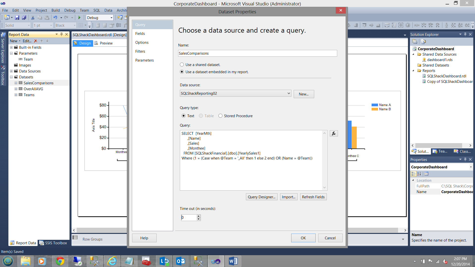
The dataset definition (with the predicate inserted) may be seen above.
We now add this same predicate to the “OverAllAVG” dataset (see below).

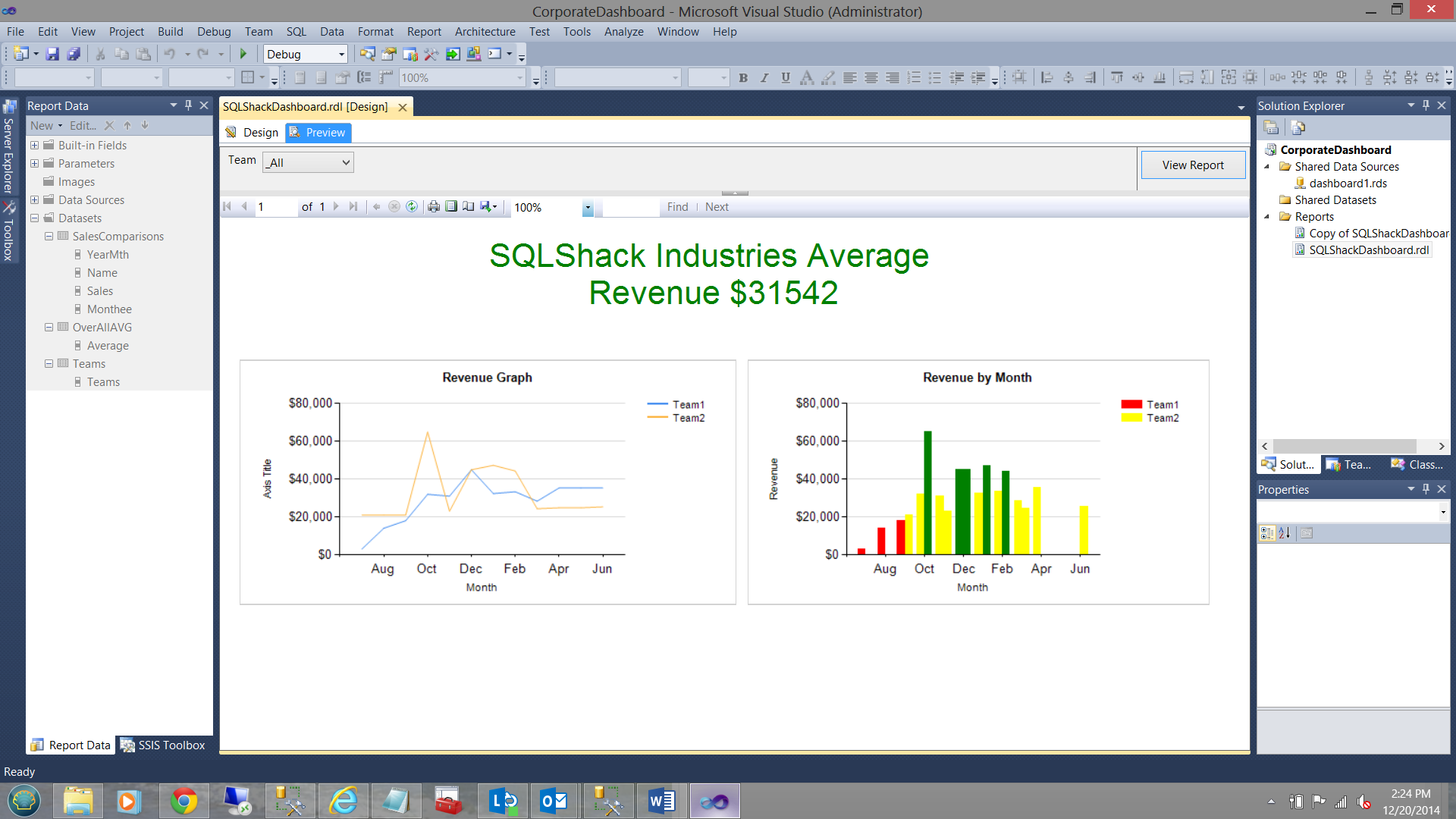
Let us now run the report.
In the screen dump below, we choose the “_All” option.
The results for ‘_All ‘values may be seen below.
Should the user have chosen Team 1, then the results would appear as follows:
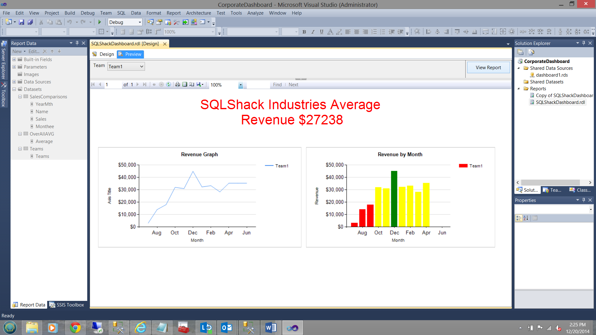
The astute reader will note that the Average has changed.
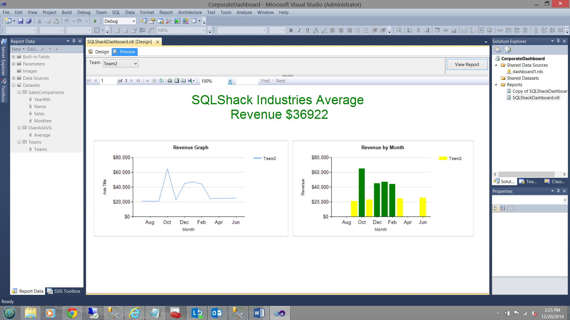
Should the user have chosen “Team2”, then the results would appear as follows:
Our task is now complete and management is extremely happy with what they have obtained.
We can now go to the head of the class!!
Conclusions
In today’s “get together” we have seen that linear graphs may be missing data and the plots appear “chopped up”. To overcome this and to smooth out the plot, we created a function that would change the line colour from transparent to another color for whole of the plot. We also saw how we could control the colour of the vertical bars on a bar chart and to develop a new colour scheme dependent upon set criteria such as total monthly sales.
We saw how the colour of the text within a text box may also be controlled by the value of some field.
Last, but not least, we saw how to create a flexible parameter to have the option of viewing all the data or only a select portion of the data.
As always, should you have any questions or concerns, please feel free to contact me.
As always, happy programming!
Steve has presented papers at 8 PASS Summits and one at PASS Europe 2009 and 2010. He has recently presented a Master Data Services presentation at the PASS Amsterdam Rally.
Steve has presented 5 papers at the Information Builders' Summits. He is a PASS regional mentor.
View all posts by Steve Simon
- Reporting in SQL Server – Using calculated Expressions within reports - December 19, 2016
- How to use Expressions within SQL Server Reporting Services to create efficient reports - December 9, 2016
- How to use SQL Server Data Quality Services to ensure the correct aggregation of data - November 9, 2016