Aveek Das

Aveek Das
Selecting Data

Introduction to Row-Level Security in SQL Server

March 31, 2020 by

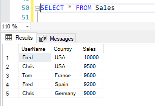
In this article, I’m going to discuss Row-Level Security in SQL Server. RLS or Row-Level Security as the name suggests is a security mechanism that restricts the records from a SQL Server table based on the authorization context of the current user that is logged in. This means the records from the tables are displayed based on who the user is and to which records do the user has access to. This is usually done to allow specific users to have access to their data only without permission to view other users’ data.

Read more »
Cube Data Model

Introduction to Many-to-Many Relationships in SSAS

March 26, 2020 by

In this article, I’m going to explain what many-to-many relationships in SSAS are and how to implement the same in a SQL Server Analysis Services (SSAS) project. For the sake of this article, we will only consider the Multidimensional Cube and not the Tabular. Also, this article assumes that you have some fair knowledge of building SSAS cubes from scratch.

Read more »
Managing the Data Gateway

Setting up Power BI Data Gateway

March 19, 2020 by

In this article, I’m going to explain what a Power BI Data Gateway is and how to set it up. I’ll also cover the underlying architecture that the gateway uses and how to manage on-premise data using the Data Gateway.

Read more »
Conditional Formatting in Power BI Applied

Conditional formatting in Power BI

March 18, 2020 by

In this article, I’m going to explain what conditional formatting in Power BI is. Conditional formatting, as the name suggests, is a way of visualizing data that applies special format rules based on some pre-defined conditions on the values of a selected metric. It is mostly used when the data is presented in a tabular format; however, it can also be used in any charts such as bar charts, line charts, etc.

Read more »
Changing the Data Type

How to sort months chronologically in Power BI

March 16, 2020 by

In this article, I’m going to demonstrate how to sort months chronologically in Power BI. Visualizing sales data in a time period is one of the most influential ways of reporting. Often, at times it is essential that you design charts that show the trend or growth of a metric over time. The time period can be anything for example days, weeks, months, or years. It basically gives you the idea of how the metric has increased or decreased over the specific period.

Read more »