
This article gives you an overview of representing coronavirus spread using Power BI Desktop visualizations.
Introduction
As you know, Coronavirus is a pandemic disease. It is spreading in almost every country, and people are locked down in their houses. Recently, India entered in 21 days total lockdown due to an increase in Coronavirus cases. In the article, Visualize Coronavirus impact using a Power BI Dashboard, we visualized the impact of Coronavirus using Power BI Desktop.
In this article, we will explore a few other ways to represent data in Power BI and focus on the trend of coronavirus cases in Italy. We will also look at how social distancing can help in reducing the cases.
Before we start, let have a quick comparison between COVID-19, FLU, and Cold using the following useful graphics. Image reference: DeZeen
You can look at the symptoms and visit a doctor in case of any issues. Be Safe and take precautions.

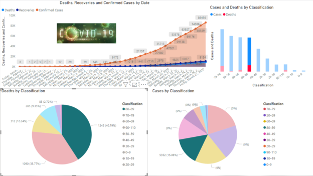
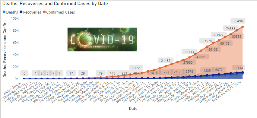
Italy is one of the most affected countries by the Corona Virus. It has reported 86,498 total cases and 9134 deaths as of 27th March 2020 due to this pandemic. It is interesting to know how this disease increases rapidly using visualization.
Note: You should validate data from valid sources such as the World Health Organization (WHO), Centers for Disease Control and Prevention(CDC).
Import data for Power BI Report
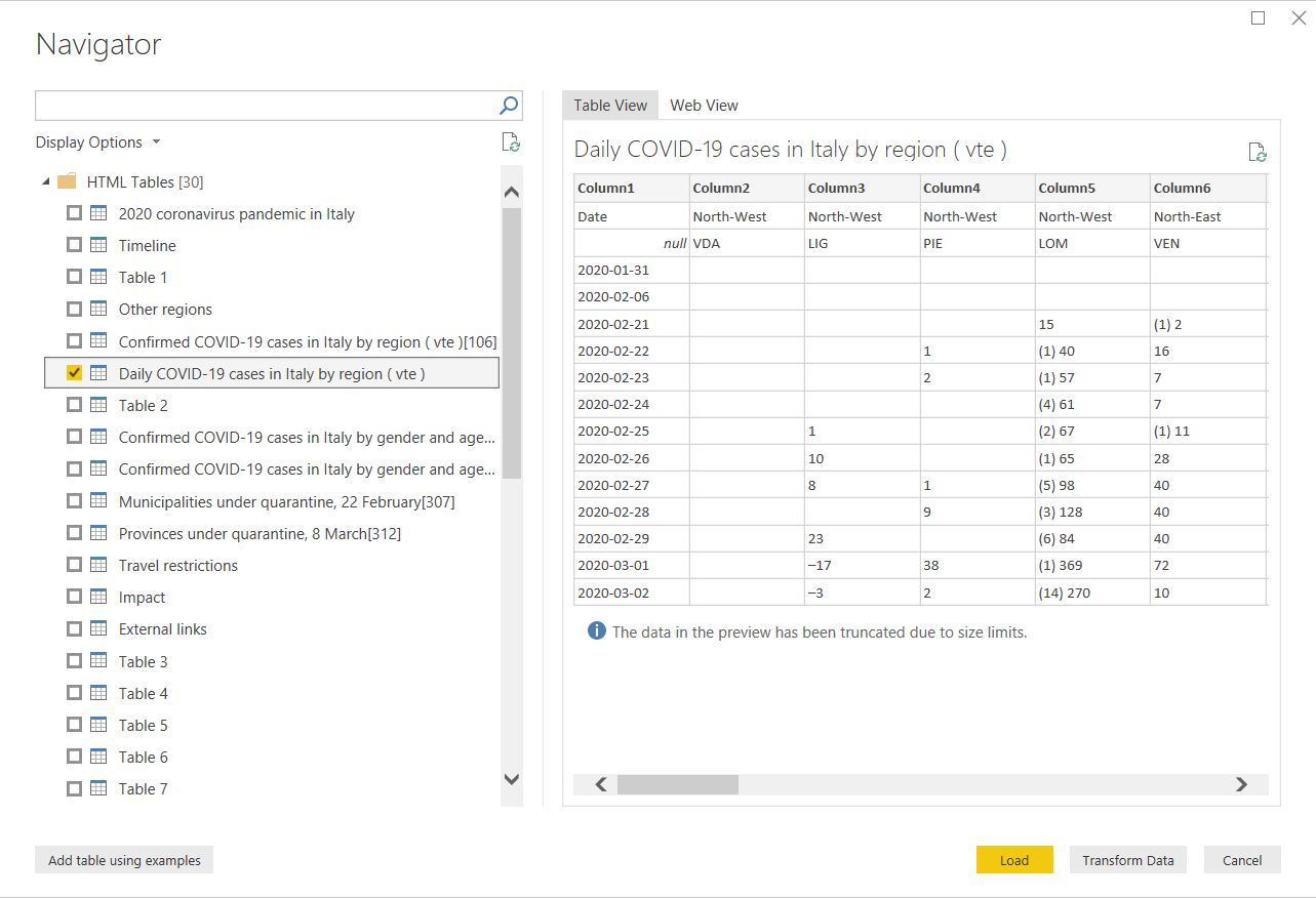
In this article, we will use reference data from the Wikipedia page 2020 coronavirus pandemic in Italy.
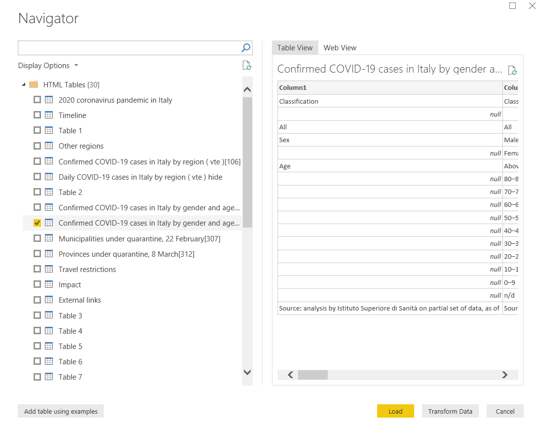
Launch Power BI Desktop and import data from a web data source using Get Data -> Web.
It shows you a list of tables from the pages. Select the highlighted table and click on Transform Data.
Before we prepare a visual, we need the following changes in the data set.
-
Click on Use first row as a header to use table column headers, as shown below:

-
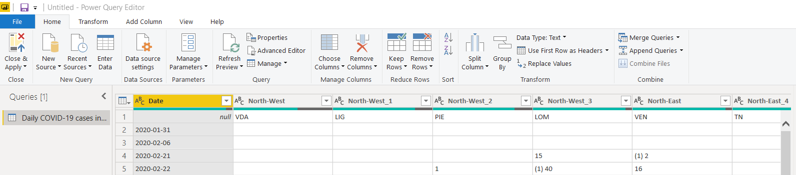
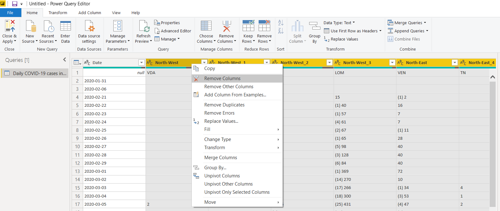
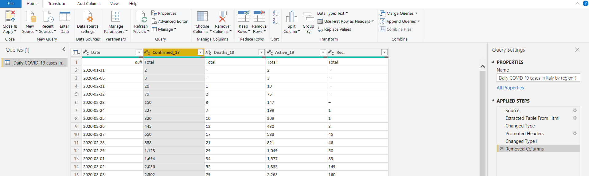
We do not require regional data in the data set. Select the unwanted columns and remove these. We can also remove the new cases columns data from the imported data set:
We have the following columns available after removing unwanted columns. You can also follow the applied steps shown in the below image.
-
As we import data from a web data source, it might show you data that is not required for the report:
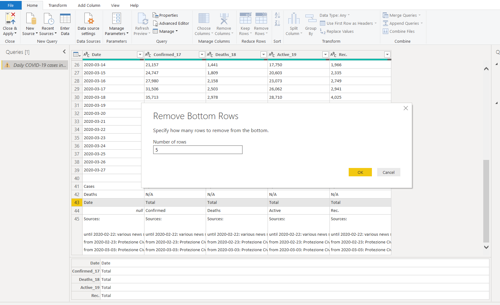
- Remove the bottom 5 rows from this data set
-
Remove Top 1 row. It contains NULL values and headers that are not required for visuals in this article
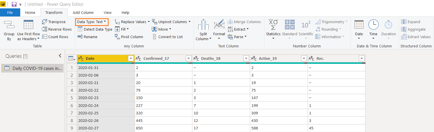
It is an important aspect the categorize each column with appropriate data types as well. If we do not assign the correct data type, it might create inaccurate charts since it does not recognize correct entries. As you see here, Power BI defined the data column as text. In the text format, it also treats the dates as text instead of dates.
Click on Transform and change the data type to Date from a drop-down list.
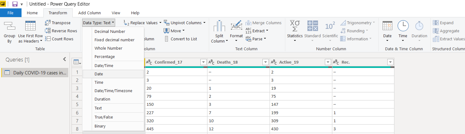
Similarly, change the data type for other columns as the Whole Number. In a few columns(Confirmed, Deaths and Active), once we change the data type to the whole number, it shows error for few rows data.
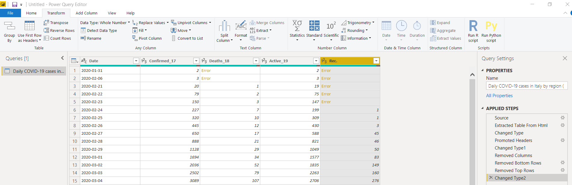
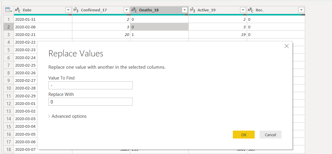
To resolve this, change the data type back to the text and replace the values for the dash (-) with zero.
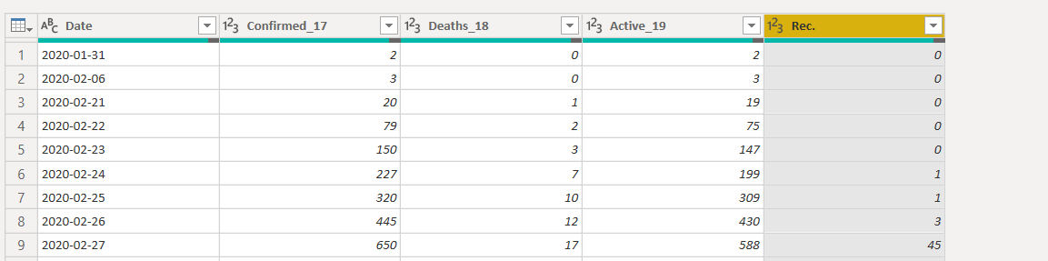
Now, switch to the whole number data type again, and it works fine.
Rename the columns’ names to give a preferred naming convention
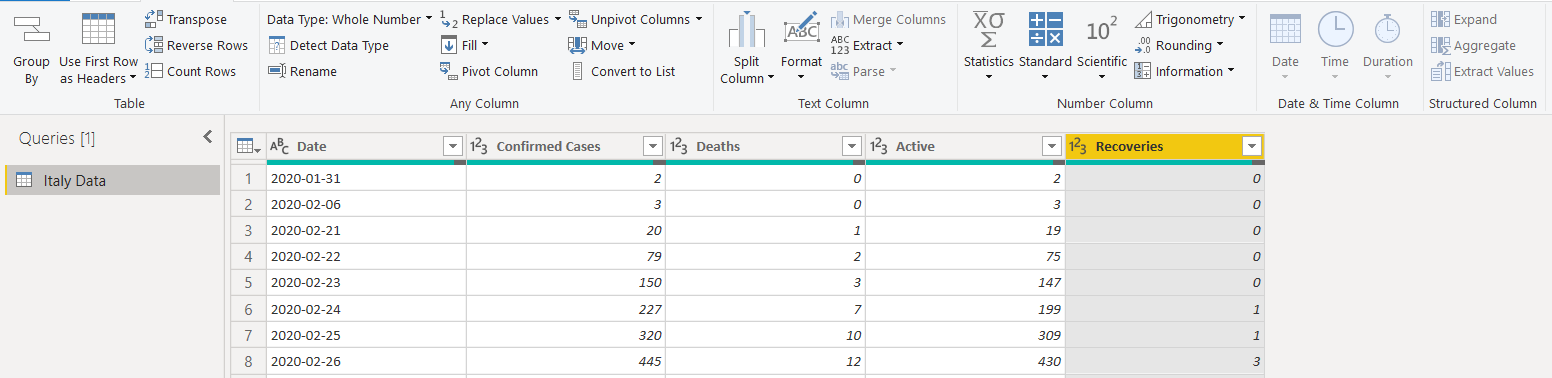
Save the changes (Close & Apply), and we get the data set in Power BI as shown below.
Create an Area Chart visualization in Power BI Desktop
Let’s start creating the visualizations for this article. We want the following area chart for this visual. It is available in the default visualizations.

Use the following steps to prepare this visual.
-
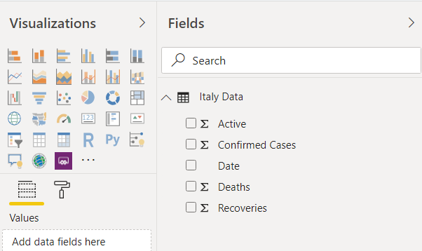
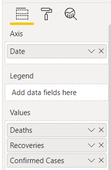
Drag the required field from the data set in the columns area:
- Axis: Date
- Values: Deaths, Recoveries and Confirmed cases
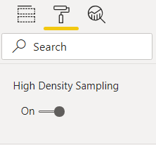
- Turn on the high-density sampling from the format area:
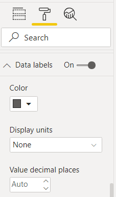
- Enable the data labels property. It shows the data labels ( values) on the chart area. Here, we choose display units as None to show actual values in the chart. We can use display units to shows values in thousands, Millions, Billions:
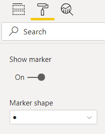
- Enable Show Marker. It shows data points in the chart. We can also change the marker shape if required:
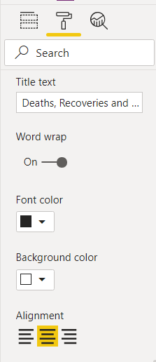
- Title alignment: Set the tile alignment to left, center or right. Here, we select the center alignment. By default, it shows a title depending upon the selected data fields. You can also modify the default title as per your requirement:
Click on the image and import an image in the report. Adjust the image size and move it in the blank area of the chart:
It completes the configuration of the visual we showed earlier.
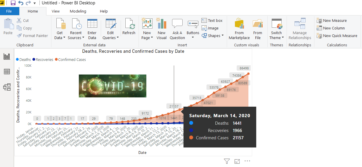
We can take the mouse pointer over any data point, and it gives you complete information.
- Date
- Total confirmed cases, recoveries and deaths
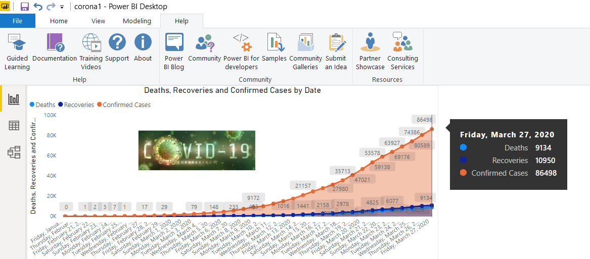
Here, we can notice that during initial days corona cases increase slowly, but later, we can case get doubled in few days only. For example, on 9th March 2020, we have 9172 confirmed cases in Italy.
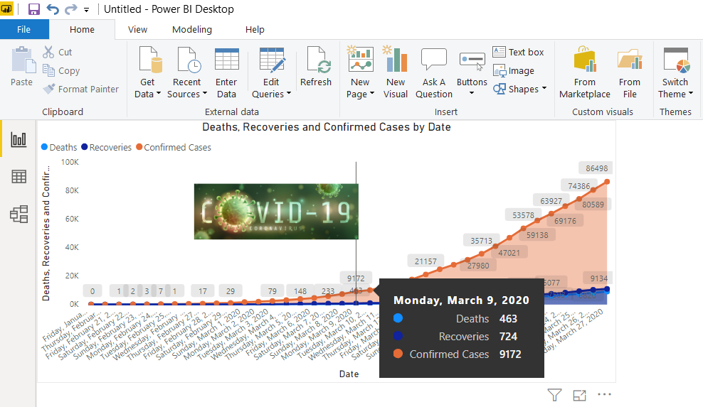
The confirmed cases doubled in just 5 days. On 14th March 2020, it shows 21157 confirmed cases.
Visualize Coronavirus impact on the age groups in Italy
Now, we will analyze the confirmed cases in Italy by their age group. For this, we will use the same URL and import the following data table. We do not need to close the report. You can click on the get data in the ribbon bar and use Get Data -> web for it.
Here, you can transform data, as shown earlier. After transformation, my data looks like below.
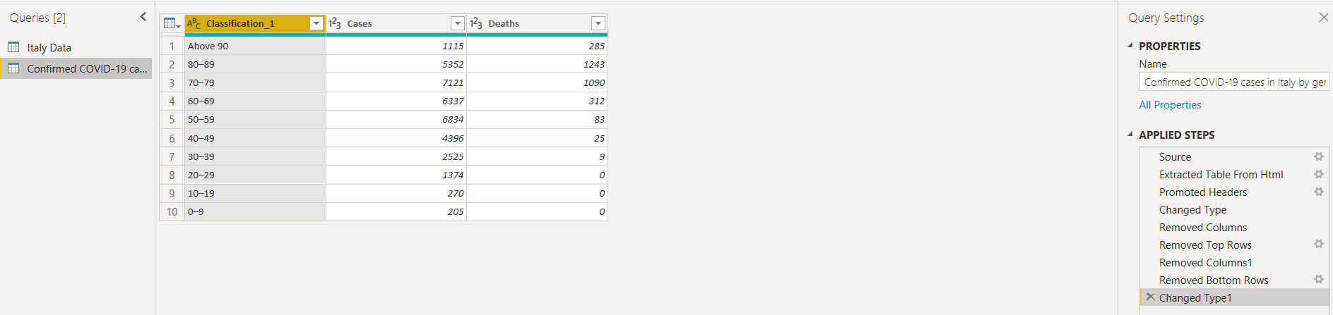
Once we save the transformations, it shows an additional data set in the Power BI Report fields section, as shown below.
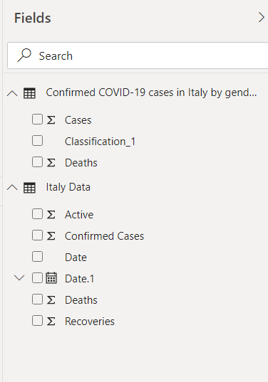
Once we have transformed data, drag the Ribbon chart and adjust the size of it in the Power BI Desktop report. In the chart configuration, drag the columns, as shown in the following image. We have not done any formatting in this chart; however, you can go in the format area and do the various configuration such as data color, title, axis, border.
- Axis: Classification
- Value: Cases, Deaths
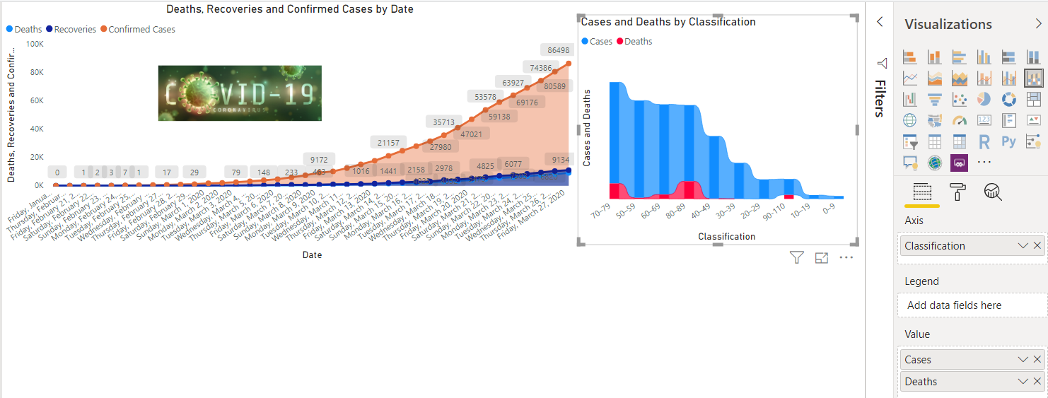
Add the PIE chart in the Power BI Report
We can use the PIE chart in Power BI to compare the categories among each other. For example, we want to know the percentage of cases and deaths in each age group. Let’s add a PIE chart from the visualizations and configure them for total cases and deaths, as shown below. Here, we see that Coronavirus mostly affects the old age group (70+ years).
We can click on an individual category in the bar chart, and you can see the other data charts changes accordingly.

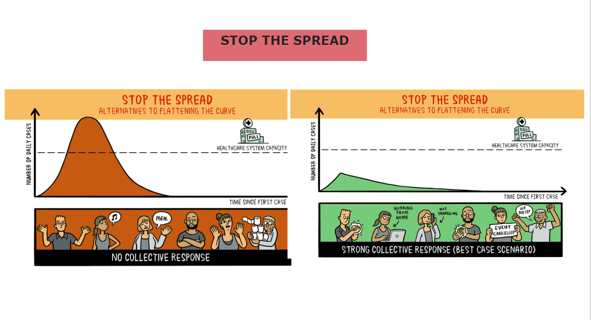
Social distance impact on Corona Virus spread
In this last section of the article, I will add an important image showing the impact of social distancing on coronavirus disease from DeZeen. For this, add a new page in the Power BI Desktop report. We add the following items on the new page.
- Add a text box and write the title of the page
- Add image
Here, you see that if you take precautions and make collective efforts, we can stop this disease spread and bring the world out of this unprecedented situation.
Conclusion
In this article, we explored different ways of visualizing coronavirus impact in Italy on a daily basis. It also shows the coronavirus impact on different age groups. In the end, I hope you all doing good and taking all the necessary precautions and safety measures.

I am the author of the book "DP-300 Administering Relational Database on Microsoft Azure". I published more than 650 technical articles on MSSQLTips, SQLShack, Quest, CodingSight, and SeveralNines.
I am the creator of one of the biggest free online collections of articles on a single topic, with his 50-part series on SQL Server Always On Availability Groups.
Based on my contribution to the SQL Server community, I have been recognized as the prestigious Best Author of the Year continuously in 2019, 2020, and 2021 (2nd Rank) at SQLShack and the MSSQLTIPS champions award in 2020.
Personal Blog: https://www.dbblogger.com
I am always interested in new challenges so if you need consulting help, reach me at rajendra.gupta16@gmail.com
View all posts by Rajendra Gupta
- Understanding PostgreSQL SUBSTRING function - September 21, 2024
- How to install PostgreSQL on Ubuntu - July 13, 2023
- How to use the CROSSTAB function in PostgreSQL - February 17, 2023