
In this article, we will discover how to find the associations and hidden patterns in a dataset. The tool we will use for this is Power BI and not use any statistical functions or calculation.
Explanation
Power BI is one of the most powerful business intelligence solutions in the market. A cloud-based, user-friendly interface and basic development abilities provide this solution to be more convenient for people to use.
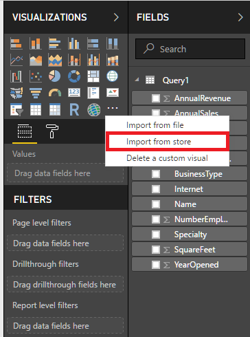
As you may know, Microsoft now supports R script in SQL Server and Power BI. R script support opens magical gates of statistics world to Power BI. Custom Visual offers very useful and interesting visual components for Power BI. In this store, many useful visualizations have been created by Microsoft or the community itself. Some of these visuals use R script infrastructure and this feature allows us to create advanced visual analytic in Power BI. Only a Power BI account is enough to connect and download theses visuals. We will use these visuals in our examples.
What will we learn?
- We will learn how to perform a correlation analysis and how to find the relationship between the data.
- We will learn clustering analysis for separating and patterns in data.
Preliminary
- We will install R Script console and R script studio
- We will enable R Script in Power BI.
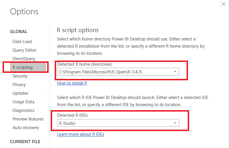
In the first step, we have to install Microsoft R Open and then we have to install R Studio. After the installation is completed, we will check Power BI R Scripting options. Detected R home directories and Detected R IDEs must be filled as shown in the picture below.
After the installation and setting up Power BI gains R Script capability, we now can start our first analysis. In this example, we will try to find the interaction between two numeric values.
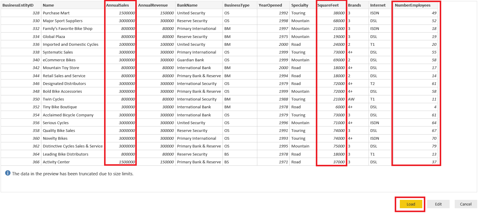
We will explore our sample data and will use sample AdventureWorks database. In AdventureWorks database there is view which name is [Sales].[vStoreWithDemographics]. This view gives information about or related to stores. Some of them are sales, the number of employees and etc.
Correlation analysis
Correlation Analysis is a widely used method in statistics which quantifies the relation between two continuous variables. If there is a relation between two variables, correlation analysis measures the relation intensity and direction. The correlation coefficient is an indicator which indicates the correlation strength and direction. The correlation coefficient can lie in between -1 and +1
- If Correlation coefficient <0.2, there is no correlation.
- Weak correlation occurs between 0.2-0.4.
- A moderate-intensity correlation can be seen between 0.4 and 0.6.
- A high correlation is shown between 0.6-0.8.
- > 0.8 proves to be a very high correlation.
In this, our very first analysis, we will try to find any relation between AnnualSales, Squarefeet and Numberofemployees.
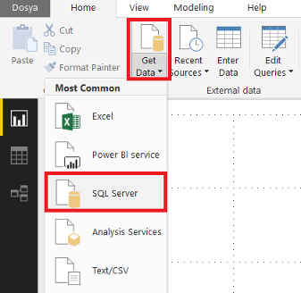
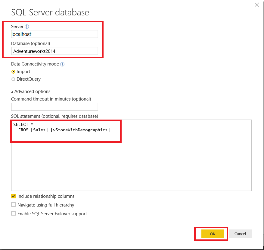
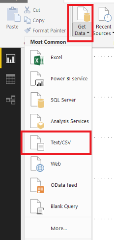
We’ll get data from SQL Server AdventureWorks database
We define the connection string and paste query to SQL Statement textbox in the first step:
|
1 2 |
SELECT * FROM [Sales].[vStoreWithDemographics] |
Upload the data to Power BI:
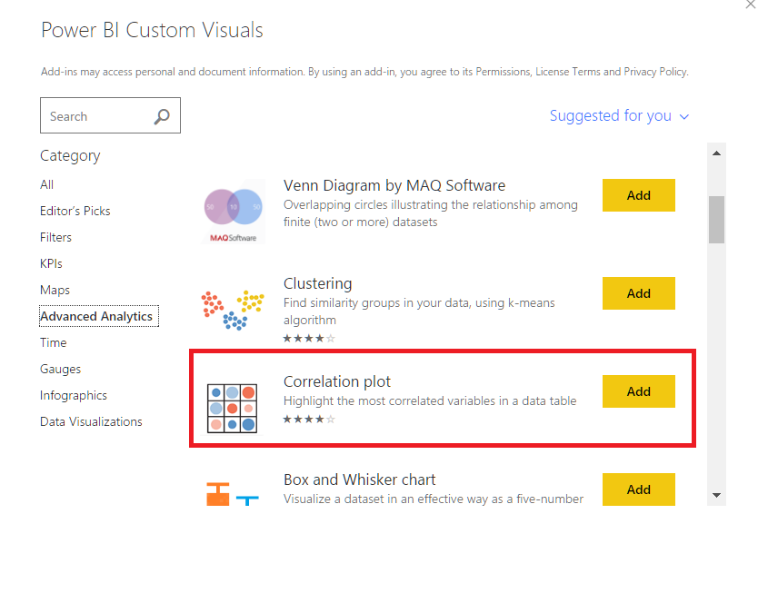
Next, connect to Power BI custom visuals and then add Correlation plot component to Power BI. This component helps us to create and to visualize correlation analysis. We can make this analysis with R script but while using this tool we don’t need any R script knowledge

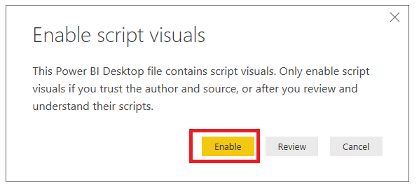
Next we will enable “script visuals”
When we add the correlation plot, this component comes to visualizations and then we will add it to the canvas and select the AnnualSales , NumberofEmployee and, SquareFeet
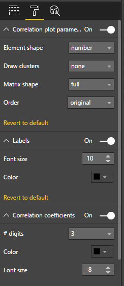
In this step, we will make some changes in the property of correlation plot. We will turn on Correlation plot parameters and change the Element Shape number. Turn on Labels parameter, Correlation coefficients and change #digit parameters to 3. Finally, our correlation plot will be created.
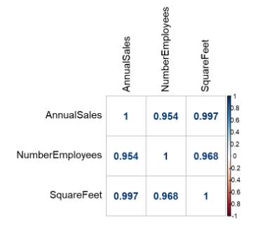
Now, we will look at how to read these graphic values. They tell us that there is a correlation between NumberEmployees and AnnualSales. The Correlation coefficient is 0.954 which means there is a strong correlation between NumberEmployees and AnnualSales.
In this analysis, we found the correlation between these dataset columns without any coding knowledge or any complex statistical calculations.
Clustering analysis
Clustering analysis is a statistical technique that divides the dataset into similar groups. The data in these groups have the same similar characteristics. This technique is used for marketing, health, and education. Assume that you have survey results and you need to categorize this, you can easily use clustering analysis for this.
Now, we will try to find similar groups in our dataset.
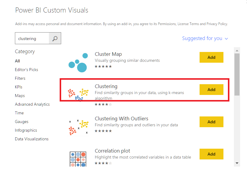
In the first step, we will add clustering visuals from Power BI Custom Visuals.
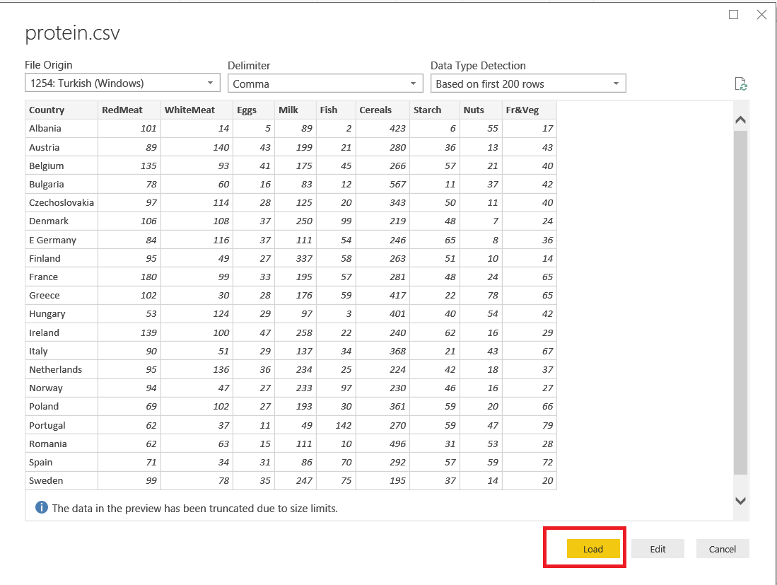
In this analysis, we will use a very common csv dataset. This dataset includes protein indicates from 25 different countries. In our analysis, we will find which countries have same eating habits in food sources. Now we will upload our csv file
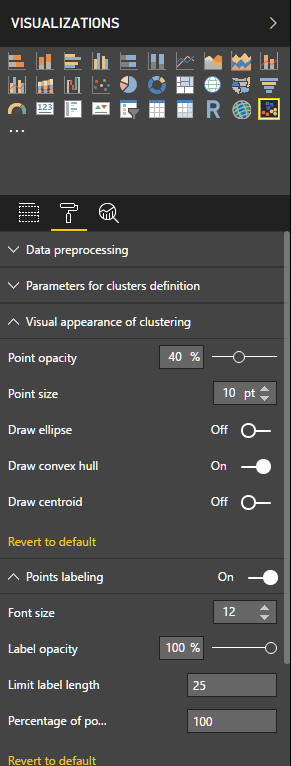
After this step, we will choose columns for the cluster chart. Choose WhiteMeat and RedMeat, because we want the analysis for countries whose eating habits are similar in white meat and red meat. After this selection, we will change a few settings. We will set Draw convex hull “on” and Points labeling font size “12” and limit label length as “25”
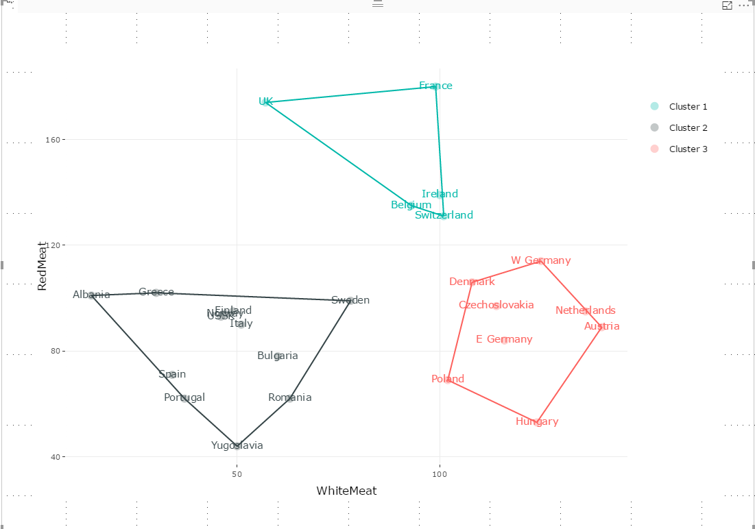
Cluster 1 = {UK,France,Ireland,Belgium,Switzerland}
Cluster 2 = {Albania, Greece, Sweden,Finland,Italy,Bulgaria,Romania,Yugoslavia,Portugal,Spain}
Cluster 3 = {W Germany, Denmark,Czechoslovakia,Netherland,Austria,Hungary,Poland,E Germany}
As you can see in the graphic above, is our cluster analysis chart created. Now, we will have a look at what this graphic value shows. Our chart created clusters and these clusters tell us which countries have similar white and red meat eating habits.
Conclusions
As shown in above examples, it is very easy to create analytics charts and analysis in Power BI. We can easily see the relation and hidden pattern in our dataset. Nowadays, it is not enough to create simple charts or pivot tables for taking a decision. Consider that, a company will make a marketing campaign, they need to categorize their customers. This company cannot do this without clustering analysis.
The key point in here is to take a decision we need; more information and this information have guided us.
References
- Introduction to Correlation and Regression Analysis
- Correlation Plot
- Introduction to K-Means Clustering

Most of his career has been focused on SQL Server Database Administration and Development. His current interests are in database administration and Business Intelligence. You can find him on LinkedIn.
View all posts by Esat Erkec
- SQL Performance Tuning tips for newbies - April 15, 2024
- SQL Unit Testing reference guide for beginners - August 11, 2023
- SQL Cheat Sheet for Newbies - February 21, 2023