
Introduction
Power BI is an extremely powerful tool to create dashboards and reports. In the last article, we learned how to create a Data Warehouse in Azure. In this new chapter, we will learn how to create reports from the Data Warehouse in Azure using Power BI in Azure.
With Power BI, you have your information in real time, it is easy to learn and use. In Azure, you do not need to install anything!
In this article, I will show you how to create charts, work with maps and show some limitations of the tool.
Requirements
- An Azure Account.
- The Azure Data Warehouse installed.
Getting started
-
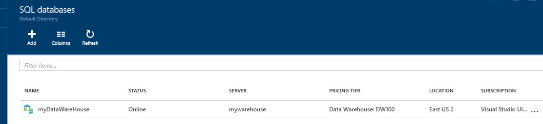
Open the Azure Portal and go to the SQL Database:

Figure 1. SQL databases -
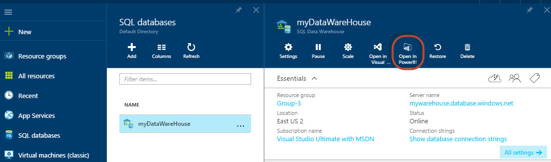
Select your SQL Data Warehouse created in earlier chapters and press “Open” in Power BI icon:
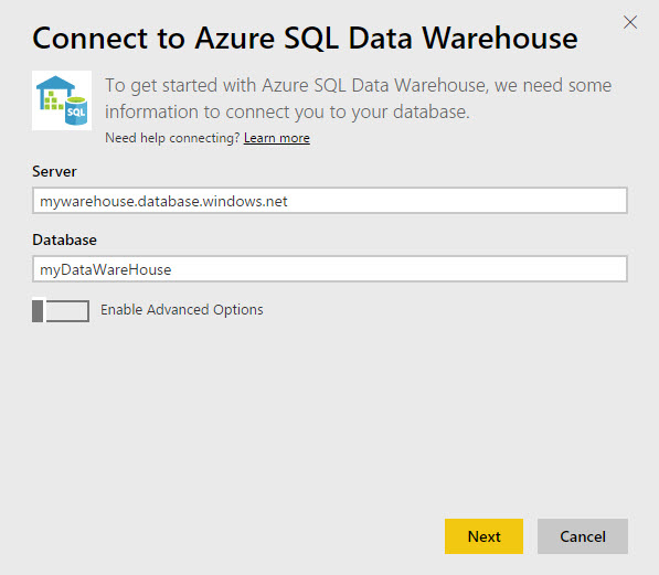
Figure 2. The Data warehouse in the Portal If it is your first time using Power BI, you may need to specify your credentials. Otherwise, login with your credential:
Figure 3. The login window. The system will show the Server name and the Database name. You can optionally enable the advanced option to specify the frequency to refresh the data (by default 15, which is the minimum value). Just press “Next”, unless you want to change the advanced options:
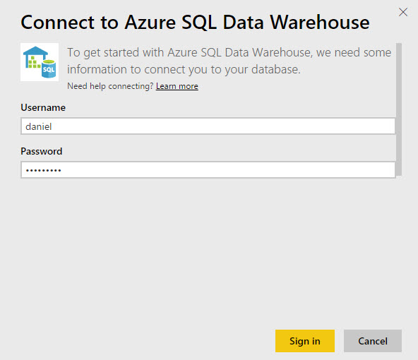
Figure 4. The Data Warehouse Connection information You will need to specify the username and password to connect to the Database:
Figure 5. The username and password You will have the following image created. Double click on it:
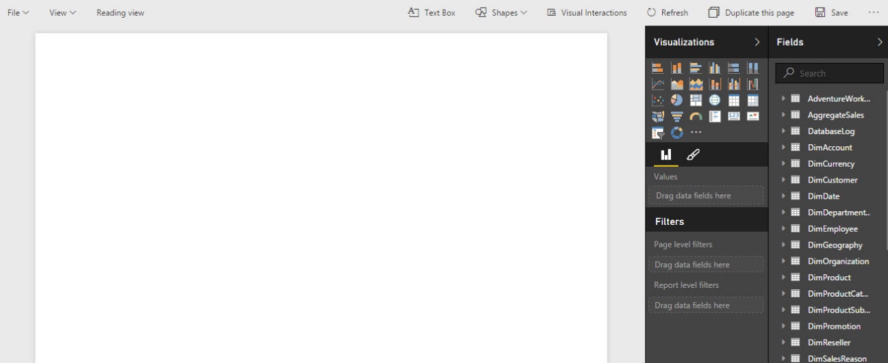
Figure 6. The Power BI You are now in Power BI! You can create the report now.
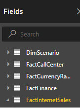
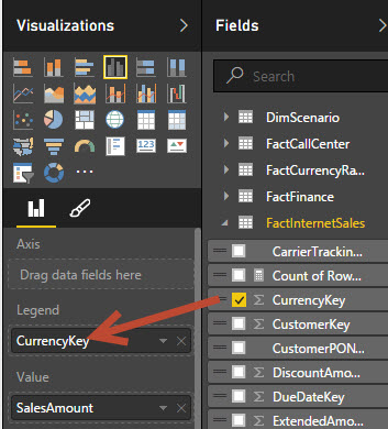
Figure 7. The Power BI Window Check the “FactInternetSales” in the “Fields” section:
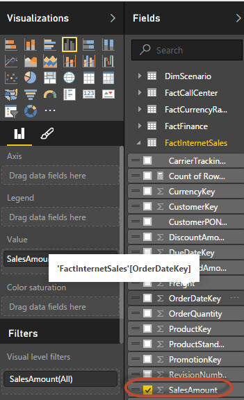
Figure 8. The Fields Select the “SalesAmount” field:
Figure 9. Selecting the field for the chart In the legend, select the “Currency key”:
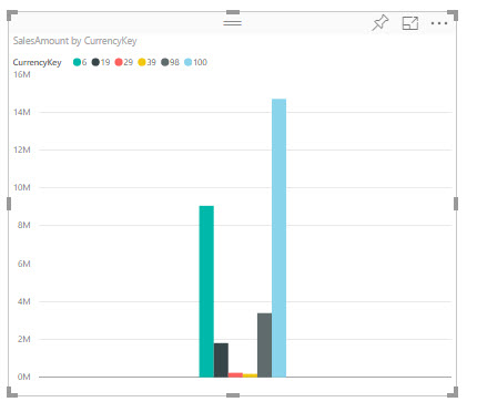
Figure 10. Selecting the Legend for the chart The graph created is the following:
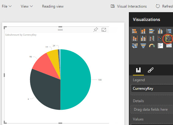
Figure 11. The chart created You can easily change the bars to pies using the visualization option:
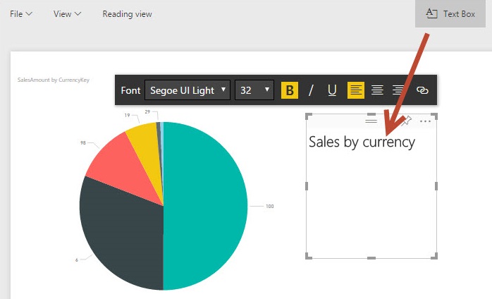
Figure 12. The pie chart in Power BI You can add text boxes to your chart and add text by customizing the font, size, alignment:
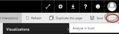
Figure 13. Adding the text box You have a button to analyze your information in Excel. This option is in the preview version. For this option, you will need to install the SQL_AS_OLEDB installer, which will be downloaded from the Azure Portal. The installer is a new version of the connector included in SQL 2016:
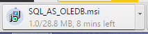
Figure 14. Analyzing the report in Excel This new provider allows connecting to Power BI from Microsoft Excel. When you try to access, you will the the odc file. This file contains the connection information. The installer has 28 MB approx:
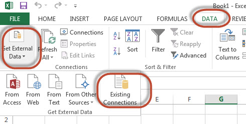
Figure 15. The SQL_AS_OLEDB Provider To open the connection in Excel, in the menu go to “DATA”. Select the “Get External Data” and select “Existing Connections”. Then you will select the odc file:
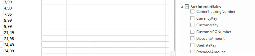
Figure 16. Connecting to Excel Your Power BI credentials will be required. You will be connected to Excel. You will be able to handle the Azure Data in Excel like any dynamic table:
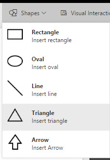
Figure 17. Using Excel to connect to Power BI In Power BI, you can also add Shapes to your charts, like rectangles, ovals, lines and arrows:
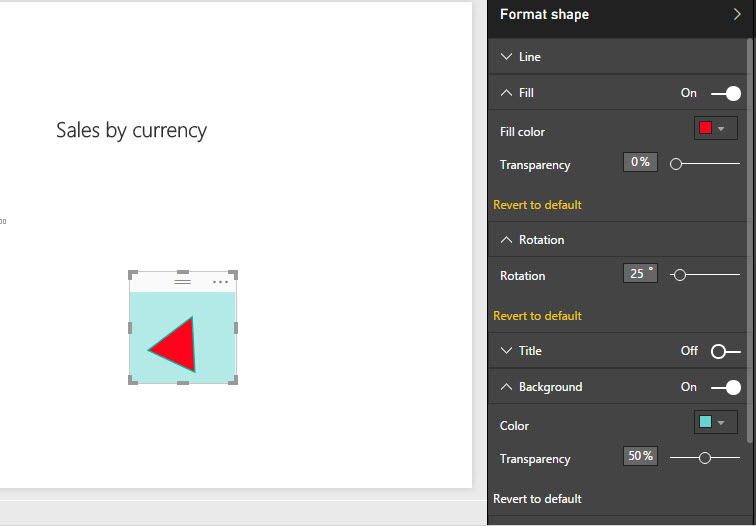
Figure 18. The Power BI Shapes The format shape allows you to change the color, transparency, rotation, background, titles and other shape properties:
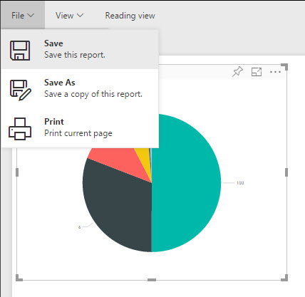
Figure 19. The shape’s properties You can “Save” or “Save As” your report and create similar reports with some modifications:
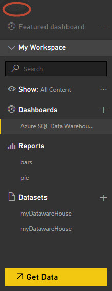
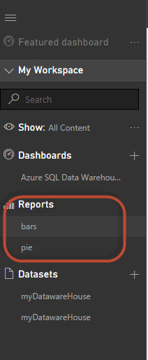
Figure 20. The File menu. In the menu, you can find the dashboards, reports, and datasets:
Figure 21. The Power BI menu. When you click the “Save as” button, the report will be created in the report section:
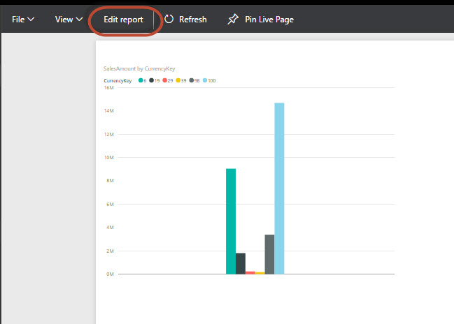
Figure 22. The reports By default, when you select a report, it is in a read-only mode. You’ll need to press the “Edit report” option to edit the report:
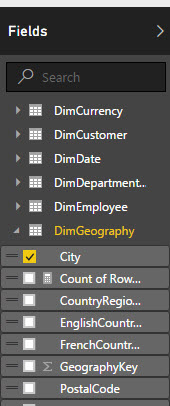
Figure 23. Editing a report Another cool feature is the Map. In the “Fields” section, go to the “DimGeography” dimension and select the “City” field:
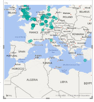
Figure 24. The DimGeography dimension A map is displayed and it shows all the cities from the dimension:
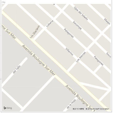
Figure 25. The Power BI maps Using the mouse wheel, you can Zoom in and Zoom out the map. You can see the names of the streets:
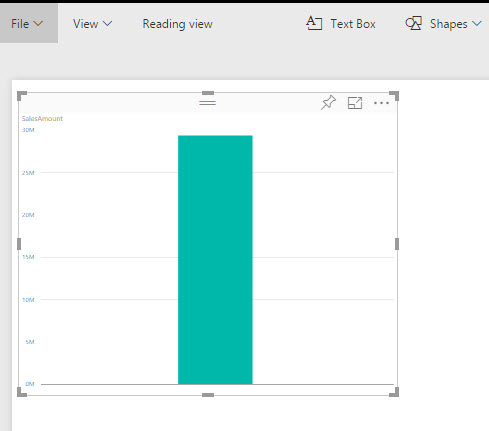
Figure 26. The street names in Power BI In the a new report, create a chart of the “FactInternetSales” table of the “SalesAmount” field (as we did in step 9):
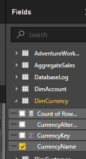
Figure 27. The sales amount chart Now, I am going to try to get the chart of sales amount per currency name. In the “DimCurrency” table, select the “CurrencyName” field.
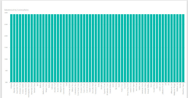
Figure 28. The graph per Currency Name If you check the graph of the “SalesAmount” per currency name, you will notice that all the values are the same for each currency. This is because Power BI cannot detect the relationships between the Fact Table and the dimensions. This is not cool, but you can create views to get this information.


Conclusion
Power BI is a simple an intuitive tool. In Azure, you do not need to worry about the installation. You only need to take care of the information and create nice reports for your company. I hope you will have fun with it as I did.
In this article, we have learned how to create charts, add shapes, add text, and work with maps. We’ve also learned how to export the Power BI information to MS Excel. For Excel, you will need the last OLEDB provider. We’ve also noticed that Power BI cannot detect the relationships between the Fact and Dimension tables. The workaround is to create some views with the information required.
If you have any questions, please let me know – you may use the comments section below.

He has worked for the government, oil companies, web sites, magazines and universities around the world. Daniel also regularly speaks at SQL Servers conferences and blogs. He writes SQL Server training materials for certification exams.
He also helps with translating SQLShack articles to Spanish
View all posts by Daniel Calbimonte
- PostgreSQL tutorial to create a user - November 12, 2023
- PostgreSQL Tutorial for beginners - April 6, 2023
- PSQL stored procedures overview and examples - February 14, 2023